Eighty five years ago today, Wilson Alwyn Bentley died of pneumonia. It was December 23, 1931, and outside his home in Jericho, Vermont, the sky was ripe for snow. His final diary entry read: “Cold north wind afternoon. Snow Flying.” It was the sort of weather he had lived for.
Bentley began to observe snow at 15 years old, when his mother bought him a microscope. It consumed his days, he later recalled:
When the other boys of my age were playing with popguns and sling-shots, I was absorbed in studying things under this microscope: drops of water, tiny fragments of stone, a feather dropped from a bird’s wing, a delicately veined petal from some flower. But always, from the very beginning, it was snowflakes that fascinated me most. The farm folks, up in this north country, dread the winter; but I was supremely happy.
Over the subsequent decades, Bentley photographed more than 5,000 snowflakes, and created the first photomicrograph of an ice crystal, combining a microscope and an accordion-shaped bellows camera. A professor of natural history who became known as “the snowflake man,” he demonstrated what is now a common adage: no two snowflakes are alike.

Photos: Snowflakes circa 1902 by Wilson Bentley. Courtesy of Wikimedia Commons.
The snow Bentley observed at a microscopic scale, satellites now see at the size of whole continents. The subject matter that fascinated him still provides fodder for heaps of scientific papers today.
December 2016 has brought a flurry of Bentley-esuqe weather to the U.S. East Coast, including snow and biting winds. But long before winter kicked into full gear in cities like Washington and New York, it painted landscapes around the world white. From Japan to Kazakhstan, NASA satellites observed snow from space. So if you’re dreaming of a white Christmas or waiting for the gingerbread cookies to bake, here are several images—some we previously published, and others that are quite fresh.

Image: NASA Earth Observatory/Joshua Stevens, using Landsat data from the U.S. Geological Survey.
December 19: ‘Gateway to the Desert’ Gets First Snow in 37 Years
Snow fell in the town of Ain Sefra for the first time in nearly four decades this December. Satellites show a thin, white veil covering the orange sand dunes of the northern Sahara. The Enhanced Thematic Mapper Plus (ETM+) on the Landsat 7 satellite captured this natural-color image of snow on December 19, 2016. On the ground, Photographer Karim Bouchetata captured the snow before it melted.

Image: NASA Earth Observatory/Joshua Stevens using VIIRS day-night band data from the Suomi National Polar-orbiting Partnership.
December 14: The Great Lakes Don a White Cloak
An Arctic air mass brought more snow to communities around the Great Lakes on December 14, 2016. The lake-effect snow comes on the heels of an earlier accumulation that piled up to several feet of snow in some areas, according to reports. Officials issued weather warnings and advisories from northeast Ohio to upstate New York.

Image: NASA Earth Observatory/Jeff Schmaltz, using MODIS data from LANCE/EOSDIS Rapid Response.
December 2: Snow and ash above Katmai
A plume of volcanic ash hangs over the Gulf of Alaska in this natural-color image. The plume is not the product of an active volcano; it contains re-suspended ash from the 1912 eruption of Novarupta, according to the Alaska Volcano Observatory.

Photograph: Astronaut photography from the Expedition 48 crew.
November 27: Snow 2.0
The white hills sprawling in every direction look like mounds built by snow plows, or massive hills of sugar. In fact, they’re the world’s largest gypsum dune field: the White Sands National Monument, located in southern New Mexico.
During the last Ice Age, melting snow and ice from the San Andres Mountains (west of the dunes) and the Sacramento Mountains (to the east) eroded minerals from the hillsides and carried them downhill to the basin below. As the climate warmed and the water evaporated, the basin remained full of selenite (the crystalline form of gypsum) and created the Alkali Flats. Over time, winds broke the crystals into sand grains, which built up into the dunes.

Image: NASA Earth Observatory/Joshua Stevens, using MODIS data from LANCE/EOSDIS Rapid Response.
November 25: Rare November snow in Tokyo
On November 24, 2016, Tokyo received its first November snowfall in more than half a century. The snow fell in and around the Japanese capital, coating the metropolitan area.
The Moderate Resolution Imaging Spectroradiometer (MODIS) on NASA’s Terra satellite captured this natural-color image the same day. Central Tokyo is gray-brown in color, suggesting less accumulation or faster melting. Urban centers tend to shed snow faster than surrounding countryside because they are often hotter, a result of the urban heat island effect.

Image: NASA Earth Observatory/Pola Lem, using MODIS data from LANCE/EOSDIS Rapid Response.
November 20: White hills appear amid green in England
Snow arrived in parts of northern England before a satellite took this image on November 20. According to reports, the same storm brought high winds and lashing rain farther south, in Kent and Sussex.

Image: NASA Earth Observatory/Pola Lem, using MODIS data from LANCE/EOSDIS Rapid Response.
November 17: White Kazakhstan
Broad swaths of Kazakhstan turned white before this Visible Infrared Imaging Radiometer Suite (VIIRS) image was taken on November 17, 2016. Parts of the country saw temperatures dipping well below freezing, with extreme wind chills. That’s not a surprise for locals; the country’s capital, Astana, often experiences frigid days in winter months.

Image: NASA Earth Observatory/Jesse Allen, using EO-1 ALI data provided courtesy of the NASA EO-1 team.
November 5: Snow meets lava in Iceland
More than a year after the latest eruption at Iceland’s Holuhraun lava field, the newly-formed lava may still be toasty underneath. Although the basaltic rock formed a hard crust, according to volcanologists, the flow is probably still hot enough to prevent snow from building up atop it.
“You’re not going to freeze the lava flow,” said Erik Klemetti, a volcanologist at Denison University and author of the Eruptions blog at Wired magazine. “You need to wait for the soil to freeze to get snow to accumulate in temperate latitudes.”

Image: NASA/Jeff Schmaltz.
October 7: Early snow blankets Nebraska
Snow dusted parts of Nebraska on October 6, 2016. This natural-color image, acquired by the Moderate Resolution Imaging Spectroradiometer (MODIS) on NASA’s Terra satellite, shows a white blanket covering about 40 square miles (more than 100 square kilometers). Photos taken by highway cameras showed snow falling along parts of U.S. Route 83 on the afternoon of October 6.

Image: NASA Earth Observatory/Joshua Stevens. Data courtesy of Hakkarainen, J., Ialongo, I., and Tamminen, J.
A reader recently wrote to ask us about our November 17 article: “Satellite Detects Human Contribution to Atmospheric CO2.”
“Hello, I read on the site that CO2 concentrations are higher in some areas and lower in others. Is the reason for this that the higher zones are near CO2 sources such as heavily populated areas? I always thought gas spread evenly in a container.”
We asked Janne Hakkarainen, a researcher at the Finnish Meteorological Institute and co-author of the study that used OCO-2 data to make satellite-based maps of human emissions of carbon dioxide. Launched in July 2014, NASA’s Orbiting Carbon Observatory-2 (OCO-2) was designed to give scientists comprehensive, global measurements of carbon dioxide in the atmosphere.
Hakkarainen wrote: “Carbon dioxide is indeed well mixed in the atmosphere. This means that if we look at the CO2 concentrations globally, the value is about 400 ppm everywhere.” (That’s 400 parts per million.)
Findings from the UN Intergovernmental Panel on Climate Change warn about the consequences of rising CO2 concentrations: “Any CO2 stabilisation target above 450 ppm is associated with a significant probability of triggering a large-scale climatic event.”
“In our recent research paper, we developed a methodology to derive regional CO2 anomalies, which means that we remove from individual CO2 values the regional CO2 median,” wrote Hakkarainen. “When these anomalies are averaged over time, the map highlights the CO2 signal that is not yet mixed and still close to the emission source. The idea is to average out the ‘CO2 weather’ or ‘transport,’ illustrated nicely in this NASA computer simulation (below).”
Another reader asked: “Can someone explain the high CO2 content over the Idaho panhandle and the large area at sea off the Oregon-California border.”
“The Idaho Panhandle anomalies could be related to biogenic sources or fire emissions,” wrote Hakkarainen. For example, NOAA’s CarbonTracker system showed positive fluxes (not including fossil fuel emissions) in that area in 2014.

Image: NASA Earth Observatory/Joshua Stevens. Data courtesy of Hakkarainen, J., Ialongo, I., and Tamminen, J.
The science team behind the Multi-angle Imaging SpectroRadiometer (MISR) on NASA’s Terra satellite frequently publishes special images called stereo anaglyphs. For example, you might have seen our recent series of anaglyphs celebrating the centennial of the National Park Service. But what exactly is an anaglyph, and how is one made from MISR data?

All methods of viewing images in three dimensions rely on the fact that our two eyes see things at slightly different angles; this is what gives us depth perception. As a simple demonstration, hold a finger at a short distance from your face, and close one eye at a time. You will notice that your finger appears to be in a different place with each eye. The horizontal distance between the two versions of your finger is called the parallax. Your brain interprets the amount of parallax to tell you how far away your finger is from your face—the greater the parallax, the closer your finger!
However, your brain can also be tricked into thinking that a perfectly flat picture is actually a three-dimensional object by presenting each eye with a slightly different version of the picture. The first 3D viewing technology was the stereoscope, originally invented by Sir Charles Wheatstone in 1838. The stereoscope takes two images viewed from slightly different angles and mounts them next to each other. The photos are viewed using fixed lenses that fool the brain into thinking that it is looking at one picture. Stereoscopes worked well, but their major drawback was that they could only be used by one person at a time.
In 1858, Joseph D’Almeida, a French physics professor, invented a method of showing stereoscopic images to many people at once using a lantern projector equipped with red and blue filters. The viewers wore red and blue goggles. Later, Louis Du Haron adapted this technique to allow anaglyphs to be printed and viewed on paper. In 1889, William Freise-Green created the first anaglyphic motion picture. These early 3D movies were nicknamed “plastigrams” and were very popular by the 1920s.
At the most basic level, anaglyphs work by superimposing images taken from two angles. The two images are printed in different colors, usually red and cyan. The viewer needs glasses with lenses in the same colors. The lenses are needed to filter out the unwanted image for each eye. So, if the image for the right eye is printed in red, the image can be seen through the cyan lens placed over the right eye, but not through the red lens over the left eye, and vice versa. The brain, seeing two different pictures through each eye, interprets this as a three-dimensional scene.

The reason why the MISR instrument can be used to make anaglyphs is because it has nine cameras, each fixed to point at a different angle. Therefore, as MISR passes over a particular feature on Earth, it captures nine images spanning a range of 140 degrees (diagram above). Any two of these images can be combined to make an anaglyph. The greater the angular difference between the images, the greater the resulting 3D effect; however, if the angular difference is too great, the brain will be unable to interpret the image.
Anaglyphs made with MISR must be rotated so that the north-south direction is roughly horizontal. Though this is inconvenient — we are used to viewing the Earth with north at the top — it is necessary because Terra flies from north to south, and MISR’s cameras are aligned to take images along that track. Therefore, the angular difference between the images is in the north-south direction. Since our eyes are arranged horizontally, the angular difference between the anaglyph images must be horizontal as well.
You can see this by comparing two versions of an anaglyph of Denali, Alaska (below). In the version with north upwards (left), the 3D effect does not work. But when the image is rotated so that north is to the left, suddenly the mountains pop out.

Anaglyphs are useful for science because they allow us to intuitively understand the three-dimensional structure of things like hurricanes and smoke plumes. For example, examine the three-panel image of Typhoon Nepartak below. (All three images have been rotated so north is to the left).

In the top, single-angle image, the eye of the storm appears to be quite deep due to the shadows, but otherwise it is difficult to determine how high the clouds are. Compare this to the middle image, which shows the results from MISR’s cloud top height product; it uses a computer algorithm to compare the data from multiple cameras and determine the geometry of the clouds. Now we can tell that clouds in the central part of the storm are very high (except for the eye), while the spiral cloud bands are slightly lower and there are very low clouds between the arms. However, understanding this data set requires us to interpret the color key and have at least a rudimentary idea of how 16 kilometers compares to 4 kilometers.
Now put on your red-blue glasses* and look at the anaglyph in the third image. All of the features are immediately understood by our brains. While it takes a few minutes (or paragraphs) of explanation to introduce a first-time viewer to MISR datasets, the red-blue glasses make it possible to enjoy the same experience with a simple image. This is why anaglyphs make great tools for scientists as well as for sharing unique views of Earth’s features with the public.
Editor’s note: If you don’t have a pair of red-blue glasses, this page lists companies that sell them. Or if you can find some red and blue plastic wrap, you can make your own. The instructions are here.

Every month on Earth Matters, we offer a puzzling satellite image. The November 2016 puzzler is above. Your challenge is to use the comments section to tell us what part of the world we are looking at, when the image was acquired, what the image shows, and why the scene is interesting.
How to answer. Your answer can be a few words or several paragraphs. (Try to keep it shorter than 200 words). You might simply tell us what part of the world an image shows. Or you can dig deeper and explain what satellite and instrument produced the image, what spectral bands were used to create it, or what is compelling about some obscure speck in the far corner of an image. If you think something is interesting or noteworthy, tell us about it.
The prize. We can’t offer prize money or a trip to Mars, but we can promise you credit and glory. Well, maybe just credit. Roughly one week after a puzzler image appears on this blog, we will post an annotated and captioned version as our Image of the Day. After we post the answer, we will acknowledge the person who was first to correctly ID the image at the bottom of this blog post. We may also recognize certain readers who offer the most interesting tidbits of information about the geological, meteorological, or human processes that have played a role in molding the landscape. Please include your preferred name or alias with your comment. If you work for or attend an institution that you want us to recognize, please mention that as well.
Recent winners. If you’ve won the puzzler in the last few months or work in geospatial imaging, please sit on your hands for at least a day to give others a chance to play.
Releasing Comments. Savvy readers have solved some of our puzzlers after only a few minutes or hours. To give more people a chance to play, we may wait between 24-48 hours before posting the answers we receive in the comment thread.
Good luck!
Editor’s Note: Congratulations to James Varghese, David, and John Dierks for being some of the first readers to solve the puzzler on Earth Matters and Facebook. See a labeled version of the November puzzler with a more detailed discussion of El Jorf and the qanats here.

Photo by Adam Voiland. Taken from Rodeo Beach in Marin County, California, in the evening on December 14, 2015.
If you have ever stood on a beach before sunset and gawked at a gleaming line of light extending toward the horizon, you have seen a glitter path.
What causes this spectacular optical phenomenon? Glitter paths are made up of many bright points of light reflecting off tiny ripples, waves, and undulations on the water surface and back at a sensor (for instance, a camera or human eye). Together, these points of light make up areas of sunglint. The appearance of glitter paths on water varies depending on the height of the Sun above the horizon, the height of the surface waves, and the position of the observer.
For instance, if the Sun had been directly overhead and above perfectly calm water, I would have seen a circular reflection that looked much like the Sun in the sky. However, when I took this photograph from Rodeo Beach near sunset in December 2015, the reflection appeared as a long elliptical line of light because the Sun was quite low in the sky. Note how much the roughness of the water surface affected the glitter path. Near the shore, where waves had just broken and the water surface was filled with foam, the glitter path was significantly wider than it was in the smoother waters farther off shore.

NASA image acquired by the Moderate Resolution Imaging Spectroradiometer (MODIS) on the Terra satellite on the morning of June 22, 2015.
Sunglint is visible from space as well. In the satellite image of California above, which the Terra satellite captured on the morning of June 22, 2015, notice the line of light running over the Pacific Ocean. This line of sunglint traces the track of Terra’s orbit. If the ocean surface had been completely smooth, a sequence of perfect reflections of the Sun would have appeared in a line along the track of the satellite’s orbit. In reality, ocean surfaces are chaotic and often in motion due to the constant churn of waves and winds. As a result, light reflecting off the surface was scattered in many directions. This left the blurred, washed out line of light along the satellite’s orbital track that you see here instead.
You can learn more about sunglint and glitter paths from stories by Darryn Schneider, Atmospheric Optics, Joseph Shaw, Richard Fleet, NASA Earth Observatory, and Earth Science Picture of the Day.
Editor’s Note: Ground to Space is a recurring series of posts on NASA Earth Observatory’s Earth Matters blog that pairs ground photography and satellite imagery of the same feature or phenomenon. If you have a photograph that you think would be a good candidate, please email Adam Voiland.

View of the dais during the High-Level Segment Ministerial Round Table ‘Towards an Agreement on the HFC Amendment under the Montreal Protocol – Part 2: Ensuring Benefits for All.’ October 14, 2016 (day 6). Photo by IISD/ENB | Kiara Worth
The Antarctic ozone hole in 2016 was not exactly remarkable. But each year, we publish an annual update because, when strung together over time, the series shows the unparalleled success of the Montreal Protocol in stabilizing the atmosphere.
Now the scientists and negotiators behind the Protocol are taking on a new problem: the climate warming effects of chemicals that were supposed to be better for the ozone layer. NASA scientist Paul Newman attended the Montreal Protocol’s international meeting this October in Kigali, Rwanda, and he sat down with us to explain the new agreement, why it’s unique, and what it was like to participate in the meeting. Here are some of the main takeaways:
“The Montreal Protocol is written so that we can control ozone-depleting substances and their replacements. Chlorofluorocarbons (CFCs) were initially replaced with hydrochlorofluorocarbons (HCFCs) and then hydrofluorocarbons (HFCs), making HFCs the so-called “grandchildren” of the Montreal Protocol.
HFCs very weakly affect the ozone layer. But the problem is that they are powerful greenhouse gases. One can of this keyboard cleaner [an aerosol can with HFC-134a] is equivalent to 1,360 cans of carbon dioxide. HCFs are much more powerful than carbon dioxide as a greenhouse gas, and that’s true of many HFCs, not just HFC-134a. And their use—particularly in refrigeration and air conditioning—has been going up fast.
It has been projected that by 2100, the effect of HFCs on temperature could be as high as 0.5 Kelvin (0.5 degrees Celsius, or 0.9 degrees Fahrenheit) if we did nothing. Because of the amendment, that number will be closer to 0.06 Kelvin (0.06 degrees Celsius, or 0.11 degrees Fahrenheit).
The point of the of Kigali amendment was to control these greenhouse gases because they are a replacement for CFCs. They are adding to the climate problem, so the world’s nations wanted to do something about it. The Montreal Protocol has evolved from strictly an ozone treaty, to an ozone and climate treaty.”

NASA scientist Paul Newman (right) on October 10, 2016 (day 2). Photo by IISD/ENB | Kiara Worth
“HFCs go through a series of steps before they can begin accumulating in the atmosphere. The first is production, in which factories make tanks of the gas (like a brewery making big vats of beer). The next step is consumption, when HFCs are added to things like refrigerators and air conditioners (to follow the beer analogy, that’s when the brewer puts the beer in a bottle or keg). Finally, HFCs are emitted when people use those things (pop the cork on the bottle or tap the keg).
The important point is that there is a time lag. Consumption of HFCs are projected to peak in the late 2020s, but emissions don’t peak until about 2035. Once in the atmosphere, HFCs last a long time before being destroyed by chemical reactions. For example, If I vent my can of 134a, 5 percent of it will still be in the atmosphere after 42 years. So they continue to accumulate and peak in the atmosphere by the mid 2050s.”

Delegates during the morning plenary on October 11, 2016 (day 3). Photo by IISD/ENB | Kiara Worth
“Montreal Protocol meetings don’t have a schedule; they have an agenda. That means that we have a list of topics and we work until they are all addressed. For example, we worked all day Friday (October 14, 2016) but didn’t finish, so we reconvened Saturday at 1 a.m. and finished the amendment at 7 a.m. I was up for 27 straight hours, tired and hungry.”
… but uniquely effective.
“This agreement is a huge step forward because it is essentially the first real climate mitigation treaty that has bite to it. It has strict obligations for bringing down HFCs, and is forcing scientists and engineers to look for alternatives.
The Montreal Protocol is also technically the perfect mechanism for dealing with these issues. The technology people, economics people, science people, chemical manufacturers—they have all worked through the Montreal Protocol and are fully capable of dealing with refrigerants like HFCs and their alternatives.
The agreement wouldn’t go forward without a pretty good idea about what those replacements might be. Hydrofluoroolefins, for example, have a really tiny climate impact and only 10-day lifetimes and are already being used in some applications. The Montreal Protocol is pro-engineering, pro-technology, and very different than any other treaty. We can solve our environmental problems—that is the power of a technological society.”

Every month on Earth Matters, we offer a puzzling satellite image. The October 2016 puzzler is above. Your challenge is to use the comments section to tell us what part of the world we are looking at, when the image was acquired, what the image shows, and why the scene is interesting.
How to answer. Your answer can be a few words or several paragraphs. (Try to keep it shorter than 200 words). You might simply tell us what part of the world an image shows. Or you can dig deeper and explain what satellite and instrument produced the image, what spectral bands were used to create it, or what is compelling about some obscure speck in the far corner of an image. If you think something is interesting or noteworthy, tell us about it.
The prize. We can’t offer prize money or a trip to Mars, but we can promise you credit and glory. Well, maybe just credit. Roughly one week after a puzzler image appears on this blog, we will post an annotated and captioned version as our Image of the Day. In the credits (and also on this blog), we will acknowledge the person who was first to correctly ID the image. We may also recognize certain readers who offer the most interesting tidbits of information about the geological, meteorological, or human processes that have played a role in molding the landscape. Please include your preferred name or alias with your comment. If you work for or attend an institution that you want us to recognize, please mention that as well.
Recent winners. If you’ve won the puzzler in the last few months or work in geospatial imaging, please sit on your hands for at least a day to give others a chance to play.
Releasing Comments. Savvy readers have solved some of our puzzlers after only a few minutes or hours. To give more people a chance to play, we may wait between 24-48 hours before posting the answers we receive in the comment thread.
Good luck!
Editor’s Note: Congratulations to Peter Gunnarsson, and James Varghese for being some of the first readers to solve the puzzler on Facebook. Congratulations to Vera Maria for being the first to weigh in with the answer on Earth Matters. See a labeled version of the October puzzler here.
September 2016 was the warmest September in 136 years of modern record-keeping, according to a monthly analysis of global temperatures by scientists at NASA’s Goddard Institute for Space Studies (GISS) in New York.
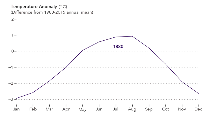
NASA Earth Observatory chart by Joshua Stevens, based on data from the NASA Goddard Institute for Space Studies.
September 2016’s temperature was a razor-thin 0.004 degrees Celsius warmer than the previous warmest September in 2014. The margin is so narrow those two months are in a statistical tie. Last month was 0.91 degrees Celsius warmer than the mean September temperature from 1951-1980.
The record-warm September means 11 of the past 12 consecutive months dating back to October 2015 have set new monthly high-temperature records. Updates to the input data have meant that June 2016, previously reported to have been the warmest June on record, is, in GISS’s updated analysis, the third warmest June behind 2015 and 1998 after receiving additional temperature readings from Antarctica. The late reports lowered the June 2016 anomaly by 0.05 degrees Celsius to 0.75.
“Monthly rankings are sensitive to updates in the record, and our latest update to mid-winter readings from the South Pole has changed the ranking for June,” said GISS director Gavin Schmidt. “We continue to stress that while monthly rankings are newsworthy, they are not nearly as important as long-term trends.”
The monthly analysis by the GISS team is assembled from publicly available data acquired by about 6,300 meteorological stations around the world, ship- and buoy-based instruments measuring sea surface temperature, and Antarctic research stations. The modern global temperature record begins around 1880 because previous observations didn’t cover enough of the planet. Monthly analyses are updated when additional data become available, and the results are subject to change.
Related Links
+ For more information on NASA GISS’s monthly temperature analysis, visit: data.giss.nasa.gov/gistemp.
+ For more information about how the GISS analysis compares to other global analysis of global temperatures, visit:
http://earthobservatory.nasa.gov/blogs/earthmatters/2015/01/21/why-so-many-global-temperature-records/
+ To learn more about climate change and global warming, visit:
http://earthobservatory.nasa.gov/Features/GlobalWarming/

After Hurricane Matthew ripped through Haiti, it blew through the Southeast. From above, NASA satellites, aircraft, and astronauts kept watch on the storm. The Earth Observatory published several images of the destructive storm (thumbnails above). The below includes a sampling of other notable images and maps related to the storm.
Soil Moisture
Matthew drenched the Carolinas, breaking records for single day rainfall in six places, The Washington Post reported. The Southeast received a total of 13.6 trillion gallons of water—that’s three-fourths the volume of the Chesapeake Bay. Hard-hit areas of North Carolina received 15 inches (38 centimeters) of rain.
That downpour saturated the area, causing values for soil moisture to increase substantially. The North American Land Data Assimilation System (NLDAS) mapped these values for October 1, 2016.
Even before the storm arrived, the ground in many areas was saturated. Eastern North Carolina and northeastern South Carolina have localized areas over the 98th percentile. That means that on October 1, the soil was wetter than it was on that date in 98 percent of previous years. The already-wet soils and heavy precipitation from Matthew led to significant flooding in these areas.

Image: NASA
Temperature and Precipitation
The Jet Propulsion Laboratory (JPL) HAMSR instrument flew above Hurricane Matthew on October 7, 2016, aboard a NASA Global Hawk aircraft. The image below shows atmospheric temperatures overlaid atop ground-based radar and satellite visible images, according to a JPL release. Reds tones show a lack of clouds, whereas blue tones show ice and heavy precipitation. At the top left is an image taken from the Global Hawk.

Image: JPL/NASA
Clouds Swirling from Above
Expedition 49 astronaut Kate Rubins took the photograph below from the International Space Station at 21:05 Universal Time, on October 4, 2016, as the hurricane approached the Florida coast. Hurricane clouds fill the shot, which includes the station’s solar arrays.

Photo: NASA/Kate Rubins
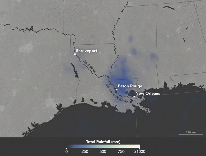
Heavy rains fell on Louisiana in August 2016, causing record-high crests for a number of rivers in the area. Map by Joshua Stevens/NASA Earth Observatory.
In the United States, we say “it’s raining cats and dogs” when we get a heavy downpour. In South Africa, it rains “women with clubs.” In Slovakia, a good soak means “tractors are falling.”
World languages brim with rainy day idioms. But when it comes to describing copious amounts of wet stuff, meteorologists do not encourage wordplay. Researchers are particularly adamant about one expression that does not work: the “rain bomb.”
The summer of 2016 brought extreme rain to multiple parts of the U.S., taking lives and causing billions in property damage. In July, thunderstorms dumped more than six inches of rain on Elicott City, Maryland in roughly two hours, causing flash floods that upended cars and lives. In May, nearly eight inches of rain fell in two days, among a series of heavy rains to inundate Texas. Most recently in Louisiana, more than 30 inches of rain fell in three days, stranding 20,000 people and killing nine.
The Louisiana storm didn’t meet the criteria of a tropical depression as defined by the National Hurricane Center: a tropical cyclone in which the maximum sustained surface wind speed is 38 miles per hour (62 kilometers per hour) or less. In another instance of precise wording, 2012’s Hurricane Sandy technically ceased to be a “hurricane” a few hours before it made landfall, turning into a “post-tropical cyclone.”
For some in the media, “tropical depression” lacks pizzazz and conviction. It lacks the visceral pelting of tractors falling out of the sky or of women with clubs beating down on the Earth. Some news organizations referred to the Louisiana event as a rain bomb. So what should we call severe rain?
NASA scientists George Huffman and Owen Kelley parsed some of the commonly-used rain terminology.
For one, there’s the “rain shaft.” A rain shaft is a centralized column of precipitation—not necessarily heavy rain. “The rain shaft […] is any rain event, no matter how modest or foreboding, that can be seen stretching from the cloud to the ground,” wrote Huffman, a research meteorologist at NASA’s Goddard Space Flight Center.
Then, there are “microbursts.” These are severe wind events caused by a “small column of exceptionally intense and localized sinking air that results in a violent outrush of air at the ground,” according to AccuWeather. Microbursts are smaller than 2.5 miles (4 kilometers) in size.
Be careful of mixing rain shafts with microbursts, Huffman cautioned.
“Just as you don’t have a microburst with every rain shaft, you don’t necessarily have an identifiable rain shaft with every microburst,” wrote Huffman in an email. “The really interesting dynamics of microbursts are a bit rare, and frequently not present in flooding rains.”
There’s also a size distinction between the different systems, NASA scientists said. A rain shaft comes out of an individual convective cell, making it roughly five to ten kilometers across. (By contrast, tropical depressions measure roughly 100 to 500 kilometers across.)
But in some cases, like Louisiana’s, the term “tropical depression” works, said Owen Kelley. “You don’t need to appeal to rain shafts, microbursts, or rain bombs to explain this system,” Kelley wrote in an email. The storm in Louisiana was “just a plain-old tropical depression that got stuck in one place for several days in a row and therefore dumped a lot of rain in one place.” That weather system did display some of the common signs of a tropical system. For instance, Huffman notes that it had low pressure at low and middle altitudes, and high pressure at the top, “implying some degree of warm core.” (Mid-latitude systems have a cold core, with the most negative pressure deviation at the system’s top.)
Researchers agree, though, about one term, “rain bomb,” which appeared in a couple of articles this summer in reference to extreme rainfall events. Don’t use it, scientists said. While it makes for a catchy headline, “rain bomb” is not an established meteorological term.
For extreme rain, Kelley suggested yet another phrase: “vigorous convective cells.” These severe rainstorms can take on various forms: super-cells, squall lines, isolated cells.
Microbursts, rain shafts, vigorous convective cells. At the end, isn’t it all just wet stuff coming out of the sky? Yes and no, scientists say. Terms used to describe extreme rain should be used with an eye on precision. As extreme rains (and extreme weather, in general) become more frequent, so will the terms we use to describe them.
