UPDATE (October 3, 2014) – The answer to this puzzler was posted here.
Every month on Earth Matters, we offer a puzzling satellite image. The September 2014 puzzler is above. Your challenge is to use the comments section to tell us what part of the world we are looking at, when the image was acquired, what the image shows, and why the scene is interesting.
How to answer. Your answer can be a few words or several paragraphs. (Try to keep it shorter than 200 words). You might simply tell us what part of the world an image shows. Or you can dig deeper and explain what satellite and instrument produced the image, what spectral bands were used to create it, or what is compelling about some obscure speck in the far corner of an image. If you think something is interesting or noteworthy, tell us about it.
The prize. We can’t offer prize money, but, we can promise you credit and glory (well, maybe just credit). Roughly one week after a puzzler image appears on this blog, we will post an annotated and captioned version as our Image of the Day. In the credits, we’ll acknowledge the person who was first to correctly ID the image. We’ll also recognize people who offer the most interesting tidbits of information about the geological, meteorological, or human processes that have played a role in molding the landscape. Please include your preferred name or alias with your comment. If you work for or attend an institution that you want us to recognize, please mention that as well.
Recent winners. If you’ve won the puzzler in the last few months or work in geospatial imaging, please sit on your hands for at least a day to give others a chance to play.
Releasing Comments. Savvy readers have solved some of our puzzlers after only a few minutes or hours. To give more people a chance to play, we may wait between 24-48 hours before posting the answers we receive in the comment thread.
Good luck!
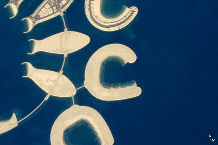
As a side project, I have been filing away images to make a satellite version of the ABCs. I have most letters now, but I could still use help tracking down good examples of B, G, F, K, and Z. Since I first posted about the search, there is a new browsing tool available — called Worldview — that I highly recommend. Once you navigate to the site, just make sure you have a MODIS true color layer (either Aqua or Terra) turned on, and you can quickly start browsing for cloud formations, dust storms, smoke plumes, and much more.
When you find a letter, click the permalink button on the upper right (it looks like two links of a chain), and then post the url in the comments section below. Another great place to look is the astronaut Earth from Space gallery curated by the Johnson Space Center. The “Earth-Human Interactions” section might be especially useful for finding the straight lines needed for an upper case F, K, or Z. Though I am still missing those five letters, feel free to send any you find. Perhaps you’ll find a better example than what I already have. Good luck and happy hunting!
As a preview, here is the C and the D that I have filed away. The C is an artificial island off the southern end of Bahrain Island. The D is a rotated view of Akimiski Island in Canada’s James Bay.
Drought-induced depletion of groundwater is no longer an issue that’s out of sight, out of mind.
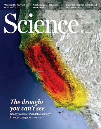
Research by scientists from Scripps Institution of Oceanography, published this week in Science, describes a GPS technique used to measure drought-induced uplift of land in the western United States. The uplift measurements were used, in turn, to calculate the deficit in surface and near-surface water for the area, which they estimated for March 2014 to be 240 billion tons. That’s equivalent to a 4-inch-thick layer (10 centimeters) of water over the region, or the current annual mass loss from the Greenland Ice Sheet.
GPS is not the only way to measure land displacement caused by the loss of ground and surface water. Scientists have long used the Gravity Recovery and Climate Experiment (GRACE) satellites to estimate groundwater depletion around the planet, as noted by Marcia McNutt in a related editorial.
GRACE’s achievements even graced the cover of the same issue of Science (pictured above). The image shows California’s loss of fresh water (red) from 2002 through 2014. Drought has drained the region of more than 3.6 cubic miles (15 cubic kilometers) of fresh water in each of the past three years.
The image was updated from a version that initially appeared alongside research in 2013 by James Famiglietti of NASA’s Jet Propulsion Laboratory and University of California, Irvine, and Matthew Rodell of NASA’s Goddard Space Flight Center.
Read more to learn about how GRACE is used to view Earth’s water supplies, or how U.S. groundwater on July 7, 2014, compared to the average from 1948 to 2009.
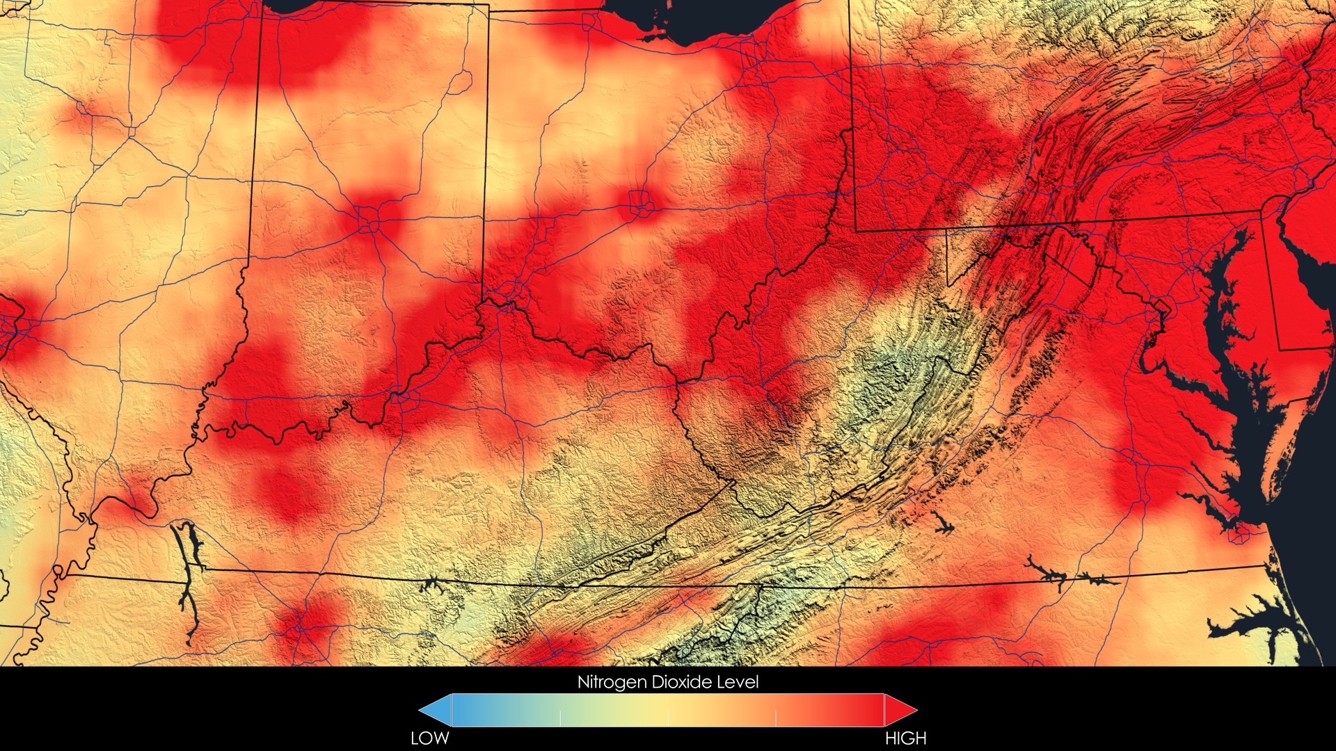
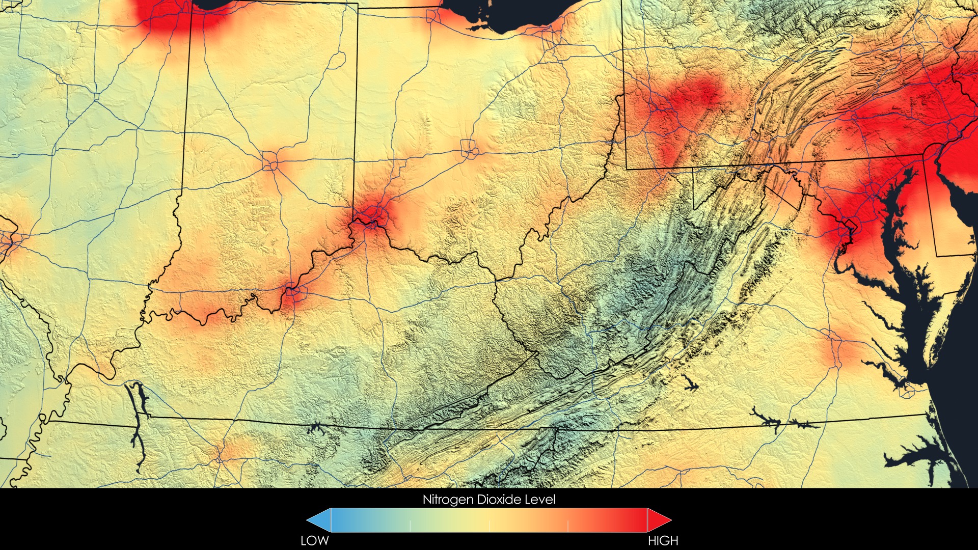
These images compare averaged yearly nitrogen dioxide concentrations over the Ohio River Valley region from 2005 [top] to 2011 [bottom]. Image credit: NASA Goddard’s Scientific Visualization Studio/T. Schindler
Editor’s Note: This is an excerpt from the NASA Earth Science in the News column published in the May/June issue of The Earth Observer newsletter. You can download the current issue here.
See NASA’s Dazzling Proof that U.S. Air Quality Has Improved, Mashable.com. Summer in the U.S. is the time of year when humidity skyrockets, air stagnates, and the air quality deteriorates, especially downwind of the coal-fired power plants and manufacturing plants of the Ohio Valley. During hazy and hot summer days in the big cities along the Interstate 95 corridor, the sky often looks like the visual equivalent of white noise—with the horizon indistinguishable from the milky sky. Yet air quality has actually been steadily improving over the past few years, largely thanks to the Clean Air Act, along with a drop in coal use and dramatic changes in vehicle fuel efficiency and emissions. NASA has released beautiful images demonstrating that people in major U.S. cities from Los Angeles to New York are breathing less nitrogen oxide. The data come from the Ozone Monitoring Instrument (OMI) aboard NASA’s Aura satellite. Nitrogen dioxide is one of the six common pollutants the EPA regulates to protect human health. It can harm the respiratory system and also combines with other pollutants to form smog. Nitrogen dioxide is mostly produced by burning gasoline in vehicle engines and from burning coal. “While our air quality has certainly improved over the last few decades, there is still work to do—ozone and particulate matter are still problems,” said atmospheric scientist Bryan Duncan.
Water Weight Used to Calculate the Amount of Snow in California with GPS, Scientific American. Water weighs about 8.3 pounds per gallon (1 kg/L). Now, scientists have developed a way to use water’s weight to measure just how much snow is covering mountains in the western U.S. In states like California, currently in the midst of a crippling drought, the more water managers know about how much snow is in the mountains, the better they can plan for the summer months ahead. More accurate information about such snowpack can help these managers and hydrologists plan for how to fill reservoirs, how much water they might have available during the dry season, and how dry the soils might be during fire season. They’ll also get a better fix on future levels of reservoirs for hydroelectric power generation. Donald Argus, a research scientist and geophysicist at JPL, recently published a study outlining the new technique in the journal Geophysical Research Letters. If scientists know the height of a piece of land in summertime, and the height when snow covers it, they can use the difference to calculate how much snow is sitting on the mountains. The technique uses a dense network of global positioning system (GPS) sites scattered across the Western U.S.
Scientists Warn of Rising Oceans From Polar Melt, The New York Times. A large section of the mighty West Antarctica ice sheet has begun falling apart and its continued melting now appears to be unstoppable, two groups of scientists reported on May 12, 2014. If the findings hold up, they suggest that the melting could destabilize neighboring parts of the ice sheet and a rise in sea level of 10 feet (about 3 meters) or more may be unavoidable in coming centuries. Global warming caused by the human-driven release of greenhouse gases has helped to destabilize the ice sheet, though other factors may also be involved, the scientists said. The rise of the sea is likely to continue to be relatively slow for the rest of the twenty-first century, the scientists added, but in the more distant future it may accelerate markedly. The West Antarctic ice sheet sits in a bowl-shaped depression, with the base of the ice below sea level. Warm ocean water is causing the ice sitting along the rim of the bowl to thin and retreat. As the front edge of the ice pulls away from the rim and enters deeper water, it can retreat much faster than before. In a new paper published in Geophysical Research Letters, a team led by glaciologist Eric Rignot used satellite and airborne measurements to document an accelerating retreat of six glaciers draining into the Amundsen Sea region. With updated mapping of the terrain beneath the ice sheet, the team was able to rule out the presence of any mountains or hills significant enough to slow the retreat.
NASA Places Radar in North Carolina to Study Rain in Smokies, Washington Times. NASA placed two radars on land in Rutherford County, North Carolina, for a field campaign to study rainfall in the Great Smoky Mountains. The campaign ran from May 1 to June 15, 2014. “We have set up rain gauges and radars across the area to learn more about how weather and rain systems behave in the mountains,” said research scientist David Wolff. The campaign was designed to validate data from the Global Precipitation Measurement (GPM) mission’s Core Observatory, which launched in February 2014. The science team expected to end the six-week campaign with detailed data to improve their understanding of both the fundamental sciences of mountain rainfall and how best to estimate rainfall using satellite observations over remote and rugged regions. Scientists will use what they learn to improve weather predictions and flood warnings. Team members will take a break after the summer and are scheduled to travel to Seattle, Washington, in 2015-16 to measure winter weather there.
NASA ‘Balloon Campaign’ Goes to Australia, International Business Times. NASA and the University of Wyoming teamed up with the Australian Bureau of Meteorology (BOM) in Darwin, Australia, for a balloon-based campaign designed to better understand the composition and behavior of volcanic plumes. The Kelud Ash (KlAsh) experiment involved launching a series of balloons to take measurements of emissions from the volcano in Indonesia. Mt. Kelud sent small droplets of sulfuric acid—as ash particles and sulfate aerosol—up to 15 mi (25 km) above Earth when it erupted in February this year. Principal investigator Duncan Fairlie said: “The purpose is to better characterize particle sizes, composition, and optical properties from a relatively fresh volcanic plume in the stratosphere.” The two-week balloon campaign, which started on May 14, 2014, launched small balloon payloads over the Indian Ocean from the bushes of Darwin territory. Fairlie said the team sampled the volcanic plumes at an altitude of around 12 miles (20 kilometers) in all flights.
The answer to the August puzzler — Nagoya and the south-central coast of Japan — was puzzling even to Earth Observatory staff.

When we first posted the image on August 26, even we did not know what we were looking at. We had asked our colleagues at the Crew Earth Observations (CEO) office at NASA Johnson Space Center to give us an image that would stump our readers and would help us talk about a new citizen science project to identify the locations shown in nighttime images. They gave us an image that no one here immediately recognized.
In the process of presenting the answer last Friday (image below), we unwittingly demonstrated a quality-control portion of that ID program.

As you can see, we correctly labeled Nagoya, and then labeled the two cities on the left as Osaka and Wakayama. But as several readers from Japan pointed out, Osaka and Wakayama are farther west, and Kyoto also appears in the scene. Though we had consulted two different sources, maps of Earth at night are still pretty raw and the human eye can be tricked when looking at an unfamiliar landscape.
One of the protocols of the Cities at Night program is to ensure that every image is classified by multiple individuals working separately. It took several NASA staff and several readers to figure out the correct locations in this image. One of the goals of the citizen-science project is to figure out the optimal number of people needed to correctly classify an image. We didn’t intend to be a case study, but that’s what just happened.
Congratulations to Bruce Boucek, a data librarian at Brown University, for being the first reader to correctly identify Nagoya and the Chita peninsula of Japan. We asked him how he figured out the location, and he wrote: “I’ve been a map fanatic since I was a kid…When I was an undergrad, I had a particular interest in Japanese geography and as a PhD student I spent years working with remote sensing and satellite imagery. My initial hunch was that it was the eastern coast of Japan, but it didn’t look like Tokyo. I guessed that it was the next bay south and verified my hunch by looking at the NASA earth at night imagery. The clincher was the airports which have a significantly higher brightness signature.”
Three other readers — James Titmas, Jyo Sano, and Yumiko Stettler — also correctly identified the Nagoya area. Thanks also to Justin Wilkinson, Will Stefanov, and the CEO unit at NASA Johnson, a team that has to catalog and identify the thousands of images that come down from the International Space Station every year.
