
This post was originally published by the Society for News Design for the Malofiej Infographic World Summit.
Palettes aren’t the only important decision when visualizing data with color: you also need to consider scaling. Not only is the choice of start and end points (the lowest and highest values) critical, but the way intermediate values are stretched between them.
Note: these tips apply to scaling of smoothly varying, continuous palettes. For discrete palettes divided into distinct areas (countries or election districts, for example, technically called a choropleth map), read John Nelson’s authoritative post, Telling the Truth.
For most data simple linear scaling is appropriate. Each step in the data is represented by an equal step in the color palette. Choice is limited to the endpoints: the maximum and minimum values to be displayed. It’s important to include as much contrast as possible, while preventing high and low values from saturating (also called clipping). There should be detail in the entire range of data, like a properly exposed photograph.
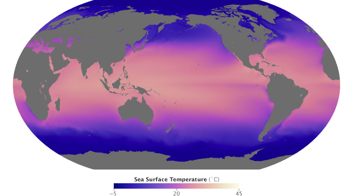
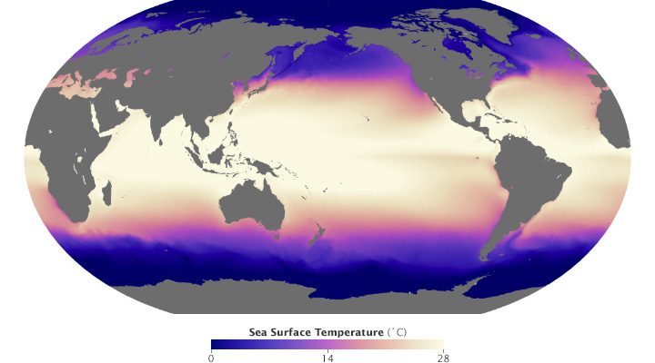
These maps of sea surface temperature (averaged from July 2002 through January 2014) demonstrate the importance of appropriately choosing the range of data in a map. The top image varies from -5˚ to 45˚ Celsius, a few degrees wider than the bounds of the data. Overall it lacks contrast, making it hard to see patterns. The lower image ranges from 0˚ to 28˚ Celsius, eliminating details in areas with very low or very high temperatures. (NASA/MODIS.)
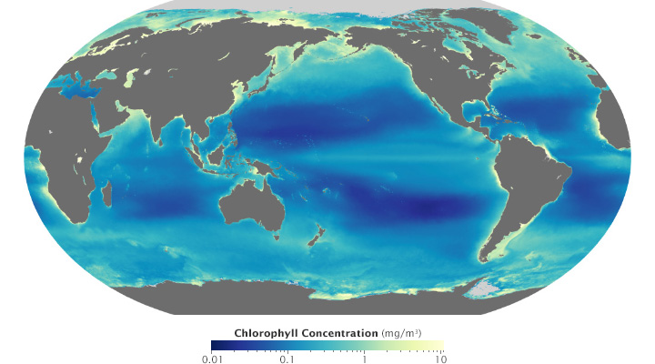
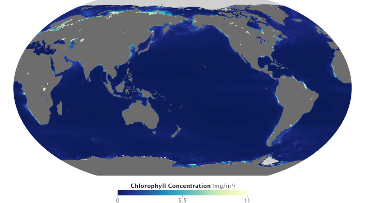
Ocean chlorophyll (a measure of plant life in the oceans) ranges from hundredths of a milligram per cubic meter to tens of milligrams per cubic meter, more than 3 orders of magnitude. Both of these maps use the almost same endpoints from near 0 (it’s impossible to start a logarithmic scale at exactly 0) to 11. Plotted linearly, the data show a simple pattern: narrow bands of chlorophyll along coastlines, and none in mid-ocean. A logarithmic base-10 scale reveals complex structures throughout the oceans, in both coastal and deep water. (NASA/MODIS.)
Some visualization applications support logarithmic scaling. If not, you’ll need to apply a little math to the data (for example calculate the square root or base 10 logarithm) before plotting the transformed data.
Appropriate decisions while scaling data are a complement to good use of color: they will aid in interpretation and minimize misunderstanding. Choose a minimum and maximum that reveal as much detail as possible, without saturating high or low values. If the data varies over a very wide range, consider a logarithmic scale. This may help patterns remain visible over the entire range of data.
Espetacular! À beleza do nosso Planeta Terra.
Contudo, à gama de dados e fotos executadas em todas as suas dimensões, são nítidas e deslumbrantes, causam impactos de contraste em todas as situações de categorias, quer sejam máxima e\ou mínima.
Espetacular! À beleza do nosso Planeta Terra.
Contudo, à gama de dados científicos e fotos executadas são precisas, nítidas e deslumbrantes.