Somehow, a recent conversation on Twitter about tweet density led to a mention of the installation of variable highway lighting in the Netherlands, by way of the 2012 NASA/NOAA city lights map. Which made me wonder—would we be able to see the effects of the new lighting from space? After all, the day night band on the VIIRS instrument is sensitive enough to see by starlight.
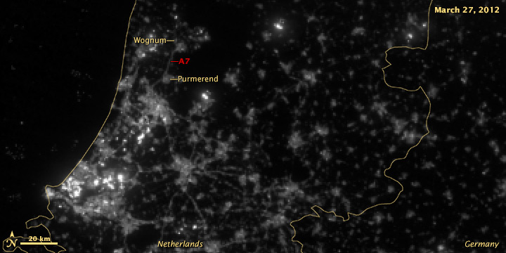
According to Philips, streetlights along the A7 from Purmerend (just north of Amsterdam) to Wognum are dimmed 50% after 9 pm. The system was switched on in early 2013, so any change should be visible in 2012 vs. 2013 data:


It’s subtle, but the difference is clear.
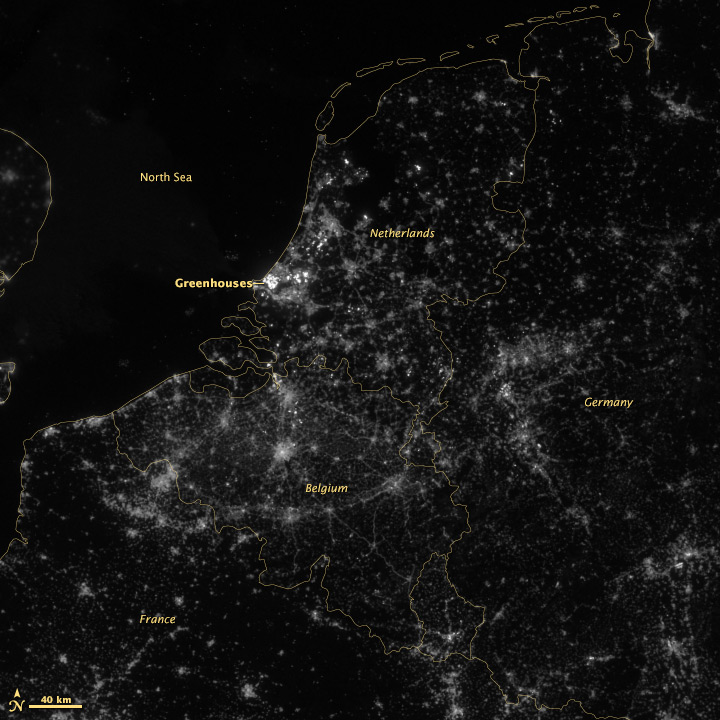
A wider view of the area reveals more interesting features:

The brightest lights in the Netherlands are from clusters of greenhouses—perhaps growing hydroponic vegetables 24 hours a day. The Netherlands and Belgium are more densely populated and brightly lit than neighboring France and Germany, including their highways. Unsurprisingly water bodies are largely dark, but there is a scattering of boats in the North Sea.
A few notes on the image processing. These data are from the NOAA CLASS system, which is the primary archive for VIIRS data. Unfortunately they’re not in a convenient format: each file is an 80-second chunk of the satellite’s orbit (called a granule), with no preview images. The file format is HDF, which many scientists like but can be (extremely) difficult to read. (This Beginner’s Guide from Colorado State University may be helpful.)
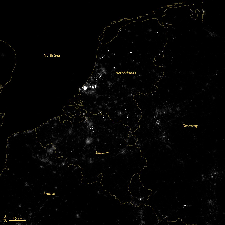
The product is labeled “VIIRS Day Night Band SDR.” SDR means “science data record” which is a calibrated measurement, in this case Watts per square meter per steradian. It turns out this is a very low number, so to visualize the data we multiply everything by 1,500,000,000,000,000 (1.5E15) to make a usable 16-bit grayscale image, which looks like this:

There’s little detail aside from the very brightest lights, so we take the square root of the data to accentuate low values and compress high values—the results of which are in the top images. I usually apply additional contrast adjustments on published imagery, but here I wanted to be more conservative.
Thanks to Gregor Aisch (@driven_by_data), Moritz Stefaner (@moritz_stefaner), Eric Fischer (@enf), and Jan Willem Tulp (@JanWillemTulp) for piquing my interest. My Twitter handle is @rsimmon if you’re interested in data visualization, Earth science, and NASA (with the occasional digression into hockey and dogs). Additional thanks to my colleague Jesse Allen for converting the HDF into something useful.
Update:
Dan W. Williams made a GIF with the 2012 and 2013 images which makes the changes easier to see. Thanks!

Update 2:
By request, here are the full files as GeoTIFFs. You’ll need a TIFF reader that supports floating point (Photoshop does not) to read the “Raw” and “Scaled” data. Photoshop (and even Safari on a Mac) will read the two “Square Root” files.
March 27, 2012
Raw Floating Point
Scaled Floating Point
Square Root 16 bit Integer
March 4, 2013
Raw Floating Point
Scaled Floating Point
Square Root 16 bit Integer


I made you a GIF http://i.imgur.com/sUnK1ci.gif
Oh, thanks. I didn’t even think of making an animated GIF.