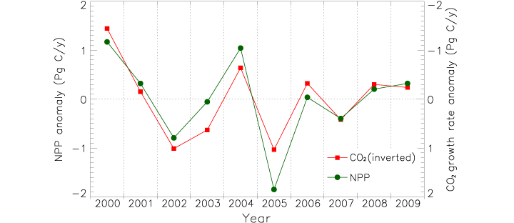
James Hrynyshyn over at Class M has an interesting post about a graph of net primary productivity (also, and perhaps more commonly, referred to as NPP—it’s a measure of the amount of carbon a plant takes from the atmosphere and uses to grow) anomaly (difference from normal) compared to the anomaly in the growth rate of carbon dioxide in the atmosphere. The graph is from the same paper as our recent image: Drought Slows Plant Growth, 2000–2009. The two variables are plotted together, but “carbon dioxide growth rate anomaly” (a somewhat complex concept in itself) is inverted. This gives the impression (unless you read the caption) that the growth rate of carbon dioxide in the atmosphere falls if net primary productivity falls, and rises if net primary productivity rises, when, in fact, the opposite is true.

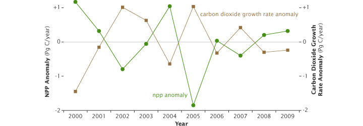
I agree with Class M: if the first impression a graph gives is the opposite of what the data shows, and a close reading of the caption and annotations is required for understanding, the graph is destined to cause misunderstandings. Just for the record, this is what I would have done:

Reference: Zhao, M., Running, S.W. (2010). Drought-induced reduction in global terrestrial net primary production from 2000 through 2009. Science, 329(5994), 940–943.


What is your opinion as to the data points being squares for one data series as opposed to circles for the other? I’ve always felt that if color sets the two data sets apart, then leave the graphic symbols as a constant. I’d be curious if you would agree, since you included that symbology in your re-drawing of this graph.
There are advantages and disadvantages to using different symbols for different data series. In general, the use of different symbols makes it easier to differentiate between datasets—especially for color-blind readers. The disadvantage, as you’ve pointed out, is the redundancy, plus a little extra visual clutter. In theory, one could use shape and color to encode different variables (for example, separate out NPP for northern and southern hemispheres), but that’s not necessary here. With such a simple graph, I don’t think one approach is significantly better than the other.
The real reason I left the circles and squares as-is is that I was editing a postscript file by hand, not starting from scratch with raw data, and I didn’t even think to make the change.
If I understand this correctly, the original graph had a useful purpose, it just went about it poorly. The point of the original graph, as I understood it, was not to mislead about the positive/negative aspect of the correlation, but to demonstrate the strong level of correlation. This is a useful visualization in the right context, you just can’t do it by itself.
So why not add a third line? Something like this:
Show the actual NPP and CO2 numbers with differently colored solid lines, as shown in the 2nd version. Add a third dotted line in the same color as the CO2, labeled CO2 (Inverted to demonstrate absolute correlation).
If you show the actual numbers clearly, then equally clearly distinguish the inversion, you can make both points without misleading, or allowing your graph to be misused.
On the subject of graphs using color as the only difference, don’t forget about what happens when you print it out on a standard black/white desk printer. Using different symbols or linetypes eliminates this problem. Also, red/green colorblindness can make distinguishing color plots impossible.
I agree with Alex’s statement that the original graph was to show the strong correlation, but adding another line showing the same actual data points on the same graph isn’t the solution. It would be really distracting because people would assume that a third line meant a third set of data and not just the same data plotted differently. I prefer the revised plot shown above. The correlation is still discernable shown like this.
I think the objection to this plot is naive. Scientific papers are written for experts, and an expert is not going to be confused by this. The nonexpert who also does not read the caption or axis might be confused, but I think this is a pretty small fraction of the total people reading the paper.
Scientific papers do indeed consider the audience, however, it is bad editorial practice to include a graph that on its face “gives…the opposite of what the data shows.”
Why would you say that the graph gives the opposite results? Clearly the data is reflected in both graphs and correlates.
Jay: Yes the original graph is technically correct (and it’s not the worst graph ever—I suspect James (the blogger who originally posted the graph) was exaggerating to illustrate a point). The problem is it gives the impression that CO2 and NPP are positively correlated, when in fact they are negatively correlated. It’s necessary to both read the caption and mentally flip the CO2 anomaly to understand that, which I think is an unnecessary burden on the reader.
I’ve always felt that if color sets the two data sets apart, then leave the graphic symbols as a constant. I’d be curious if you would agree, since you included that symbology in your re-drawing of this graph.
Jay: Yes the original graph is technically correct (and it’s not the worst graph ever—I suspect James (the blogger who originally posted the graph) was exaggerating to illustrate a point). The problem is it gives the impression that CO2 and NPP are positively correlated, when in fact they are negatively correlated. It’s necessary to both read the caption and mentally flip the CO2 anomaly to understand that, which I think is an unnecessary burden on the reader.