

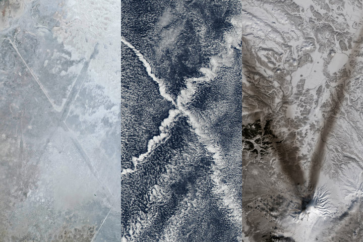
We are kicking off 2025 with much to look forward to but also much to look back on. In 2024, over 7.5 million readers visited our website to read our stories, and many millions more viewed our imagery on the NASAEarth social media channels and elsewhere. Since our founding in 1999 (2024 marked our 25th anniversary), we have produced text and imagery for over 15,700 stories.
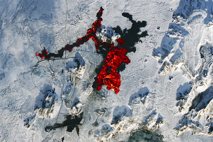
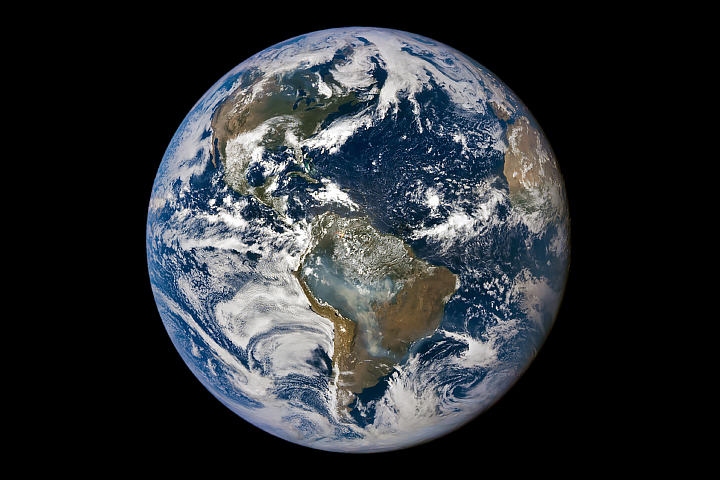
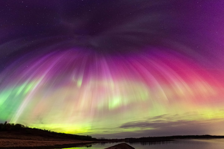


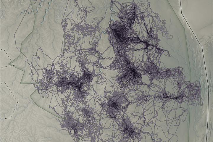
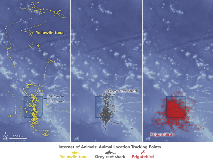
Animals – elephants in Africa (top) and tuna, sharks, and birds in the remote Pacific (bottom) – provide data that complement satellite observations, helping us better understand wildlife ecology in our changing climate.
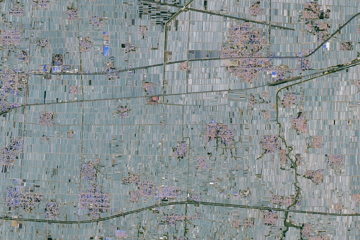
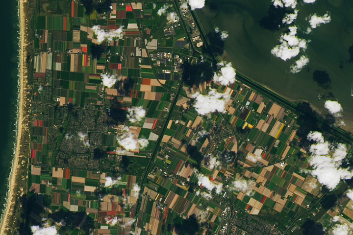
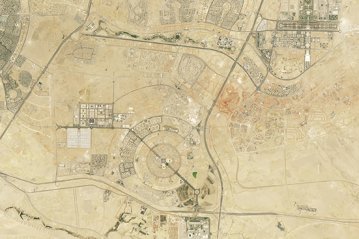
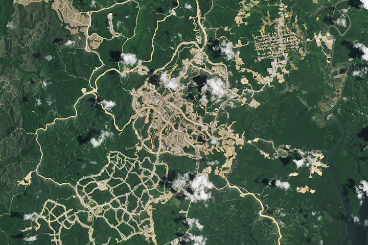
From growing fruits and vegetables in China and flowers in the Netherlands to building new capital cities in Egypt and Indonesia, people have transformed the land.
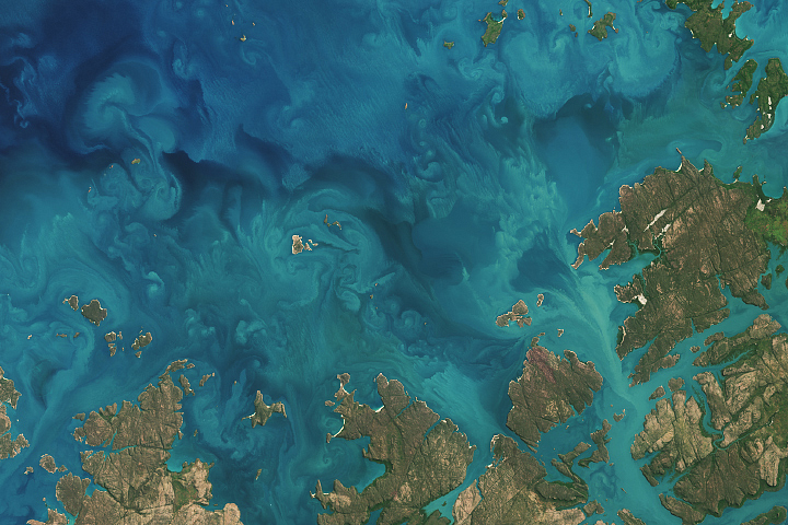
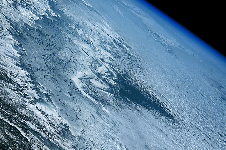
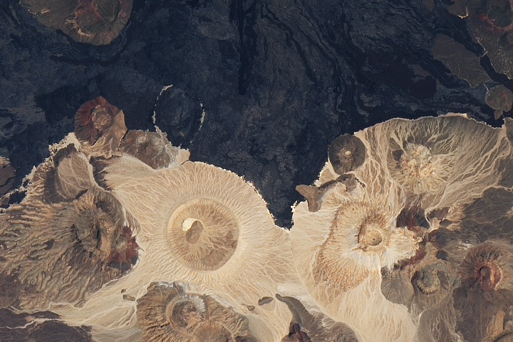
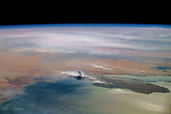
There have been two rounds of voting in Tournament Earth 2020, and two rounds of stunning upsets. Only two of the top eight seeds made it through. Night Lights? Snuffed out. Colorado River? Dried up. Caspian ice? Melted. Aerosols? Cleaned out. A river of tea? Gone cold. Dark side of the Moon? Someone broke the record. Iconic Earthrise? Didn’t make it to dawn.
Every time we run one of these tournaments, we are surprised by what catches the eyes of our readers. It is time to surprise us again. Cast your votes now in round three to pick the best four of the Earthly 8. Voting ends on April 13 at 9 a.m. U.S. Eastern Time. Check out the remaining competitors below.
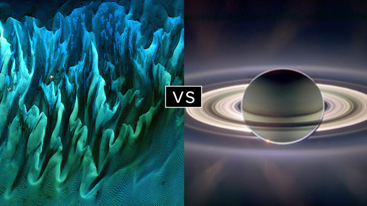
In round 1, Ocean Sand garnered the most votes overall and wiped out #4 seed and 2014 champion El Hierro Submarine Eruption, winning by the largest margin of any pairing (81 to 19 percent). In round 2, Sand beat the #1 seed, The Dark Side and the Bright Side, by a 57 to 43 percent margin.
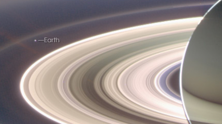
A View from Saturn garnered the second highest vote total in round 1, besting Blooming Baltic Sea by 77 to 23 percent. In the second round, Saturn beat Sensing Lightning from the Space Station, 60 to 40 percent. In case you didn’t notice, Earth is visible in that Saturn image.
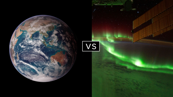
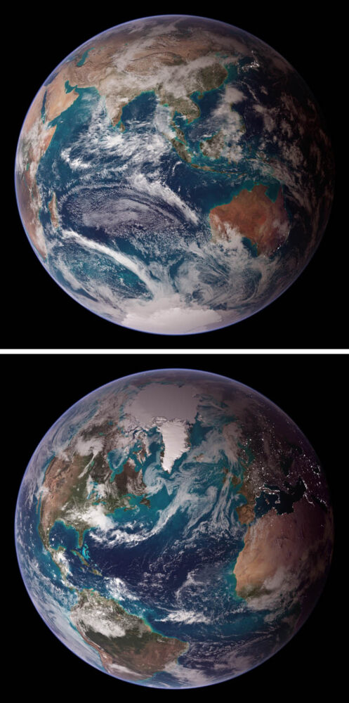
Twin Blue Marbles is the only #1 seed left in the tournament. In round 1, it captured 71 percent of the vote while besting Auroras Light Up the Antarctic Night. In round 2, Blue Marbles was the top overall vote getter and beat the iconic A Voyager Far from Home by 66 to 34 percent.
Fire in the Sky and On the Ground has pulled off two massive upsets. In round 1, it beat #2 seed Night Light Maps Open Up New Applications, 71 to 29 percent. In round 2, Fire beat the sentimental favorite and oldest image in Tournament Earth, All of You on the Good Earth — the original Blue Marble photo (1968) and the inspiration for the first Earth Day (1970). The voters chose the auroral fire over Apollo 8 fame by 57 to 43 percent.
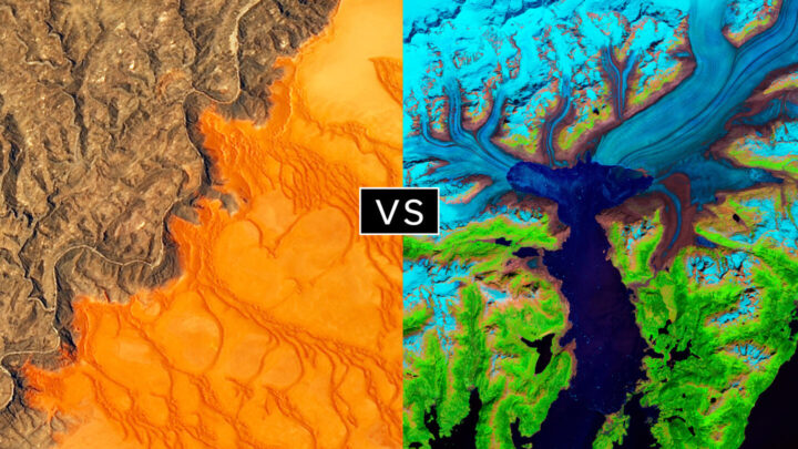
This bracket pairs two low seeds that knocked off highly ranked opponents. #8 seed Where the Dunes End topped #1 A Curious Ensemble of Wonderful Features in round 1 (63 to 37 percent), then topped #4 Roiling Flows on Holuhraun Lava Field (56 to 44).
The false-color image Retreat of the Columbia Glacier got 57 percent of the vote to beat Icy Art in the Sanikov Strait in round 1. Round 2 was a close call: Columbia barely eclipsed Antartica Melts Under the Hottest Days on Record (51 to 49 percent).
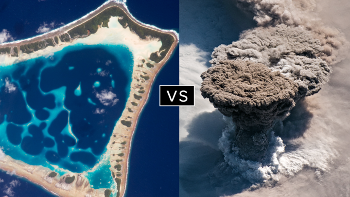
Another pair of Cinderella stories here. Atafu Atoll outclassed #1 seed Some Tea with Your River in round 1 by 75 to 25 percent. In round 2, it collected the second most votes overall, beating #5 Making Waves in the Andaman Sea 62 to 38 percent.
Raikoke erupted in round 1, collecting 72 percent of the vote while beating #3 Awesome, Frightening View of Hurricane Florence. In round 2, the volcanic plume smothered #2 Just Another Day on Aerosol Earth, 61 to 39 percent.
The coronavirus (COVID-19) epidemic is first and foremost an issue of human health and safety. But as people have changed their everyday behaviors and patterns to contain or avoid the virus, there have been some subtle effects on the environment. There also has been misinformation. Below are four ways the virus is—and is not—affecting the environment in China.
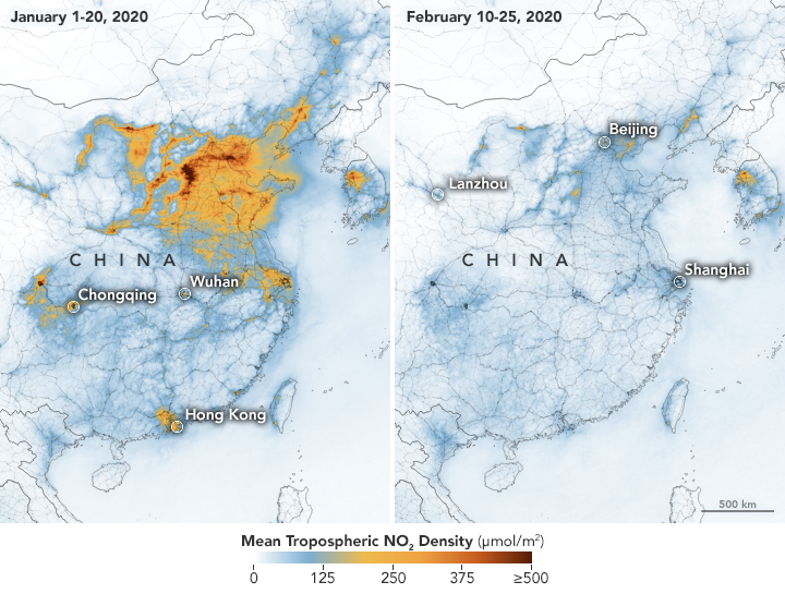
On February 28, we reported how decreases in industrial, transportation, and business activity since the coronavirus outbreak had reduced levels of atmospheric nitrogen dioxide (NO2) over China. But researchers note that a measurable change in one pollutant does not necessarily mean air quality is suddenly healthy across the country.
In February, news outlets reported unhealthy air pollution in Beijing, which was largely affected by airborne particulate pollution known as PM 2.5. As reported in the South China Morning Post, “weak winds, high humidity and a strong thermal inversion had trapped bad air in the city.” NASA satellites also showed a high load of airborne aerosols. Measurements of aerosol optical depth depict how the abundance of natural or manmade particles in the air prevents light from traveling through the atmosphere to the ground.
Beyond aerosol emissions, weather also plays an important role in determining air quality. NASA/USRA researcher Fei Liu notes that wind patterns and the height of the planetary boundary layer — the lowest layer of the troposphere near Earth’s surface — are important meteorological factors. Planetary boundary layer height influences how air pollution mixes vertically in the atmosphere. If the height of the boundary layer is high, then air pollutants can move higher into the atmosphere and concentrations will be lower near the ground (and vice versa). Liu and her colleagues are currently studying how changes in such meteorological factors may have influenced the decrease in NO2 before and during the quarantine.
For more information on NASA’s long-term measurements of nitrogen dioxide, please see this page.
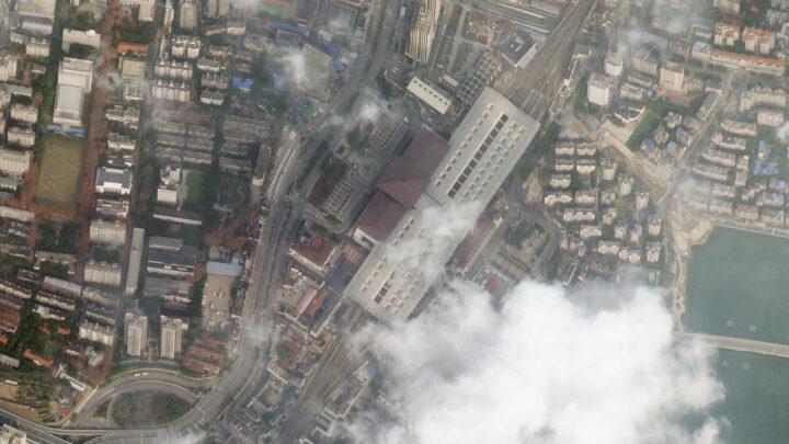
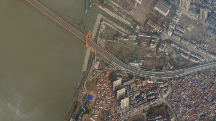
It is no surprise that road traffic in China’s major cities has been lighter, as many people have been forced to stay home and public transportation has been shut down. Satellite imagery from Planet Labs captured scenes of reduced traffic and empty parking lots near the Wuhan train station and airport. Trains stopped running around January 22, when the first quarantines began. And compared to late January 2019, domestic flights within mainland China this year dropped by 60 to 70 percent.
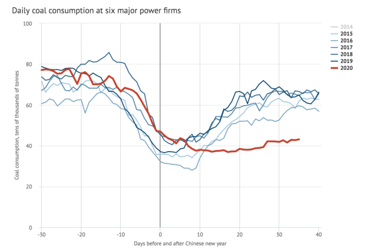
A report in Carbon Brief stated that key industries in China were operating at much lower-than-normal levels during the quarantine. Oil refinery operations in Shandong province, for instance, were at their lowest since 2015. Average coal consumption at power plants also reached a four-year low. As a result, carbon dioxide (CO2) emissions were at least 25 percent lower in the two weeks following the Lunar New Year compared to 2019. However, that decrease in CO2 emissions for two weeks would only reduce annual totals by approximately 1 percent.
In February 2020, a map floating around on social media showed increased sulfur dioxide (SO2) concentrations near Wuhan. Some news outlets prematurely speculated that the elevated levels of SO2 were due to an increase in human cremation.
The data for the map came from NASA’s GEOS earth system model and were not based on real-time observations of SO2. NASA’s Arlindo da Silva explained that while the GEOS model assimilates many ground-based and satellite observations to constrain meteorological conditions such as winds, humidity, and temperature, it currently does not ingest any real-time observations of sulfur dioxide. In the model, the concentrations of SO2 are estimated from historical emissions sources that are transported around the globe by atmospheric circulation. Therefore, da Silva said, GEOS model simulations cannot account for variations in SO2 concentrations arising from a sudden change in human activity (like a quarantine). Essentially, the model output of enhanced SO2 was not completely reflecting reality in this case.
Secondly, as the writers at Snopes pointed out, sulfur dioxide is commonly associated with burning coal — not burning human corpses.
Since its launch on the web in April 1999, NASA Earth Observatory has published more than 15,500 image-driven stories about our planet. In celebration of our 20th anniversary — as well as the 50th anniversary of Earth Day — we want you to help us choose our all-time best image.
For now, we need you to help us brainstorm: what images or stories would you nominate as the best in the Earth Observatory collection? Do you go for the most beautiful and iconic view of our home? the most newsworthy? the most scientifically important? the most inspiring?
Search our site and then post the URLs of your favorite Earth images in the comments section below. Please send your ideas by March 17.
In late March 2020, we will include some of your selections in Tournament Earth, a head-to-head contest to vote for the best of the best from our archives. Each week, readers will pick from pairs of images as we narrow down the field from 32 nominees to one champion.
The all-time best Earth Observatory image will be announced on April 29, 2020, the end of our anniversary year.
If you want some inspiration as you begin your search, take a look at the galleries listed below. Or use our search tool (top left) to find your favorite places, images, and events.
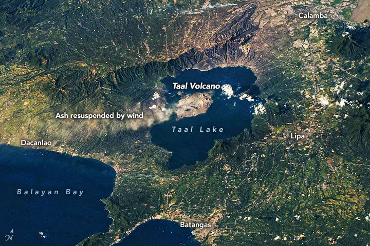
On January 12-13, 2020, Taal Volcano erupted for the first time in more than four decades. On January 22, ash plumes again emanated from Taal—but, this time, not from an eruption (seen above). According to the Philippine Institute of Volcanology and Seismology (PHIVOLCS), strong low-level winds lifted previously deposited ash lying around the volcano to heights of 5,800 meters (19,000 feet).
“Resuspension of volcanic ash is more likely at higher wind speeds, if the ash is dry and if ash particles are small,” said Simon Carn, volcanologist at Michigan Tech. “The ash deposits at Taal may have initially been quite wet, so the fact that ash resuspension is now occurring may indicate that the deposits have dried out.” The Philippines is currently in its dry season.
This time it was resuspended ash, but officials are cautious about a potential eruption again. Since its initial eruption, Taal remains on a level 4 alert, with a hazardous eruption still possible. Data show that SO₂ emissions, one of the key parameters for monitoring active volcanoes, have been present, but low, since the initial eruption. Carn said this indicates magma is most likely intruding into the main portion of the volcano, but predicting whether the magma will ultimately erupt is challenging.
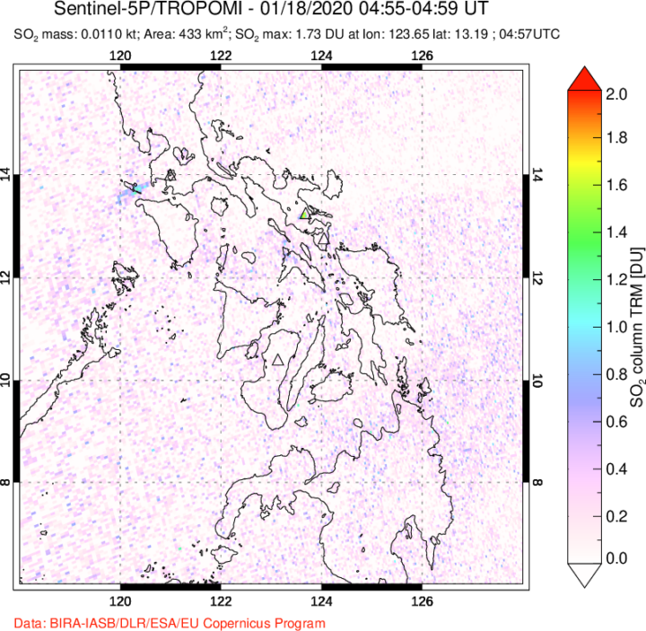
If the volcano erupts again, it could look different than the early January event. During that “wet” eruption, water from the nearby crater lake covered the ash particles with water droplets. Wetter eruptions tend to produce finer ash particles. However, nearly all of the water in the main crater is now gone. According to Carn, the lake could have vaporized from the heat of the emanating magma; some could have been physically ejected by the previous eruption; and some could have drained through fractures or fissures in the volcano. In the absence of water, this volcano could produce a “dry” eruption, which would make comparatively larger ash particles.
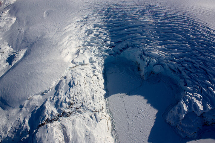
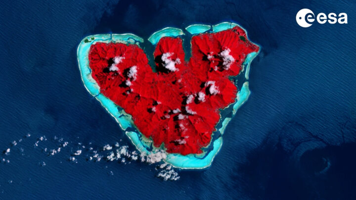
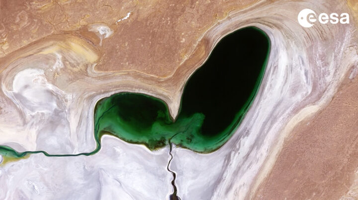
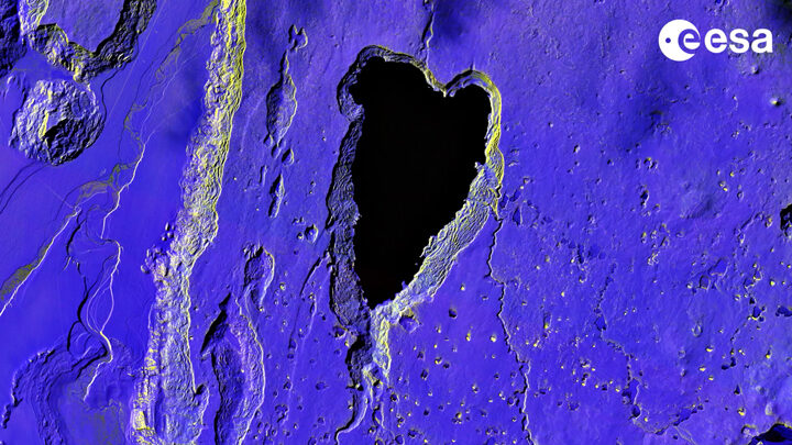
When you look at Earth from above as often as we do, you become intimately familiar with the shapes and patterns that can emerge across the planet. Some are made by people and others by nature. Some are ephemeral and others more permanent.
Today we took a light-hearted approach to the Image of the Day, explaining the science behind one such shape—what appears to be a Valentine in the Sky. The image prompted us to look and see where other heart-shaped features have turned up.
Heart-Shaped Uummannaq
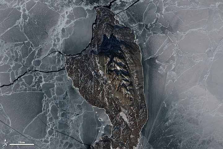
Love Lake
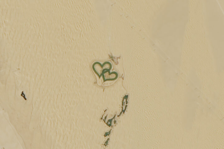
Heart-shaped Calving Front
Island Love
Shrinking Heart
Loving Big

“Pho,” a cartoon character representing a photon of light from ICESat-2, illustrates how the science mission works. Watch the video here. Credit: NASA/Goddard/Savannah College of Art and Design et al.
The successful launch of a satellite is an exciting step for the scientists and engineers who have spent years dedicated to a mission. But there are still many more boxes to be checked, and anticipation builds as a satellite’s instruments are turned on and they produce what scientists call “first light” — the first time a satellite opens its “eyes” and delivers preliminary images or data.
After the successful launch of NASA’s Ice, Cloud, and land Elevation Satellite-2 (ICESat-2) on September 15, 2018, “first light” was not a natural-color image of Earth like those that come from satellites such as Terra, Aqua, or Landsat. Rather, the satellite’s sole instrument—the Advanced Topographic Laser Altimeter System (ATLAS)—acquired measurements of surface elevation. The laser fired for the first time on September 30, and returned its first height measurements from across the Antarctic ice sheet on October 3.
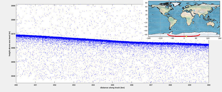
This visualization of ICESat-2 data shows the first set of height measurements from the satellite as it orbited over the Antarctic ice sheet. Credit: NASA’s Goddard Space Flight Center
This elevation measurement, acquired on October 3, shows the height of the Antarctic ice sheet along a path starting in East Antarctica, passing close to the South Pole, and ending in West Antarctica. As explained in a NASA story about the measurement:
“When scientists analyze the preliminary ICESat-2 data, they examine what is called a “photon cloud,” or a plot of each photon that ATLAS detects. Many of the points on a photon cloud are from background photons — natural sunlight reflected off Earth in the exact same wavelength as the laser photons. But with the help of computer programs that analyze the data, scientists can extract the signal from the noise and identify height of the ground below.”
These charts show the first photon returns from the instrument’s six beams as the satellite orbited over Antarctica. The green lines represent the number of photons detected. The X axis indicates the amount of time it took the photons to get from the satellite to the ground and back again. Credit: Megan Bock/NASA’s Goddard Space Flight Center.
Donya Douglas-Bradshaw, the project manager for the ATLAS instrument, said in the NASA story:
“We were all waiting with bated breath for the lasers to turn on and to see those first photons return. Seeing everything work together in concert is incredibly exciting. There are a lot of moving parts and this is the demonstration that it’s all working together.”
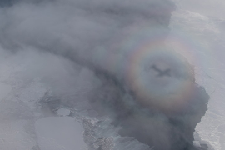
Earlier this month, we showed a space-based view of a glory—a colorful, circular optical phenomenon caused by water droplets scattering light. The Moderate Resolution Imaging Spectroradiometer on the Terra and Aqua satellites can see only a cross section of the glory, making it appear in satellite imagery as two elongated bands parallel to the path of the satellite.
To the Earth-bound observer, however, glories take on a circular shape. You might have seen one while on an aircraft. From this perspective, passengers on the side of the plane directly opposite the Sun can sometimes see the plane’s shadow on the clouds below. This position is also where glories can be observed as the cloud’s water droplets scatter sunlight back toward a source of light.
Before aviation, the phenomenon was often seen by mountain climbers; the glory encircling the climber’s shadow on the clouds below. Today, pilots and passengers have a good chance of seeing them, earning the phenomenon the name “glory of the pilot” or “pilot’s halo.”
But you still have to be flying close enough to the cloud deck for the phenomenon to be visible, which is one of the reasons why they are frequently spotted by scientists and crew with NASA’s Operation IceBridge mission. The mission makes annual flights over Earth’s poles to map the ice; flights are relatively low, long, and frequent. Glories are not part of the mission’s science goals—in fact, clouds can interfere with the collection of science data. But they are on the list of natural wonders that IceBridge scientists witness in the field.
Jeremy Harbeck, a sea ice scientist at NASA’s Goddard Space Flight Center, snapped the top photograph of a glory on April 18, 2018, during an IceBridge science flight over the Chukchi Sea. (See the full image and other photographs shot by Harbeck during the Arctic 2018 IceBridge campaign here.)
“I remember having taken more images of glories, especially down over Antarctica, as we see them quite often down there,” Harbeck said. “From what I remember, they’re not outside the window all the time, but you can catch them here and there on flights when conditions are right.”
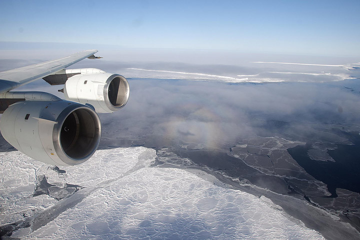
One such Antarctic glory is visible in the image above, snapped by Michael Studinger during an IceBridge flight on October 26, 2010. Read more about that image here.
Remember the year 2000? Bill Clinton was president of the United States, Faith Hill and Santana topped Billboard music charts, and the world’s computers had just “survived” the Y2K bug. It also was the year that NASA’s Terra satellite began collecting images of Earth.
Eighteen years later, the versatile satellite — with five scientific sensors — is still operating. For all of that time, the satellite’s Moderate Resolution Imaging Spectroradiometer (MODIS) has been collecting daily data and imagery of the Arctic — and the rest of the planet, too.
If you knew where to look and were willing to wait patiently for file downloads, the images have always been available on specialized websites used by scientists. But there was no quick-and-easy way for the public to browse the imagery. With the recent addition of the full record of MODIS data into NASA’s Worldview browser, checking on what was happening anywhere in the world on any day since 2000 has gotten much easier.
Say you want to check on the weather in your hometown on the day you or your child was born. Just navigate to the date on Worldview, and make sure that the MODIS data layer is turned on. (In the image below, you can tell the Terra MODIS data layer is on because it is light gray.)
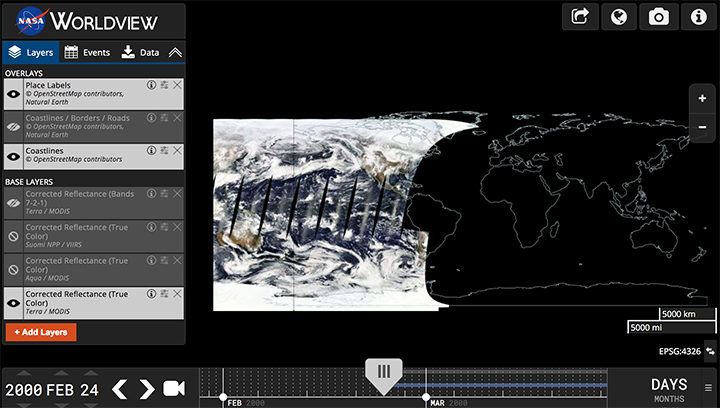
This Worldview screenshot shows the first day that Terra MODIS collected data — February 24, 2000. The very first Terra scene showed northern Argentina and Chile. Credit: EOSDIS.
One of the things I love about having all this MODIS data at my fingertips is that it makes it possible to see the passage of relatively long periods of time in just a few minutes. Look, for instance, at the animation at the top of this page, generated by Delft University of Technology ice scientist Stef Lhermitte using Worldview.
Lhermitte summoned every natural-color MODIS image of the Arctic that Terra and Aqua (which also has a MODIS instrument) have collected since April 2003. The result — a product of 71,000 satellite overpasses — is a remarkable six-minute time capsule of swirling clouds, bursts of wildfire smoke, the comings and goings of snow, and the ebb and flow of sea ice.
Though beautiful, Lhermitte’s animation also has a troubling side to it. If you look carefully, you can see the downward trend in sea ice extent. Look, for instance, at mid-August and September 2012 — the period when Arctic sea ice extent hit a record-low minimum of 3.4 million square miles. Between the heavy cloud cover, you will see lots of dark open water. Compare that to the same period in 2003, when the minimum extent was 6.2 million square miles. Scientists attribute the loss of sea ice to global warming.
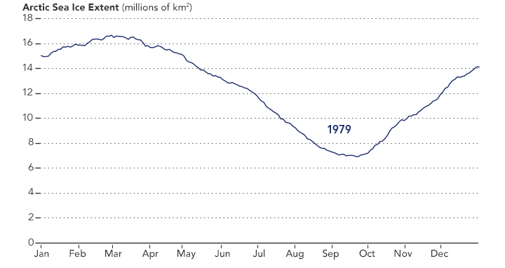
NASA Earth Observatory chart by Joshua Stevens, using data from the National Snow and Ice Data Center.
Earth Matters had a conversation with Lhermitte to find why he made the clip and what stands out about it. MODIS images of notable events that Lhermitte mentioned are interspersed throughout the interview. All of the images come from the archives of NASA Earth Observatory, a website that was founded in 1999 in conjunction with the launch of Terra.
What prompted you to create this animation?
The extension of the MODIS record back to the beginning of the mission in the Worldview website triggered me to make the animation. As a remote sensing scientist, I often use Worldview to put things into context (e.g. for studying changes over ice sheets and glaciers). Previously, Worldview only had data until 2010.
What do you think are the most interesting events or patterns visible in the clip?
I think the strength of the video is that it contains so many of them, and it allows you to see them all in one video. The ones that are most striking to me are:
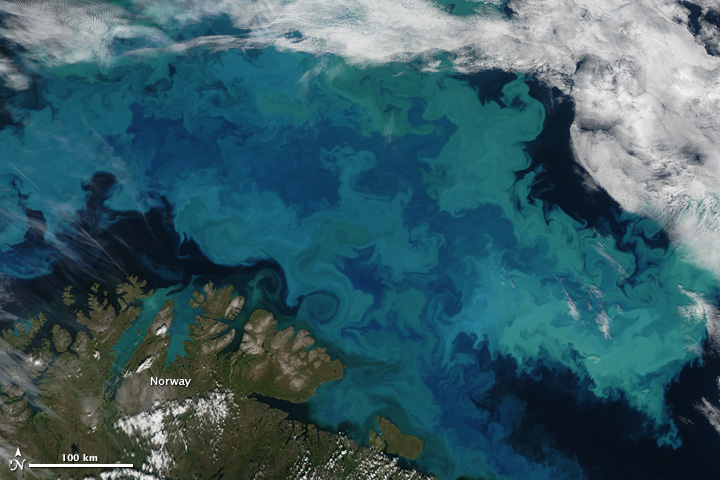
An Aqua MODIS image of a bloom in the Barents Sea on August 14, 2011. Image by Jeff Schmaltz, MODIS Rapid Response Team at NASA GSFC.
+ algal blooms in the Barents Sea
+ declining sea ice extent. You can see this both annually and over the longer term.
+ changing snow extent. You can see this each summer, especially over Canada and Siberia.
+ summer wildfire smoke in Canada (2004, 2005, 2009, 2014, 2017) and Russia (2006, 2011, 2012, 2013, 2014, 2016)
+ albedo reductions (reduction in brightness) over the Greenland Ice Sheet in 2010 and 2012 related to strong melt years.
+ overall eastward atmospheric circulation
+ the Grímsvötn ash plume (21 May 2011)
How did you make it? Was it difficult from a technical standpoint?
It was simple. I just downloaded the MODIS quicklook data from the Worldview archive using an automated script. Afterwards, I slightly modified the images for visualization purposes (e.g. overlaying country borders, clipping to a circular area). and stitched everything together in a video.
When you sit back and watch the whole video, how does it make you feel?
On the one hand, I am fascinated by the beauty and complexity of our planet. On the other hand, as a scientist, it makes me want to understand its processes even better. The video shows so many different processes at different scales, from natural processes (annual changes in snow cover and the Vatnajökull ash plume) to climate change related changes (e.g. the long term decrease in sea ice).
There are some gaps during the winter where the extent of the sea ice abruptly changes. Can you explain why?
I used the standard reflectance products, which show the reflected sunlight. I decided to leave all dates out where part of the Arctic is without sunlight during satellite overpasses (approximately 10:30 a.m. and 1:30 p.m. local time). The missing data due to the polar night are very prominent if you compile the complete record including winter months, and I did not want it to distract the viewer from the more subtle changes in the video.
In the course of your day job as a scientist, do you use MODIS imagery? For what purpose?
Yes, as a polar remote sensing scientist, I tend to work with a range of satellite data sets. MODIS is a unique data product, given its global daily coverage and its long record. Besides the fact that I use MODIS frequently to monitor ice shelves and outlet glaciers, my colleagues and I use it to study snow and ice-albedo processes, snow cover in mountainous areas, vegetation recovery after wildfires, and ecosystem processes. One MODIS animation of ice calving from a glacier in Antarctica actually made it into the Washington Post recently.
Seen from space by day, central Argentina looks green and unpopulated. But by night…
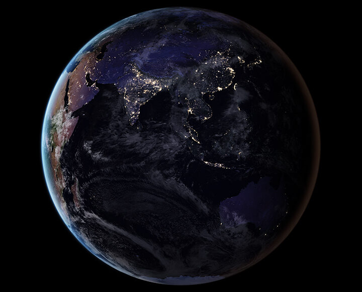
Visit our Earth at Night page to learn more about how scientists are using images of the planet’s dark side to gain insight on human activity and on poorly understood natural events.