

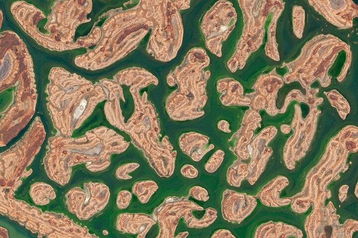
Every month on Earth Matters, we offer a puzzling satellite image. The April 2020 puzzler is above. Your challenge is to use the comments section to tell us what we are looking at, where it is, and why it is interesting.
How to answer. You can use a few words or several paragraphs. You might simply tell us the location, or you can dig deeper and explain what satellite and instrument produced the image, what spectral bands were used to create it, or what is compelling about some obscure feature. If you think something is interesting or noteworthy, tell us about it.
The prize. We cannot offer prize money or a trip to Mars, but we can promise you credit and glory. Well, maybe just credit. Roughly one week after a puzzler image appears on this blog, we will post an annotated and captioned version as our Image of the Day. After we post the answer, we will acknowledge the first person to correctly identify the image at the bottom of this blog post. We also may recognize readers who offer the most interesting tidbits of information about the geological, meteorological, or human processes that have shaped the landscape. Please include your preferred name or alias with your comment. If you work for or attend an institution that you would like to recognize, please mention that as well.
Recent winners. If you’ve won the puzzler in the past few months, or if you work in geospatial imaging, please hold your answer for at least a day to give less experienced readers a chance.
Releasing Comments. Savvy readers have solved some puzzlers after a few minutes. To give more people a chance, we may wait 24 to 48 hours before posting comments. Good luck!
See our “Filling up Lake Carnegie” Image of the Day for the answer.
East Africa is experiencing one of its worst locust outbreaks in decades. The voracious insects are devouring thousands of hectares of farmland and forests, and threatening food security for millions across the region, which is already vulnerable to food shortages.
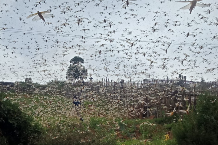
To help manage outbreaks, NASA scientists are developing tools to track locust breeding grounds and to assess crop damage. We previously reported on the satellite data used in these assessments, but researchers are also using ground-based observations from several local organizations and government offices. Such information is used to validate estimates of crop conditions made from satellite imagery and included in international crop forecasts.
“Our ground partners give monthly updates on crop conditions and major events like flooding and disease outbreaks,” said Catherine Nakalembe, a food security researcher with NASA SERVIR and NASA Harvest. “They help provide critical ground information when the remote sensing data are not sufficient.”
The following photos, taken by people in Uganda and Kenya, show some of the effects of the locust outbreak on farms.
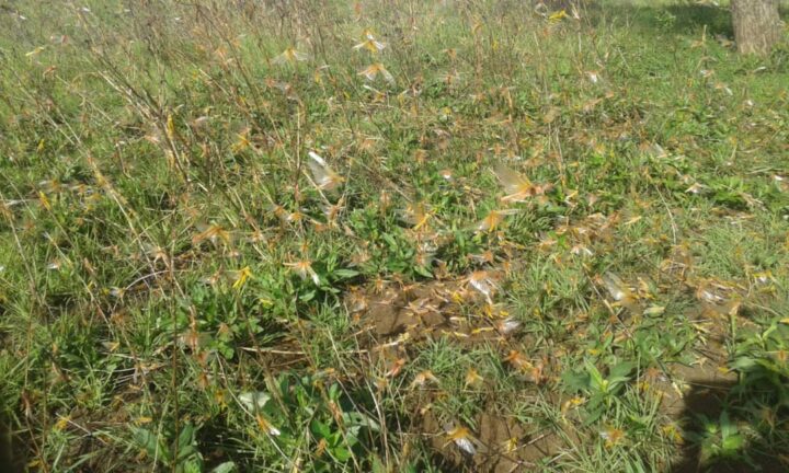
Kenya is experiencing its worst locust outbreak in 70 years. The image at the top of this page and the one below shows locusts (yellow) swarming a field in March 2020.
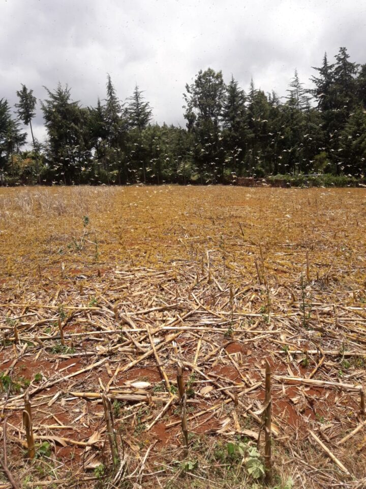
The images were taken by Gentrix Machenje. Machenje is a county officer who works with NASA SERVIR and provides information for Kenya’s National Crop Monitor.
The photos below were taken in early April 2020 in the Karamoja region of northeast Uganda. Officials believe the locusts hatched from eggs laid a few weeks ago.
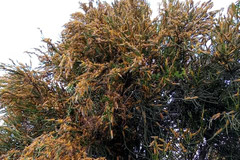
The images were taken by Evans Noble Opiolo, an agricultural officer in the Nakapiripirit District who also contributes to a Disaster Risk Financing Project for Uganda’s Office of the Prime Minister. Such officers are reporting on locust locations and are often present when ground-control operations, such as pesticide spraying, are in progress.

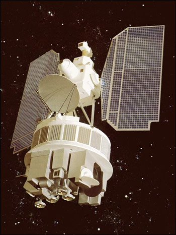
When NASA launched the Nimbus-4 satellite 50 years ago, nobody knew the ozone layer over Antarctica was thinning. And nobody knew that chlorofluorocarbons (CFCs)—long-lived chemicals that had been used in refrigerators and aerosol sprays since the 1930s—were responsible.
But the mission included a sensor called the Backscatter Ultraviolet (BUV) experiment capable of measuring ozone nonetheless. “We simply wanted to measure the atmosphere. It was curiosity-driven research,” said Pawan Bhartia, an atmospheric scientist at NASA’s Goddard Space Flight Center in an interview about the discovery of the ozone hole.
Developed by a team led by NASA’s Donald Heath, BUV was the first space-based instrument to measure the total amount of ozone in the Earth’s atmosphere. “Don was really sweating the Nimbus-4 launch because his MUSE instrument on one of the previous Nimbus satellites ended up in the Pacific Ocean offshore from Vandenberg Air Force Base,” said Arlin Krueger, technical officer for the BUV science team. “That instrument was recovered from the ocean floor and sat on his filing cabinet for years as a reminder that risks are big part of the NASA experimenter’s life.”
Fortunately, the launch went smoothly. The BUV performed well and demonstrated a new way to measure total column ozone. This led to the Total Ozone Mapping Spectrometer (TOMS) on Nimbus-7. The ozone data it collected gave researchers baseline measurements that, in the mid-1980s, helped them recognize that a troubling hole in the ozone layer had opened up.
The global recognition of the destructive potential of CFCs soon led to the 1987 Montreal Protocol, a treaty phasing out the production of ozone-depleting chemicals. Since then, scientists have begun to see definitive proof of ozone recovery.
You can find the latest data and imagery of the status of the ozone hole on NASA’s Ozone Watch website. You can read more about the role that satellites played in the discovery of stratospheric ozone depletion here.
There have been two rounds of voting in Tournament Earth 2020, and two rounds of stunning upsets. Only two of the top eight seeds made it through. Night Lights? Snuffed out. Colorado River? Dried up. Caspian ice? Melted. Aerosols? Cleaned out. A river of tea? Gone cold. Dark side of the Moon? Someone broke the record. Iconic Earthrise? Didn’t make it to dawn.
Every time we run one of these tournaments, we are surprised by what catches the eyes of our readers. It is time to surprise us again. Cast your votes now in round three to pick the best four of the Earthly 8. Voting ends on April 13 at 9 a.m. U.S. Eastern Time. Check out the remaining competitors below.
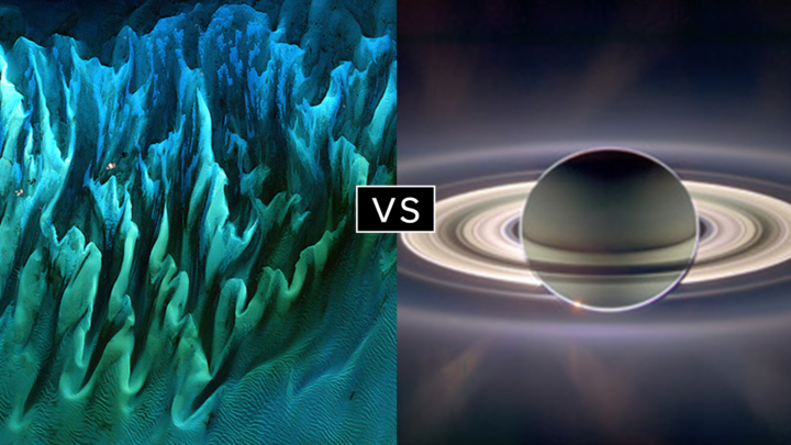
In round 1, Ocean Sand garnered the most votes overall and wiped out #4 seed and 2014 champion El Hierro Submarine Eruption, winning by the largest margin of any pairing (81 to 19 percent). In round 2, Sand beat the #1 seed, The Dark Side and the Bright Side, by a 57 to 43 percent margin.
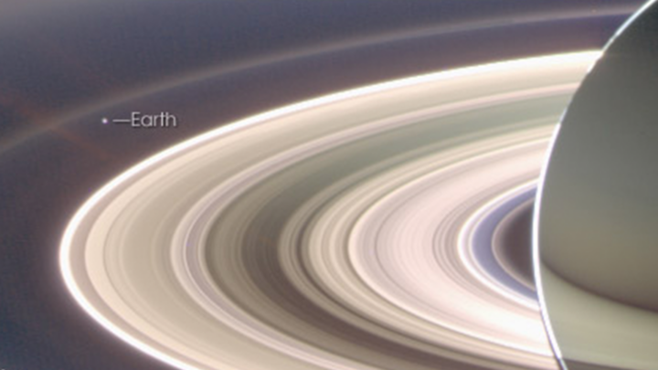
A View from Saturn garnered the second highest vote total in round 1, besting Blooming Baltic Sea by 77 to 23 percent. In the second round, Saturn beat Sensing Lightning from the Space Station, 60 to 40 percent. In case you didn’t notice, Earth is visible in that Saturn image.
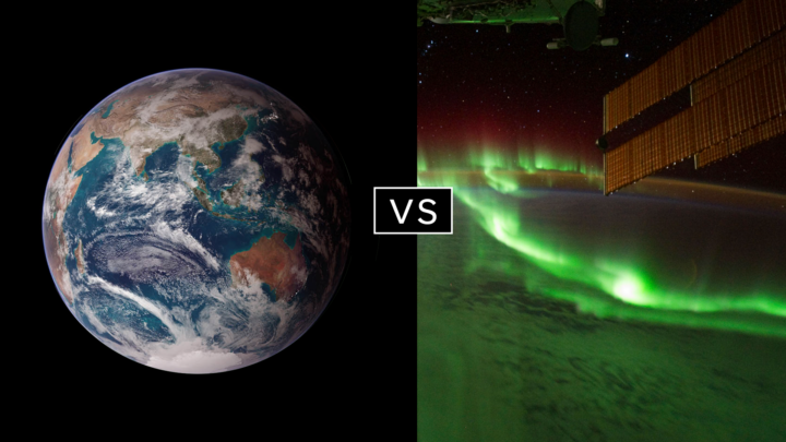
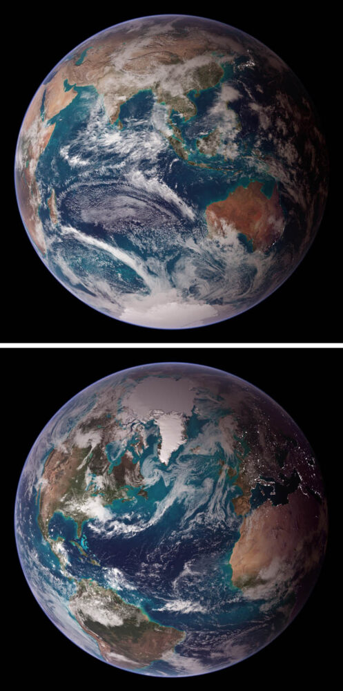
Twin Blue Marbles is the only #1 seed left in the tournament. In round 1, it captured 71 percent of the vote while besting Auroras Light Up the Antarctic Night. In round 2, Blue Marbles was the top overall vote getter and beat the iconic A Voyager Far from Home by 66 to 34 percent.
Fire in the Sky and On the Ground has pulled off two massive upsets. In round 1, it beat #2 seed Night Light Maps Open Up New Applications, 71 to 29 percent. In round 2, Fire beat the sentimental favorite and oldest image in Tournament Earth, All of You on the Good Earth — the original Blue Marble photo (1968) and the inspiration for the first Earth Day (1970). The voters chose the auroral fire over Apollo 8 fame by 57 to 43 percent.
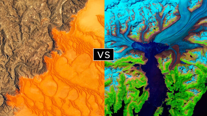
This bracket pairs two low seeds that knocked off highly ranked opponents. #8 seed Where the Dunes End topped #1 A Curious Ensemble of Wonderful Features in round 1 (63 to 37 percent), then topped #4 Roiling Flows on Holuhraun Lava Field (56 to 44).
The false-color image Retreat of the Columbia Glacier got 57 percent of the vote to beat Icy Art in the Sanikov Strait in round 1. Round 2 was a close call: Columbia barely eclipsed Antartica Melts Under the Hottest Days on Record (51 to 49 percent).
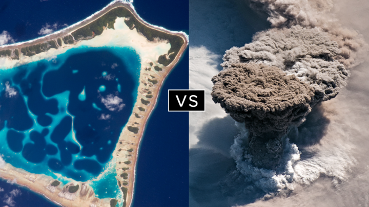
Another pair of Cinderella stories here. Atafu Atoll outclassed #1 seed Some Tea with Your River in round 1 by 75 to 25 percent. In round 2, it collected the second most votes overall, beating #5 Making Waves in the Andaman Sea 62 to 38 percent.
Raikoke erupted in round 1, collecting 72 percent of the vote while beating #3 Awesome, Frightening View of Hurricane Florence. In round 2, the volcanic plume smothered #2 Just Another Day on Aerosol Earth, 61 to 39 percent.
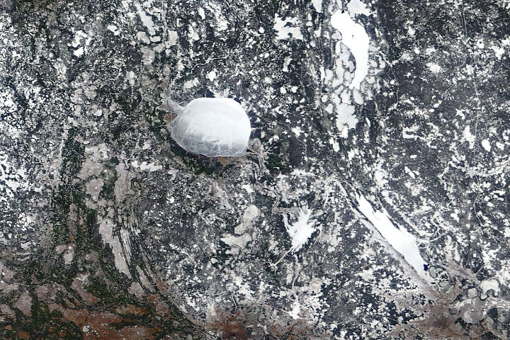
Every month on Earth Matters, we offer a puzzling satellite image. The March 2020 puzzler is above. Your challenge is to use the comments section to tell us what we are looking at, where it is, and why it is interesting.
How to answer. You can use a few words or several paragraphs. You might simply tell us the location, or you can dig deeper and explain what satellite and instrument produced the image, what spectral bands were used to create it, or what is compelling about some obscure feature. If you think something is interesting or noteworthy, tell us about it.
The prize. We cannot offer prize money or a trip to Mars, but we can promise you credit and glory. Well, maybe just credit. Roughly one week after a puzzler image appears on this blog, we will post an annotated and captioned version as our Image of the Day. After we post the answer, we will acknowledge the first person to correctly identify the image at the bottom of this blog post. We also may recognize readers who offer the most interesting tidbits of information about the geological, meteorological, or human processes that have shaped the landscape. Please include your preferred name or alias with your comment. If you work for or attend an institution that you would like to recognize, please mention that as well.
Recent winners. If you’ve won the puzzler in the past few months, or if you work in geospatial imaging, please hold your answer for at least a day to give less experienced readers a chance.
Releasing Comments. Savvy readers have solved some puzzlers after a few minutes. To give more people a chance, we may wait 24 to 48 hours before posting comments. Good luck!
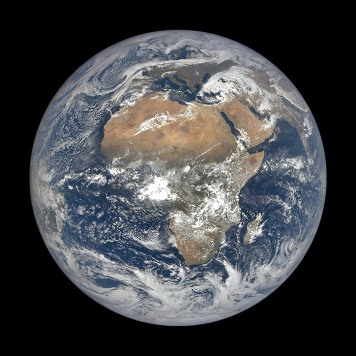
It has been a tough month on Earth. Good news has been scarce. But here’s at least one update ― from one million miles away ― to appreciate.
The Deep Space Climate Observatory (DSCOVR) satellite, which had been out of commission for about nine months due to a technical problem, is fully operational again, according to NOAA. Issues with the satellite’s attitude control system prompted engineers to put the satellite into a “safe hold” in June 2019, but they recently developed a software fix for the problem.
And that means that the satellite’s Earth Polychromatic Imaging Camera (EPIC) is once again taking beautiful full-disk images of our home several times each day. NASA’s EPIC instrument acquired the image of Africa and Europe (above) on March 19, 2020.
Head over to the science team page for EPIC and take a few moments to savor some imagery of our ever-changing planet. If Twitter is more your style, check out @DSCOVRDaily. Look carefully and you’ll see clouds and storm fronts coming and going, plumes of dust or smoke rising and fading, and whole continents greening and browning as the seasons change.
The EPIC view is a potent reminder of something that Frank White, author of The Overview Effect, said recently on a NASA podcast. (The book explores how seeing Earth from space causes many astronauts to dramatically change their outlook on our planet and life itself.)
“[One of the] conclusions they draw is that we are really all in this together,” he said. “Our fate is bound up with people that we may think are really different from [us]. We may have different religions, we may have different politics. But ultimately, we are connected. Totally connected.”
In February, we showed a drop in nitrogen dioxide (NO2) levels over China as a result of the coronavirus quarantine. New data from the European Space Agency (ESA) now show drops in NO2 concentrations over Italy due to that country’s nationwide lockdown. The change is particularly evident in the Pro Valley of northern Italy.
The video above shows NO2 levels across Europe from January 1 to March 11, 2020. These data come from ESA’s Tropospheric Monitoring Instrument (TROPOMI) onboard the Copernicus Sentinel-5P satellite. NO2 is a noxious gas emitted by motor vehicles, power plants, and industrial facilities.
ESA stated: “Although there could be slight variations in the data due to cloud cover and changing weather, we are very confident that the reduction in emissions that we can see coincides with the lockdown in Italy causing less traffic and industrial activities.”
Read more here…
For more information on NASA’s long-term measurements of nitrogen dioxide, please see this page.
The coronavirus (COVID-19) epidemic is first and foremost an issue of human health and safety. But as people have changed their everyday behaviors and patterns to contain or avoid the virus, there have been some subtle effects on the environment. There also has been misinformation. Below are four ways the virus is—and is not—affecting the environment in China.
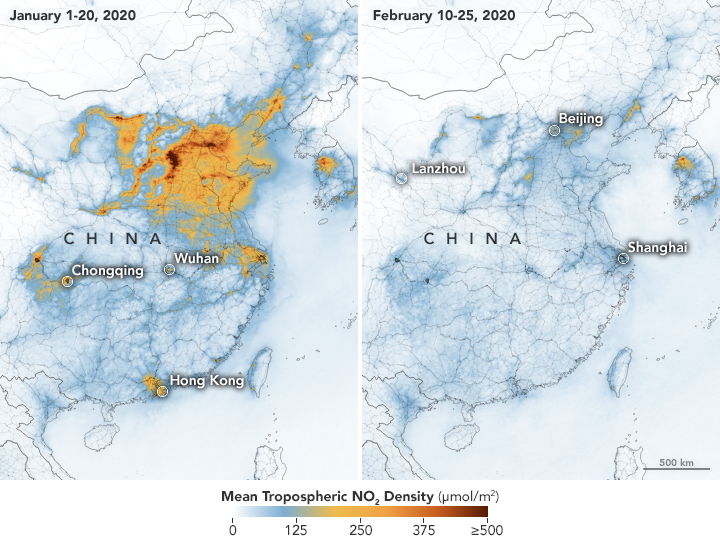
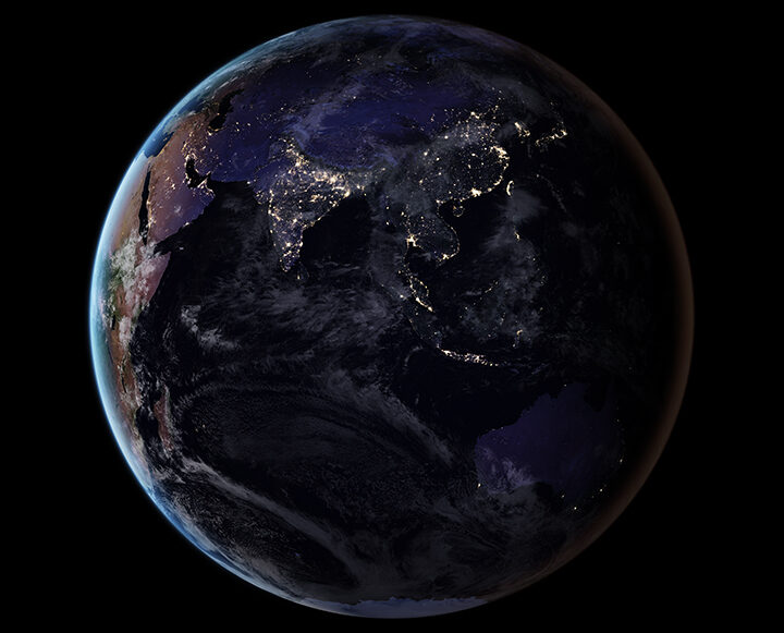
On February 28, we reported how decreases in industrial, transportation, and business activity since the coronavirus outbreak had reduced levels of atmospheric nitrogen dioxide (NO2) over China. But researchers note that a measurable change in one pollutant does not necessarily mean air quality is suddenly healthy across the country.
In February, news outlets reported unhealthy air pollution in Beijing, which was largely affected by airborne particulate pollution known as PM 2.5. As reported in the South China Morning Post, “weak winds, high humidity and a strong thermal inversion had trapped bad air in the city.” NASA satellites also showed a high load of airborne aerosols. Measurements of aerosol optical depth depict how the abundance of natural or manmade particles in the air prevents light from traveling through the atmosphere to the ground.
Beyond aerosol emissions, weather also plays an important role in determining air quality. NASA/USRA researcher Fei Liu notes that wind patterns and the height of the planetary boundary layer — the lowest layer of the troposphere near Earth’s surface — are important meteorological factors. Planetary boundary layer height influences how air pollution mixes vertically in the atmosphere. If the height of the boundary layer is high, then air pollutants can move higher into the atmosphere and concentrations will be lower near the ground (and vice versa). Liu and her colleagues are currently studying how changes in such meteorological factors may have influenced the decrease in NO2 before and during the quarantine.
For more information on NASA’s long-term measurements of nitrogen dioxide, please see this page.
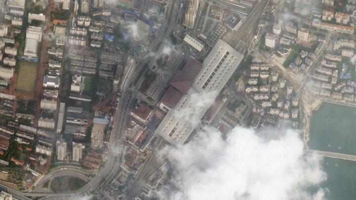
It is no surprise that road traffic in China’s major cities has been lighter, as many people have been forced to stay home and public transportation has been shut down. Satellite imagery from Planet Labs captured scenes of reduced traffic and empty parking lots near the Wuhan train station and airport. Trains stopped running around January 22, when the first quarantines began. And compared to late January 2019, domestic flights within mainland China this year dropped by 60 to 70 percent.
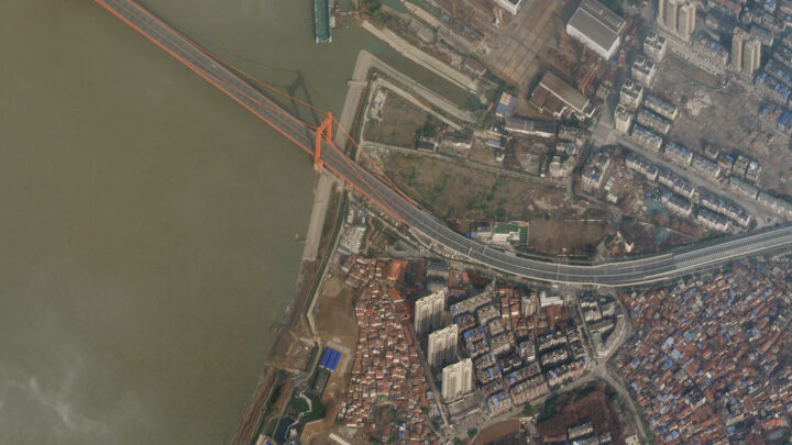
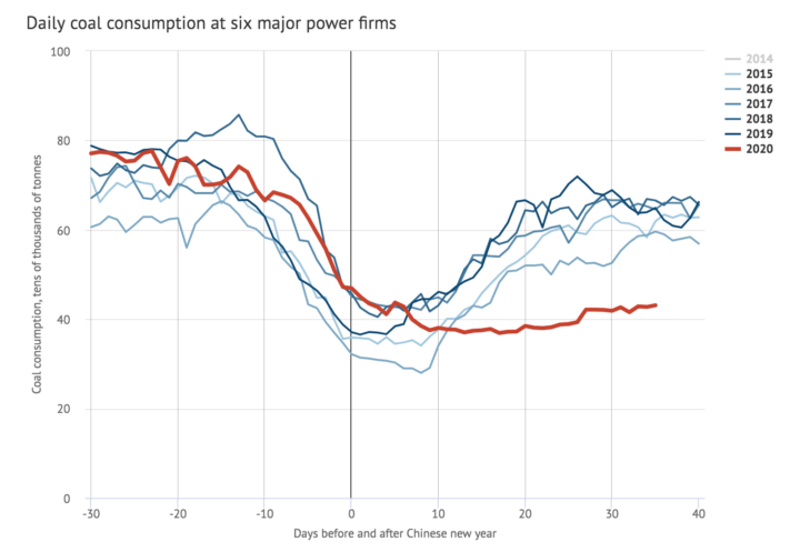
A report in Carbon Brief stated that key industries in China were operating at much lower-than-normal levels during the quarantine. Oil refinery operations in Shandong province, for instance, were at their lowest since 2015. Average coal consumption at power plants also reached a four-year low. As a result, carbon dioxide (CO2) emissions were at least 25 percent lower in the two weeks following the Lunar New Year compared to 2019. However, that decrease in CO2 emissions for two weeks would only reduce annual totals by approximately 1 percent.
In February 2020, a map floating around on social media showed increased sulfur dioxide (SO2) concentrations near Wuhan. Some news outlets prematurely speculated that the elevated levels of SO2 were due to an increase in human cremation.
The data for the map came from NASA’s GEOS earth system model and were not based on real-time observations of SO2. NASA’s Arlindo da Silva explained that while the GEOS model assimilates many ground-based and satellite observations to constrain meteorological conditions such as winds, humidity, and temperature, it currently does not ingest any real-time observations of sulfur dioxide. In the model, the concentrations of SO2 are estimated from historical emissions sources that are transported around the globe by atmospheric circulation. Therefore, da Silva said, GEOS model simulations cannot account for variations in SO2 concentrations arising from a sudden change in human activity (like a quarantine). Essentially, the model output of enhanced SO2 was not completely reflecting reality in this case.
Secondly, as the writers at Snopes pointed out, sulfur dioxide is commonly associated with burning coal — not burning human corpses.
Since its launch on the web in April 1999, NASA Earth Observatory has published more than 15,500 image-driven stories about our planet. In celebration of our 20th anniversary — as well as the 50th anniversary of Earth Day — we want you to help us choose our all-time best image.
For now, we need you to help us brainstorm: what images or stories would you nominate as the best in the Earth Observatory collection? Do you go for the most beautiful and iconic view of our home? the most newsworthy? the most scientifically important? the most inspiring?
Search our site and then post the URLs of your favorite Earth images in the comments section below. Please send your ideas by March 17.
In late March 2020, we will include some of your selections in Tournament Earth, a head-to-head contest to vote for the best of the best from our archives. Each week, readers will pick from pairs of images as we narrow down the field from 32 nominees to one champion.
The all-time best Earth Observatory image will be announced on April 29, 2020, the end of our anniversary year.
If you want some inspiration as you begin your search, take a look at the galleries listed below. Or use our search tool (top left) to find your favorite places, images, and events.
The striking patterns in northeastern Canada’s flood basalts tell a story of continental collisions that played out almost two billion years ago. The large-scale patterns are visible from space—a wide view that provides a sweeping perspective on the region’s steps and folds cut by faults. But look closer, and then closer again, and other patterns and details emerge.
Deanne van Rooyen, a geologist at Cape Breton University, and David Corrigan of the Geological Survey of Canada, have been doing field work in the region to better understand the details of how the flood basalts evolved. They provided the following photos as examples of some of the details that become visible when viewed close up.
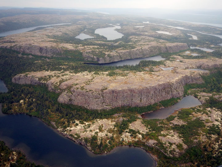
As described in detail in the Image of the Day, successive layers of flood basalt eroded and formed step-like features known as “traps.” The cliff face of each flow (or series of flows) represents a step, each standing about 50 to 70 meters (160 to 230 feet) tall. The steps were later folded as ancient, stable parts of Earth’s crust collided. The steps visible in the photograph above, shot from a helicopter, show some of these step-like features amid the central part of a folded structure.
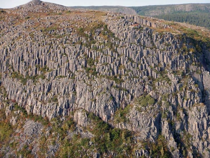
A closer look at the steps (above) reveals hexagonal columns in the flood basalts. These structures are known as “columnar jointing,” and form when layers of basalt cool and contract. They occur elsewhere around the planet too; a well-known example is the Giant’s Causeway in Northern Ireland.
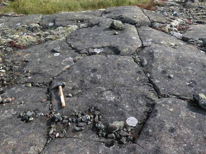
This photograph shows an even closer look at the column tops. Notice the hexagonal shape of the basalt. Corrigan and Van Rooyen are working on a detailed study of these basalts, which they refer to as the “Labrador Traps.”