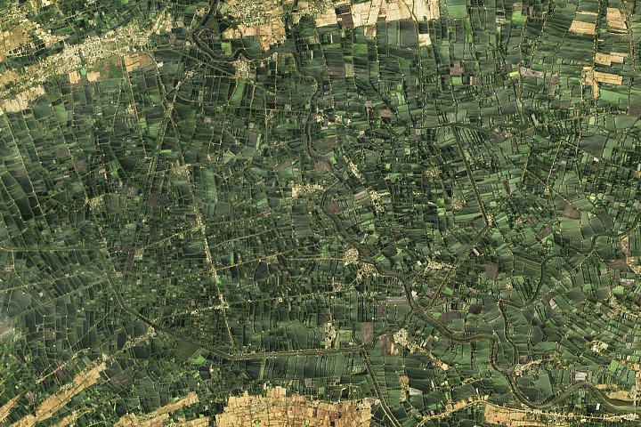
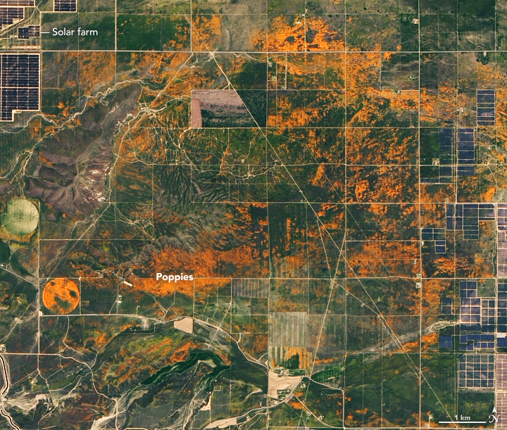
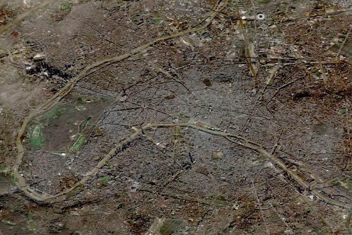
UPDATE — This puzzling image shows an abundance of agriculture in Andhra Pradesh. See the full image and story in our Image of the Day, published on July 17.
Every month on Earth Matters, we offer a puzzling satellite image. The July 2021 puzzler is above. Your challenge is to use the comments section to tell us what we are looking at, where it is, and why it is interesting.
How to answer. You can use a few words or several paragraphs. You might simply tell us the location, or you can dig deeper and explain what satellite and instrument produced the image, what spectral bands were used to create it, or what is compelling about some obscure feature. If you think something is interesting or noteworthy, tell us about it.
The prize. We cannot offer prize money or a trip to Mars, but we can promise you credit and glory. Well, maybe just credit. Roughly one week after a puzzler image appears on this blog, we will post an annotated and captioned version as our Image of the Day. After we post the answer, we will acknowledge the first person to correctly identify the image at the bottom of this blog post. We also may recognize readers who offer the most interesting tidbits of information about the geological, meteorological, or human processes that have shaped the landscape. Please include your preferred name or alias with your comment. If you work for or attend an institution that you would like to recognize, please mention that as well.
Recent winners. If you’ve won the puzzler in the past few months, or if you work in geospatial imaging, please hold your answer for at least a day to give less experienced readers a chance.
Releasing Comments. Savvy readers have solved some puzzlers after a few minutes. To give more people a chance, we may wait 24 to 48 hours before posting comments. Good luck!
The American West is in the grip of an exceptional drought. Following one of the planet’s hottest years on record — and with rainfall and snowfall in the western U.S. well below average — water managers, policymakers, government agencies, and scientists are facing strapped water supplies and anticipating potentially devastating wildfires.
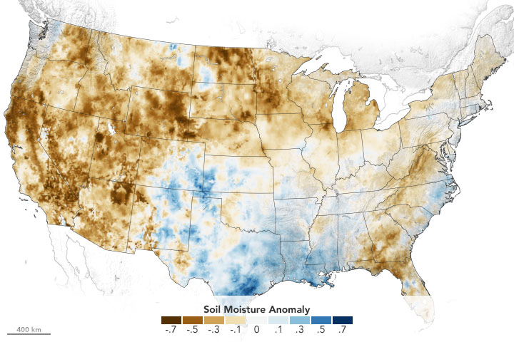
Using its satellites, aircraft, and computer models, NASA is helping water managers respond. NASA’s drought resource page details how the agency is helping farmers, reservoir managers, and decision makers track and monitor the ongoing drought, predict how much water will be available, and help improve how we use the water we have. The site will be updated throughout the year.
Underpinning all of this is NASA’s expertise in water science, our partnerships with water managers across the country, and our leadership in space and remote-sensing technology.
Learn more at the drought resource page.
Researchers have found that Earth’s energy imbalance approximately doubled during the 14-year period from 2005 to 2019.
Earth’s climate is determined by a delicate balance between how much of the Sun’s radiative energy is absorbed in the atmosphere and at the surface and how much thermal infrared radiation Earth emits to space. A positive energy imbalance means the Earth system is gaining energy, causing the planet to heat up. The doubling of the energy imbalance is the topic of a recent study published June 15 in Geophysical Research Letters.
Scientists at NASA and the National Oceanic and Atmospheric Administration compared data from two independent sets of measurements. NASA’s Clouds and the Earth’s Radiant Energy System (CERES) satellite sensors measure how much energy enters and leaves Earth’s system. A global array of ocean floats, called Argo, provide data to enable an accurate estimate of the rate at which the world’s oceans are warming. Since approximately 90 percent of the excess energy from an energy imbalance ends up in the ocean, the overall trends of incoming and outgoing radiation should broadly agree with changes in ocean heat content.
“The two very independent ways of looking at changes in Earth’s energy imbalance are in really, really good agreement, and they’re both showing this very large trend, which gives us a lot of confidence that what we’re seeing is a real phenomenon and not just an instrumental artifact,” said Norman Loeb, lead author for the study and principal investigator for CERES at NASA’s Langley Research Center. “The trends we found were quite alarming in a sense.”
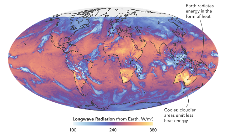
“It’s likely a mix of anthropogenic forcing and internal variability,” said Loeb. “And over this period they’re both causing warming, which leads to a fairly large change in Earth’s energy imbalance. The magnitude of the increase is unprecedented.”
Increases in emissions of greenhouse gases such as carbon dioxide and methane trap heat in the atmosphere, capturing outgoing radiation that would otherwise escape into space. The warming drives other changes, such as the melting of snow and ice, increased water vapor, and cloud changes that can further enhance the warming. Earth’s energy imbalance is the net effect of all these factors.
In order to determine the factors driving the imbalance, the investigators examined changes in clouds, water vapor, trace gases, the output of light from the Sun, Earth’s surface albedo (the amount of light reflected by the surface), atmospheric aerosols, and changes in surface and atmospheric temperature distributions.
The scientists found that the doubling of the energy imbalance is partially the result an increase in greenhouse gases from human activity, also known as anthropogenic forcing. It can also be attributed to increases in water vapor, which traps more outgoing longwave radiation and further contributes to Earth’s energy imbalance. The related decrease in clouds and sea ice also lead to more absorption of solar energy.
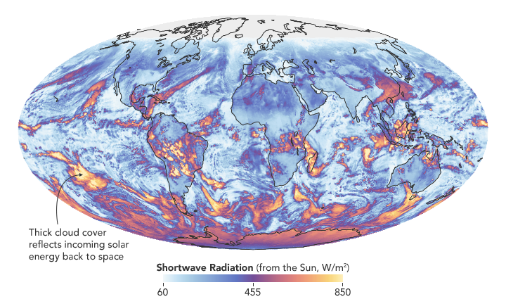
The authors also found that a flip of the Pacific Decadal Oscillation (PDO) from a cool phase to a warm phase likely played a major role in the intensification of the energy imbalance. The PDO is a pattern of Pacific climate variability in which a massive wedge of water in the eastern Pacific goes through cool and warm phases. This naturally occurring internal variability in the ocean can have far-reaching effects on weather and climate. An intensely warm PDO phase that began around 2014 and continued until 2020 caused a widespread reduction in cloud coverage over the ocean and a corresponding increase in the absorption of solar radiation.
“The lengthening and highly complementary records from Argo and CERES have allowed us both to pin down Earth’s energy imbalance with increasing accuracy, and to study its variations and trends with increasing insight, as time goes on,” said Gregory Johnson, co-author on the study and physical oceanographer at NOAA’s Pacific Marine Environmental Laboratory. “Observing the magnitude and variations of this energy imbalance are vital to understanding Earth’s changing climate.”
Loeb cautions that the study is only a snapshot relative to long-term climate change, and that it is not possible to predict with any certainty what the coming decades might look like for Earth’s energy budget. The study does conclude, however, that unless the rate of heat uptake subsides, greater changes in climate should be expected.
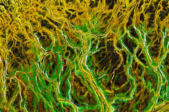
UPDATE — This puzzling image shows the Yukon-Kuskokwim delta in colorful transition. See the full image and story in our Image of the Day, published on June 21.
Every month on Earth Matters, we offer a puzzling satellite image. The June 2021 puzzler is above. Your challenge is to use the comments section to tell us what we are looking at, where it is, and why it is interesting.
How to answer. You can use a few words or several paragraphs. You might simply tell us the location, or you can dig deeper and explain what satellite and instrument produced the image, what spectral bands were used to create it, or what is compelling about some obscure feature. If you think something is interesting or noteworthy, tell us about it.
The prize. We cannot offer prize money or a trip to Mars, but we can promise you credit and glory. Well, maybe just credit. Roughly one week after a puzzler image appears on this blog, we will post an annotated and captioned version as our Image of the Day. After we post the answer, we will acknowledge the first person to correctly identify the image at the bottom of this blog post. We also may recognize readers who offer the most interesting tidbits of information about the geological, meteorological, or human processes that have shaped the landscape. Please include your preferred name or alias with your comment. If you work for or attend an institution that you would like to recognize, please mention that as well.
Recent winners. If you’ve won the puzzler in the past few months, or if you work in geospatial imaging, please hold your answer for at least a day to give less experienced readers a chance.
Releasing Comments. Savvy readers have solved some puzzlers after a few minutes. To give more people a chance, we may wait 24 to 48 hours before posting comments. Good luck!
From Wisconsin to Washington D.C., pollen counts were quite high this spring, making seasonal allergies brutal for many people. Recent research shows that changes in the onset of spring—both early and late—can extend allergy misery and lead to more severe asthma for some people.
Warm springtime temperatures signal shrub buds to burst, trees to leaf-out, and flowers to bloom. As plants produce and release pollen, our bodies can mistakenly identify it as a dangerous intruder to our respiratory systems. Our immune systems produce chemicals to fight it, inducing sneezing, watery eyes, and stuffy noses. Research also shows allergenic pollen is also among the leading risk factors known to worsen asthma.
Amir Sapkota, a professor of public health at the University of Maryland, and his colleagues investigated how changes in the timing of spring onset affected asthma hospitalizations in Maryland over the past decade. The team used the Normalized Difference Vegetation Index (NDVI), which shows the relative “greenness” of vegetation, to determine the timing of the spring onset. (The data come from the Moderate Resolution Imaging Spectroradiometer (MODIS) on NASA’s Aqua and Terra satellites.) The team combined the satellite data with pollen counts and inpatient hospital admissions from the Maryland Department of Health.
They found that very early onset of spring (10 days early) was associated with a 17 percent increase in asthma hospitalizations in Maryland from 2001-2012, while late onset (3 days later) was associated with a 7 percent increase.
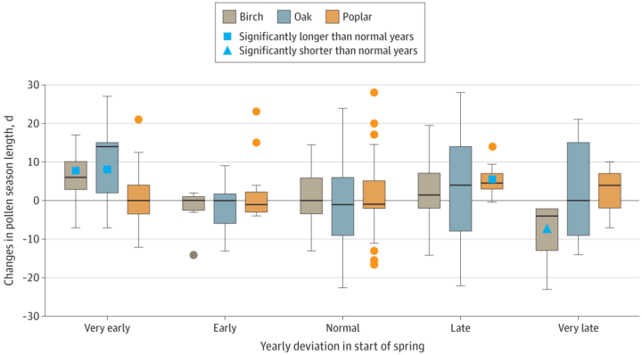
Sapkota explained that the hospitalization risk increased because of changes in pollen dynamics. Tree pollen is common in spring, while grass and weed pollen are more common during summer and fall. According to Sapkota, an early onset of spring leads to earlier and longer tree pollen seasons. At the other end, late onset causes different species of trees to bloom at the same time, thus increasing overall pollen levels in the environment. Both scenarios can lead to increases in asthma hospitalizations.
harmony: 1. A pleasing arrangement of parts. 2. An interweaving of different accounts into a single narrative. (Merriam-Webster Online Dictionary)
The Operational Land Imager (OLI) aboard the Landsat 8 satellite and the Multi-Spectral Instrument (MSI) aboard the Sentinel-2A and Sentinel-2B satellites tell two slightly different stories of Earth. OLI fully images the planet’s land surfaces every sixteen days at 30-meter resolution. MSI images Earth with repeat coverage every five days at 10- to 20-meter resolution.
But what if you could combine, or harmonize, these two data stories into a single narrative? With the provisional release of the Harmonized Landsat Sentinel-2 (HLS) dataset, NASA, the U.S. Geological Survey, and the European Space Agency have done just that. By combining OLI and MSI data—processing it to be used together as if it all came from a single instrument on one satellite—scientists have created global land surface products at 30-meter spatial resolution that are refreshed every two to three days.
“Our definition of ‘harmonized’ is that observations should be interchangeable for common [spectral] bands,” says Jeff Masek, the HLS principal investigator and Landsat 9 project scientist. “By harmonizing the datasets and making the corrections so that it appears to the user that the data are coming from a single platform, it makes it easier for a user to put these two datasets together and get that high temporal frequency they need for land monitoring.”
Two provisional surface reflectance HLS products are available through NASA’s Earthdata Search and NASA’s Land Processes Distributed Active Archive Center (LP DAAC): the Landsat 30-meter (L30) product (doi:10.5067/HLS/HLSL30.015) and the Sentinel 30-meter (S30) product (doi:10.5067/HLS/HLSS30.015). HLS imagery also is available through NASA’s Global Imagery Browse Services (GIBS) for interactive exploration using the NASA Worldview data visualization application.
The HLS image-processing algorithm was initially developed by a team at NASA’s Goddard Space Flight Center starting in 2013, with test versions released in 2015, 2016, and 2017. Even though HLS was still in the prototype stage and covered just 28 percent of Earth’s land surface, the team saw immediate and clear value for the scientific community. The project was scaled up from 28 percent to nearly 100 percent of Earth’s land surface (minus Antarctica) in 2019 by NASA’s Interagency Implementation and Advanced Concepts Team (IMPACT) at NASA’s Marshall Space Flight Center.
The HLS dataset is optimized for use in the Amazon Web Services commercial cloud environment; hosting it in the cloud has significant benefits for data users. “We’re really trying to take data analysis to the next level where we’re able to provide this large-scale processing without large-scale computing requirements,” says Brian Freitag, the HLS project manager at IMPACT. “For example, if you want to look at all the HLS data for a particular plot of land at the 30-meter resolution provided by HLS, you can do this using your laptop. Everything is in cloud-optimized GeoTIFF format.”
The harmonious combination of the OLI and MSI stories is opening new avenues of terrestrial research. A principal HLS application area will be agriculture, including studies of vegetation health; crop development, management, and identification; and drought impacts. HLS data also are being used in a new vegetation seasonal cycle dataset available through LP DAAC.
Global, 30-meter coverage every two to three days? The ability to access and work with years of Landsat and Sentinel imagery in the commercial cloud? That’s a harmonious arrangement the scientific community is eager to explore.
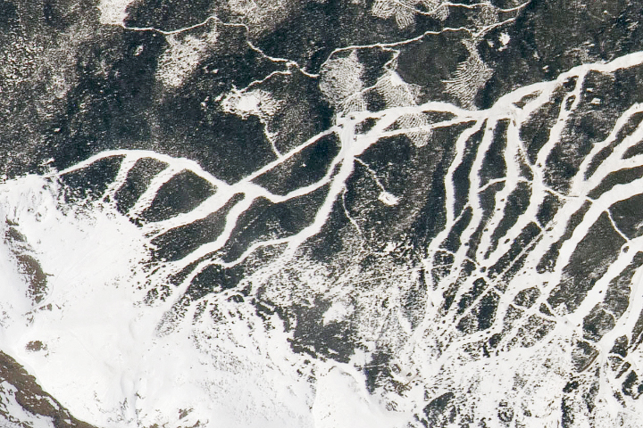
UPDATE on May 17, 2021 — This puzzling image shows part of Breckenridge Ski Resort in Colorado’s Tenmile Range. Congratulations to Steve Bassett, who guessed the correct location and deduced that the photo was shot from the International Space Station. The detailed view pictured here shows the resort’s newer slopes, which opened to skiers and snowboarders for the 2013-2014 winter season. See the full image and story in our Image of the Day, published on May 15.
Every month on Earth Matters, we offer a puzzling satellite image. The May 2021 puzzler is above. Your challenge is to use the comments section to tell us what we are looking at, where it is, and why it is interesting.
How to answer. You can use a few words or several paragraphs. You might simply tell us the location, or you can dig deeper and explain what satellite and instrument produced the image, what spectral bands were used to create it, or what is compelling about some obscure feature. If you think something is interesting or noteworthy, tell us about it.
The prize. We cannot offer prize money or a trip to Mars, but we can promise you credit and glory. Well, maybe just credit. Roughly one week after a puzzler image appears on this blog, we will post an annotated and captioned version as our Image of the Day. After we post the answer, we will acknowledge the first person to correctly identify the image at the bottom of this blog post. We also may recognize readers who offer the most interesting tidbits of information about the geological, meteorological, or human processes that have shaped the landscape. Please include your preferred name or alias with your comment. If you work for or attend an institution that you would like to recognize, please mention that as well.
Recent winners. If you’ve won the puzzler in the past few months, or if you work in geospatial imaging, please hold your answer for at least a day to give less experienced readers a chance.
Releasing Comments. Savvy readers have solved some puzzlers after a few minutes. To give more people a chance, we may wait 24 to 48 hours before posting comments. Good luck!
Through May 15, 2021, the GLOBE Program is hosting the 2021 Trees Community Challenge, a project aimed at making science better together by encouraging participants to collect data and learn about trees.
Using the Trees Challenge Activity Tracker, participants can pick and choose activities – or complete all of them – to become members of the NASA citizen science community. Activities include taking a tree height observation, writing a tree poem, and sharing stories about trees that are special to you on social media
Trees are diverse and tree height can tell us a lot about Earth’s ecosystems. Satellites and ground-based measurements are used to track tree growth, monitor how well an ecosystem supports trees, and estimate how much carbon is stored by trees. The GLOBE community encourages #CitizenScientists to use the GLOBE Observer app to take tree height measurements with their smartphones.
Read more about the challenge and how to participate.

Lake Van is one of the largest alkaline lakes on Earth, but today it has another superlative: Tournament Earth 2021 champion.
This year, readers, astronauts, and NASA staff chose 32 photos — shot by the astronauts from the International Space Station — to compete in our tournament. Lake Van was slotted as a #8 seed, but knocked out higher seeded fishing boat lights (#1 seed), Elba at night (#4), Typhoon Maysak (#2), the castellanus cloud tower (#6), and finally Stars in Motion (#3) to win the crown. Across the five rounds, more than 930,000 ballots were cast, a record in the history of our Tournament Earth competitions.
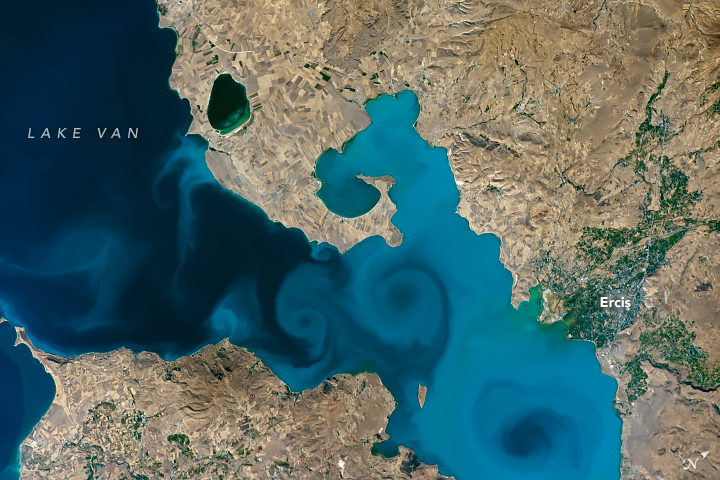
The winning image, showing a northeastern portion of the lake, was shot by astronaut Kate Rubins while orbiting on the space station in September 2016. Lake Van is an endorheic lake—it has no outlet, so its water disappears by evaporation—with a pH of 10 and high salinity levels. Turbidity plumes, which appear as swirls of light- and dark-toned water, are mostly comprised of calcium carbonate, detritus, and some organic matter. The lake is also the largest water body in Turkey.
Lake Van also has quirkier characteristics. According to legend, it is the home for a lake monster popularized in Turkish folklore. Akin to the Loch Ness monster, the Lake Van monster is rumored to look like an ancient marine reptile such as a plesiosaur. No monster-like creature has been confirmed, although archeologists have found parts of a 3,000-year-old castle buried under the lake’s waters.
The Lake Van region is also home to a special cat breed known as the Van cat. The felines have been seen swimming in Lake Van and are known for their almond-shaped eyes, often of different colors.
For the past five weeks, the competition has caught the eye of several Turkish news outlets, government officials, and Turkish citizens expressing love for their home. Other readers liked the photo due the simple beauty as a single photograph. The mayor of Van has since invited astronaut Rubins to visit.
The tournament may be over, but be sure to come back as we bring you a new view of our home planet every day of the year. If you really like astronaut photos, come back for a new one every weekend. To view other photos shot from the space station, visit the EO Astronaut Photography Collection and the Gateway to Astronaut Photography of Earth.
If you want to learn about the experience of observing the Earth from the International Space Station or about how astronauts are trained to observe our planet, watch our Picturing Earth video series above.
Thank you for voting in this year’s #TournamentEarth. We hope to bring you more competitions like this in future months and years.
Five decades ago, NASA and the U.S. Geological Society launched a satellite to monitor Earth’s landmasses. The Apollo era had given us our first look at Earth from space and inspired scientists to regularly collect images of our planet. The first Landsat — originally known as the Earth Resources Technology Satellite (ERTS) — rocketed into space in 1972. Today we are preparing to launch the ninth satellite in the series.
Each Landsat has improved our view of Earth, while providing a continuous record of how our home has evolved. We decided to examine the legacy of the Landsat program in a four-part series of videos narrated by actor Marc Evan Jackson (who played a Landsat scientist in the movie Kong: Skull Island). The series moves from the birth of the program to preparations for launching Landsat 9 and even into the future of these satellites.
Episode 1: Getting Off the Ground
The soon-to-be-launched Landsat 9 is the intellectual and technical successor to eight generations of Landsat missions. Episode 1 answers the “why?” questions. Why did space exploration between 1962 and 1972 lead to such a mission? Why did the leadership of several U.S. government agencies commit to it? Why did scientists come to see satellites as important to advancing earth science? In this episode, we are introduced to William Pecora and Stewart Udall, two men who propelled the project forward, as well as Virginia Norwood, who breathed life into new technology.
Episode 2: Designing for the Future
The early Landsat satellites carried a sensor that could “see” visible light, plus a little bit of near-infrared light. Newer Landsats, including the coming Landsat 9 mission, have two sensors: the Operational Land Imager (OLI) and the Thermal Infrared Sensor (TIRS). Together they observe in visible, near-infrared, shortwave-infrared, and thermal infrared wavelengths. By comparing observations of different wavelengths, scientists can identify algal blooms, storm damage, fire burn scars, the health of plants, and more.
Episode 2 takes us inside the spacecraft, showing how Landsat instruments collect carefully calibrated data. We are introduced to Matt Bromley, who studies water usage in the western United States, as well as Phil Dabney and Melody Djam, who have worked on designing and building Landsat 9. Together, they are making sure that Landsat continues to deliver data to help manage Earth’s precious resources.
Episode 3: More Than Just a Pretty Picture
The Landsat legacy includes five decades of observations, one of the longest continuous Earth data records in existence. The length of that record is crucial for studying change over time, from the growth of cities to the extension of irrigation in the desert, from insect damage to forests to plant regrowth after a volcanic eruption. Since 2008, that data has been free to the public. Anyone can download and use Landsat imagery for everything from scientific papers to crop maps to beautiful art.
Episode 3 explores the efforts of USGS to downlink and archive five decades of Landsat data. We introduce Mike O’Brien, who is on the receiving end of daily satellite downloads, as well as Kristi Kline, who works to make Landsat data available to users. Jeff Masek, the Landsat 9 project scientist at NASA, describes how free access to data has revolutionized what we are learning about our home planet.
Episode 4: Plays Well With Others
For the past 50 years, Landsat satellites have shown us Earth in unprecedented ways, but they haven’t operated in isolation. Landsat works in conjunction with other satellites from NASA, NOAA, and the European Space Agency, as well as private companies. It takes a combination of datasets to get a full picture of what’s happening on the surface of Earth.
In Episode 4, we are introduced to Danielle Rappaport, who combines audio recordings with Landsat data to measure biodiversity in rainforests. Jeff Masek also describes using Landsat and other data to understand depleted groundwater.
Learn more about the Landsat science team at NASA.
Learn more about the Landsat program at USGS.
View images in our Landsat gallery.
alert message

