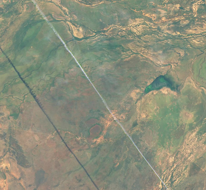
Every month on Earth Matters, we offer a puzzling satellite image. The May 2017 puzzler is above. Your challenge is to use the comments section to tell us what we are looking at, when the image was acquired, and why the scene is interesting.
How to answer. Your answer can be a few words or several paragraphs. (Try to keep it shorter than 200 words). You might simply tell us what part of the world an image shows. Or you can dig deeper and explain what satellite and instrument produced the image, what spectral bands were used to create it, or what is compelling about some obscure speck in the far corner of an image. If you think something is interesting or noteworthy, tell us about it.
The prize. We can’t offer prize money or a trip to Mars, but we can promise you credit and glory. Well, maybe just credit. Roughly one week after a puzzler image appears on this blog, we will post an annotated and captioned version as our Image of the Day. After we post the answer, we will acknowledge the person who was first to correctly ID the image at the bottom of this blog post. We may also recognize certain readers who offer the most interesting tidbits of information about the geological, meteorological, or human processes that have played a role in molding the landscape. Please include your preferred name or alias with your comment. If you work for or attend an institution that you want us to recognize, please mention that as well.
Recent winners. If you’ve won the puzzler in the last few months or work in geospatial imaging, please sit on your hands for at least a day to give others a chance to play.
Releasing Comments. Savvy readers have solved some of our puzzlers after only a few minutes or hours. To give more people a chance to play, we may wait between 24-48 hours before posting the answers we receive in the comment thread.
Good luck!
Editor’s Note: Congratulations to Maxim Nofal for being the first reader to solve the puzzler on the Earth Observatory site, and to Victor Tarazzi for answering first on Facebook. See a labeled version of the May puzzler here.
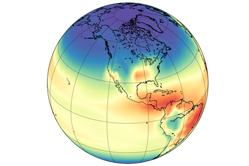
Model simulation of the hydroxyl radical concentration in the atmosphere. Image by Angharad Stell, University of Bristol.
A mystery about global methane trends just got more muddled. Two studies published in April 2017 suggest that recent increases in atmospheric concentrations of methane may not be caused by increasing emissions. Instead, the culprit may be the reduced availability of highly reactive “detergent” molecules called hydroxyl radicals (OH) that break methane down.
Understanding how globally-averaged methane concentrations have fluctuated in the past few decades—and particularly why they have increased significantly since 2007—has proven puzzling to researchers. As we reported last year:
“If you focus on just the past five decades—when modern scientific tools have been available to detect atmospheric methane—there have been fluctuations in methane levels that are harder to explain. Since 2007, methane has been on the rise, and no one is quite sure why. Some scientists think tropical wetlands have gotten a bit wetter and are releasing more gas. Others point to the natural gas fracking boom in North America and its sometimes leaky infrastructure. Others wonder if changes in agriculture may be playing a role.”
The new studies suggest that such theories may be off the mark. Both of them find that OH levels may have decreased by 7 to 8 percent since the early 2000s. That is enough to make methane concentrations increase by simply leaving the gas to linger in the atmosphere longer than before.
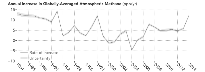
Atmospheric methane has continued to increase, though the rate of the increase has varied considerably over time and puzzled experts. (NASA Earth Observatory image by Joshua Stevens, using data from NOAA. Learn more about the image.)
As a press release from the Jet Propulsion Laboratory (JPL) noted: “Think of the atmosphere like a kitchen sink with the faucet running,” said Christian Frankenberg, an associate professor of environmental science and engineering at Caltech and a JPL researcher. “When the water level inside the sink rises, that can mean that you’ve opened up the faucet more. Or it can mean that the drain is blocking up. You have to look at both.”
Unfortunately, neither of the new studies is definitive. The authors of both papers caution that high degrees of uncertainty remain, and future work is required to reduce those uncertainties. “Basically these studies are opening a new can of worms, and there was no shortage of worms,” Stefan Schwietzke, a NOAA atmospheric scientist, told Science News.
You can find the full studies here and here. The University of Bristol has also published a press release.
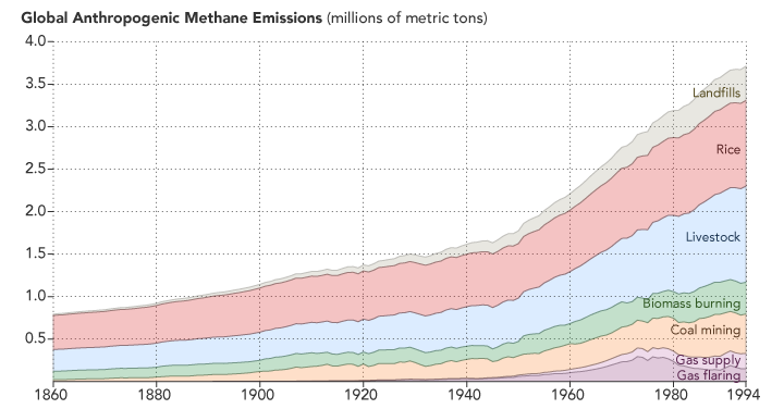
Methane emissions related to human activity are on the rise. (NASA Earth Observatory image by Joshua Stevens, using data from CDIAC. Learn more.)
Here’s a roundup of some of the latest Earth science news from NASA.
ANATOMY OF A TSUNAMI
When it comes to generating a tsunami, it’s not just the vertical movement of the seafloor that matters. Research performed in a giant tank showed that horizontal movement also contributes to the formation and strength of these potentially destructive waves. See the wave tank in the video below, and read more about the research here.
SPRING IS FOR FIELDWORK
Spring in the northern hemisphere can be a good time to hit the field for some ground- and air-based research. Among the myriad projects, NASA scientists are collecting atmospheric data atop a volcano in Hawaii and over the Mid-Atlantic area, and continuing airborne surveys of snow and ice over Earth’s arctic regions.
THE SKINNY ON GREENLAND’S THINNING GLACIERS
NASA data contributed to a study led by University of Texas researchers, which shows that the amount of ice lost by glaciers in Greenland depends on their shape. They found that the thick, wide parts of glaciers lose ice more easily than the thin, steep portions. Read more here.
SATELLITE SEES A SOLITARY CONTRAIL
And last but not least, check out this image from Landsat 8 posted to Twitter by @andrewmiskelly. The scene shows a “solitary contrail” over western Queensland, Australia.
You want to know what is better than a “Celebration of Clouds” (our recent photo essay)? A slideshow of clouds set to music. A slideshow you can use to hook your friends and family on Earth science.
So sit back, push play, and take a tour of Earth’s elegant atmosphere. Then share the beauty.
Our focus at Earth Observatory has long been still imagery and data-intensive maps. But lately we have been supplementing some stories with video and animations. For instance, check out this narrated video about the Chesapeake Bay Watershed. It’s a relatively new direction for us, so please let us know what you think.
On top of all the great science they make possible, satellites often produce imagery that is simply beautiful.
This image of Turnabout Glacier on Canada’s Ellesmere Island is a case in point. It shows a classic piedmont glacier that looks almost like pancake batter spilling over a frozen landscape. Piedmont glaciers form when steep valley glaciers spill out into relatively flat plains. Unchained from the constraints of the terrain, the ice flows freely in all directions.
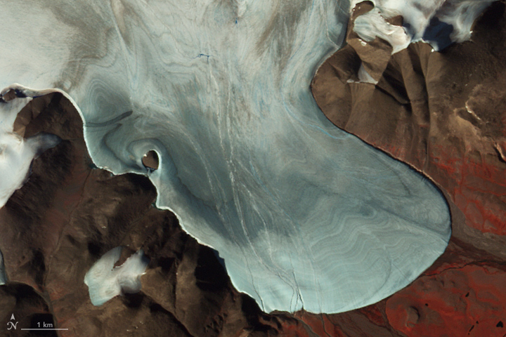
Image Credit: NASA Earth Observatory/ASTER/Jesse Allen
The Advanced Spaceborne Thermal Emissions and Reflection Radiometer (ASTER) instrument on NASA’s Terra satellite acquired an image of the glacier and its surroundings on July 26, 2009. The summertime image shows the glacier free of overlying snow from the previous winter. Banding in the surface of the ice shows different years in which the ice was laid down on the glacier.
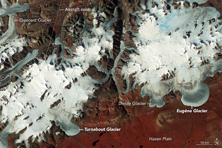
Image Credit: NASA Earth Observatory/ASTER/Jesse Allen
In the wider view, you can see glaciers drain out of ice caps between mountain peaks and ridgelines. Many features, including Turnabout, were first formally cataloged in 1957 and 1958 as part of the first International Geophysical Year (IGY). This area is so far north and the weather so cold much of the year that there has been little in the way of human footprints on the landscape. Hence, features had no official names within the scientific community before the IGY.
Humans have, though, made one visible impact on this image. The line on the top left is a contrail from a plane. Contrails form when water-rich exhaust from jet engines freezes into tiny ice crystals at high altitude.
Compare Turnabout to Eugène Glacier in the wider view. Both are classic piedmont glaciers, but Turnabout exits the mountain pass into the Hazen Plain with some obstacles that cause it to twist and turn before ending and draining into the Turnabout River. Eugène Glacier has no such obstacles and spreads out more evenly.
This false-color image was made by combining observations of near infrared, red, and green light. Red indicates vegetation; the chlorophyll in plants reflects much more strongly in the near infrared than other wavelengths.
On April 18, I had the opportunity to participate in the launch of the newest version of Google Earth, which now includes some collaboration with the NASA Earth Observatory. The Google Earth team even used two image collections from EO to highlight some of the functionality of their new product.
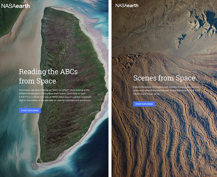
Image Credit: Google Earth screenshot of NASA Earth Observatory imagery.
The first is Reading the ABCs from Space, which is a republishing of our planetary-scale scavenger hunt (which was partly built with assistance from our letter-hunting readers). The second collection is Scenes from Space, a curated selection of recent EO Images of the Day. The Scenes from Space collection will continue to be updated monthly by the Google Earth content team.
This launch event provided us with the opportunity to meet with media and other potential users of the 14,000 images and stories that have been produced by the Earth Observatory team since our establishment in 1999. We syndicate our content through a variety of different feed formats, and the Google Earth team will be utilizing those feeds to keep their NASA Earth content up to date.
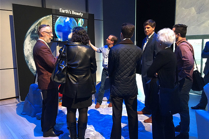
Image Credit: NASA/Jamie Favors
We hope that other users can use these feeds for their various applications, and if you are one of those users, please let us know what we can do to help you. The vast majority of our imagery and all of our stories are freely available without any license restrictions (though we hope that you will provide proper credit). Perhaps you might even consider the Earth Observatory as a resource for the upcoming NASA Space Apps Challenge.
Image Credit: NASA Earth Observatory/Kevin Ward
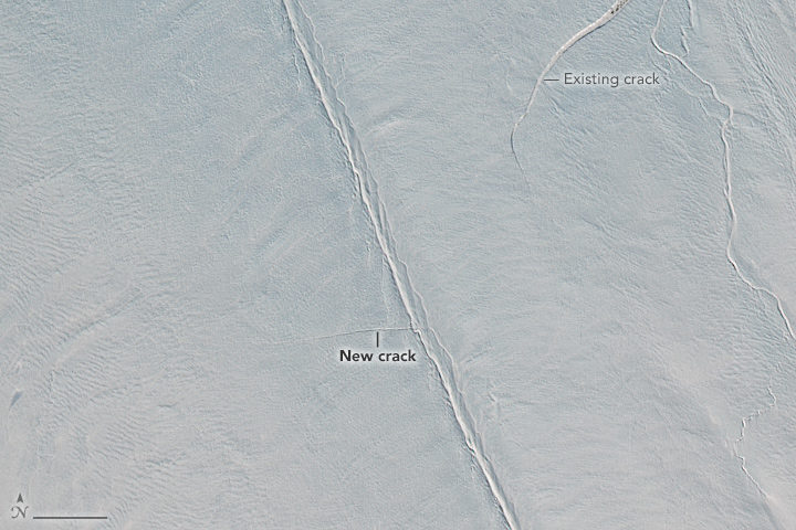
In early April, remote sensing scientist Stef Lhermitte examined Sentinel-2 satellite images and saw a new crack developing on Greenland’s Petermann Glacier. About two weeks later, Landsat 8 also got a look (top image). Read more about that image here.
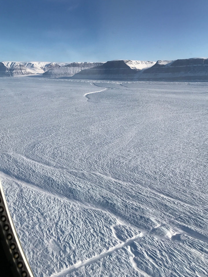
But the space-based view is not the only evidence of a new crack in the large glacier. NASA’s Operation IceBridge has been making science flights in the area this month, and scientists got a first-hand look. Kelly Brunt, a glaciologist at NASA’s Goddard Space Flight Center, snapped the photograph above from a window of a P-3 Orion research plane on April 14. The new crack is the feature running diagonal from the bottom-left of the photo toward the center.
“What’s interesting here is that the crack originated in the center of the glacier, not along the edges,” Brunt said. “When John Sonntag and I were looking for the new crack during the flight, we were looking for something substantial emanating from the edge. This totally surprised me!”
Most cracks start along a glacier’s edge, where a huge amount of strain is produced as the glacier slides along the walls of a fjord. That is especially true for Petermann—a narrow glacier that has previously rifted along the edges of its floating shelf.
Cracks that make their way across an ice shelf can eventually release icebergs. Petermann has launched two huge icebergs since 2010, so scientists are watching for additional retreat. It remains to be seen whether this crack will result in an iceberg. If the crack continues to lengthen, it could potentially meet the older rift at the edge of the glacier, visible near the top-center of the photo.
View more images of the rift and other icy phenomenon here.
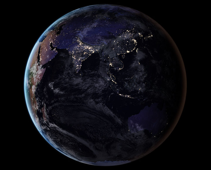
By removing natural and stray light sources, researchers have provided a clearer picture of the human footprint on Earth. Learn more about this image. (NASA Earth Observatory image by Joshua Stevens, using Suomi NPP VIIRS data from Miguel Román, NASA GSFC.)
As we arrive at Earth Day 2017, reporting on Earth science can sometimes feel like a gloomy affair. Global temperatures are at record highs. Arctic sea ice is in pretty bad shape. Bleaching events are taking a toll on coral reefs. And as an interesting article in EOS recently noted, humanity is affecting the very shape of Earth’s surface in unprecedented ways.
“We have altered flood patterns, created barriers to runoff and erosion, funneled sedimentation into specific areas, flattened mountains, piled hills, dredged land from the sea, and even triggered seismic activity,” the authors wrote. (Read our stories about land reclamation in China, mining in Canada, gas and oil infrastructure in Texas, the growing Wax Lake Delta in Louisiana, and the retreat of the Aral Sea to see changes of this nature.)
In spite of the challenges in a changing world, there are reasons to be optimistic. The world has come together to confront global problems before. Levels of protective ozone are stabilizing because of the Montreal Protocol. In the United States and Europe, better technology and regulations have led to drastic reductions in air pollutants such as sulfur dioxide and nitrogen dioxide. There are signs that efforts to clean up the Chesapeake Bay are making a difference.
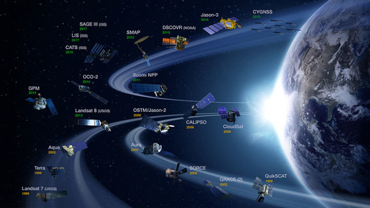
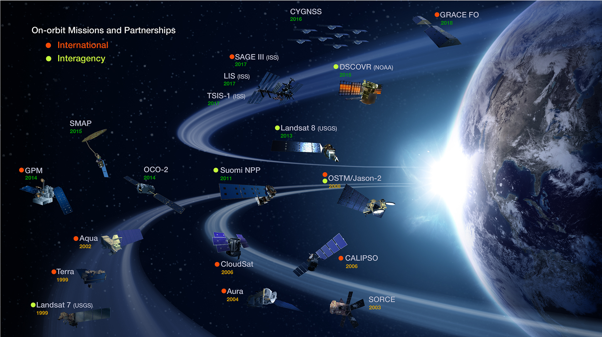
NASA’s operating Earth science missions as of March 31, 2017. (Image Credit: NASA’s Earth Observing Project Science Office.)
Some of the environmental challenges we face are daunting and can seem intractable, but there are some good reasons to feel reassured by the tools and expertise that the scientific community brings to the table. Americans live in a country where the number of deaths due to hurricanes, landslides, floods, droughts, tornadoes, blizzards, and other weather hazards have plummeted over the past century, and that is largely due to better understanding and to appropriate hazards warning systems that Earth scientists have developed.
Computers and instruments that used to take up whole rooms now fit snugly onto autonomous aircraft, satellites, and robots. At this moment, 1,459 satellites orbit Earth—including 19 that are part of the NASA fleet keeping a watchful eye on this dynamic, fragile planet. The authors of the EOS article note that a unified, global, high-resolution 3-D map of the human fingerprint on Earth is within reach due to the remarkable lidar instruments, aerial photogrammetry, and satellite observations that are now available.
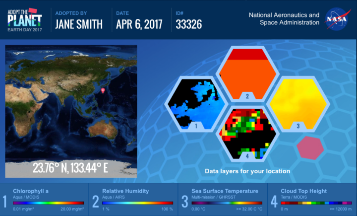
NASA invites people around the world to help us celebrate Earth Day 2017 by “adopting” one of 64,000 individual pieces of Earth as seen from space. Learn more. (Image Credit: NASA)
To get a sense of the sophistication and breadth of the information satellites now collect, just navigate to your home town with NASA’s Worldview browser or take a look at the Earth Observations (NEO) data archive. You will find information on everything from plant health to particulate aerosol levels to fires to city lights.
As you look, keep in mind that NASA isn’t just collecting that data for data’s sake. The Applied Sciences program is focused on making that data useful to citizens, resource managers, and civic planners in ways that make life better here on Earth. So if you plan to celebrate Earth Day by cleaning up trash in your neighborhood or adopting a piece of the planet with NASA, rest assured that you are not alone in working to make the planet just a little bit more livable.
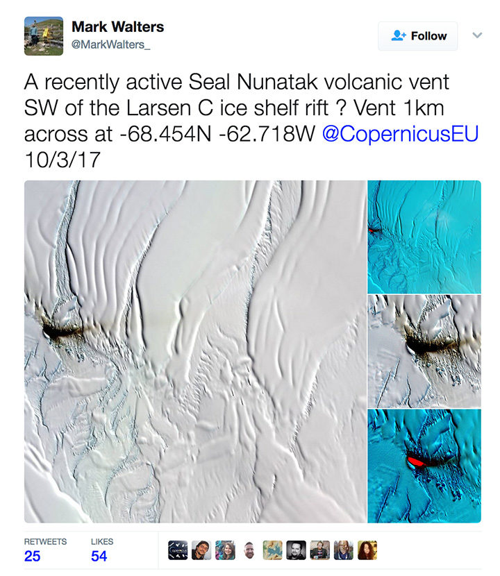
On April 4, 2017, archaeologist Mark Walters tweeted an intriguing set of satellite images of a dark smear on the Larsen C Ice Shelf. Was it volcanic ash from a recently active volcanic vent, he wondered?
The tweet — and especially a bright, red spot in an infrared image (lower right in the screenshot) — generated interest among folks who follow Earth science, Antarctica, and volcanoes. New volcanic activity in this area would be surprising and newsworthy. While there is some evidence of volcanic activity near this part of the Larsen Ice Shelf, the most recent reports date back to 1980.
Some remote sensing experts who saw the images were skeptical. “I looked through about four months of satellite images before/after and never saw anything that resembled a plume. Think it’s dust on ice,” tweeted Erik Klemetti, an associate professor at Denison University and author of Wired’s Eruptions blog.
Later, CNRS scientist Simon Gascoin weighed in, noting that the underlying geology in that area was sedimentary rock—a sign that volcanic activity wasn’t likely. Then he shared even stronger evidence against the idea of volcanic activity.
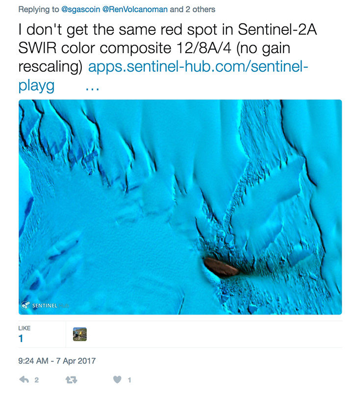
In an email, I asked Gascoin to clarify what he meant by “no gain rescaling” and why his image from the Sentinel Playground looked so different in comparison to the image from Land Viewer.
His reply: “Mark Walters used the Land Viewer, I just checked and found out that the ‘contrast stretching‘ is computed on each RGB band separately. Hence you can get strange results, especially in cases where a single rock island is surrounded by snow and ice which have a very distinct reflectance signature.”
In other words, Gascoin is saying that the image-processing algorithm that drives the Land Viewer browser amplified the reflectance signal from the dust in a way that made it appear stronger in the infrared than it actually was. Sentinel Playground uses a different image processing approach (adjusting the contrast of the image “bands” all at once rather than individually) to avoid the problem.
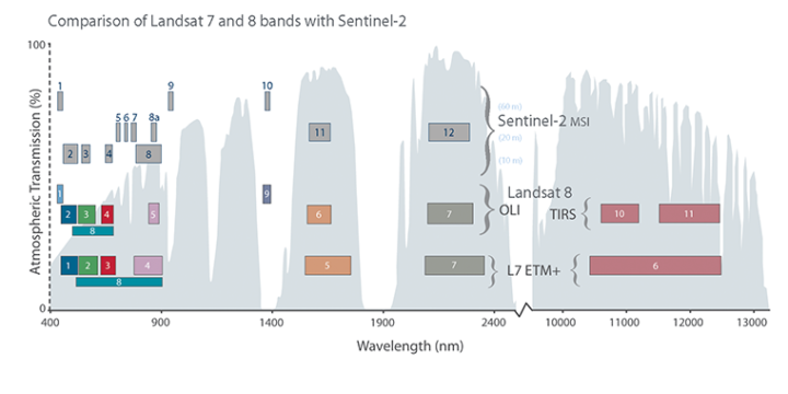
Satellite instruments carry many sensors that are each tuned to a narrow range, or “band,” of wavelengths (just red or green light, for instance). This chart shows how the bands of sensors on the Sentinel-2, Landsat 7, and Landsat 8 satellites compare. To make a satellite image, three different bands are represented in tones of red, green, or blue. A false-color image uses at least one non-visible wavelength, though that band is still represented in red, green, or blue. Read this story to learn more about how observations made in the infrared are displayed in false-color images.
Meanwhile, experts from the Smithsonian’s Global Volcanism Program had arrived at a similar conclusion. “It seems unlikely that this is an eruption for a few reasons,” emailed Benjamin Andrews. “First, Table Nunatak is formed of Cretaceous rocks, with no evidence of recent activity. Second, it is located pretty far from any other volcanoes, and there doesn’t appear to be a good tectonic explanation for current magmatism at Table Nunatak.”
So, the mystery appears to be solved. As interesting as it would have been, there is no new volcanic activity happening in this part of Larsen C.
Bigger isn’t necessarily better—at least where satellites are concerned. Modern “CubeSat” satellites are smaller and more numerous than ever.
The CubeSat takes its name from its dimensions; it is made up of multiples of 10×10×11 centimeter cubic units. A basic CubeSat weighs roughly 3 pounds (1.3 kilograms) and looks a good deal like a portable speaker.
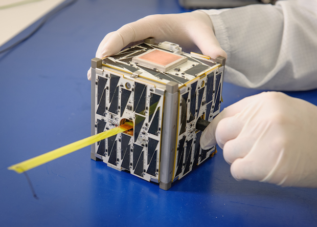
Image by NASA Ames.
BACK TO THEIR ROOTS
Early satellites started out small, too. Launched in 1957, Sputnik weighed around 184 pounds (83 kilograms). America’s first satellite, Explorer I, weighed just under 31 lbs (14 kg). Then, as the desire for more sensors grew, so did the size of satellites. The first American weather satellite, TIROS I, was a hefty 270 lbs (122 kg). But recent years have seen a reversal of this trend.
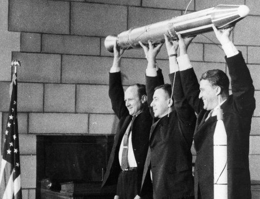
Explorer I. Image by NASA.
Like modern cell phones, satellites have benefited from more compact and more powerful computing technology. (A 1980s cell phone was an expensive, brick-sized gadget that could only place phone calls and store a couple dozen numbers.) Satellites, too, have sprouted new cameras and sensors. Take the IPEX CubeSat developed by NASA’s Jet Propulsion Laboratory (45 seconds into the video below); it can track features like forest fires, volcanic eruptions, and algae blooms.
THE UPSIDES OF BEING SMALL
A satellite today can be a “hitchhiker,” aboard a larger mission, as the video below mentions. Or, a CubeSat can be launched from the International Space Station.
Because they are smaller, CubeSats tend to cost less, so research organizations can deploy more of them. That means more spatial coverage for monitoring the Earth. Where researchers once relied on two or three larger satellites to keep an eye on weather over the Pacific Ocean, now, handfuls of smaller satellites can help with the job.
NASA is not the only organization that builds CubeSats. The space agency has delivered little satellites made by private companies, college students, and even grade school students.
To learn more, watch the video below. Or read more here.
