

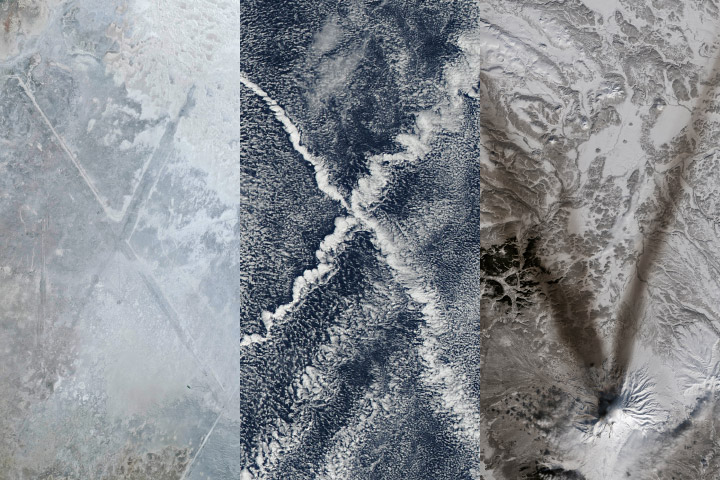
We are kicking off 2025 with much to look forward to but also much to look back on. In 2024, over 7.5 million readers visited our website to read our stories, and many millions more viewed our imagery on the NASAEarth social media channels and elsewhere. Since our founding in 1999 (2024 marked our 25th anniversary), we have produced text and imagery for over 15,700 stories.
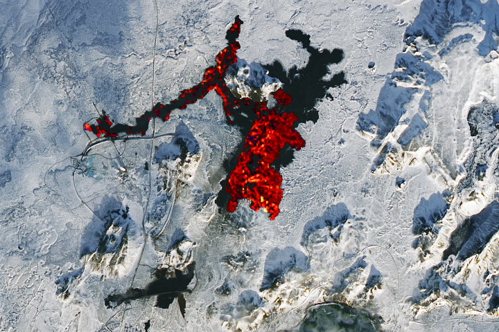
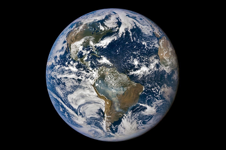
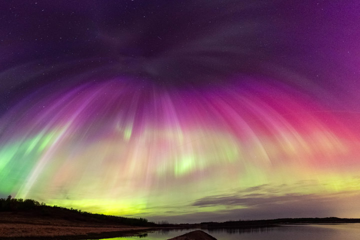
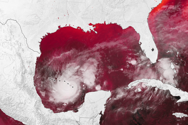
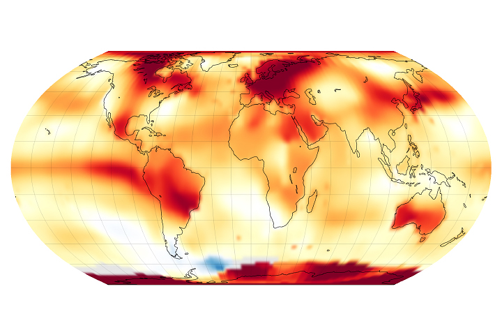
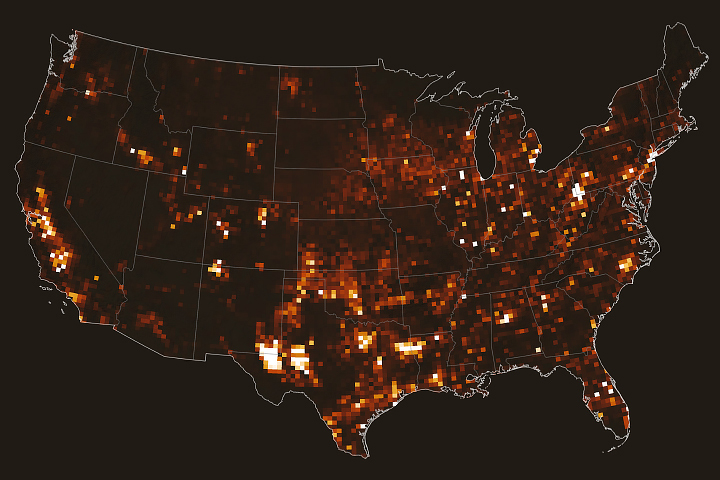

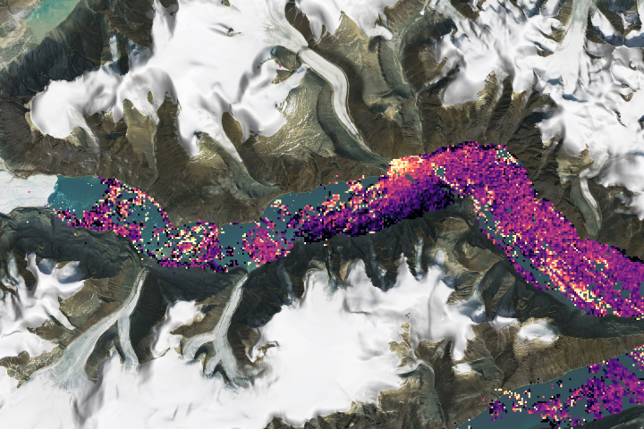
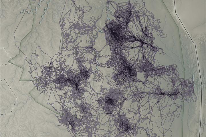
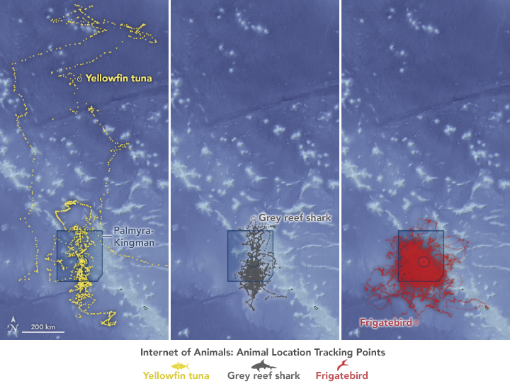
Animals – elephants in Africa (top) and tuna, sharks, and birds in the remote Pacific (bottom) – provide data that complement satellite observations, helping us better understand wildlife ecology in our changing climate.
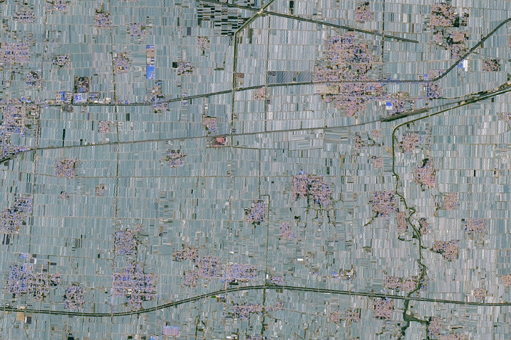
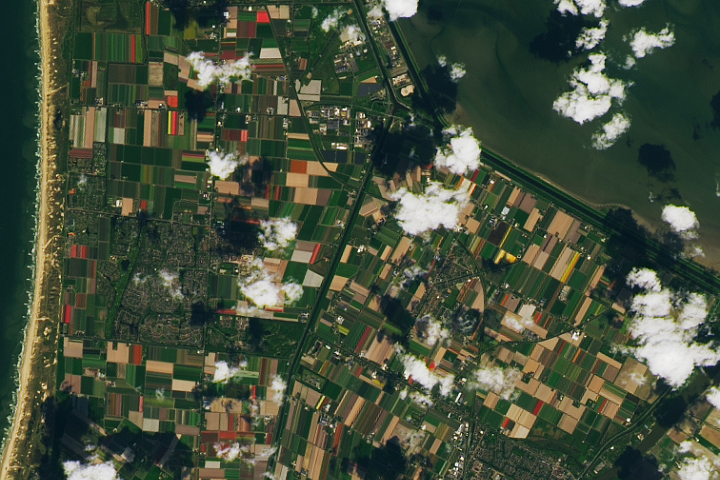
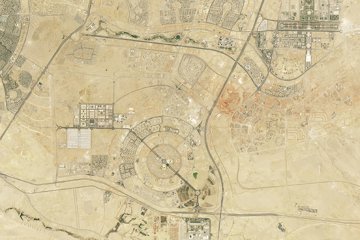
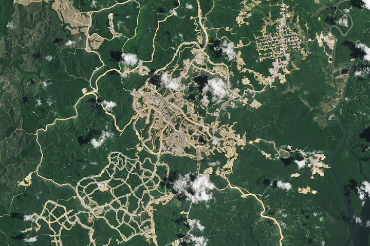
From growing fruits and vegetables in China and flowers in the Netherlands to building new capital cities in Egypt and Indonesia, people have transformed the land.
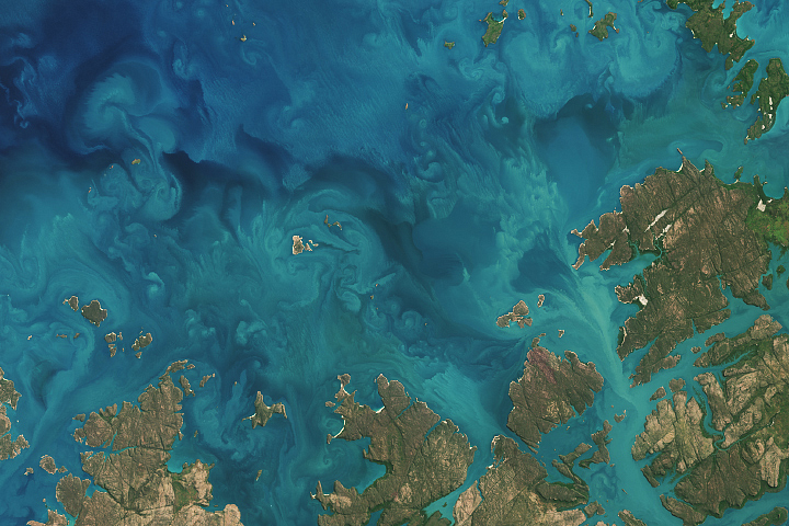
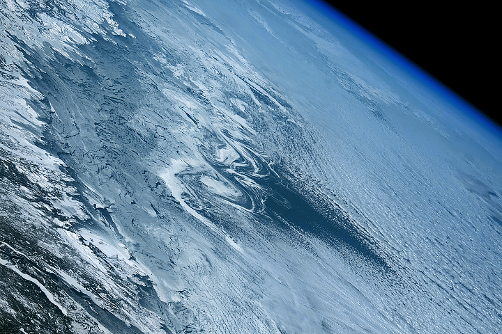
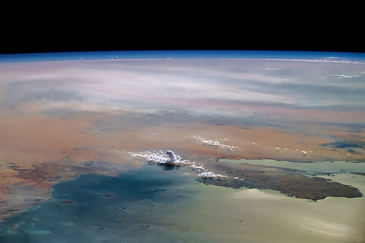
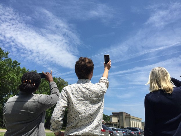
Clouds are an important part of the climate system. They affect how much sunlight reaches the ground and how much heat returns to space, which in turn affects Earth’s temperature and rainfall patterns. Scientists are working to better understand the role that clouds play in the global climate system, but that requires significant amounts of data.
“No single cloud observation method or system … is able to provide a complete and accurate depiction of cloud properties across the Earth under the many conditions that naturally occur,” said Bill Smith, an atmospheric scientist at NASA’s Langley Research Center (LaRC). Cloud observations are gathered by active and passive satellites, ground-based sensors, and, by humans.
The citizen scientists of the GLOBE Program have been playing a vital role in data collection by observing clouds around the globe, especially at times that “match” a satellite flyover. When that happens, the observations from the citizen scientists on the ground are matched with satellite observations that were made near the same time and place. By combining the ground-up view of GLOBE citizen scientists with the top-down view of satellites, scientists get a more complete view of the atmosphere.
Now, the NASA GLOBE Clouds team is hoping to hit a significant milestone: one million matches by the time of the GLOBE annual meeting in late July 2022.

When a GLOBE cloud observation is taken within 15 minutes of a satellite observation, both points of view are coupled, creating a match. Some satellites are geostationary satellites, such as GOES, Himawari, and Meteosat. Others are polar-orbiting satellites, such as Aqua, Terra, and CALIPSO. The satellite-matched data provides an augmented dataset for research. When a match is made, the NASA GLOBE Clouds team sends a personalized email to participants with the matching satellite data. Approximately 4,000 emails are sent to participants each month.

Participants who want to help GLOBE meet their million-match goal this July can photograph clouds, then upload the photographs and classify the clouds using the GLOBE Observer app. Visit the GLOBE Observer website to learn more about the Match to a Million campaign and how you can help NASA learn more about Earth’s atmosphere.
Read more about the value of combining ground and space measurements in the GLOBE blog Counting to a Million Matches and learn more about matching to satellites on the GLOBE Clouds Science page. You can also follow GLOBE on social media and share what you’re doing to help GLOBE match to a million by using the hashtag #GLOBE1M .
The NASA-funded Global Learning and Observations to Benefit the Environment (GLOBE) program was launched on Earth Day in 1995. Over the past 27 years, millions of students in more than 120 countries have collected and entered more than 200 million environmental measurements into the GLOBE database. Those observations include surface temperatures, rainfall amounts, tree heights, land cover, mosquito habitats, and a variety of other environmental observations, including cloud type and coverage.
Cloud enthusiasts and citizen scientists take note: For the next month, you are invited to help NASA investigate clouds during the NASA GLOBE Cloud Challenge 2022: Clouds in a Changing Climate.
There are two ways to participate. The first involves using the GLOBE Observer app to make cloud observations, preferably timed with observations being made by satellites as they pass overhead. Scientists can use such observations to help identify clouds that can be difficult to distinguish in satellite imagery.
You can also participate via the NASA GLOBE CLOUD GAZE. In this app-based program, users look at the photos, identify cloud types, and tag various other elements.
“Are you seeing more precipitating clouds? Are you seeing less of them? Are there more thick, blanketed clouds that cast more shadows, or are you seeing more of those thin high clouds that are ice and don’t cast shadows but hold the heat in the atmosphere?” said Marilé Colón Robles, atmospheric scientist and lead for the GLOBE Clouds Team at NASA’s Langley Research Center. “Each cloud type affects Earth’s energy balance differently. That’s what we’re trying to understand.”
Read more about the challenge in this feature story from NASA Langley. Also, visit the GLOBE Observer website to download the apps and find additional resources—videos, Instagram reels, webinars, and more.
Researchers have found that Earth’s energy imbalance approximately doubled during the 14-year period from 2005 to 2019.
Earth’s climate is determined by a delicate balance between how much of the Sun’s radiative energy is absorbed in the atmosphere and at the surface and how much thermal infrared radiation Earth emits to space. A positive energy imbalance means the Earth system is gaining energy, causing the planet to heat up. The doubling of the energy imbalance is the topic of a recent study published June 15 in Geophysical Research Letters.
Scientists at NASA and the National Oceanic and Atmospheric Administration compared data from two independent sets of measurements. NASA’s Clouds and the Earth’s Radiant Energy System (CERES) satellite sensors measure how much energy enters and leaves Earth’s system. A global array of ocean floats, called Argo, provide data to enable an accurate estimate of the rate at which the world’s oceans are warming. Since approximately 90 percent of the excess energy from an energy imbalance ends up in the ocean, the overall trends of incoming and outgoing radiation should broadly agree with changes in ocean heat content.
“The two very independent ways of looking at changes in Earth’s energy imbalance are in really, really good agreement, and they’re both showing this very large trend, which gives us a lot of confidence that what we’re seeing is a real phenomenon and not just an instrumental artifact,” said Norman Loeb, lead author for the study and principal investigator for CERES at NASA’s Langley Research Center. “The trends we found were quite alarming in a sense.”
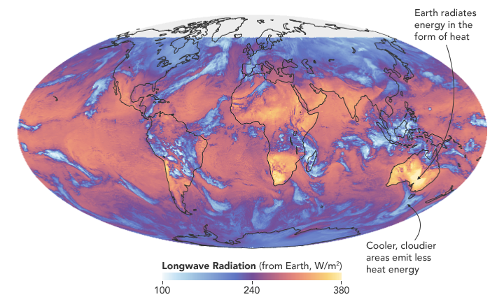
“It’s likely a mix of anthropogenic forcing and internal variability,” said Loeb. “And over this period they’re both causing warming, which leads to a fairly large change in Earth’s energy imbalance. The magnitude of the increase is unprecedented.”
Increases in emissions of greenhouse gases such as carbon dioxide and methane trap heat in the atmosphere, capturing outgoing radiation that would otherwise escape into space. The warming drives other changes, such as the melting of snow and ice, increased water vapor, and cloud changes that can further enhance the warming. Earth’s energy imbalance is the net effect of all these factors.
In order to determine the factors driving the imbalance, the investigators examined changes in clouds, water vapor, trace gases, the output of light from the Sun, Earth’s surface albedo (the amount of light reflected by the surface), atmospheric aerosols, and changes in surface and atmospheric temperature distributions.
The scientists found that the doubling of the energy imbalance is partially the result an increase in greenhouse gases from human activity, also known as anthropogenic forcing. It can also be attributed to increases in water vapor, which traps more outgoing longwave radiation and further contributes to Earth’s energy imbalance. The related decrease in clouds and sea ice also lead to more absorption of solar energy.
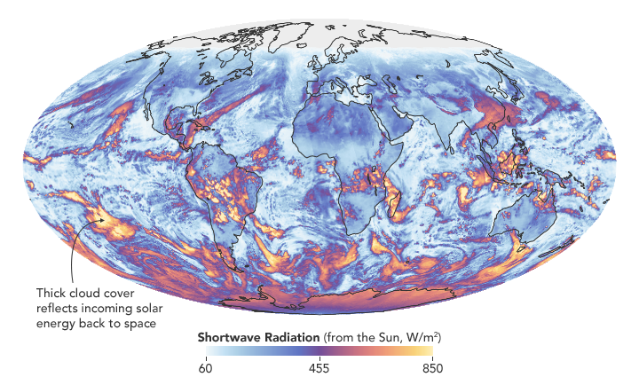
The authors also found that a flip of the Pacific Decadal Oscillation (PDO) from a cool phase to a warm phase likely played a major role in the intensification of the energy imbalance. The PDO is a pattern of Pacific climate variability in which a massive wedge of water in the eastern Pacific goes through cool and warm phases. This naturally occurring internal variability in the ocean can have far-reaching effects on weather and climate. An intensely warm PDO phase that began around 2014 and continued until 2020 caused a widespread reduction in cloud coverage over the ocean and a corresponding increase in the absorption of solar radiation.
“The lengthening and highly complementary records from Argo and CERES have allowed us both to pin down Earth’s energy imbalance with increasing accuracy, and to study its variations and trends with increasing insight, as time goes on,” said Gregory Johnson, co-author on the study and physical oceanographer at NOAA’s Pacific Marine Environmental Laboratory. “Observing the magnitude and variations of this energy imbalance are vital to understanding Earth’s changing climate.”
Loeb cautions that the study is only a snapshot relative to long-term climate change, and that it is not possible to predict with any certainty what the coming decades might look like for Earth’s energy budget. The study does conclude, however, that unless the rate of heat uptake subsides, greater changes in climate should be expected.
Every year, a group of scientists affiliated with the Global Carbon Project give Earth something like an annual checkup. Among the key questions they address: how much carbon is stored in the atmosphere, the ocean, and the land? And how much of that carbon has moved from one reservoir to another through fossil fuel burning, deforestation, reforestation, and uptake by the ocean each year?
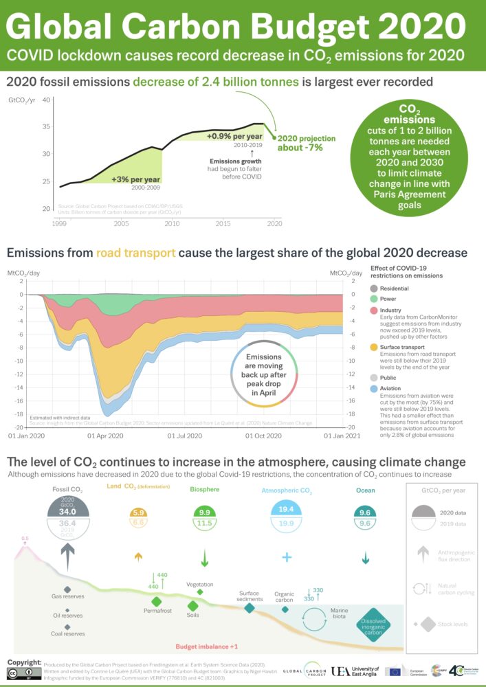
All of the latest findings—including the data for 2020, a year like few others—are available here, including links to dozens of interesting charts and a peer-reviewed science paper. Ben Poulter, a NASA scientist and member of the Global Carbon Project team, summarized the findings this way: “The economic effects of COVID-19 caused fossil fuel emissions to decrease by 7 percent in 2020, but we continued to see atmospheric CO2 concentrations increase, by 2.5 ppm, or about 5.3 PgC. This means that the remaining carbon budget to avoid 1.5 or 2 degrees warming continues to shrink, and that we need to continue to monitor the land, ocean, and atmosphere to understand where fossil fuel CO2 ends up.”
Below are 10 key findings from the most recent report. (Note: the Global Carbon Project team synthesizes a broad range of data, some of which requires time-consuming processing, quality-control, and analysis. While they do report some 2020 numbers, the most recent full year of data available for others is 2019.)
The Global Carbon Budget is produced by more than 80 researchers working from universities and research institutions in 15 countries. Observations from several NASA satellites, sensors, aircraft, and models were among the sources of information used to formulate the 2020 budget. Sources of information supported by NASA included: the MODIS sensors on Aqua and Terra satellites, the Global Fire Emissions Database (GFED), the LPJ land surface carbon exchange model, Landsat, the LUHv2 land-cover change model, the CASA land surface carbon exchange model, ODIAC fossil fuel emissions data, the MERRA-2 reanalysis, the Cooperative Global Atmospheric Data Integration Project, and OCO-2.
If you follow science news, this will probably sound familiar.
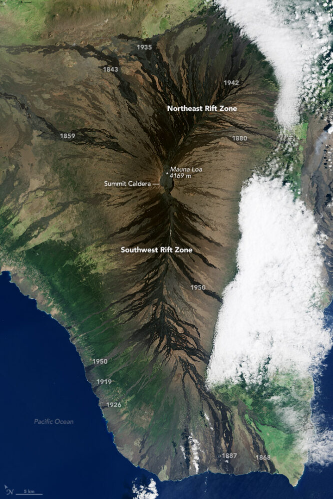
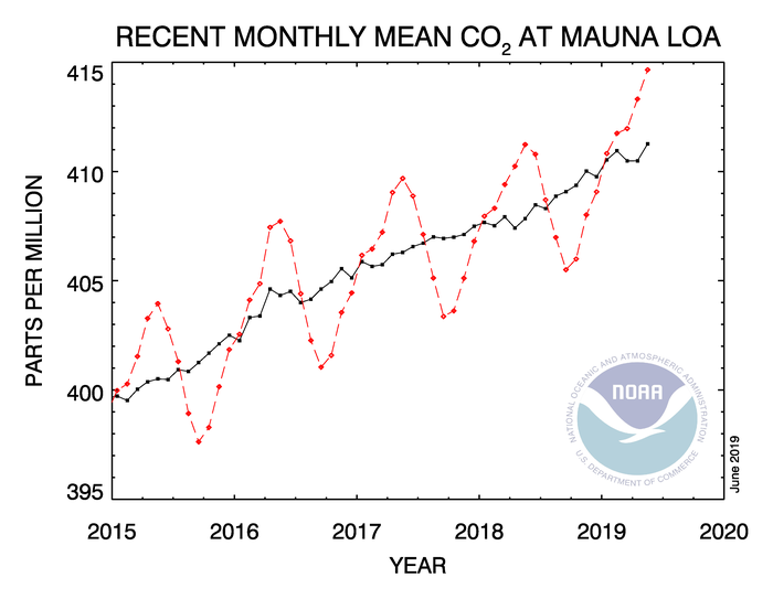
In May 2019, when atmospheric carbon dioxide reached its yearly peak, it set a record. The May average concentration of the greenhouse gas was 414.7 parts per million (ppm), as observed at NOAA’s Mauna Loa Atmospheric Baseline Observatory in Hawaii. That was the highest seasonal peak in 61 years, and the seventh consecutive year with a steep increase, according to NOAA and the Scripps Institution of Oceanography.
The Mauna Loa Observatory has been measuring carbon dioxide since 1958. The remote location (high on a volcano) and scarce vegetation make it a good place to monitor carbon dioxide because it does not have much interference from local sources of the gas. (There are occasional volcanic emissions, but scientists can easily monitor and filter them out.) Mauna Loa is part of a globally distributed network of air sampling sites that measure how much carbon dioxide is in the atmosphere.
The broad consensus among climate scientists is that increasing concentrations of carbon dioxide in the atmosphere are causing temperatures to warm, sea levels to rise, oceans to grow more acidic, and rainstorms, droughts, floods and fires to become more severe. Here are six less widely known but interesting things to know about carbon dioxide.
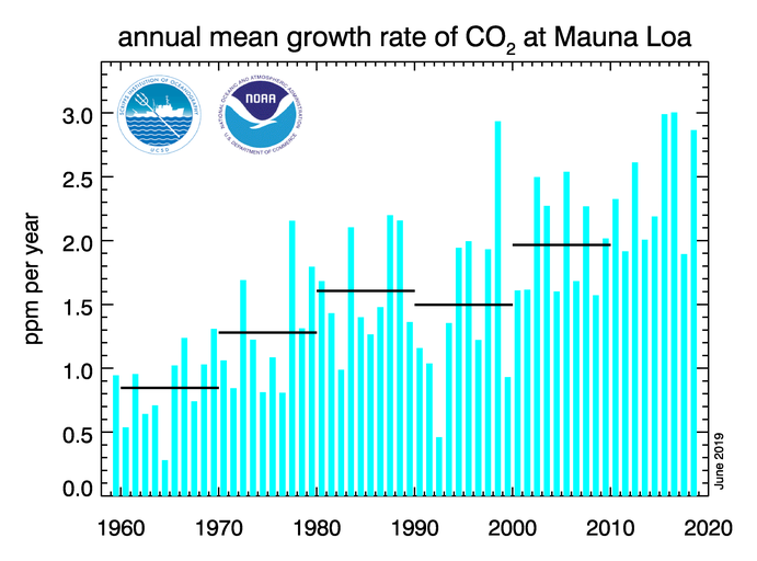
For decades, carbon dioxide concentrations have been increasing every year. In the 1960s, Mauna Loa saw annual increases around 0.8 ppm per year. By the 1980s and 1990s, the growth rate was up to 1.5 ppm year. Now it is above 2 ppm per year. There is “abundant and conclusive evidence” that the acceleration is caused by increased emissions, according to Pieter Tans, senior scientist with NOAA’s Global Monitoring Division.
To understand carbon dioxide variations prior to 1958, scientists rely on ice cores. Researchers have drilled deep into icepack in Antarctica and Greenland and taken samples of ice that are thousands of years old. That old ice contains trapped air bubbles that make it possible for scientists to reconstruct past carbon dioxide levels. The video below, produced by NOAA, illustrates this data set in beautiful detail. Notice how the variations and seasonal “noise” in the observations at short time scales fade away as you look at longer time scales.
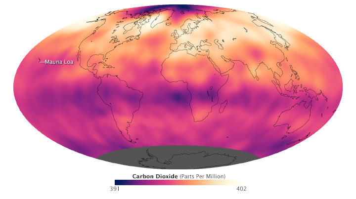
Satellite observations show carbon dioxide in the air can be somewhat patchy, with high concentrations in some places and lower concentrations in others. For instance, the map below shows carbon dioxide levels for May 2013 in the mid-troposphere, the part of the atmosphere where most weather occurs. At the time there was more carbon dioxide in the northern hemisphere because crops, grasses, and trees hadn’t greened up yet and absorbed some of the gas. The transport and distribution of CO2 throughout the atmosphere is controlled by the jet stream, large weather systems, and other large-scale atmospheric circulations. This patchiness has raised interesting questions about how carbon dioxide is transported from one part of the atmosphere to another—both horizontally and vertically.
In this animation from NASA’s Scientific Visualization Studio, big plumes of carbon dioxide stream from cities in North America, Asia, and Europe. They also rise from areas with active crop fires or wildfires. Yet these plumes quickly get mixed as they rise and encounter high-altitude winds. In the visualization, reds and yellows show regions of higher than average CO2, while blues show regions lower than average. The pulsing of the data is caused by the day/night cycle of plant photosynthesis at the ground. This view highlights carbon dioxide emissions from crop fires in South America and Africa. The carbon dioxide can be transported over long distances, but notice how mountains can block the flow of the gas.
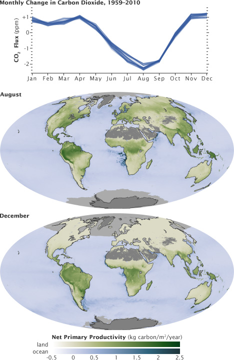
You’ll notice that there is a distinct sawtooth pattern in charts that show how carbon dioxide is changing over time. There are peaks and dips in carbon dioxide caused by seasonal changes in vegetation. Plants, trees, and crops absorb carbon dioxide, so seasons with more vegetation have lower levels of the gas. Carbon dioxide concentrations typically peak in April and May because decomposing leaves in forests in the Northern Hemisphere (particularly Canada and Russia) have been adding carbon dioxide to the air all winter, while new leaves have not yet sprouted and absorbed much of the gas. In the chart and maps below, the ebb and flow of the carbon cycle is visible by comparing the monthly changes in carbon dioxide with the globe’s net primary productivity, a measure of how much carbon dioxide vegetation consume during photosynthesis minus the amount they release during respiration. Notice that carbon dioxide dips in Northern Hemisphere summer.
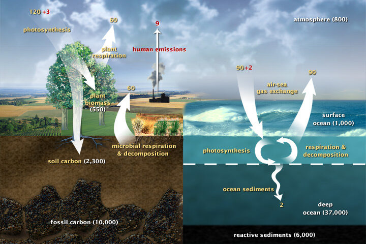
Most of Earth’s carbon—about 65,500 billion metric tons—is stored in rocks. The rest resides in the ocean, atmosphere, plants, soil, and fossil fuels. Carbon flows between each reservoir in the carbon cycle, which has slow and fast components. Any change in the cycle that shifts carbon out of one reservoir puts more carbon into other reservoirs. Any changes that put more carbon gases into the atmosphere result in warmer air temperatures. That’s why burning fossil fuels or wildfires are not the only factors determining what happens with atmospheric carbon dioxide. Things like the activity of phytoplankton, the health of the world’s forests, and the ways we change the landscapes through farming or building can play critical roles as well. Read more about the carbon cycle here.
Lately, it feels like we’re hearing about wildfires erupting in the western United States more often. But how have wildfire occurrences changed over the decades?
Researchers with the NASA-funded Rehabilitation Capability Convergence for Ecosystem Recovery (RECOVER) have analyzed more than 40,000 fires from Colorado to California between 1950 to 2017 to learn how wildfire frequency, size, location, and a few other traits have changed.
Here are six trends they have observed in the western United States:
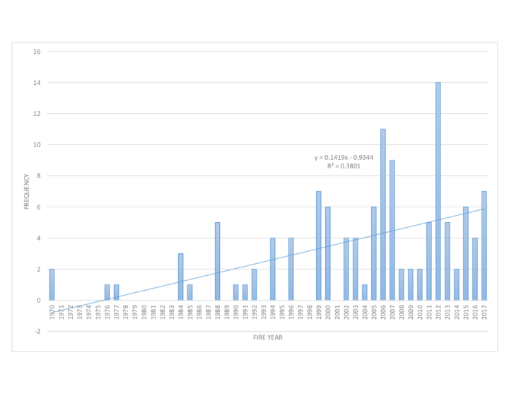
Over the past six decades, there has been a steady increase in the number of fires in the western U.S. In fact, the majority of western fires—61 percent—have occurred since 2000 (shown in the graph below).
Those fires are also burning more acres of land. The average annual amount of acres burned has been steadily increasing since 1950. The number of megafires—fires that burn more than 100,000 acres (156 square miles)—has increased in the past two decades.
Source: NASA RECOVER / Keith Weber
The recent increase in fire frequency and size is likely related to a few reasons, including the rise of global temperatures since the start of the new millennia. Seventeen of the 18 warmest years on record have occurred since 2001.
Global temperatures can affect local fire conditions. Amber Soja, a wildfire expert at NASA’s Langley Research Center, said fire-weather conditions—high temperatures, low relative humidity, high wind speed, and low precipitation—can increase dryness and make vegetation in the west easier to burn. “Those fire conditions all fall under weather and climate,” said Soja. “The weather will change as Earth warms, and we’re seeing that happen.”
Even though fire frequency and size has increased, only a small percentage of western lands— 11 percent—has burned since 1950. In this map, wildfires are shown in orange. Private lands are shown in purple while public lands are clear (no color). The location of wildfires was random; that is, there was no bias toward fires affecting private or public land.
Keith Weber, a professor at Idaho State University who led the analysis, was surprised at the 11 percent figure. There’s no clear reason yet for why more of the region hasn’t burned. “Some of the 89% may not burn because it has low susceptibility—not dry enough or it has low fuel (vegetation),” said Weber. “Some areas may be really ripe for a fire, but they have not had an ignition source yet.”
How has only 11 percent of the west burned, yet the annual number of acres burned and the frequency of fire increased? It turns out that many fires are occurring in areas that have already experienced fires, known as burn-on-burn effects. About 3 percent—almost a third of the burned land—has seen repeated fire activity.
The map here shows the locations of repeated fire activity. While you can’t see it at this map’s resolution, some areas have experienced as many as 11 fires since 1950. In those areas, fires occurred about every seven years, said Weber, which is about the amount of time it takes for an ecosystem to build up enough vegetation to burn again.
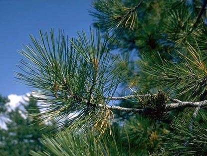
Since 2000, wildfires have shifted from burning shrub-lands to burning conifers. The Southern Rocky Mountains Ponderosa Pine Woodland landscape has experienced the most acres burned—more than 3 million.
The reason might lie within the tree species. Ponderosa Pine is a fire-adapted species. With its thick and flaky bark, the tree can withstand low-intensity surface fires. It also drops branches lower as they age, which deters fire from climbing up the tree and burning their green needles. “The fire will remove forest undergrowth, but will be just fine for the pines,” said Weber. “We are starting to see Ponderosa Pines thrive in those areas.”
Source: National Park Service
Research suggests that global warming is predicted to increase the number of very large fires (more than 50,000 acres) in the western United States by the middle of the century (2041-2070).
The map below shows the projected increase in the number of “very large fire weeks”—periods where conditions will be conducive to very large fires—by mid-century (2041-2070) compared to the recent past (1971-2000). The projections are based on scenarios where carbon dioxide emissions continue to increase.
According the Fourth National Climate Assessment, wildfires are expected to affect human health and several industries:
More about the source data:
Unless otherwise stated in the article, these data come from NASA’s Rehabilitation Capability Convergence for Ecosystem Recovery. RECOVER is an online mapping tool that pulls together data on 26 different variables useful for fires managers, such as burn severity, land slope, vegetation, soil type, and historical wildfires. In the past, fire managers might need several days or weeks to assemble and present such a large amount of information. RECOVER does so in five minutes, with the help of sophisticated server technologies that gather data from a multitude of sources. Funded by NASA’s Applied Science Program, RECOVER provides these data on specific fires to help fire managers to start rehabilitation plans earlier and implement recovery efforts quickly.
The researchers used the data layer showing historical fires since 1950, which were compiled from comprehensive databases by the U.S. Geological Survey Geospatial Multi-Agency Coordination, National Interagency Fire Center, Bureau of Land Management, U.S. Forest Service, and various state agencies such as the California Department of Forestry and Fire Protection. The historical fires do not include prescribed fires and undocumented fires. Learn more about the RECOVER program and its recent involvement with the Woosley Fire.
"The key thing to remember from this report is that it's clear that the best time to have reduced emissions was 25 years ago," @ClimateofGavin of @NASAGoddard/@GISS tells @WmBrangham. "But the second best to reduce emissions is right now." pic.twitter.com/ndMIzRSS0t
— PBS News Hour (@NewsHour) October 8, 2018
In October 2018, the Intergovernmental Panel on Climate Change (IPCC) released yet another sobering report about the planetary disruption happening because of all the carbon human activity puts into the atmosphere.
Many parts of the world are already seeing rising sea levels, hotter temperatures, more extreme precipitation and droughts, more acidic oceans, and faster rates of extinctions, the scientists said. And without dramatic reductions in carbon emissions to keep warming below 1.5 degrees Celsius, the problems are going to get far worse.
In just one sentence, Gavin Schmidt, director of NASA’s Goddard Institute for Space Studies, captured the essence of the report. “The key thing to remember is that it’s clear that the best time to have reduced emissions was 25 years ago,” he said during an interview with PBS News Hour. “But the second best time to reduce emissions is right now.”
Like any good scientist, Schmidt is always quick to give credit where credit is due. In this case, he noted that what he said on television was a riff on something that renowned Kenyan marathoner Eliud Kipchoge once said. “The best time to plant a tree was 25 years ago. The second-best time to plant a tree is today,” The New York Times quoted the marathon world record holder as saying.
If you are wondering what the IPCC authors based their findings on, there is no shortage of information to explore. Each chapter of the report has a supplementary information section with dozens of references that detail the evidence the scientists used to draw their conclusions.
For more details, the IPCC also put together a succinct summary for policy makers, a press release, headline statements, and FAQs. Also, below are a few other good resources if you’re looking to understand some of the basics about climate change.
+NASA’s Global Climate Change Evidence Page
+NASA Earth Observatory’s Global Temperatures World of Change
+NOAA Climate Education Resources
+Skeptical Science Climate Change Myths
According to an ongoing temperature analysis conducted by scientists at NASA’s Goddard Institute for Space Studies, the average global temperature on Earth has increased by about 0.8° Celsius (1.4° Fahrenheit) since 1880. Two-thirds of the warming has occurred since 1975, at a rate of roughly 0.15-0.20°C per decade. Read more about this map here.
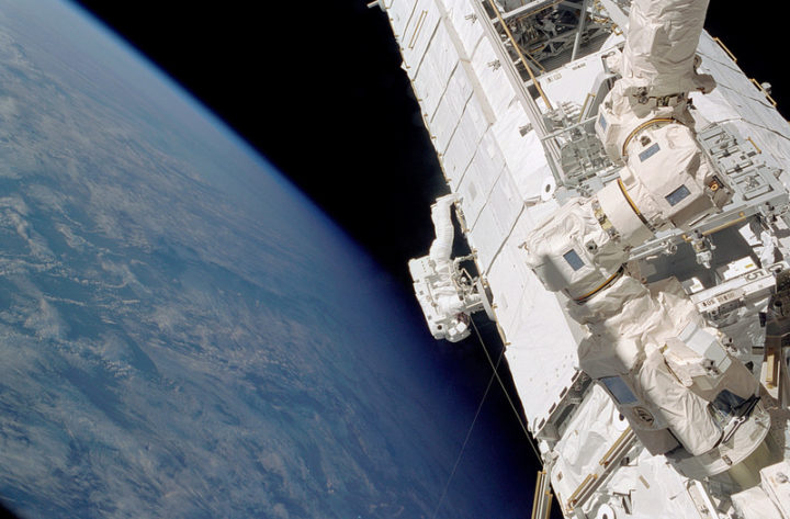
Piers Sellers during a spacewalk outside of the International Space Station. Credit: NASA
Astronaut and scientist Piers Sellers is no longer with us, but his words still resonate.
A posthumous plea from Sellers arrived in July 2018 in the form of an article in PNAS. The topic was one that he cared deeply about: building a better space-based system for observing and understanding the carbon cycle and its climate feedbacks.
As NASA’s Patrick Lynch reported, Sellers wrote the paper along with colleagues at NASA’s Jet Propulsion Laboratory and the University of Oklahoma. Work on the paper began in 2015, and Sellers continued working with his collaborators up until about six weeks before he died. They carried on the research and writing of the paper until its publication in July 2018.
The carbon cycle refers to the constant flow of carbon between rocks, water, the atmosphere, plants, soil, and fossil fuels. Climate change feedbacks—natural effects that may amplify or diminish the human emissions of greenhouse gases—are one of the most poorly understood aspects of climate science.
Here is how Sellers and colleagues characterized the current state of the carbon cycle in the PNAS article:
“It is quite remarkable and telling that human activity has significantly altered carbon cycling at the planetary scale. The atmospheric concentrations of carbon dioxide (CO2) and methane (CH4) have dramatically exceeded their envelope of the last several million years.”
They also explain in detail how we have altered the carbon cycle:
“The perturbation by humans occurs first and foremost through the transfer of carbon from geological reservoirs (fossil fuels) into the active land–atmosphere–ocean system and, secondarily, through the transfer of biotic carbon from forests, soils, and other terrestrial storage pools (e.g., industrial timber) into the atmosphere.”
Scientists understand the broad outlines of how this works relatively well. What worried Sellers was the potential curve balls the climate might throw at us with unanticipated feedbacks. They addressed some of the the challenges in understanding how climate change might affect concentrations of carbon dioxide and methane through feedbacks.
For carbon dioxide:
“While experimental studies consistently show increases in plant growth rates under elevated CO2 (termed carbon dioxide fertilization), the extrapolation of even the largest-scale experiments to ecosystem carbon storage is problematic, and some ecologists have argued that the physiological response could be eliminated entirely by restrictions due to limitation by nutrients or micronutrients. However, there is recent evidence from the atmosphere that suggests increasing CO2 enhances terrestrial carbon storage, leading to the continued increase in land uptake paralleling CO2 concentrations.”
As we detailed in a separate story, the situation is even more complicated for methane. Sellers and his colleagues explained some of the challenges in understanding the feedbacks that affect that potent greenhouse gas this way:
“Atmospheric methane is currently at three times its preindustrial levels, which is clearly driven by anthropogenic emissions, but equally clearly, some of the change is because of carbon-cycle–climate feedbacks. Atmospheric CH4 rose by about 1 percent per year in the 1970s and 1980s, plateaued in the 1990s, and resumed a steady rise after 2006. Why did the plateau occur? These trends in atmospheric methane concentration are not understood. They may be due to changes in climate: increases in temperature, shifts in the precipitation patterns, changes to wetlands, or proliferation in the carbon availability to methane-producing bacteria.”
The consequences of the gaps in understanding could be significant.
“Terrestrial tropical ecosystem feedbacks from the El Nino drove an ∼2-PgC increase in global CO2 emissions in 2015. If emissions excursions such as this become more frequent or persistent in the future, agreed-upon mitigation commitments could become ineffective in meeting climate stabilization targets. Earth system models disagree wildly about the magnitude and frequency of carbon–climate feedback events, and data to this point have been astonishingly ineffective at reducing this uncertainty.”
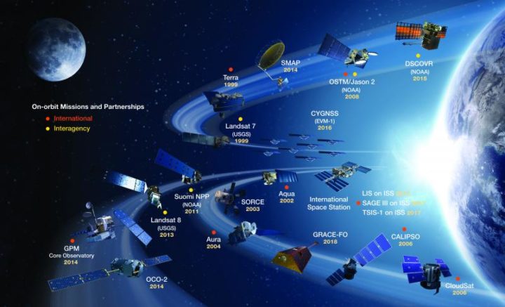
NASA’s current missions and partnership missions in orbit. Credit: NASA
Sellers and his colleagues do offer a solution. It has much to do with satellites.
“Space-based observations provide the global coverage, spatial and temporal sampling, and suite of carbon cycle observations required to resolve net carbon fluxes into their component fluxes (photosynthesis, respiration, and biomass burning). These space-based data substantially reduce ambiguity about what is happening in the present and enable us to falsify models more effectively than previous datasets could, leading to more informed projections.”
This is a cross-post of a story by Ellen Gray. It provides deeper insight into our May 23 Image of the Day.
Six months after GRACE launched in March 2002, we got our first look at the data fields. They had these big vertical, pole-to-pole stripes that obscured everything. We’re like, holy cow this is garbage. All this work and it’s going to be useless.
But it didn’t take the science team long to realize that they could use some pretty common data filters to remove the noise, and after that they were able to clean up the fields and we could see quite a bit more of the signal. We definitely breathed a sigh of relief. Steadily over the course of the mission, the science team became better and better at processing the data, removing errors, and some of the features came into focus. Then it became clear that we could do useful things with it.
It only took a couple of years. By 2004, 2005, the science team working on mass changes in the Arctic and Antarctic could see the ice sheet depletion of Greenland and Antarctica. We’d never been able before to get the total mass change of ice being lost. It was always the elevation changes – there’s this much ice, we guess – but this was like wow, this is the real number.
Not long after that we started to see, maybe, that there were some trends on the land, although it’s a little harder on the land because with terrestrial water storage — the groundwater, soil moisture, snow, and everything. There’s inter-annual variability, so if you go from a drought one year to wet a couple years later, it will look like you’re gaining all this water, but really, it’s just natural variability.
By around 2006, there was a pretty clear trend over Northern India. At the GRACE science team meeting, it turned out another group had noticed that as well. We were friendly with them, so we decided to work on it separately. Our research ended up being published in 2009, a couple years after the trends had started to become apparent. By the time we looked at India, we knew that there were other trends around the world. Slowly not just our team but all sorts of teams, all different scientists around the world, were looking at different apparent trends and diagnosing them and trying to decide if they were real and what was causing them.
I think the map, the global trends map, is the key. By 2010 we were getting the broad-brush outline, and I wanted to tell a story about what is happening in that map. For me the easiest way was to just look at the data around the continents and talk about the major blobs of red or blue that you see and explain each one of them and not worry about what country it’s in or placing it in a climate region or whatever. We can just draw an outline around these big blobs. Water is being gained or lost. The possible explanations are not that difficult to understand. It’s just trying to figure out which one is right.
Not everywhere you see as red or blue on the map is a real trend. It could be natural variability in part of the cycle where freshwater is increasing or decreasing. But some of the blobs were real trends. If it’s lined up in a place where we know that there’s a lot of agriculture, that they’re using a lot of water for irrigation, there’s a good chance it’s a decreasing trend that’s caused by human-induced groundwater depletion.
And then, there’s the question: are any of the changes related to climate change? There have been predictions of precipitation changes, that they’re going to get more precipitation in the high latitudes and more precipitation as rain as opposed to snow. Sometimes people say that the wet get wetter and the dry get dryer. That’s not always the case, but we’ve been looking for that sort of thing. These are large-scale features that are observed by a relatively new satellite system and we’re lucky enough to be some of the first to try and explain them.
The past couple years when I’d been working the most intensely on the map, the best parts of my time in the office were when I was working on it. Because I’m a lab chief, I spend about half my time on managerial and administrative things. But I love being able to do the science, and in particular this, looking at the GRACE data, trying to diagnose what’s happening, has been very enjoyable and fulfilling. We’ve been scrutinizing this map going on eight, nine years now, and I really do have a strong connection to it.
What kept me up at night was finding the right explanations and the evidence to support our hypotheses – or evidence to say that this hypothesis is wrong and we need to consider something else. In some cases, you have a strong feeling you know what’s happening but there’s no published paper or data that supports it. Or maybe there is anecdotal evidence or a map that corroborates what you think but is not enough to quantify it. So being able to come up with defendable explanations is what kept me up at night. I knew the reviewers, rightly, couldn’t let us just go and be completely speculative. We have to back up everything we say.
The world is a complicated place. I think it helped, in the end, that we categorized these changes as natural variability or as a direct human impact or a climate change related impact. But then there can be a mix of those – any of those three can be combined, and when they’re combined, that’s when it’s more difficult to disentangle them and say this one is dominant or whatever. It’s often not obvious. Because these are moving parts and particularly with the natural variability, you know it’s going to take another 15 years, probably the length of the GRACE Follow-On mission, before we become completely confident about some of these. So it’ll be interesting to return to this in 15 years and see which ones we got right and which ones we got wrong.
You can read about Matt’s research here: https://go.nasa.gov/2L7LXoP.