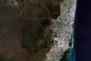
A satellite image is more than a photo. It is a picture of the amount and type of energy reflected or emitted by the Earth and recorded by a satellite instrument. There are many ways to combine those measurements to create an image, and each combination provides different insights.
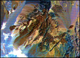
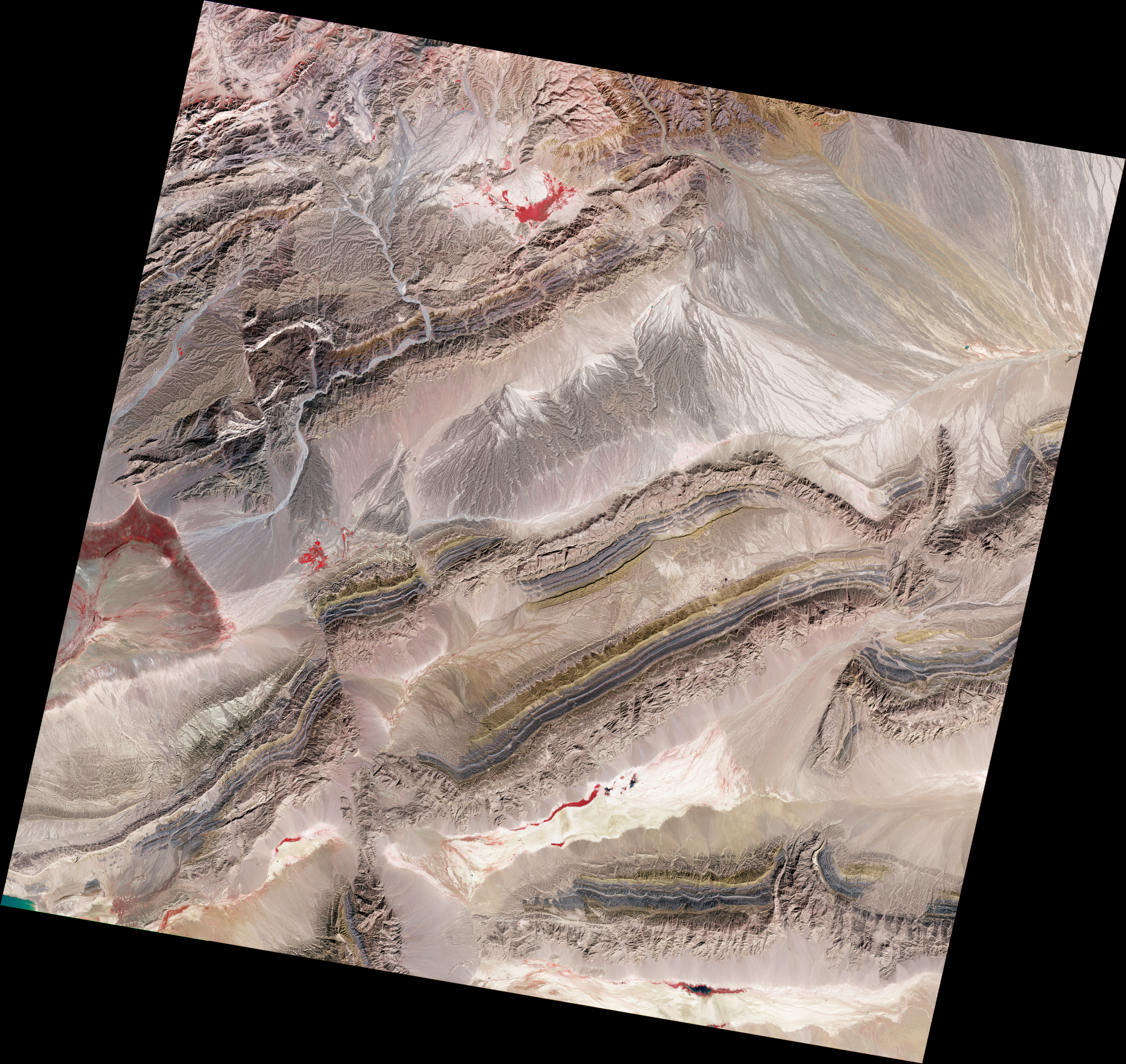
The spectacular exposed geology of northwestern China offers an ideal landscape for illustrating how satellite measurements can identify minerals from afar. In satellite imagery, this area has three different sedimentary rock layers that are visible as rainbow stripes on a series of ridges. The Piqiang Fault has split the ridgeline, so the colored layers are offset by about three kilometers (two miles). All of the images on this page were made from data acquired on February 24, 2005, by the Advanced Spaceborne Thermal Emission and Reflection Radiometer (ASTER) on NASA’s Terra satellite.
A satellite image is made by combining observations from three different wavelengths of light. A natural color image—one in which the colors are similar to a person’s vision—is made with red, green, and blue light. The image above is a false-color image made with a combination of near infrared, red, and green light. Since near infrared is outside of a human’s range of vision, it is assigned to look red in this image. By scientific convention, red light is assigned to look green, and green light is shown in shades of blue, a combination that matches traditional infrared film.
When all three are combined, the landscape takes on the colors shown above. Plants are dark red, but the striped ridges remain similar to their appearance in a natural color view. The gold layers on the north side of the ridge line are Devonian sandstone. The dark gray layers are Silurian sandstone, and the light brown layers are Cambrian-Ordovician limestone. (See Faults in Xinjiang for more information.) The plants are red because they reflect a lot of near infrared light, the wavelength assigned to be red in the image; they reflect very little red light, the wavelength assigned to be green.
Combining observations from three different wavelengths is just the first step in creating a satellite image. The next step is to optimize the contrast, an adjustment similar to fixing the light exposure in a photograph. If you were to chart the amount of near infrared light in the scene above as a line graph, you would see peaks where lots of light is reflected and valleys where little is reflected. In an image, these peaks and valleys are depicted with different shading. The image below, for example, shows the near infrared measurements from the top image in shades of gray. It is bright where the most near infrared light is reflected—the peaks on the line graph—and it is dark where less near infrared is reflected.
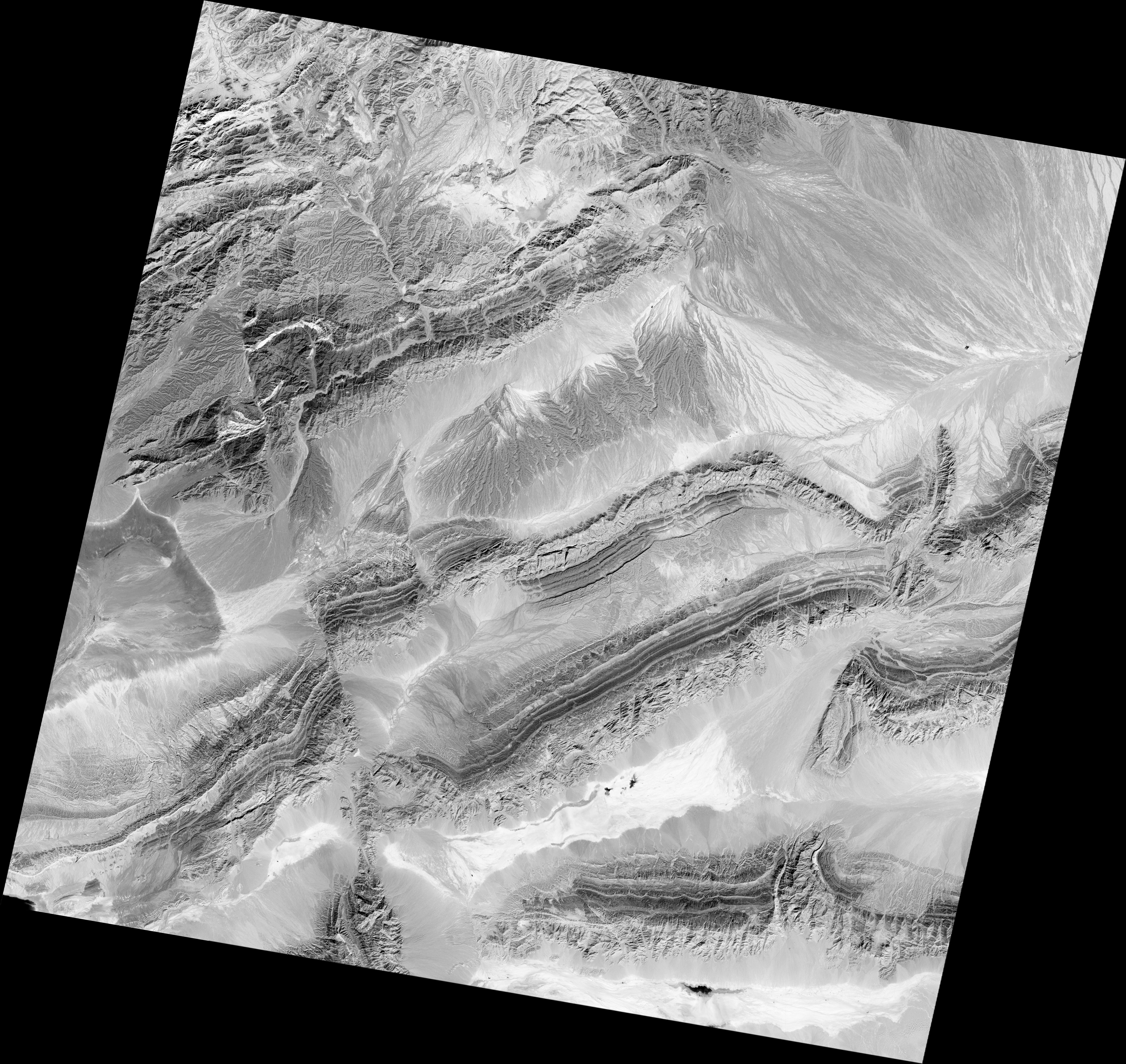
Often the values in the line graph will be bunched in one area, with many pixels reflecting moderate amounts of light and a few reflecting either no light or a lot of light. When we translated that line graph into shades of gray in the above image, we made the highest peak white and the lowest valley black and all of the values in between a shade of gray. This effectively “stretches” the image to include black, white, and every shade in between; this makes small features more distinct.
Sometimes a scientist might want to “stretch” an image using a value other than color. The image below is an example. It uses three different wavelengths of shortwave infrared light to expose mineralogy. If you were to draw line graphs for the three shortwave infrared wavelengths in this image, they would look pretty similar. But if a scientist wanted to emphasize the minor variations, she or he could use mathematics to emphasize the differences between those graphs. The result is three line graphs that have the same relationship to the original data.
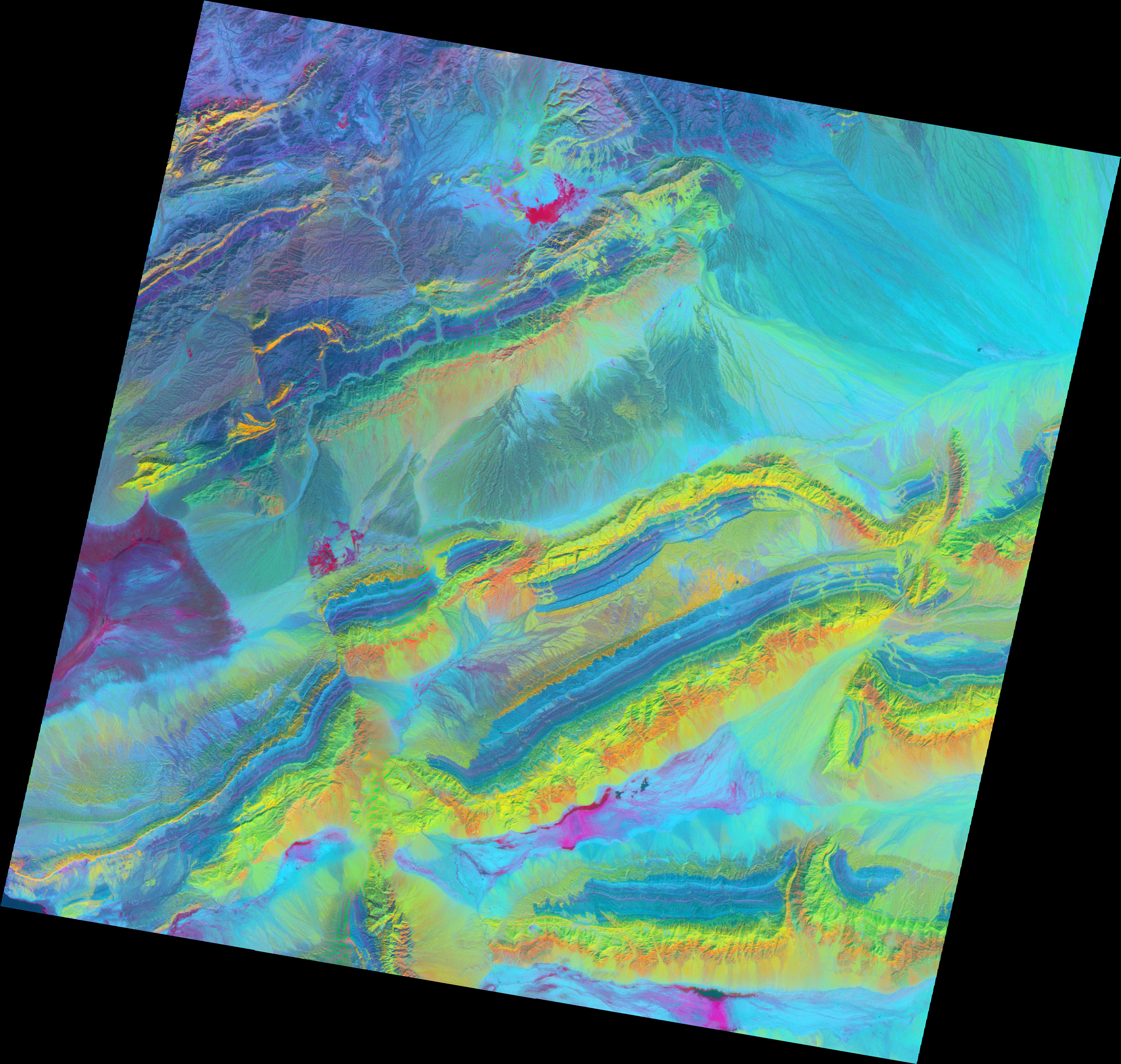
After performing the mathematical stretch, the scientist will assign the stretched grayscale images to colors and create a new picture. This type of stretch is called

Performing a decorrelation stretch on three thermal infrared wavelengths emphasizes the difference between sandstone and other mineral types. The sandstone features are red, while everything else is green.
These images help geologists see patterns that might be otherwise difficult to pick out. They can then figure out specific mineral types by comparing the spectral signatures in satellite images with reference graphs for known minerals.
To learn more about how scientists use different wavelengths of light to learn about the world, see the Earth Observatory feature, Why is that forest red and that cloud blue? How to interpret a false-color satellite image.
NASA image by Robert Simmon with ASTER data. Caption by Holli Riebeek with information and review provided by David Mayer, Robert Simmon, and Michael Abrams.