Chances are, you have a camera near you as you read this—in the smart phone in your pocket or on the tablet or computer you’re using to view this page. Some of you might have a 35 mm film or digital camera nearby. And at some point this week, you probably looked through photos posted by friends or even strangers on the Internet. In our photo-saturated world, it’s natural to think of the images on the Earth Observatory as snapshots from space. But most aren’t.
Though they may look similar, photographs and satellite images are fundamentally different. A photograph is made when light is focused and captured on a light-sensitive surface (such as film or a CCD). A satellite image is created by combining measurements of the intensity of certain wavelengths of light, both visible and invisible to human eyes.
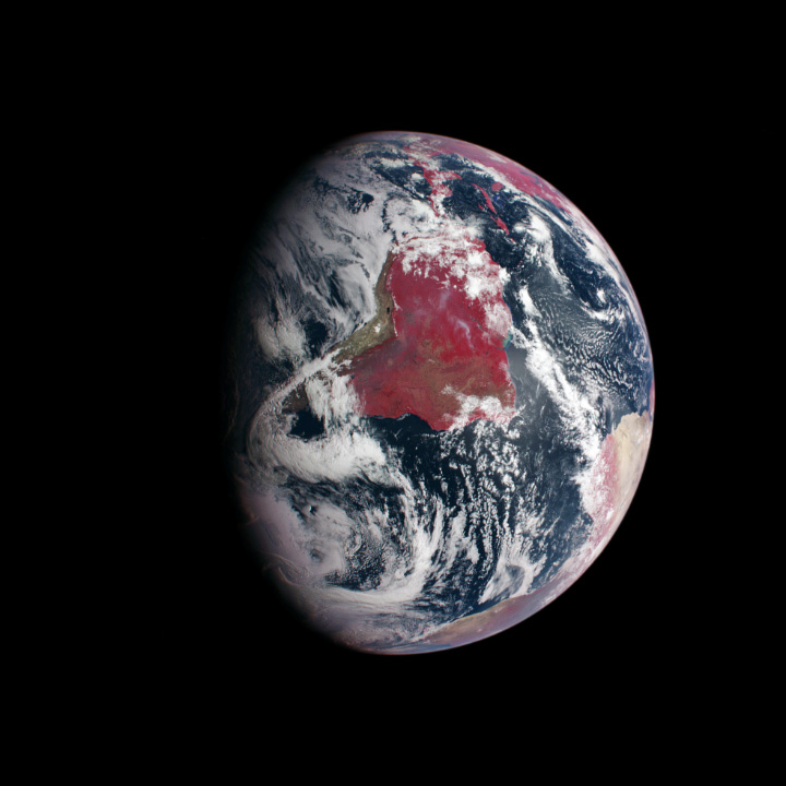
From the Amazon rainforest to North American forests, plant-covered land is red in this view of Earth from the Messenger spacecraft. The image incorporates both visible and infrared light. (NASA image based on data from the Mercury Dual Imaging System (MDIS) on Messenger.)
Why does the difference matter? When we see a photo where the colors are brightened or altered, we think of it as artful (at best) or manipulated (at worst). We also have that bias when we look at satellite images that don’t represent the Earth’s surface as we see it. “That forest is red,” we think, “so the image can’t possibly be real.”
In reality, a red forest is just as real as a dark green one. Satellites collect information beyond what human eyes can see, so images made from other wavelengths of light look unnatural to us. We call these images “false-color,” and to understand what they mean, it’s necessary to understand exactly what a satellite image is.
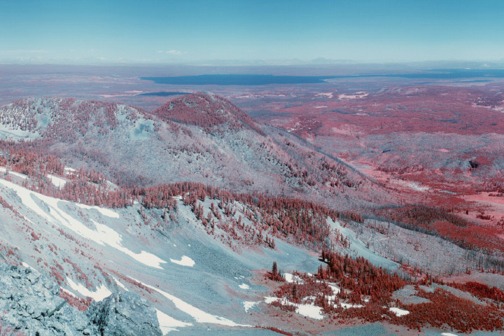
Infrared light renders the familiar unfamiliar. This infrared photograph shows the forests of Yellowstone National Park from Mount Sheridan. (Photograph courtesy National Park Service.)
Satellite instruments gather an array of information about the Earth. Some of it is visual; some of it is chemical (such as gases in the atmosphere); some of it is physical (sensing topography). In fact, remote sensing scientists and engineers are endlessly creative about what they can measure from space, developing satellites with a wide variety of tools to tease information out of our planet. Some methods are active, bouncing light or radio waves off the Earth and measuring the energy returned; lidar and radar are good examples. The majority of instruments are passive; that is, they record light reflected or emitted by Earth’s surface.
These observations can be turned into data-based maps that measure everything from plant growth or cloudiness. But data can also become photo-like natural-color images or false color images. This article describes the process used to transform satellite measurements into images.
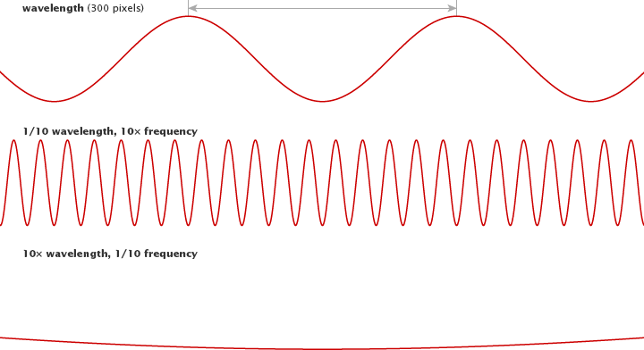
So what does a satellite imager measure to produce an image? It measures light that we see and light that we don’t see. Light is a form of energy—also known as electromagnetic radiation—that travels in waves. All light travels at the same speed, but the waves are not all the same. The distance between the top of each wave—the wavelength—is smaller for high-energy waves and longer for low-energy waves.
Visible light comes in wavelengths of 400 to 700 nanometers, with violet having the shortest wavelengths and red having the longest. Infrared light and radio waves have longer wavelengths and lower energy than visible light, while ultraviolet light, X-rays, and gamma rays have shorter wavelengths and higher energy.
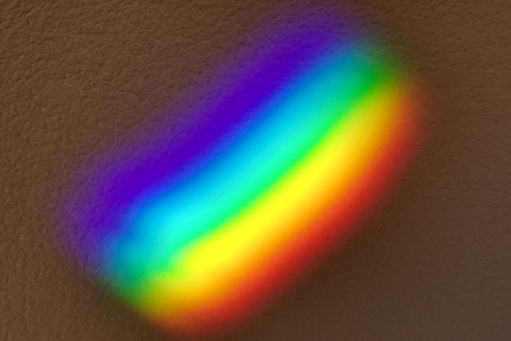
The spectrum of visible light stretches from violet (0.4 µm) to red (0.7 µm). (Photograph ©2013 Mathew Buckley.)
Most of the electromagnetic radiation that matters for Earth-observing satellites comes from the Sun. When sunlight reaches Earth, the energy is absorbed, transmitted, or reflected. (Absorbed energy is later re-emitted as lower-energy radiation.) Every surface or object absorbs, emits, and reflects light uniquely depending on its chemical makeup. Chlorophyll in plants, for example, absorbs red and blue light, but reflects green and infrared; this is why leaves appear green. This unique absorption and reflection pattern is called a spectral signature.
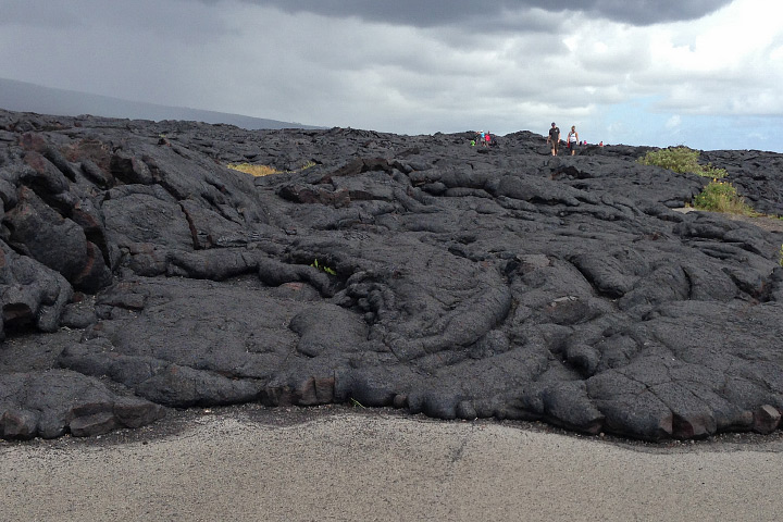
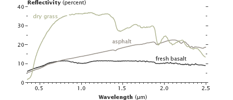
Varied land surfaces have distinct spectral signatures. Fresh basalt lava and asphalt reflect different amounts of infrared light, even though they appear similar in visible light. (Photograph ©2012 Robert Simmon. Figure by Robert Simmon, using data from the USGS Digital Spectral Library.)
Like Earth’s surfaces, gases in the atmosphere also have unique spectral signatures, absorbing some wavelengths of electromagnetic radiation and emitting others. Gases also let a few wavelengths pass through unimpeded. Scientists call these “atmospheric windows” for specific wavelengths, and satellite sensors are often tuned to measure light through these windows.
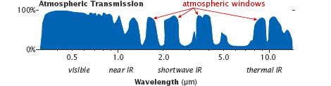
Atmospheric windows are regions of the spectrum where most light penetrates through the atmosphere, allowing satellites to view the Earth’s surface. (Figure adapted from Casey et al, 2012.)
Some satellite instruments also directly measure the energy emitted by objects. Everything gives off energy, usually in the form of heat (thermal infrared radiation). The hotter an object is, the shorter the peak wavelength it emits. At about 400°C (750° F)—the temperature of an electric stove burner set to high—the emitted light will begin to be visible. The colder an object is, the longer the peak wavelength it emits.
Satellite instruments carry many sensors that are each tuned to a narrow range, or “band,” of wavelengths (just red or green light, for instance). Viewing the output from just one band is a bit like looking at the world in shades of gray. The brightest spots are areas that reflect or emit a lot of that wavelength of light, and darker areas reflect or emit little (if any).
To make a satellite image, we choose three bands and represent each in tones of red, green, or blue. Because most visible colors can be created by combining red, green, and blue light, we then combine the red, green, and blue-scale images to get a full-color representation of the world.
A natural or “true-color” image combines actual measurements of red, green, and blue light. The result looks like the world as humans see it. (For tips on understanding true-color images, read How to Interpret a Satellite Image on the Earth Observatory.")
A false-color image uses at least one non-visible wavelength, though that band is still represented in red, green, or blue. As a result, the colors in the final image may not be what you expect them to be. (For instance, grass isn’t always green.) Such false-color band combinations reveal unique aspects of the land or sky that might not be visible otherwise.
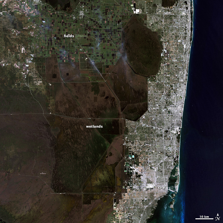
This series of Landsat images of southeastern Florida and the Northern Everglades illustrates why you might want to see the world in false color. (A related animation shows how the images were made.) The visible light image shows dark green forest, light green agriculture, brown wetlands, silver urban areas (the city of Miami), and turquoise offshore reefs and shallows. These colors are similar to what you would see from an airplane.
The second image shows the same scene in green, near infrared, and shortwave infrared light. In this false-color band combination, plant-covered land is bright green, water is black, and bare earth ranges from tan to pink. Urban areas are purple. Newly burned farmland is dark red, while older burns are lighter red. Much of the farmland in this area is used to grow sugar cane. Farmers burn the crop before harvest to remove leaves from the canes. Because burned land looks different in this kind of false-color image, it is possible to see how extensively farmers rely on fire in this region.
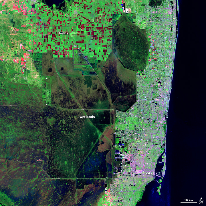
This false-color image of Florida combines shortwave infrared, near infrared, and green light. (NASA image by Matt Radcliff with Landsat 5 data from the USGS Earth Explorer.)
This false-color view also reveals how water flows through the Northern Everglades. Green islands punctuate the wetlands, which are black and blue. These are tree islands that are hard to distinguish in natural color. Their orientation aligns with the flow of the water, highlighting direction that is not obvious in the natural color image. It is also easier to see the extent of the wetlands against surrounding land, since water is dark in this view and plant-covered land is bright green.
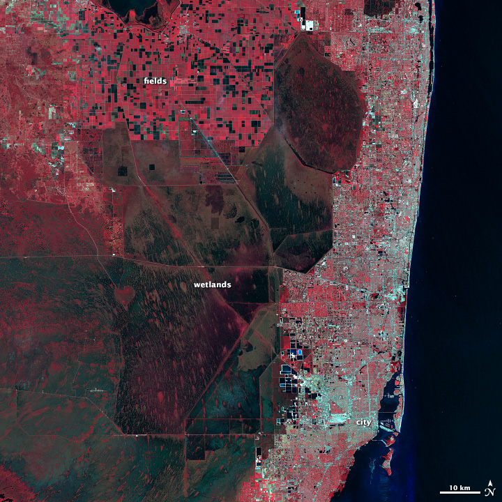
Southeast Florida is shown in near infrared, red, and green light. (NASA image by Matt Radcliff with Landsat 5 data from the USGS Earth Explorer.)
The third image shows the scene in green, red, and near infrared light. Plants are dark red because they reflect infrared light strongly, and the infrared band is assigned to be red. Plants that are growing quickly reflect more infrared, so they are brighter red. That means that this type of false-color image can help us see how well plants are growing and how densely vegetated an area is. Water is black and blue, and urban areas—including Miami, Fort Lauderdale, and West Palm Beach—are silver.
Data visualizers and remote sensing scientists make true- or false-color images in order to show the features they are most interested in, and they select the wavelength bands most likely to highlight those features.
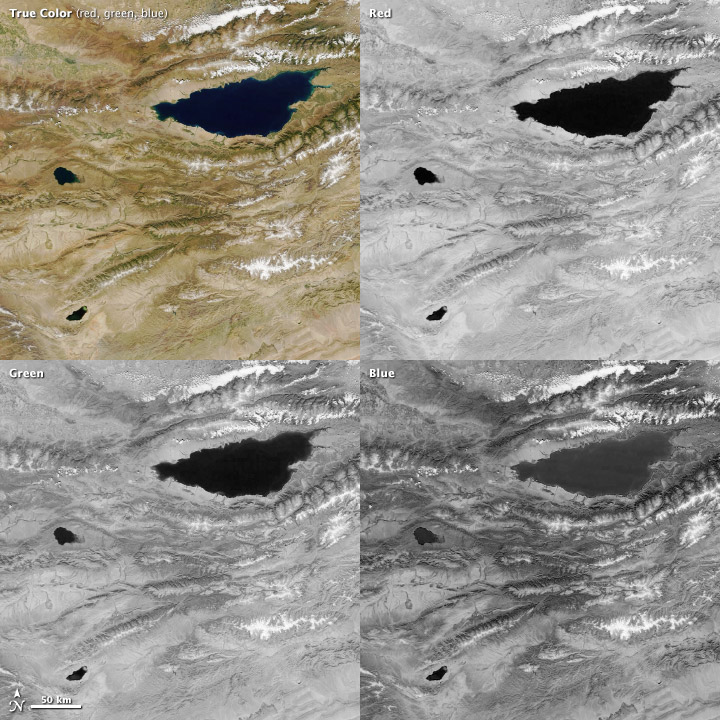
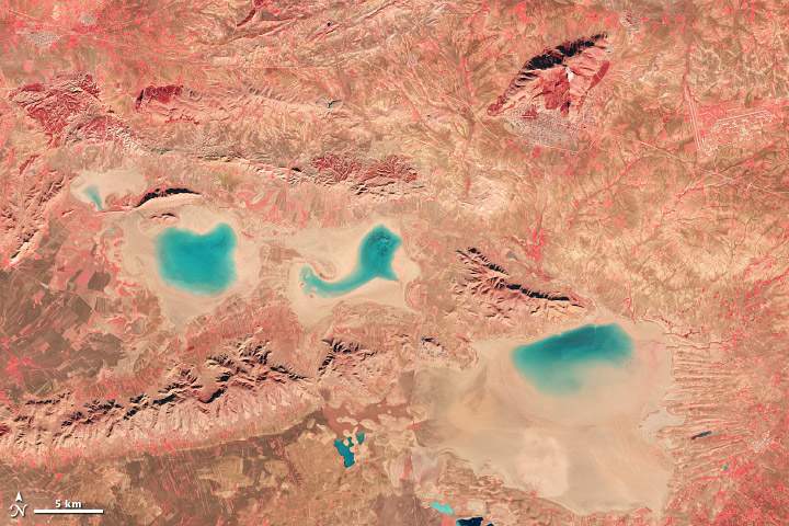
Combining red, green, and blue bands results in a true-color satellite image, such as this view of Lake Issyk Kul, Kyrgyzstan. (MODIS image from NASA Worldview.)
Blue light (450 to 490 nanometers) is among the few wavelengths that water reflects (the rest are absorbed). Hence, blue bands are useful for seeing water surface features and for spotting the sea- or lake floor in shallow waters. You can see that water reflects some blue light in the above image of Lake Issyk Kul, Kyrgyzstan. Water is lighter in the blue band than it is in either the red or green bands, though the lake is too deep for shallow features to be visible. Manmade creations like cities and roads also show up well in blue light. It is also the wavelength most scattered by particles and gas molecules in the atmosphere, which is why the sky is blue.
Green light (490 to 580 nanometers) is useful for monitoring phytoplankton in the ocean and plants on land. The chlorophyll in these organisms absorbs red and blue light, but reflects green light. Sediment in water also reflects green light, so a muddy or sandy body of water will look brighter because it is reflecting both blue and green light.
Red light (620 to 780 nanometers) can help distinguish minerals and soils that contain a high concentration of iron or iron oxides, making it valuable for studying geology. In the above image, for example, the exposed ground around Lake Issyk Kul varies in tone from pale tan to orange based on the mineral content of the soil. Since chlorophyll absorbs red light, this band is commonly used to monitor the growth and health of trees, grasses, shrubs, and crops. Red light can also help distinguish between different types of plants on a broad scale.
Near infrared (NIR) light includes wavelengths between 700 and 1,100 nanometers. Water absorbs NIR, so these wavelengths are useful for discerning land-water boundaries that are not obvious in visible light. The below image shows the near infrared view of the Piqiang Fault, China. Stream beds and the wetland in the upper left corner are darker than the surrounding arid landscape because of their water content. (See a natural color view of the scene here.) Plants, on the other hand, reflect near infrared light strongly, and healthy plants reflect more than stressed plants. Finally, near infrared light can penetrate haze, so including this band can help discern the details in a smoky or hazy scene.
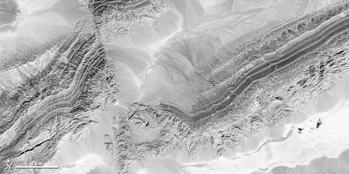
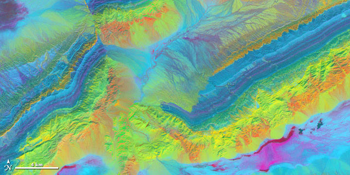
Shortwave infrared (SWIR) light includes wavelengths between 1,100 and 3,000 nanometers. Water absorbs shortwave infrared light in three regions: 1,400, 1,900, and 2,400 nanometers. The more water there is, even in soil, the darker the image will appear at these wavelengths. This means SWIR measurements can help scientists estimate how much water is present in plants and soil. Shortwave-infrared bands are also useful for distinguishing between cloud types (water clouds versus ice clouds) and between clouds, snow, and ice, all of which appear white in visible light. Newly burned land reflects strongly in SWIR bands, making them valuable for mapping fire damage. Active fires, lava flows, and other extremely hot features “glow” in the shortwave-infrared part of the spectrum. In the image below, different types of sandstone and limestone make up the mountains around China’s Piqiang Fault. Each rock type reflects shortwave infrared light differently, making it possible to map out geology by comparing reflected SWIR light. Enhancing the subtle differences between the 3 bands of reflected shortwave infrared light used to make this image gives each mineral a distinctive, bright color.
Midwave Infrared (MIR) ranges from 3,000 to 5,000 nanometers and is most often used to study emitted thermal radiation in the dark of night. Midwave infrared energy is also useful in measuring sea surface temperature, clouds, and fires. The images below contrast a visible-light nighttime view of the Niger River Delta with the same view in midwave infrared; both images are from the Visible Infrared Imaging Radiometer Suite (VIIRS) on the Suomi-NPP satellite. The day-night band shows visible light—the lights of Port Harcourt and Benin City, bright gas flares, and moonlight reflected off clouds. The midwave infrared image shows emitted thermal radiation. The warmer ocean and river are pale, while the cold land and clouds are dark, and the hot gas flares are bright.
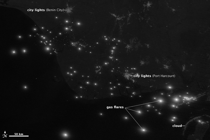
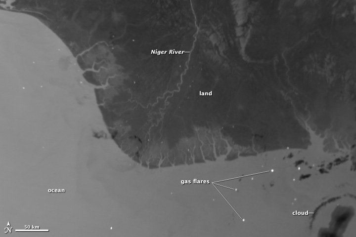
Visible light at night (top) shows cities, gas flares, and moonlight reflected off clouds. Flares also shine in midwave infrared (lower); this view also contrasts warm waters with colder land and clouds. (NASA/NOAA image by Jesse Allen and Robert Simmon, using VIIRS data from NGDC.)
Infrared (IR) light—specifically between 6,000 to 7,000 nanometers—is critical for observing water vapor in the atmosphere. Though water vapor makes up just 1 to 4 percent of the atmosphere, it is an important greenhouse gas. It is also the basis for clouds and rainfall. Water vapor absorbs and re-emits energy in this range, so infrared satellite observations can be used to track water vapor. Such observations are integral to weather observations and forecasts.
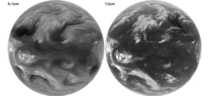
Mid-infrared (7µm) and thermal-infrared (12 µm) images showing water vapor (left), and temperature (right). The images are inverted to better show clouds: cold areas are light and warm areas are dark. (NASA/NOAA images by Robert Simmon, using data from the GOES Project Science Team.)
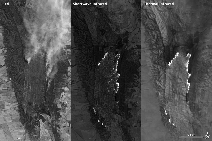
Thermal or longwave infrared (TIR or LWIR) light includes wavelengths between 8,000 and 15,000 nanometers. Most of the energy in this part of the spectrum is emitted (not reflected) by the Earth as heat, so it can be observed both day and night. Thermal infrared radiation can be used to gauge water and land surface temperatures; this makes it particularly useful for geothermal mapping and detection of heat sources like active fires, gas flares, and power plants. Scientists also use TIR to monitor crops. Actively growing plants cool the air above them by releasing water through evapotranspiration, so TIR light helps scientists assess how much water the plants are using.
Though there are many possible combinations of wavelength bands, the Earth Observatory typically selects one of four combinations based on the event or feature we want to illustrate. For instance, floods are best viewed in shortwave infrared, near infrared, and green light because muddy water blends with brown land in a natural color image. Shortwave infrared light highlights the difference between clouds, ice, and snow, all of which are white in visible light.
Our four most common false-color band combinations are:
One of our most frequently published combinations uses near infrared light as red, red light as green, and green light as blue. In this case, plants reflect near infrared and green light, while absorbing red. Since they reflect more near infrared than green, plant-covered land appears deep red. The signal from plants is so strong that red dominates the false-color view of Algeria below. Denser plant growth is darker red. This band combination is valuable for gauging plant health.
Cities and exposed ground are gray or tan, and clear water is black. In the image below, the water is muddy, and the sediment reflects light. This makes the water look blue. Images from the Advanced Spaceborne Thermal Emission and Reflection Radiometer (ASTER) and from the early Landsats are often shown in this band combination because that’s what the instruments measured.
The most common false-color band combination on the Earth Observatory uses the shortwave infrared (shown as red), the near infrared (green), and the green visible band (shown as blue).
Water absorbs all three wavelengths, so it is black in this band combination. In the below false-color image of Algeria, however, water is blue because it is full of sediment. Sediment reflects visible light, which is assigned to look blue in this band combination. This means that both sediment-laden water and saturated soil will appear blue. Because water and wet soil stand out in this band combination, it is valuable for monitoring floods. Saturated soil will also appear blue. Ice clouds, snow, and ice are bright blue, since ice reflects visible light and absorbs infrared. This helps distinguish water from snow and ice; it also distinguishes clouds made up mostly of liquid water or ice crystals.
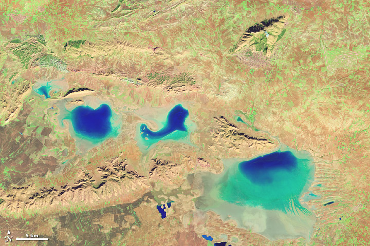
Newly burned land reflects shortwave infrared light and appears red in this combination. Hot areas like lava flows or fires are also bright red or orange. Exposed, bare earth generally reflects shortwave infrared light and tends to have a red or pink tone. Urban areas are usually silver or purple, depending on the building material and how dense the area is.
Since plants reflect near infrared light very strongly, vegetated areas are bright green. The signal is so strong that green often dominates the scene. Even the sparse vegetation in Algeria’s desert landscape stands out as bright green spots in the above image.
Occasionally, the Earth Observatory will publish a band combination that assigns blue light to be red and two different shortwave infrared bands to green and blue. This band combination is especially valuable in distinguishing snow, ice, and clouds. Ice reflects more blue light than snow or ice clouds. Ice on the ground will be bright red in this false color, while snow is orange, and clouds range from white to dark peach.
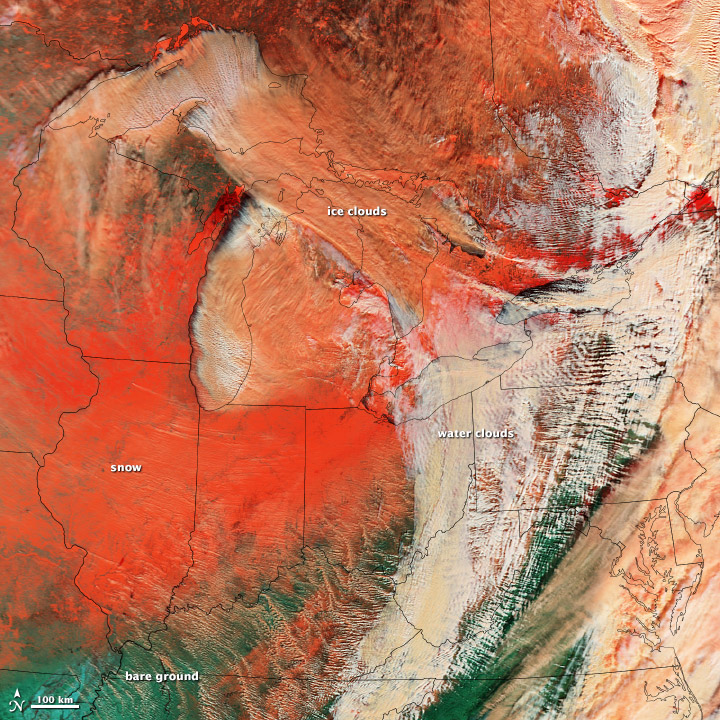
A combo of blue and shortwave infrared light contrasts clouds, snow, and ice in a large winter storm from January 2014. (NASA image by Jesse Allen and Robert Simmon; data from LANCE/EOSDIS Rapid Response.)
The Earth Observatory also uses thermal infrared measurements to show land temperatures, fire areas, or volcanic flows, but most of the time, these are published as grayscale images. Occasionally, the thermal features of interest will be layered on top of a true-color or grayscale image, particularly in the case of a fire or volcano.
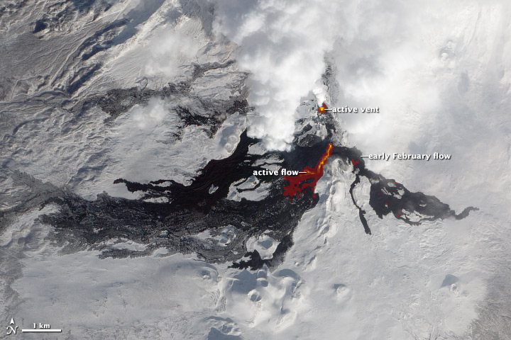
Infrared light reveals details of the evolving lava flows on Russia’s Tolbachik Volcano. (NASA image by Jesse Allen and Robert Simmon, using EO-1 ALI data from the NASA EO-1 team.)
You can explore the way different band combinations highlight different features by using a browse tool called Worldview, which displays data from many different imagers, including Aqua and Terra MODIS. Click on “add layers” and then select one of the alternate band combinations (1-2-1, 3-6-7, or 7-2-1). The site also provides descriptions of common MODIS band combinations.
You can also explore false color imagery with Landsat. See a few examples with a description in the Landsat 7 Compositor, or watch this animation of the Florida Everglades in three different band combinations. You can also make your own Landsat images and experiment with band combinations by using software like Adobe Photoshop or ImageJ. Download data for free from the U.S. Geological Survey, then follow the instructions for Photoshop or ImageJ.
Thanks to the following science reviewers and/or content providers: Michael King, Vincent Salomonson, David Mayer, Patricia Pavon and Belen Franch.
