

In June 2009, NASA and the U.S. Geological Survey put the finishing touches on a new collection of mapped images covering the entire land surface of the Earth and made them available to anyone, anywhere in the world, absolutely free.
The result of a collaboration between NASA, the U.S. Geological Survey, and the U.S. National Geospatial Agency, the Global Land Survey 2005 features around 9,500 images from NASA’s Landsat satellites captured between 2004–2007.
The images are detailed enough to make out features as small as 30 meters (about one-third the length of an American football field), they have been carefully screened for clouds, and each one shows the landscape during its growing season.
Some of the images are as striking as a piece of artwork. Stitched together into a single mosaic, the collection paints the most detailed picture of Earth’s land surface a person can get for free.
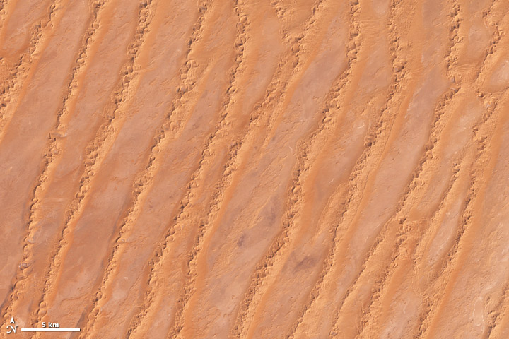
Before you think about ordering it, however, consider this: to view the entire thing at full size, your computer screen would need to be as big as the Hoover Dam.
The survey’s pretty pictures are just a fringe benefit, though. The real motivation for the project, explains remote-sensing scientist Jeff Masek, the NASA lead on the project, was the increasingly urgent need among Earth and climate scientists for a detailed global image of the land surface in which the latitude, longitude, and elevation of every pixel had been mapped.
Scientists need this view in order to understand the extent and pace of changes people are making to Earth’s surface. Landscape changes affect the climate, but perhaps more significantly, they will determine whether Earth’s natural and managed ecosystems are able to sustain the human population as it grows to a projected 9 billion people in the next 40 years.
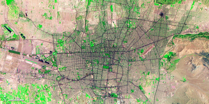
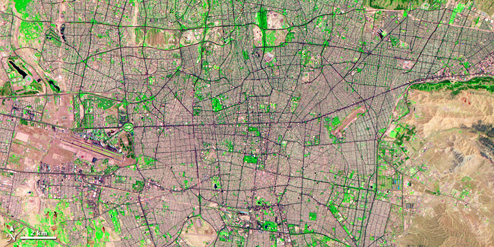
Of course, scientists could have used this detailed, global view several decades ago, and in theory, the earliest Landsat missions could have provided it. But only recently have scientists been able to handle the expense and the technical challenges of mapping the world with Landsat images.
When the first Landsat launched in 1972, virtually every piece of technology that we think of as essential for viewing, sharing, or analyzing digital images either hadn’t been invented (like the World Wide Web and DVDs) or hadn’t been commercialized (like the microprocessor that runs desktop computers).
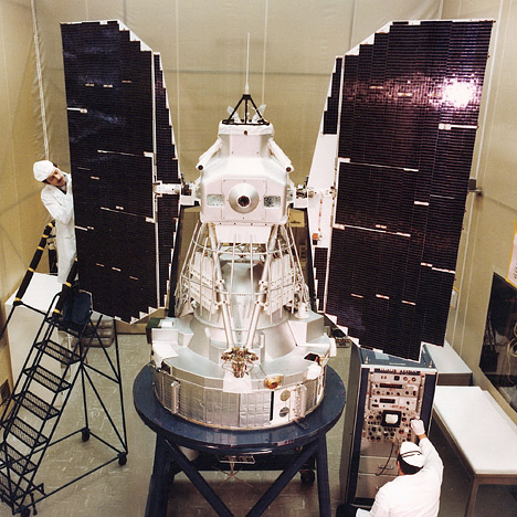
Each Landsat image is several hundred Megabytes. Until recently, it would have taken a super computer to sort, join, and geolocate (map the latitude and longitude of) the thousands of images needed to make a global picture. “For decades, the computing challenge was huge,” says Masek.
The challenge of handling the data translated into prices that few researchers could afford. “For a number of years in the 80s and early 90s,” said Masek, when the satellites were being operated by a commercial company, “it cost about $4,000 for a single Landsat image, and it takes about 9,000 of them to map the land area of the globe.” To make a global image for just one time period would have cost $36 million.
When the government resumed satellite operations in 2000, the price per scene dropped to about $600, says Masek. And since late last year, all the Landsat scenes in the USGS archive have been free. With prices dropping, in the late 1990s, NASA began working on Landsat image mosaics centered on 1975 and 1990, and a 2000-era collection came out a few years ago.
Price may have been the primary obstacle to global Landsat mosaics for many years, but according to John Dwyer, the USGS lead on the Global Land Survey 2005 project, “monumental” technical challenges remained.
“Normally when a person wants a Landsat scene,” says Dwyer, “they go to a website, they start a geographic search, they restrict it to a certain time of year, and the system returns a bunch of browse images [small versions of the full image]. The user then looks through them all and decides which one is optimal for their purpose.”
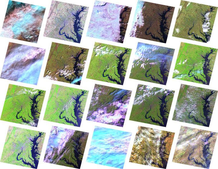
For a global picture circa 2005, an analyst would have to repeat this process more than 9,000 times, sorting through the roughly 500,000 images captured by Landsat 5 and Landsat 7 between 2004 and 2007. “A person just can’t do that,” says Dwyer.
Instead, NASA scientists developed a sophisticated search engine that sorted through the archive and found images that were the best compromise among various criteria set by the scientists—for example, season, cloud cover, or satellite preference.
Even with the hundreds of thousands of images available in the USGS archive, though, getting an image of every land surface on Earth wasn’t easy. In 2003, a part of the Landsat 7 sensor failed. The result was that the outside margins of all the images had stripes of missing data. “It was a real headache,” says Masek.
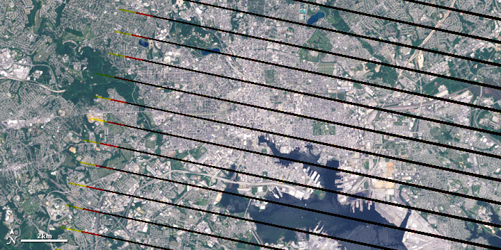
The back up plan was to fill in the gaps in the collection with images from the older, but still-operational Landsat 5 satellite. But Landsat 5 doesn’t have an onboard data recorder. It continuously broadcasts what it is seeing below, but it doesn’t store the images.
In the United States, ground stations downlink data whenever Landsat 5 passes overhead. Once the satellite passes out of communication range of U.S. ground stations, though, its images are out of reach, complicating the goal of a global image mosaic. Fortunately, U.S. stations aren’t the only ones tuning into Landsat.
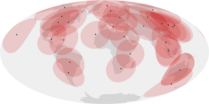
“There are about a dozen international Landsat receiving stations, but we [USGS and NASA] don’t have any formal agreement with them to repatriate the data,” explains Masek. So the USGS offered the foreign stations a complete copy of the whole global data set in exchange for access to images that were within their station’s acquisition range.
The partnerships with international ground receiving stations made the coverage nearly global. The last obstacles to creating a complete image collection of all land areas on Earth were the hundreds of tiny islands and reefs scattered across the world’s oceans.
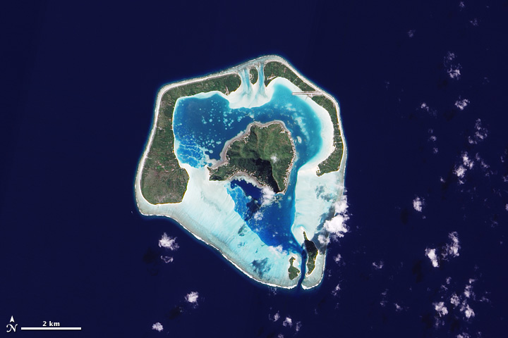
Except over the United States, says Masek, “Landsat doesn’t acquire every image on every overpass. For the rest of the world, the satellite may only acquire a target a few times a year.” To complete the collection, the team tasked the Advanced Land Imager on NASA’s EO-1 satellite to image the smaller islands and reefs.
Anyone who has stood before a spectacular vista and taken a series of overlapping photos in the hopes of turning them into a panoramic image has probably experienced the frustration of trying to get the resulting photos to line up. You line up the mountains in the background, for example, and see that a road running through the foreground no longer overlaps.
These small distortions occur because as careful as you try to be when you take the picture, you can’t hold the camera at exactly the same angle as you shoot each image. You may lower the camera a fraction, or lean forward a tiny bit. Satellites experience the same small wobbles as they fly through space, and the impact on images is similar. Changes in the angle of view change the relative size and distance between features in the images.
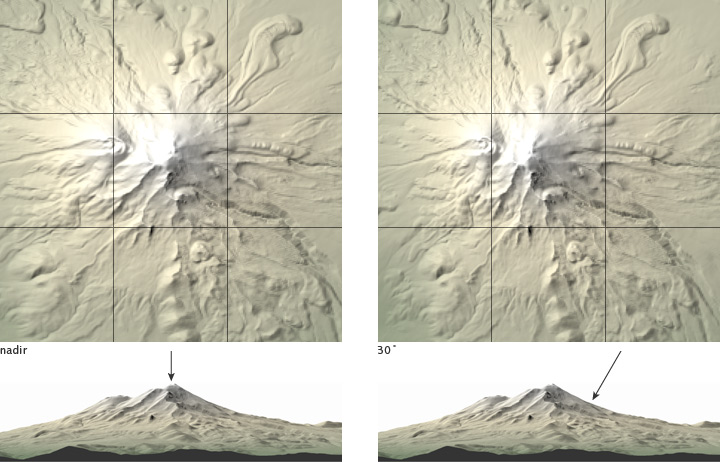
Rugged terrain is a problem, too. If scientists don’t account for the topography when they turn the satellite data into images, the same landscape feature might look compressed in one image and stretched out in another, or it may appear to have shifted location by a several hundreds meters from one image to the next.
“It’s sort of like the image was on a piece of fabric, and it got wrinkled up,” says Masek. Smoothing the images out is critical for scientists who want to compare images of the same area over time or to combine satellite images with other types of geographic data, such population density, land ownership, or roads.
To correct the distortions (geographers call the process orthorectification), scientists have computers compare new satellite images to a library of ground control points. The control points are snippets of an image centered on a recognizable feature whose geographic information—latitude, longitude, and elevation—is precisely known from ground surveys. Computers identify features in the new image that match the control points, and maximize the alignment of all the features by resizing or rotating the new images.
The orthorectification of the 2005 version of the Global Land Survey is significantly more accurate than previous versions, mostly because of improved topographic data provided by the Shuttle Radar Topographic Mission, which flew on Space Shuttle Endeavor in 2002. For areas outside the United States, the Shuttle data improved the topographic detail by a factor of 10. “That alone resulted in dramatic improvement of geo-registration for many areas of the world,” said Dwyer.
The improvements were so dramatic that Masek and his collaborators persuaded NASA and the USGS to chip in some extra money to reprocess the 1975, 1990, and 2000 collections to match the 2005 Global Land Survey. NASA and the USGS are now working on the next iteration of the Global Land Survey, centered on imagery collected during 2009 and 2010.
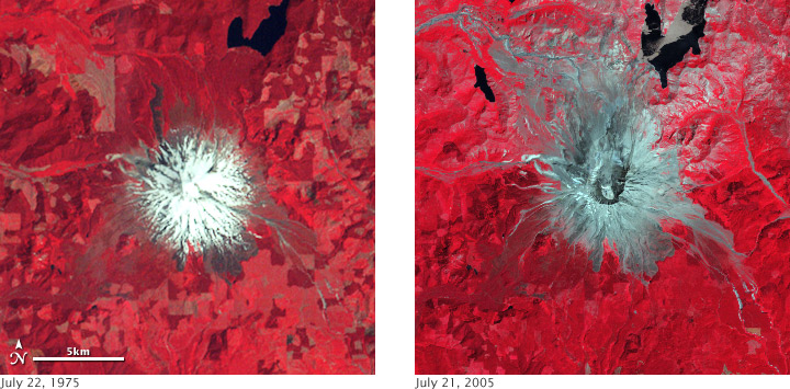
“It’s kind of an amazing thing,” says Masek, “that the Landsat missions have been in operation since 1972, and only now are we getting to the point where we can use them at a global scale. We are hoping we can finally start to produce some of the global land cover assessments—urban growth, the extent of irrigated agriculture, etc—that were always the promise of the Landsat missions.”
The Global Land Survey 2005 project was funded by NASA’s Land Cover Land Use Change Program and the U.S. Geological Survey.
At the Global Land Cover Facility at the University of Maryland-College Park, the computers are in training. For the past few months, geographer and remote-sensing scientist John Townshend and his UMD research group, Jeff Masek with NASA Goddard Space Flight Center, and Matt Hansen with South Dakota State University have been testing and retesting the computers’ ability to identify forested areas in Landsat images and report how much they have changed over time.
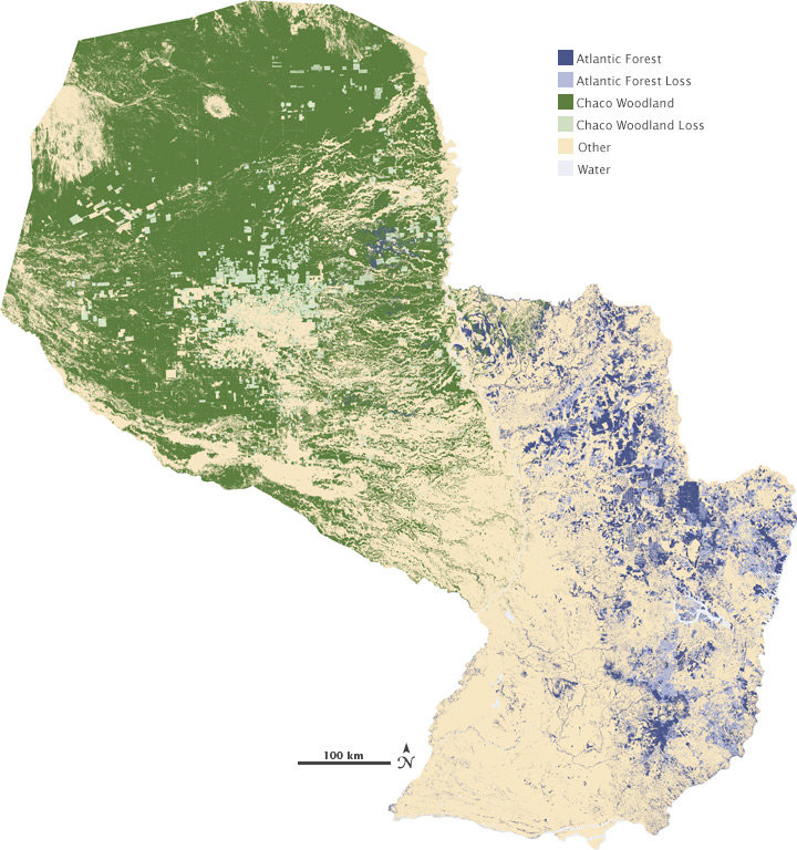
The training is a warm up for a survey of how forests worldwide changed from 1990–2000 and from 2000–2005. All this testing is necessary, explains Townshend, because the huge amount of data the computers have to go through means the analysis takes an enormous amount of time. To do just one step of the analysis, say locating all tree-covered areas in North America, the computers will run continuously for weeks.
In the 1990s, Townshend was involved in efforts to make continental-scale forest assessments for the tropics using Landsat images. “Following that project,” Townshend said, “we tried to estimate what it would cost if we were to do this for the whole world, and it was always just too much money with technologies available then.”
A big part of getting the images into a usable state is finding cloud-free views of every landscape on Earth and making sure that all the images from different eras line up seamlessly. “The GLS gets rid of a large proportion of that pre-processing, and that is just incredibly valuable,” said Townshend. With those steps out of the way, Townshend and his colleagues can tackle another preliminary step: removing the haziness that the atmosphere causes in all images of Earth from space.
Sometime this fall, Townshend’s computers will have finished their training and will be turned loose on the global land survey datasets for 1990 to 2000. “I’ve been waiting twenty-five years for this,” Townshend says. “I’m not joking.”
In the mid-1990s, highly pathogenic avian influenza (bird flu) emerged in southern China. Severe outbreaks in the winter of 2005-2006 spread the virus, designated H5N1, across Asia, Europe, and Africa, killing hundreds of people, thousands of wild birds, and millions of poultry. In fall 2009, scientists and public health officials continued to watch H5N1 closely for signs that, like H1N1 (“swine flu”), it had evolved into a form capable of creating a pandemic.
Landscape ecologist Xiangming Xiao of the University of Oklahoma is part of a large group of scientists from U.S. and international scientific and public health organizations who are trying to predict areas at high risk for future avian influenza outbreaks. Xiao and his team use satellite images to map the location of rice paddies and wetlands in China and Southeast Asia, something that Landsat images will allow them to do in much more detail.
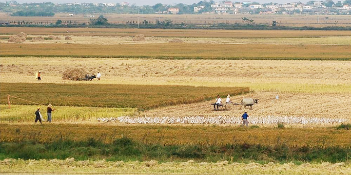
“Harvested rice paddies have become a stage where wild water birds, which naturally carry low pathogenic types of the virus, and domestic ducks mix,” explains Xiao. “In that mixing, virus transmission might occur.” As the virus spreads among species, the possibility for evolution into a highly pathogenic type of flu increases.
Xiao starts his analysis of satellite images by having computers identify areas with a unique seasonal pattern: a period where the satellite sees only water, followed by a mix of water and vegetation, followed by a period where all the satellite sees is vegetation. “This sequence—water, mix, no water—is unique to rice paddies,” explains Xiao.
Xiao currently uses observations from the MODIS sensor on NASA’s Terra satellite for this stage of the analysis because it depends on frequent images of the same area. MODIS provides daily observations of most places on Earth, but the images show only a moderate amount of detail. “In many cases, rice paddies are smaller than the 250-meter pixels in the MODIS images,” explains Xiao, “and we miss them.”
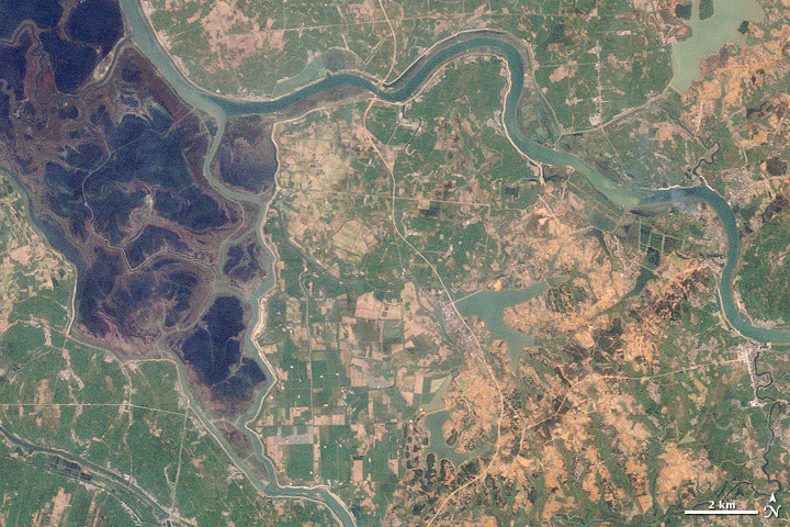
This is where the Global Land Survey 2005 collection will contribute substantially. Xiao and his team are starting to combine radar images from the ALOS/PALSAR mission of Japan with Landsat images from the Global Land Survey to identify and map paddy rice and wetlands with much greater detail than they could before.
“We need that kind of detail to better understand how and when the birds are moving among the different habitats where they can acquire or transmit the H5N1 virus,” says Xiao.
During the devastating 2004 Indian Ocean tsunami, more than 200,000 people lost their lives. Some coastal communities were shielded from the waves’ destruction by mangrove forests, which motivated efforts to protect and restore them.
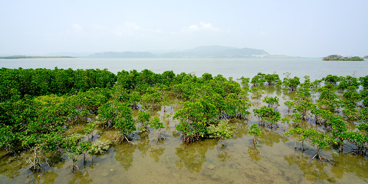
As a foundation for conservation planning, remote-sensing ecologist Chandra Giri of the U.S. Geological Survey’s Center for Earth Resources Observation and Science led a team of researchers who used Landsat images to map the extent of mangroves in tsunami-affected countries and to determine the rate and causes of deforestation from 1975 through 2000.
In some ways, explained Giri, mapping mangroves with satellite imagery is straightforward. Mangroves have a unique appearance in satellite images that makes them easy to identify. But in the tropics, finding enough cloud-free scenes is hard. Also, mangroves are often tucked into small pockets of coastline, or they narrowly line meandering creeks. When you are mapping small features, any distortion or misalignment among images can make it impossible to detect changes over time.
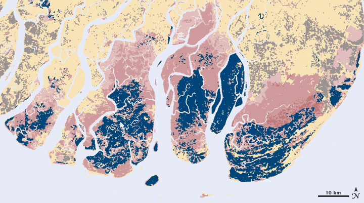
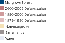
“The most important result obtained from South and Southeast Asia is that agriculture is the main factor responsible for mangrove destruction,” said Giri. That finding was contrary to the widespread belief that shrimp farming was the primary cause of deforestation.
When Giri and his colleagues mapped the mangroves in the tsunami-affected regions, the Global Land Survey 2005 collection wasn’t released yet. Instead, the team had to do much of the pre-analysis processing—including the orthorectification to remove distortions—themselves. It was a gigantic task that makes Giri appreciate the work that went into the Global Land Survey 2005 collection.
The surprising results in the tsunami-affected areas inspired Giri and his colleagues to expand their analysis worldwide. “For a global study of this nature, acquiring and pre-processing large volumes of Landsat data is a gigantic task for a single researcher,” says Giri. Without the Global Land Survey data, he concludes, a global map of mangroves wouldn’t be possible.