
The Data and the Details | |||
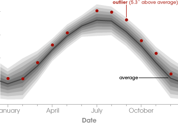
Some nagging questions remained for Hansen and his colleagues. Citing issues such as stations located too close to paved surfaces, stations located in urban areas that are known to be warmer than rural regions, and stations located in developing nations where data collection methods may be unreliable, critics argued that any of these problems could throw off an individual station’s temperature readings. Don’t such concerns cast a shadow of doubt on the NOAA weather station data? Initially, perhaps, but not after the data have been carefully tested in several ways. First, Hansen’s team (and others) finds good agreement of the weather station data with “proxy” data sets that are sensitive to surface temperature changes—such as the rate at which glaciers are receding, or subsurface temperature measurements in boreholes drilled down into the ground. (Scientists can infer surface temperature change from underground temperatures based on equations that describe how heat diffuses through the ground over time.) The results in thousands of remote locations around the world agree well with the surface temperature measurements. Second, Hansen’s team “cleans” the weather station data by finding and filtering out flawed data entries. Specifically, they apply a computer algorithm that checks each data point for temperature readings that are very significantly higher or lower than average for a given location at that time of year. Whenever such an anomaly is flagged, the algorithm compares those data to data from nearby stations to see if they show a similar anomaly. If so, then the data in question are kept; if not, or if there are no nearby stations for comparison, then the data are thrown away. |
|||
 |

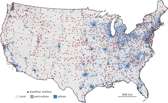
His team also modifies the data from stations located in densely populated areas by removing the long-term bias of these “urban heat islands.” The team uses satellite data to determine if a given station is in an urban or near-urban location. If so, then the team uses the nearest rural stations to determine the long-term trend at the urban site. If there are no rural neighbors, then Hansen’s team throws out the urban station data. |
Bad data are cleaned from the NASA global temperature record by first looking for outliers: months when the temperature at a station is much higher or lower than the average for that time of year. The monthly temperature record for Linyi, China, in 1932 (red dots; June data is missing) shows that September was 5.3° C warmer than average. The unusual data point was compared to nearby stations. Since some of those stations were also exceptionally warm, the data point was retained. If nearby stations do not confirm the anomaly, the team does not use the data. (Graph by Robert Simmon, based on data from the GISS Surface Temperature Analysis Station Data.) | |
 | |||
One lesson to be learned here is weather science and climate science are quite different: weather is concerned with what conditions are like at a given location and time, whereas climate is concerned with what conditions are like over large regions, or over the entire globe, and for a long period of time. That explains why climate scientists are not as interested in any given reading for an individual station as they are in 5-year and 10-year blocks of time for the entire planet. Hansen acknowledged there may be flaws in the weather station data. “But that doesn’t mean you give up on the science, and that you can’t draw valid conclusions about the nature of Earth’s temperature change,” he asserted. |
Weather stations are screened for potential bias from urban heat islands by comparing station locations with maps of urbanization. Measurements from nearby stations in rural areas (gray) are used to correct urban station data for warming due to the heat island effect. If no rural neighbors are available for comparison, data from urban (dark blue) and peri-urban (blue) stations are left out of the global average calculation. (Map by Robert Simmon, based on data from NOAA.) | ||