A Strategy for Detecting Climate Change Feedbacks | |||
Kato wanted to know if either of these possible outcomes of melting snow and ice—decreases in reflected sunlight or increases in cloudiness—could be observed yet over the polar regions. Was polar amplification already underway? Peering at the Earth from 700 kilometers away, could satellites reveal whether loss of Arctic ice cover was already making our planet less reflective? If clouds had replaced snow and ice as a polar reflector, would the new sensors onboard the Terra satellite be able to tell? |
|||
 | |||
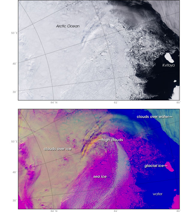
For measuring the reflected light at the top of the atmosphere, Kato could use the CERES data he had been working with for years. For clouds, he would turn to another Terra satellite sensor: a radiometer called MODIS, short for Moderate Resolution Imaging Spectroradiometer. “Detecting clouds over snow and ice is a very, very difficult problem in remote sensing because the clouds are bright, and the snow and ice are bright,” says Kato. To previous satellite sensors, many of which observed only a handful of wavelengths of light, it all looked the same: white. Previous studies that tried to identify long-term or even seasonal changes in Arctic clouds couldn’t agree. Some analyses indicated that summer was cloudier than winter; others that that reverse was true. Still others found no seasonal difference at all. With the launch of its Terra satellite, however, NASA introduced remote sensors with dramatically improved cloud-detection abilities, including devices that can observe the Earth in more than 20 different parts of the electromagnetic spectrum—from visible light, to shortwave infrared, to thermal infrared. Although a cloud and ice might look identical in visible light—white—they don’t look the same in other wavelengths, such as near- or thermal infrared. The more wavelengths a sensor observes, the more chances the scientists have to distinguish clouds from snow and ice. With this additional information, says Kato, “we think we are doing a much better job of detecting clouds over snow and ice, and that with MODIS we were ready to detect a trend in clouds over the Arctic region.” |
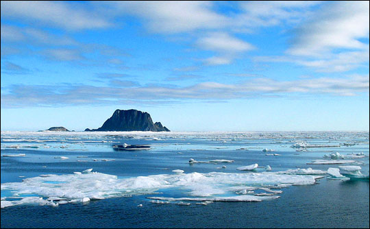
Ice, oceans, land surfaces, and clouds all play a role in determining how much incoming solar radiation the Earth reflects back into space. While melting of snow and sea ice reduces the poles’ ability to reflect incoming sunlight, increased evaporation from an increasingly ice-free ocean surface might lead to more clouds. Because clouds also reflect incoming sunlight, they might be able to hold polar albedo steady, at least temporarily. (Photograph copyright kenyai.) | ||
The main concern when he began the study, says Kato, was that they simply wouldn’t have a long enough data record to detect any trends. Small changes occurring over a large area can have a big impact on climate. But the smaller the change, the longer the data record needs to be to make sure that the change is real. At the time Kato and his colleagues began their study, Terra’s sensors had only accumulated four years of cloud and energy balance data, spanning 2000-2004; Aqua, launched later, had only collected data between 2002-2004. Although he suspected four years of data would be a bare minimum—and probably not enough—Kato figured if the change in the Arctic was dramatic enough, they just might be able to find it. With those doubts lingering in the back of their minds, Kato and his colleagues began processing, mapping, and analyzing the satellite data. Snow and ice extent data came from a series of microwave-frequency remote sensors nicknamed SSM/I, flown on a series of Department of Defense meteorological satellites. Cloud data came from NASA’s MODIS, and energy budget data came from CERES. The goal was to create, in essence, a virtual map with three layers that could be laid on top of one another: sea ice and snow, clouds, and albedo. The scientists divided up the Arctic and Antarctic (60-90 degrees North and South, respectively) into a grid in which each box was a bit smaller than 100 kilometers by 100 kilometers. Team members wrote computer software that sorted the satellite observations—usually multiple observations each day— into their appropriate grid box and merged them. Computers continued churning through the data, turning daily observations into monthly averages for the four-year period. Once the virtual maps were complete, the team could test whether changes in the sea ice and snow layer of the virtual map were matched by changes in the maps of clouds or albedo.
|
Detecting clouds in polar regions has been a long-standing problem for remote-sensing scientists. In satellite images based only on visible light reflected from the Earth (top), clouds, snow, and sea ice may all look the same—white. New NASA sensors detect many more wavelengths of light (visible, short-wave infrared, and thermal infrared) than previous Earth-observing satellites, giving Kato and his colleagues a new way to distinguish clouds from snow and ice (bottom). (NASA images by Robert Simmon and Jesse Allen, based on MODIS data.) |
