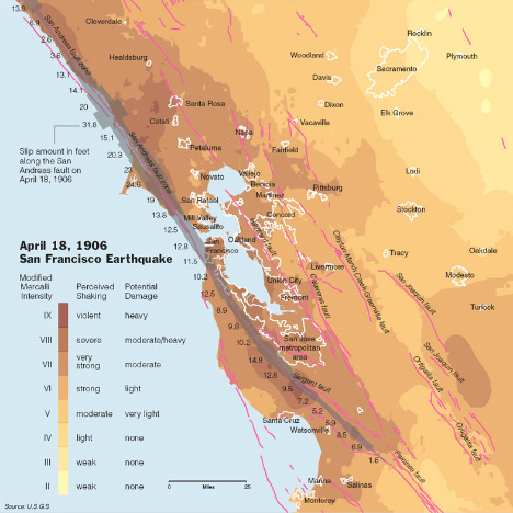
Since I was (slightly) critical of the New York Times graphics department yesterday, I’ll show a Times map that is one of my favorite visualizations today: a map of shaking intensity and slip during the 1906 San Francisco Earthquake.

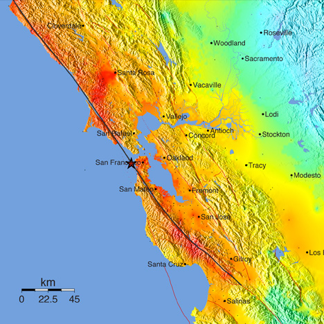
Aside from being elegant, it’s data-rich without being cluttered, and multivariate. It shows shaking intensity (in two dimensions), fault location (in two dimensions), slip along the San Andreas (one dimension), urban locations (two dimensions), and has three layers of direct labeling (cities, faults, and slip). The key is adjacent to the data, and written in clear language. Compare the map from the Times to the equivalent from the USGS:

The New York Times version both has more data and is more readable. Why? First off, the Times uses a subdued, discrete, color palette that shifts through a small range of hues. This allows other information to be layered into the map. The USGS, in contrast, uses a rainbow of hues at maximum saturation. The rainbow palette [at some point I’m going to do series of posts on color palettes, but for now i’ll just point to Color Brewer to explain the importance of appropriate color maps in data visualization] uses the full spectrum and is so saturated that there are very few colors left over for additional data—notice how the red fault lines on the USGS map disappear in areas of intense shaking. The dark ocean in the USGS version also competes visually with the data-rich areas of the map.
The New York Times also forgoes the use of terrain data in their map. It adds a lot of great context to the image (the San Andreas creates a distinct valley), but at web resolutions shaded relief is very difficult to pull off. The high frequency contrast distracts from the other data in the map. At larger sizes, or printed at high resolution, the terrain could be added back in (but it still needs to be treated carefully—see Relief Shading for advice). As a result, fine details in the faults and the boundaries of urban areas remain legible.
My favorite part of the Times map is the inclusion of the amount of slip at various locations on the San Andreas: it’s so much more informative than merely indicating the epicenter. Earthquakes—especially big earthquakes—aren’t points. They occur over a two dimensional area (reduced to a one dimensional quantity on this map). Increased slip correlates with increased shaking, which tells a story. That’s what makes this map so powerful. It’s a narrative of cause and effect, which is a quality of the best data visualizations.


As a student of geology, like it. (Small gripes, but always are.)
I am having trouble finding latest info re Rogers Creek fault. Any ideas for good sites ? Thanks.
I