

Fire on Bellandur Lake on January 19, 2018. Photo by pee vee.
In Bengaluru, India, one of the city’s lakes is so polluted with sewage, trash, and industrial chemicals that it has an alarming habit of catching on fire. As recently as January 19, 2018, fire broke out on Bellandur Lake and burned for seven hours.
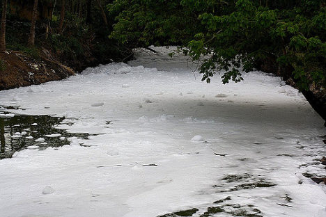
The same lake is notorious for churning up large amounts of white foam that has, at times, spilled from the lake and enveloped nearby streets, cars, and bridges. The water is so polluted that it can’t be used for drinking or bathing or even irrigation.
Bellandur Lake is not the only lake in Bengaluru with water quality problems. During a recent check, not one of the hundreds of lakes that the city tested was clean enough to be used for drinking or bathing.

Foamy water flowing into Bellandur Lake. Photo by Kannon B.
I point this out on World Water Day to underscore that Bengaluru’s water woes, though extreme, are not particularly uncommon. According to the United Nations, a quarter of all people on the planet lack access to safely managed drinking water, and 40 percent of people live in areas where water scarcity is a problem. Roughly 80 percent of wastewater flows back into ecosystems untreated. Even in the United States, tens of millions of people may be exposed to unsafe drinking water, according to one recently published study.
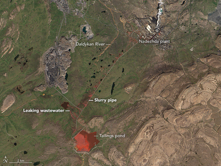
Even in the course of reporting for this website from a satellite perspective, we see signs of trouble. Capetown was on the verge of running out of water in February 2018. Drought pushed São Paulo’s reservoirs to near empty in recent years. The GRACE satellites have observed rapid depletion of groundwater in several critical aquifers. On more than one occasion, we have reported on rainbow-colored escaped mine tailings contaminating waterways.

NASA Earth Observatory image by Jesse Allen, using Landsat data from the U.S. Geological Survey. Learn more about the image here.
To push back against such problems, NASA’s Earth Science Division, and particularly its applied sciences program, is doing what it can to marshal the agency’s resources to make countries aware of what NASA resources are available to monitor and reduce the impact of water-related problems.

Learn more about the Sustainable Development Goals. Image by the United Nations.
As one piece of its water program, NASA scientists and staff are working with the United Nations to highlight key NASA datasets, tools, and satellite-based monitoring capabilities that may help countries meet the 17 sustainable development goals established by the international body. Goal number 6—that countries ensure the availability and sustainable management of water and sanitation for all—has been a particular focus of the NASA teams.
NASA and NOAA satellites collect several types of data that may be useful for water management. Sensors such as the Moderate Resolution Imaging Spectroradiometer (MODIS) and the Visible Infrared Imaging Radiometer Suite (VIIRS) collect daily data and images of water bodies around the planet that can be used to track the number and extent of lakes and reservoirs.

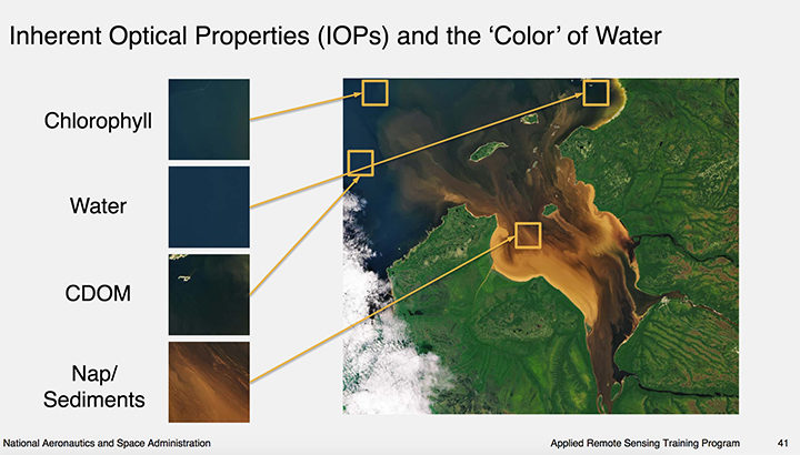
Image courtesy of this NASA ARSET presentation. Learn more about the image here.
The same sensors collect information about water color, which scientists use to detect sediment, chlorophyll-a (a product of phytoplankton and algae blooms), colored dissolved organic matter (CDOM), and other indicators of water quality.
The strength of MODIS and VIIRS is that these sensors collect daily imagery; the downside is that the data is relatively coarse. However, another family of satellites, Landsat, carries sensors that provide more than 10 times as much detail.
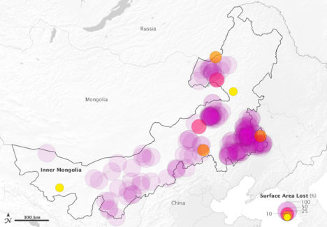
The combination of information from multiple satellites collected over time can be powerful. For instance, as we reported previously, a team of scientists based in China used decades of Landsat data to track a 30 percent decrease in the total surface area of lakes in Inner Mongolia between the 1980s and 2010. The scientists attributed the losses to warming temperatures, decreased precipitation, and increased mining and agricultural activity.

This map above depicts 375 lakes within Inner Mongolia that experienced a loss in water surface area between 1987-2010. The large, purple circles indicate a complete loss of water. Learn more about the map here.
Meanwhile, one of NASA’s scientists, Nima Pahlevan, is in the process of building an early warning system based on Landsat and Sentinel-2 data that will be used to alert water managers in near-real time when satellites detect high levels of chlorophyll-a, an indicator that harmful algal blooms could be present. While some blooms are harmless, outbreaks of certain types of organisms lead to fish kills and dangerous contamination of seafood. His team is working on a prototype system for Lake Mead in Nevada (see below), Indian River Lagoon in Florida, and certain reservoirs in Oregon. Eventually, he hopes to have a tool available that can be used globally.
“The idea is that we can get the information to water managers quickly about where satellites are seeing suspicious blooms, and then folks on the ground will know where to test water to determine if there’s a harmful algae bloom,” said Pahvalen. “We’re not suggesting that satellites can replace on-the-ground sampling, but they can be a great complement and make that work much work more efficient and less costly.”
To learn more about how satellites can be used to aid in the monitoring of water quality, see this workshop report and harmful algal bloom training module from NASA’s ARSET program.
Recently, we published a data visualization showing tropospheric NO2 over the Indian Ocean. The effort got us to thinking about how we try to present data in a way that’s easy to interpret while staying true to the science.
The visualization below of satellite measurements of NO2 in the atmosphere revealed the location of shipping lanes in the Indian Ocean. Ships tend to pass consistently along the same paths — through the Red Sea, across the Arabian Sea, across the southern end of the Bay of Bengal, through the Malacca Straits — to major ports in eastern Asia. On any given day, the exhaust fumes from a few ships do not provide a dramatic signal. But by making a long-term average (2005 through 2012) of data, the small day-to-day fluctuations add up to a discernible signal.
One of the other things we did in building this visualization was to mask the land surfaces with light grey, in order to emphasize the NO2 over the oceans. But what happens if we take off that gray blanket over the land masses?
Oh my! Pretty much anywhere there are people, there’s a saturated pool of NO2. All of Europe looks like a putrid mass of polluted air, as does eastern China, the cities of the Middle East, the Himalayan regions of India and Pakistan. In fact, pretty much anywhere there are significant human populations, there is NO2 running right off the scale! You can still see the ship tracks, but it’s the deep, over-saturated brown-orange that grabs your attention.
If you want to show concentrations over land, you need a breath of fresh air, like this:
This is a better way to show NO2 emissions over land. Distinct signals show up around industrialized cities in Europe, the Middle East, and southern Asia, as well as fire emissions in equatorial Africa. Eastern China is still a saturated mess, as are some of the major industrial areas elsewhere in China. Heavy industrialization and an increase in automobiles for transportation has resulted in levels of atmospheric pollution in China not seen since the 1940s to 60s in the U.S. and Europe.
But this third map scarcely shows the NO2 emissions over the sea, and the ship track signals are hardly discernible, even though we are still using the same exact set of data in all three visualizations. So what is going on?
Look carefully at the color palette, or scale bar, below each map describing how different colors reflect different concentrations of NO2. The high end of the scale has been changed; in fact, it has been multiplied by a factor of ten in the last version. When compared to land-based sources of pollution, ship tracks are quite faint. As much as ships contribute to NO2 pollution, they can’t compare to land-based sources.
That makes sense, if you think about it. If a single ship emitted the same amount of NO2 each day as a small coal-fired power plant, you would expect the signals to match. But the ship is not sitting still; it is moving back and forth across thousands of miles of open ocean and its emissions are thinned out over long distances and time. It is only when there are hundreds of similar ships traveling along the same route that the signal begins to build; and even then, the emissions are still spread across a vast area in a way that land-based sources are not.
So for our story on ship tracks, we made the visualization with tight limits on the NO2 concentration in order to bring out the signal from the noise. Had we not masked out the land sources, the ship tracks would have been lost.