In digging for news on the nor’easter that whacked New England (and my house in southeastern Massachusetts), I happened upon several compelling images.
Marshall Shepherd, current president of the American Meteorological Society and director of the atmospheric science program at the University of Georgia, tweeted out this annotated version of a Terra MODIS satellite image of the storm aftermath:

It seems that the monumental snowfall highlighted some land features of New England, including its longest river, one of the largest manmade reservoirs in the United States (Quabbin), and the scar of a vicious tornado.
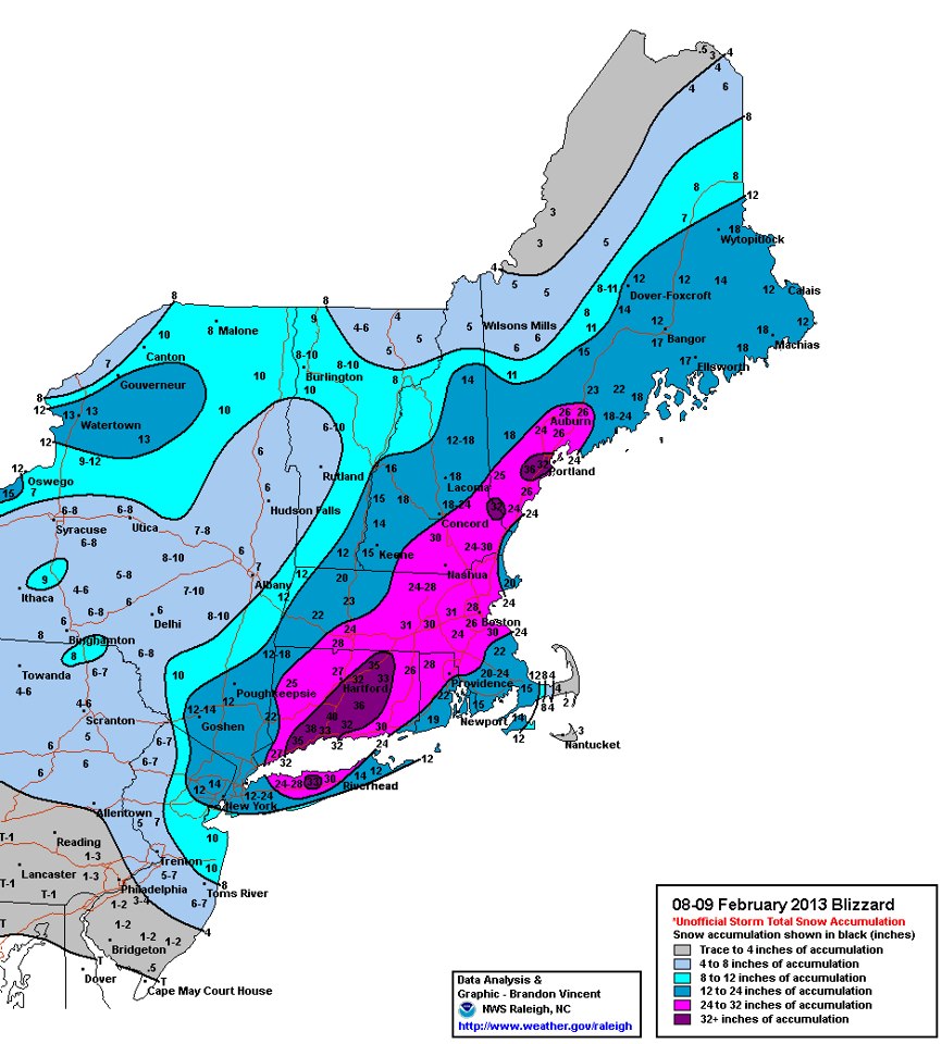
EarthSky published a map of snowfall totals compiled by the National Weather Service Hydrometeorological Prediction Center. About 35 to 40 million Americans live within that snowy bullseye.
Finally, our colleague Jeff Schmaltz on the LANCE/MODIS Rapid Response team noticed that while the skies cleared over New England and the Canadian Maritimes on February 10, cloud streets lined up offshore.

Cloud streets form when cold air moves over warmer waters, while a warmer air layer (or temperature inversion) rests over the top of both. Read more here from my fellow Earth Observatory writer Adam Voiland.
By the way, I am not buying into this idea of naming winter storms. I certainly won’t let it spoil my fondness for Nemo, both the movie and book characters. How do you feel about this idea of naming winter storms?
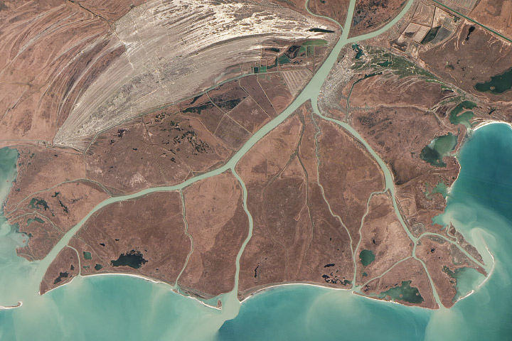
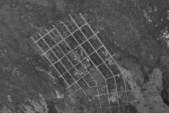
Each month, Earth Observatory offers up a puzzling satellite image here on Earth Matters. The ninth puzzler is above. Your challenge is to use the comments section to tell us what part of the world we’re looking at, when the image was acquired, and why the scene is interesting.
How to answer. Your answer can be a few words or several paragraphs. (Try to keep it shorter than 300 words). You might simply tell us what part of the world an image shows. Or you can dig deeper and explain what satellite and instrument produced the image, what spectral bands were used to create it, or what is compelling about some obscure speck in the far corner of an image. If you think something is interesting or noteworthy, tell us about it.
The prize. We can’t offer prize money for being the first to respond or for digging up the most interesting kernels of information. But, we can promise you credit and glory (well, maybe just credit). Roughly one week after a puzzler image appears on this blog, we will post an annotated and captioned version as our Image of the Day. In the credits, we’ll acknowledge the person who was first to correctly ID the image. We’ll also recognize people who offer the most interesting tidbits of information. Please include your preferred name or alias with your comment. If you work for an institution that you want us to recognize, please mention that as well.
Recent winners. If you’ve won the puzzler in the last few months, please sit on your hands for at least a few days to give others a chance to play.
You can read more about the origins of the satellite puzzler here. Good luck!
Many wildfires burn unnoticed in remote forests and grasslands, far from major population centers. Satellites detect the majority of them, but in many cases, images of the fire from the ground are scarce.
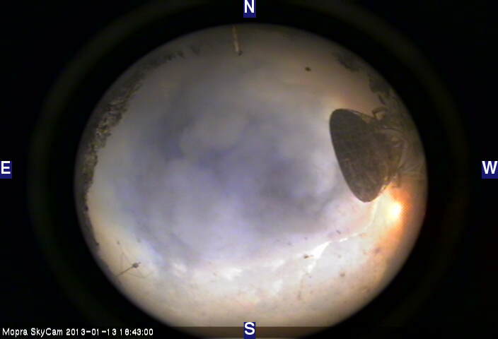
Not so for an Australian bushfire in January 2013 that passed through the campus of Siding Spring Observatory in New South Wales. The world-class astronomy facility houses numerous powerful telescopes. They’re designed to peer out into space, but webcams on a few of the telescopes captured remarkable images of smoke billowing and flames blazing. See, for instance, the all-sky view from the MOPRA SkyCam shown above.
Other webcams around the observatory were also capturing images as the fire raged nearby. The video below, a time lapse of webcams compiled by Las Cumbres Observatory Education Director Edward Gomez, offers a remarkable perspective on the blaze. For more, on-the-ground coverage of the fire, see the Astropixie blog.
Levels of particulate pollution rose above 130 micrograms per cubic meter in Salt Lake City on January 23, 2013. That’s three times the federal clean-air limit, according to the U.S. Environmental Protection Agency. Or, as the Associated Press put it, roughly equivalent to Los Angeles air on a bad day.
“The Salt Lake Valley has some of the worst wintertime pollution episodes in the West due to the combination of its increasing population and urbanization, as well as its geometry, with the valley sandwiched between mountain ranges to the west and east,” University of Utah atmospheric scientist John Horel explained in a recent story published by the National Center for Atmospheric Research (NCAR).
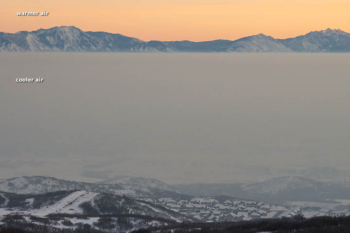
Normally temperatures decline with altitude, but meteorological conditions across the Great Basin set up a situation in which the opposite occurred for a prolonged period. For much of January, temperatures increased with altitude, creating what’s known as a temperature inversion. During the peak of the inversion, temperatures were -15.5ºC (4.1ºF) at the surface and 7.6ºC (45.7ºF) at 2,130 meters (6,988 feet), University of Utah meteorologist Jim Steenburgh reported on his blog.
The result? The layer of warm air on top functioned like a lid, trapping pollutants in the valleys and preventing winds from dispersing the haze. The photograph above, taken by Roland Li on January 19, shows the sharp boundary an inversion can create.
Air quality problems caused by temperature inversions are not unique to Salt Lake City. Cities in California (including Bakersfield, Fresno, Hanford, Los Angeles, Modesto) and Pittsburgh, Pennsylvania, have some of the most severe short-term particle pollution problems in the nation, according to a list published by the American Lung Association.
Such events are a reminder that the United States is not immune from dangerous spikes in particulate pollution, though particulate levels don’t get as high as they do in some other parts of the world. (See this map of fine particulates for a global perspective.) Eastern China, for example, recently suffered through an extreme pollution event that was far more potent than the Salt Lake City event.
More:
Utah Department of Environmental Quality: About Inversions
Salt Lake City Office of the National Weather Service: What Are Weather Inversions?
Jeff Masters: Dangerous Air Pollution Episode in Utah
Today we have a re-post from one of our colleagues on the sunny side of NASA. Karen C. Fox is a writer for NASA’s Heliophysics division.
A new kind of television recently made headlines at the 2013 Consumer Electronics Show: Ultra High Definition TV. With four times as many pixels as a current high definition (HD) TV, viewers reported being impressed with how crisp and vibrant the pictures appear.
This comes as no surprise to scientists who study the Sun using NASA’s Solar Dynamics Observatory (SDO). Its Atmospheric Imaging Assembly (AIA) and Helioseismic Magnetic Imager (HMI) together capture an image every second that is twice as large as what the ultra high-def screens can display. Such detailed pictures show features on the Sun that are as small as 200 miles across, helping researchers observe what causes giant eruptions known as coronal mass ejections (CME), which can travel toward Earth and interfere with our satellites.
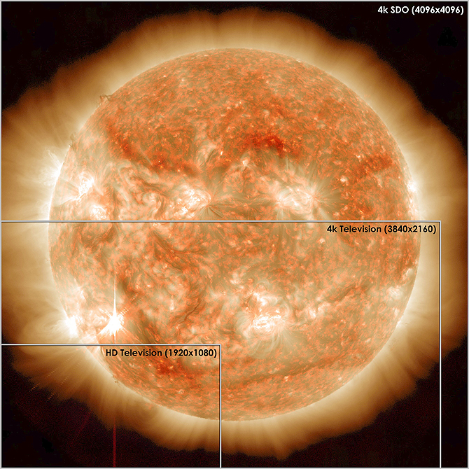
One concern about the new TVs is that there’s not yet enough content to make use of the opulent amount of pixels. SDO can help with that. As of December 2012, the solar observatory had captured 100 million images, which — if watched at a standard video rate of 30 frames per second — would mean a viewer could watch eight hours of Sun movies a day for almost four months.
For HD imagery from NASA’s SDO mission, visit: www.nasa.gov/sdo
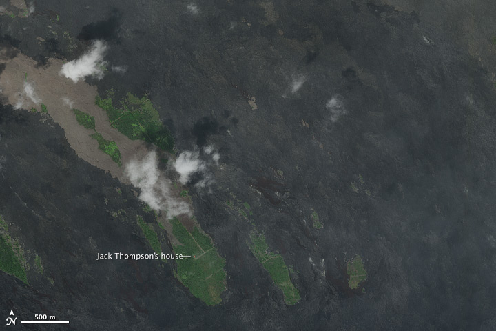
We thought the January puzzler would be tough, but it sure didn’t take Ron Schott long to solve it. We posted the puzzler at 12:56 a.m. Eastern (U.S.) time on January 21; a mere hour-and-thirty-four minutes later Ron posted the correct answer: the Royal Gardens subdivision in Hawaii. (Jeesh, Ron, don’t you sleep?) Ron is a professor of geology at Bakersfield College and a veteran of Where on Google Earth (WOGE), so we’re not particularly surprised he was so quick. WOGE even has a rule named after him. The “Schott Rule” states that you have to wait an hour for each win you have before posting. For now, we’re going to go with something slightly simpler for the puzzler: if you’ve won in the past, please wait a day before answering.
You can read more about what the puzzler image showed in Saturday’s Image of the Day. Plus, special for the blog, see the video above of Jack Thompson evacuating Royal Gardens just prior to lava flowing over his property.
In late 2012, floods swamped the United Kingdom and news reports said tens of thousands of residents had been affected. It was the kind of natural hazard the Earth Observatory tries to cover, but floods can be hard to see. When heavy rains are in progress, storm clouds typically hide the flooding from satellite sensors. Even if flooding lingers after the clouds clear away, certain types of land cover (such as dense forests) can make floods notoriously difficult to spot.
Another way of seeing floods caused by rainfall is to look at the rainfall itself. The Earth Observatory sometimes publishes imagery from the Multisatellite Precipitation Analysis (MPA). MPA estimates rainfall by combining measurements from multiple satellites and calibrating them using rainfall measurements from the Tropical Rainfall Measuring Mission (TRMM) satellite.
But as its name implies, TRMM focuses on the tropics. More specifically, TRMM specializes in picturing moderate to heavy rainfall over the tropical and subtropical regions. So we can visualize rainfall at relatively low latitudes, but places like the United Kingdom are too far north for this approach to work well.

GPM satellite constellation. Courtesy NASA Precipitation Measurement Missions.
Fortunately a solution is on the horizon—or more accurately, set to launch next year. The Global Precipitation Measurement (GPM) mission is an international collaboration spearheaded by NASA and the Japan Aerospace Exploration Agency (JAXA). Scheduled to launch in June 2014, the GPM Core Observatory will improve upon TRMM by extending observations to higher latitudes. And GPM won’t just focus on heavy rain; it will also observe light rain and snow, which comprise a significant portion of the precipitation at higher latitudes.
The NASA overview of GPM explains:
GPM will provide global precipitation measurements with improved accuracy, coverage, and dynamic range for studying precipitation characteristics. GPM is also expected to improve weather and precipitation forecasts through assimilation of instantaneous precipitation information.
So although the EO can’t visualize heavy rains in places like the UK now, that situation should change after the launch of GPM.
Every month, NASA Earth Observatory will offer up a puzzling satellite image here on Earth Matters. The eighth puzzler is above. Your challenge is to use the comments section below to tell us what part of the world we’re looking at, when the image was acquired, and why the scene is interesting.
How to answer. Your answer can be a few words or several paragraphs. (Just try to keep it shorter than 300-400 words). You might simply tell us what part of the world an image shows. Or you can dig deeper and explain what satellite and instrument produced the image, what bands were used to create it, and what’s interesting about the geologic history of some obscure speck of color in the far corner of an image. If you think something is interesting or noteworthy about a scene, tell us about it.
The prize. We can’t offer prize money for being the first to respond or for digging up the most interesting kernels of information. But, we can promise you credit and glory (well, maybe just credit). Roughly one week after a “mystery image” appears on the blog, we will post an annotated and captioned version as our Image of the Day. In the credits, we’ll acknowledge the person who was first to correctly ID an image. We’ll also recognize people who offer the most interesting tidbits of information. Please include your preferred name or alias with your comment. If you work for an institution that you want us to recognize, please mention that as well.
Recent winners. If you’ve won the puzzler in the last few months, please sit on your hands for at least a few days to give others a chance to play.
You can read more about the origins of the satellite puzzler here. Good luck!
The weather seems to be getting weirder by the month. Perhaps we are more attuned to it now, in our hyper-connected, 24-hour-news-cycle world where the news from faraway places is almost as accessible as the news form our hometown. But the research and the models say that weather extremes should grow more extreme, and the observations seem to be living up to the predictions.
The latest case in point comes from the North Pacific and Alaska. This week, a huge storm system with hurricane-force winds lashed the Aleutian Islands in an unusual winter storm. See the video of the cyclone coming over the horizon, as viewed by a GOES satellite.
[youtube vM-9NawHP-4]
According to the Alaska Dispatch, winds at Shemya (site of a former U.S. Air Force base) reached 70 miles per hour and the U.S. Coast Guard was mobilizing to “safeguard the crab fleet and other fishing vessels in the area.” According to Climate Central, the storm generated open ocean waves approaching 62 feet and “had an air pressure reading of about 932 mb, roughly equivalent to a Category 4 hurricane, and more intense than Hurricane Sandy as that storm moved toward the New Jersey coastline in October.”
The storm was weakening as it moved northeast and was not expected to have a serious impact on the mainland of Alaska.
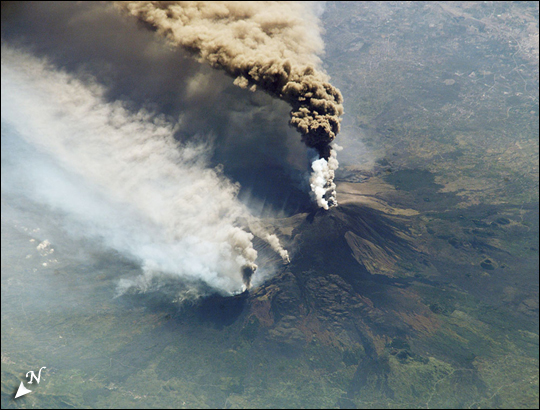
 On March 11, 2009, we posted our first image on Facebook, a spectacular view of ash billowing from Mount Etna (below). At the time, we had just a handful of friends on Facebook, and just a few of them shared it with theirs.
Fast forward three years…and tens of thousands of you have joined our Facebook community. We routinely receive dozens of comments and hundreds of you share nearly every image we post. On January 12, 2013, thanks to all of you, we hit a milestone we’ve been eying for months: 100,000 fans. The friends of these 100,000 fans, Facebook tells us, number over 34 million.
That’s an extraordinary number, but what’s even more notable is how much we’ve learned from all of you since that first post. You’ve told us what you like, what you don’t, and why. You’ve given us countless story ideas, and you have pushed us to keep digging and learning about images long after we hit the publish button. You’ve taught us—and each other—more than we could have imagined when we posted that first image.
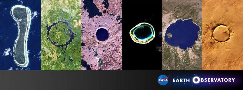
So from all of us at the Earth Observatory, THANK YOU! To mark the occasion, we’ve pulled together (above) a few of our favorite craters, plus an atoll in French Polynesia that’s conveniently shaped like a 1. The craters include Pingualuit and Manicouagan in Canada, Lonar in India, Tenoumer in Mauritania, and Crater Lake in the United States. We’ll leave it to you to figure out which is which.
In the meantime, please keep your feedback coming. We love hearing from you, and it helps make our site better. And one last plea: please share this post with your friends, tell them to join our Facebook page, and let them know that we’d love to hear from them as well.
alert message
