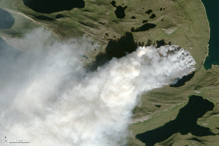
NASA Earth Observatory image by Jesse Allen, using Landsat data from the U.S. Geological Survey. The image was captured on August 3, 2017, by the Operational Land Imager (OLI) on Landsat 8.
Scientists around the world have been using satellites to monitor a wildfire in Greenland. In a place better known for ice, just how unusual is this fire? NASA Earth Observatory checked with Earth science experts Ruth Mottram, Jessica McCarty, and Stef Lhermitte to find out. Mottram is a climate scientist at the Danish Meteorological Institute; Lhermitte is remote sensing scientist at Delft University of Technology; and McCarty is a geographer at Miami University.
How unusual is this fire?
Mottram: Many of my colleagues at the Danish Meteorological Institute (DMI) were a bit surprised at first, but it was clear talking to both the Greenland weather forecasters (they do three month rotations to the airport at Kangerlussuaq) and to some of the older guys that fires do happen reasonably regularly, particularly in the west and south. However, they are not always reported either officially or in the news unless the fire is close to a settlement or affecting shipping or flights. This fire seems to be a fairly large one, but there has been no systematic attempt to gather evidence or data on Greenland’s fires – at least not at DMI. I have never heard of anyone else in Denmark doing it either, so it is a bit hard to be more precise than that.
McCarty: This is a hard question to answer, and I keep telling media reporters the same thing: we need to have the wildfire history analyzed before we know how unusual this is. I can tell you from the global wildfire science community that I am a part of, we would have never thought the we would need to make a wildfire history to understand the fire regime in Greenland. So that part is unusual.
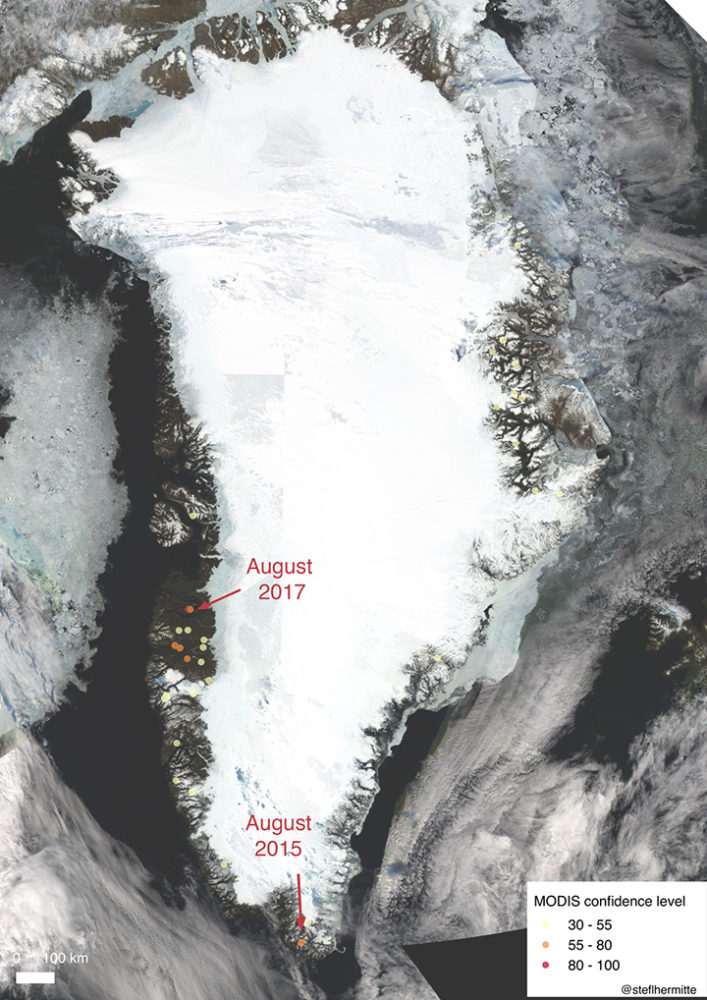
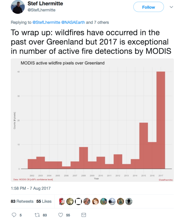
Lhermitte: I completely agree with Jessica. I used to be a wildfire remote sensing scientist (finished my PhD on African wildfires in 2008), but I have shifted since then to the cryosphere community (including some work on Greenland’s ice). It was a big surprise to me to see both worlds combined on Monday when I first noticed a Greenland fire tweet. Now it is clear that fires have occurred before, but that we basically lack a good record. MODIS gives us a glimpse, but the sensor cannot detect fires through clouds, and the record is short. Based on what I have seen, the 2017 fire is the biggest one on the MODIS record, but the record is sparse and incomplete.
I know you have done some looking through MODIS and Landsat satellite data for evidence of past fires in Greenland. What have you found?
Lhermitte: I looked back at the record of MODIS active fire detections since 2002 and made a quick overview map. In the map below, fire detections are marked with circles. Higher confidence fires are red; lower confidence fires are yellow. In most years, the satellite flags about 5 pixels as having active fires. In 2015, it flagged about 20 pixels. There were over 40 pixels flagged in 2017, so this year has been exceptional. Note: Most of these detections are probably campfires or false detections—not uncontrolled wildfires. There have been two big wildfires: the one happening now and one in August of 2015.
McCarty: Overall, 2017 appears to be a larger fire season than any year since 2001. But from a remote sensing point of view, this is a difficult place to study the fire regime using satellite-based active fire detections (because of cloudiness and other factors). The Landsat/Sentinel-2/Deimos, etc. burn scar images will be more helpful.
Mottram: I have not looked into any of the specific data, but I have heard anecdotes about fires in Narsarsuaq close to the DMI ice service reconnaissance station in the south of Greenland, in the Kobbefjord close to Nuuk, and just to the north of Sisimiut near this one. There was also a large fire in 2008 near Eqi, close to Ilulissat, which the Greenland press reported was caused by a tourist burning rubbish but failing to put the fire out.
One of you said on social media that you think the fire may be burning through peat. Are you sure? How can you tell?
McCarty: The fire line has not moved much in comparison to a wildfire in a grassland or forest. However, Stef made an awesome Sentinel-2 animation that shows the fire line moving some. I still think it is peat with a mix of grasses and moss (given the Google Earth Pro and Deimos imagery), but how deep the peat is difficult to ascertain. A recent study in the Qaanaaq region (north of where these wildfires are) found five times more peat in the soil distribution and soil content than previously reported. Also, historically, peat houses were constructed in this area of Greenland, which means there are peat deposits nearby. Short grasses with underlying peat is my working hypothesis for now since we are onto day 11 of the fire.
Mottram: I am not really a soils expert, and Greenland really suffers from having little detailed mapping of this kind. Also, Greenland is pretty diverse from north to south and east to west. There are high rocky mountains and permafrost. The south has sheep pasture and even some areas of forest; the north has large areas with low vegetation cover. However, there are also extensive areas of peat cite in the scientific literature.
Do you think this fire was triggered by human activity or lightning? Do we know what triggers most fires in Greenland?
McCarty: I still can’t find any indication that this was lightning, so it must be human activity. Greenlandic/Danish news reports are reporting that hikers and tourists should stay from this area, so I would assume that humans are on the landscape there.
Mottram: I can’t really say for sure. Lightning is not impossible, but neither is human activity. It is the middle of the hunting/fishing/berry-picking/hiking season, and this area is known for reindeer. In fact, the Greenland press had an interview with a reindeer hunter who had to turn back from visiting because of the smoke in the fjord. Actually, the hunter wanted the fire put out by the authorities, so he could go hunting there.
What has the weather been like in Greenland during the last few months? Has it been unusually hot or dry where this fire is burning?
Mottram: It has been a very dry summer in the south but also quite dry in this region, and the fire was preceded by some relatively high temperatures. My climatologist colleague John Cappelen tells me that the DMI station at Sisimiut measured an precipitation anomaly of -30.0 millimeters for June and -20.7 millimeters for July compared to the mean precipitation of 1981-2010. In other words, there was almost no rain in June and a bit more than half the usual rainfall in July. There have also been some warm days in Sisimiut (or at least at the airport where the weather station is), particularly towards the end of the month. The monthly average temperature was 7.1 Celsius compared to a 1961-1990 average of 6.3 Celsius in July. The trend has continued into August as well.
This fire got me wondering why there are ice-free areas along Greenland’s coast where vegetation grows. Are these relatively new features? How do you think they got there?
Lhermitte: These ice free coastal areas are mainly the result of the bedrock topography, where the coastal Greenland areas are much more elevated than the interior of Greenland. Since the last glacial maximum, the ice sheet has partly retreated and exposed more land. If the ice sheet would retreat further, we would see more of the inner, lower land exposed.
Mottram: The ice sheet is more or less in equilibrium with the climate, so it is where it is because that is where the glaciers can flow. During the last glacial maximum, the ice sheet extended far out onto the continental shelf and connected (in the north west) with the Laurentide ice sheet in North America. Then, with warming after the last glacial period, the ice sheet retreated. (That is, more ice was melting and calving away than was being replenished by snowfall.) The ice sheet has been more or less stable in its present extent for about the last 10,000 years (with some smaller advances and retreats responding to more local climate variability).
Seen from space by day, central Argentina looks green and unpopulated. But by night…
Visit our Earth at Night page to learn more about how scientists are using images of the planet’s dark side to gain insight on human activity and on poorly understood natural events.
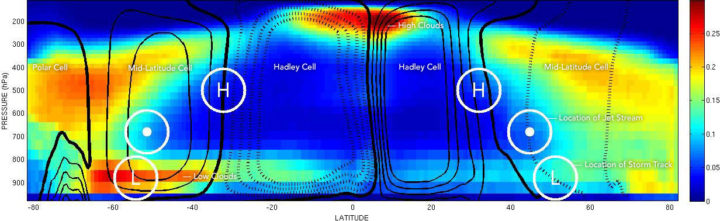
The location of mid-latitude storm tracks are marked with an L. The location of the jet stream is marked with a dot. And the place where air sinks between Hadley Cells and Mid-latitude Cells is marked with an H. The left side of the chart depicts the Southern Hemisphere; the right side depicts the Northern Hemisphere. Chart by George Tselioudis/NASA. The cloud data was collected by CloudSat.
The concentrations of greenhouse gases in Earth’s atmosphere have risen rapidly during the past century, mainly because of fossil fuel burning. Some of the effects of this are pretty straightforward: more carbon dioxide in the atmosphere means air temperatures will rise; ice in the high latitudes will begin to melt; and sea level will rise.
That seems pretty straightforward, right? But there are some areas where the changes will be more complicated. For instance, what will all of that extra carbon dioxide means for how air circulates, for the position of the jet stream, and for how clouds are distributed in the atmosphere?
George Tselioudis, a climate scientist at NASA’s Goddard Institute for Space Studies, did a nice job of explaining this as part of a post he wrote recently. In case you are not familiar with some of the scientific terms, I have added links to web sites that explain them in more detail. I also added some additional explanations to make his description a little clearer.
Take it away, George:
Atmospheric circulation, when examined using a simplified, two-dimensional view (such as the figure above), is dominated by two major features. The first is a large feature called the Hadley cell, which lifts air in the Inter-Tropical Convergence Zone (ITCZ), moves it at high altitudes towards the poles, and sinks it again to the surface in the subtropical regions. The second feature is a very strong river of air, known as the jet stream, that flows from west to east in the middle latitudes of each hemisphere. The meanders of the jet stream produce the storm tracks that are the major weather makers in the mid-latitude regions.
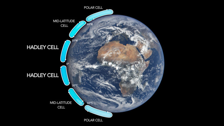
Image Credit: NASA.
George did not include it in his post, but here is a useful chart that lays out the locations of Hadley cells and the other higher-latitude cells. Now look back at the figure at the top of this page, and let’s go back to George.
The subsiding zones at latitudes between 20° and 30° North and South are noted by the letter ‘H’; the jet stream is in each hemisphere is marked with a dot; and the storm tracks are noted with an ‘L’. The circulation is superimposed on the distribution of the world’s clouds, derived from NASA CloudSat satellite observations. Areas with the most clouds are red and yellow.
Note: The CloudSat data are key. There are plenty of diagrams that show how global circulation patterns work (in fact, I have included one more below). But there are few that show you where clouds actually form and, crucially, at what altitude those clouds form.
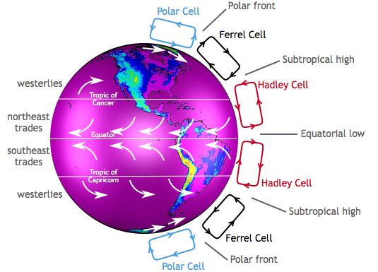
Image by the Center for Multiscale modeling of Atmospheric Processes.
George continues:
It is apparent how the clouds relate to the circulation features. The narrow zone of uplift in the tropics produces high, thick clouds in the ITCZ (which is near the equator). The areas of subsidence in the subtropics produce extensive fields of low clouds, more extensive and deep in the southern than in the northern hemisphere, while the storms embedded in the jet stream produce deep, high clouds that extend throughout the Earth’s troposphere.
It is worth looking carefully at the figure at the top of the page and tracing out the features that Tselioudis describes. Whether clouds are low or high leads to different effects on climate. Low clouds primarily reflect solar radiation and cool the surface of the Earth. In contrast, high clouds tend to have a warming effect on the surface and atmosphere.
Now let us look at the key claim that Tselioudis and other climate scientists make about how global warming will affect circulation patterns. In short, scientists expect Hadley cells to expand so that the edges (where air descends) move toward the poles. In other words, the tropics will expand.
And that is exactly what has happened over the past few decades:
Observations of the past 35 years indicate that, as the Earth has warmed, these circulation features are moving towards the poles. The Hadley cell shows a clear signal of poleward expansion, while poleward movement is present but less clear in the jet stream and mid-latitude storm tracks. We found that the two quantities that correlate significantly and consistently in all ocean basins and seasons are the Hadley cell extent and the high cloud field: when the Hadley cell edge moves poleward, the high cloud field also shifts towards the poles, and vice versa.
Still following? Good, because this is where things get more complicated. Though Hadley cells are expanding in both the Northern and Southern Hemispheres, the effects on clouds and climate are different in each hemisphere. Here is how Tselioudis puts it:
However, this coordinated movement does not have the same effect in the two hemispheres. In the northern hemisphere, the poleward movement of the high clouds opens up a “cloud curtain” that lets more sunlight into the ocean surface, thus producing warming at the surface. But in the southern hemisphere, the poleward contraction of the high clouds is balanced by an expansion of the already extensive low cloud decks, which ends up blocking more sunlight and producing a small surface cooling.
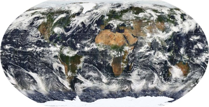
A map of Earth showing the global cloud cover on July 11, 2005, based largely on observations by the MODIS sensor on the NASA Terra satellite. Most clouds form in bands near the equator and along lines of latitude roughly 60 degrees North and South of the equator.
Why does this matter? According to Tselioudis, representing this detail correctly in climate models is critical to determining how much warming will result from a given increase of greenhouse gases. Climatologists call this climate sensitivity. Many climate models do not represent Hadley Cell expansion correctly yet; specifically, the models do not account for the fact that the Hadley cells have grown wider. Tselioudis’s research shows that the models that do match real-world observations of clouds have a lower sensitivity to greenhouse gases (a climate sensitivity near 3° Celsius compared to between 4°C and 5°C).
If Tselioudis is right, that is a piece of mildly good news for the planet from the complicated world of cloud climate science.
For more details, read the post Tselioudis wrote for GISS. Also, take a look at this June 2017 article and this May 2016 study and news release.
Every month on Earth Matters, we offer a puzzling satellite image. The July 2017 puzzler is above. Your challenge is to use the comments section to tell us what we are looking at, when the image was acquired, and why the scene is interesting.
How to answer. Your answer can be a few words or several paragraphs. (Try to keep it shorter than 200 words). You might simply tell us what part of the world an image shows. Or you can dig deeper and explain what satellite and instrument produced the image, what spectral bands were used to create it, or what is compelling about some obscure speck in the far corner of an image. If you think something is interesting or noteworthy, tell us about it.
The prize. We can’t offer prize money or a trip to Mars, but we can promise you credit and glory. Well, maybe just credit. Roughly one week after a puzzler image appears on this blog, we will post an annotated and captioned version as our Image of the Day. After we post the answer, we will acknowledge the person who was first to correctly ID the image at the bottom of this blog post. We may also recognize certain readers who offer the most interesting tidbits of information about the geological, meteorological, or human processes that have played a role in molding the landscape. Please include your preferred name or alias with your comment. If you work for or attend an institution that you want us to recognize, please mention that as well.
Recent winners. If you’ve won the puzzler in the last few months or work in geospatial imaging, please sit on your hands for at least a day to give others a chance to play.
Releasing Comments. Savvy readers have solved some of our puzzlers after only a few minutes or hours. To give more people a chance to play, we may wait between 24-48 hours before posting the answers we receive in the comment thread.
Good luck!
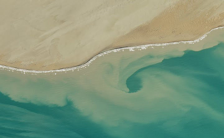
Answer: The image above shows the Makran Coast in Pakistan on May 25, 2017, when it was observed by the Operational Land Imager (OLI) on the Landsat 8 satellite. To the left of the image, the sediment-rich Hingol River feeds into the Arabian Sea. As its tan color indicates, the river frequently carries large amounts of sand and other debris. This is particularly true after a rare rain. Congratulations to Obaid-ur-rehman and j.roloff for their winning answers. Read more about the image in our July 29, 2017, Image of the Day.
Photo courtesy of Luciano Javier Avila.
Dozens of wildfires blazed along the Atlantic coast of Argentina coast last winter. One of them left behind a massive burn scar near the Valdez Peninsula. When we wrote about the fires last month, we were unable to say with certainty whether the plume rising off the burn scar was airborne ash or dust. A quick recap from our article:
This part of Argentina’s coast is sparsely populated, arid, and covered in scrubby undergrowth. The closest city is Puerto Madryn, more than 30 kilometers (20 miles) from the burn scar. Due to this remoteness, it is difficult to verify the composition of plumes.
At the time, Santiago Gassó, a NASA scientist who studies the global transport of ash and dust, gave us his best guess:
While Gassó believes ash caused this plume, it is possible that finely ground rock and soil dust also could have become dislodged by the fire. Vegetation and roots (which usually hold the soil in place) would have been removed by the fire, making it easier for the strong regional winds to sweep dust off of the land.
Since then, a reader has written to us with more details. Luciano Javier Avila, a biologist with the Patagonian Institute for the Study of Continental Ecosystems, walked around the site just days after the fires and took photos of the burned area. He confirmed that the cloud was, in fact, dust. Strong winds in January and February caused dust plumes visible from Madryn.
The fire highlights the importance of plants in this semi-arid region, according to Avila. Many of the plants which used to grow here are larrea (“jarilla” in Spanish), a desert shrub that flowers in yellow. Without their roots holding the soil together, the wind was able to blow large amounts of fine dust into the air.

Urban Heat Islands Come with a Cost
The urban heat island effect has been shown to raise the temperature of cities compared to their neighboring rural and semi-rural areas. Research published in May 2017 in Nature Climate Change spells out the cost associated the effect. Economists analyzed 1,692 cities and found that the economic cost of climate change this century could be 2.6 times larger when the heat island effect is accounted for. The costs stem from factors like air pollution, water quality, and energy for cooling.
CO2 Reached Record Highs
In April 2017, the concentration of carbon dioxide in the atmosphere reached (and surpassed) 410 parts per million (ppm) for the first time in recorded history. The milestone measurement was made at the Mauna Loa Observatory in Hawaii, a ground-based station that has collected CO2 data since 1958. (Global, space-based data now supplement those measurements and provide the big-picture view.)
Levels continued to rise, and by the end of May, the monthly average was the highest on record at 409.65 ppm. CO2 concentrations reach an annual peak every May, but the average in May 2017 was well above that of previous years. Check out this graph to see how 2017 has measured up.
Rainfall Reorg
Climate change is likely to affect Earth’s rainfall patterns. Authors of a recent study published in Science Advances used paleoclimate data to examine how rainfall patterns have responded to past climate shifts. These past trends lend evidence to scenarios that could unfold in the future. During the northern hemisphere’s summer, dry areas are likely to become drier and wet areas would be wetter; in the winter, regions of relatively heavy rainfall would expand northward.
Plants Pack a Punch on Precipitation
During photosynthesis, plants release water vapor into the air. This water vapor can ultimately cause clouds to form, which in turn can affect Earth’s energy balance and produce precipitation. A May 2017 study published in Nature Geoscience used global satellite data and a statistical technique to show that as much as 30 percent of the variability in climate and weather patterns can be attributed to plants.
“Hottest” Events on the Rise
Scientists have developed a framework to help determine if an extreme weather events can be attributed to climate change. Using the framework, they show that for 80 percent of areas where observations are available, global warming has increased the chances for (and severity of) “hottest” events—months and days that measure in as the hottest of the year. The research was published May 2017 in Proceedings of the National Academy of Sciences.
Summer is beach season in the northern hemisphere. But even if you’re a regular at your local swimming hole, you probably haven’t seen too many beaches from this perspective. This video from NASA Earth Observatory shows the satellite and space-station view of various shorelines across the United States. No sunblock necessary.
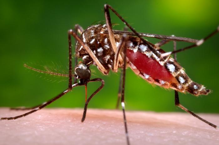
An Aedes aegypti mosquito in the process of acquiring a blood meal. Image Credit: CDC/James Gathany.
Though mosquitoes are small, they are also deadly. Mosquito bites result in the deaths of more than 725,000 people each year—more than any other animal. That compares to about 50,000 deaths from snakes, 25,000 from dogs, 20,000 from tsetse flies, 1,000 from crocodiles, and 500 from hippos.
More than 50 percent of the world’s population lives in areas where mosquito-borne diseases are common, according to the World Health Organization. Malaria is the deadliest disease spread by mosquito, but the bugs also serve as vectors for Chikungunya, Zika, Dengue, West Nile Virus, and Yellow Fever.
NASA and the Global Learning and Observation to Benefit the Environment (GLOBE) Program have a new way of fighting back. The GLOBE Observer Mosquito Habitat Mapper is an app that makes it possible for citizen scientists to collect data on mosquito range and habitat and then feed that information to public health and science institutions trying to combat mosquito-borne illnesses. The app also provides tips on fighting the spread of disease by disrupting mosquito habitats. Specifically, it will help you find potential breeding sites, identify and count larvae, take photos, and clean away pools of standing water where mosquitoes reproduce.
The Crowd & the Cloud, a show hosted by former NASA Chief Scientist Waleed Abdalati, has an excellent segment (video above) that explains how the app works.
Don’t delay. Download the Habitat Mapper for iOS from the iTunes app store or from Google Play for Android now, and start hunting down these blood-sucking killers.
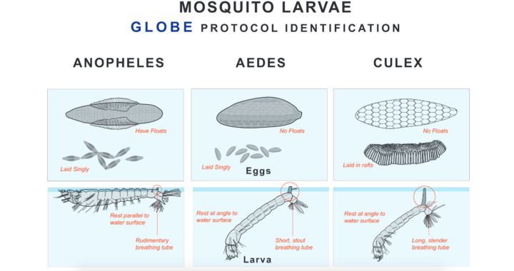
Eggs and larvae of three species of mosquitoes. Image Credit: The Globe Program. Download a larger version.
Each month, we try to stump you with a new EO Puzzler. If you missed the latest one, or if you just want more challenges, we have a new one from our colleagues at the Jet Propulsion Laboratory.
The science and outreach team from the Multi-angle Imaging SpectroRadiometer (MISR) is inviting you to become a geographical detective and solve their latest mystery quiz. But this is more than just a “where is this place?” kind of quiz. You need to know some history — natural and human — to correctly answer all of the questions. Check out the quiz — based on the image below — at http://climate.nasa.gov/quizzes/misr_quiz_29.
Quiz answers will be accepted on the MISR page through 4:00 p.m. Pacific Daylight Time on June 28.
A June snowstorm just topped off the already thick layer of white stuff atop the Sierra Nevadas. California’s snow water equivalent rose to a heaping 170 percent of normal. But not so long ago, the state was in the midst of a deep drought; its mountains were bare and brown, and water levels plummeted in reservoirs.
Throughout, satellites were watching. Check out the California drought and its aftermath in a video from NASA Earth Observatory:
alert message
