A scientist could hardly be expected to be happy about finding a mistake in his work after he published it. But if you have to watch your research go down in flames, it may help to regard it as an offering on the sacrificial fire of scientific progress. In the case of “ocean cooling,” Willis has plenty of reasons to consider the sacrifice worth it.
The first payoff for finding and fixing the XBT errors was that it allowed scientists to reconcile a stubborn and puzzling mismatch between climate model simulations of ocean warming for the past half century and observations. The second was that it helped explain why sea level rise between 1961-2003 was larger than scientists had previously been able to account for.
Much of what scientists know about how ocean heat content has changed over the past half century comes from the work of Sydney Levitus, the director of NOAA’s Ocean Climate Laboratory in Silver Spring, Maryland, and his colleagues. In the early 1990s, the United Nations Education and Scientific Organization (UNESCO) asked Levitus to undertake a scientific rescue mission.
The group wanted Levitus to locate historical ocean data sitting around in dusty library stacks, moldy basements, and forgotten filing cabinets around the world before they were lost to natural disaster or neglect. The project became known as the Global Oceanographic Data Archeology and Rescue Project (GODAR).

Historical climate records provide important context for modern measurements. This type of XBT was used in the mid-1960s. (Photograph courtesy NOAA Photo Library.)
“Since 1993 or so, we have added several million historical temperature profiles. This collection allowed us for the first time to estimate the change in ocean heat content from 1955 on. When we first published these results in 2000, they received a great deal of media, congressional, and scientific attention, because the warming that we saw was consistent with what would have been expected due to the increased greenhouse gases in the atmosphere,” recalls Levitus.
What wasn’t consistent was several large bumps in the graph of heat content over time. “We saw an overall linear [warming] trend that was consistent, “ says Levitus, “but we also saw some very large interdecadal variability. In particular, toward the late 1970s, heat content increased substantially and then around 1980, it decreased substantially.”
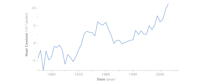
The global ocean heat content trend reconstructed by the Global Oceanographic Data Archeology and Rescue Project showed an overall increase from 1955 to 2003, but there were large unexplained swings. (Graph by Robert Simmon, based on data from GODAR.)
“Those bumps gave everyone heartburn,” says Willis. There was no established physical explanation for them, and climate models didn’t reproduce them. The science community wasn’t sure whether the discrepancy cast doubt on the models or the observations, but fingers got pointed in both directions.
In mid-2008, however, a team of scientists led by Catia Domingues and John Church from Australia’s CSIRO, and Peter Gleckler, from Lawrence Livermore National Laboratory in California, revised long-term estimates of ocean warming based on the corrected XBT data. Since the revision, says Willis, the bumps in the graph have largely disappeared, which means the observations and the models are in much better agreement. “That makes everyone happier,” Willis says.
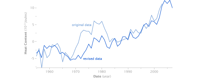
The same flaws in the XBT data that affected Willis’ ocean heat maps showed up in the long-term historical trend (light blue). After applying a correction, the historical record shows a relatively steady increase in line with what’s shown by climate models. The remaining short-term variability is as likely to be natural variation, such as El Niño, as noise in the data. (Graph by Robert Simmon, based on data from GODAR.)
Levitus agrees that the interdecadal variability is substantially decreased, but it isn’t totally gone. He argues that before anyone assumes that the observations must be wrong, they should remember that the amount of variability they are talking about is probably less than the amount of heat gained and lost during the intense El Niño in 1997-98. “Climate models don’t reproduce El Niño events very well either,” he says, but no one doubts they are real.
Although he has “caused a stir” among his colleagues in the past by criticizing models’ inability to simulate how ocean heat storage varies on short-term time scales, he stresses, “I have said from the beginning that the fact that the long-term trends in models and observations do agree so well is what is most important.”
“My point is just that we need to remain open-minded because it may be that it is possible for the ocean to gain heat and lose it more rapidly than we think. There may be other phenomena [similar to El Niño] operating on different time scales that can explain interdecadal increases and decreases,” says Levitus. Even if these ups and downs don’t change the long-term destination of global warming, they could reveal more detail about what kind of ride we can expect.
