The Making (and Breaking) of an Urban Heat Island | |||
On a hot, sunny afternoon, walk outside and find a parking lot bordered by grass. Put one hand on the asphalt and the other on the grass. The same surfaces of asphalt, stone, brick, and cement that keep weeds and water out of our way can sizzle in the sunlight and raise local temperatures. To make room for all these buildings and roads, cities squeeze out vegetation that would otherwise cool its surroundings by evaporating water. Added to the mix are car motors, hot air from air conditioners and clothes dryers, earth-moving machines, even smokestacks. All of these heat sources work together to raise temperatures. According to the U.S. Environmental Protection Agency, an urban area can see air temperatures up to 6 degrees Celsius (10 degrees Fahrenheit) hotter than the nearby suburban and rural areas. |
|||
 | |||
New York City has produced its own urban heat island for more than a century. In the summer of 2002, Gaffin and his colleagues used satellite temperature data, city-wide land cover maps, and weather data, along with a regional climate model to identify the best strategies for cooling the city. The team estimated how much cooling the city could achieve by planting trees, replacing dark surfaces with lighter ones, and installing vegetation-covered “green roofs.” The team studied the city as a whole, as well as six “hotspot” areas—including parts of Manhattan, the Bronx, Queens, and Brooklyn—where air temperatures near the ground were higher than the city-wide average. Each area was serviced by Con Edison, the local power company, so the scientists could compare electricity use. Each area also had available space so that the mitigation strategies the team considered could be modeled in the study and potentially implemented later on. |
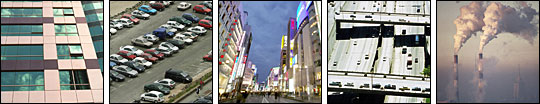
Stone, brick, concrete, and asphalt surfaces that are impervious to water can trap the Sun’s heat. Not only do cities concentrate such heat-trapping surfaces, they also contain other sources of heat, such as vehicle motors and smokestacks. (Photos courtesy Photos.com.) | ||
 | |||
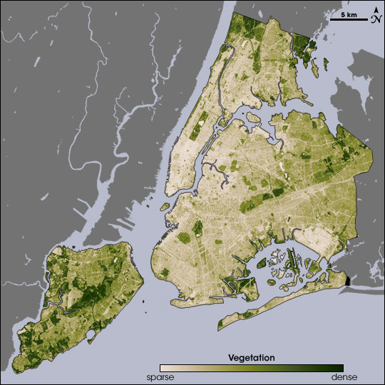 | |||
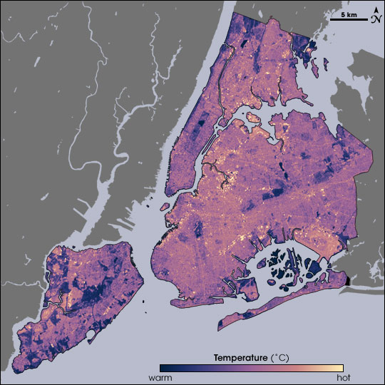
The urban heat island effect is perhaps most dangerous during heat waves, when demand for air conditioning soars, so the team concentrated on collecting data during those periods. Though heat wave definitions vary, for the 2002 study, the team settled on at least three consecutive days with maximum temperatures above 32.2 degrees Celsius (90 degrees Fahrenheit) in Central Park. Using National Weather Service data, the researchers identified three heat waves that summer: July 2–July 4, July 28–August 7, and August 11–August 18. August 14 fell on one of the hottest heat wave days in New York’s summer of 2002, making it a good day to take the city’s temperature. Measuring the temperature of every last sidewalk, street, parking lot, roof, garden, and grassy area in an entire city isn’t easily done from the ground, so the researchers relied on NASA to take the city’s temperature from the sky. NASA’s Landsat Enhanced Thematic Mapper collected thermal infrared satellite data. At a spatial resolution (level of detail) of 60 meters per data pixel, Landsat offered detailed mapping of New York City’s urban heat island, supplementing temperature data the team used from the National Weather Service. After collecting temperature measurements, Gaffin and his colleagues combined those measurements with other data, including a database of New York City land cover. Specifically, the team looked at how much of the city—and each smaller area under study—consisted of impervious surfaces and rooftops, grassy areas, trees, and water. The researchers then fed these data into a climate model. Developed by Pennsylvania State University and the National Center for Atmospheric Research, this model, known as MM5, predicts regional atmospheric circulation and weather phenomena. Gaffin and his colleagues tested the model results against observed temperature and weather conditions in New York City to ensure its predictions were accurate. Then they ran the model assuming different conditions, such as a conversion of all of the city’s available roof area to light-reflecting surfaces. The model predicted that a combination of urban forestry and light roofs could reduce New York City’s overall temperature by 0.67 degrees Celsius (1.2 degrees Fahrenheit) throughout the day. At 3 p.m., when temperatures typically peak, these mitigation strategies could reduce New York City’s temperature by 0.89 degrees Celsius (1.6 degrees Fahrenheit). Results varied for the smaller areas under study, but Mid-Manhattan West realized the greatest temperature alleviation throughout the day, at -0.94 degrees Celsius (-1.7 degrees Fahrenheit), and Lower Manhattan East saw the best reduction at 3 p.m., at -1.33 degrees Celsius (-2.4 degrees Fahrenheit). These temperature reductions might not sound like much, but they can actually have a big impact. Power usage, Gaffin explains, is very sensitive to even slight variations in temperature. “If you’re near the maximum power availability of your grid, which is often the case in these summer heat waves, each degree can make a significant difference in overloading the grid and leading to a blackout,” he says. So anything that would cool the city off, even a little, could ease energy demands and reduce blackout risks. | Gaffin and his colleagues used Landsat data to assess New York City’s summer heat. The top map shows temperature, with cooler temperatures appearing in blue and hotter temperatures appearing in yellow. The bottom image shows vegetation, with beige indicating sparse vegetation and dark green indicating dense vegetation. The maps show a correlation between dense vegetation and cool temperatures, and between sparse vegetation and high temperatures. NASA’s Landsat satellite captured these images of New York City on August 14, 2002, at 10:30 a.m. (Maps by Robert Simmon, using data from the Landsat Program.) | ||
 |
Gaffin found the modeling useful, although he harbors some reservations. “A lot of [regional climate] models were originally designed for natural land surfaces,” he explains. For cities, “we’ve got to take into account the thousands and hundreds of thousands of building geometries. The jury’s still out on how well we know what the temperature reductions will be.” The 2002 study provided enough evidence, however, to allow Gaffin and his colleagues to make some recommendations for mitigating the heat. An especially effective mitigation strategy involved planting trees. Each tree could not only cool its immediate area, it could also cast shade onto nearby buildings. Gaffin and his colleagues estimated that 17 percent of the city’s surface could be planted with trees. They also estimated, however, that the biggest temperature reductions could be achieved by addressing New York City’s dark, impervious surfaces such as roads and roofs. Their assessment of the city indicated that 64 percent of the city area consisted of such surfaces. About 14 percent of the New York City’s impervious surface area consists of rooftops, most of them dark, heat-generating surfaces, typically tar, and sometimes overlain with gravel. “The tar beach roof—ubiquitous in cities—is an oven in the summer, reaching 160 degrees Fahrenheit,” Gaffin explains. “So cooling off this roof is like turning off an open oven.” By turning off the open ovens that covered part of the city, New York could cool itself considerably. Two options exist for changing a tar beach roof into something cooler: a light-reflecting surface and vegetation.
|
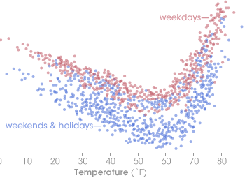
Electricity demand is highly sensitive to temperature. This graph shows demand (in gigawatt hours) versus temperature (in degrees Fahrenheit) in New York State in the late 1990s. A gigawatt hour is a unit of power equal to 1 billion watts. Electricity demand is slightly lower on weekends and holidays (blue dots) than on weekdays (red dots). Demand increases sharply as temperatures rise above about 60 degrees. (Graph adapted from Rosenzweig et. al. 2001, based on data from the New York Power Pool and Itron, Inc.) | |
