
MODIS Snow Maps | |||
Looking down on the mountains from a high airplane, bright white snow is easy to spot against the darker background of rocks, earth, and plants. An airline passenger might have more difficulty telling the difference between white clouds and white snow, unless she were wearing shortwave-infrared goggles. “If you could see in shortwave infrared (where light has a wavelength of 1.6 micrometers), snow would look dark, and most clouds would look bright,” says Dorothy Hall, Senior Scientist at NASA Goddard Space Flight Center. Objects take on their color based on the light they reflect—grass is green, for example, because it reflects green light, but absorbs other wavelengths. Snow absorbs shortwave-infrared energy, so little of that energy is reflected back to a goggle-wearing, high-flyer, to whom the snow would appear dark. Clouds, on the other hand, reflect shortwave infrared, so they would appear very bright. |
|||
 | |||
The MODIS sensor can detect energy in a shortwave-infrared part of the electromagnetic spectrum, so it has the ability to separate snow and ice from clouds, says Hall. The problem, Hall points out, is that there are so many clouds, it’s often hard to tell what the extent of snow cover is in any given image. To get around the problem, Hall and her team gather the imagery into eight-day and monthly snow maps that effectively screen out most of the clouds. The first step in generating a snow map is to divide the world into a grid where each cell covers 500 square meters. This area corresponds to the highest resolution that MODIS can see in the shortwave infrared part of the spectrum. Each cell is then sorted into one of four categories: snow, no snow, cloud, or no data. If MODIS sees snow in a 500-meter cell at any time during the eight-day period, the cell is marked as snow-covered on the map. If clouds covered the cell during the entire period, a “cloud flag” is placed in the cell, and if MODIS doesn’t detect snow during the eight days, the cell is classified as snow-free. When the grid is put together, the result is a snow map showing the maximum extent of snow during that eight-day period. |
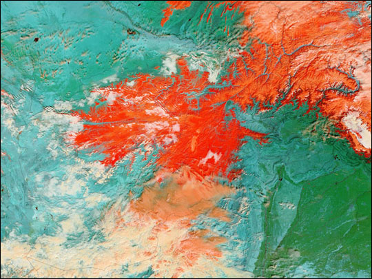
This false-color Terra MODIS image shows Afghanistan on February 25, 2005. Snow in the Hindu Kush Mountains is red; the barren desert landscape is blue-green; plant-covered land is green; and clouds appear orange or white. At the time MODIS acquired this image, heavy snows and intense cold had caused over 500 deaths in the region from avalanches, exposure, and illnesses like measles and whooping cough. (Image courtesy MODIS Rapid Response Team) | ||
 | |||
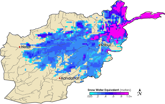
How does this help Afghanistan? The amount of snow in the mountains is directly related to the amount of water that will be available later in the year. The maps reveal how much of a basin is covered with snow, when the snow fell, and when it melted. But, says Budde, “The map doesn’t show the volume of water available.” To get that, FEWS NET scientist Guleid Artan developed a snow-water equivalent map. The map is based on a model that estimates how much snow fell in a region based on climate parameters such as relative humidity, atmospheric pressure, temperature at the surface, wind speed, and so on. Along with the MODIS snow extent, the model allows FEWS NET to estimate how much water is available in the snow. That information can point to impending drought and possible crop failure or to potential floods. “This spring [2005] we used the output from the snow-water equivalent model to actually determine values of snow-water volume above certain reservoirs. We graphed that every day and compared this year to last year,” says Budde’s colleague, Jim Verdin, the International Program Manager at the U. S. Geological Survey EROS Data Center. “Last year is a fresh reference in people’s minds,” explains Budde, and the comparison helps people interpret the information in the context of recent experience. What FEWS NET saw caused them to warn the Afghan government that severe flooding was likely as temperatures warmed. In response, the government set up a committee to deal with the floods well before they happened, says Rahimi. In fact floods did sweep through the country in the spring of 2005, and it turned out that the FEWS NET precipitation forecasts and model predictions were one of the few completely reliable sources of information for the government committee, Rahimi adds. |
Heavy snow cover in Afghanistan’s mountains on March 13, 2005, contributed to flooding as the spring melt began. This map shows snow water equivalent (the amount of liquid water in the snow). (Map by Robert Simmon, Earth Observatory, based on data from FEWS NET) | ||