

Comparing Pre- and Post-Quake Images | |||
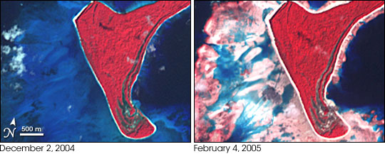
Colleagues in the Caltech Division of Geological and Planetary Sciences steered him toward remote-sensing scientist Michael Abrams of NASA’s Jet Propulsion Laboratory. Abrams is the lead scientist for a NASA sensor called ASTER, short for Advanced Spaceborne Thermal Emission and Reflection Radiometer. ASTER sees both visible and infrared wavelengths of light. In the ASTER images Meltzner saw, the ocean appeared deep blue. A submerged reef made a bright blue glow in the water. An exposed reef or beach appeared nearly white. |
|||
 | |||
In mid- to late January, Meltzner described his idea to Abrams, asking for all the post-earthquake images that ASTER had collected so far. Meltzner searched online data catalogues for pre- and post-quake images from ASTER and other satellite sensors. He identified gaps in coverage, and asked Abrams to schedule more satellite acquisitions of high-priority targets—reefs or islands along the fault that would help complete a regional map. Although the satellite images covered a broad area, there were missing pieces: for some places, there was no pre-earthquake imagery, and near the equator, some key locations were perpetually cloud covered. To help fill in some of the gaps, Meltzner incorporated field measurements that his advisor, Kerry Sieh, and other colleagues made on a short field trip to northwest Simeulue Island on January 17 and 18, 2005. Mounds of coral (called coral heads) and micro-atolls that had been thrust out of the water during the quake had died back to the water line. Sieh and his colleagues measured the height of dead coral above the water line, adjusted for pre- and post earthquake differences in the lowest annual tide (which defines the coral’s highest limit of survival), and came up with an estimate for the uplift. |
Meltzner mapped the extent of the earthquake rupture by using satellite data to identify places where coral reefs or coastal areas rose or sank after the quake. Most of the images came from the Advanced Spaceborne Thermal Emission and Reflection Radiometer (ASTER) on NASA’s Terra satellite. These false-color (infrared-enhanced) images show uplift around North Reef Island, in the Andaman Islands. On December 2, 2004, the submerged reef makes a bright blue glow around the island. After the quake, on February 4, 2005, the reefs were much more exposed. In these images, vegetation is red, and the reddish tint on the reefs could be algae that has colonized the exposed reefs. (Images by Jesse Allen, Earth Observatory Team.) Full scenes: December 2, 2004 (2.6 MB) and February 4, 2005 (2.4 MB). | ||
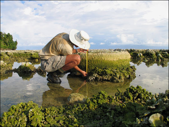 | |||
Once he had all the imagery, Meltzner used image-editing software to balance the color in all the images as closely as possible, and then began inspecting them for color change around reefs that would indicate elevation changes. “In some areas, there aren’t any reefs large enough to be recognizable on the 15-meter resolution ASTER images. In those areas—which tended to be on the eastern sides of the larger islands and on the coast of mainland Sumatra—I had to study the images a bit more closely for other signs of elevation changes, such as newly exposed beaches or standing water where no water had stood previously,” Meltzner said. In all, he compared before and after imagery for 160 locations along the fault. Some of the differences in the pre- and post-earthquake images seemed dramatic, Meltzner recalls, but he knew he had to be careful. What might appear to be an earthquake-related change could simply be natural exposure and inundation of the reef from the tides. To make sure that any apparent changes in water level that they saw in satellite imagery weren’t simply due to tides, Meltzner relied on a computer program that his colleague Duncan Agnew of the Scripps Institution of Oceanography in La Jolla, California, provided. Meltzner could input the location and time of the satellite image, and the program would tell him the level of the tide. | Mounds of coral that were thrust out of the water by the quake died back to the water line. In locations where satellite images weren’t available, often because of persistent clouds, Meltzner and his colleagues relied on field measurements of the amount of uplift of coral mounds. Here a scientist measures coral uplift around Simeulue Island. (Photo copyright © John Galetzka.) | ||
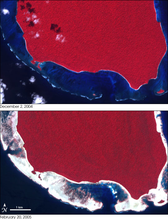 | |||
Under normal circumstances, you would expect reefs or beaches to be more exposed in images captured during low tide and more submerged at high tide. To check for quake-related elevation change, Meltzner looked at post-quake images for what you wouldn’t expect: reefs that were more exposed at high tide than they used to be at low tide, or reefs that were more submerged at low tide than they used to be at high tide. If a reef was more exposed at high tide than it used to be at low tide, it must have been lifted up by the quake. If a reef was more submerged at low tide than it used to be at high tide, then it must have sunk. By subtracting the sea surface heights at the time of the pre-and post-quake images, he could figure out the minimum elevation change that would have been required to expose or submerge the reef in the satellite imagery. | ASTER imagery showed dramatic uplift at North Sentinel Island, shown in this pair of images from December 2, 2004, and February 20, 2005. In the 2005 image, the newly exposed coral reef appears bright white, similar to the coral at North Reef Island. (Images by Jesse Allen, Earth Observatory Team.) Full scenes: December 2, 2004 (459 KB) and February 20, 2005 (353 KB). | ||
 | |||
The final picture of the quake documented through these satellite and field observations was astounding. When Meltzner plotted the points of uplift and subsidence on a regional map, he discovered that the rupture extended about 100 kilometers (62 miles) farther north than the initial estimates from seismic and GPS data suggested. In fact, the enormous quake had ruptured the ground all the way from Simeulue Island to Preparis Island. Measured parallel to the arc of the plate boundary, that is a distance of nearly 1,600 kilometers. In the United States, a rupture that long would have stretched from the southern tip of Florida to the Maryland-Pennsylvania state line. In Europe, it would have stretched from the southern tip of Spain to London. |
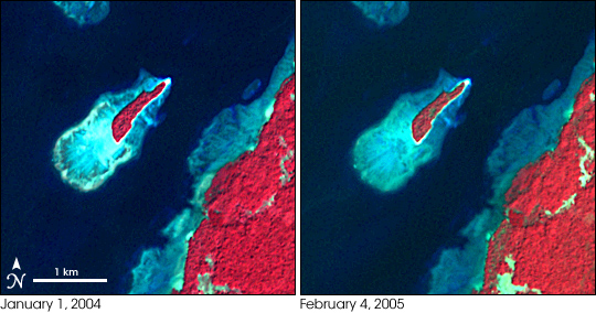
While some areas rose, killing the coral reefs they had supported, other areas sank. Although the change is more subtle, these ASTER images show the subsidence (sinking) of a small island off the coast of Rutland Island. In the image captured before the quake on January 1, 2004, the reef appears brighter blue, because less water covers it. After the quake, on February 4, 2005, the coral reef appears slightly darker blue because deeper water covers it. (Images by Jesse Allen, Earth Observatory Team.) Full scenes: January 1, 2004 (679 KB) and February 4, 2005 (664 KB). | ||
 |
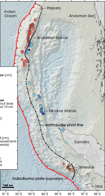 |
Through a combination of satellite imagery and field measurements, Meltzner and his colleagues developed a comprehensive picture of subsidence and uplift resulting from the Aceh quake. Colored dots represent estimates of minimum uplift or subsidence (sinking). The dashed line is the estimated pivot line, on either side of which the earth either rose or fell. Land predominantly sank around the Nicobar Islands, both sank and rose around the Andaman Islands, and predominantly rose around Simeulue Island. The satellite-based map showed that the earthquake rupture stretched nearly 1,600 kilometers along the fault—100 kilometers farther north than previous estimates suggested. (Map adapted from Meltzner et al., 2006.) | |
The amounts of uplift and subsidence were dramatic as well. The minimum uplift in the northern part of the Andaman Islands was as much as 40 centimeters (1.3 feet), while the minimum subsidence in the southern part was as much as 67 centimeters (2.2 feet). Farther south, the southern tip of Great Nicobar Island sank more than 44 centimeters (1.4 feet). Physical measurements from coral northwest of Simeulue Island documented uplift of up to 150 centimeters (4.9 feet). Meltzner stresses that the amounts he estimated from satellite data were the minimum elevation change that would have been needed to account for the differences in the pre-and post-quake satellite images, not necessarily the exact elevation change. Later studies found elevation changes of 1 to 2 meters in some places. |
|||