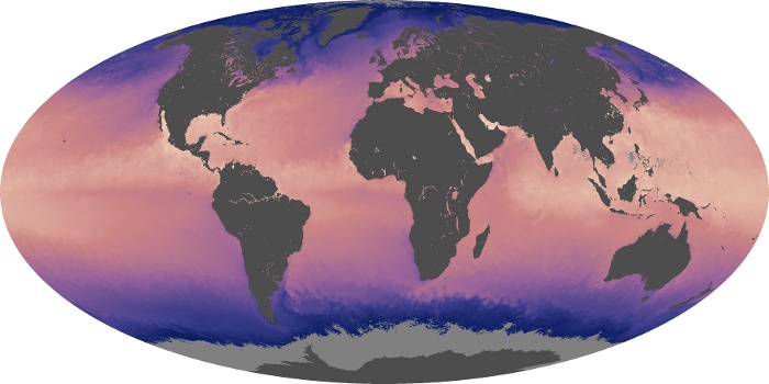
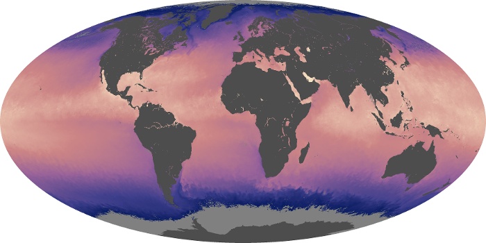
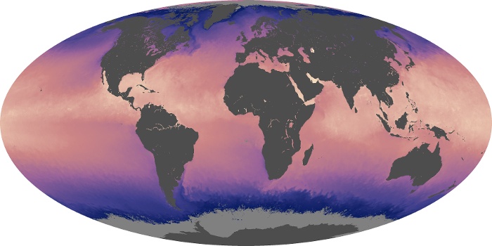
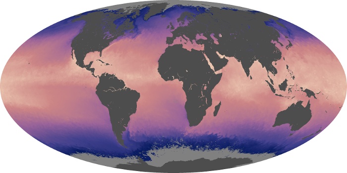
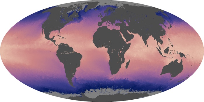
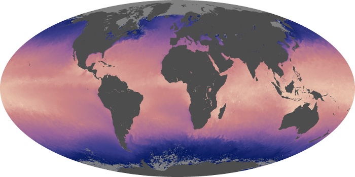
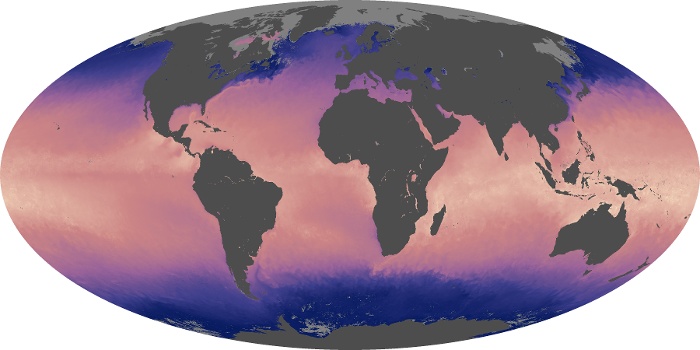
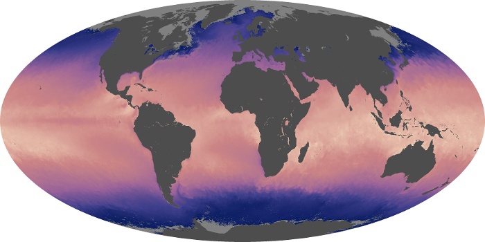


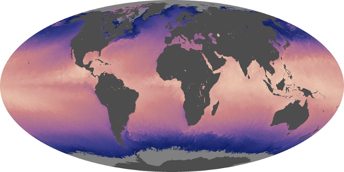
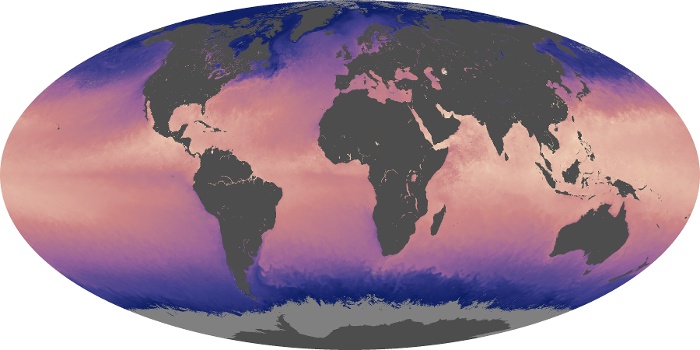
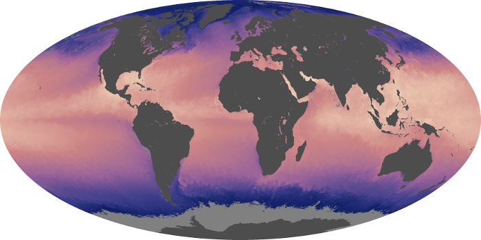

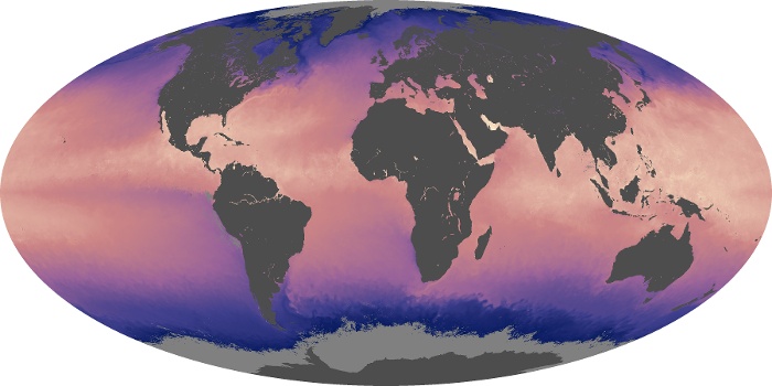

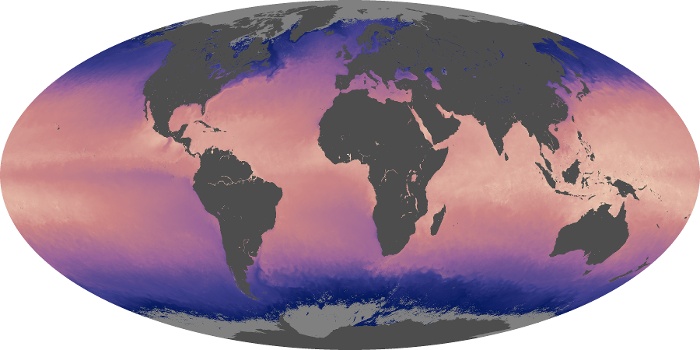

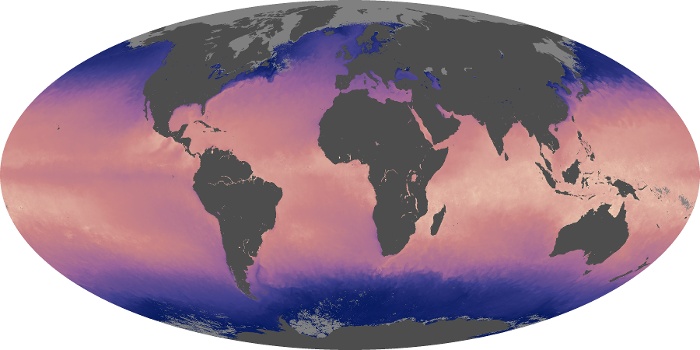
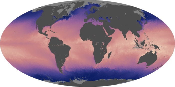
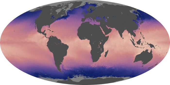


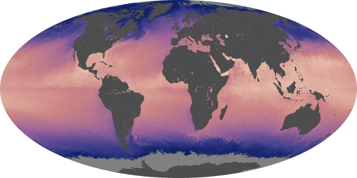

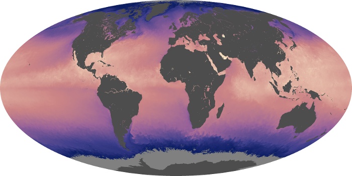
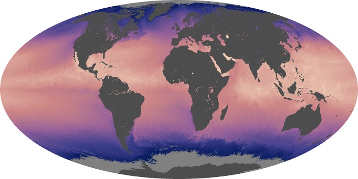
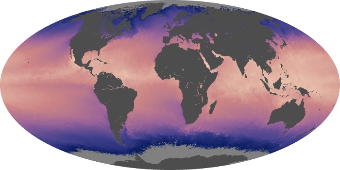
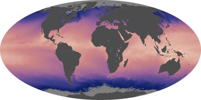
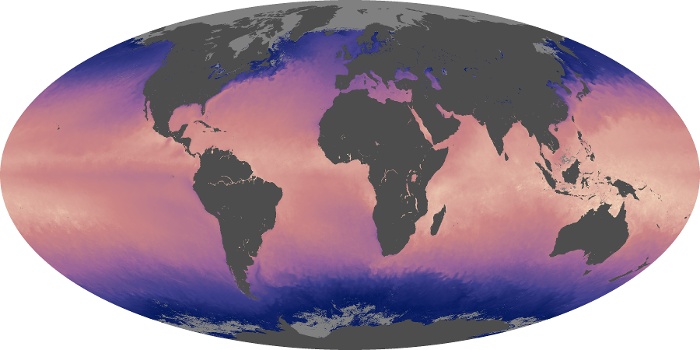

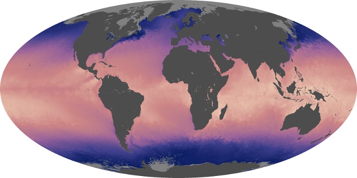


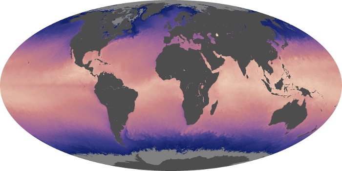

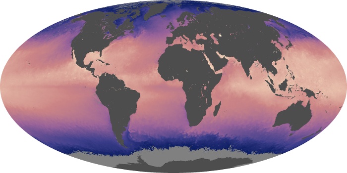

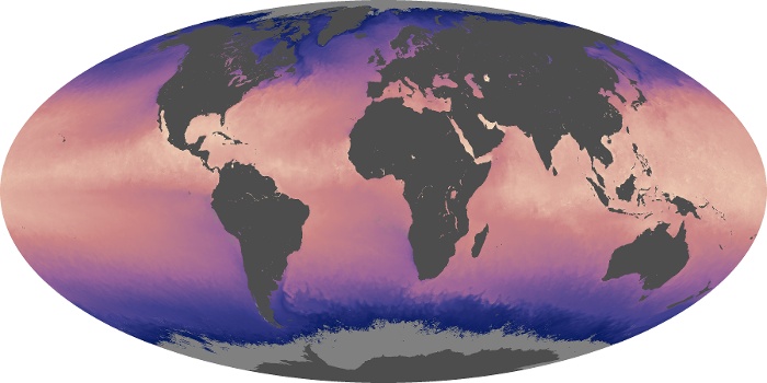
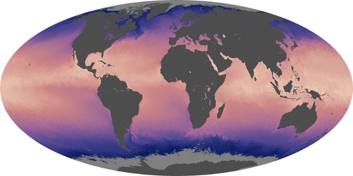
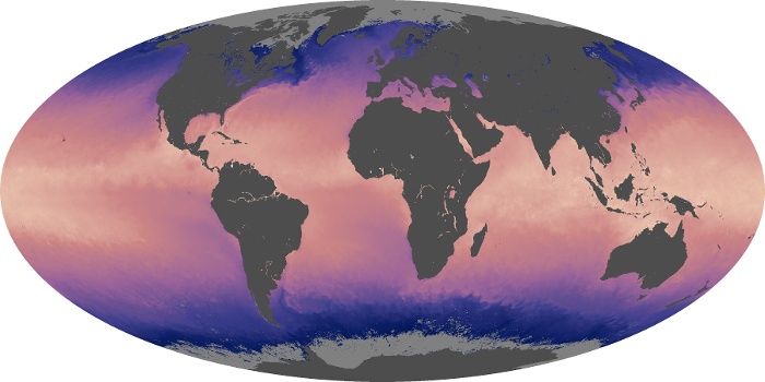
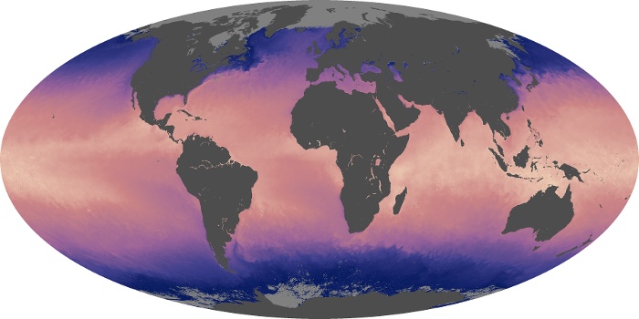
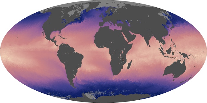
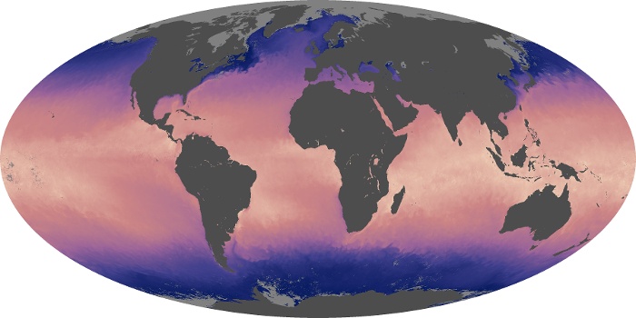

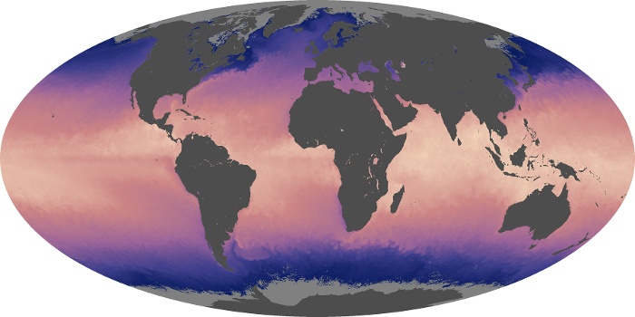

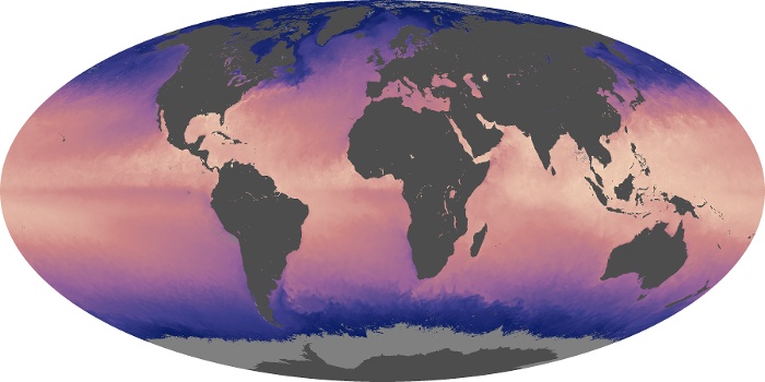
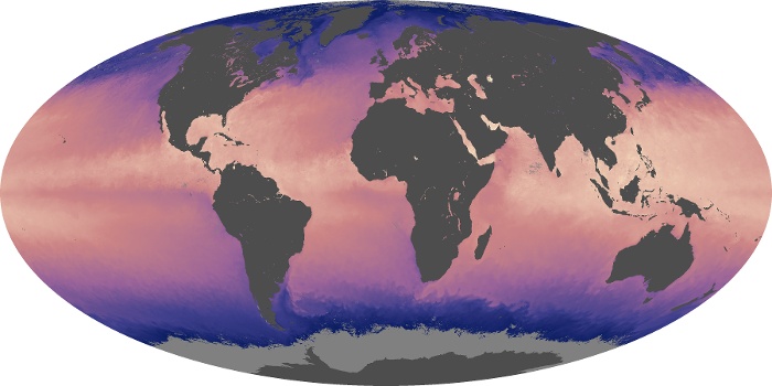

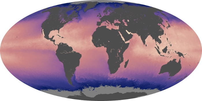
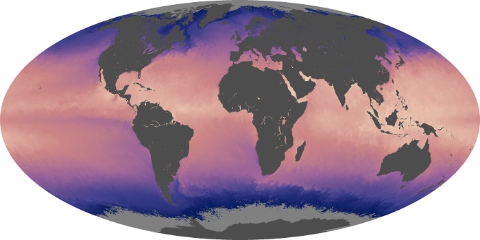
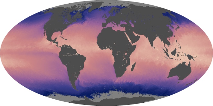

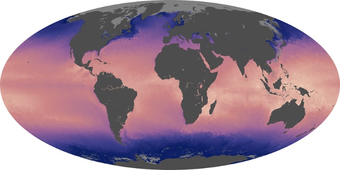

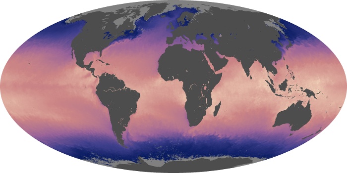
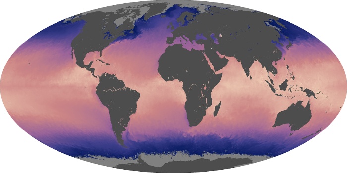
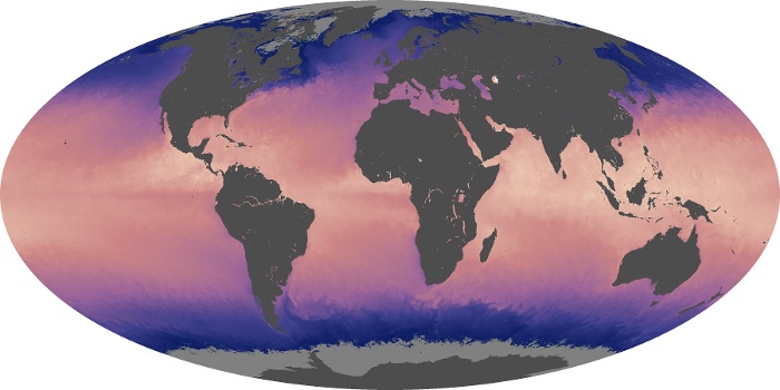

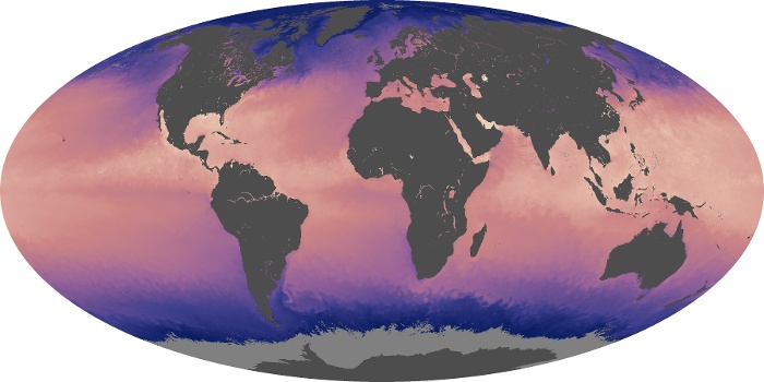
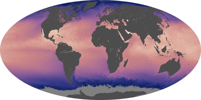
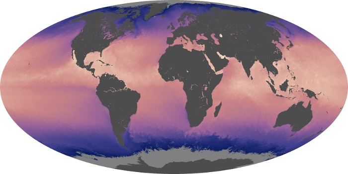
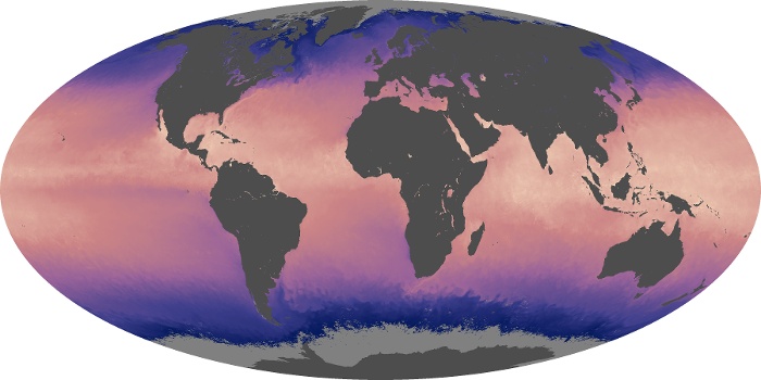
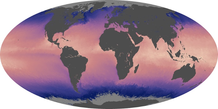
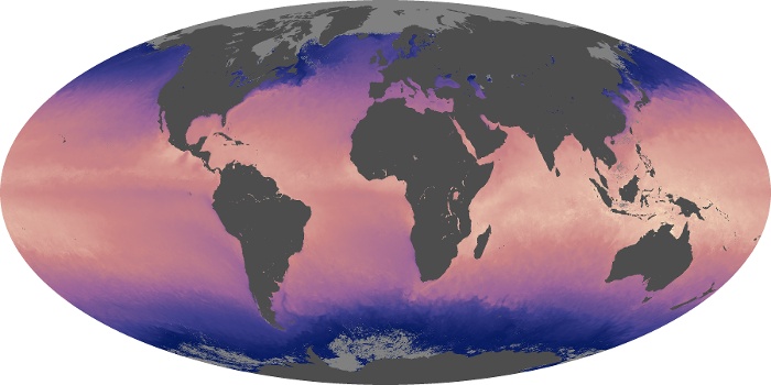
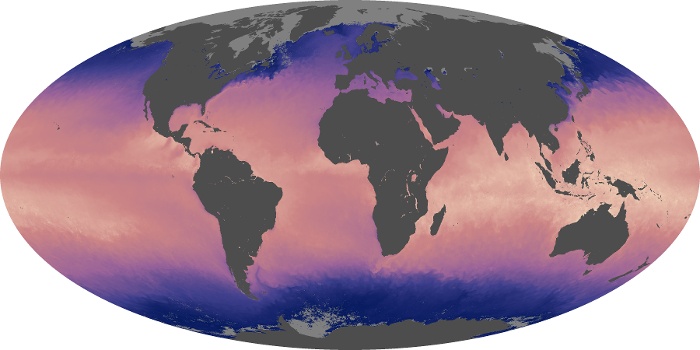
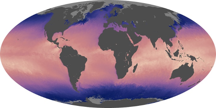
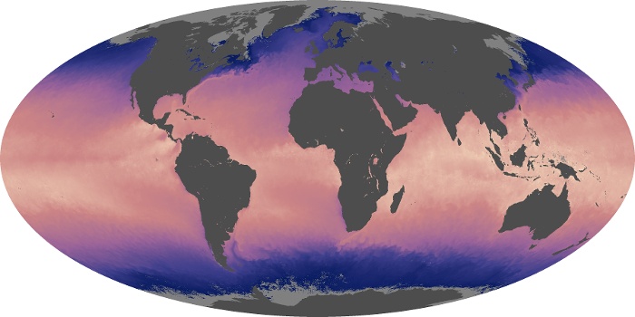
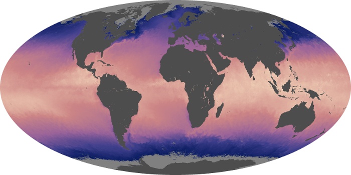
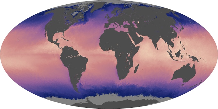
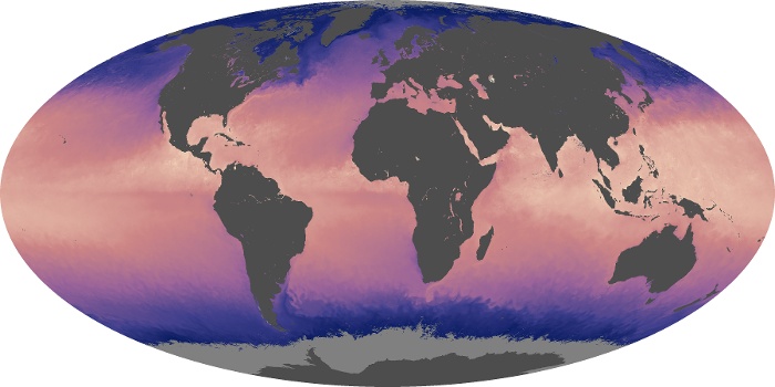

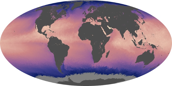
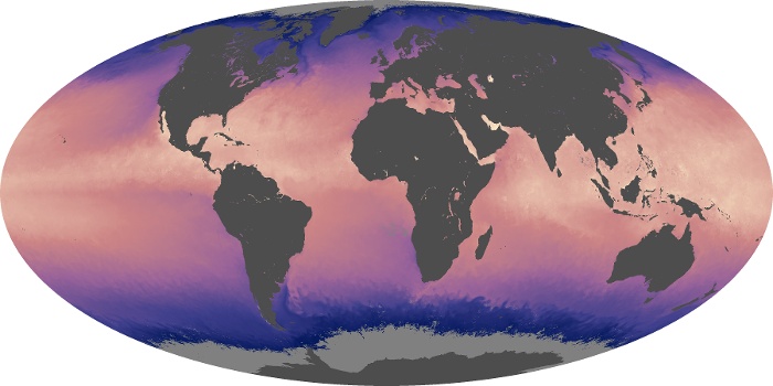
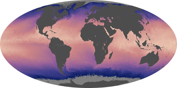

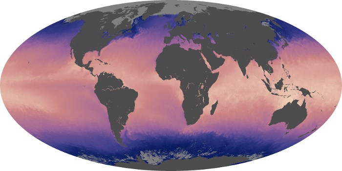
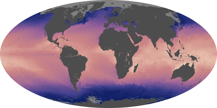


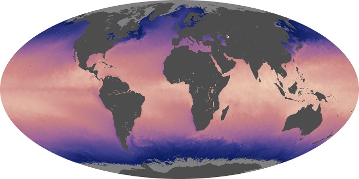
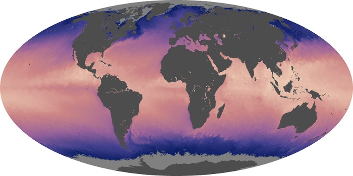


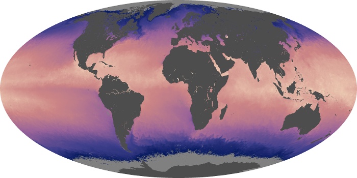

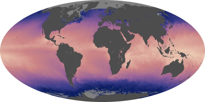
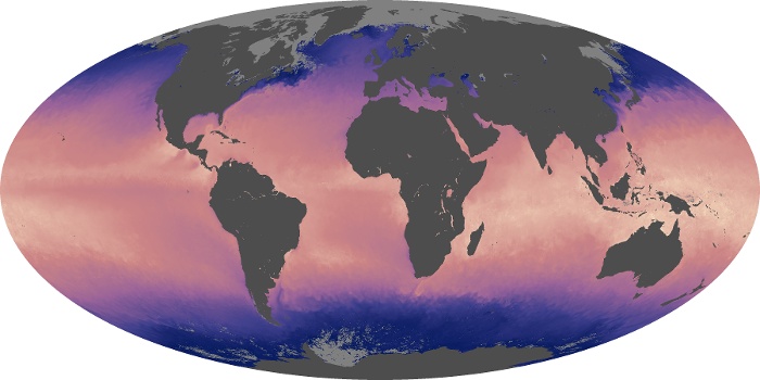
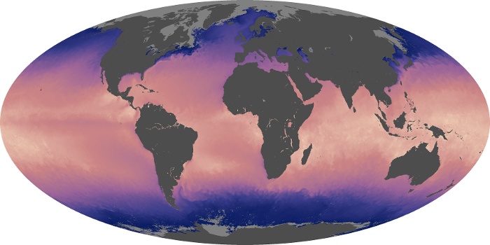
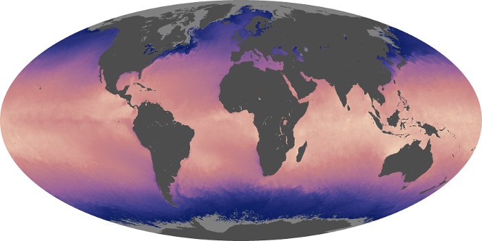

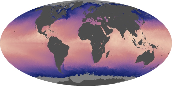
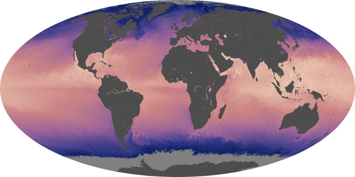
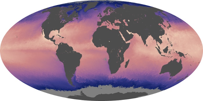
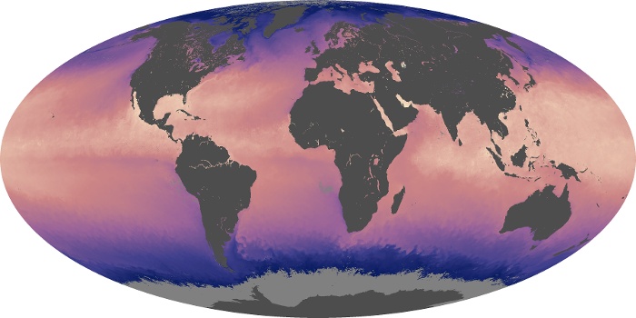
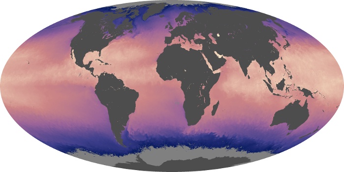
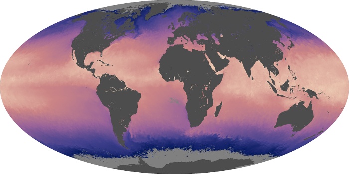
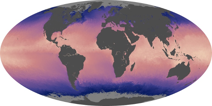
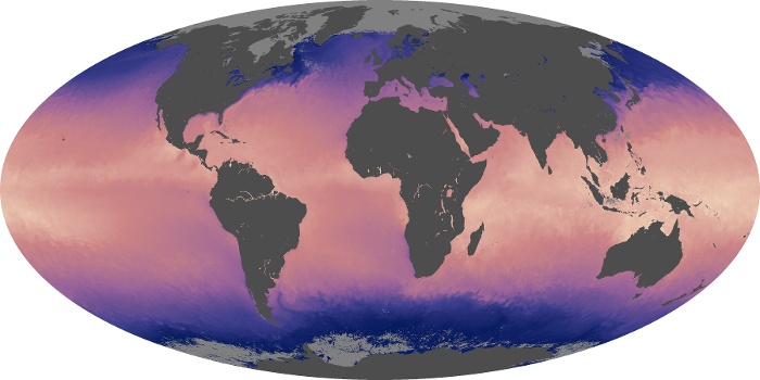
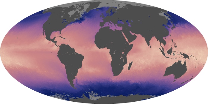
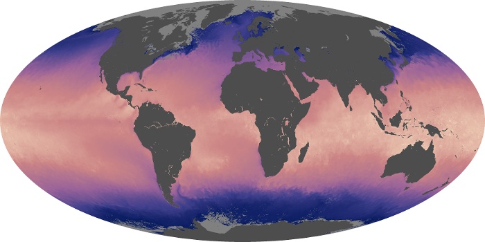
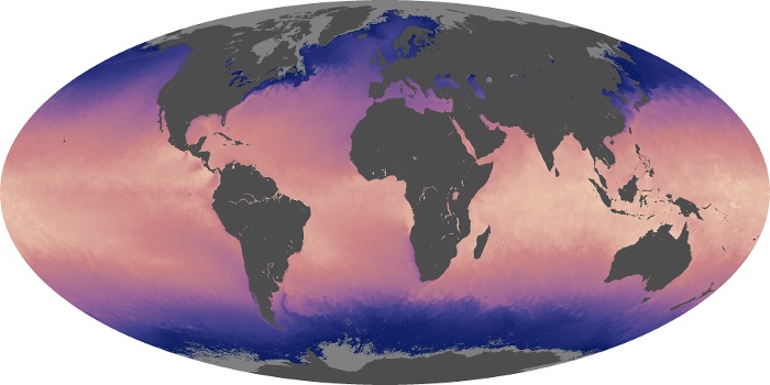
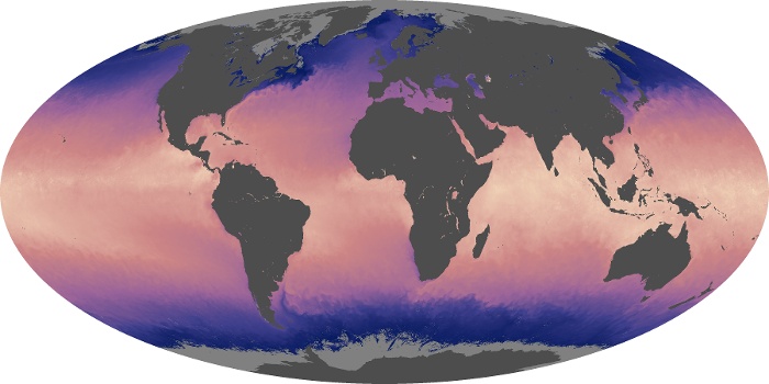

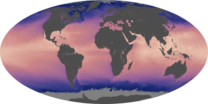
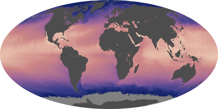
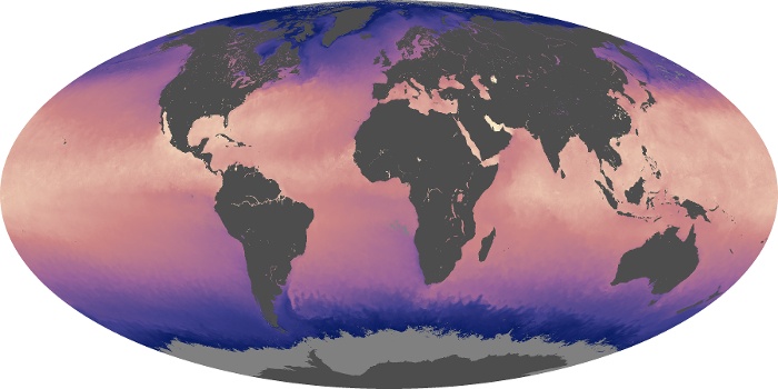
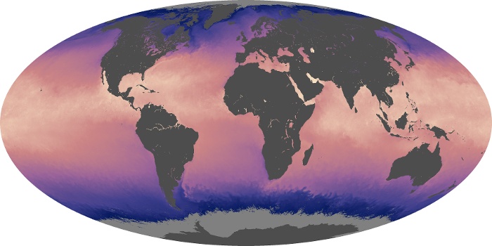
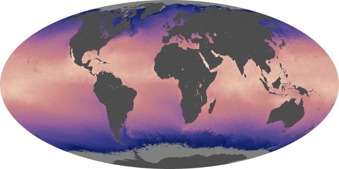
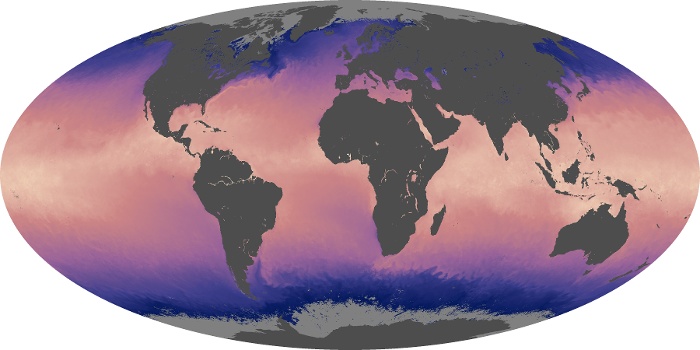
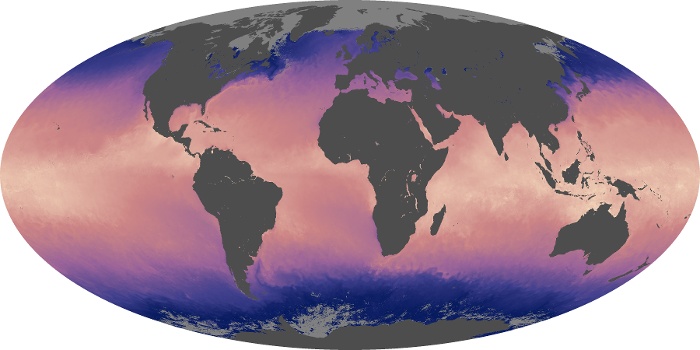
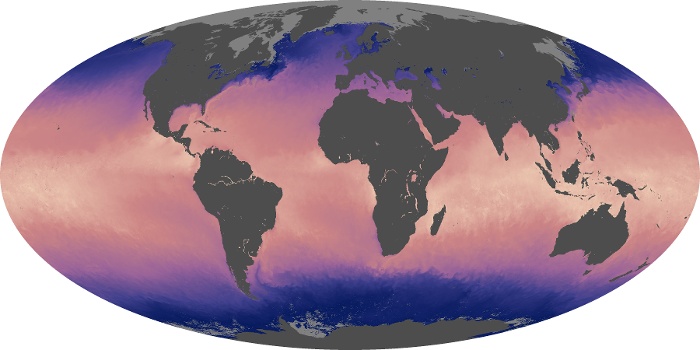
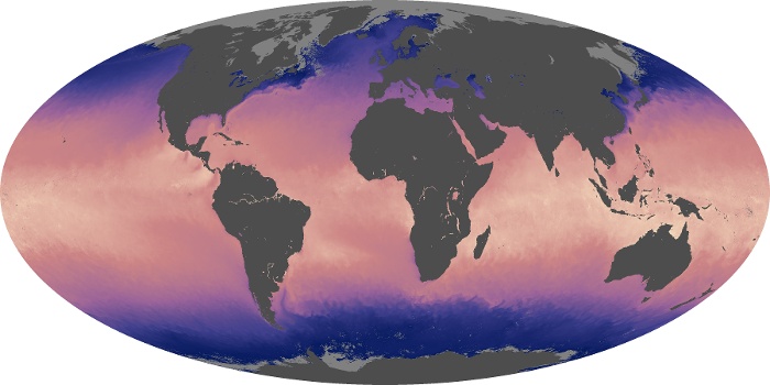
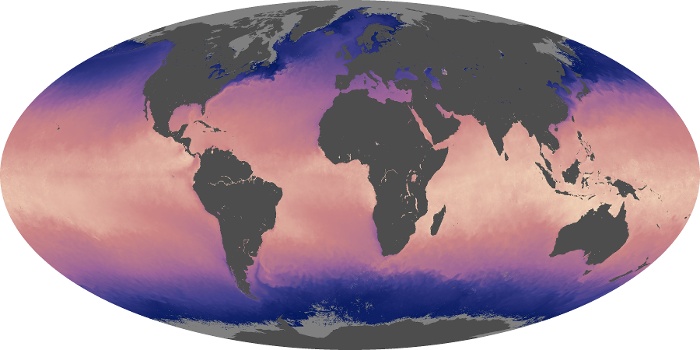


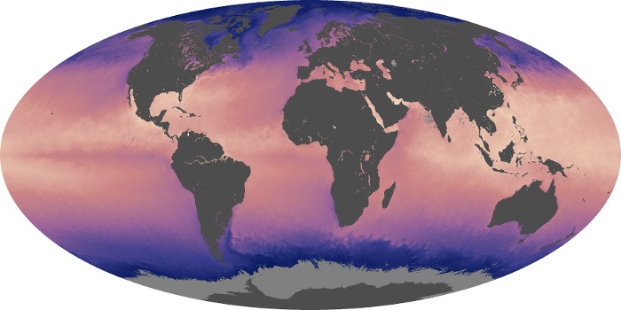
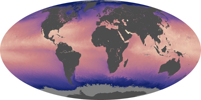
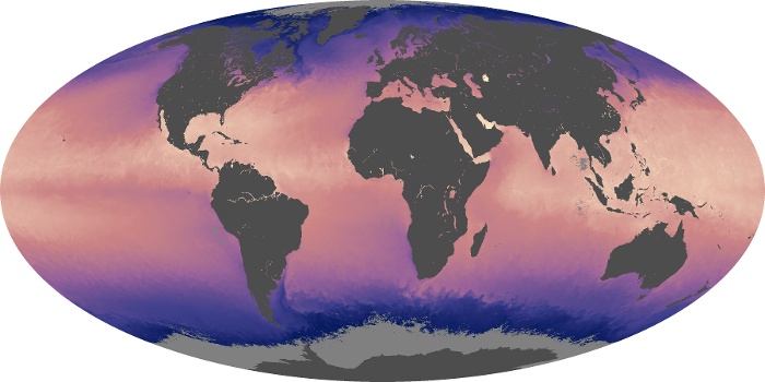
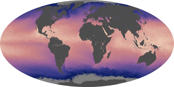
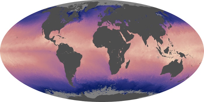
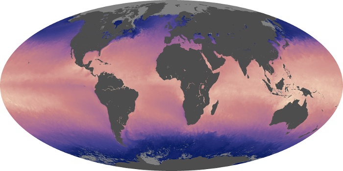


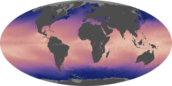

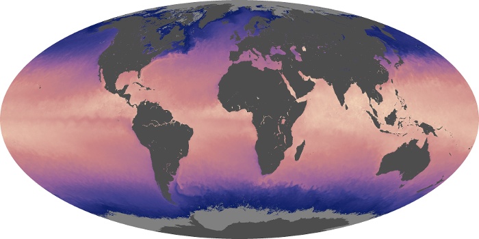


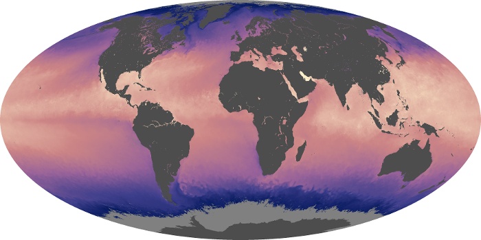

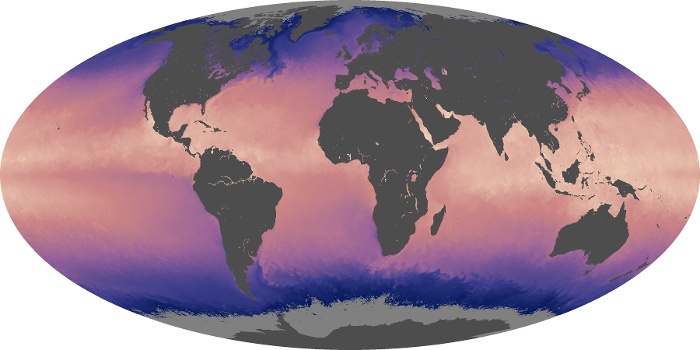
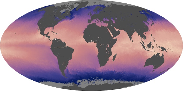
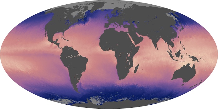


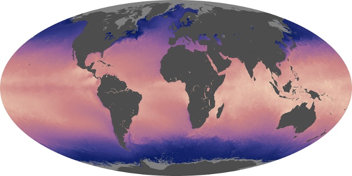

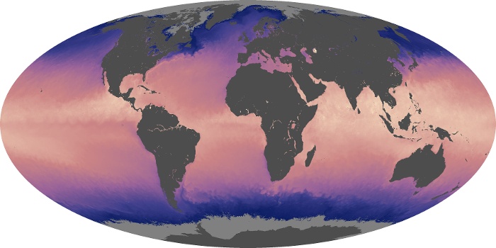

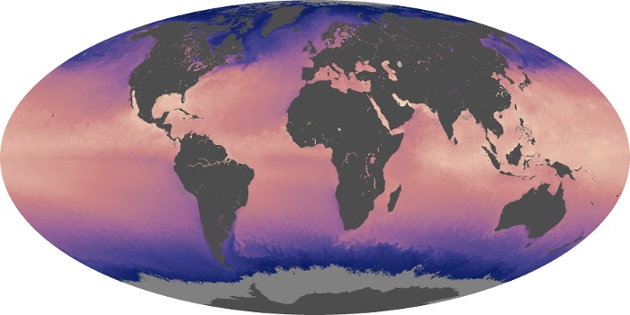
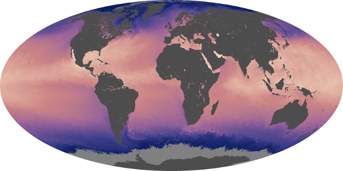
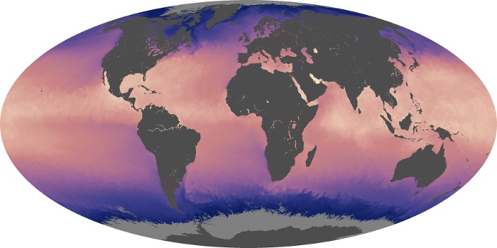
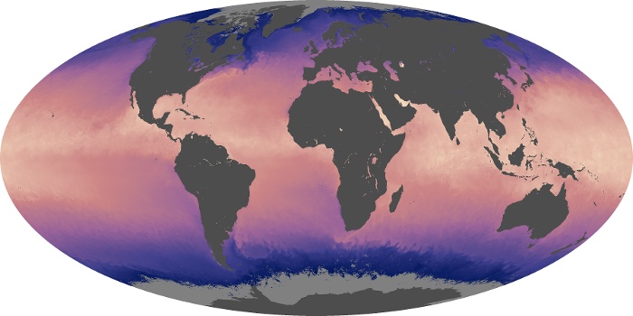
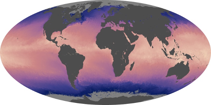
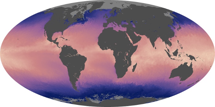


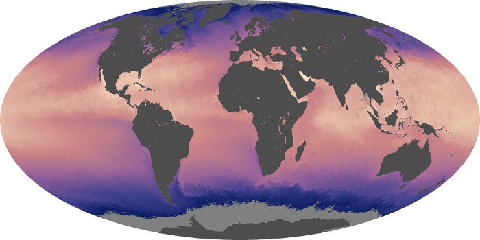
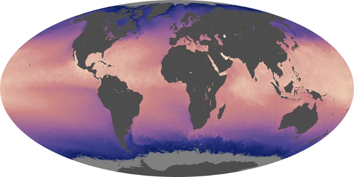
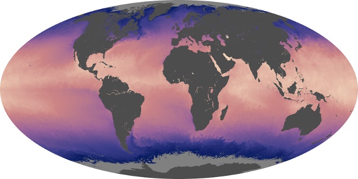
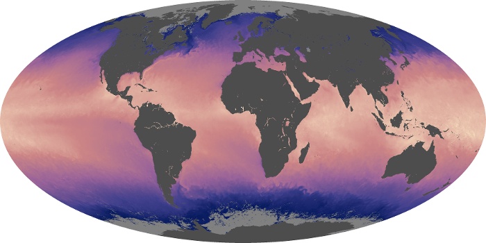
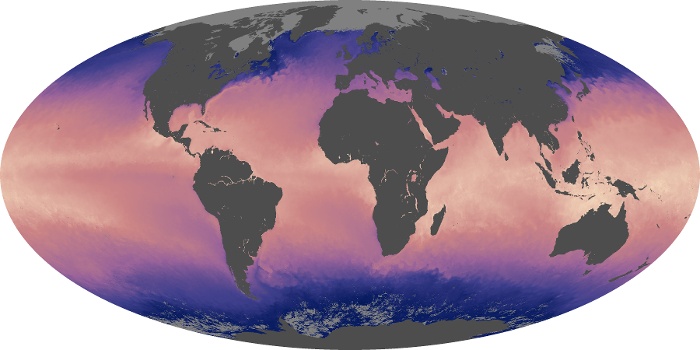
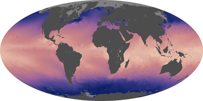

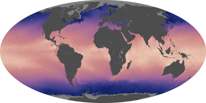
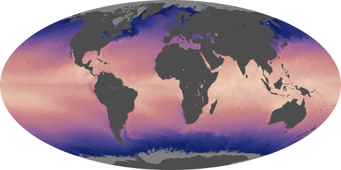
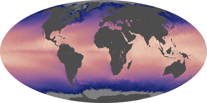

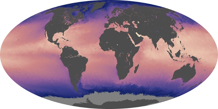
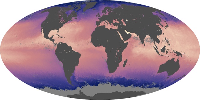
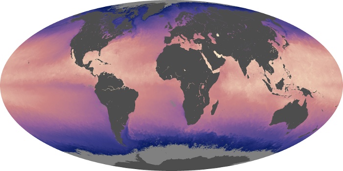
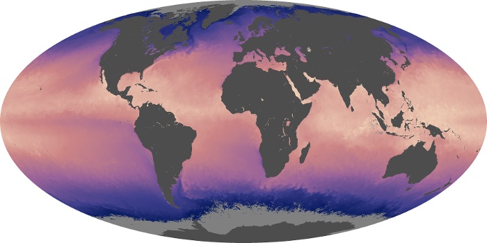
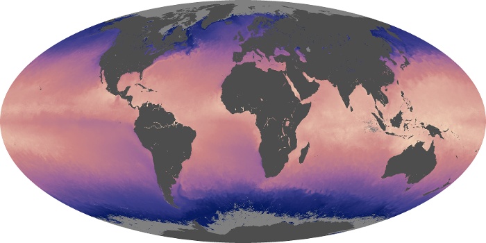


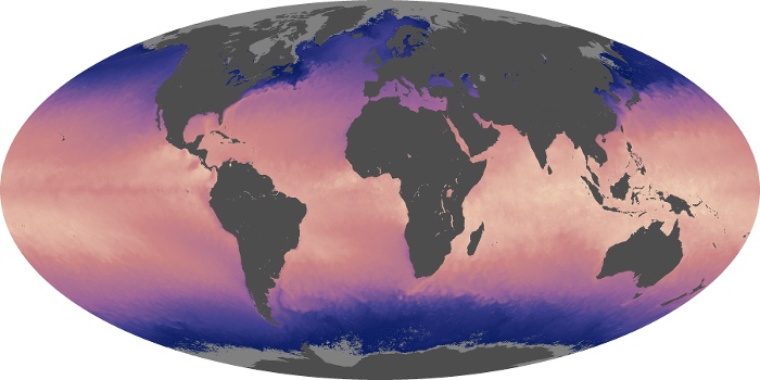
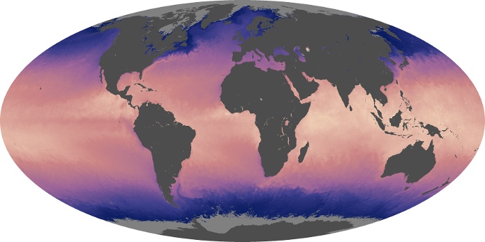
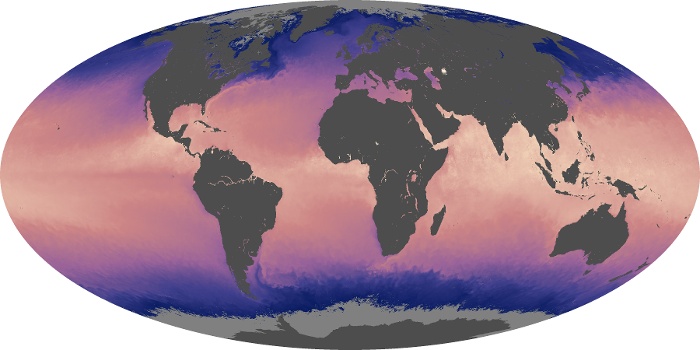

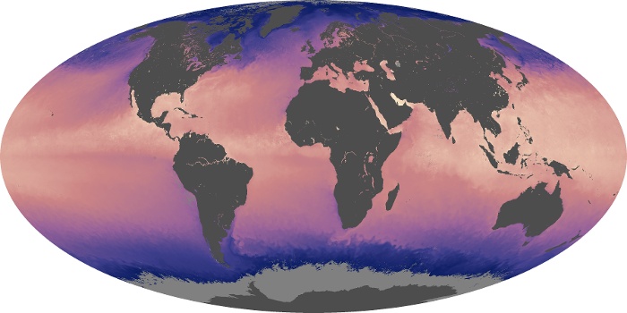
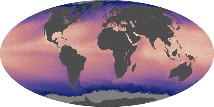

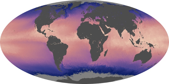
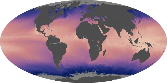
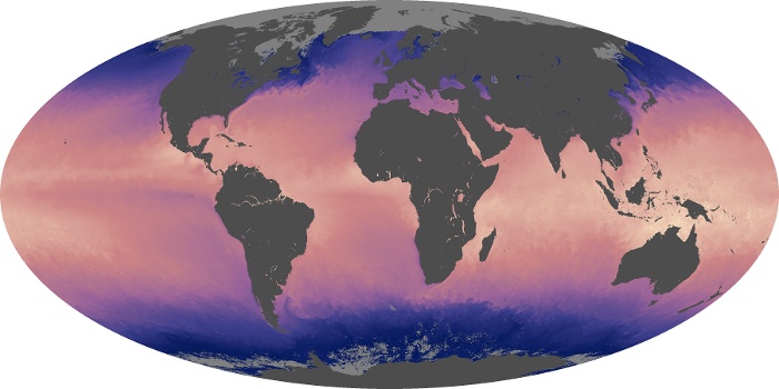
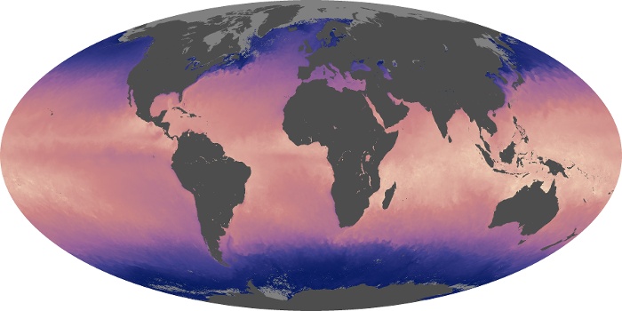

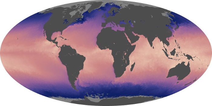
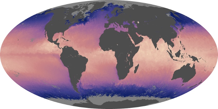
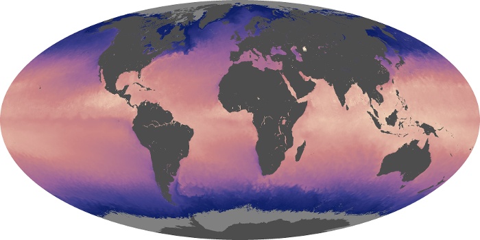
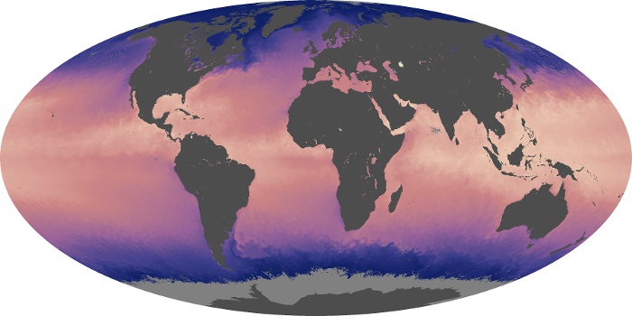

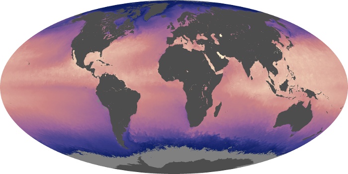

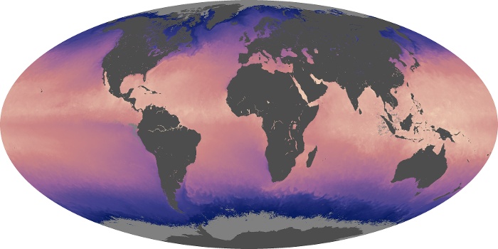
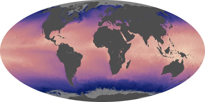

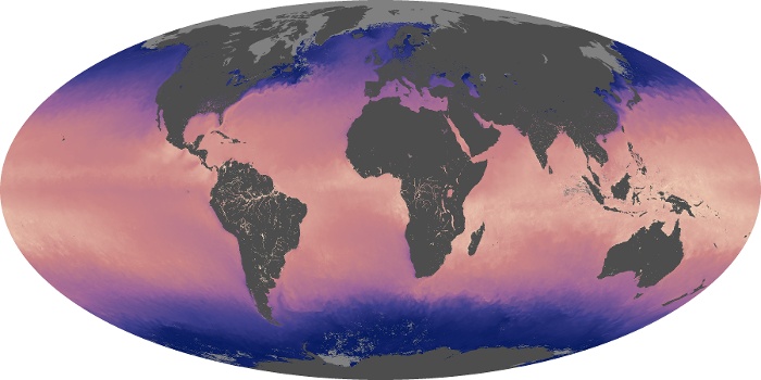
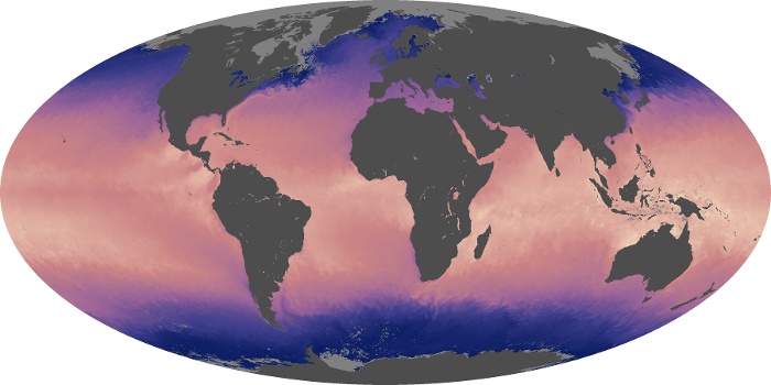
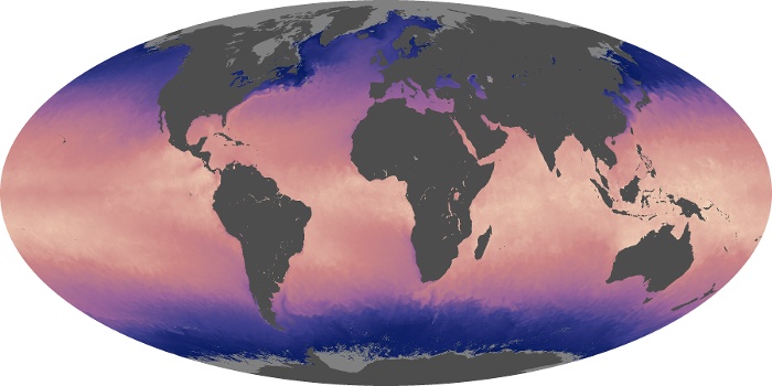

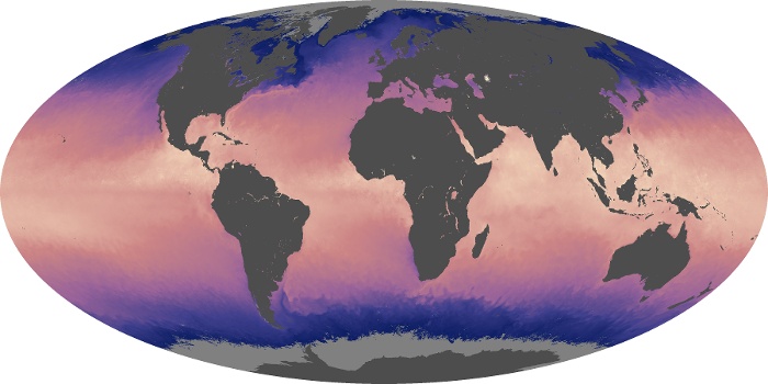
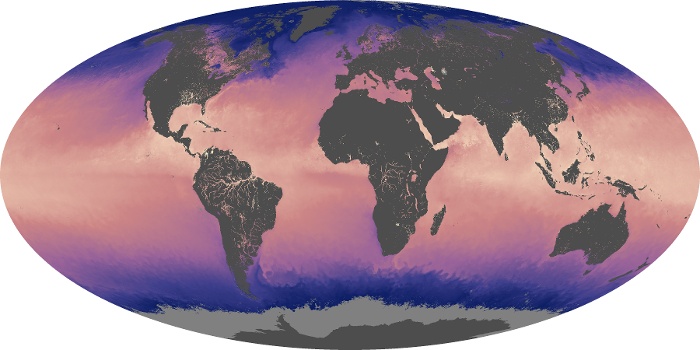
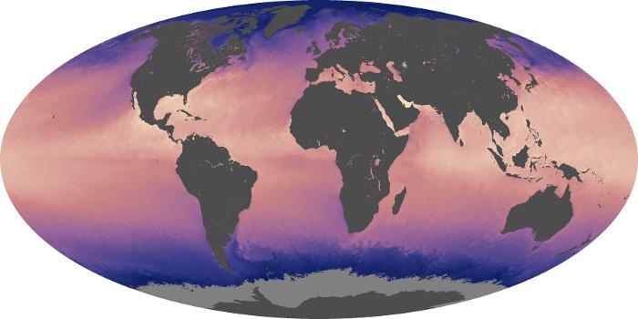
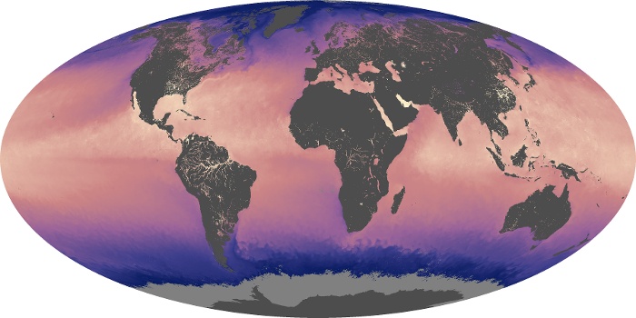
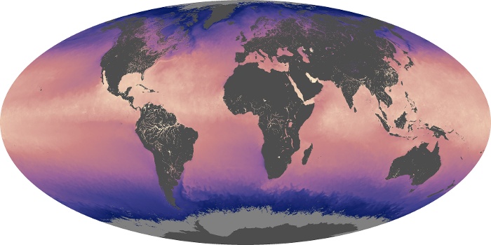
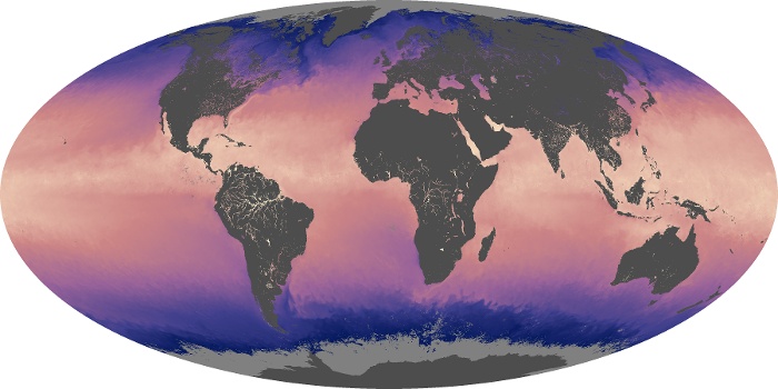
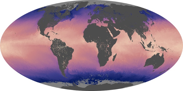
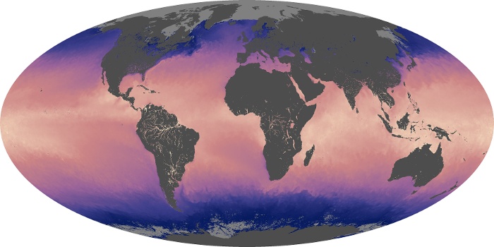


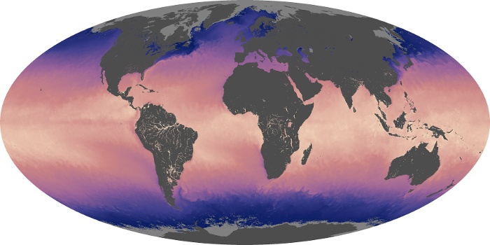
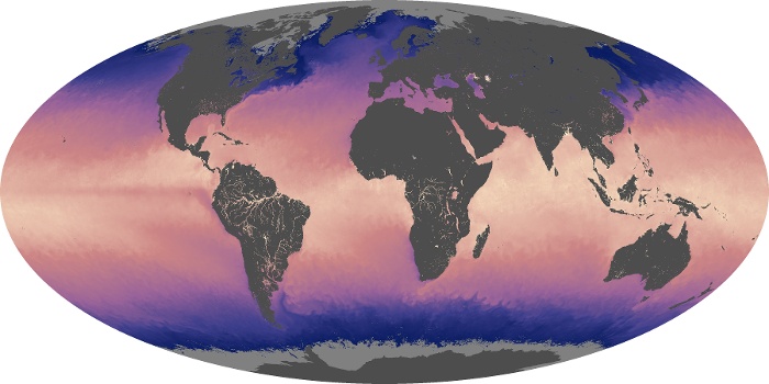


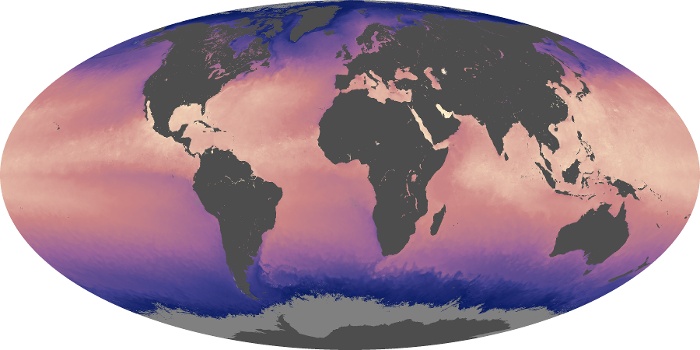

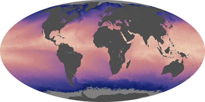
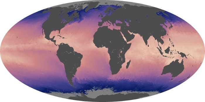
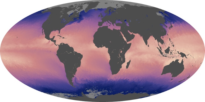
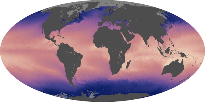


These sea surface temperature maps are based on observations by the MODIS sensors on NASA's Terra and Aqua satellites. The satellites measure the temperature of the top millimeter of the ocean surface. In this map, the coolest waters appear in blue (approximately -2 degrees Celsius), and the warmest temperatures appear in pink-yellow (35 degrees Celsius). Landmasses and the large area of sea ice around Antarctica appear in shades of gray, indicating no data were collected.
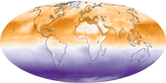
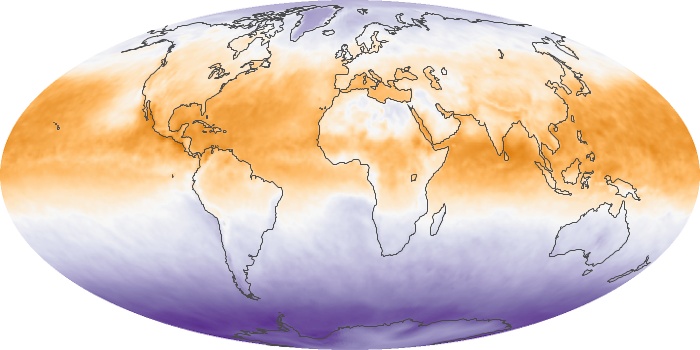
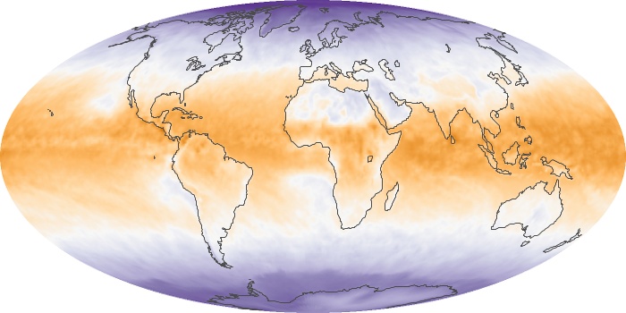
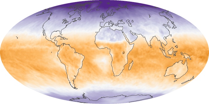
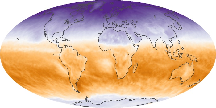
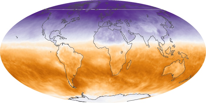
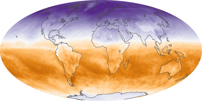
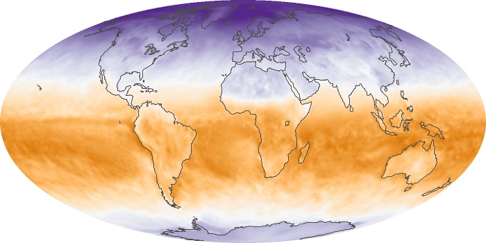
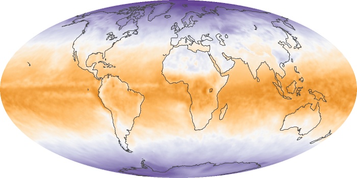
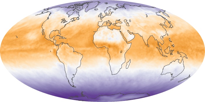
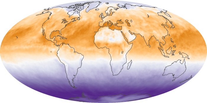
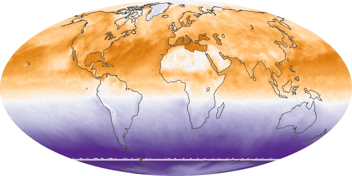
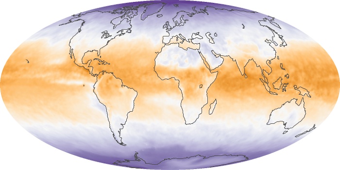
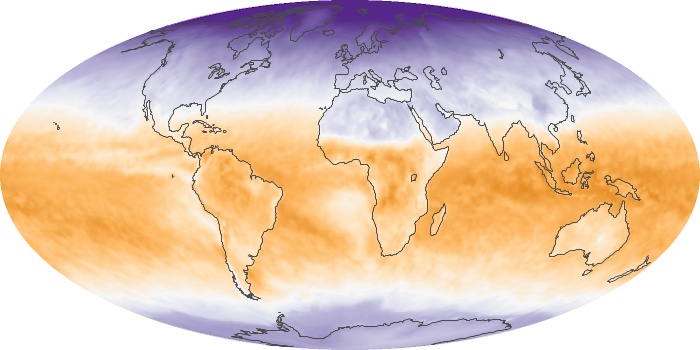
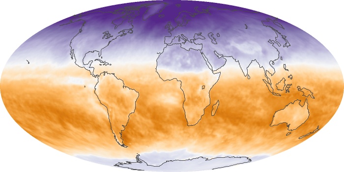
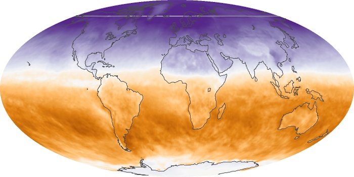
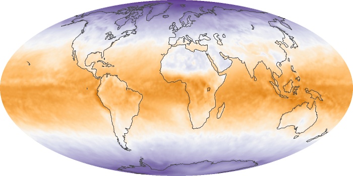
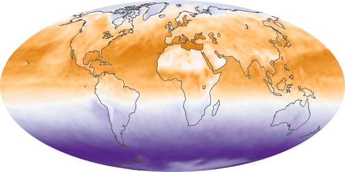
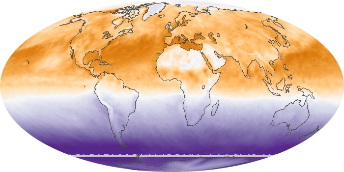
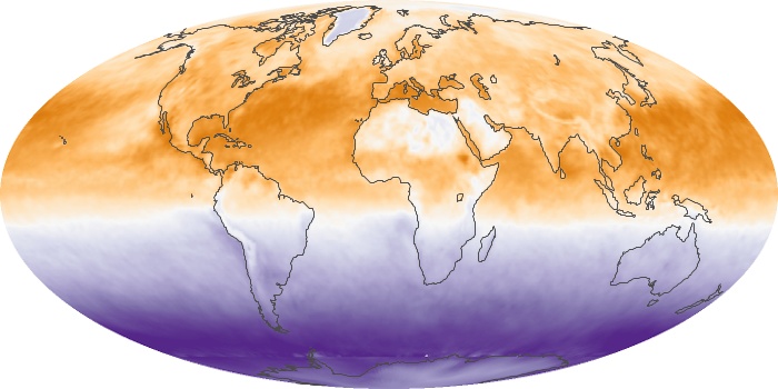
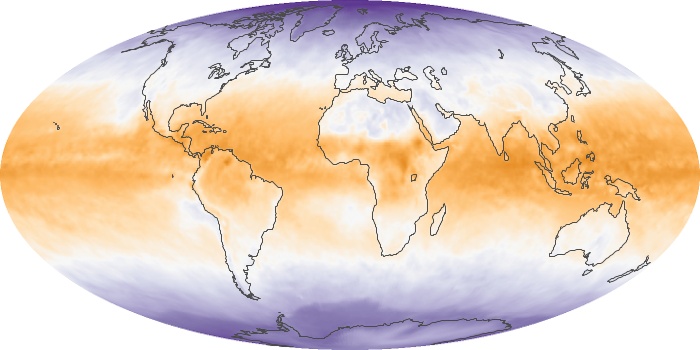
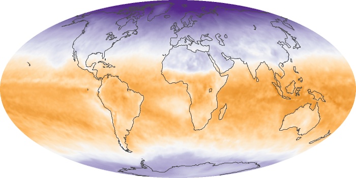
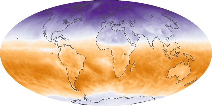
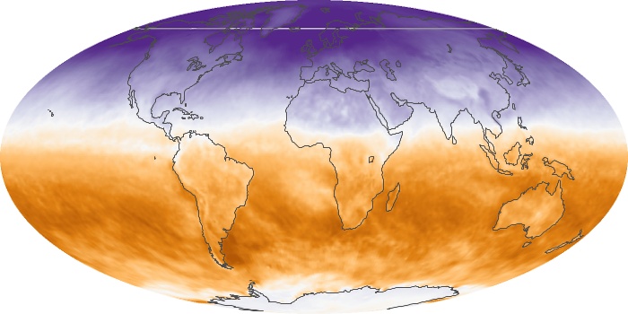
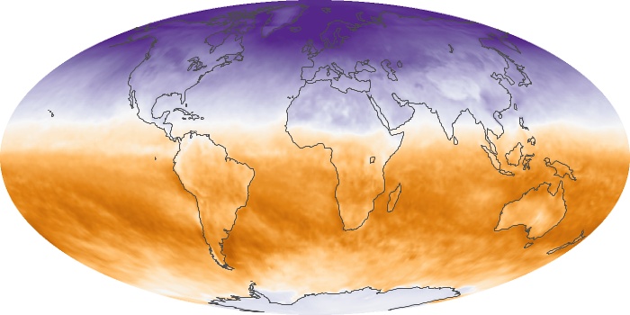
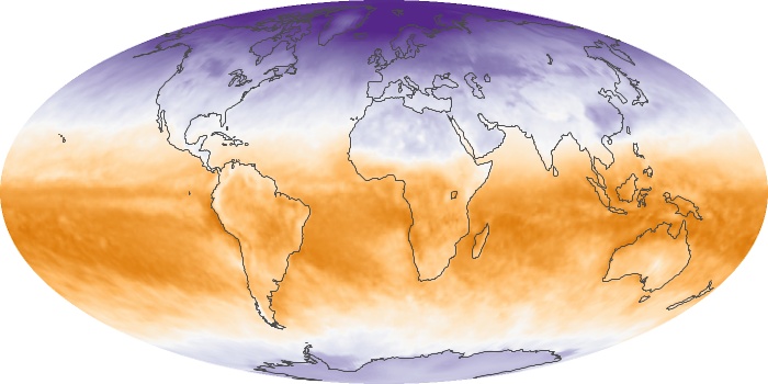
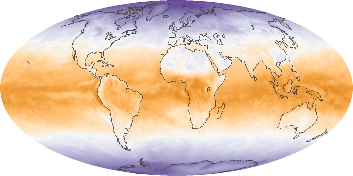
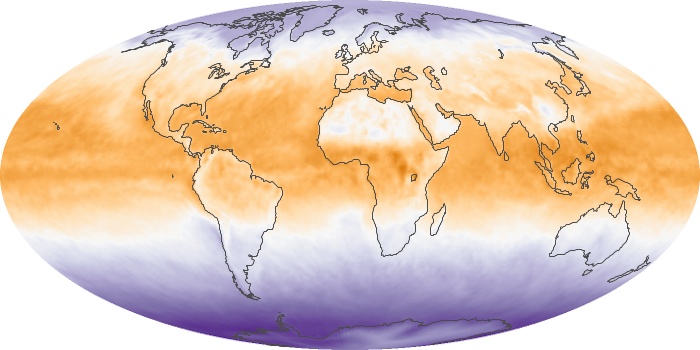
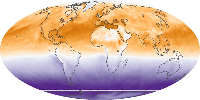
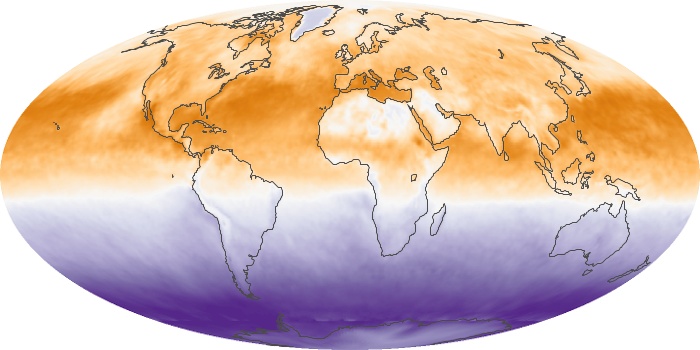
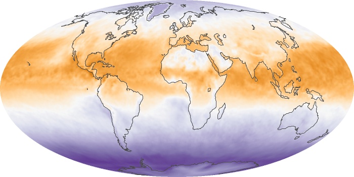
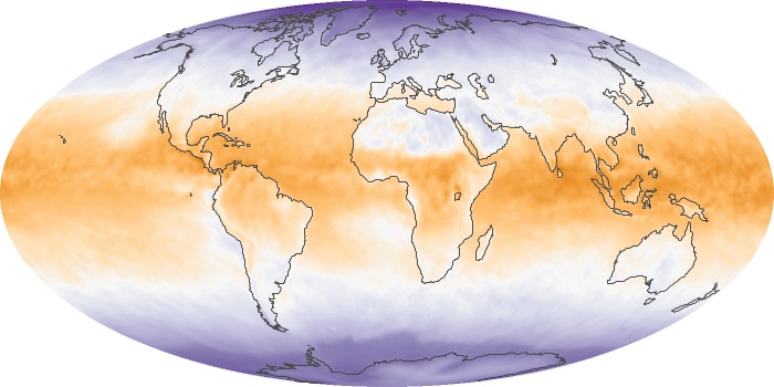
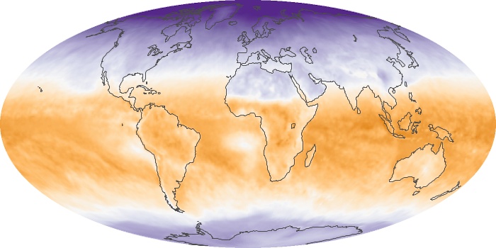
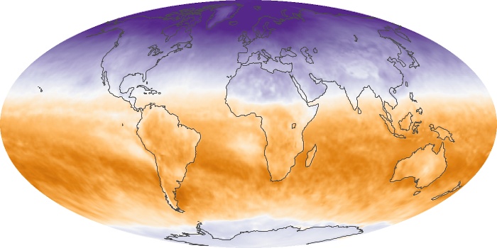
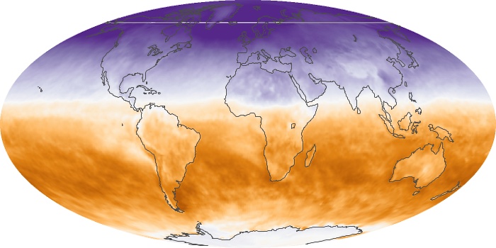
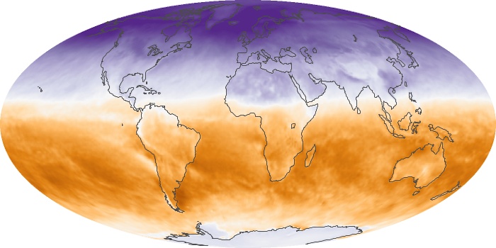
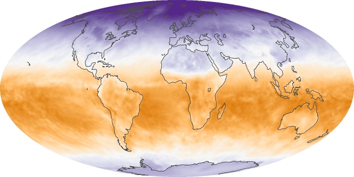
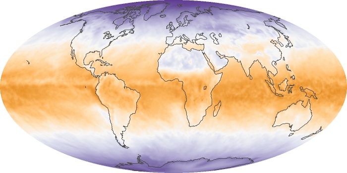
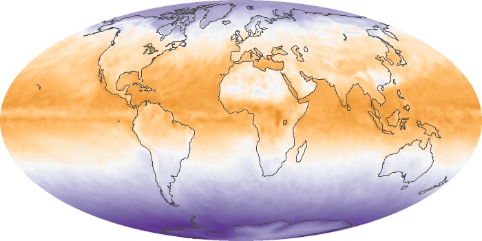
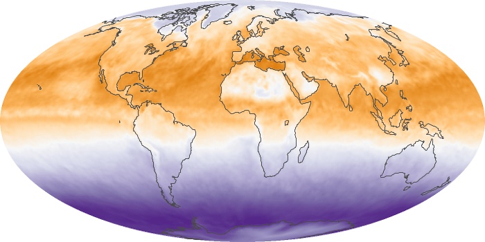
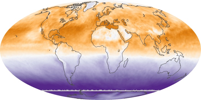
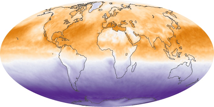
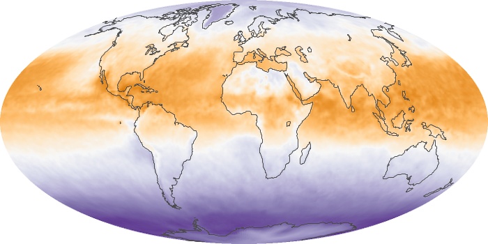
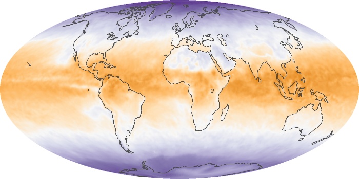
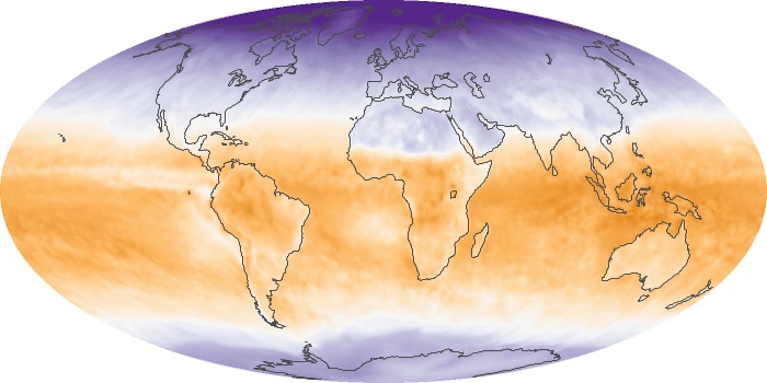
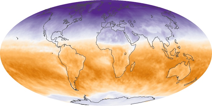
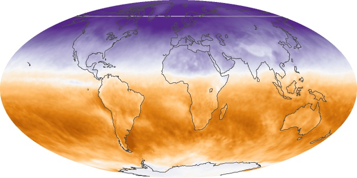
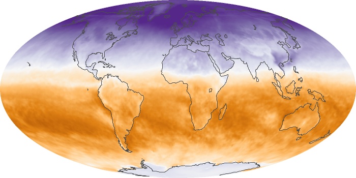
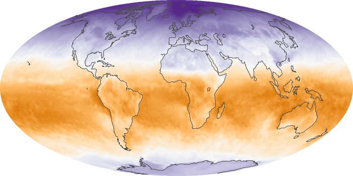
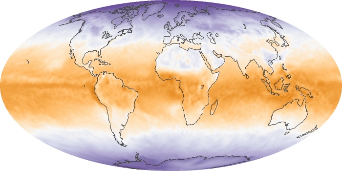
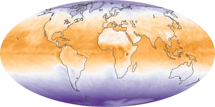
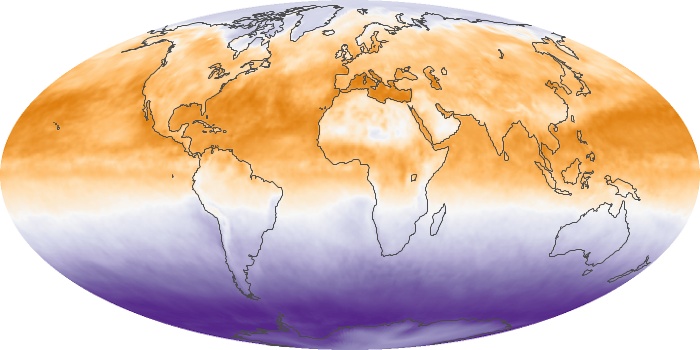
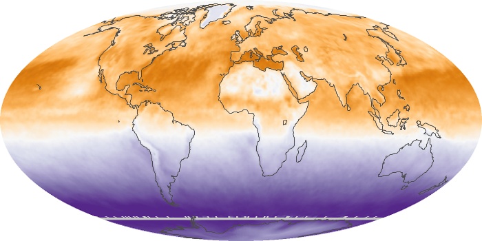
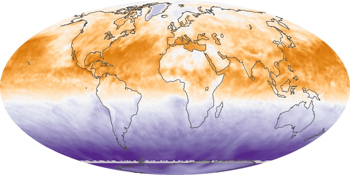
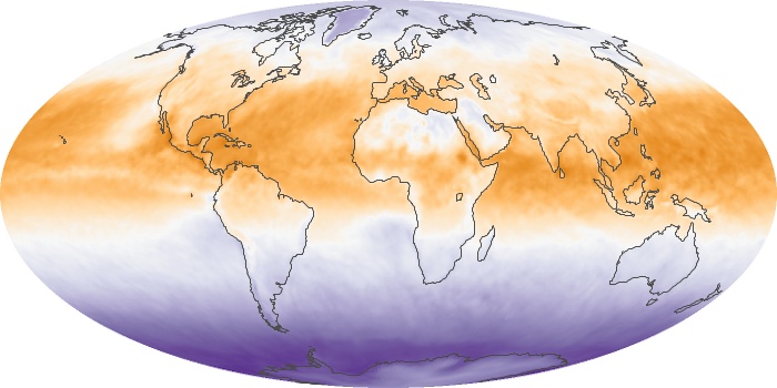
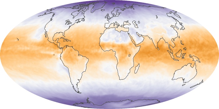
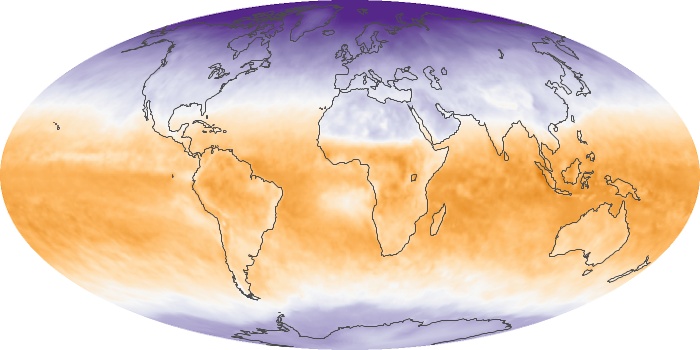
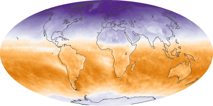
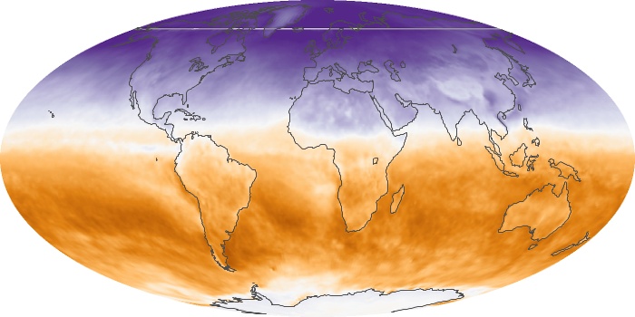
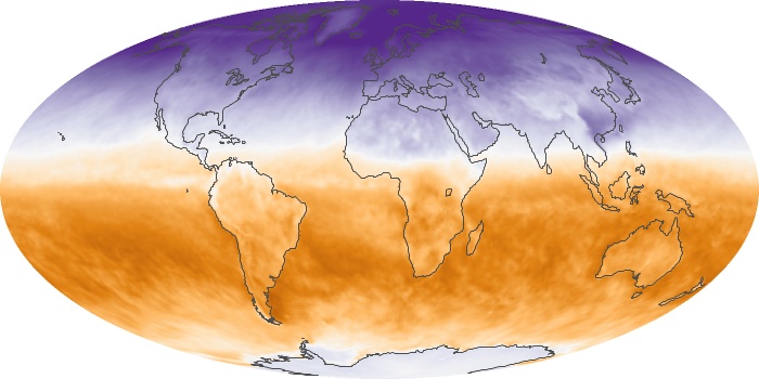
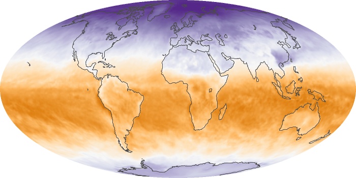
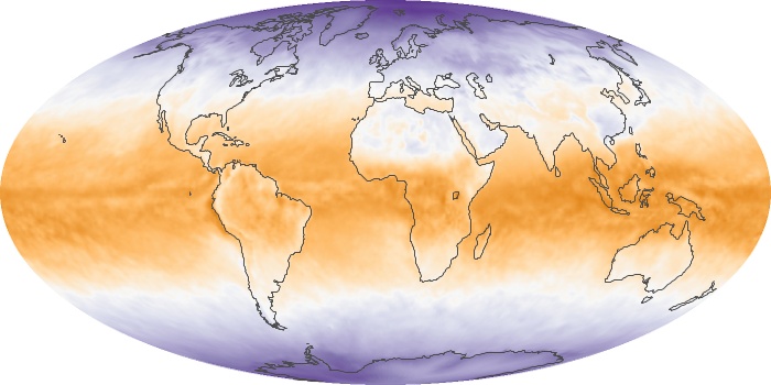
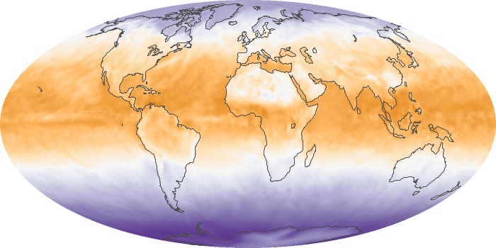
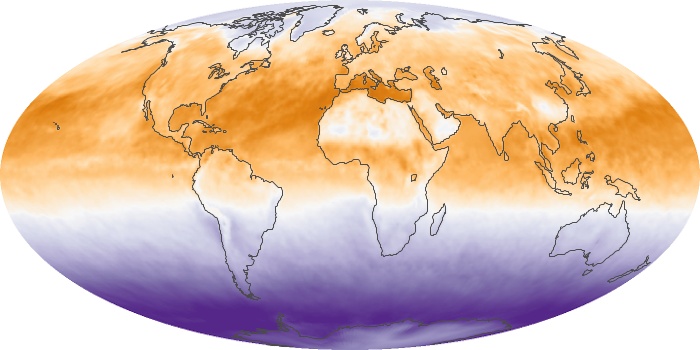
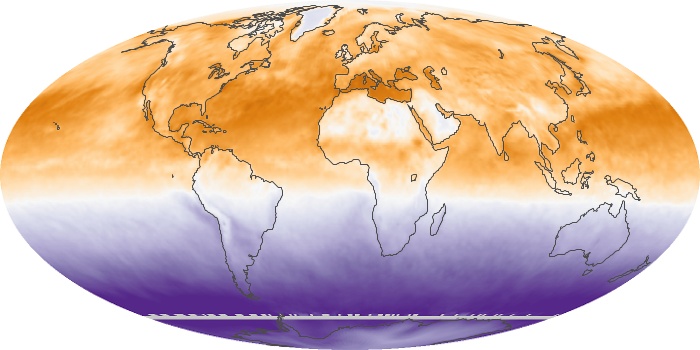
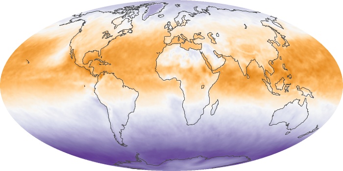
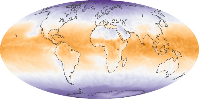
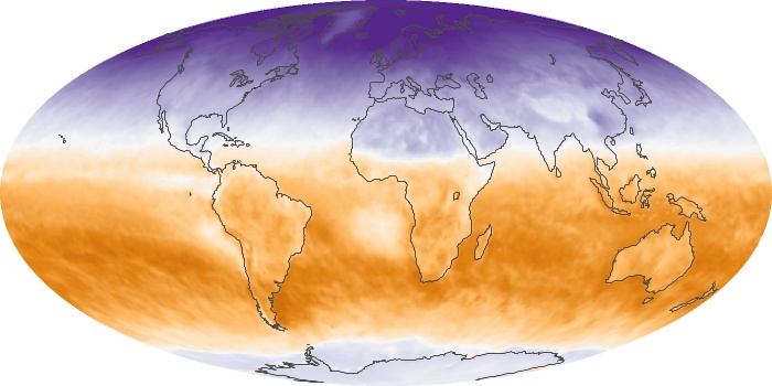
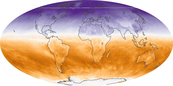
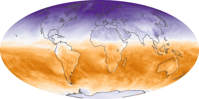
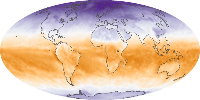
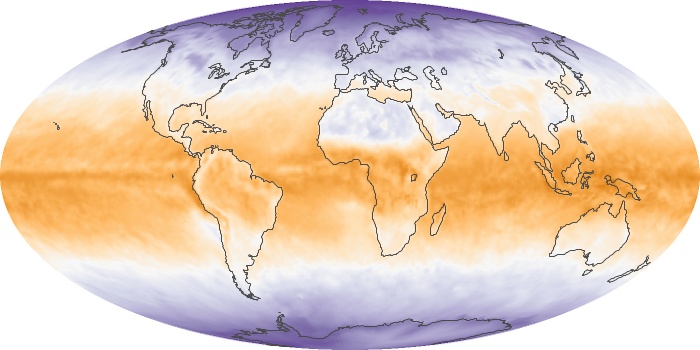
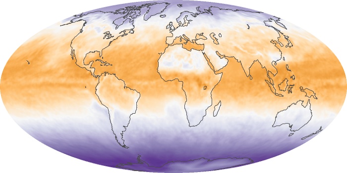
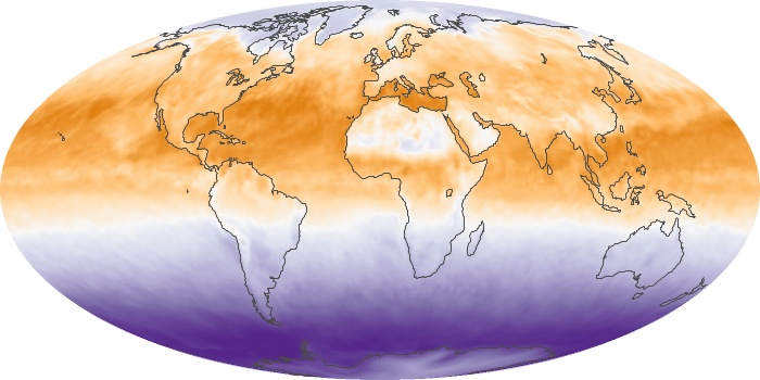
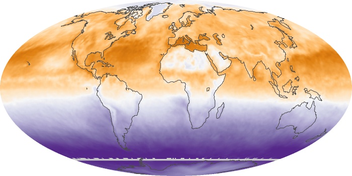
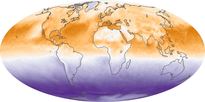
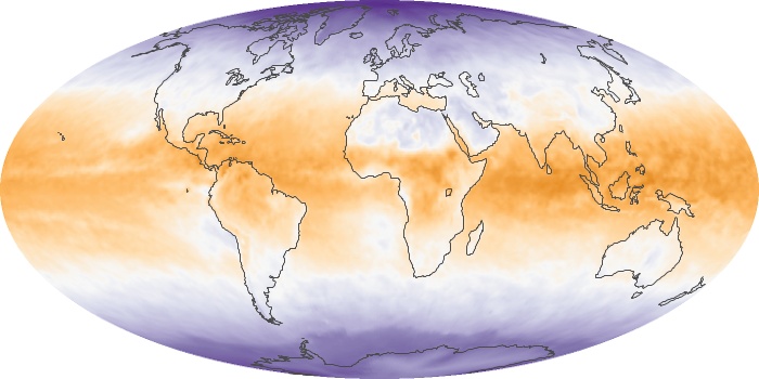
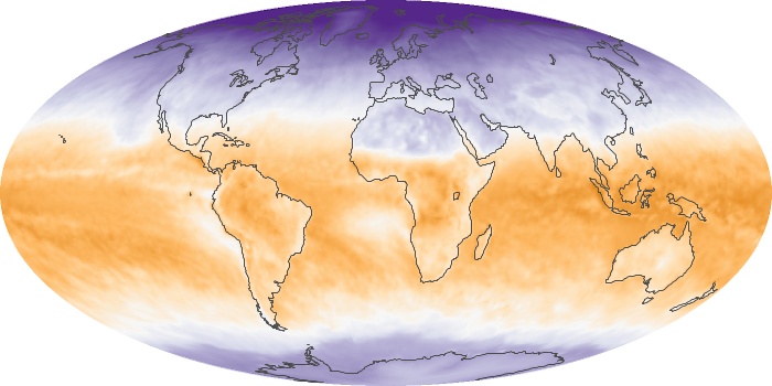
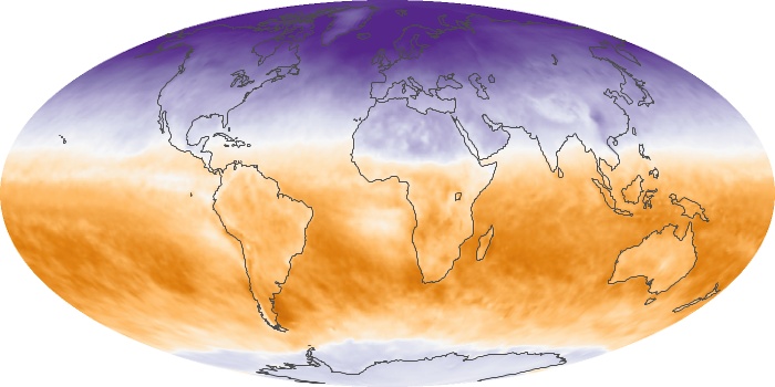
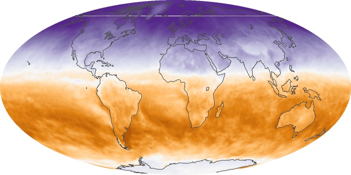
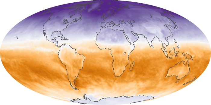
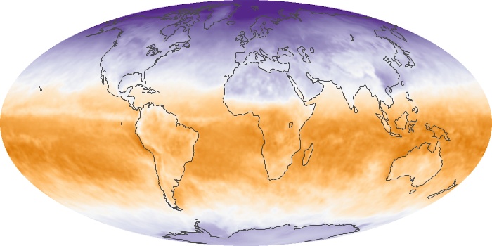
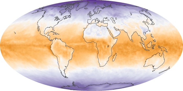
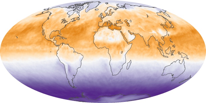
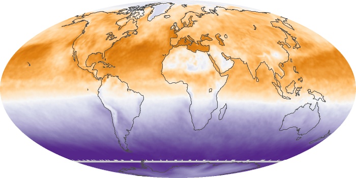
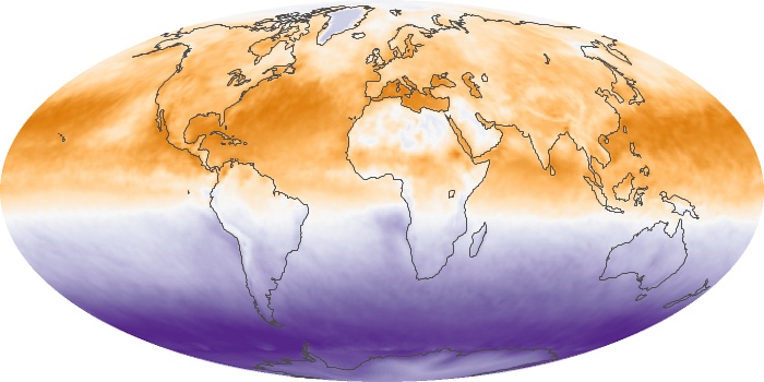
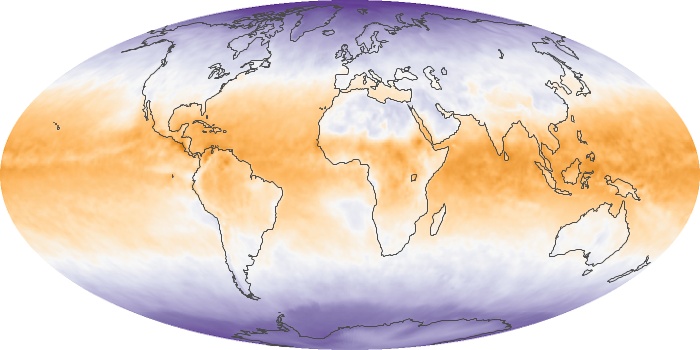
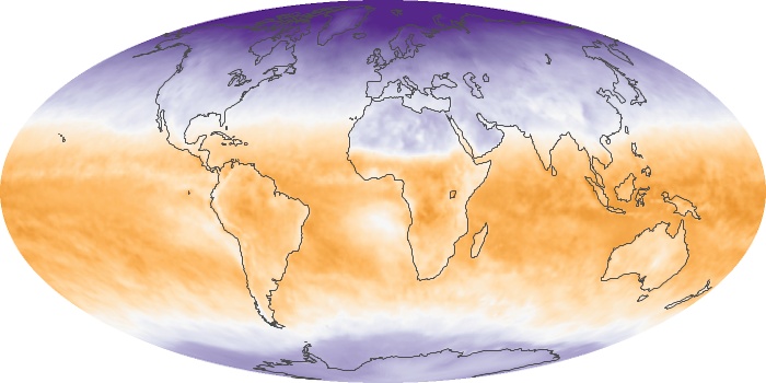
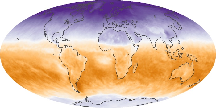
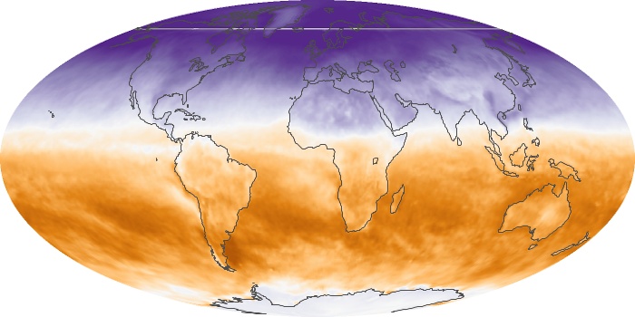
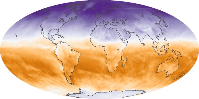
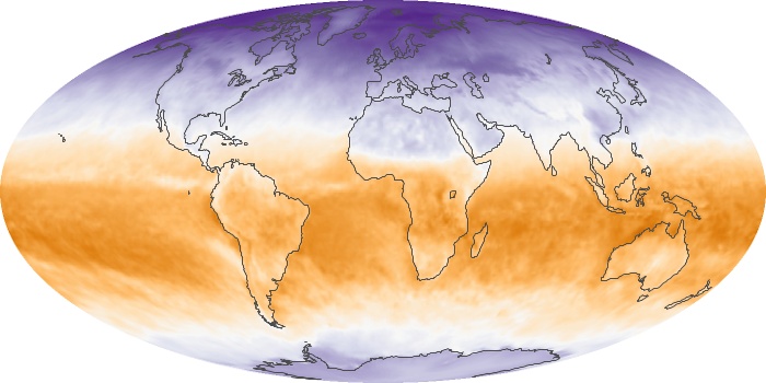
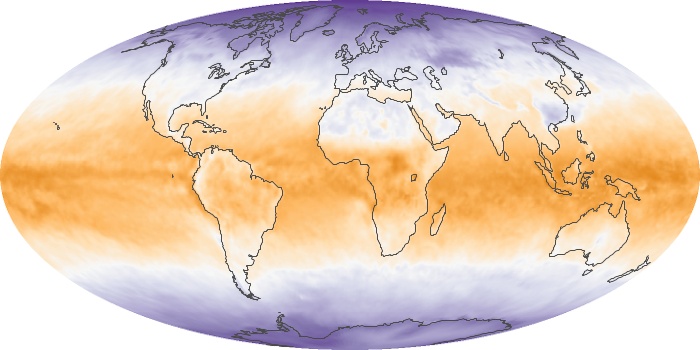
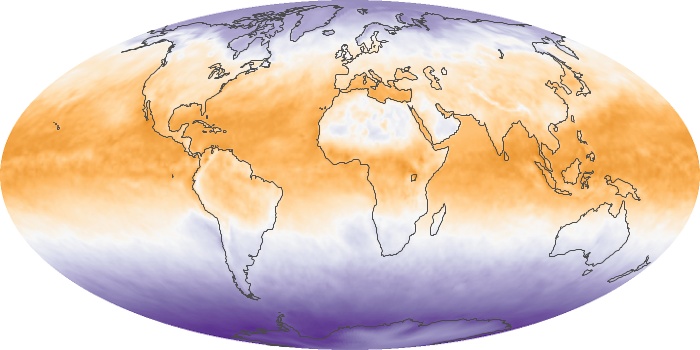
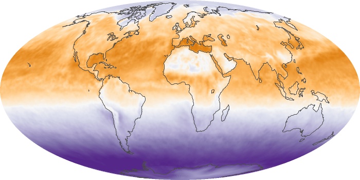
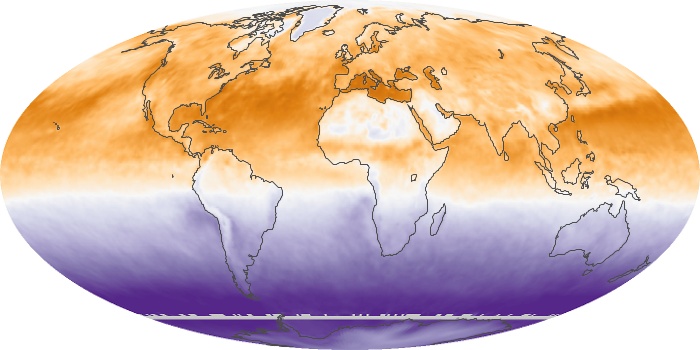
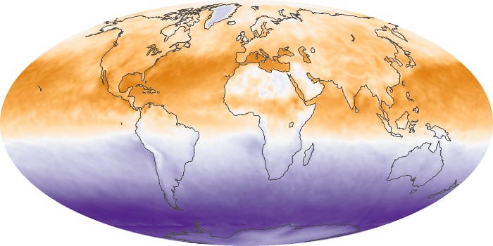
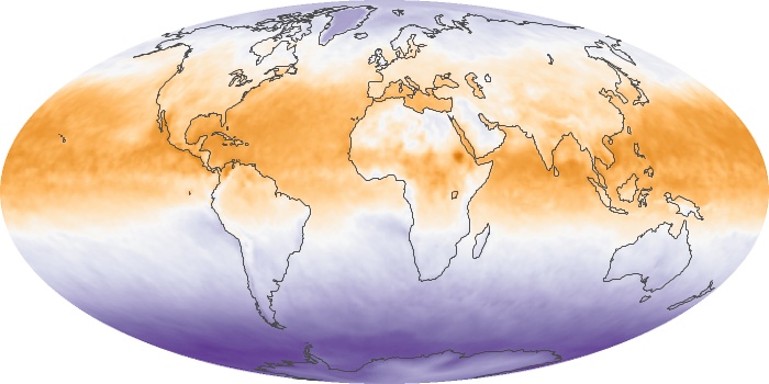
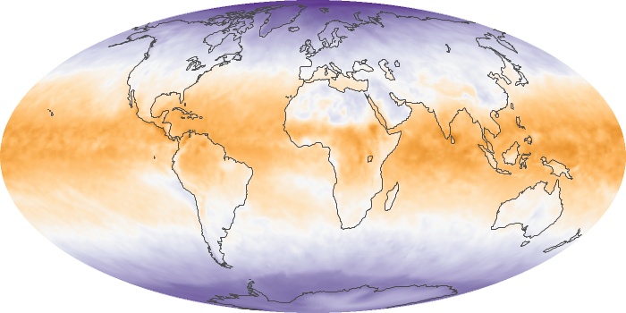
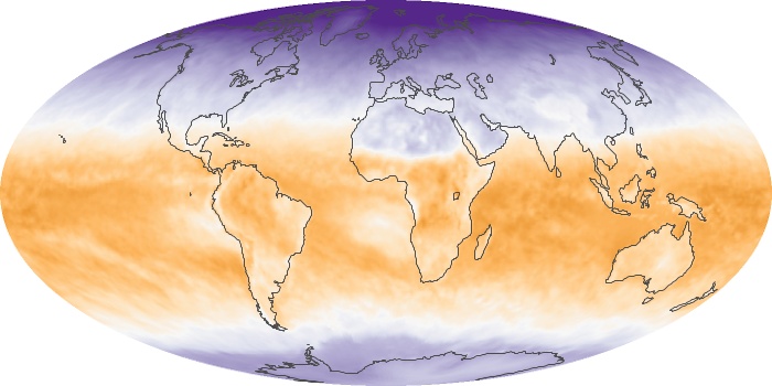
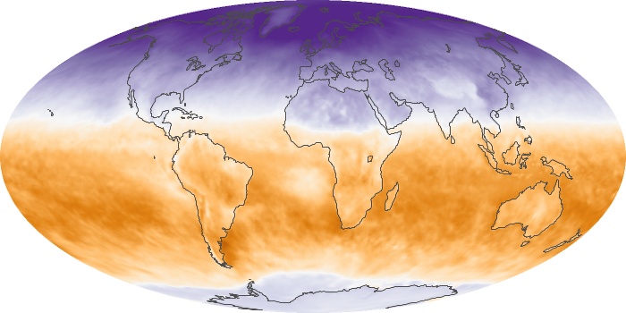
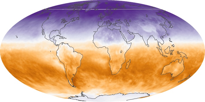
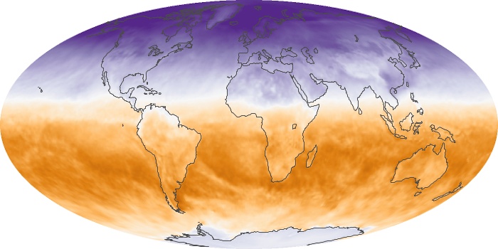
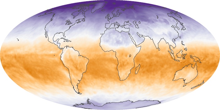
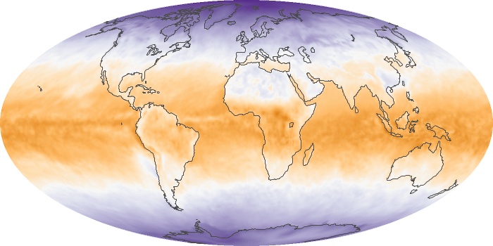
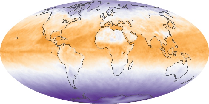
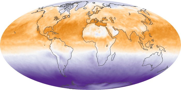
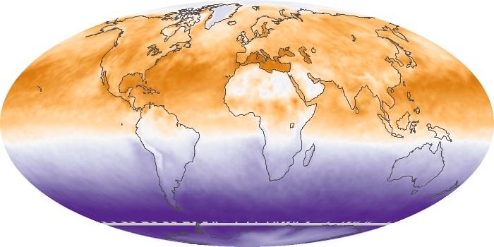
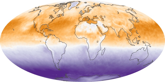
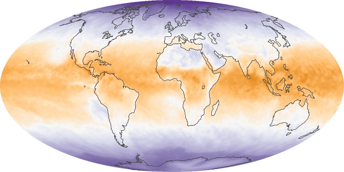
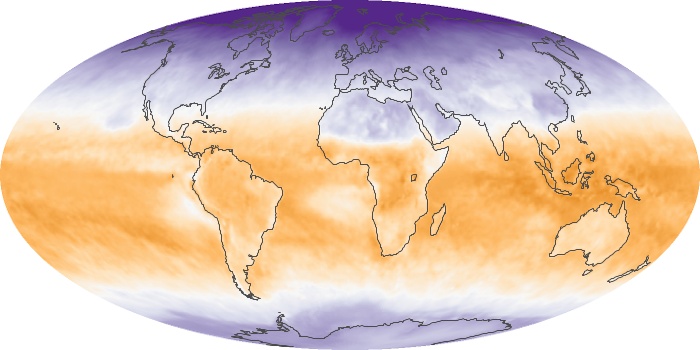
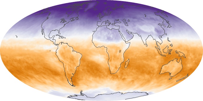
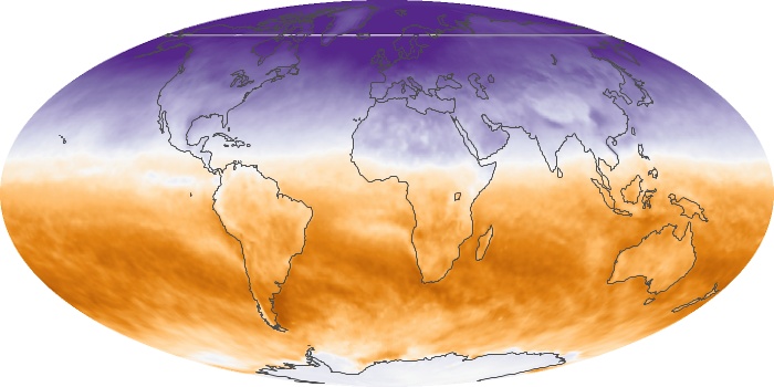
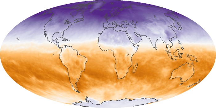
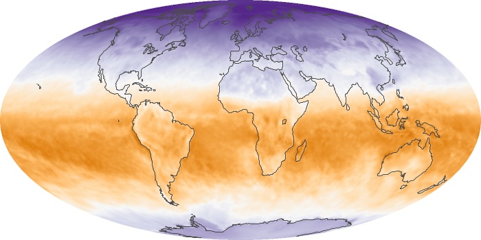
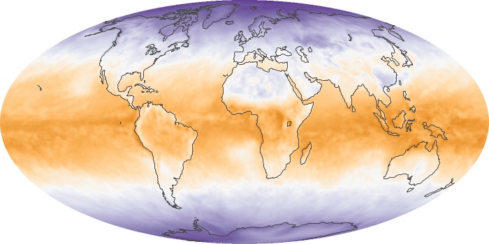
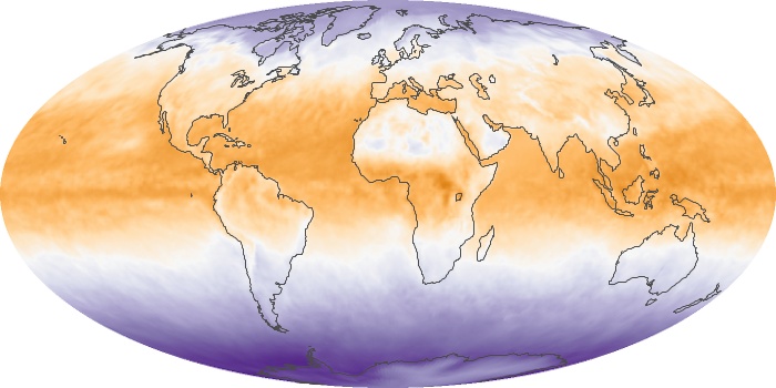
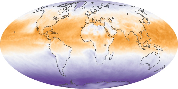
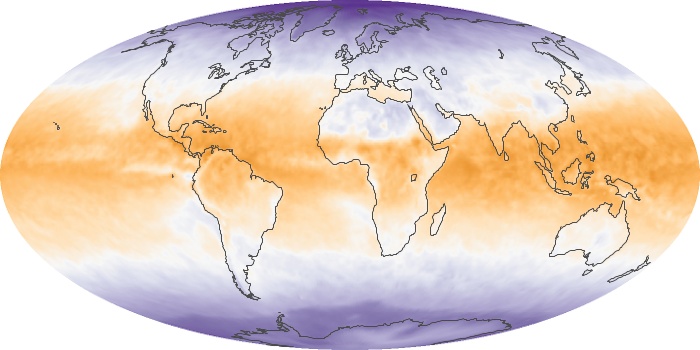
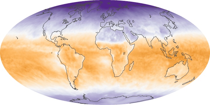
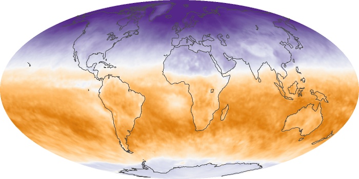
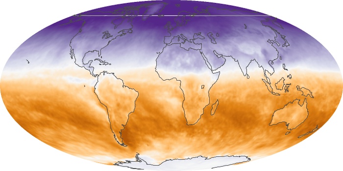
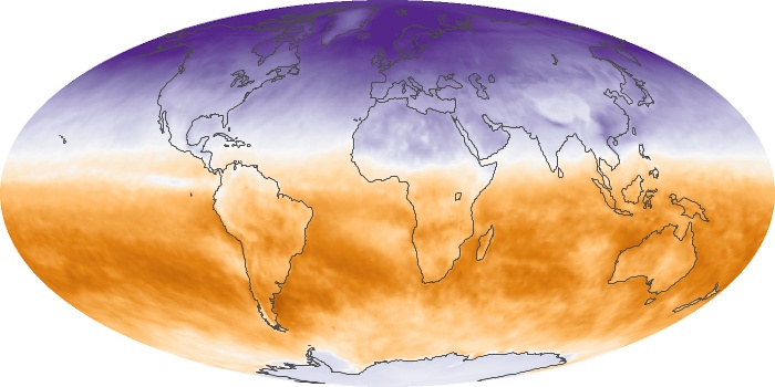
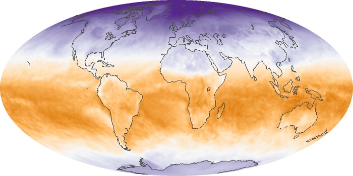
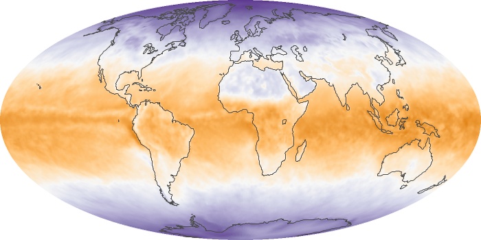
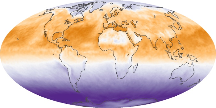
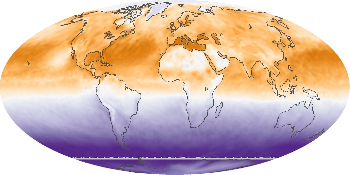
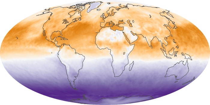
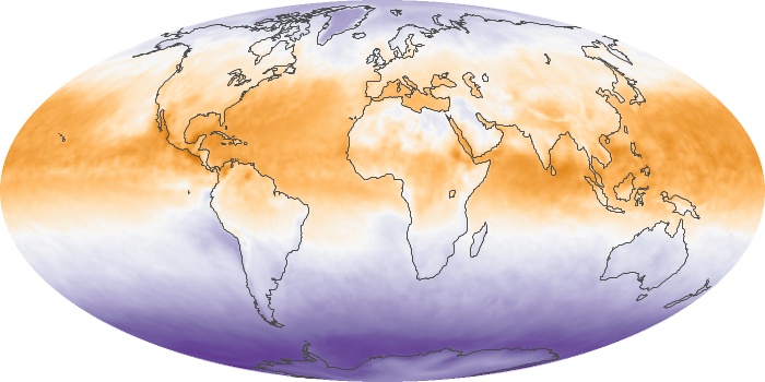
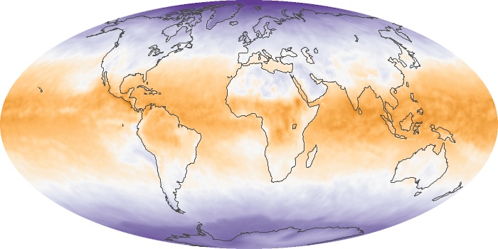
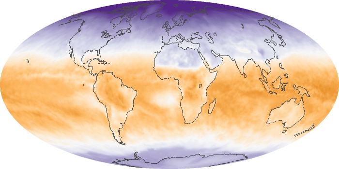
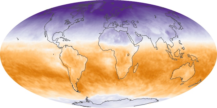
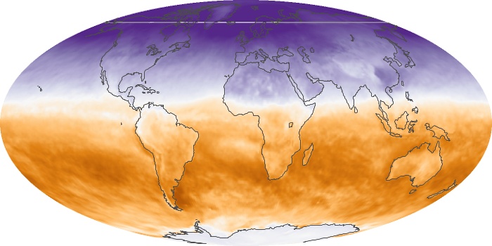
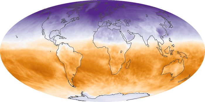
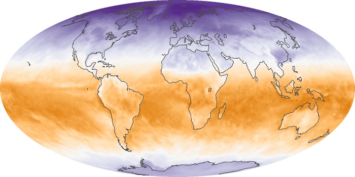
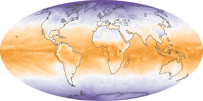
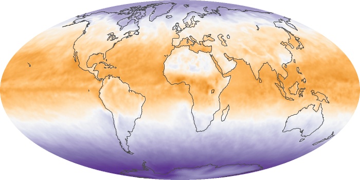
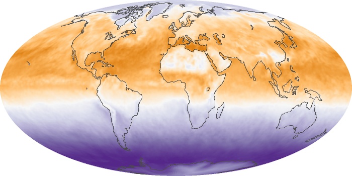
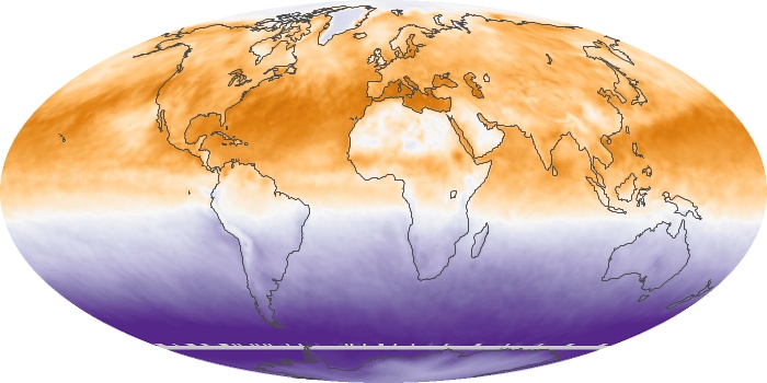
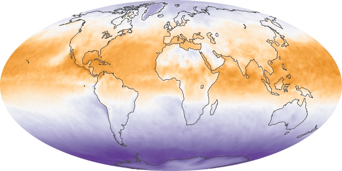
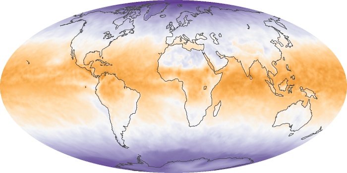
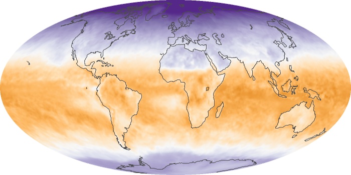
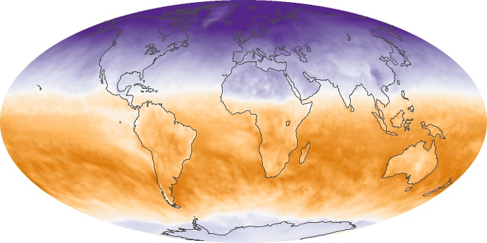
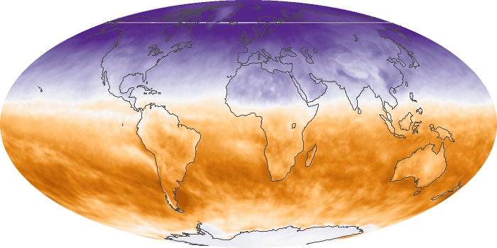
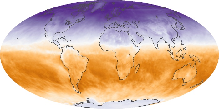
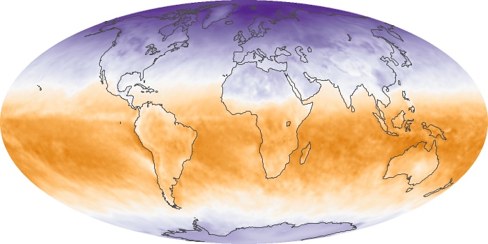
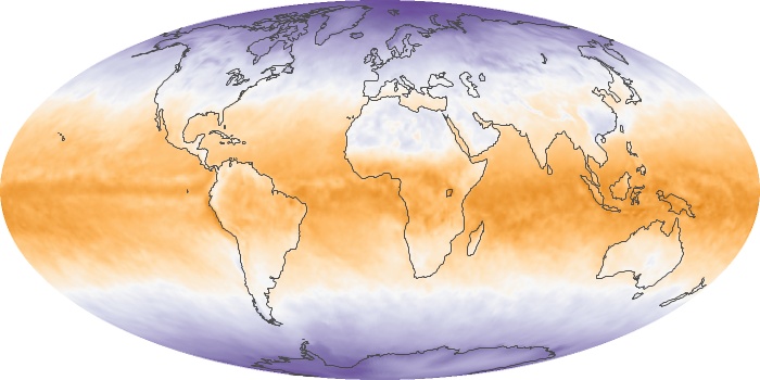
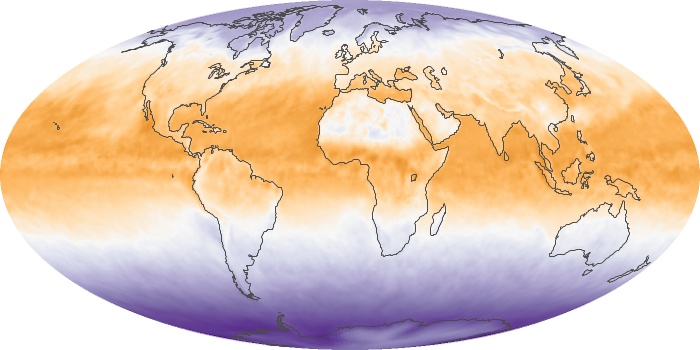
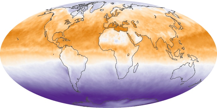
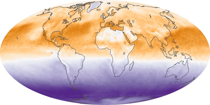
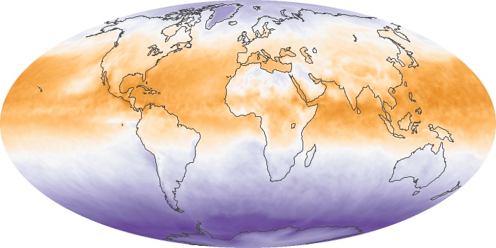
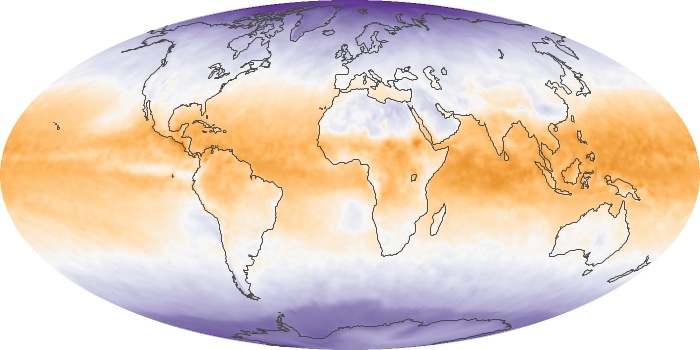
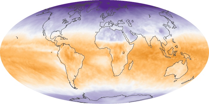
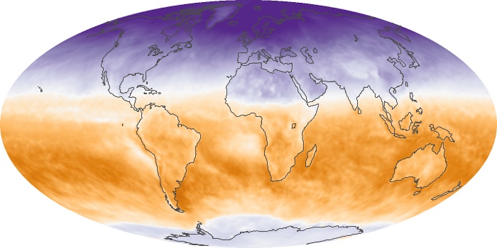
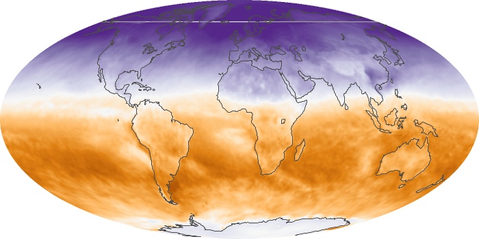
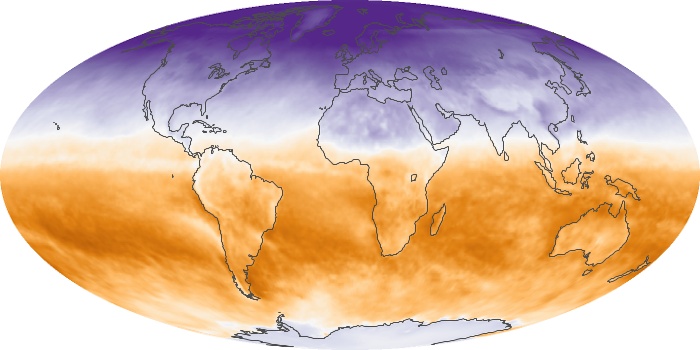
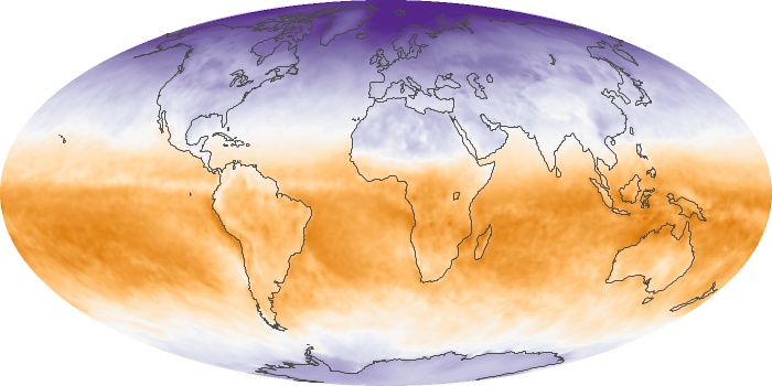
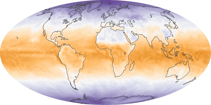
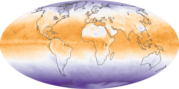
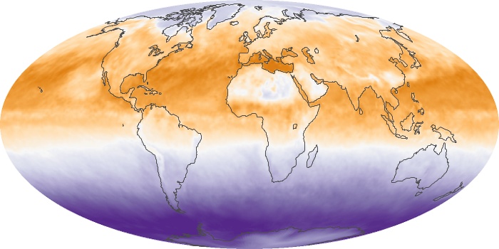
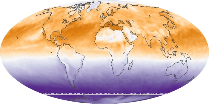
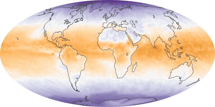
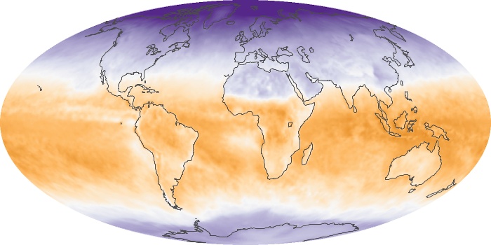
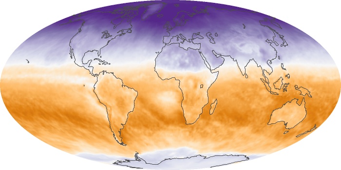
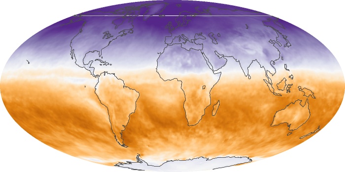
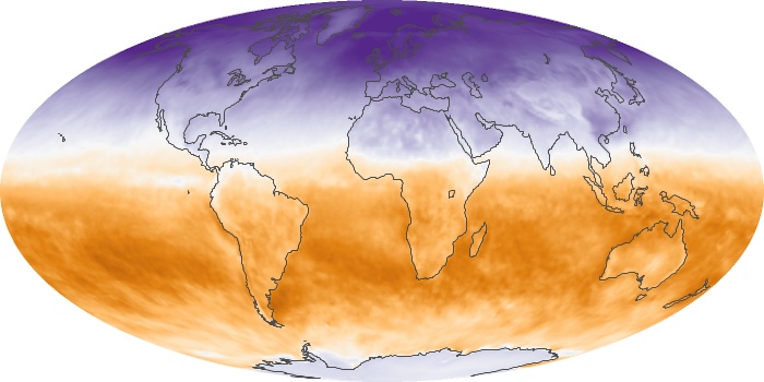
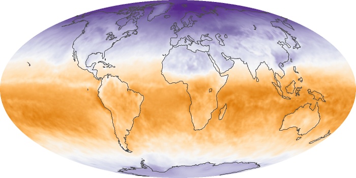
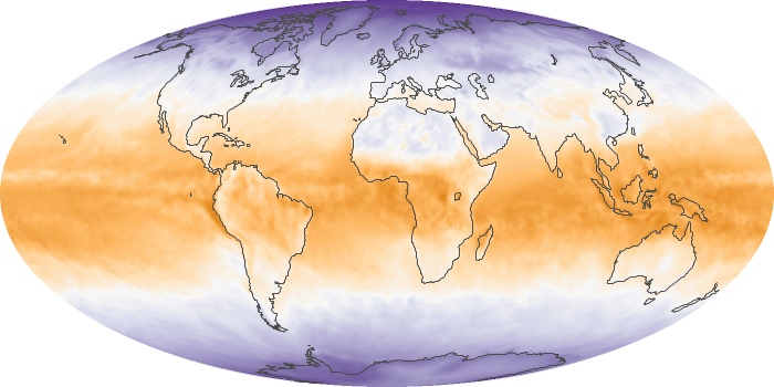
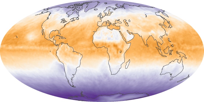
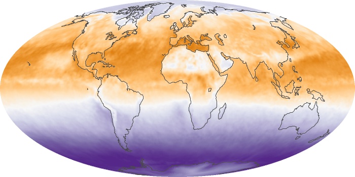
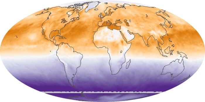
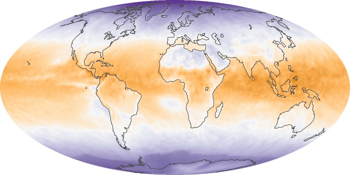
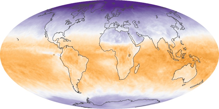
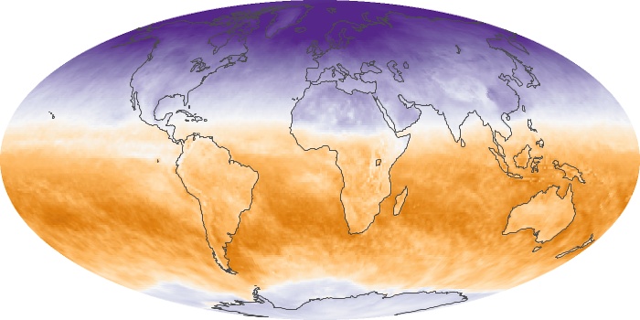
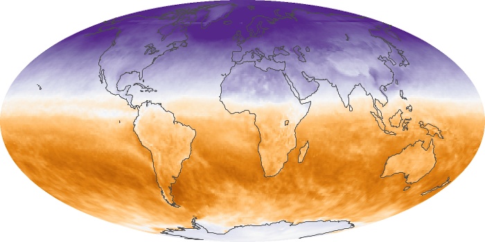
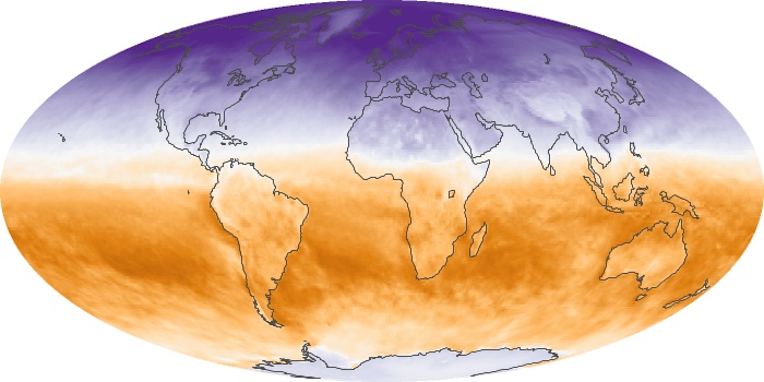
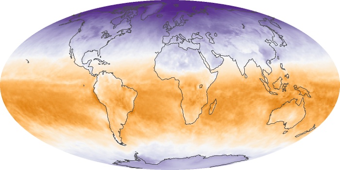
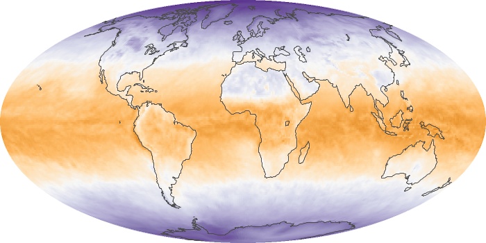
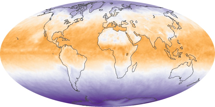
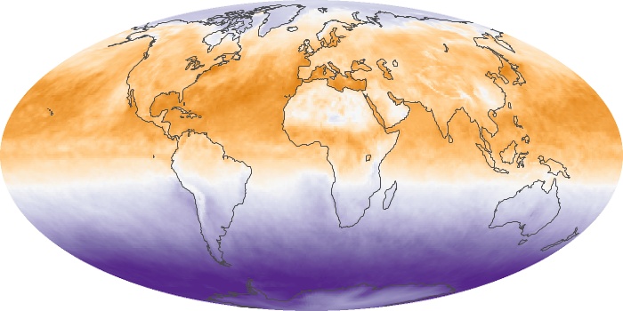
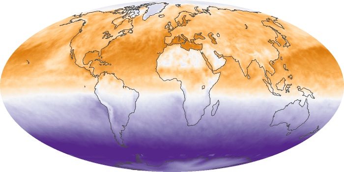
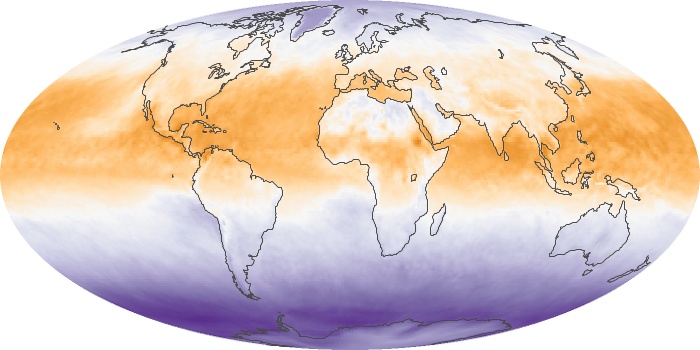
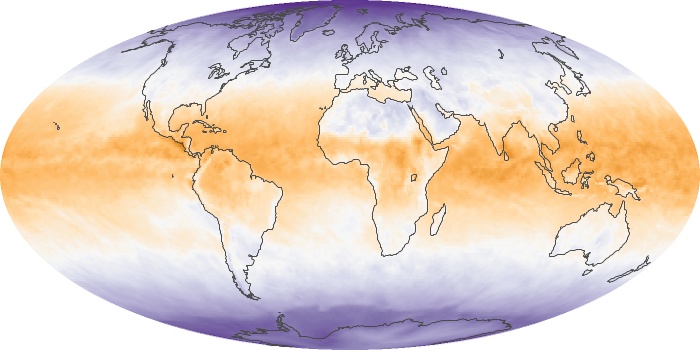
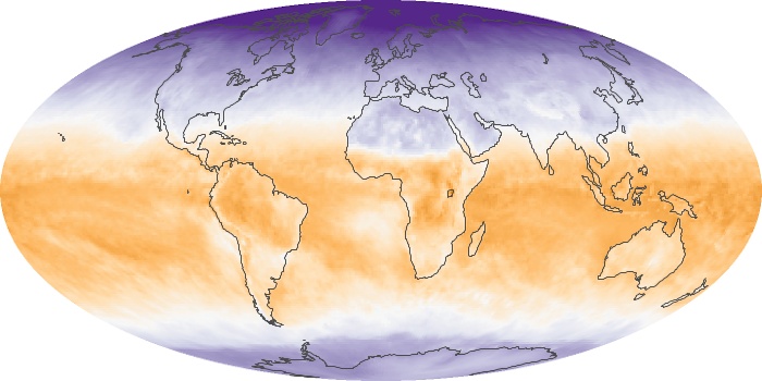
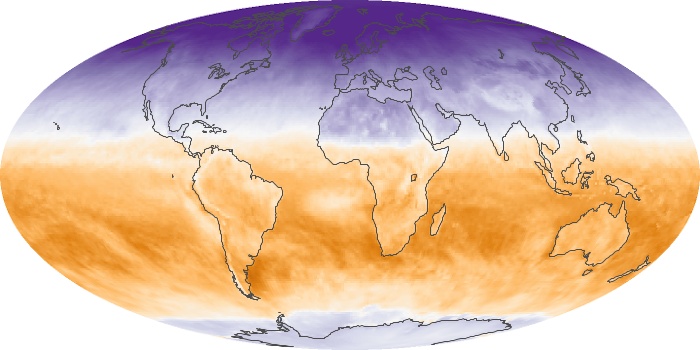
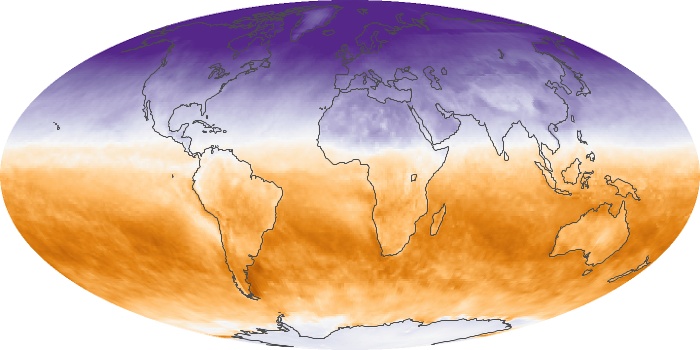
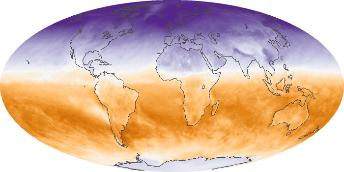
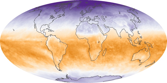
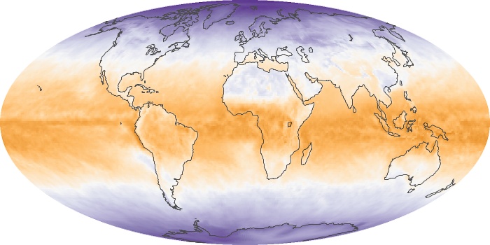
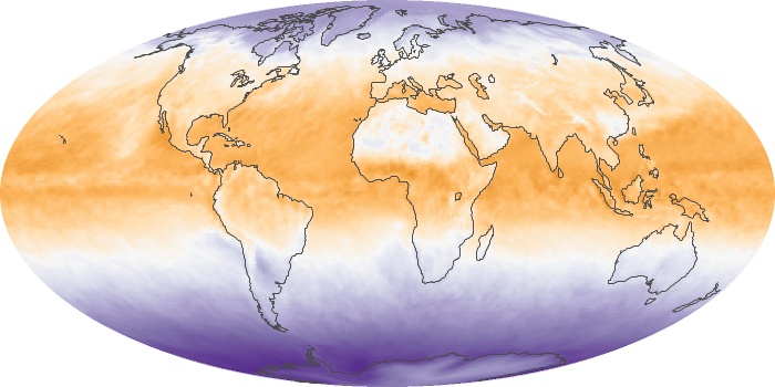
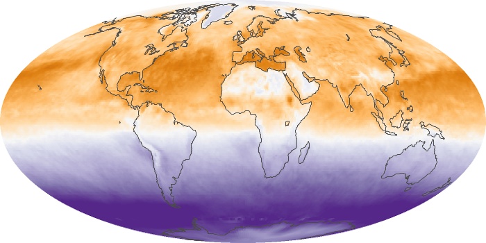
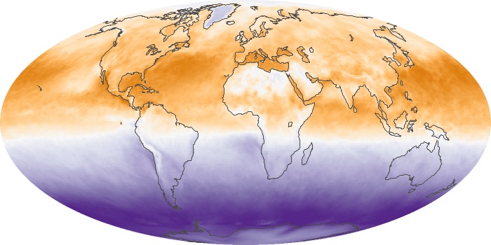
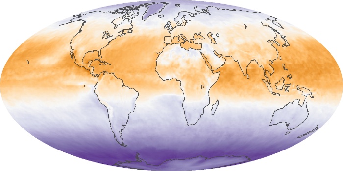
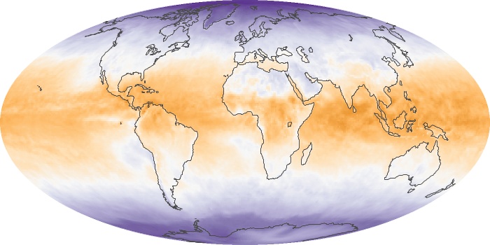
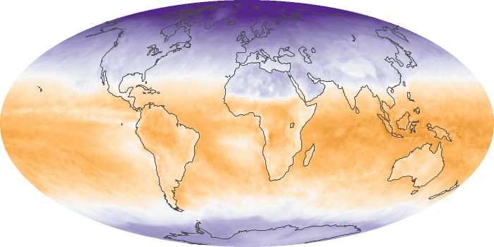
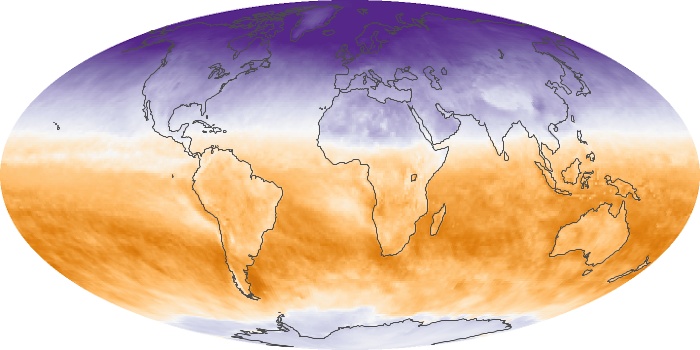
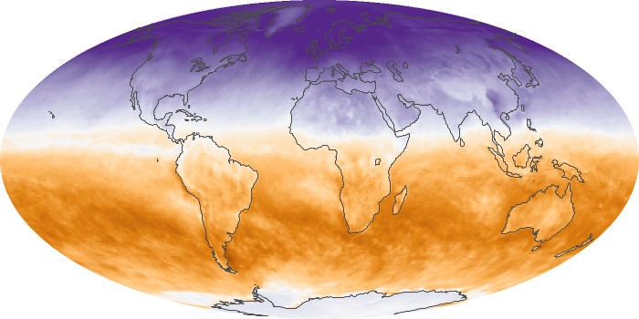
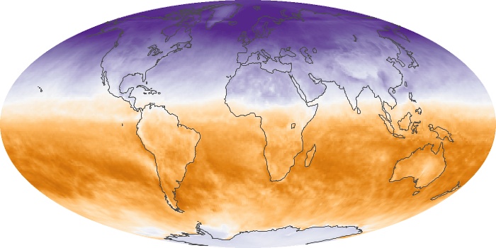
The map of net flux shows monthly changes in the balance of incoming and outgoing energy on Earth as measured by the Clouds and the Earth Radiant Energy System (CERES) sensor on NASA's Terra and Aqua satellites. Places where the amounts of incoming and outgoing energy were in balance are white. Places where more energy was coming in than going out (energy surplus) are orange. Places where less energy was coming in than going out (energy deficit) are purple.
View, download, or analyze more of these data from NASA Earth Observations (NEO):
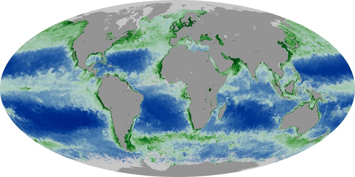
Sea Surface Temperature
Net Radiation
alert message