

The “Perfect” Palette
Despite the near-ubiquity of the rainbow palette—which distorts patterns in the underlying data—the basics of using color to represent numerical data are well-established.
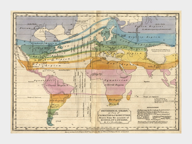 This 1823 map by W. C. Woodbridge is an early example of the use of colors to represent numbers—in this case more qualitative than quantitative. The rainbow palette is effective for this map because colors in the spectrum are perceived as “cool” and “warm,” and the colors clearly segment the climate zones. Map from the Historic Maps Collection, Princeton University Library.
By the mid-1960s cartographers had already established guidelines for the appropriate use of color in map-making. Jacques Bertin pointed out shortcomings of the rainbow palette in Sémiologie Graphique (The Semiology of Graphics), and Eduard Imhof was crafting harmonious color gradients for use in topographic maps [published in Kartographische Geländedarsellung (Cartographic Relief Presentation)].
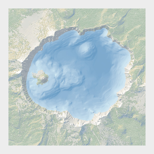 The subtle colors in this bathymetric map of Crater Lake are a direct descendent of the palettes created by Eduard Imhof. Map courtesy National Park Service Harper’s Ferry Center.
In the 1980s and 1990s researchers in perception and visualization were investigating the efficacy of palettes, based on the ways our brains and eyes physically respond to light. These color scales were crafted to achieve the principal goals of spatial displays: to show patterns and relationships in data, and to allow a viewer to accurately read individual values. [Colin Ware (1988) Color Sequences for Univariate Maps: Theory, Experiments, and Principles; Brewer (1994) Color Use Guidelines for Mapping and Visualization; Rogowitz and Treinish (1995) How NOT to Lie with Visualization; Tufte (1997) Visual Explanations; Spence et al. (1999) Using Color to Code Quantity in Spatial Displays.]
According to much of this research, a color scale should vary consistently across the entire range of values, so that each step is equivalent, regardless of its position on the scale. In other words, the difference between 1 and 2 should be perceived the same as the difference between 11 and 12, or 101 and 102, preserving patterns and relationships in the data. (For data with a wide range that is better displayed logarithmically, relative proportions should be maintained: the perceived difference between 1 and 10 should be the same as 1,000 and 10,000.) Consistent relationships between numbers—like in a grayscale palette—preserves the form of the data. Palettes with abrupt or uneven shifts can exaggerate contrast in some areas, and hide it others.
 Compared to a monochromatic or grayscale palette the rainbow palette (IDL number 35) tends to accentuate contrast in the bright cyan and yellow regions, but blends together through a wide range of greens.
A palette should also minimize errors from the color shifts introduced by nearby areas of differing color or lightness, a phenomenon known as simultaneous contrast.
 Simultaneous contrast (a visual phenomenon that helps us interpret shapes through variations in brightness) shifts the appearance of colors and shades based on their surroundings. (After Ware (1988).)
Simultaneous contrast is most pronounced in monochromatic palettes, while sharp variations in hue minimize the effect. As a result variations of the rainbow palette are good for preserving exact quantities.
How to take advantage of the strengths of both the grayscale palette (preservation of form) and rainbow palette (preservation of quantity), while minimizing their weaknesses? Combine a linear, proportional change in lightness with a simultaneous change in hue and saturation. Colin Ware describes this type of palette as “a kind of spiral in color space that cycles through a variety of hues while continuously increasing in lightness” (Information Visualization: Perception for Design, Second Edition). The continuous, smooth increase in lightness preserves patterns, the shift in hue aids reading of exact quantities, and the change in saturation enhances contrast.
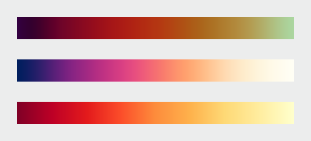 A color palette that combines a continuous increase in lightness with a shift in hue is a good compromise that preserves both form and quantity. These three palettes show the smooth, even gradations that result from color scales calculated in perceptual color spaces. Color scales with varied hues and contrast are suitable for representing different datasets. (After Spence et al. (1999), chroma.js, and Color Brewer.)
Of the three components of color—hue, saturation, and lightness—lightness is the strongest. As a result, accurate, one-way changes in lightness are more important than those in hue or saturation. For example, a color scale that goes from black to color to white can still be read accurately, even though the saturation is lower at both ends of the scale than in the middle. This allows a bit of flexibility in designing palettes, especially for datasets that benefit from high-contrast color ramps. You also don’t need to worry too much about color scales that drift a little bit out of gamut (the complete range of colors displayed on a particular device) for a portion of the ramp. Just make sure lightness is still changing smoothly.
 This palette differs from the ideal with saturation that increases from low-to-mid values, and decreases from mid-to-high values. It’s still readable because lightness, the component of color perceived most strongly, changes continuously. (Derived with the NASA Ames color tool).
All of these palettes are appropriate for sequential data. Data that varies continuously from a high to low value; such as temperature, elevation, or income. Different palettes are suited to other types of data, such as divergent and qualitative, which I’ll discuss next week.
Subtleties of Color
Part 1: Introduction
Part 3: Different Data, Different Colors
Part 4: Connecting Color to Meaning
Part 5: Tools & Techniques
Part 6: References & Resources for Visualization Professionals
(This series on the use of color in data visualization is being cross-posted on visual.ly. Thanks to Drew Skau at visual.ly for the invitation.)
Introduction
The use of color to display data is a solved problem, right? Just pick a palette from a drop-down menu (probably either a grayscale ramp or a rainbow), set start and end points, press “apply,” and you’re done. Although we all know it’s not that simple, that’s often how colors are chosen in the real world. As a result, many visualizations fail to represent the underlying data as well as they could.
The purpose of data visualization—any data visualization—is to illuminate data. To show patterns and relationships that are otherwise hidden in an impenetrable mass of numbers.
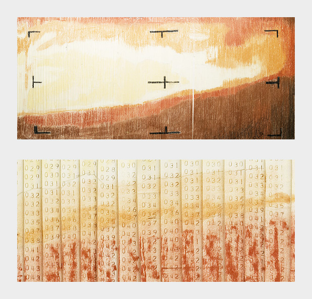
Encoding quantitative data with color is (sometimes literally) a simple matter of paint-by-numbers. In 1964 Richard Grumm and his team of engineers at NASA’s Jet Propulsion Laboratory hand-colored the first image of Mars taken from an interplanetary probe as they waited for computers to process the data.
In spatial datasets [datasets with at least two dimensions specifying position, and at least one additional dimension of quantity (a category that includes not only maps, but everything else ranging from individual atoms to cosmic background radiation)] color is probably the most effective means of accurately conveying quantity, and certainly the most widespread. Careful use of color enhances clarity, aids storytelling, and draws a viewer into your dataset. Poor use of color can obscure data, or even mislead.
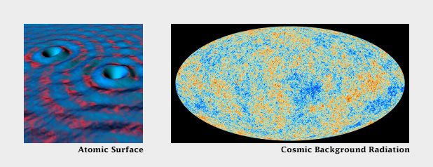
Color can be used to encode data from the atomic scale (left), to the universal (right). (Scanning tunneling microscope image originally created by IBM Corporation (left), cosmic background radiation image courtesy ESA and the Planck Collaboration (right)).
Fortunately, the principles behind the effective use of color to represent data are straightforward. They were developed over the course of more than a century of work by cartographers, and refined by researchers in perception, design, and visualization from the 1960s on.
Although the basics are straightforward, a number of issue complicate color choices in visualization. Among them:
The relationship between the light we see and the colors we perceive is extremely complicated.
There are multiple types of data, each suited to a different color scheme.
A significant number of people (mostly men), are color blind.
Arbitrary color choices can be confusing for viewers unfamiliar with a data set.
Light colors on a dark field are perceived differently than dark colors on a bright field, which can complicate some visualization tasks, such as target detection.
(Very) Basic Color Theory
Although our eyes see color through retinal cells that detect red, green, and blue light, we don’t think in RGB. Rather, we think about color in terms of lightness (black to white), hue (red, orange, yellow, green, blue, indigo, violet), and saturation (dull to brilliant). These three variables (originally defined by Albert H. Munsell) are the foundation of any color system based on human perception. Printers and painters use other color systems to describe the mixing of ink and pigment.
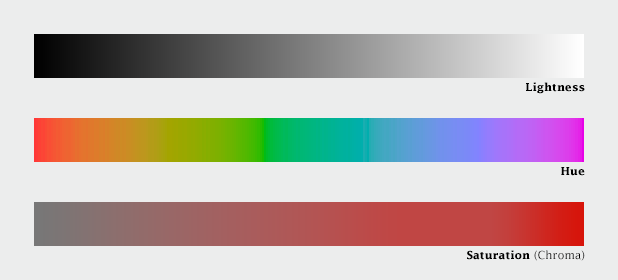
Lightness, hue, and saturation (sometimes called chroma) are the building blocks of color.
Computers (and computer programmers) on the other hand, do process colors in terms of red, green, and blue. Just not the same red, green, and blue that our eyes detect. Computer screens display colors that are a combination of very narrow frequency bands, while each type of cone in our eyes detect a relatively broad spectrum. Complicating things further, computers calculate light linearly, while humans perceive exponentially (we are more sensitive to changes at low light levels than high light levels), and we’re more sensitive to green light than red light, and even less sensitive to blue light.
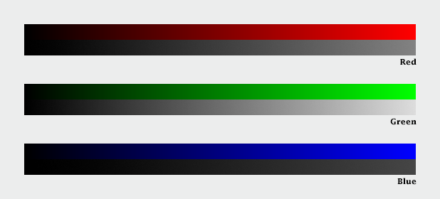
Computers calculate color using three primary colors—red, green, and blue. Unfortunately, we see green as brighter than red, which itself is brighter than blue, so colors specified in terms a computer understands (RGB intensities from 0-255) don’t always translate well to how we see.
The combined result of these nonlinearities in our vision is color perception that’s, well, lumpy. For example, the range of saturation we’re capable of seeing for a single hue is highly dependent on its lightness. In other words, there’s no such thing as a dark yellow. Near the center of the lightness range, blue and red shades can be very saturated, but green tones cannot. Very light and very dark colors are always dull.
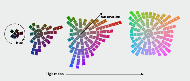
The range of colors perceived by humans is uneven. (Equiluminant colors from the NASA Ames Color Tool)
CIE Color Spaces
The unevenness of color perception was mapped by the International Commission on Illumination (Commission Internationale de l´Eclairage in French, hence “CIE”) in the 1930s. The CIE specified (and continues to refine) a series of color spaces that allow scientists, artists, and printers—anyone who works with light—to describe colors consistently, and accurately translate color between mediums. CIE L*a*b, for example, is used internally by Adobe Photoshop to interpolate color gradients and convert images from RGB (screen) to CMYK (print).
Another of these specifications: CIE L*C*h [lightness, chroma (saturation), hue] is my preferred tool for crafting color palettes for use in visualization. Because the three components of CIE L*C*h are straightforward, it’s simple to use. Because it’s based on studies of perception, color scales developed with L*C*h help accurately represent the underlying data. I say “help” because perfect accuracy is impossible—there are too many variables in play between the data and our brains. [Another option (used in Color Brewer) is the Munsell Color System, which is accurate in lightness and hue, but not in saturation.]

Choosing and interpolating colors in a perceptual space—CIE L*c*h—helps ensure consistent change across the entire palette. In this example, which varies from pale yellow to blue, the range of green shades is expanded, and blues are compressed in the nonlinear palette relative to the linear palette. Palettes generated via Gregor Aisch’s L*C*h color gradient picker and chroma.js
In short, people aren’t computers. Computer colors are linear and symmetrical, human color perception is non-linear and uneven. Yet many of the tools commonly used to create color schemes are designed more for computers than people. These include tools that calculate or specify colors in the red, green, blue (RGB) or hue, saturation, value (HSV) color spaces. A constant increase in brightness is not perceived as linear, and this response is different for red, green, and blue. Look for tools and color palettes that describe colors in a perceptual color space, like CIE L*C*h or Munsell.
In the rest of this series, I’ll outline the principles behind the “perfect” color palette, describe different types of data that require unique types of palettes, give some suggestions for mitigating color blindness, and illustrate some tricks enabled by careful use of colors.
Subtleties of Color
Part 2: The “Perfect” Palette
Part 3: Different Data, Different Colors
Part 4: Connecting Color to Meaning
Part 5: Tools & Techniques
Part 6: References & Resources for Visualization Professionals
(This series on the use of color in data visualization is being cross-posted on visual.ly. Thanks to Drew Skau at visual.ly for the invitation.)
Somehow, a recent conversation on Twitter about tweet density led to a mention of the installation of variable highway lighting in the Netherlands, by way of the 2012 NASA/NOAA city lights map. Which made me wonder—would we be able to see the effects of the new lighting from space? After all, the day night band on the VIIRS instrument is sensitive enough to see by starlight.
According to Philips, streetlights along the A7 from Purmerend (just north of Amsterdam) to Wognum are dimmed 50% after 9 pm. The system was switched on in early 2013, so any change should be visible in 2012 vs. 2013 data:
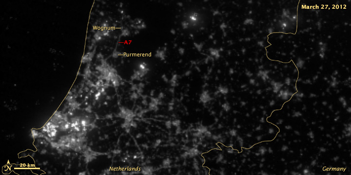

It’s subtle, but the difference is clear.
A wider view of the area reveals more interesting features:
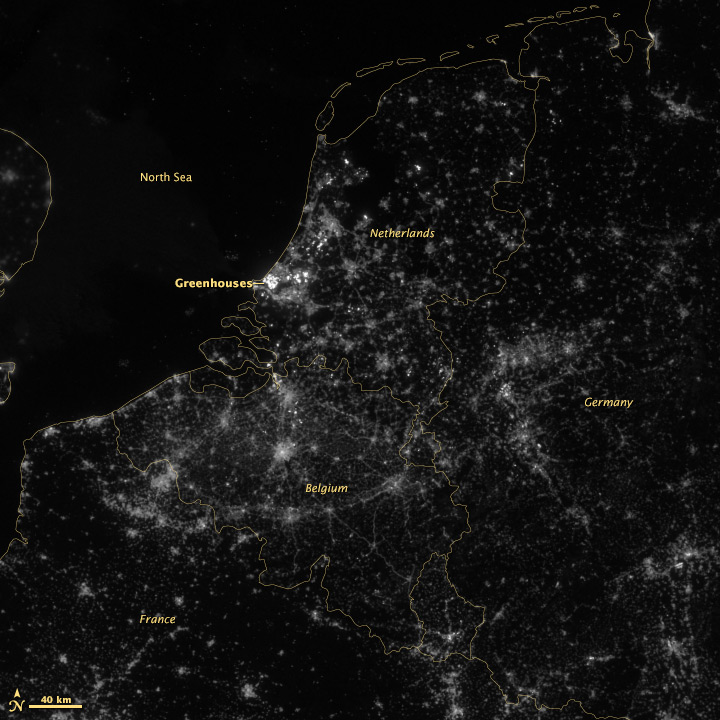
The brightest lights in the Netherlands are from clusters of greenhouses—perhaps growing hydroponic vegetables 24 hours a day. The Netherlands and Belgium are more densely populated and brightly lit than neighboring France and Germany, including their highways. Unsurprisingly water bodies are largely dark, but there is a scattering of boats in the North Sea.
A few notes on the image processing. These data are from the NOAA CLASS system, which is the primary archive for VIIRS data. Unfortunately they’re not in a convenient format: each file is an 80-second chunk of the satellite’s orbit (called a granule), with no preview images. The file format is HDF, which many scientists like but can be (extremely) difficult to read. (This Beginner’s Guide from Colorado State University may be helpful.)
The product is labeled “VIIRS Day Night Band SDR.” SDR means “science data record” which is a calibrated measurement, in this case Watts per square meter per steradian. It turns out this is a very low number, so to visualize the data we multiply everything by 1,500,000,000,000,000 (1.5E15) to make a usable 16-bit grayscale image, which looks like this:
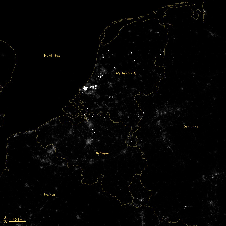
There’s little detail aside from the very brightest lights, so we take the square root of the data to accentuate low values and compress high values—the results of which are in the top images. I usually apply additional contrast adjustments on published imagery, but here I wanted to be more conservative.
Thanks to Gregor Aisch (@driven_by_data), Moritz Stefaner (@moritz_stefaner), Eric Fischer (@enf), and Jan Willem Tulp (@JanWillemTulp) for piquing my interest. My Twitter handle is @rsimmon if you’re interested in data visualization, Earth science, and NASA (with the occasional digression into hockey and dogs). Additional thanks to my colleague Jesse Allen for converting the HDF into something useful.
Update:
Dan W. Williams made a GIF with the 2012 and 2013 images which makes the changes easier to see. Thanks!

Update 2:
By request, here are the full files as GeoTIFFs. You’ll need a TIFF reader that supports floating point (Photoshop does not) to read the “Raw” and “Scaled” data. Photoshop (and even Safari on a Mac) will read the two “Square Root” files.
March 27, 2012
Raw Floating Point
Scaled Floating Point
Square Root 16 bit Integer
March 4, 2013
Raw Floating Point
Scaled Floating Point
Square Root 16 bit Integer
The Landsat Data Continuity Mission is now Landsat 8, and that means images are now public (woohoo!). NASA handed control of the satellite to the USGS yesterday (May 30, 2013), and calibrated imagery is available through the Earth Explorer. Unfortunately, the Earth Explorer interface is a bit of a pain, so I’ve put together a guide to make it easier.
First, go to the Earth Explorer site: earthexplorer.usgs.gov
You can search, but not order data, without logging in—so register if you don’t have an account (don’t worry, it’s instant and free), or log in if you do.
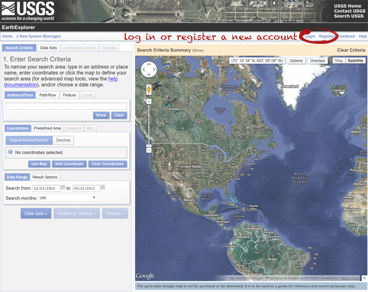
The simplest way to select a location is to simply pick a single point on the map. You can define a box or even a polygon, but that makes it more likely you’ll get images with only partial coverage. Navigate to the location you’re interested in, and click to enter the coordinates. You can choose a data range, but right now there are only 3 or 4 scenes for a given spot, so skip it and just click “Data Sets”.
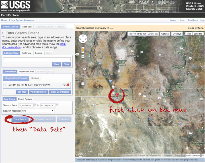
On the data sets page, you can search everything from Aerial Imagery to Vegetation Monitoring. Click the “+” symbol next to Landsat Archive, then the first check box that appears: “L8 OLI/TIRS” (which stands for Landsat 8 Operational Land Imager/Thermal Infrared Sensor (creative, no?)). Click “Results” to start a search.
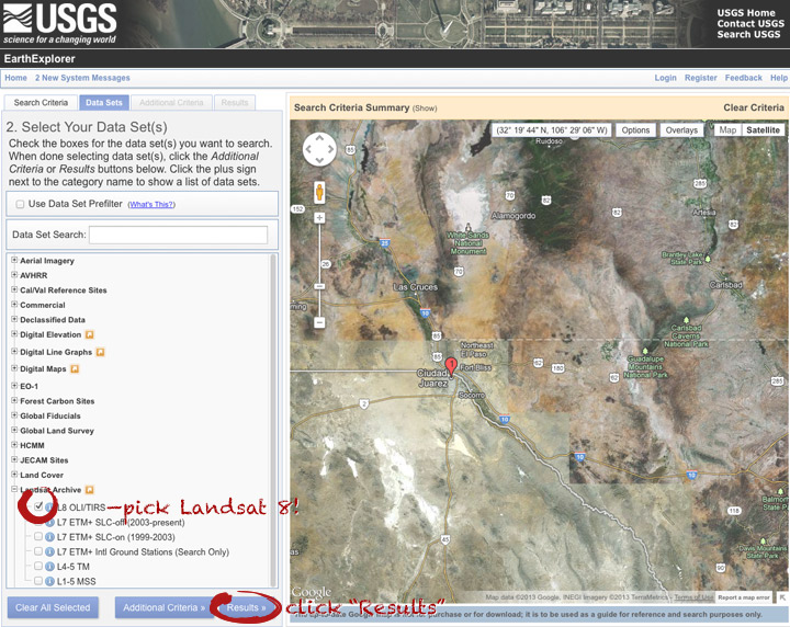
After a short wait, you’ll get a list of available images. The thumbnails aren’t big enough to show much, so click on one to see a slightly larger image. Close that window, and click the download icon: a green arrow pointing down towards a hard drive …
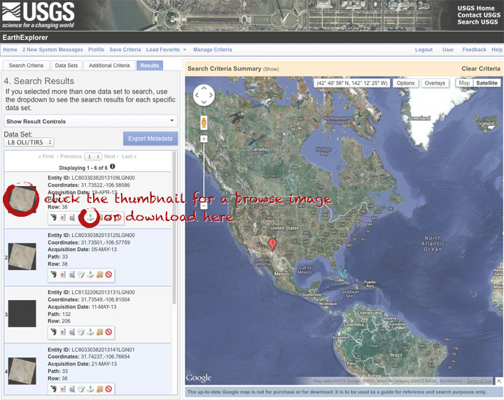
… which doesn’t actually download the data, just provides a list of download options. “LandsatLook” are full-resolution JPEGs, and are a quick way to check image quality (I’d prefer full-resolution browse images without a separate download, but I digress). The Level 1 Product is terrain-corrected, geolocated, calibrated data—a bundle of 16 bit, single-channel GeoTIFFs. Select the “Level 1 Product” radio button, then click “Select Download Option”.
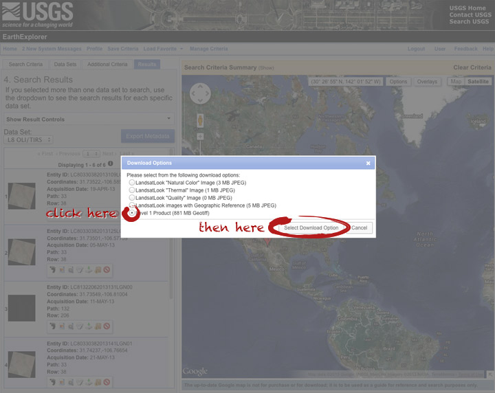
Done! Oh, wait. Not done. You need to click one more button: “Download”.
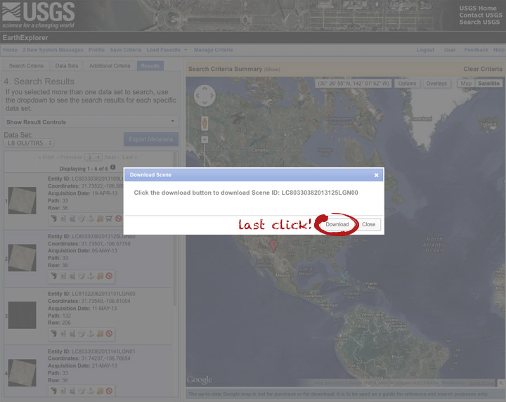
Now you’re done. The data should arrive in your browser’s designated download folder.
Drop a note in the comments section if I’ve skipped a step, or if you have any other questions. Next week I’ll explain what to do with the data once you’ve got it.
This photo of Skylab was taken by the astronauts of Skylab-2 as they left the space station and departed for Earth on June 22, 1973. More photos from all three Skylab missions are archived on NASA’s Gateway to Astronaut Photography of Earth.
To look through the rest of the Skylab collection, select Find Photos > Search > Mission-Roll-Frame from the menu in the upper-left hand corner of the Gateway to Astronaut Photography of Earth home page. Under Missions pick one or more of SL2, SL3, and SL4, then delete the “E” in the Roll field. Finally, hit Run Query at the bottom of the page. On the Database Search Results page, enable the Show thumbnails if they are available checkbox. Click the number in the Frame column to view a screen-sized image. High-res images are downloadable from each Display Record, just click the View link for the image size you want.
Enjoy.
Japan’s MTSAT-2 (also known as Himawari-7) collected these images of today’s annular solar eclipse from geostationary orbit. The satellite (similar to the United State’s GOES satellites), observed the moon’s shadow as it passed over Australia & the Pacific Ocean. The image sequence begins at 21:32 UTC, with an additional image each hour until 02:32 UTC. The eclipse itself lasted from 22:33 UTC until 02:20 UTC.
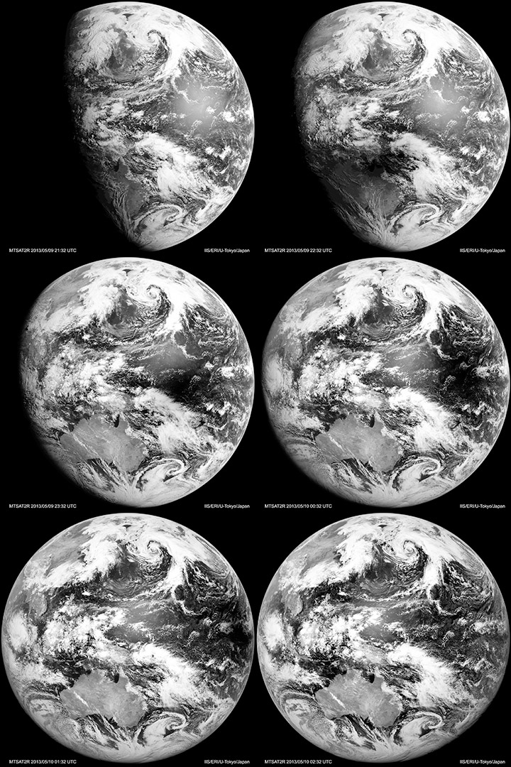
Visible-light & infrared MTSAT images dating back to October 2006 are available from the Earthquake Research Institute & Institute of Industrial Science, University of Tokyo.
Earth Day (8,192 by 8,192 pixels, 9.1 MB JPEG)
Earth Night (8,192 by 8,192 pixels, 4.2 MB JPEG)
Credit: NASA Earth Observatory images by Robert Simmon, using Suomi NPP VIIRS data from Chris Elvidge (NOAA National Geophysical Data Center). Suomi NPP is the result of a partnership between NASA, NOAA, and the Department of Defense.
I (@rsimmon) had a brief exchange this morning about the use of motion graphics in data visualization with Alberto Cairo (@albertocairo) and Andy Kirk (@visualisingdata) which quickly outgrew Twitter’s 140-character limit:
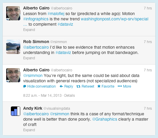
The increasing use of animation (and 3D) in data and information visualization is definitely a trend, but I don’t think it’s a good one. My (possibly naïve) understanding is that motion in data visualization is great for engagement (nothing can capture the attention of the human visual system like motion), but can be a detriment to comprehension. Cognitive science researchers like Barbara Tversky and Richard Lowe discovered that animations—even “well designed” ones—were often less effective than static diagrams at communicating concepts like the inner workings of a British toilet (I’m not kidding) or the movements of a piano action. Motion may get more people to view a graphic, but they may learn less from it.
Don’t get me wrong: recent work by Graham Roberts (thanks Andy!) and many other designers is stunning, and I love working in compositing and 3D software. One of the best visualizations I’ve ever done—a satellite view of the terminator over the course of a year—is animated:
[youtube FmCJqykN2J0]
But animation is typically more difficult and time consuming to produce than static visualization. Even if it’s no worse than a static graphic, is an animation worth the extra expense?
Alberto also touched on the issue of audience: does the general public understand data visualization? On the web that may not be something we have to worry about. Anybody that clicks a link on the Interent is the member of an attentive public—they’re actively seeking information. An attentive person is already interested in a topic, and is usually willing to do the mental work to understand what they’re looking at. (Jon Miller pioneered the concept of attentive publics in his 1983 book, The American People and Science policy: The Role of Public Attitudes in the Policy Process.)
Data visualization is a young field, however, and perhaps we’ll learn how to make beautiful, effective animations quickly & inexpensively. Right now, however, perhaps we should focus on improving more pedestrian information displays.
I’ll be speaking at the upcoming Fall AGU in San Francsico Tuesday morning—8:15 a.m. December 4, room 104 Moscone South. PA21B. Communication of Science Through Art: A Raison d’Etre for Interdisciplinary Collaboration I. (I know, it’s early, but Blue Bottle coffee is close to Moscone Center.)
Art, Aesthetics, Design, And Data: Reaching The Public Through Scientific Visualization
The primary challenge in science communication is attracting a broad audience while maintaining technical accuracy. Scientific topics are often and reflexively considered boring, dry, or difficult by non-scientists. One way to overcome this hurdle and gain the public’s attention is through beautiful and striking imagery. Imaging techniques borrowed from art and design can generate interest in technical or abstract concepts.
NASA’s Earth Observatory routinely uses imagery to communicate current Earth science research. Earth Observatory designers collaborate with NASA scientists to produce imagery using the principles of data visualization. Curiously, the popularity of images tends to be inversely correlated with the scientific content. Simple photographs and illustrations tend to be viewed more often, and more widely shared, than maps and graphs. However, maps of tree density and melt on the Greenland ice sheet are among the most popular images published on the Earth Observatory. These graphics share some features both with each other and our most-viewed natural-color images: clear, relatable themes, intuitive color palettes, and a clean aesthetic. These similarities may explain their success, and provide a roadmap for future data-rich visualizations that engage viewers while communicating complex science.
Please stop by. In addition, I’ve spent the past few weeks putting together imagery for a NASA/NOAA press conference Wednesday morning about a new, very cool sensor on the Suomi NPP satellite, and I’ll be on-hand to answer questions afterwards.
Earth at Night
Wednesday, 5 December
10:30 a.m.A new cloud-free view of the entire Earth at Night, courtesy of a joint NASA-NOAA satellite
program called Suomi NPP, will be unveiled at the press conference. This image is an order of
magnitude more detailed than the wildly popular earlier Earth at Night image, and reveals new
information scientists are using to study meteorology, natural and human-caused fires, fishing
boats, human settlement, urbanization and more. Scientists will discuss the advancements now
possible with these new images and detail a few examples of the features mentioned above – plus
present images of Earth on moonless nights, lit only by “airglow” and starlight, as well as the
vast difference moonlight makes on the Earth’s surface.Participants:
James Gleason, NASA Suomi NPP project scientist, NASA Goddard, Greenbelt, Maryland, USA;
Christopher Elvidge, lead of the Earth Observation Group, NOAA’s National Geophysical Data Center in Boulder, Colorado, USA;
Steve Miller, senior research scientist and deputy director of the Cooperative Institute for Research in the Atmosphere (CIRA), Colorado State University, Fort Collins, Colorado, USASessions: A54F, IN33C
If you’re interested I’ll be sending out some of my impressions of the meeting via Twitter: @rsimmon hashtag #AGU12
I’d also love to meet any Earth Observatory readers who are attending—I’ll try to hang around after each of these sessions, or you can send a message through the Earth Observatory contact form:
http://earthobservatory.nasa.gov/Contact/
Be sure to pick the “Design Feedback” topic (otherwise it won’t go to me, but to our harried developer), and leave your email address.
Active since 2006, Batu Tara continues to puff away. A thin volcanic plume streams northwest from the cloud-shrouded volcano. The Advanced Land Imager (ALI) aboard the Earth Observing-1 (EO-1) satellite collected this natural-color image on June 21, 2012.
NASA image By Jesse Allen and Robert Simmon using EO-1 ALI data.