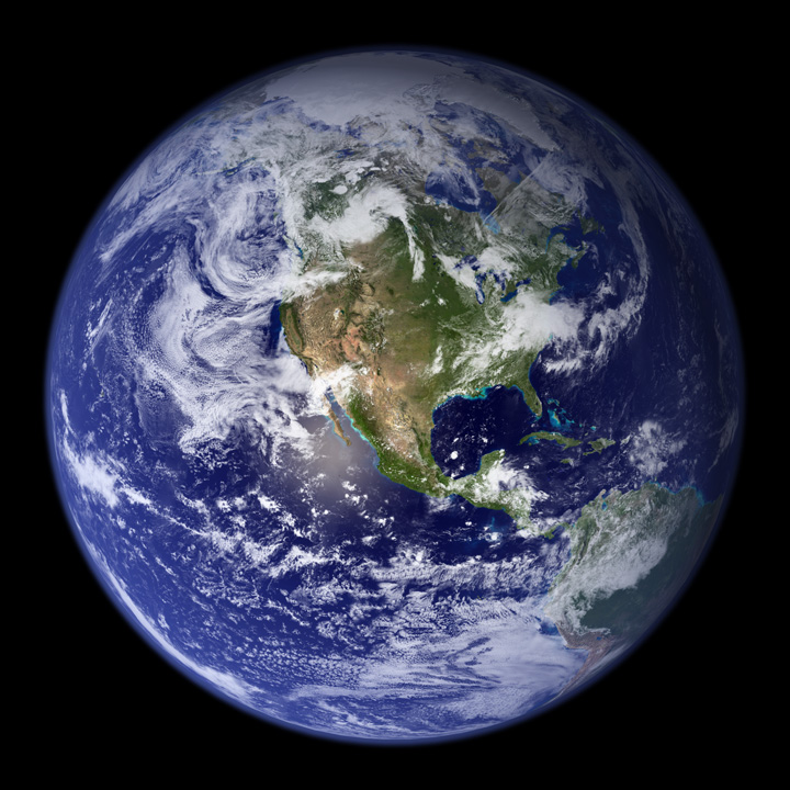
One of the best surprises of my life was turning on my brand-new iPhone—before it had even been activated—glancing down at the screen, and seeing an image I had made. Apple chose the NASA Blue Marble for the default welcome screen and wallpaper, and I had no idea beforehand.
Here’s how I did it.
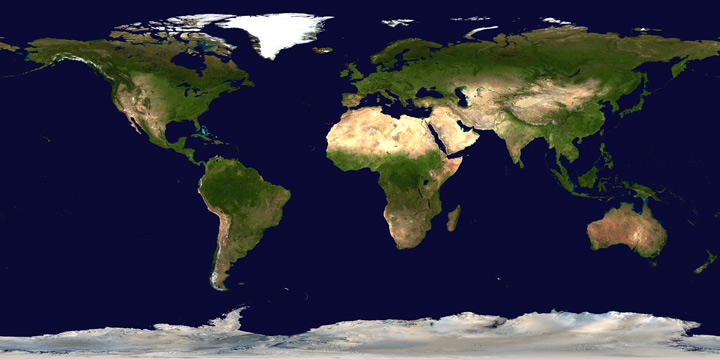
In 2002 my colleague Reto Stöckli (now back in Switzerland) was working on a global map of the Earth that was going to blow away all previous examples. A new NASA satellite (Terra) was gathering the first color pictures of the entire Earth, and we wanted to showcase the imagery. Reto put together about 10,000 satellite scenes (each file over 300 MB) collected over 100 days, stripped out the clouds, and created a 43,200-pixel by 21,600-pixel map of the Earth in (this was the hard part, everything I did afterwards was just adding chrome).
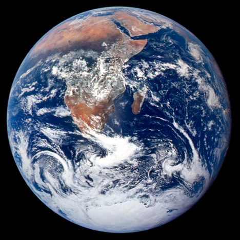
Now that we had a source image, we needed to create something evocative, something that would show the potential of the imagery. To us, at least, the obvious choice was to render a few 3D views of the world as it would look from space: echoes of the famous Apollo 17 photograph.
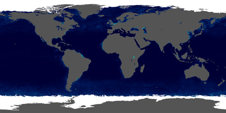
To make the Earth look realistic, or at least how I imagined the Earth would look, I needed to do some work. First of all, the satellite images weren’t usable over deep water (it collects data, but there’s no automated process to detect clouds and correct for the atmosphere), so I needed to add some color into the water. NASA measures chlorophyll in the ocean (a way of monitoring phytoplankton), so I grabbed a month’s worth of that data, colored it blue and green (I looked at individual satellite images to get a sense of what hues to use), and used that map for the ocean. I also had to add a stand-in for sea ice, since it’s impossible to measure chlorophyll beneath a few meters of snow and ice. At least that was simple–I just replaced missing data near the poles with white. In addition to the sea ice, I brightened and reduced the saturation of Antarctica, which was pasted into the original from a different dataset. The combined ocean color and ice look like this:
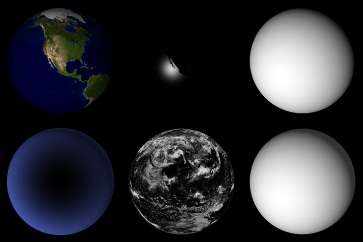
Throw in a map of clouds stitched together from 200 satellite scenes, and a global topographic map to add some texture in the landscape, and I was ready to bring everything into my 3D software (Electric Image at the time). Wrapping a rectangular image onto a sphere and rendering out images was probably the simplest and fastest part of the entire process. It’s much easier to fine-tune an image with each component of the image rendered separately, so I made individual renders of the land and ocean, specular highlight, clouds, a couple day/night masks, and atmospheric haze (which I never did get quite right). [Click on the image below to download a zip file with each layer as a separate JPEG].
Compositing separate images into a convincing whole is (of course) easier said than done. Even with control of each layer in my image processing software (Photoshop) it took hours of tweaking and re-tweaking transparency, layer masks, hue, saturation, gaussian blur, and curves to get an image that looked like the picture I had in my head. Since it was before adjustment layers were introduced (with which I could have saved all the settings), I have no idea exactly what I did. Making the clouds appear opaque, while remaining white, rather than gray, was by far the hardest part. It was also tricky trying to get the atmosphere to appear most transparent in the center, and thicker and bluer near the edges. Looking at the Photoshop file, I’ve got two atmospheric layers and two cloud layers, each set to different levels of transparency, over a combined land and ocean layer, with sunglint (a specular highlight) off Baja California.
At the time, I had no idea the Blue Marble would be seen by so many people: it was just a way to show off some cool data. It’s based on the hard work of the literally thousands of scientists, engineers, programmers, admin staff, and others here at NASA; especially the MODIS team. I’m glad Steve Jobs seemed to like it, and I’m sad he died so young.
Made on a Mac, of course. Thanks, Steve.
A Few Notes
All the source files are archived on the original Blue Marble page. They’re free to use and modify, but you can’t use them to imply you’re associated with NASA.
We’ve subsequently made a new and improved version of the base maps, the Blue Marble Next Generation. It’s not only twice the resolution (86,400 pixels by 43,200 pixels), but there’s a separate image for each month, so you can see the changing seasons. Reto didn’t make new clouds because it’s a really long and painful process of stitching images together by hand that’s never going to be perfect.
In the existing cloud map some people have noticed a few repeating features that appear photoshopped. They are. There are gaps between orbits near the equator, and there’s no way to fill them with real data. The specular highlight off Baja and the thickness and fuzziness of the atmosphere I based off full-disk GOES images. There’s a weird streak in the clouds near Greenland that’s entirely due to an error on my part, and I have no idea why the shading on the east coast of Greenland is incorrect.
Yes, it’s centered on North America: I’ve spent the vast majority of my life here, and I’m biased. I did, however, make a version centered on South Asia at the same time, as well as a rotating Earth centered on the Equator. I’ve subsequently done a few more versions, including the Pacific Ocean. I’m still not happy with the shading of the atmosphere—anyone know how to simulate Rayleigh scattering in Maya?



nice write up, I like your style of metadata.
Just a bit of earlier history on Tom Van San’s vision in the late 70s and 1980s:
The GeoSphere Image marks a milestone in cartographic history. It is the first satellite map of Earth, showing the real world as it appears from space. The work required one year of effort by Van Sant and his technical team using the world’s most powerful graphics computers. The image was first published as the title page of the 1990 National Geographic World Atlas. Since 1991 it has been adopted by all U.S. federal agencies, has been published in over 300 magazines and atlases, and is the largest selling image in the world.
http://www.tomvansant.com/id4.html
First of all congratulations on NASA using your wallpaper. I’m an app developer, i found it interesting that you took so much time to not only create what they used, but to tell us your process. It’s neat to see the “making of” an aspect of an app especially one so detailed as what you did. good job.
Just Wonderful!!
Hi Robert,
AWESOME work 🙂 amazing work using EIAS!
Thanks
Awesome work guys! Thank you for this.
That seems like an awful lot of work (and I’m assuming taxpayer dollars but maybe not) for a PhotoShopped screensaver that we’ve all seen a billion times.
Good job! Great story of how you created the image. I had no idea, thought it was just a photo!
Wow, now that is a cool image and pretty awesome how you created it. Thanks for sharing with us how it was done.
was this image inadequate?
http://goes.gsfc.nasa.gov/goescolor/goeseast/overview2/color_lrg/latestfull.jpg
GOES (a pair of geostationary weather satellites) provide completely different data from the instruments on Terra & Aqua, and can only view the Western Hemisphere from about 60 degrees north to 60 degrees south. They also don’t measure color information, so the colors in that image are from the same Blue Marble data I used to create the globe.
I thought this was just an image pic! Great build very interesting 🙂
J’Aime beaucoup se que rait la NASA et je vais en profiter plainnement…….!. Merci a la NASA pour tout les érforts qu’ielle fait….!. A bientôt ……..
Monsier Leblanc Johann78
Hi Robert,
I love your work – and since I am biased, too: What would it take to put Europe in the center of another version of your blue marble picture?
That would be just great, if you’d go for this – and I am pretty sure some more Europeans would be exited about it!
Thanks a lot!
Markus
No way to do a view of Europe: I no longer have a Mac capable of running OS 9 and never upgraded Electric Image to a version that would run on OS X. But we did publish all the source files, so anyone who wants a unique perspective can render it.