

Along with half the Earth scientists at NASA, I’ll be at the American Geophysical Union Fall Meeting next week. If you’re interested in getting together to talk scientific visualization, drop a note in the comments, or stop by my poster: Methods to Enhance Climate Change Imagery for Communication (5 MB PDF). It’s got a few before/after examples of imagery from NASA press releases and the IPCC showing a better way of presenting the information (in my opinion).
U11B: Effectively Communicating Climate Science (How to Address Related Issues)
December 5, 2011
8:00 a.m.–12:20 p.m. (good thing I’ll still be on East Coast time).
Halls A-C (Moscone South)
Here’s more info on the session, and the oral presentation in the afternoon.
I’ll also be at Communicating Your Science: Panel and Workshops on Sunday, and at the social media soiree Mondy evening (6:00–8:00 p.m. InterContinental Ballroom C). Hope to see you there!
One of the best surprises of my life was turning on my brand-new iPhone—before it had even been activated—glancing down at the screen, and seeing an image I had made. Apple chose the NASA Blue Marble for the default welcome screen and wallpaper, and I had no idea beforehand.
Here’s how I did it.
In 2002 my colleague Reto Stöckli (now back in Switzerland) was working on a global map of the Earth that was going to blow away all previous examples. A new NASA satellite (Terra) was gathering the first color pictures of the entire Earth, and we wanted to showcase the imagery. Reto put together about 10,000 satellite scenes (each file over 300 MB) collected over 100 days, stripped out the clouds, and created a 43,200-pixel by 21,600-pixel map of the Earth in (this was the hard part, everything I did afterwards was just adding chrome).
Now that we had a source image, we needed to create something evocative, something that would show the potential of the imagery. To us, at least, the obvious choice was to render a few 3D views of the world as it would look from space: echoes of the famous Apollo 17 photograph.
To make the Earth look realistic, or at least how I imagined the Earth would look, I needed to do some work. First of all, the satellite images weren’t usable over deep water (it collects data, but there’s no automated process to detect clouds and correct for the atmosphere), so I needed to add some color into the water. NASA measures chlorophyll in the ocean (a way of monitoring phytoplankton), so I grabbed a month’s worth of that data, colored it blue and green (I looked at individual satellite images to get a sense of what hues to use), and used that map for the ocean. I also had to add a stand-in for sea ice, since it’s impossible to measure chlorophyll beneath a few meters of snow and ice. At least that was simple–I just replaced missing data near the poles with white. In addition to the sea ice, I brightened and reduced the saturation of Antarctica, which was pasted into the original from a different dataset. The combined ocean color and ice look like this:
Throw in a map of clouds stitched together from 200 satellite scenes, and a global topographic map to add some texture in the landscape, and I was ready to bring everything into my 3D software (Electric Image at the time). Wrapping a rectangular image onto a sphere and rendering out images was probably the simplest and fastest part of the entire process. It’s much easier to fine-tune an image with each component of the image rendered separately, so I made individual renders of the land and ocean, specular highlight, clouds, a couple day/night masks, and atmospheric haze (which I never did get quite right). [Click on the image below to download a zip file with each layer as a separate JPEG].
Compositing separate images into a convincing whole is (of course) easier said than done. Even with control of each layer in my image processing software (Photoshop) it took hours of tweaking and re-tweaking transparency, layer masks, hue, saturation, gaussian blur, and curves to get an image that looked like the picture I had in my head. Since it was before adjustment layers were introduced (with which I could have saved all the settings), I have no idea exactly what I did. Making the clouds appear opaque, while remaining white, rather than gray, was by far the hardest part. It was also tricky trying to get the atmosphere to appear most transparent in the center, and thicker and bluer near the edges. Looking at the Photoshop file, I’ve got two atmospheric layers and two cloud layers, each set to different levels of transparency, over a combined land and ocean layer, with sunglint (a specular highlight) off Baja California.
At the time, I had no idea the Blue Marble would be seen by so many people: it was just a way to show off some cool data. It’s based on the hard work of the literally thousands of scientists, engineers, programmers, admin staff, and others here at NASA; especially the MODIS team. I’m glad Steve Jobs seemed to like it, and I’m sad he died so young.
Made on a Mac, of course. Thanks, Steve.
A Few Notes
All the source files are archived on the original Blue Marble page. They’re free to use and modify, but you can’t use them to imply you’re associated with NASA.
We’ve subsequently made a new and improved version of the base maps, the Blue Marble Next Generation. It’s not only twice the resolution (86,400 pixels by 43,200 pixels), but there’s a separate image for each month, so you can see the changing seasons. Reto didn’t make new clouds because it’s a really long and painful process of stitching images together by hand that’s never going to be perfect.
In the existing cloud map some people have noticed a few repeating features that appear photoshopped. They are. There are gaps between orbits near the equator, and there’s no way to fill them with real data. The specular highlight off Baja and the thickness and fuzziness of the atmosphere I based off full-disk GOES images. There’s a weird streak in the clouds near Greenland that’s entirely due to an error on my part, and I have no idea why the shading on the east coast of Greenland is incorrect.
Yes, it’s centered on North America: I’ve spent the vast majority of my life here, and I’m biased. I did, however, make a version centered on South Asia at the same time, as well as a rotating Earth centered on the Equator. I’ve subsequently done a few more versions, including the Pacific Ocean. I’m still not happy with the shading of the atmosphere—anyone know how to simulate Rayleigh scattering in Maya?
During every minute of the day, every day, a volcano is erupting somewhere on Earth. Actually, it’s more like a dozen. Or two. Satellites capture much of this activity, and we try to highlight as many eruptions as possible, but for one reason or another (like clouds) some of them fall through the cracks. Here are a handful from the past few weeks:
Natural-color satellite image of Mount Etna, Italy; acquired on September 18, 2011, by the Advanced Land Imager (ALI). Credit: NASA Earth Observatory/EO-1 Science Team.
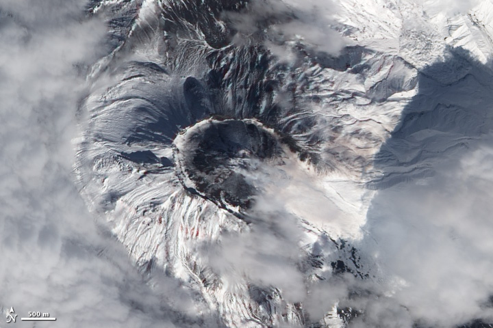
Natural-color satellite image of Bezymianny Volcano, Russia; acquired on September 20, 2011 by the Advanced Land Imager (ALI). Credit: NASA Earth Observatory/EO-1 Science Team.
False-color satellite image of Kizimen Volcano, Russia; acquired on September 21, 2011, by the Advanced Spaceborne Thermal Reflection and Emission Radiometer (ASTER). Credit: NASA Earth Observatory and the NASA/GSFC/METI/ERSDAC/JAROS, and U.S./Japan ASTER Science Team.
Natural-color satellite image of Ambrym Volcano, Vanuatu; acquired on September 23, 2011, by the Advanced Land Imager (ALI). Credit: NASA Earth Observatory/EO-1 Science Team.
Once upon a time Landsat images were expensive (Landsat 7 data was $600 per scene, and the earlier satellites were even pricier) and difficult to find. Now the data—which dates to 1972—is free, and reasonably easy (or at least not painfully difficult) to browse and download from the Global Visualization Viewer, or even the Google Earth Engine (which still has some rough edges).
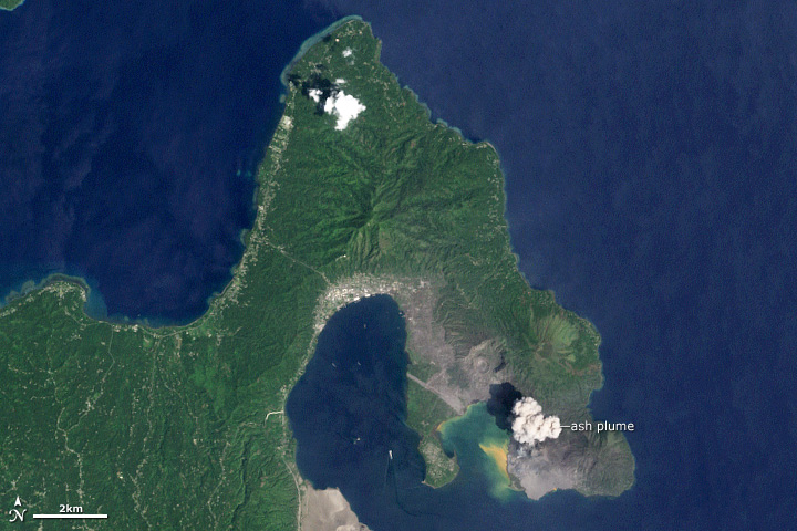
There are some amazing things buried in the archive, like this natural-color image of an eruption at Rabaul. According to the Global Volcanism Program the activity at the time was “continuous, forceful emissions of thick, light-to-dark gray ash clouds.”
Poke around, and let me know what you find.
The photos were taken about 3 seconds apart, from 11:20 to 11:31 UTC, September 3, 2011. Images from the Gateway to Astronaut Photography of Earth.
Callan Bentley of Mountain Beltway posted a photo of the Chesapeake that’s a nice complement to the view from space we published last night. I live in the Anacostia River watershed, which feeds into the Chesapeake, and all the nearby streams have been brown since Hurricane Irene hit three weeks ago. The Bay is probably going to be muddy for a while.
You can see how things progress with twice-daily satellite views of the Bay via the image “subset” centered on the Chesapeake Lighthouse. Unfortunately, it’s been cloudy the past few days, but there’s a chance there will be a clear shot by early next week—the forecast for Monday is “mostly sunny.”
Two more images that don’t quite fit on the main site: Nabro Volcano and the Riley Road Fire near Houston.
Nabro Volcano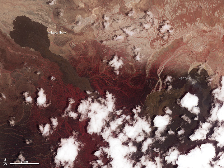 This long-dormant Eritrean volcano began erupting in June, but it’s so remote (at least for western media and scientists) that there’s been no news from the area for months. Unfortunately it’s often been cloudy, so we haven’t gotten any good satellite imagery, either. The best recent imagery is this false-color image (vegetation is red), which shows activity has ceased, although there may be a slight hint of gas emissions near the vent. We’re still trying for better imagery, and will post anything we get in our Volcanoes and Earthquakes section.
Riley Road Fire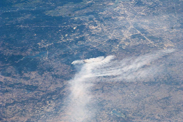 Closer to NASA’s home is this photograph from last week of smoke from the Riley Road Fire, which burned 18,960 acres (7,670 hectares) near Houston, Texas (visible in the upper right corner). It was taken by an astronaut aboard the International Space Station, who could probably see his (the Expedition 28 crew is all male) house at the time.
Credit for the Nabro Volcano image goes to the the NASA/GSFC/METI/ERSDAC/JAROS, and U.S./Japan ASTER Science Team, and credit for the Riley Road Fire to the Image Science and Analysis Laboratory, NASA-Johnson Space Center.
A time-lapse sequence from the International Space Station taken on September 3, 2011. The station starts above Northern Africa, then passes over the Mediterranean Sea and Turkey, followed by the Black and Caspian Seas, the Great Steppe, and finally Mongolia and Lake Baikal.
For more ISS (and Shuttle, Apollo, etc.) photos, check out The Gateway to Astronaut Photography of Earth.
Sometimes I’ll find a surprise in a satellite image. In this case, kilometer-tall letters that spell out “LUECKE” near Austin, TX (Near the Bastrop Fire):
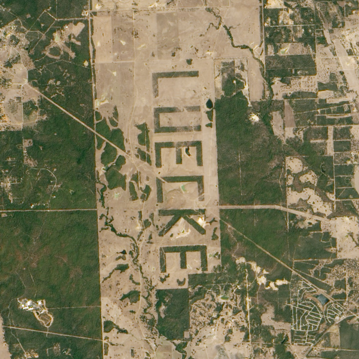
Although this could have just been a curiosity for passing pilots and astronauts, it turns out that Johnson Space Center scientists used the letters to estimate the maximum resolution of cameras aboard the Space Shuttle.
We also made an empirical estimate of spatial resolution for lower contrast vegetation boundaries. By clearing forest so that a pattern would be visible to landing aircraft, a landowner outside Austin, Texas (see also aerial photo in Lisheron 2000), created a target that is also useful for evaluating spatial resolution of astronaut photographs. The forest was selectively cleared in order to spell the landowner’s name ‘LUECKE’ with the remaining trees (figure 10). According to local surveyors who planned the clearing, the plan was to create letters that were 3100 ´ 1700 ft (944.9 ´ 518.2 m). Photographed at a high altitude relative to most Shuttle missions (543 km) with a 250-mm lens, Formula 3 predicts that each pixel would represent an area 28.6 ´ 36.0 m on the ground (table 5). When original film was digitised at 2400 ppi (10.6 mm/pixel), letters correspond to 29.4 ´ 18.8 pixels for a comparable pixel size of 27 – 32 m.
It’s reminiscent of the map of Italy I saw on a hillside near Castellucio, in the Apennines, or even the Nazca Lines. What other examples of landscaping visible from space are out there?
Of all the Earth sciences, geology has the strongest tradition of visual communication. It’s probably because mapping is fundamental to the field, and geologists have 200 years of practice at it. As a result, they tend to create well designed imagery.
Two exemplary techniques geologists use: they almost always include a scale, and they often annotate images directly, rather than relying on separate keys or text descriptions. Here’s an example from Lockwood DeWitt, of Outside the Interzone:
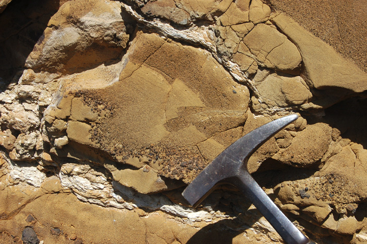
Callan Bentley, author of Mountain Beltway, added annotations that show small faults, and the distribution of grain size in the rock:
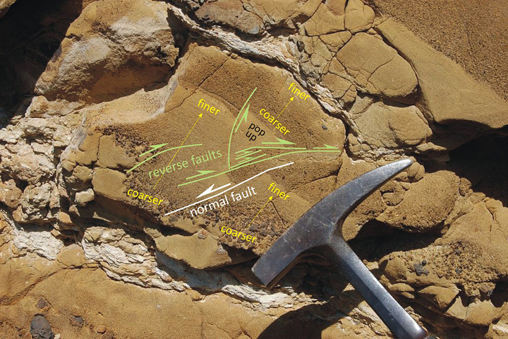
Callan even used different colors to differentiate types of information, and varied the size labels to emphasize the location and type of faulting. Excellent work.
Here’s what Lockwood had to say about Table Rock:
Table Rock is quite similar to the more widely known Fort Rock, but larger and better preserved. It erupted enough material that toward the end, it had raised a cone above the original water-influenced explosive (hydrophreatic) vent. The final phase was a more gentle effusive basalt eruption, which filled in the hollow interior. Without that basalt filling, Table Rock would look very similar indeed to Fort Rock. Here’s the location in FlashEarth, maybe a hundred yards north of the dirt road. The two features both lie in the Fort Rock-Christmas Valley, which were filled by a pluvial lake during the Pleistocene. Even a quick glance over this area reveals quite a few similar water-mediated eruptions. In this view, Hole-in-the-Ground is in the left of the top middle, Fort Rock is in the upper middle, just to left of the four center-pivot irrigation fields, turning the rotated “L” into a backwards “C,” and Table Rock is in the bottom right middle, just above and a bit to the right of the Highway 31 label and tight cluster of irrigated fields.
By the way, I don’t include a scale in every image. Sometimes I just want to let the beauty of a spot be what it is. so I take two pictures. One with, and one without, scale. Here’s an example from a couple days earlier, sans scale. But I have a number of other photos of the same spot (not posted yet) that do provide a sense of scale.
I rest my case.