Satellite images are like maps: they are full of useful and interesting information, provided you have a key. They can show us how much a city has changed, how well our crops are growing, where a fire is burning, or when a storm is coming. To unlock the rich information in a satellite image, you need to:
These tips come from the Earth Observatory’s writers and visualizers, who use them to interpret images daily. They will help you get oriented enough to pull valuable information out of satellite images.
One of the first things people want to do when they look at a satellite image is identify the places that are familiar to them: their home, school, or place of business; a favorite park or tourist attraction; or a natural feature like a lake, river, or mountain ridge. Some images from military or commercial satellites are detailed enough to show many of these things. Such satellites zoom in on small areas to collect fine details down to the scale of individual houses or cars. In the process, they usually sacrifice the big picture.
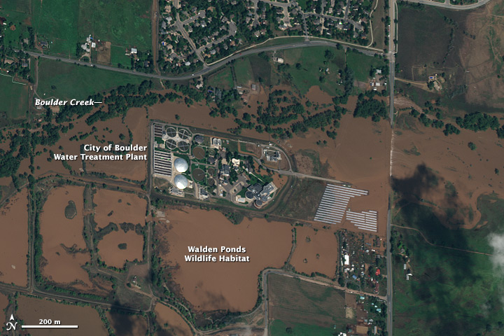
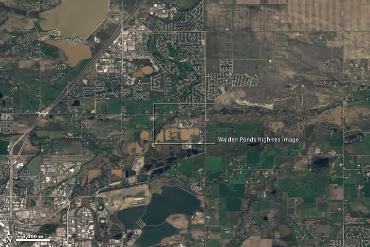
Images from the commercial WorldView-2 satellite (top) can show street by street details of the September 2013 flood in Boulder, Colorado, while the scientific Landsat 8 satellite (lower) can be zoomed in to give a city size scale. (Worldview-2 image based on data ©2013 DigitalGlobe. Landsat image by Jesse Allen and Robert Simmon, using data from the USGS Earth Explorer.)
NASA satellites take the opposite approach. Earth science researchers typically want a wide-angle lens to see whole ecosystems or atmospheric fronts. As a result, NASA images are less detailed but cover a wider area, ranging from the landscape scale (185 kilometers across) to an entire hemisphere. The level of detail depends on the satellite’s spatial resolution. Like digital photographs, satellite images are made up of little dots called pixels. The width of each pixel is the satellite’s spatial resolution.
Commercial satellites have a spatial resolution down to 50 centimeters per pixel. The most detailed NASA images show 10 meters in each pixel. Geostationary weather satellites, which observe a whole hemisphere at a time, are much less detailed, seeing one to four kilometers in a pixel.
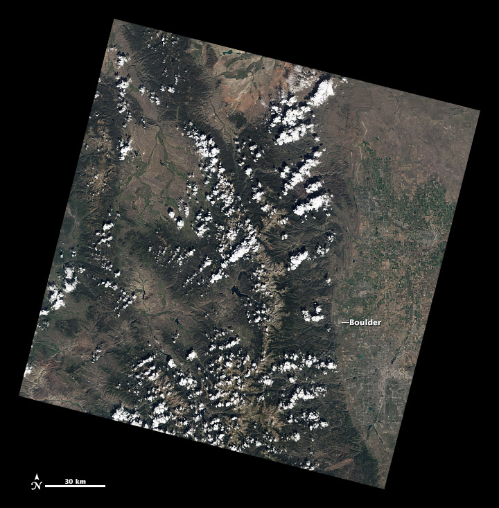
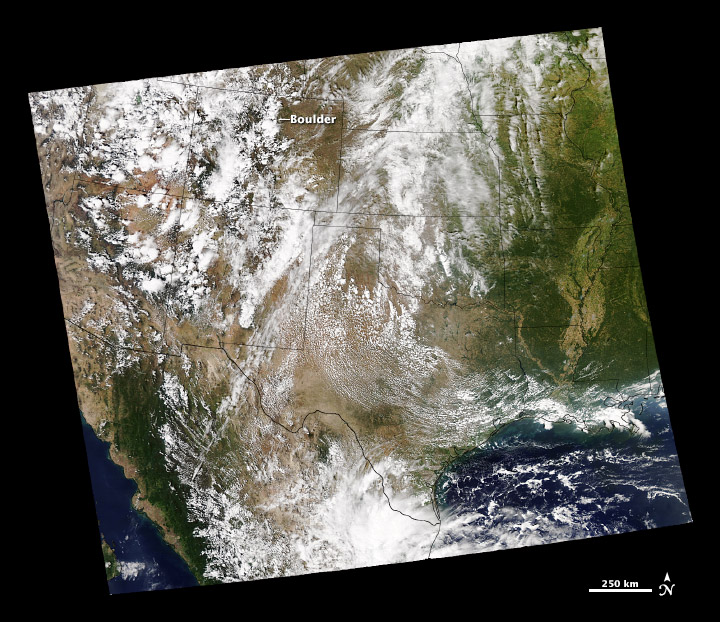
Raw Landsat scenes (top) provide a landscape view, while MODIS (lower) provides a wider view. The images are from September 17 (Landsat) and September 14 (MODIS), 2013. (Landsat image by Jesse Allen and Robert Simmon, using data from the USGS Earth Explorer. MODIS image by Jeff Schmaltz LANCE/EOSDIS MODIS Rapid Response Team, GSFC.)
Depending on the image resolution, a city may fill an entire satellite image with grids of streets or it may be a mere dot on a landscape. Before you begin to interpret an image, it helps to know what the scale is. Does the image cover 1 kilometer or 100? What level of detail is shown? Images published on the Earth Observatory include a scale.
You can learn different things at each scale. For example, when tracking a flood, a detailed, high-resolution view will show which homes and businesses are surrounded by water. The wider landscape view shows which parts of the county or metropolitan area are flooded and perhaps where the water is coming from. A broader view would show the entire region—the flooded river system or the mountain ranges and valleys that control the flow. A hemispheric view would show the movement of weather systems connected to the floods.
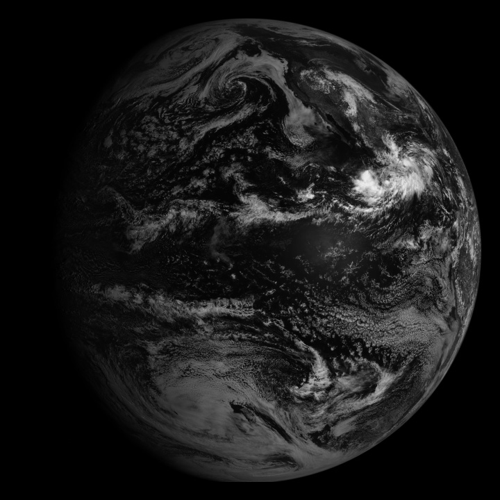
GOES satellites offer a nearly full view of the Earth’s disk. This image shows North and South America on September 14, 2013. (Image by the NASA/NOAA GOES Project Science Office.)
If you have ever spent an afternoon identifying animals and other shapes in the clouds, you’ll know that humans are very good at finding patterns. This skill is useful in interpreting satellite imagery because distinctive patterns can be matched to external maps to identify key features.
Bodies of water—rivers, lakes, and oceans—are often the simplest features to identify because they tend to have unique shapes and they show up on maps.
Other obvious patterns come from the way people use the land. Farms usually have geometric shapes—circles or rectangles—that stand out against the more random patterns seen in nature. When people cut down a forest, the clearing is often square or has a series of herring-bone lines that form along roads. A straight line anywhere in an image is almost certainly human-made, and may be a road, a canal, or some kind of boundary made visible by land use.
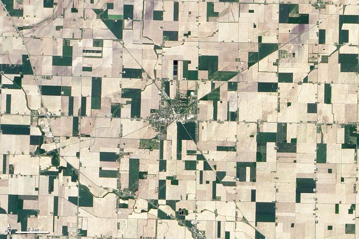
Straight lines and geometric shapes in this image of Reese, Michigan, are a result of human land use. Roads cut diagonally across the squares that define farm fields. (NASA Earth Observatory image by Jesse Allen and Robert Simmon, using ALI data from the NASA EO-1 team.)
Geology shapes the landscape in ways that are often easier to see in a satellite image. Volcanoes and craters are circular, and mountain ranges tend to run in long, sometimes wavy lines. Geologic features create visible textures. Canyons are squiggly lines framed by shadows. Mountains look like wrinkles or bumps.
These features can also affect clouds by influencing the flow of air in the atmosphere. Mountains force air up, where it cools and forms clouds. Islands create turbulence that results in swirling vortices or wakes in the clouds. When you see a line of clouds or vortices, they provide a clue about the topography of the land below.
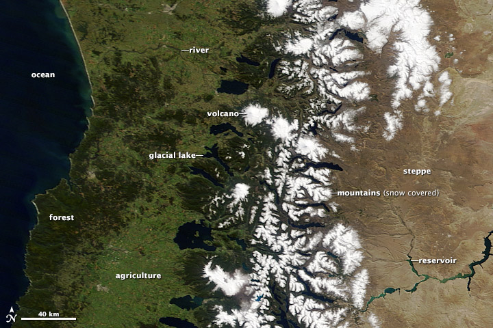
Central Chile and Argentina offer a wide range of geographic features, including snow-covered mountains, canyons, and volcanoes. (NASA image courtesy Jeff Schmaltz LANCE/EOSDIS MODIS Rapid Response Team, GSFC.)
Occasionally, shadows can make it hard to tell the difference between mountains and canyons. This optical illusion is called relief inversion. It happens because most of us expect an image to be lit from the top left corner. When the sunlight comes from another angle (especially from the lower edge), the shadows fall in ways we don’t expect and our brains turn valleys into mountains to compensate. The problem is usually resolved by rotating the image so the light appears to come from the top of the image.
The colors in an image will depend on what kind of light the satellite instrument measured. True-color images use visible light—red, green and blue wavelengths—so the colors are similar to what a person would see from space. False-color images incorporate infrared light and may take on unexpected colors. In a true color image, common features appear as follows:
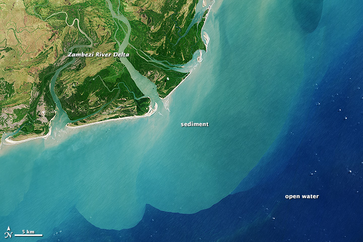
Water absorbs light, so it is usually black or dark blue. Sediment reflects light and colors the water. When suspended sand or mud is dense, the water looks brown. As the sediment disperses, the water’s color changes to green and then blue. Shallow waters with sandy bottoms can lead to a similar effect.
Sunlight reflecting off the surface of the water makes the water look gray, silver, or white. This phenomenon, known as sunglint, can highlight wave features or oil slicks, but it also masks the presence of sediment or phytoplankton.
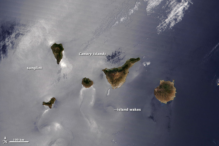
Sunglint makes it possible to see current patterns on the ocean’s surface around the Canary Islands. (NASA image courtesy Jeff Schmaltz LANCE/EOSDIS MODIS Rapid Response Team, GSFC.)
Frozen water—snow and ice—is white, gray, and sometimes slightly blue. Dirt or glacial debris can give snow and ice a tan color.
Plants come in different shades of green, and those differences show up in the true-color view from space. Grasslands tend to be pale green, while forests are very dark green. Land used for agriculture is often much brighter in tone than natural vegetation.
In some locations (high and mid latitudes), plant color depends on the season. Spring vegetation tends to be paler than dense summer vegetation. Fall vegetation can be red, orange, yellow, and tan; leafless and withered winter vegetation is brown. For these reasons, it is helpful to know when the image was collected.
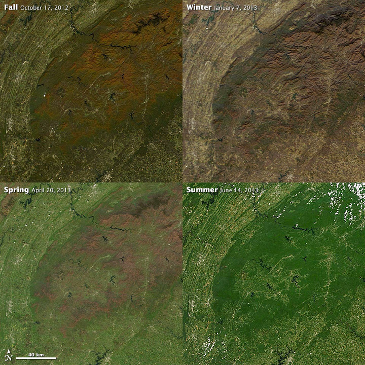
The forests covering the Great Smoky Mountains of the Southeastern United States change colors from brown to green to orange to brown as the seasons progress. (NASA images courtesy Jeff Schmaltz LANCE/EOSDIS MODIS Rapid Response Team, GSFC.)
In the oceans, floating plants—phytoplankton—can color the water in a wide variety of blues and greens. Submerged vegetation like kelp forests can provided a shadowy black or brown hue to coastal water.
Bare or very lightly vegetated ground is usually some shade of brown or tan. The color depends on the mineral content of the soil. In some deserts such as the Australian Outback and the southwestern United States, exposed earth is red or pink because it contains iron oxides like hematite (Greek for blood-like). When the ground is white or very pale tan, especially in dried lakebeds, it is because of salt-, silicon-, or calcium-based minerals. Volcanic debris is brown, gray, or black. Newly burned land is also dark brown or black, but the burn scar fades to brown before disappearing over time.
Densely built areas are typically silver or gray from the concentration of concrete and other building materials. Some cities have a more brown or red tone depending on the materials used for rooftops.
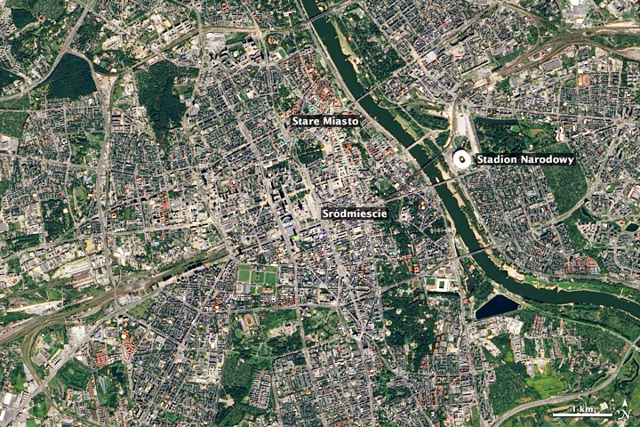
The contrast between Warsaw’s modern and historic neighborhoods is easily visible by satellite. The new Stadion Narodowy is brilliant white. Śródmieście (Inner City) was rebuilt after World War II and most areas appear beige or gray. But some neighborhoods rebuilt with older-style buildings, such as the red tile and green copper roofs of Stare Miasto (Old Town). (Image courtesy NASA/USGS Landsat.)
Clouds are white and gray, and they tend to have texture just as they do when viewed from the ground. They also cast dark shadows on the ground that mirror the shape of the cloud. Some high, thin clouds are detectable only by the shadow they cast.
Smoke is often smoother than clouds and ranges in color from brown to gray. Smoke from oil fires is black. Haze is usually featureless and pale gray or a dingy white. Dense haze is opaque, but you can see through thinner haze. The color of smoke or haze usually reflects the amount of moisture and chemical pollutants, but it’s not always possible to tell the difference between haze and fog in a visual interpretation of a satellite image. White haze may be natural fog, but it may also be pollution.
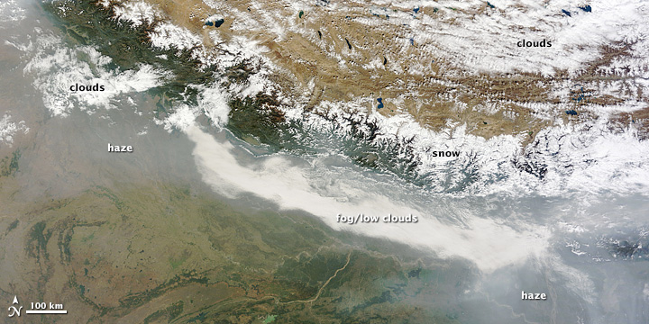
Clouds, fog, haze and snow are sometimes difficult to distinguish in satellite imagery, as in this MODIS image of the Himalaya from November 1, 2013. (Image adapted from MODIS Worldview.)
Dust ranges in color, depending on its source. It is most often slightly tan, but like soil, can be white, red, dark brown, and even black due to different mineral content.
Volcanic plumes also vary in appearance, depending on the type of eruption. Plumes of steam and gas are white. Ash plumes are brown. Resuspended volcanic ash is also brown.
Looking at a satellite image, you see everything between the satellite and the ground (clouds, dust, haze, land) in a single, flat plane. This means that a white patch might be a cloud, but it could also be snow or a salt flat or sunglint. The combination of context, shape, and texture will help you tell the difference.
For example, shadows cast by clouds or mountains can be easy to mistake for other dark surface features like water, forest, or burned land. Looking at other images of the same area taken at another time can help eliminate confusion. Most of the time, context will help you see the source of the shadow—a cloud or mountain—by comparing the shape of the shadow to other features in the image.
When you get lost, the simplest way to figure out where you are is to find a familiar landmark and orient yourself with respect to it. The same technique applies to satellite images. If you know where north is, you can figure out if that mountain range is running north to south or east to west, or if a city is on the east side of the river or the west. These details can help you match the features to a map. On the Earth Observatory, most images are oriented so that north is up. All images include a north arrow.
Perhaps the most powerful tool for interpreting a satellite image is knowledge of the place. If you know that a wildfire burned through a forest last year, it’s easy to figure out that the dark brown patch of forest is probably a burn scar, not a volcanic flow or shadow.
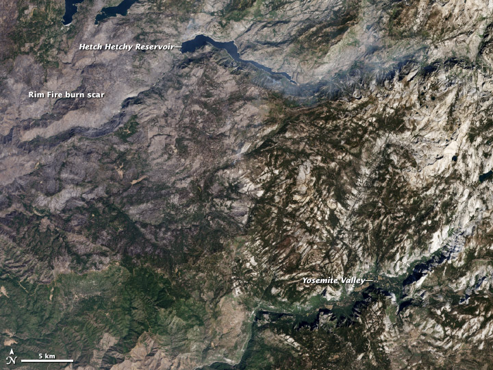
Land burned by Yosemite’s Rim Fire is gray brown in comparison to the unburned brown and green landscape around it. See this linked map that helps differentiate between burned land and non-burned land. (NASA Earth Observatory images by Robert Simmon, using Landsat 8 data from the USGS Earth Explorer.)
Having local knowledge also allows you to connect satellite mapping to what’s happening in everyday life, from social studies, economics, and history (for example, population growth, transport, food production); to geology (volcanic activity, tectonics); to biology and ecology (plant growth and ecosystems); to politics and culture (land and water use); to chemistry (atmospheric pollution); and to health (pollution, habitat for disease carriers).
For example, land ownership and land use policy is contrasted in the pair of images below. In Poland, small parcels of privately owned land surround the Niepolomice Forest. The government has managed the forest as a unit since the thirteenth century. While the canopy isn't a solid, unbroken green, the forest is largely intact. The lower image shows a checkerboard combination of private and public land near Washington’s Okanogan-Wenatchee National Forest. The U.S. Forest Service manages the forest under a mixed use policy that preserves some forest, while opening other sections to logging. Lighter green areas indicate that logging has occurred on federal, state, or private land. Parcels of private land are much larger in this part of the western United States than in Poland.
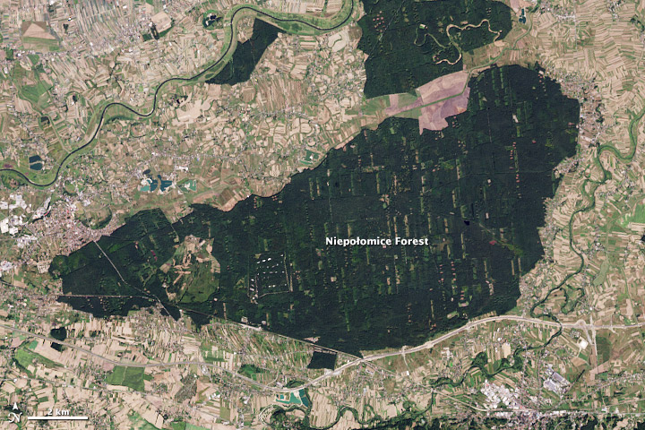
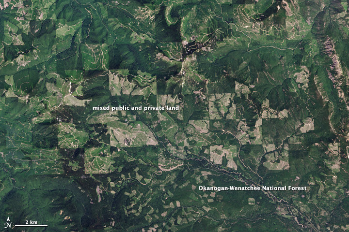
Land use and conservation policies define the forest area in both Poland (top) and the U.S. state of Washington (lower). (NASA Earth Observatory images by Robert Simmon, using Landsat 8 data from the USGS Earth Explorer.)
If you lack knowledge of the area shown, a reference map or atlas can be extremely valuable. A map gives names to the features you can see in the image, and that gives you the ability to look for additional information. Several online mapping services even provide a satellite view with features labeled. Historic maps, such as those found at the Library of Congress or in the David Rumsey Map Collection, can help you identify changes and may even help you understand why those changes occurred.
Whether you are looking at Earth for science, history, or something else, also consider the Earth Observatory as a key resource. The site hosts a rich, deep archive of more than 12,000 interpreted satellite images covering a wide range of topics and locations. The archive includes images of natural events as well as more diverse featured images. If the Earth Observatory does not have an image of an area or topic that interests you, please let us know. We’re always looking for new ways to explore our world from space.
