The Earth Observatory has published its last Image of the Day on this website. Please join us on our new home at science.nasa.gov/earth/earth-observatory.
(Repost of an article on the Exelis Vis Imagery Speaks blog.)
One of the most interesting new capabilities of the NOAA/NASA/DoD Suomi-NPP satellite is the Day-Night Band. These detectors, part of the Visible Infrared Imaging Radiometer Suite (VIIRS), are sensitive enough to image Earth’s surface by starlight. The Day Night Band is both higher resolution and up to 250 times more sensitive than its ancestor, the DMSP Operational Linescan System (OLS).
Applications of the Day Night Band include monitoring warm, low-level clouds, urban lights, gas flares, and wildfires. Long-term composites reveal global patterns of infrastructure development and energy use.
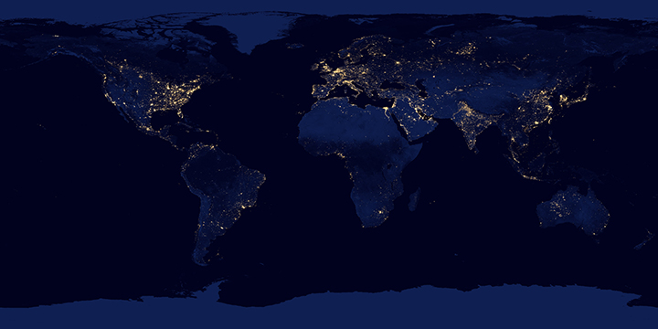
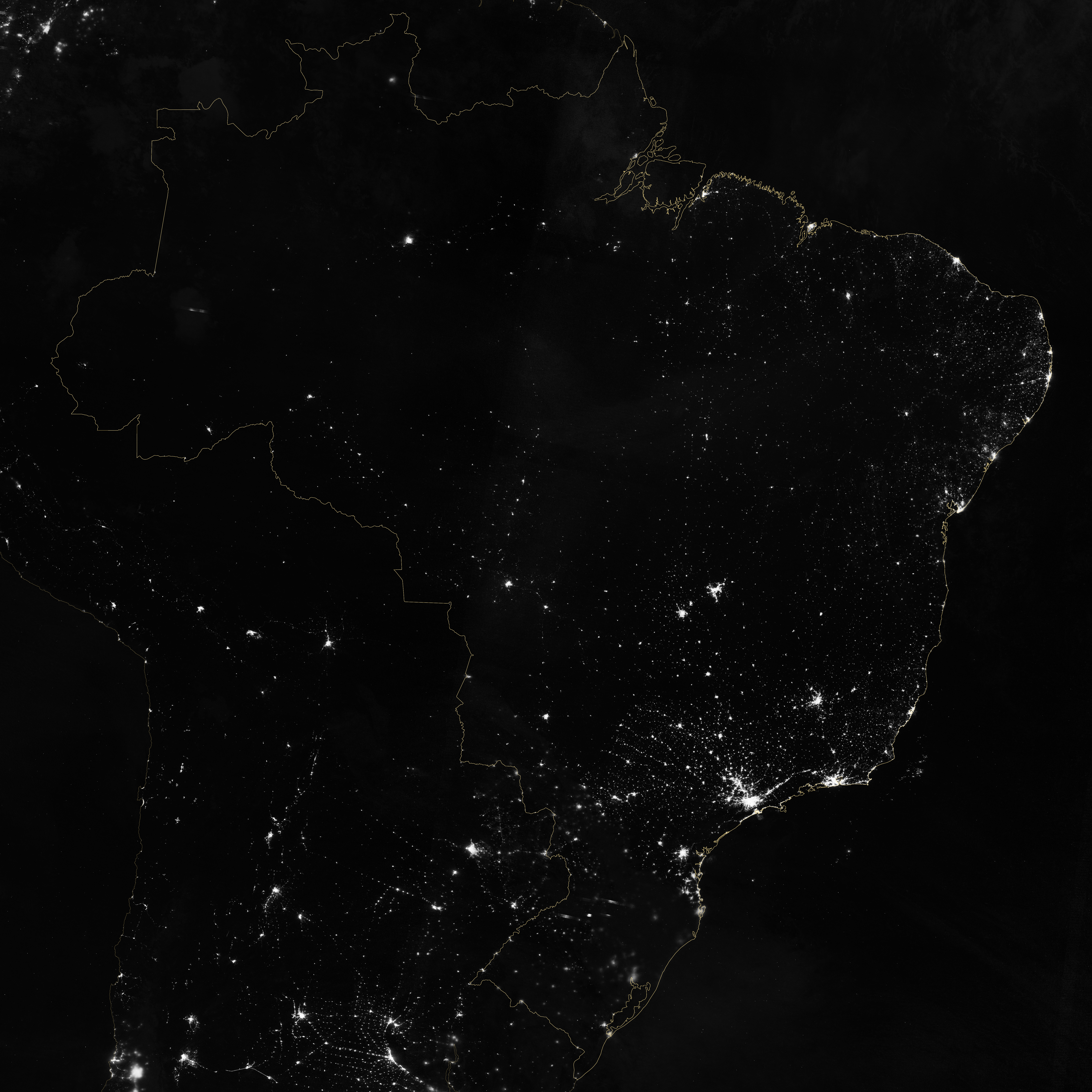
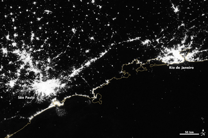
Over shorter times scales (Suomi-NPP completes an orbit every 100 minutes or so) multiple Day Night Band scenes stitched together show a snapshot of the Earth at night, like this view of South America, including the 14 Brazilian World Cup cities.
Marit Jentoft-Nilsen and I used a number of software tools to read, stitch, project, and visualize the data, starting with a handful of HDF5 files. VIIRS data is aggregated into granules, each acquired over 5 minutes. These files are distributed, archived, and distributed by NOAA’s CLASS (the Comprehensive Large Array-data Stewardship System). To deal with the unique projection of VIIRS, I used ENVI’s Reproject GLT with Bowtie Correction function to import the data. (If you’re unfamiliar with VIIRS data, now’s a good time to read the Beginner’s Guide to VIIRS Imagery Data (PDF) by Curtis Seaman of CIRA/Colorado State University.)
So far so good. Of course the data is in Watts per square meter per steradian, and the useful range is something around 0.0000000005 to 0.0000000500. With several orders of magnitude of valid data, any linear scale that maintained detail in cities left dim light sources and the surrounding landscape black. And any scaling that showed faint details left cities completely blown out.
To make the data more manageable, show detail in dark and bright areas, and allow export to Photoshop I did a quick band math calculation: UINT(SQRT((b1+1.5E-9)*4E15)*(SQRT((b1+1.5E-9)*4E15) lt 65535) + (SQRT((b1+1.5E-9)*4E15) ge 65535)*65535)
It looks a bit complicated, but it’s not too bad. It adds an offset to account for some spurious negative values; multiplies by a large constant to fit the data into the 65,536 values allowed in a 2-byte integer file; calculates the square root to improve contrast, sets any values above 65,535 to 65,535; then converts from floating point to unsigned integer. This data can be saved as a 16-bit TIFF readable by just about any image processing program, while maintaining more flexibility than an 8-bit file would.
The final steps were to bring the TIFF into Photoshop, tweak the contrast with levels and curves adjustments to bring out as much detail as possible, add coastlines and labels, and export for the web. The result: Brazil at Night published by the NASA Earth Observatory on the eve of the World Cup.
Last week I had the privilege of helping judge the 22nd Malofiej Awards. Presented by the Spanish Chapter of the Society for News Design, Malofiej 22 recognized the best news infographics of 2013. (For the uninitiated, infographics aren’t limited to those posters illustrating tenuously related facts with a handful of pie charts. A good infographic is an information-rich visual explanation; often incorporating illustration and text, but sometimes they’re as simple as a line graph.)
My fellow jurors for the online competition were an eclectic and brilliant bunch: Anatoly Bondarenko, interactive visualization designer for Texty (a Ukrainian guerrilla news site); Scott Klein, news applications editor at ProPublica, Golan Levin, artist & professor at Carnegie Mellon University; and Sérgio Lüdtke, journalist and professor of digital journalism at the International Institute of Social Sciences. (Good thing I didn’t read these bios before heading to Spain: I would have been more intimidated than I already was.)
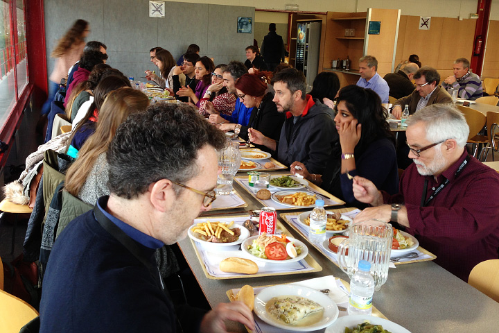
A traditional Spanish lunch for the Malofiej jurors and student volunteers.
For four days we evaluated, discussed, and sometimes argued about 400 or so online visualizations. We first narrowed the field down to about 100, then selected 8 gold, 24 silver, and 39 bronze medals (assuming I counted right). It was interesting to me that we largely liked (and disliked) the same entries, but often for different reasons. This led to several “ah ha” moments, when I suddenly appreciated a new perspective on a figure.
Instead of writing about the golds, which have already garnered their fair share of praise, here are some of my favorite silver and bronze winners.
Silver
China’s Memory Hole: The Images Erased From Sina Weibo (ProPublica)

The beauty of this piece is that the images are the data: images censored from Weibo, a Chinese service similar to Twitter.
Bronze
Electionland (Zeit Online)
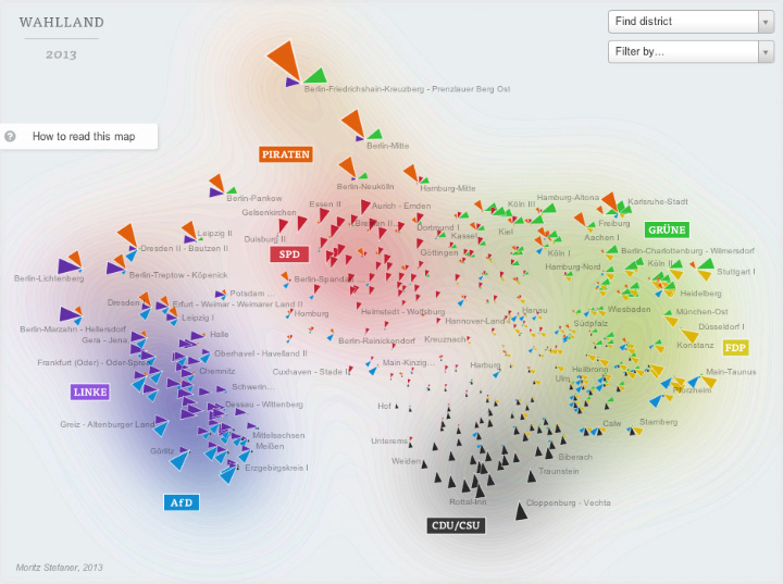
I have a few quibbles about this map of the 2013 German Bundestag elections, but it’s a brilliant bit of data crunching and abstraction. Voting districts are positioned based on the similarity of their voting patterns, rather than geography.
Bronze
The federal health-care exchange’s abysmal success rate (The Washington Post)
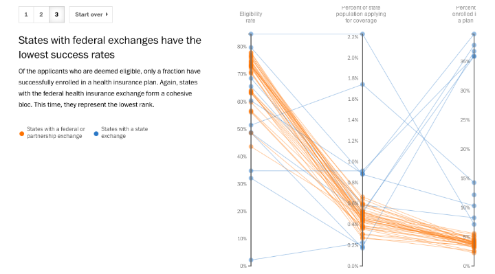
It’s a slope graph, what more do I need to say?
Of course, if you’re on the Malofiej jury picking awards is the easy part. You’re then on the hook to give a talk to some of the best designers and data visualizers in the world.

The Malofiej audience.
Jonathan Corum (Two Little Ducks) and Anatoly Bondarenko (Texty on Malofiej-22) gave two of the standouts.
Phew. What a long, exhausting, tremendously rewarding week.
Finally, I’d like to personally thank the student volunteers that functioned as tour guides, travel agents, translators, and personal assistants. They also made sure the online jury got our fair share of chocolate croissants, showed us the best pintxos bars in Pamplona, and even provided tips on surviving a run with the bulls [train, wear white, and run sober (which should’t be that hard, considering it starts at 8:00 a.m.!)]: Carmen Guitián, Alicia Arza, Ann Radjassamy, Beatriz Ciordia, Carmen Arroyo, Carmen Camey, Gabriela Suescum, Kristina Votrubová, Lucía Pérez, Andrés Juárez, Leire Emparanza, María Elena Quiñonero, Mariu Tena, and Alicia Alamillos.
Gracias.
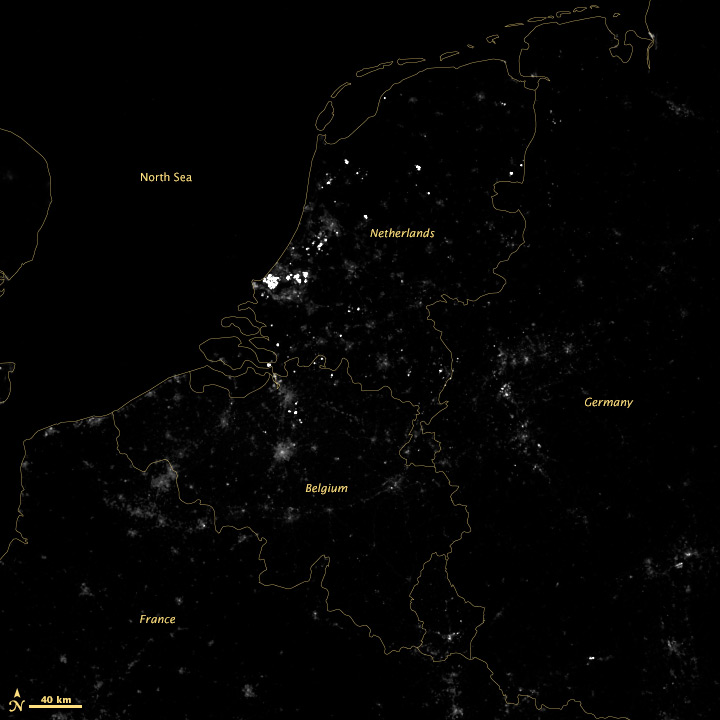
Somehow, a recent conversation on Twitter about tweet density led to a mention of the installation of variable highway lighting in the Netherlands, by way of the 2012 NASA/NOAA city lights map. Which made me wonder—would we be able to see the effects of the new lighting from space? After all, the day night band on the VIIRS instrument is sensitive enough to see by starlight.
According to Philips, streetlights along the A7 from Purmerend (just north of Amsterdam) to Wognum are dimmed 50% after 9 pm. The system was switched on in early 2013, so any change should be visible in 2012 vs. 2013 data:
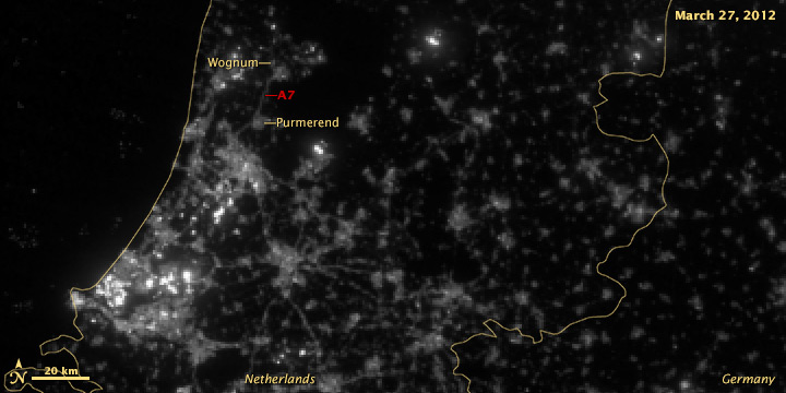

It’s subtle, but the difference is clear.
A wider view of the area reveals more interesting features:
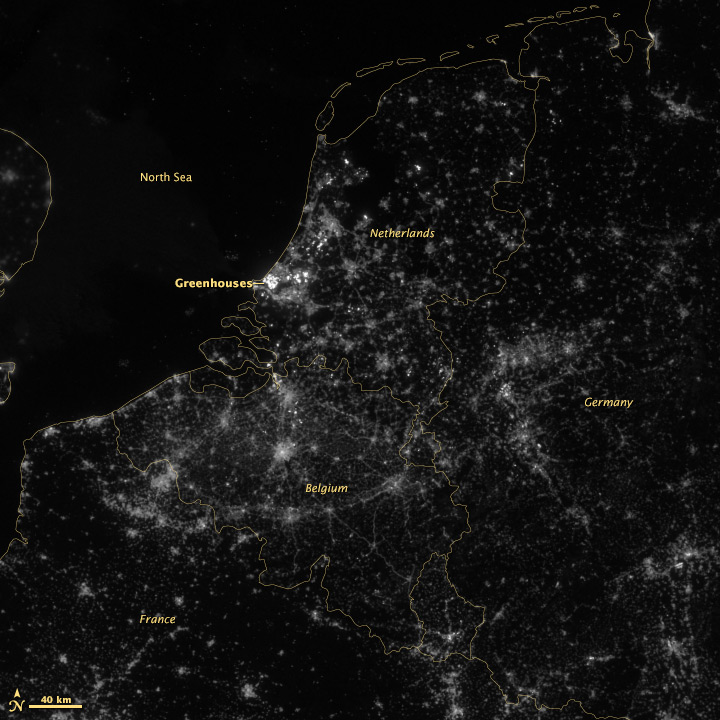
The brightest lights in the Netherlands are from clusters of greenhouses—perhaps growing hydroponic vegetables 24 hours a day. The Netherlands and Belgium are more densely populated and brightly lit than neighboring France and Germany, including their highways. Unsurprisingly water bodies are largely dark, but there is a scattering of boats in the North Sea.
A few notes on the image processing. These data are from the NOAA CLASS system, which is the primary archive for VIIRS data. Unfortunately they’re not in a convenient format: each file is an 80-second chunk of the satellite’s orbit (called a granule), with no preview images. The file format is HDF, which many scientists like but can be (extremely) difficult to read. (This Beginner’s Guide from Colorado State University may be helpful.)
The product is labeled “VIIRS Day Night Band SDR.” SDR means “science data record” which is a calibrated measurement, in this case Watts per square meter per steradian. It turns out this is a very low number, so to visualize the data we multiply everything by 1,500,000,000,000,000 (1.5E15) to make a usable 16-bit grayscale image, which looks like this:
There’s little detail aside from the very brightest lights, so we take the square root of the data to accentuate low values and compress high values—the results of which are in the top images. I usually apply additional contrast adjustments on published imagery, but here I wanted to be more conservative.
Thanks to Gregor Aisch (@driven_by_data), Moritz Stefaner (@moritz_stefaner), Eric Fischer (@enf), and Jan Willem Tulp (@JanWillemTulp) for piquing my interest. My Twitter handle is @rsimmon if you’re interested in data visualization, Earth science, and NASA (with the occasional digression into hockey and dogs). Additional thanks to my colleague Jesse Allen for converting the HDF into something useful.
Update:
Dan W. Williams made a GIF with the 2012 and 2013 images which makes the changes easier to see. Thanks!

Update 2:
By request, here are the full files as GeoTIFFs. You’ll need a TIFF reader that supports floating point (Photoshop does not) to read the “Raw” and “Scaled” data. Photoshop (and even Safari on a Mac) will read the two “Square Root” files.
March 27, 2012
Raw Floating Point
Scaled Floating Point
Square Root 16 bit Integer
March 4, 2013
Raw Floating Point
Scaled Floating Point
Square Root 16 bit Integer

This photo of Skylab was taken by the astronauts of Skylab-2 as they left the space station and departed for Earth on June 22, 1973. More photos from all three Skylab missions are archived on NASA’s Gateway to Astronaut Photography of Earth.
To look through the rest of the Skylab collection, select Find Photos > Search > Mission-Roll-Frame from the menu in the upper-left hand corner of the Gateway to Astronaut Photography of Earth home page. Under Missions pick one or more of SL2, SL3, and SL4, then delete the “E” in the Roll field. Finally, hit Run Query at the bottom of the page. On the Database Search Results page, enable the Show thumbnails if they are available checkbox. Click the number in the Frame column to view a screen-sized image. High-res images are downloadable from each Display Record, just click the View link for the image size you want.
Enjoy.
Japan’s MTSAT-2 (also known as Himawari-7) collected these images of today’s annular solar eclipse from geostationary orbit. The satellite (similar to the United State’s GOES satellites), observed the moon’s shadow as it passed over Australia & the Pacific Ocean. The image sequence begins at 21:32 UTC, with an additional image each hour until 02:32 UTC. The eclipse itself lasted from 22:33 UTC until 02:20 UTC.
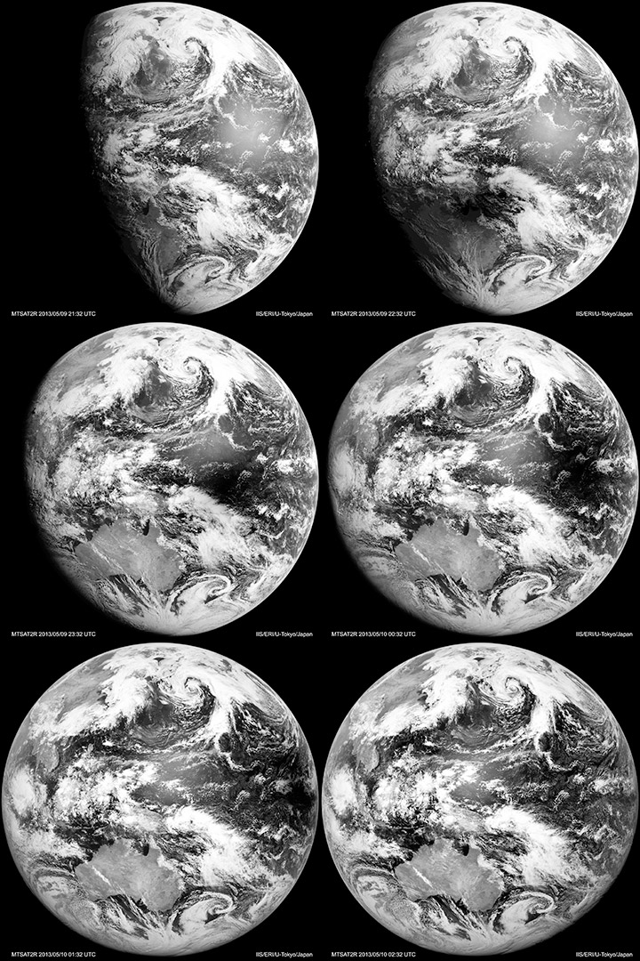
Visible-light & infrared MTSAT images dating back to October 2006 are available from the Earthquake Research Institute & Institute of Industrial Science, University of Tokyo.


Earth Day (8,192 by 8,192 pixels, 9.1 MB JPEG)
Earth Night (8,192 by 8,192 pixels, 4.2 MB JPEG)
Credit: NASA Earth Observatory images by Robert Simmon, using Suomi NPP VIIRS data from Chris Elvidge (NOAA National Geophysical Data Center). Suomi NPP is the result of a partnership between NASA, NOAA, and the Department of Defense.
I (@rsimmon) had a brief exchange this morning about the use of motion graphics in data visualization with Alberto Cairo (@albertocairo) and Andy Kirk (@visualisingdata) which quickly outgrew Twitter’s 140-character limit:
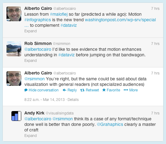
The increasing use of animation (and 3D) in data and information visualization is definitely a trend, but I don’t think it’s a good one. My (possibly naïve) understanding is that motion in data visualization is great for engagement (nothing can capture the attention of the human visual system like motion), but can be a detriment to comprehension. Cognitive science researchers like Barbara Tversky and Richard Lowe discovered that animations—even “well designed” ones—were often less effective than static diagrams at communicating concepts like the inner workings of a British toilet (I’m not kidding) or the movements of a piano action. Motion may get more people to view a graphic, but they may learn less from it.
Don’t get me wrong: recent work by Graham Roberts (thanks Andy!) and many other designers is stunning, and I love working in compositing and 3D software. One of the best visualizations I’ve ever done—a satellite view of the terminator over the course of a year—is animated:
[youtube FmCJqykN2J0]
But animation is typically more difficult and time consuming to produce than static visualization. Even if it’s no worse than a static graphic, is an animation worth the extra expense?
Alberto also touched on the issue of audience: does the general public understand data visualization? On the web that may not be something we have to worry about. Anybody that clicks a link on the Interent is the member of an attentive public—they’re actively seeking information. An attentive person is already interested in a topic, and is usually willing to do the mental work to understand what they’re looking at. (Jon Miller pioneered the concept of attentive publics in his 1983 book, The American People and Science policy: The Role of Public Attitudes in the Policy Process.)
Data visualization is a young field, however, and perhaps we’ll learn how to make beautiful, effective animations quickly & inexpensively. Right now, however, perhaps we should focus on improving more pedestrian information displays.
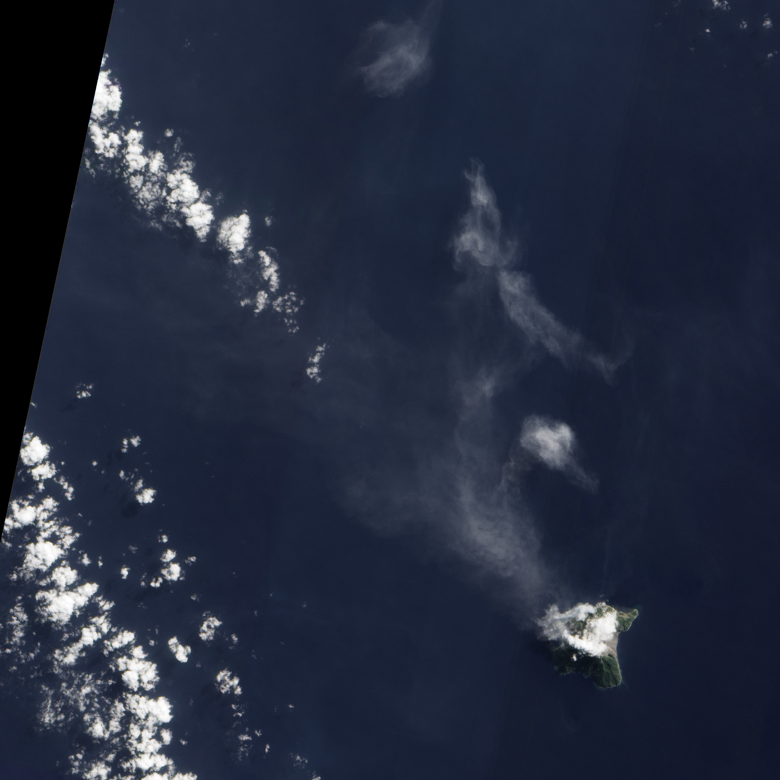
Active since 2006, Batu Tara continues to puff away. A thin volcanic plume streams northwest from the cloud-shrouded volcano. The Advanced Land Imager (ALI) aboard the Earth Observing-1 (EO-1) satellite collected this natural-color image on June 21, 2012.
NASA image By Jesse Allen and Robert Simmon using EO-1 ALI data.
Of all the Earth sciences, geology has the strongest tradition of visual communication. It’s probably because mapping is fundamental to the field, and geologists have 200 years of practice at it. As a result, they tend to create well designed imagery.
Two exemplary techniques geologists use: they almost always include a scale, and they often annotate images directly, rather than relying on separate keys or text descriptions. Here’s an example from Lockwood DeWitt, of Outside the Interzone:
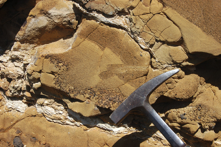
Callan Bentley, author of Mountain Beltway, added annotations that show small faults, and the distribution of grain size in the rock:
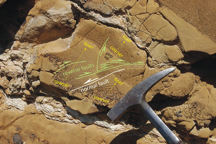
Callan even used different colors to differentiate types of information, and varied the size labels to emphasize the location and type of faulting. Excellent work.
Here’s what Lockwood had to say about Table Rock:
Table Rock is quite similar to the more widely known Fort Rock, but larger and better preserved. It erupted enough material that toward the end, it had raised a cone above the original water-influenced explosive (hydrophreatic) vent. The final phase was a more gentle effusive basalt eruption, which filled in the hollow interior. Without that basalt filling, Table Rock would look very similar indeed to Fort Rock. Here’s the location in FlashEarth, maybe a hundred yards north of the dirt road. The two features both lie in the Fort Rock-Christmas Valley, which were filled by a pluvial lake during the Pleistocene. Even a quick glance over this area reveals quite a few similar water-mediated eruptions. In this view, Hole-in-the-Ground is in the left of the top middle, Fort Rock is in the upper middle, just to left of the four center-pivot irrigation fields, turning the rotated “L” into a backwards “C,” and Table Rock is in the bottom right middle, just above and a bit to the right of the Highway 31 label and tight cluster of irrigated fields.
By the way, I don’t include a scale in every image. Sometimes I just want to let the beauty of a spot be what it is. so I take two pictures. One with, and one without, scale. Here’s an example from a couple days earlier, sans scale. But I have a number of other photos of the same spot (not posted yet) that do provide a sense of scale.
I rest my case.
Historic flooding along the Mississippi River gives me an excuse to show another of my favorite maps, from Geological Investigation of the Alluvial Valley of the Lower Mississippi River.
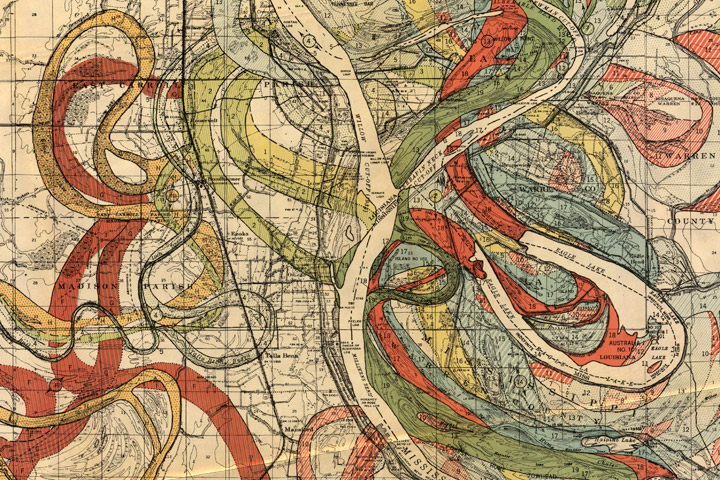
Each color represents an old channel, dating back 1,000 years or so. Those that correspond to historical records are dated, while older channels are ordered according to the principle of superposition (newer sediments on top of older ones). Many of the surface layers are still visible in satellite imagery. High-resolution, geolocated maps from Cairo to the Gulf, along with major tributaries, geological maps, and cross sections, are distributed by the U.S. Army Corps of Engineers.
