The Earth Observatory has published its last Image of the Day on this website. Please join us on our new home at science.nasa.gov/earth/earth-observatory.
In response to Map of the Ancient Mississippi a few of you left comments to the effect of “no one should live in floodplains.” It’s an appealing notion, but I think it’s unrealistic. Anne Jefferson of Highly Allochthonous published an epic post yesterday outlining the benefits and risks of building in a flood plain, and the need to balance them: Levees and the illusion of flood control. It’s well worth a read. Plus, she dug up some great archival imagery, like this map of the 1927 flood:

Some additional details on the map are in this article from the National Archives: The 200th Anniversary of the Survey of the Coast.
Sticking to the flood theme, here’s a recent map from the U.S. Army Corps of Engineers showing the predicted travel time for water in the Morganza Floodway.
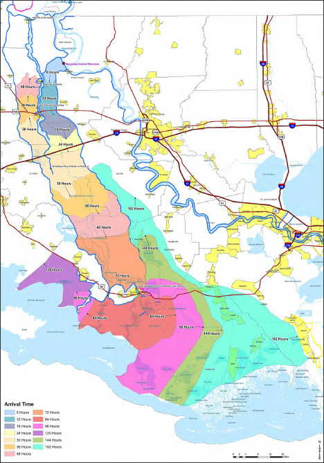
It’s a reasonably good map, with one big flaw: the colors are more appropriate for categorical data (such as a geological map of different rock types) rather than sequential data (like elapsed time). There’s no natural progression from one color to the next, so to work out the ordering one has to rely on the position of adjacent bands of color, or look repeatedly between the map and the key. A palette that varied from light to dark, dull to saturated, or both, would be easier to read at a glance. Like this:
![]()
Since I’m still not ready to do a long series of posts on colors, here’s a handout I wrote for the 2008 Access Data Workshop that covers more of the basics: Use of Color in Data Visualization. (PDF) If you’re really interested in the topic just skip what I wrote and go straight to the references:
A few weeks ago I stumbled on this headline and image from the UK Daily Mail Online:
World of two halves! Map shows most of Northern Hemisphere is covered in snow and ice.
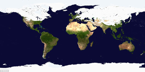
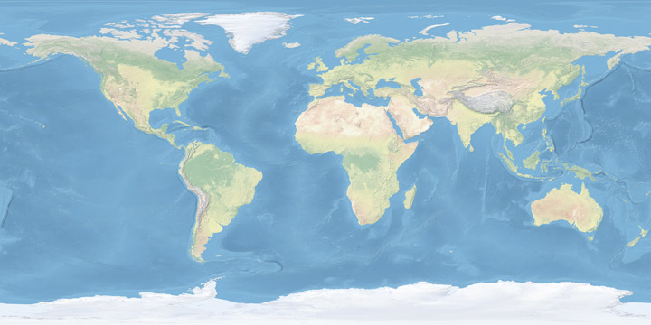
Most of the Northern Hemisphere was covered in snow and ice a few weeks ago? (The image dates from late January/early February—I couldn’t find the exact date.) Really? At first glance it’s a plausible claim, but there’s a problem. The map is in a cylindrical equirectangular projection, which distorts relative areas—regions north and south of the equator appear larger on the map than they are in reality. The higher the latitude, the larger the exaggeration. As a result, a much higher percentage of the Earth’s surface appears to be covered in snow or ice than really is.
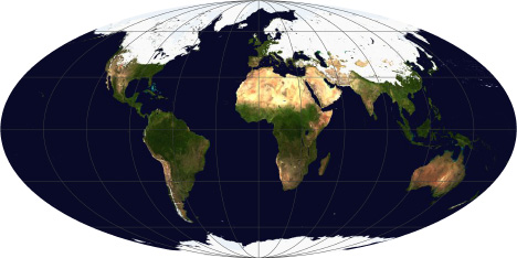
After transforming the map to an equal-area projection (in this case Mollweide, which also preserves straight lines of latitude) it’s obvious that most of the Northern Hemisphere remains snow and ice free, even in mid-winter:
A map showing just the Northern Hemisphere (azimuthal equal area, centered on the North Pole) makes is yet more clear:
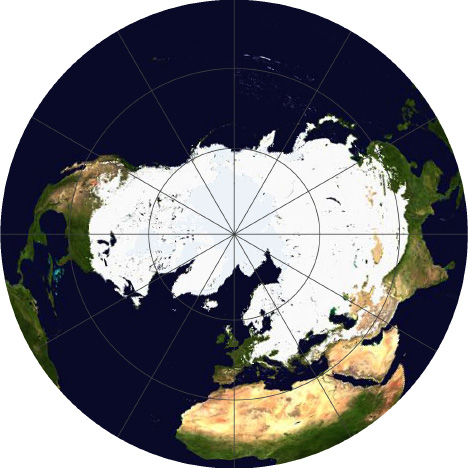
For maps of measured quantities on the Earth’s surface (like snow, temperature, rainfall, or vegetation) it’s important to choose a projection carefully, to minimize misunderstandings of the underlying data. It’s far too easy for a map to exaggerate one area at the expense of another. It’s also important to keep projections consistent when displaying a time series, or comparing datasets to one another.
Despite the major flaw of not being equal area, cylindrical equirectangular (which goes by many other names) is very useful: it’s the standard projection for importing into a 3D program and wrapping around a sphere, and it’s easy to define the corner points and scale for import into software to transform to other map projections. I did all the reprojections with the excellent tool G.Projector, which I’ve written about before.
For more information about map projections, see the USGS page Map Projections, the National Atlas’ Map Projections: From Spherical Earth to Flat Map, and the Wolfram Mathworld Map Projection site. For an in-depth discussion, read Map Projections—A Working Manual, (PDF) also from the USGS.
(As far as I can tell, the snow and ice map was originally from the NOAA Environmental Visualization Laboratory. Unfortunately, I couldn’t find archived images on their site, so I had to use the original low resolution and highly compressed image from the Daily Mail.)
We just published a mini-feature on the recent forest fires in Russia—Russian Firestorm: Finding a Fire Cloud from Space—accompanied by this map of smoke movement (read the article for details, then come back):
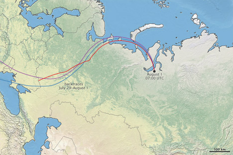
I’m reasonably happy with the map, largely due to the wonderful Natural Earth data I used as a base. Put together by Nathaniel Vaughn Kelso, Tom Patterson, and many others. It uses NASA’s Blue Marble imagery, but it’s lightened and desaturated, which works much better than the Blue Marble when combined with other data. The maps based on color imagery are complemented by another set: “Cross-blended Hypsometric Tints”. These are based on elevation data (SRTM 30 plus), but have the added twist that arid and temperate climates get separate color palettes, so deserts look like deserts and forested areas are green.
If that weren’t enough (I’m beginning to sound like a salesman) there’s a matching set of vector (resolution-independent) data for coastlines, country boundaries, rivers, roads, etc., optimized for three different scales (a low-resolution map needs less-detailed coastline data than a high-resolution map, otherwise areas of coastline with fine detail become a blobby mess). If you make maps, or even just like maps, they’re well worth checking out.
