The Earth Observatory has published its last Image of the Day on this website. Please join us on our new home at science.nasa.gov/earth/earth-observatory.
This post was originally published by the Society for News Design for the Malofiej Infographic World Summit.
Palettes aren’t the only important decision when visualizing data with color: you also need to consider scaling. Not only is the choice of start and end points (the lowest and highest values) critical, but the way intermediate values are stretched between them.
Note: these tips apply to scaling of smoothly varying, continuous palettes. For discrete palettes divided into distinct areas (countries or election districts, for example, technically called a choropleth map), read John Nelson’s authoritative post, Telling the Truth.
For most data simple linear scaling is appropriate. Each step in the data is represented by an equal step in the color palette. Choice is limited to the endpoints: the maximum and minimum values to be displayed. It’s important to include as much contrast as possible, while preventing high and low values from saturating (also called clipping). There should be detail in the entire range of data, like a properly exposed photograph.
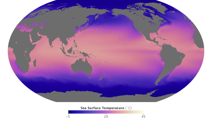
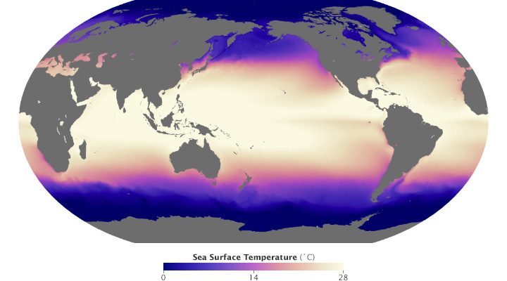
These maps of sea surface temperature (averaged from July 2002 through January 2014) demonstrate the importance of appropriately choosing the range of data in a map. The top image varies from -5˚ to 45˚ Celsius, a few degrees wider than the bounds of the data. Overall it lacks contrast, making it hard to see patterns. The lower image ranges from 0˚ to 28˚ Celsius, eliminating details in areas with very low or very high temperatures. (NASA/MODIS.)
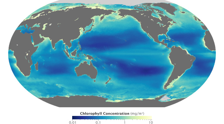
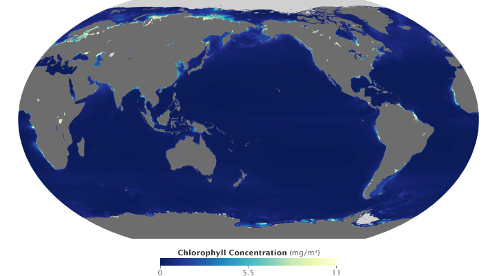
Ocean chlorophyll (a measure of plant life in the oceans) ranges from hundredths of a milligram per cubic meter to tens of milligrams per cubic meter, more than 3 orders of magnitude. Both of these maps use the almost same endpoints from near 0 (it’s impossible to start a logarithmic scale at exactly 0) to 11. Plotted linearly, the data show a simple pattern: narrow bands of chlorophyll along coastlines, and none in mid-ocean. A logarithmic base-10 scale reveals complex structures throughout the oceans, in both coastal and deep water. (NASA/MODIS.)
Some visualization applications support logarithmic scaling. If not, you’ll need to apply a little math to the data (for example calculate the square root or base 10 logarithm) before plotting the transformed data.
Appropriate decisions while scaling data are a complement to good use of color: they will aid in interpretation and minimize misunderstanding. Choose a minimum and maximum that reveal as much detail as possible, without saturating high or low values. If the data varies over a very wide range, consider a logarithmic scale. This may help patterns remain visible over the entire range of data.
(Repost of an article on the Exelis Vis Imagery Speaks blog.)
One of the most interesting new capabilities of the NOAA/NASA/DoD Suomi-NPP satellite is the Day-Night Band. These detectors, part of the Visible Infrared Imaging Radiometer Suite (VIIRS), are sensitive enough to image Earth’s surface by starlight. The Day Night Band is both higher resolution and up to 250 times more sensitive than its ancestor, the DMSP Operational Linescan System (OLS).
Applications of the Day Night Band include monitoring warm, low-level clouds, urban lights, gas flares, and wildfires. Long-term composites reveal global patterns of infrastructure development and energy use.
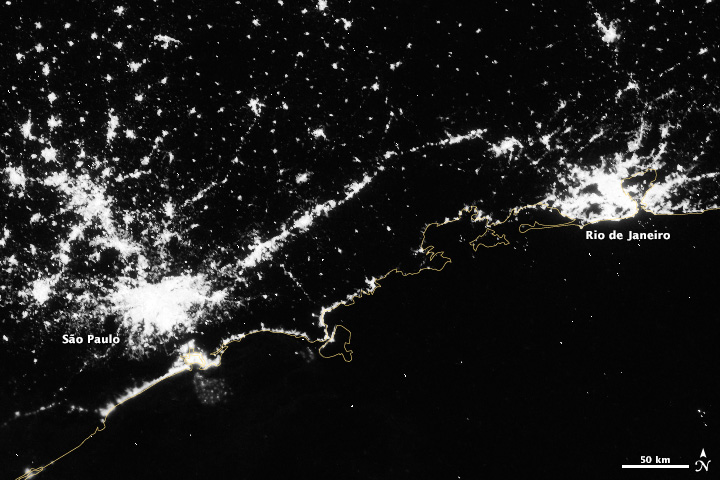
Over shorter times scales (Suomi-NPP completes an orbit every 100 minutes or so) multiple Day Night Band scenes stitched together show a snapshot of the Earth at night, like this view of South America, including the 14 Brazilian World Cup cities.
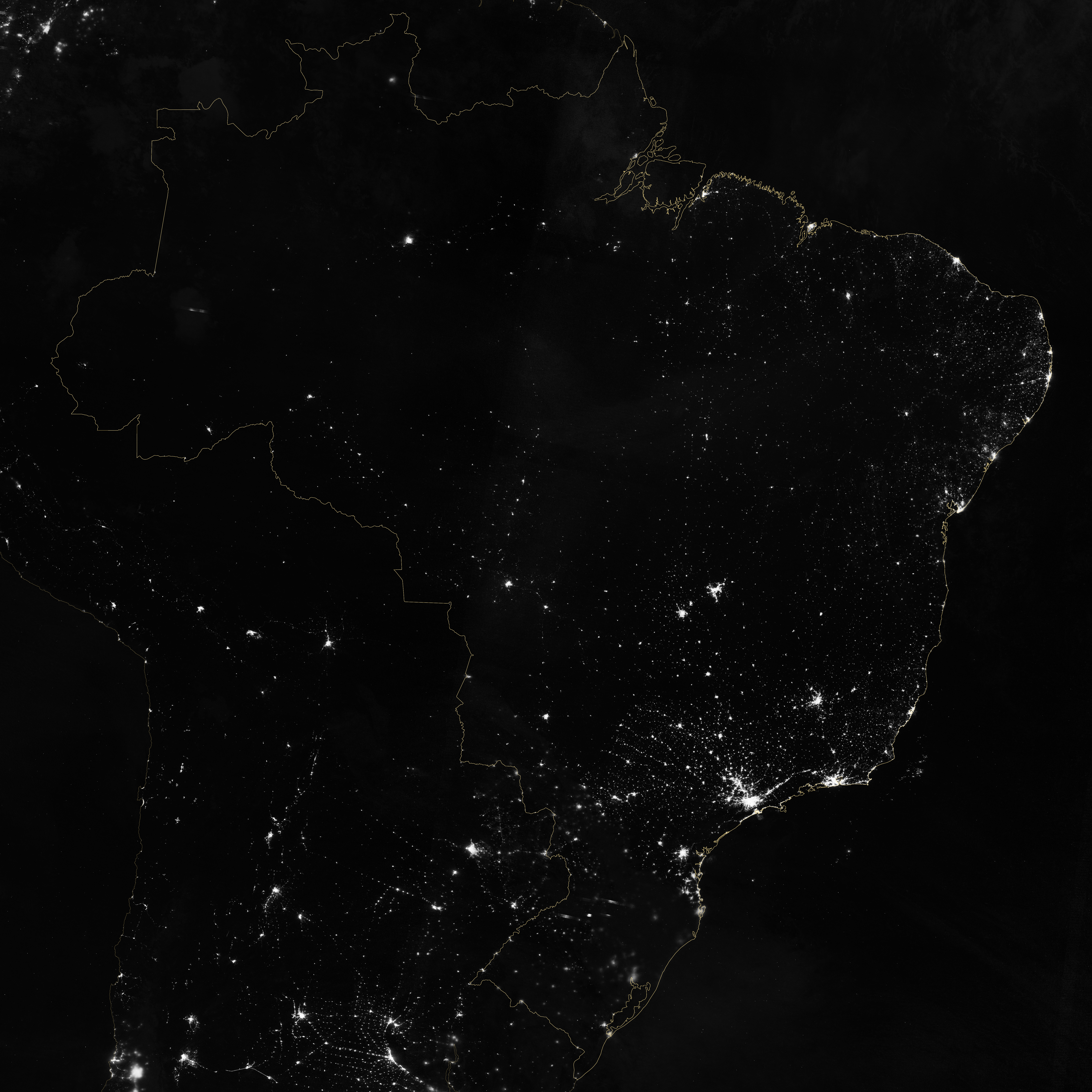
Marit Jentoft-Nilsen and I used a number of software tools to read, stitch, project, and visualize the data, starting with a handful of HDF5 files. VIIRS data is aggregated into granules, each acquired over 5 minutes. These files are distributed, archived, and distributed by NOAA’s CLASS (the Comprehensive Large Array-data Stewardship System). To deal with the unique projection of VIIRS, I used ENVI’s Reproject GLT with Bowtie Correction function to import the data. (If you’re unfamiliar with VIIRS data, now’s a good time to read the Beginner’s Guide to VIIRS Imagery Data (PDF) by Curtis Seaman of CIRA/Colorado State University.)
So far so good. Of course the data is in Watts per square meter per steradian, and the useful range is something around 0.0000000005 to 0.0000000500. With several orders of magnitude of valid data, any linear scale that maintained detail in cities left dim light sources and the surrounding landscape black. And any scaling that showed faint details left cities completely blown out.
To make the data more manageable, show detail in dark and bright areas, and allow export to Photoshop I did a quick band math calculation: UINT(SQRT((b1+1.5E-9)*4E15)*(SQRT((b1+1.5E-9)*4E15) lt 65535) + (SQRT((b1+1.5E-9)*4E15) ge 65535)*65535)
It looks a bit complicated, but it’s not too bad. It adds an offset to account for some spurious negative values; multiplies by a large constant to fit the data into the 65,536 values allowed in a 2-byte integer file; calculates the square root to improve contrast, sets any values above 65,535 to 65,535; then converts from floating point to unsigned integer. This data can be saved as a 16-bit TIFF readable by just about any image processing program, while maintaining more flexibility than an 8-bit file would.
The final steps were to bring the TIFF into Photoshop, tweak the contrast with levels and curves adjustments to bring out as much detail as possible, add coastlines and labels, and export for the web. The result: Brazil at Night published by the NASA Earth Observatory on the eve of the World Cup.