

Since I was (slightly) critical of the New York Times graphics department yesterday, I’ll show a Times map that is one of my favorite visualizations today: a map of shaking intensity and slip during the 1906 San Francisco Earthquake.
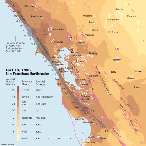
Aside from being elegant, it’s data-rich without being cluttered, and multivariate. It shows shaking intensity (in two dimensions), fault location (in two dimensions), slip along the San Andreas (one dimension), urban locations (two dimensions), and has three layers of direct labeling (cities, faults, and slip). The key is adjacent to the data, and written in clear language. Compare the map from the Times to the equivalent from the USGS:
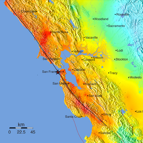
The New York Times version both has more data and is more readable. Why? First off, the Times uses a subdued, discrete, color palette that shifts through a small range of hues. This allows other information to be layered into the map. The USGS, in contrast, uses a rainbow of hues at maximum saturation. The rainbow palette [at some point I’m going to do series of posts on color palettes, but for now i’ll just point to Color Brewer to explain the importance of appropriate color maps in data visualization] uses the full spectrum and is so saturated that there are very few colors left over for additional data—notice how the red fault lines on the USGS map disappear in areas of intense shaking. The dark ocean in the USGS version also competes visually with the data-rich areas of the map.
The New York Times also forgoes the use of terrain data in their map. It adds a lot of great context to the image (the San Andreas creates a distinct valley), but at web resolutions shaded relief is very difficult to pull off. The high frequency contrast distracts from the other data in the map. At larger sizes, or printed at high resolution, the terrain could be added back in (but it still needs to be treated carefully—see Relief Shading for advice). As a result, fine details in the faults and the boundaries of urban areas remain legible.
My favorite part of the Times map is the inclusion of the amount of slip at various locations on the San Andreas: it’s so much more informative than merely indicating the epicenter. Earthquakes—especially big earthquakes—aren’t points. They occur over a two dimensional area (reduced to a one dimensional quantity on this map). Increased slip correlates with increased shaking, which tells a story. That’s what makes this map so powerful. It’s a narrative of cause and effect, which is a quality of the best data visualizations.
Last week, Jessica Ball of the American Geophysical Union’s Magma Cum Laude blog pointed out this map of natural hazards in the U.S., published by the New York Times:

The map has many of the design virtues common in graphics from the Times (clean, focused on the data, clearly labeled, small multiples), but when I first viewed it I had trouble parsing the data. It took me a while to figure out that hazard was indicated by color, and the size of each circle denoted ancilliary information (population).
It turns out that our eyes & brains perceive area more strongly than color. Here’s a list of ways to visually compare quantities (described by Bang Wong in his Points of View column for Nature Methods), in order from easiest to hardest:
I suspect I’m not the only person who would consider the size of the circles more important than the color, and assume size was correlated with hazard. I had to carefully read the key to figure out the proper way to read the map. Perhaps using size to encode hazard, and color (or opacity, or icons) for population would have worked better.
I recently had the opportunity to attend & give a presentation at the 2011 International Symposium on Remote Sensing of the Environment in lovely Sydney, Australia. (OK, not so recently—the conference ended on the April 15th. I blame jetlag.) Just over 60 people turned up for the talk, which was mostly about our visualization of Eyjafjallajökull. (Which means I had to attempt to learn how to pronounce “Eyjafjallajökull.” Luckily I don’t think anybody made it from Iceland to Sydney to critique me.) If you’re interested, I’ve posted Keynote and PDF copies (originally prepared for last years’s fall AGU).
During sessions many of the talks were a bit on the technical side for me, so I ended up preparing material for NASA’s portable “hyperwall”—9 HDTV screens linked together. It’s useful for either high-res animations, or small multiples. With relatively thick bezels on the monitors, simultaneous display of 9 images worked particularly well:
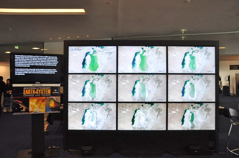
Compare the small multiples on the hyperwall with the sequential display of the same images from the Earth Observatory’s World of Change.
During my talk I promised the audience that I’d update the blog more frequently, so there should be more posts in the future. I sometimes struggle for good ideas, so if you have a suggestion, please drop a note in the comments.
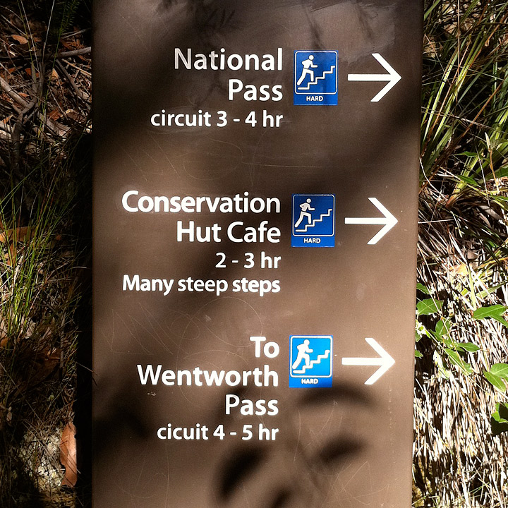
One of the best things about international travel (at least to a geek like me) is to see how different cultures approach design and signage. Here’s a few from Blue Mountains National Park, near Sydney, Australia.
Wow. 28 photographs from within the crater of Nyiragongo Volcano in the Democratic Republic of the Congo. (Thanks to Zuid Wal, commenting on the Eruptions blog.)
Russia’s Kamchatka Peninsula is perhaps the most volcanically active spot on the planet. Last week’s Global Volcanism Program weekly report (for February 16–22, 2011) listed three Kamchatkan volcanoes currently in eruption—Karymsky, Kizimen, and Shiveluch—and two others—Bezymianny and Klyuchevskaya—were mentioned earlier in February. In one overpass a NASA satellite captured four of these volcanoes in one narrow overpass, only 60 kilometers wide and 300 kilometers long. All of them exhibit plumes. I zoomed in on the most spectacular—Kizimen and Shiveluch—for our Natural Hazards section, but I’d like to share Klyuchevskaya (below) and the entire image—all 9,822 by 20,729 pixels of it (13 MB JPEG).
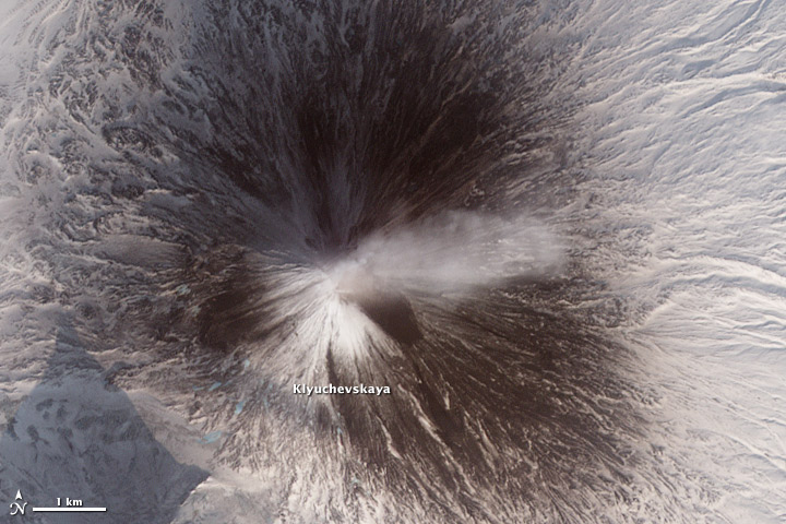
NASA Earth Observatory image by Robert Simmon, using data from the NASA/GSFC/METI/ERSDAC/JAROS, and U.S./Japan ASTER Science Team.
A few weeks ago I stumbled on this headline and image from the UK Daily Mail Online:
World of two halves! Map shows most of Northern Hemisphere is covered in snow and ice.
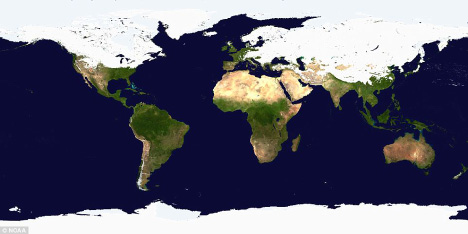
Most of the Northern Hemisphere was covered in snow and ice a few weeks ago? (The image dates from late January/early February—I couldn’t find the exact date.) Really? At first glance it’s a plausible claim, but there’s a problem. The map is in a cylindrical equirectangular projection, which distorts relative areas—regions north and south of the equator appear larger on the map than they are in reality. The higher the latitude, the larger the exaggeration. As a result, a much higher percentage of the Earth’s surface appears to be covered in snow or ice than really is.
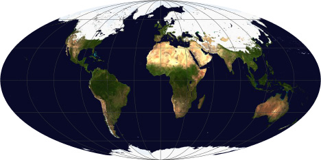
After transforming the map to an equal-area projection (in this case Mollweide, which also preserves straight lines of latitude) it’s obvious that most of the Northern Hemisphere remains snow and ice free, even in mid-winter:
A map showing just the Northern Hemisphere (azimuthal equal area, centered on the North Pole) makes is yet more clear:
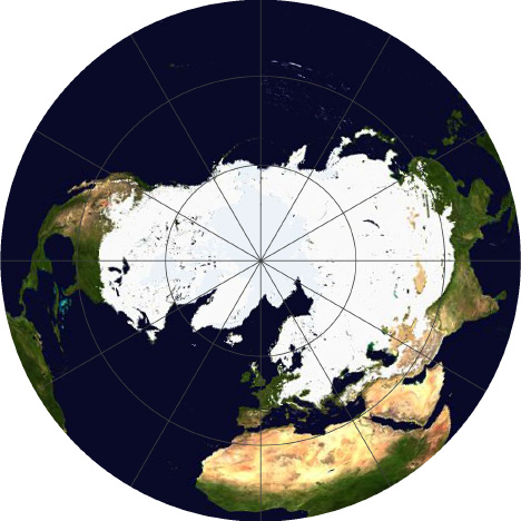
For maps of measured quantities on the Earth’s surface (like snow, temperature, rainfall, or vegetation) it’s important to choose a projection carefully, to minimize misunderstandings of the underlying data. It’s far too easy for a map to exaggerate one area at the expense of another. It’s also important to keep projections consistent when displaying a time series, or comparing datasets to one another.
Despite the major flaw of not being equal area, cylindrical equirectangular (which goes by many other names) is very useful: it’s the standard projection for importing into a 3D program and wrapping around a sphere, and it’s easy to define the corner points and scale for import into software to transform to other map projections. I did all the reprojections with the excellent tool G.Projector, which I’ve written about before.
For more information about map projections, see the USGS page Map Projections, the National Atlas’ Map Projections: From Spherical Earth to Flat Map, and the Wolfram Mathworld Map Projection site. For an in-depth discussion, read Map Projections—A Working Manual, (PDF) also from the USGS.
(As far as I can tell, the snow and ice map was originally from the NOAA Environmental Visualization Laboratory. Unfortunately, I couldn’t find archived images on their site, so I had to use the original low resolution and highly compressed image from the Daily Mail.)
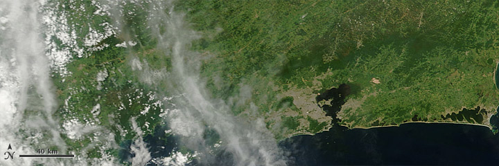
Over the past week or two, there has been severe flooding in Australia, Brazil, Sri Lanka, and the Phillipines, but all we’ve shown on the Earth Observatory is the flooding in Australia. Why? Here’s a sampling of images of Rio de Janeiro since January 12:
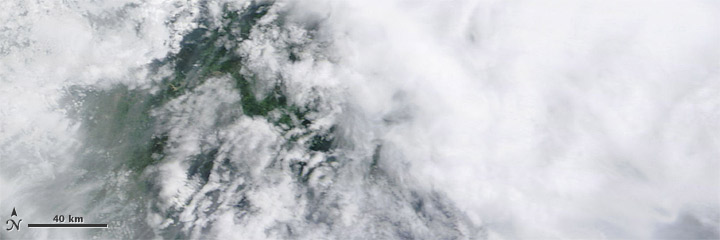
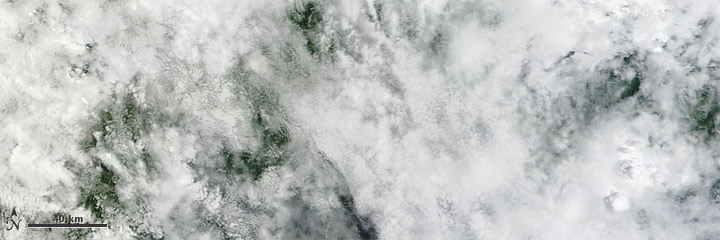
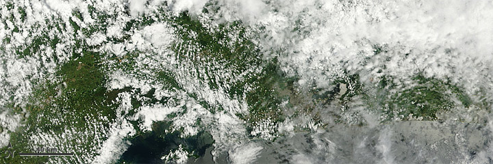
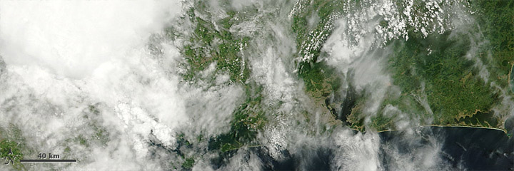
Earth is cloudy. Especially in the tropics. Even more especially when there’s enough rain to cause flooding. The satellite imagery we have easy, fast, and free access to (for example, check out the twice daily MODIS imagery of São Paulo) is primarily based on visible and infrared light, which can’t penetrate clouds, so for many floods we can’t show anything useful.
In addition, the damage in Brazil, Sri Lanka, and the Philippines was caused by flash floods, landslides, and debris flows, which are all much smaller scale than the rivers overflowing their banks near Brisbane. In satellite imaging there’s a tradeoff between spatial resolution (detail) and temporal resolution (frequency) so there are fewer opportunities to capture the high resolution data necessary to show relatively localized events. To view something like a landslide, we have to have both a break in the clouds and the opportunity to aim a high resolution sensor. Which occurred this morning:
With clear skies and an overpass of Earth Observing-1, we may have an image of Teresopolis, Brazil by tomorrow.
P.S.: Despite the dispassionate view afforded by satellites, my thoughts go out to the victims and their families.
Update: For some reason the satellite never acquired the data, and the next viewing opportunity won’t be for another few days.