The Earth Observatory has published its last Image of the Day on this website. Please join us on our new home at science.nasa.gov/earth/earth-observatory.
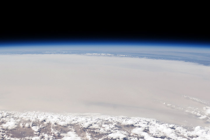
An astronaut took this photograph of dust obscuring the Taklamakan Desert, with the Tien Shan mountains in the distance, on September 5, 2010.
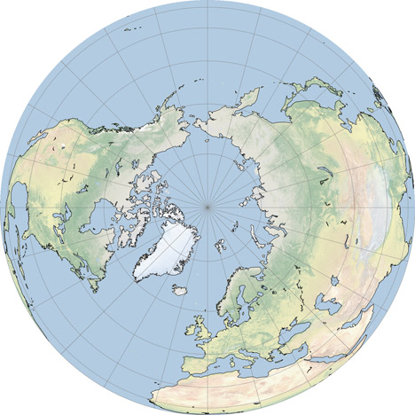
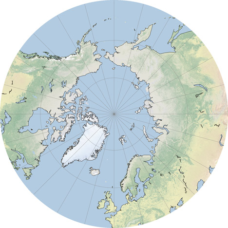
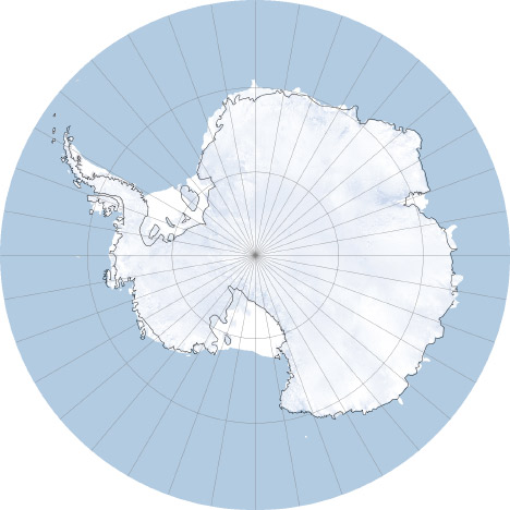
In the comments to my Natural Earth post Jim Meyer suggested I make copies of the global maps centered on the Poles. Rather than just making a few images I’ll mention G.Projector: the simplest map projection conversion software I know of. Developed by NASA Goddard Institute of Space Studies, it features 93 map projections, (assuming I didn’t lose count) decent customization options, and a good coastline database at multiple resolutions. Even better, it’s free.
The conversion process is straightforward: import an image in the equirectangualr map projection, pick a new projection, set options for coastlines and other overlays, then export. Very, very, simple (in contrast to many other remapping applications which seem to be written for people with GIS degrees). Here’s some examples:
While poking around the Gateway to Astronaut Photography of Earth (tens of thousands of photos of Earth from space, dating back to the Mercury program) I found this photo of the Milky Way rising (setting?) above the Earth’s limb:
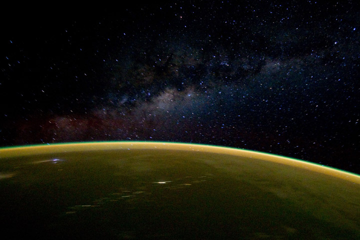
Taken from the Space Shuttle Discovery on April 18, 2010.
Really busy this week, so I’ll just post this slightly off-center satellite view of Mount St. Helens:
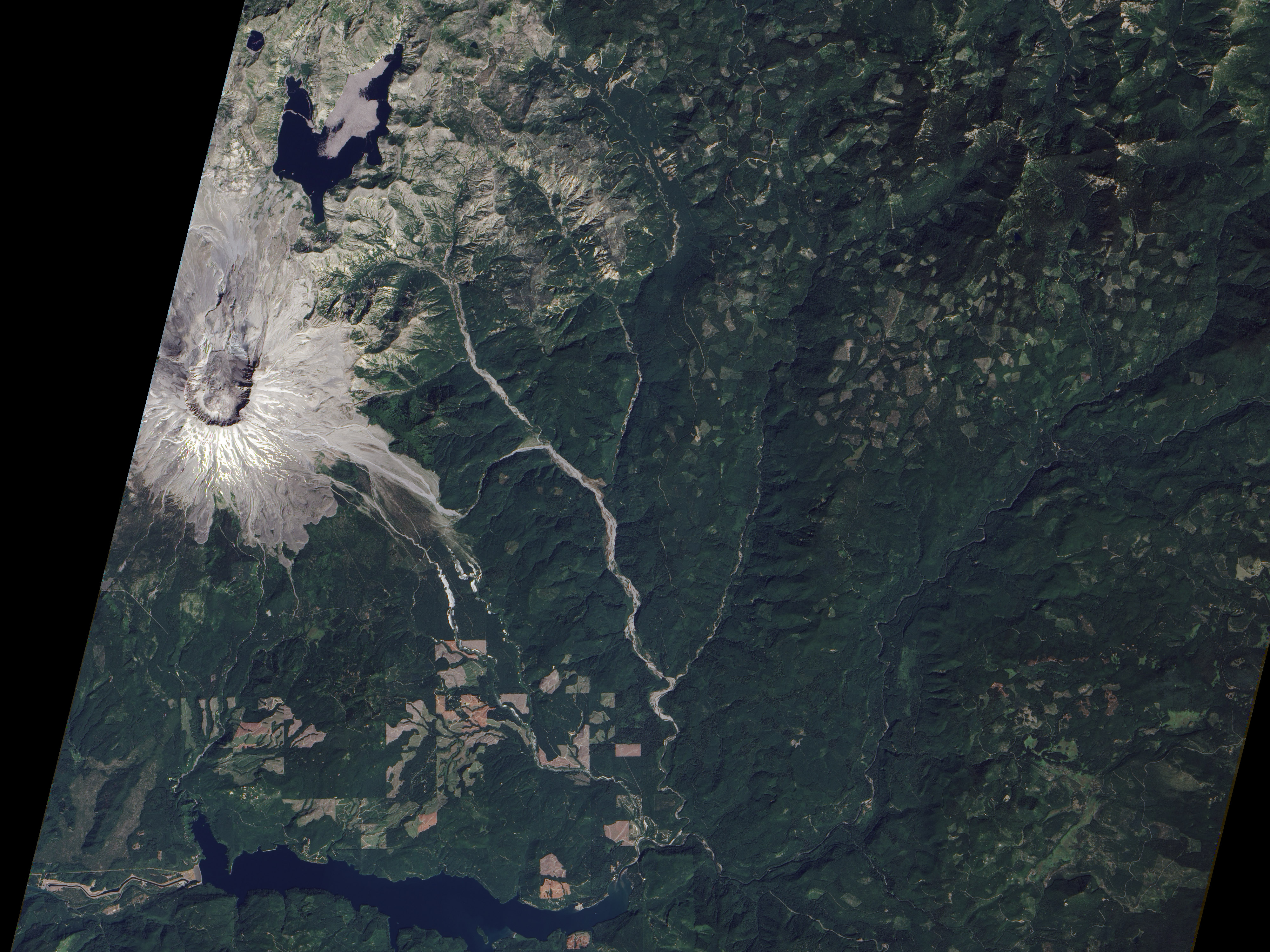
Click for the large version, and be sure to check out Devastation and Recovery at Mt. St. Helens to see the volcano and its surroundings every year from 1979 to 2009, including the immediate aftermath of the 1980 eruption. 2010 coming soon. (Image acquired by the Advanced Land Imager on board Earth Observing-1 on August 23, 2010.)
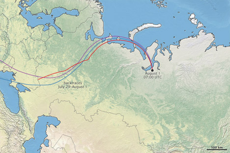
We just published a mini-feature on the recent forest fires in Russia—Russian Firestorm: Finding a Fire Cloud from Space—accompanied by this map of smoke movement (read the article for details, then come back):
I’m reasonably happy with the map, largely due to the wonderful Natural Earth data I used as a base. Put together by Nathaniel Vaughn Kelso, Tom Patterson, and many others. It uses NASA’s Blue Marble imagery, but it’s lightened and desaturated, which works much better than the Blue Marble when combined with other data. The maps based on color imagery are complemented by another set: “Cross-blended Hypsometric Tints”. These are based on elevation data (SRTM 30 plus), but have the added twist that arid and temperate climates get separate color palettes, so deserts look like deserts and forested areas are green.
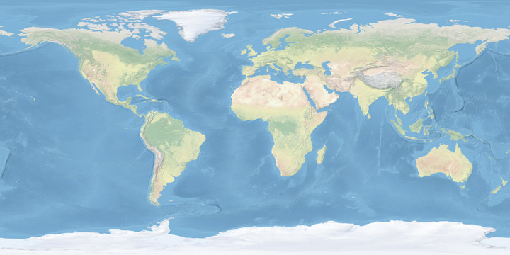
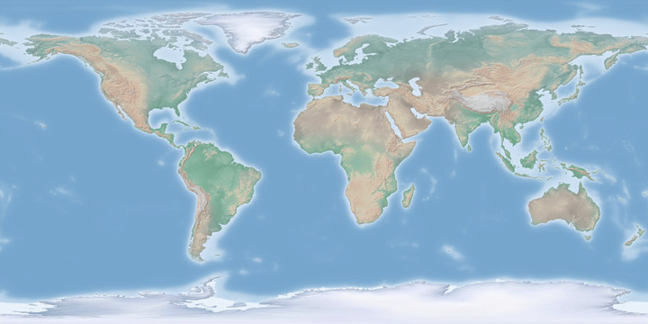
If that weren’t enough (I’m beginning to sound like a salesman) there’s a matching set of vector (resolution-independent) data for coastlines, country boundaries, rivers, roads, etc., optimized for three different scales (a low-resolution map needs less-detailed coastline data than a high-resolution map, otherwise areas of coastline with fine detail become a blobby mess). If you make maps, or even just like maps, they’re well worth checking out.
