After nearly 20 years, it’s time for me to leave NASA and do something radically different—help Planet Labs develop world-class satellite imagery. OK, not that radically different. In any case, now is as good a time as ever to point to some of my favorite visualizations. If you’d like like to get in touch with me, drop me a note on Twitter (@rsimmon) or contact the Earth Observatory team—they’ll know where I am.
Thanks to everyone on the Earth Observatory team that I’ve worked with over the years. Among them: David Herring, Kevin Ward, Mike Carlowicz, Paul Przyborski, Rebecca Lindsey, Holli Riebeek, Adam Voiland, Jesse Allen, Reto Stöckli, Goran Halusa, and John Weier.
Ten: The Blue Marble
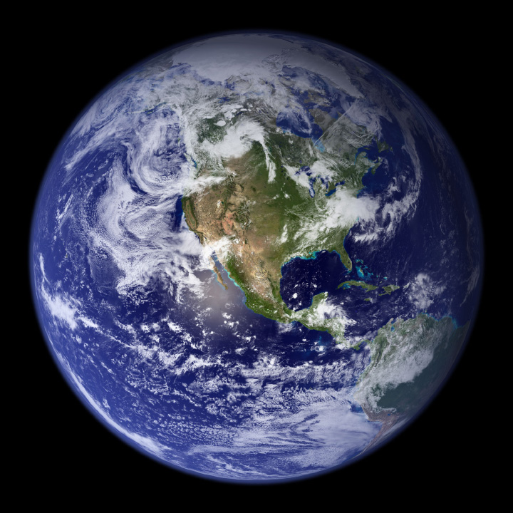
Let me get this out of the way: this was the first NASA image of an entire hemisphere of the Earth made with full-color data since the Apollo 17 crew returned from the Moon. It’s certainly striking, but once you look carefully a number of flaws start to appear. Flaws that I may or may not have pointed out when I described my design process. (I’ll also reiterate Reto Stöckli’s invaluable work building the land and cloud textures, which were the hard parts.)
Nine: Global Net Primary Productivity
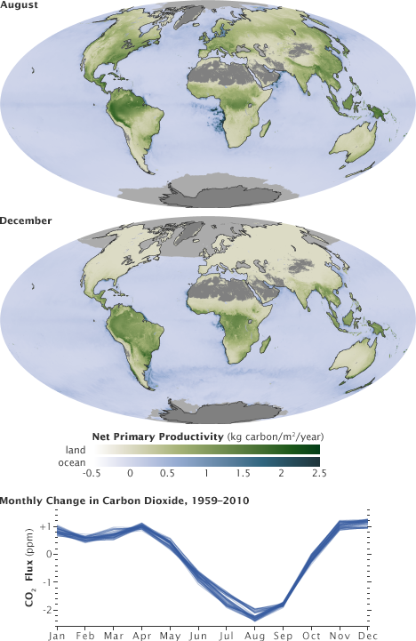
Although these two datasets show the exact same property (net primary productivity, a measure of the amount of carbon the biosphere draws out of the atmosphere) they’re measured in different ways, and deserve to be differentiated. By using palettes with different hues but an identical range of lightness and saturation, they are directly comparable but remain distinct from one another.
Eight: The Landsat Long Swath
[youtube 8nboMGGdXUc]
Shortly after launch, Landsat 8 collected what was probably the single largest satellite image ever made. Roughly 12,000 pixels wide by 600,000 pixels tall the image combined 56 individual Landsat scenes into a single strip from Siberia to South Africa.
Seven: LIDAR
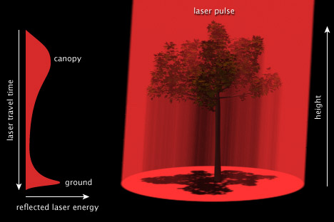
Back when I used to be competent at 3D, I made this illustration showing how a pulse of laser light can measure the structure of a forest canopy.
Six: Air Quality over 16 Megacities
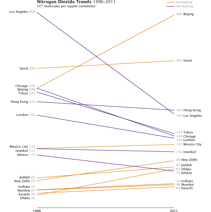
It may just be that I’m enamored with Alberto Cairo, but I’m growing increasingly fond of slope graphs. They occasionally tell stories more clearly than more conventional graph types.
Five: an Erupting Volcano from the International Space Station
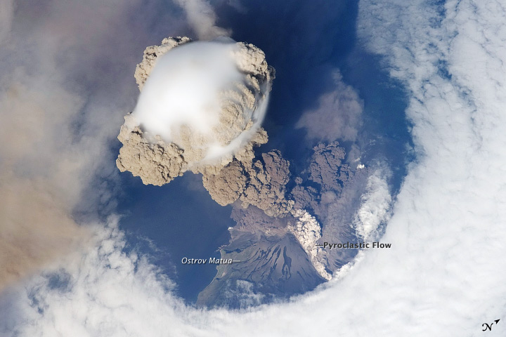
When Sarychev Volcano blasted a column of ash high above the Kuril Islands an astronaut captured not one, but a whole sequence of photographs of the plume. Make sure you look for the pyroclastic flows coursing down the side of the volcano. (The eruption did not blast a hole in the clouds by the way, that’s a result of interactions between wind, clouds, and island topography.)
Four: Faults in Xinjiang
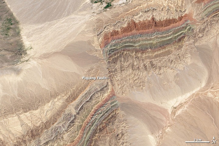
I’ve probably worked on more than 1,000 Landsat images over the course of my career. This scene of offset folds in Xinjian China is the best.
Three: Amazonia
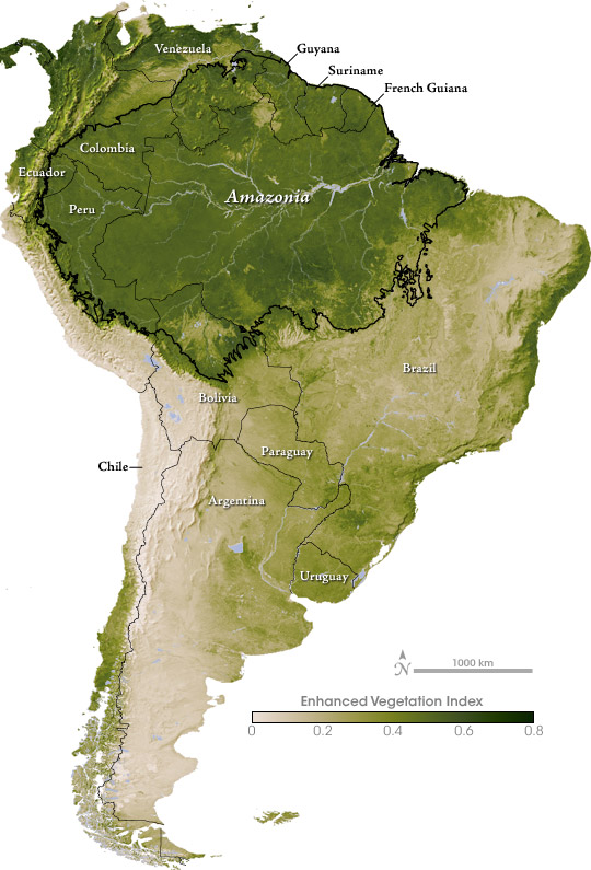
I think this map of vegetation in South America was the first original color palette I really got right.
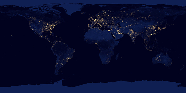
Two: The Original Earth at Night
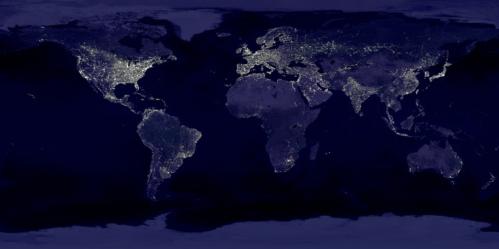
For some reason the color and contrast work better in this version (originally published in 2000 to accompany the story Bright Lights, Big City) than any of my attempted remakes. This includes the 2012 Black Marble, which was made with much better data.
One: Seeing Equinoxes and Solstices from Space
[youtube FmCJqykN2J0]
I’m generally skeptical of animation in data visualization, but for some things motion is the story. I think this applies to the apparent motion of the sun over the course of a year, alternately lighting the North and South Poles. (Apologies for the poor quality of the YouTube compression. Make sure you check out the HD version.)
Finally: Thanks to the NASA family, and to all of you who’ve expressed appreciation for my pictures over the years.
This post was originally published by the Society for News Design for the Malofiej Infographic World Summit.
Palettes aren’t the only important decision when visualizing data with color: you also need to consider scaling. Not only is the choice of start and end points (the lowest and highest values) critical, but the way intermediate values are stretched between them.
Note: these tips apply to scaling of smoothly varying, continuous palettes. For discrete palettes divided into distinct areas (countries or election districts, for example, technically called a choropleth map), read John Nelson’s authoritative post, Telling the Truth.
For most data simple linear scaling is appropriate. Each step in the data is represented by an equal step in the color palette. Choice is limited to the endpoints: the maximum and minimum values to be displayed. It’s important to include as much contrast as possible, while preventing high and low values from saturating (also called clipping). There should be detail in the entire range of data, like a properly exposed photograph.
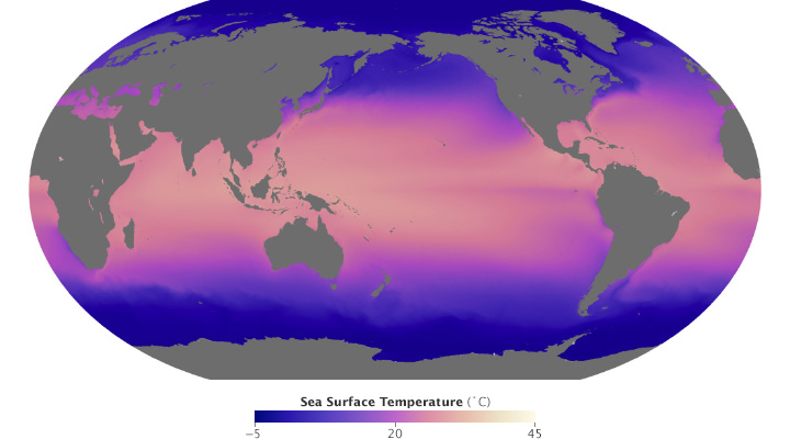
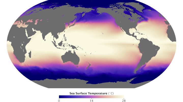
These maps of sea surface temperature (averaged from July 2002 through January 2014) demonstrate the importance of appropriately choosing the range of data in a map. The top image varies from -5˚ to 45˚ Celsius, a few degrees wider than the bounds of the data. Overall it lacks contrast, making it hard to see patterns. The lower image ranges from 0˚ to 28˚ Celsius, eliminating details in areas with very low or very high temperatures. (NASA/MODIS.)
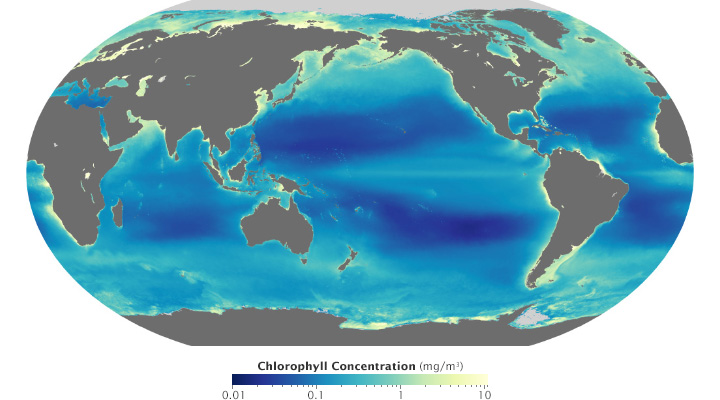
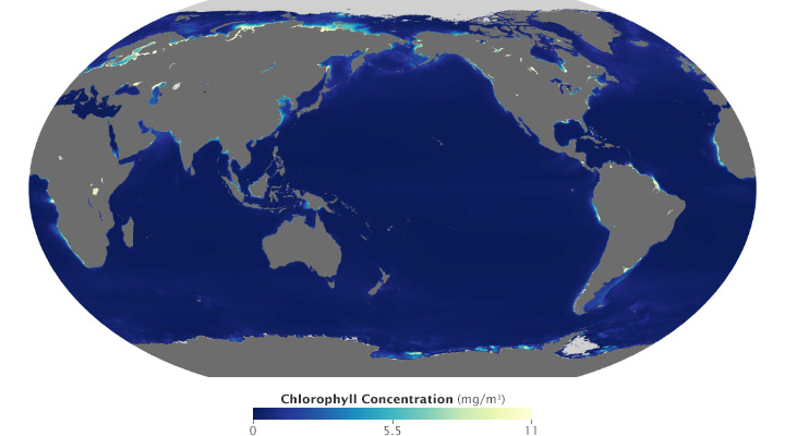
Ocean chlorophyll (a measure of plant life in the oceans) ranges from hundredths of a milligram per cubic meter to tens of milligrams per cubic meter, more than 3 orders of magnitude. Both of these maps use the almost same endpoints from near 0 (it’s impossible to start a logarithmic scale at exactly 0) to 11. Plotted linearly, the data show a simple pattern: narrow bands of chlorophyll along coastlines, and none in mid-ocean. A logarithmic base-10 scale reveals complex structures throughout the oceans, in both coastal and deep water. (NASA/MODIS.)
Some visualization applications support logarithmic scaling. If not, you’ll need to apply a little math to the data (for example calculate the square root or base 10 logarithm) before plotting the transformed data.
Appropriate decisions while scaling data are a complement to good use of color: they will aid in interpretation and minimize misunderstanding. Choose a minimum and maximum that reveal as much detail as possible, without saturating high or low values. If the data varies over a very wide range, consider a logarithmic scale. This may help patterns remain visible over the entire range of data.
(Repost of an article on the Exelis Vis Imagery Speaks blog.)
One of the most interesting new capabilities of the NOAA/NASA/DoD Suomi-NPP satellite is the Day-Night Band. These detectors, part of the Visible Infrared Imaging Radiometer Suite (VIIRS), are sensitive enough to image Earth’s surface by starlight. The Day Night Band is both higher resolution and up to 250 times more sensitive than its ancestor, the DMSP Operational Linescan System (OLS).
Applications of the Day Night Band include monitoring warm, low-level clouds, urban lights, gas flares, and wildfires. Long-term composites reveal global patterns of infrastructure development and energy use.
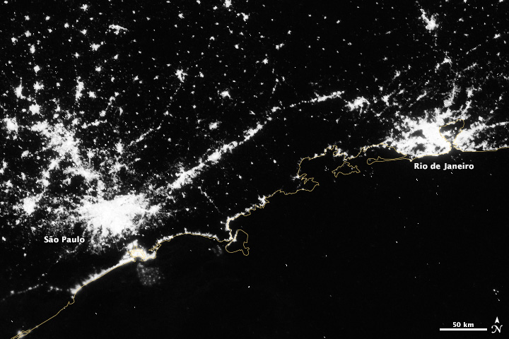
Over shorter times scales (Suomi-NPP completes an orbit every 100 minutes or so) multiple Day Night Band scenes stitched together show a snapshot of the Earth at night, like this view of South America, including the 14 Brazilian World Cup cities.
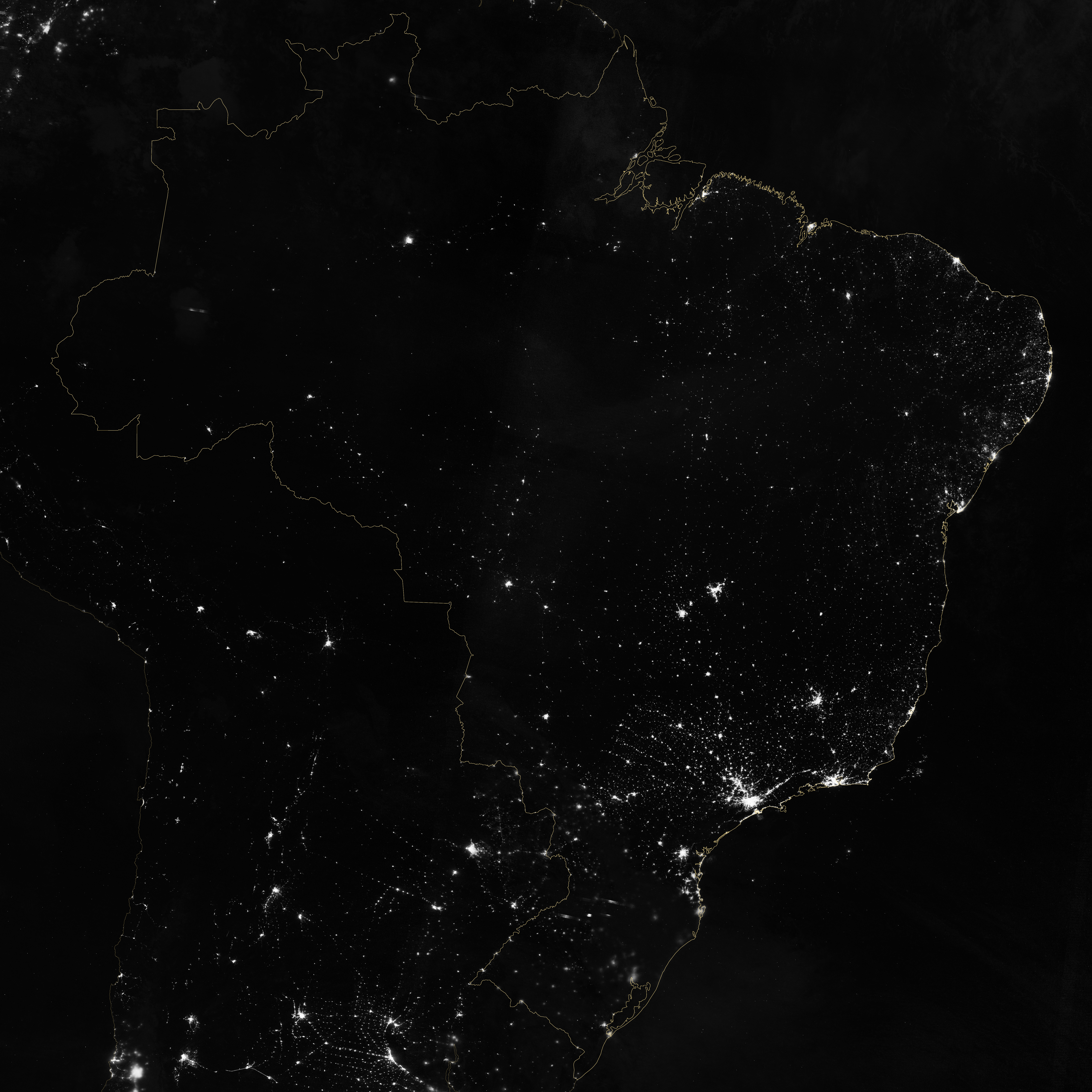
Marit Jentoft-Nilsen and I used a number of software tools to read, stitch, project, and visualize the data, starting with a handful of HDF5 files. VIIRS data is aggregated into granules, each acquired over 5 minutes. These files are distributed, archived, and distributed by NOAA’s CLASS (the Comprehensive Large Array-data Stewardship System). To deal with the unique projection of VIIRS, I used ENVI’s Reproject GLT with Bowtie Correction function to import the data. (If you’re unfamiliar with VIIRS data, now’s a good time to read the Beginner’s Guide to VIIRS Imagery Data (PDF) by Curtis Seaman of CIRA/Colorado State University.)
So far so good. Of course the data is in Watts per square meter per steradian, and the useful range is something around 0.0000000005 to 0.0000000500. With several orders of magnitude of valid data, any linear scale that maintained detail in cities left dim light sources and the surrounding landscape black. And any scaling that showed faint details left cities completely blown out.
To make the data more manageable, show detail in dark and bright areas, and allow export to Photoshop I did a quick band math calculation: UINT(SQRT((b1+1.5E-9)*4E15)*(SQRT((b1+1.5E-9)*4E15) lt 65535) + (SQRT((b1+1.5E-9)*4E15) ge 65535)*65535)
It looks a bit complicated, but it’s not too bad. It adds an offset to account for some spurious negative values; multiplies by a large constant to fit the data into the 65,536 values allowed in a 2-byte integer file; calculates the square root to improve contrast, sets any values above 65,535 to 65,535; then converts from floating point to unsigned integer. This data can be saved as a 16-bit TIFF readable by just about any image processing program, while maintaining more flexibility than an 8-bit file would.
The final steps were to bring the TIFF into Photoshop, tweak the contrast with levels and curves adjustments to bring out as much detail as possible, add coastlines and labels, and export for the web. The result: Brazil at Night published by the NASA Earth Observatory on the eve of the World Cup.
Last week I had the privilege of helping judge the 22nd Malofiej Awards. Presented by the Spanish Chapter of the Society for News Design, Malofiej 22 recognized the best news infographics of 2013. (For the uninitiated, infographics aren’t limited to those posters illustrating tenuously related facts with a handful of pie charts. A good infographic is an information-rich visual explanation; often incorporating illustration and text, but sometimes they’re as simple as a line graph.)
My fellow jurors for the online competition were an eclectic and brilliant bunch: Anatoly Bondarenko, interactive visualization designer for Texty (a Ukrainian guerrilla news site); Scott Klein, news applications editor at ProPublica, Golan Levin, artist & professor at Carnegie Mellon University; and Sérgio Lüdtke, journalist and professor of digital journalism at the International Institute of Social Sciences. (Good thing I didn’t read these bios before heading to Spain: I would have been more intimidated than I already was.)
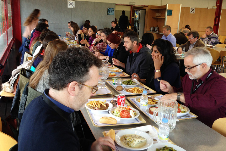
A traditional Spanish lunch for the Malofiej jurors and student volunteers.
For four days we evaluated, discussed, and sometimes argued about 400 or so online visualizations. We first narrowed the field down to about 100, then selected 8 gold, 24 silver, and 39 bronze medals (assuming I counted right). It was interesting to me that we largely liked (and disliked) the same entries, but often for different reasons. This led to several “ah ha” moments, when I suddenly appreciated a new perspective on a figure.
Instead of writing about the golds, which have already garnered their fair share of praise, here are some of my favorite silver and bronze winners.
Silver
China’s Memory Hole: The Images Erased From Sina Weibo (ProPublica)
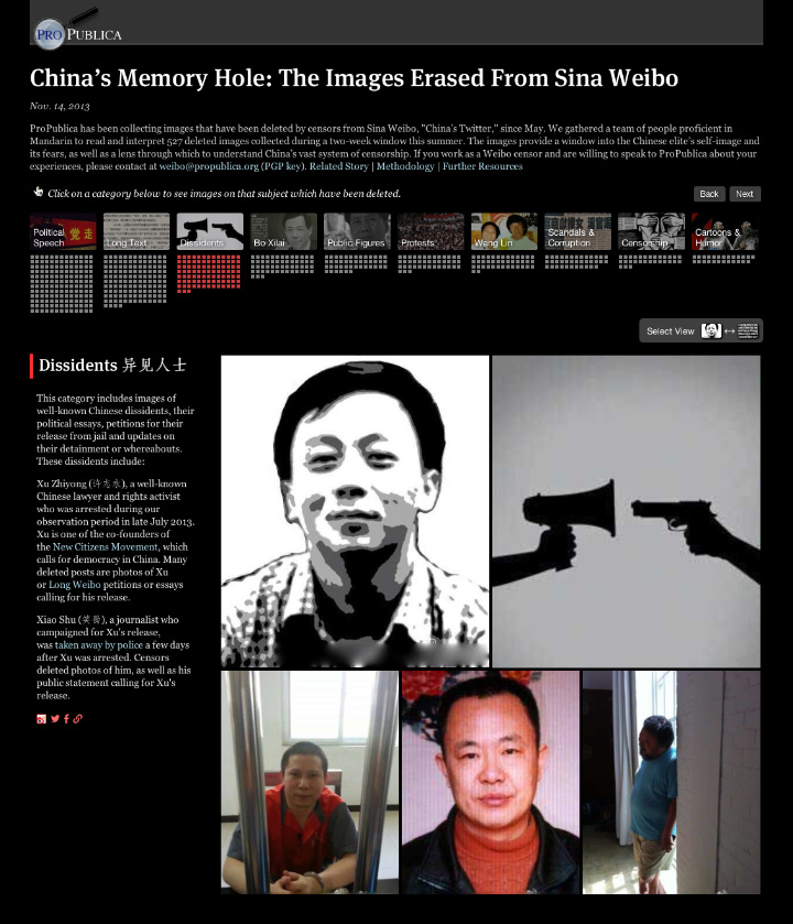
The beauty of this piece is that the images are the data: images censored from Weibo, a Chinese service similar to Twitter.
Bronze
Electionland (Zeit Online)
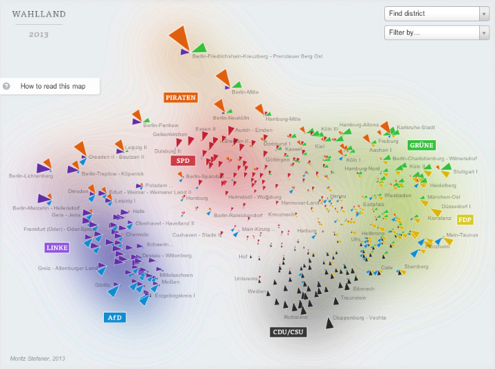
I have a few quibbles about this map of the 2013 German Bundestag elections, but it’s a brilliant bit of data crunching and abstraction. Voting districts are positioned based on the similarity of their voting patterns, rather than geography.
Bronze
The federal health-care exchange’s abysmal success rate (The Washington Post)
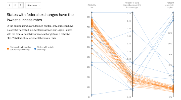
It’s a slope graph, what more do I need to say?
Of course, if you’re on the Malofiej jury picking awards is the easy part. You’re then on the hook to give a talk to some of the best designers and data visualizers in the world.
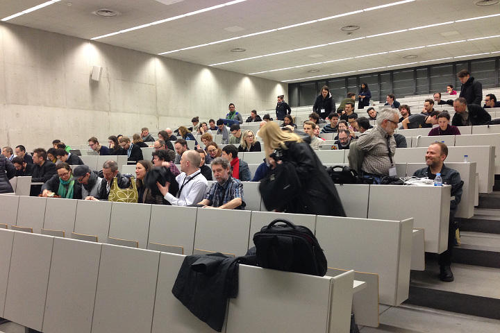
The Malofiej audience.
Jonathan Corum (Two Little Ducks) and Anatoly Bondarenko (Texty on Malofiej-22) gave two of the standouts.
Phew. What a long, exhausting, tremendously rewarding week.
Finally, I’d like to personally thank the student volunteers that functioned as tour guides, travel agents, translators, and personal assistants. They also made sure the online jury got our fair share of chocolate croissants, showed us the best pintxos bars in Pamplona, and even provided tips on surviving a run with the bulls [train, wear white, and run sober (which should’t be that hard, considering it starts at 8:00 a.m.!)]: Carmen Guitián, Alicia Arza, Ann Radjassamy, Beatriz Ciordia, Carmen Arroyo, Carmen Camey, Gabriela Suescum, Kristina Votrubová, Lucía Pérez, Andrés Juárez, Leire Emparanza, María Elena Quiñonero, Mariu Tena, and Alicia Alamillos.
Gracias.
Since its launch in February 2013, Landsat 8 has collected about 400 scenes of the Earth’s surface per day. Each of these scenes covers an area of about 185 by 185 kilometers (115 by 115 miles)—34,200 square km (13,200 square miles)—for a total of 13,690,000 square km (5,290,000 square miles) per day. An area about 40% larger than the united states. Every day.
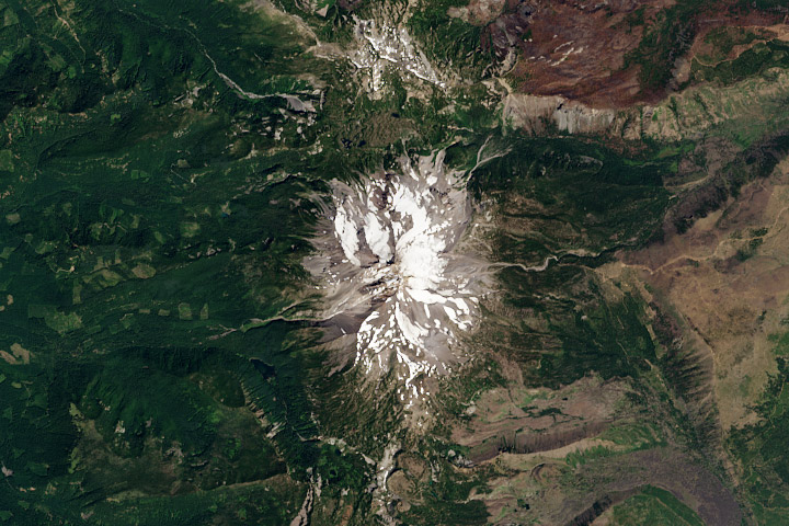
Mount Jefferson, Oregon. True-color Landsat 8 image collected August 13, 2013.
Although it’s possible to process all that data automatically, it’s best to process each scene individually to bring out the detail in a specific region. Believe it or not, this doesn’t require any tools more specialized than Photoshop (or any other image editing program that supports 16-bit TIFF images, along with curve and level adjustments).
The first step, of course, is to download some data. Either use this sample data (184 MB ZIP archive) of the Oregon Cascades, or dip into the Landsat archive with my tutorial for Earth Explorer. The data are comprised of 11 separate image files, along with a quality assurance file (BQA) and a text file with metadata (date and time, corner points—that sort of thing). These arrive in a ZIPped and TARred archive. (Windows does not natively support TAR, so you may need to use something like 7-Zip to unpack the files. OS X can automatically uncompress the files (with default settings) when the archive is downloaded—double-click to unpack the TAR.) Inexplicably, the TIFFs aren’t compressed. [The patent on the LZW lossless compression algorithm (which is transparently supported by Photoshop and many other TIFF readers) expired about a decade ago.]
After you’ve extracted the files, you’ll have a somewhat cryptically-named directory [i.e. “LC80450292013225LGN00” (download sample data) (184 MB ZIP archive)] with the three band files in it (B2, B3, B4):
LC80450292013225LGN00_B1.TIF
LC80450292013225LGN00_B2.TIF
LC80450292013225LGN00_B3.TIF
LC80450292013225LGN00_B4.TIF
LC80450292013225LGN00_B5.TIF
LC80450292013225LGN00_B6.TIF
LC80450292013225LGN00_B7.TIF
LC80450292013225LGN00_B8.TIF
LC80450292013225LGN00_B9.TIF
LC80450292013225LGN00_B10.TIF
LC80450292013225LGN00_B11.TIF
LC80450292013225LGN00_BQA.TIF
LC80450292013225LGN00_MTL.txt
I’ve highlighted the three bands needed for natural-color (also called true-color, or photo-like) imagery: B4 is red (0.64–0.67 µm), B3 is green (0.53–0.59 µm), B2 is blue (0.45–0.51 µm). (The complete scene data can be downloaded using Earth Explorer.)
I prefer using the red, green, and blue bands because natural-color imagery takes advantage of what we already know about the natural world: trees are green, snow and clouds are white, water is (sorta) blue, etc. False-color images, which incorporate wavelengths of light invisible to humans, can reveal fascinating information—but they’re often misleading to people without formal training in remote sensing. The USGS also distributes imagery they call “natural color,” using shortwave infrared, near infrared, and green light. Although the USGS imagery superficially resembles an RGB picture, it is (in my opinion) inappropriate to call it natural-color. In particular, vegetation appears much greener than it actually is, and water is either black or a wholly unnatural electric blue.
Even natural-color satellite imagery can be deceptive due to the unfamiliar perspective. Eduard Imhof, a Swiss cartographer active in the mid Twentieth Century, wrote*:
(A)erial photographs from great heights, even in color, are often quite misleading, the Earth’s surface relief usually appearing too flat and the vegetation mosaic either full of contrasts and everchanging (sic) complexities, or else veiled in a gray-blue haze. Colors and color elements in vertical photographs taken from high altitudes vary by a greater or lesser extent from those that we perceive as natural from day to day visual experience at ground level.
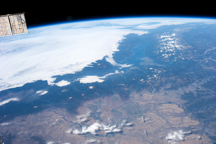
Seen from above, the Earth’s surface is made brighter and bluer by the atmosphere (compare the hue of the clouds to the hue of the panels on the International Space Station). (Astronaut Photograph ISS037-E-001180)
Because of this, satellite imagery needs to be processed with care. I try to create imagery that matches what I see in my mind’s eye, as much or more than a literal depiction of the data. Our eyes and brains are inextricably linked, after all, and what we see (or think we see) is shaped by context.
Enough theory. To build a natural-color image, open the three separate files in Photoshop:
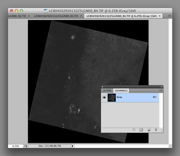
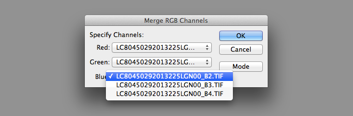
You’ll end up with three grayscale images, which need to be combined to make a color image. From the Channels Palette (accessed through Photoshop’s Windows menu item) select the Merge Channels command (click on the small downward-pointing triangle in the upper-right corner of the palette).
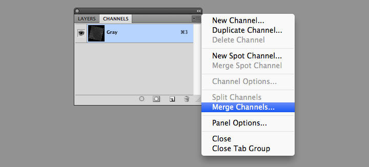
Then change the mode from Multichannel to RGB Color in the dialog box that appears. Set band B4 as red, B3 as green, and B2 as blue.
This will create a single RGB image, which will be dark. Very dark:
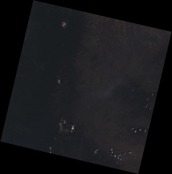
The raw Landsat 8 scene is so dark because it’s data, not merely an image: the numbers represent the precise amount of light reflected from the Earth’s surface (or a cloud) in each wavelength, a quantity called reflectance. To encode this information in an image format, the reflectance is scaled, and the range of values found in the data are smaller than the full range of values in a 16-bit image. As a result the images have low contrast, and only the brightest areas are visible (much of the Earth is also quite dark relative to snow or clouds—I’ll explain why that matters later).
As a result, the images need to be contrast enhanced (or stretched) with Photoshop’s levels and curves functions. I use adjustment layers, a feature in Photoshop that applies enhancements to a displayed image without modifying the underlying data. This allows a flexible, iterative approach to contrast stretching.
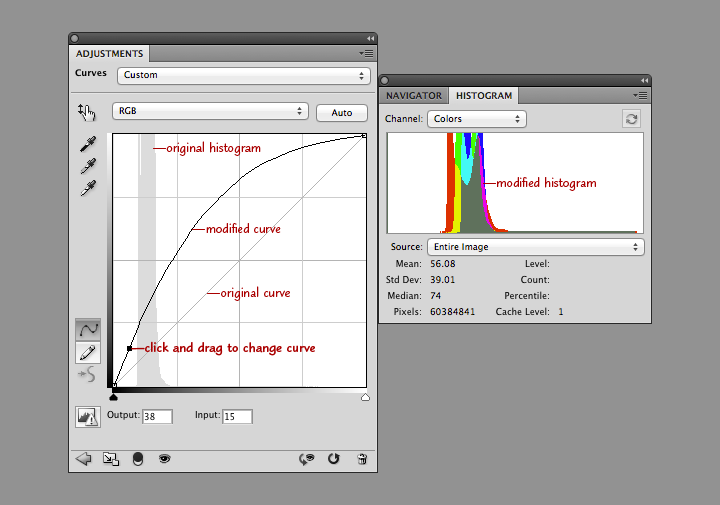
The first thing to do after creating the RGB composite (after saving the file, at least) is to add both a Levels adjustment layer, and a Curves adjustment layer. You add both adjustment layers from the Layer Menu (just hit OK to create the layer): Layer > New Adjustment Layer > Levels… and Layer > New Adjustment Layer > Curves…
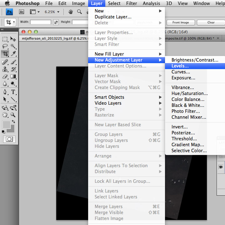
Levels and curves adjustments both allow manipulation of the brightness and contrast of an image, just in slightly different ways. I use both together for 16-bit imagery since the combination gives maximum flexibility. Levels provides the initial stretch, expanding the data to use the full range of values. Then I use curves to fine-tune the image, matching it to our nonlinear perception of light.
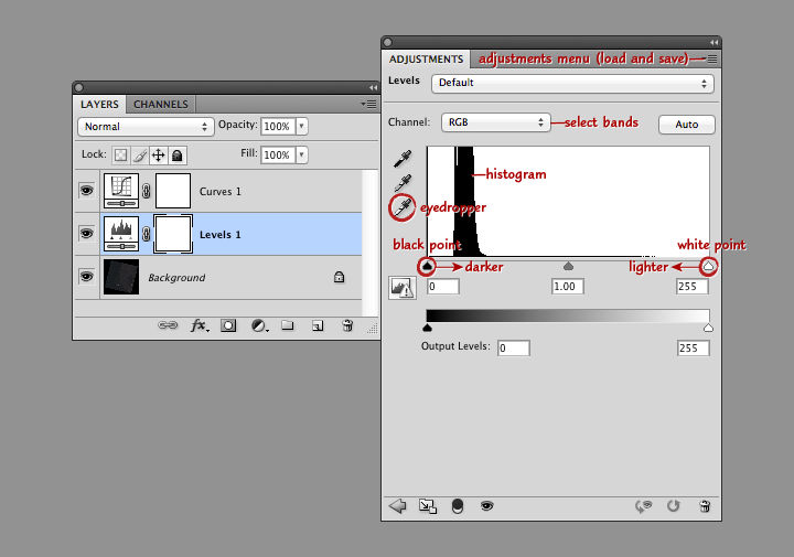
This screenshot shows Photoshop’s layers palette (on the left) and a levels adjustment layer (right). From top to bottom: the adjustment menu allows you to save and load presets; the channel menu allows you to select the individual red, green, and blue bands; the histogram shows the relative distribution of light and dark pixels (the higher the bar the more pixels share that specific brightness level); the white eyedropper sets the white point of the red, green, and blue channels to the values of a selected pixel (select a pixel by clicking on it); and the black point and white point sliders adjust the contrast of the image.
Move the black point slider right to make the image darker, move the white point slider left to make the image lighter. (Important: any parts of the histogram that lie to the left of the black point slider or to the right of the white point slider will be solid black or solid white. Large areas of solid color don’t look natural, so make sure only a small number of pixels are 100% black or white). Combined black point and white point adjustments make the dark parts of an image darker, and the light parts lighter. The process is called a “contrast stretch” or “histogram stretch” (since it spreads out the histogram).
With a Landsat image, we want to do a contrast stretch to make the image brighter and reveal detail. The first step is to select the white eyedropper (the bottom of the three eyedropper icons on the left edge of the Levels Palette), and find an area of the brightest area of the image that we know is white: a puffy cloud, or even better, pristine snow. In general the brightest side of a cloud (or mountain, if you have snow) will be facing southeast in the Northern Hemisphere, east in the tropics, and northeast in the Southern Hemisphere. (This is simply because Landsat collects imagery at about 10:30 in the morning, and the Sun is still slightly to the east of the satellite.) If there are no clouds or snow, a salt pan or even a white rooftop would be a good alternative.
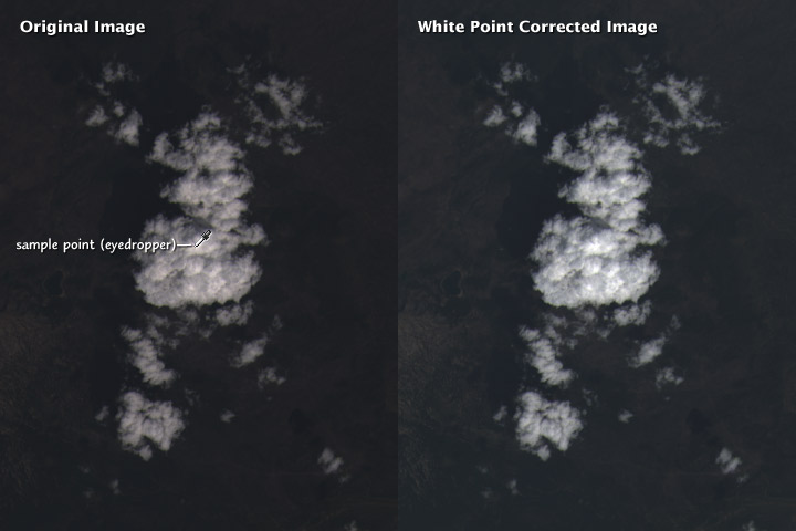
Setting the white point does two things: the brightest handful of pixels in the image are now as light as possible, and the scene is partially white balanced. This means that the white clouds appear pure white, and not slightly tinted. Slight differences in the characteristics of the different color bands, combined with scattering of blue light by the atmosphere, can add an overall tint to the image. Ordinarily our brain does this for us (a white piece of paper looks white whether it’s lit by the sun at noon, a fluorescent light, or a candle), but satellite imagery needs to be adjusted. As do photographs: digital cameras have white balance settings, and film type effects the white balance in an analog camera.
It’s possible to automate white balancing (Photoshop has a handful of algorithms, accessed by option-clicking the auto button in the levels and curves adjustment layer windows) but I find hand-selecting an appropriate area to work best.
After white balancing, the histograms of the red, green, and blue channels in the Mount Shasta image look like this:
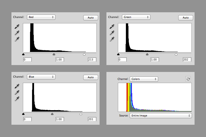
Notice that the value of white in each channel is slightly different (213, 202, and 201), and that there’s a small number of pixels above the white point in each channel. The combined RGB histogram makes it easier to see the differences between channels.
The histogram also shows that most of the image is still dark: there’s a sharp peak from about 10 to 20 percent brightness, with few values in the middle tones, and even fewer bright pixels. This is typical in a heavily forested region like the Cascades. The next step is to brighten the entire image (at least brighten it enough to make further adjustments).
In the curves adjustment layer, click near the center of the line that runs at a 45˚ angle from lower left to upper right. This will add an adjustment point with which to modify the curve. When it’s straight, no adjustments are made. When it’s above 45˚ the image will be brighter, and when it’s below it will be darker. Steeper parts of the line result in more contrast in those tones, while where the line is flatter it will compress the brightness range of the image. Dragging the curve to the left and down brightens the image overall, but dark areas are brightened more than lighter ones. This reveals details in the land surface, and makes clouds look properly white, instead of gray.
Take a look at the combined histogram (open the Histogram Palette by selecting Window > Histogram from Photoshop’s menu bar): it’s easy to see that the darkest areas of the image aren’t black, and that the minimum red values are lower than the minimum green values, which are lower than the minimum blue values.
There’s no true black in a Landsat 8 image for three reasons. First, Landsat reflectance data are offset—a pixel with zero reflectance is represented by a slightly higher 16-bit integer (details: Using the USGS Landsat 8 Product). That is, if there were any pixels with zero reflectance. Very little (if any at all) of the Earth’s surface is truly black. Even if there was, light scattered from the atmosphere would likely lighten the pixel, giving it some brightness. (Landsat 8 reflectance data are “top of atmosphere”—the effects of the atmosphere are included. It’s possible, but very difficult in practice, to remove all the influence of the atmosphere.)
Shorter wavelengths (blue) are scattered more strongly than longer wavelengths (red), so the satellite images have an overall blue cast. This is especially apparent in shadowed regions, where the atmosphere (i.e. blue light from the sky) is lighting the surface, not the sun. We think of shadows as black, however, so I think it’s best to remove most of the influence of scattered light (a little bit of the atmospheric influence was already removed by choosing a white point) by adjusting the black points in each channel.
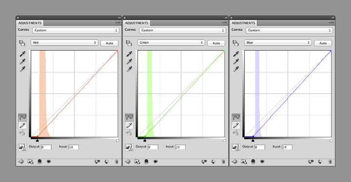
You can change the curves separately for each channel by selecting “Red”, “Green”, or “Blue” from a drop-down menu (initially labelled “RGB”) in the Curves adjustments palette. Starting with the red channel, drag the point at the lower-left towards the right, until it’s 2 or 3 pixels away from the base of the histogram. Repeat with green and blue, but leave a bit more space (an additional 1 or 2 pixels for green, and 3 or 4 for blue) between the black point and base of the histogram. This will prevent shadows from becoming pure black, with no visible details, and leave a slight blue cast, which appears natural.
Like so:
The image is now reasonably well color balanced, and the clouds look good, but the surface is (again) dark. At this point it’s a matter of iteration. Tweak the RGB curve, maybe with an additional point or three, then adjust the black points as necessary. Look at the image, repeat. I find it helpful to walk away every once in a while to let my eyes relax, and reset my innate color balance: if you stare at one image for too long it will begin to look “right”, even with a pronounced color cast.
I sometimes find it helpful to find photographs of a location to double-check my corrections, either with a generic image search or through a photography archive like flickr. It helps give me a sense of what the ground should look like, especially for places I’ve never been. Keep in mind, however, that things look different for above. In an arid, scrub-covered landscape, for example, a ground-level photograph will show what appears to be nearly continuous vegetation cover. From above, the spaces between individual bushes and trees are much more apparent.
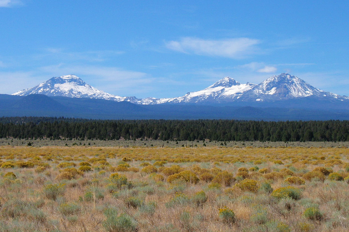
The Three Sisters Volcanoes from the ground. Scattering in the atmosphere between the photographer and the distant mountains causes them to appear lighter, bluer, and fuzzier than the brush in the foreground. In views from space, the entire image will be affected in a similar way. ©2006 Robert Tuck.
Try to end up with an RGB curve that forms a smooth arch: any abrupt changes in slope will cause discontinuities in the contrast of the image. Don’t be surprised if the curve is almost vertical near the black point, and almost flat near the white point. That stretches the values in the shadows and in dark regions, and compresses them in the highlights. This enhances details of the surface, and makes clouds look properly white. (If there’s too much contrast in clouds they’ll look gray.)
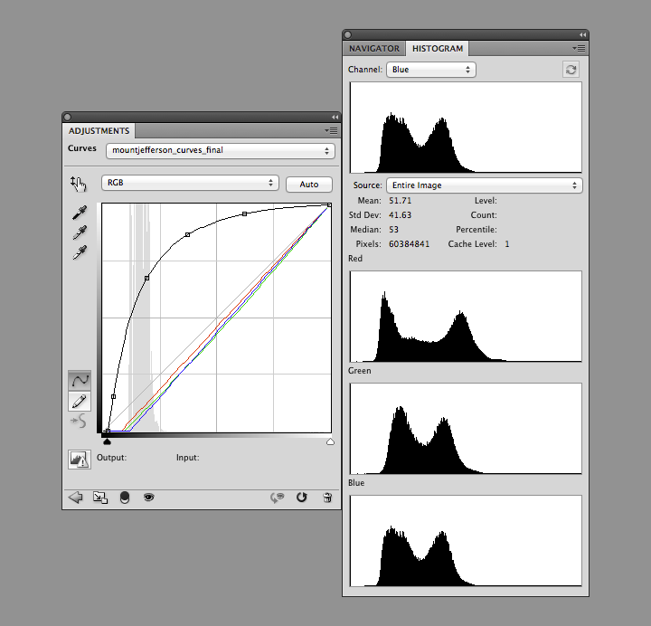
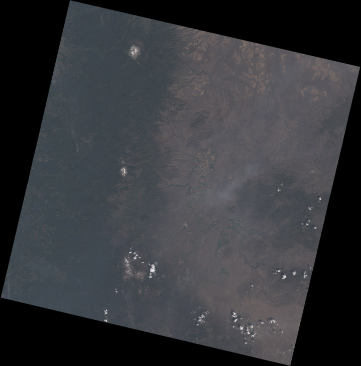
Notice how each of the bands have two distinct peaks, and most of the histogram (select All Channels View to see separate red, green, and blue channels) is packed into the lower half of the range. The bimodal distribution is a result of the eastern Oregon landscape being split into two distinct types: the dark green forests of the Cascades, and the lighter, high-altitude desert in the mountain’s rain shadow. The skew towards dark values is a compromise. I sacrificed some detail in the forest and left the desert a little dark, to bring out features in the clouds. If I was focusing exclusively on a cloud-free region, the peaks in the histogram would be more widely distributed. Fortunately Landsat 8’s 12-bit data provides a lot of flexibility—adjustments can be quite aggressive before there’s noticeable banding in the image.
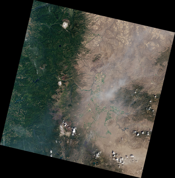
The full image has a challenging range of features: smoke, haze, water, irrigated fields (both crop-covered and fallow), clearcuts, snow, and barren lava flows, in addition to forest, desert, and clouds. The color adjustments are a compromise, my attempt to make the image as a whole look appealing.
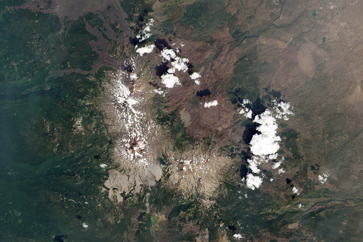
Some areas of the image (the Three Sisters) look good, even close up (half-resolution, in this case). But others are washed-out:
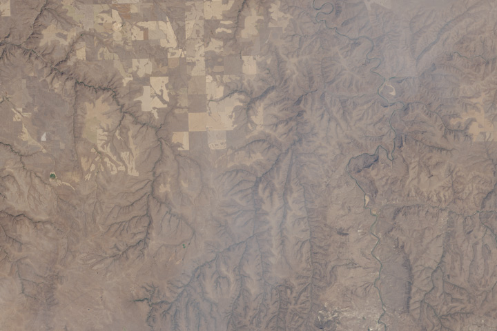
I’d use a different set of corrections if I was focused on this area (and probably select a scene without smoke, which is visible in the center of this crop).
These techniques can also be applied to data from other satellites: older Landsats, high-resolution commercial satellites, Terra and Aqua, even aerial photography and false-color imagery. Each sensor is slightly (or more than slightly) different, so you’ll probably use different techniques for each one.
To practice, download a true color TIFF of this Landsat scene [(450 MB) right-click to download, you do not want to open it in your browser] with my levels and curves, or pick your own scene from the USGS Earth Explorer (use my guide if you need help ordering the data).
If you’re interested in different perspectives on creating Landsat images, Tom Patterson, a cartographer with the National Park Service, has an excellent tutorial. Charlie Loyd, of MapBox, has a pair of posts detailing Landsat 8’s bands, and a method for using open-source tools to make Landsat images.
* Here’s the full Eduard Imhof quotation:
Complete fidelity to natural color can not be achieved in a map. Indeed, how can it be when there is no real consistency in the natural landscape, which offers endless variations of color? For example, one could consider the colors seen while looking straight down from an aircraft flying at great altitude as the model for a naturalistic map image. But aerial photographs from great heights, even in color, are often quite misleading, the Earth’s surface relief usually appearing too flat and the vegetation mosaic either full of contrasts and everchanging complexities, or else veiled in a gray-blue haze. Colors and color elements in vertical photographs taken from high altitudes vary by a greater or lesser extent from those that we perceive as natural from day to day visual experience at ground level.
The faces of nature are extremely variable, whether viewed from an aircraft or from the ground. They change with the seasons and the time of day, with the weather, the direction of views, and with the distance from which they are observed, etc. If the completely “lifelike” map were produced it would contain a class of ephemeral—even momentary—phenomena; it would have to account for seasonal variation, the time of day and those things which are influenced by changing weather conditions. Maps of this type have been produced on occasion and include excursion maps for tourists, which seek to reproduce the impression of a winter landscape by white and blue terrain and shading tones. Such seasonal maps catch a limited period of time in their colors.
—Eduard Imhof, Cartographic Relief Presentation, 1965 (English translation 1982).
Drew Skau and I have received a few comments on Subtleties of Color that deserve to be included. (By the way, don’t be shy. You can leave a comment here or at visual.ly)
Naomi B. Robbins demonstrated that the standard land cover classification palette fails for color-deficient viewers. She also pointed out that “color-deficient” is the correct term to use, not “color-blind”. (Robbins is an expert in graphical data presentation who leads her own consulting firm, NBR, tweets from @nbrgraphs, and has blogged for Forbes.)
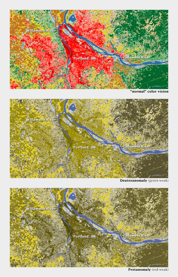
Color-deficient viewers would likely confuse red urban areas with green forests, not to mention tan scrub, in this land cover classification map of the Portland area.
Robbins is absolutely right, and I don’t think there’s an easy answer—even the Geological Survey, with its rich history of cartography, has problems displaying more than a handful of categories on a single map.
On an encouraging note, Mike Bostock sent examples (via Twitter: @mbostock) of CIE L*C*h color palettes dynamically generated by D3.js. In a web browser. (D3.js is a library that enables dynamic, interactive display of everything from time series to networks to maps. For those of us who began our careers 3 days before Netscape Navigator came out of beta, this is astonishing. Bostock created it.)
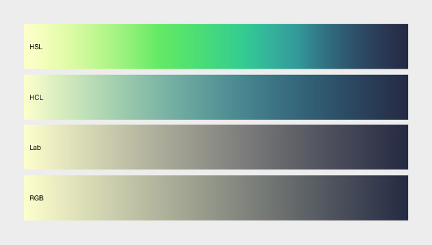
Comparison of color ramps generated with D3.js in hue, saturation, lightness (HSL, non-perceptual); hue, chroma, lightness (HCL, perceptual); L*a*b, (Lab, perceptual); and red, green, blue (RGB, non-perceptual). D3.js allows both the selection of start and end points and interpolation in perceptual color spaces.
Here’s an example of a palette applied to a grayscale image of topography by d3.js:
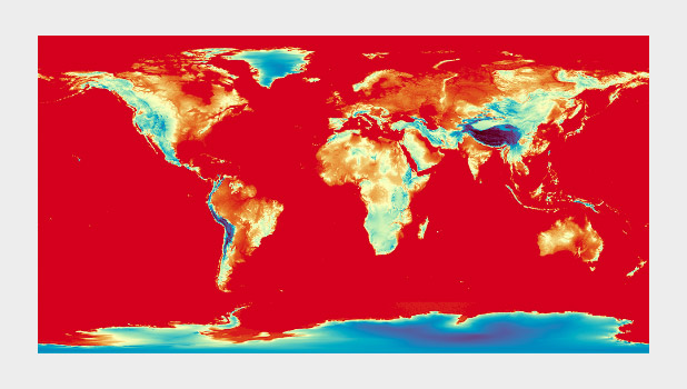
A divergent color map from D3.js (reminiscent of Color Brewer’s Spectral palette) used to display global topographic data. I do not usually recommend using a divergent palette to show sequential data, but this map cleverly uses the breakpoint (light yellow) to show median elevation. (It’s still a bit bright & saturated for my taste, though.)
I’ll post more comments if and when I get them.
Subtleties of Color
Part 1: Introduction
Part 2: The “Perfect” Palette
Part 3: Different Data, Different Colors
Part 4: Connecting Color to Meaning
Part 5: Tools & Techniques
Part 6: References and Resources for Visualization Professionals
References and Resources for Visualization Professionals
The previous posts are my personal take on using color in visualization. I hope my perspective is useful, but it’s primarily a synthesis of the work of others. Here’s a list of the sources that inspired and informed this series. If you don’t have the time or the inclination to sort through the whole set, I think these three resources are essential: Colin Ware’s Information Visualization: Perception for Design, which has several sections on vision, light, and color; The “Color and Information” chapter in Edward Tufte’s Envisioning Information, and the supplementary information in Cynthia Brewer’s ColorBrewer tool.
Artists
Artists (particularly painters) have long been concerned, possibly better described as obsessed, with color. Two Twentieth-Century classics stand out: Johannes Itten’s The Elements of Color and Josef Albers’ The Interaction of Color. Itten’s text focuses on color theory (including a somewhat outdated explanation of the physiology of color perception) and the mixture of pigments.
The Interaction of Color is centered around a series of exercises performed with colored paper (replicated in an iPad app developed by Yale University) a concrete demonstration of simultaneous contrast, simulated transparency, and perceptual versus mathematical use of color. It’s the definitive guide to the relativity of color.
Bruce MacEvoy’s web site is primarily about painting with watercolors, and has outstanding sections on color theory and color vision.
Cartographers
As I’ve mentioned several times in this series, cartographers were communicating with color long before the term “data visualization” was coined.
Eduard Imhof’s Cartographic Relief Presentation explains the theory and meticulous craft applied to Swiss topographic maps (zoom in). The book covers the use of color to denote elevation and how to layer information by carefully controlling hue, saturation, and lightness.
Tom Patterson, a cartographer with the National Park Service, updates Imhof’s ideas on Shaded Relief: Ideas and Techniques about Relief Presentation on Maps. This web site shows how to use modern techniques and data to replicate classic map designs. I find The Development and Rationale of Cross-blended Hypsometric Tints (PDF) particularly fascinating. It describes Patterson’s technique of using two color palettes to denote elevation on a single map: one optimized for arid areas, the other for humid ones.
Relief Shading covers similar ground, with a straightforward section on color.
In addition to developing Color Brewer, Cynthia Brewer has written two books relevant to color and visualization. Designing Better Maps: A Guide for GIS Users is a how-to guide. Its companion volume, Designed Maps: A Sourcebook for GIS Users teaches by example, showcasing well-designed maps, and describing why they are effective.
Designers
Written in 1967, Jacques Bertin’s Semiology of Graphics laid out what may have been the first comprehensive, perception-based theory of visualization. The section on color is short, but essential.
Edward Tufte may be dogmatic, perhaps even a bit curmudgeonly, but he makes an elegant case for his point of view. The chapter on color in Envisioning Information is dense and convincing, packing an entire textbook’s worth of information into 16 pages.
Maureen Stone’s A Field Guide to Digital Color could probably fit in any one of these categories. It covers everything from color theory, the physiology of vision, color management, and data visualization.
Scientists Studying Vision, Perception, and Visualization
As I’ve hopefully made clear, a perceptual approach to color in data visualization isn’t a matter of aesthetics or personal taste: it’s based on research into human vision and understanding. Here are some of the papers and books I’ve found most helpful.
Borland and Taylor Rainbow Color Map (Still) Considered Harmful Key quote: “The rainbow color map confuses viewers through its lack of perceptual ordering, obscures data through its uncontrolled luminance variation, and actively misleads interpretation through the introduction of non-data-dependent gradients.”
Penny Rheingans Task-based Color Scale Design (zipped PDF) Key Quote: “There are no hard and fast rules in the design of color scales. … The actual answers must come from the visualization designer after consideration of relevant factors, and perhaps with a bit of divine inspiration. In the end, the true test of the value of a color scale is simply ‘Does it work?’”
Bernice Rogowitz and Lloyd Treinish authored two key papers in the 1990s: How NOT to Lie with Visualization and Why Should Engineers and Scientists Be Worried About Color? Key quote: “At the core of good science and engineering is the careful and respectful treatment of data.”
Spence, et al. Using Color to Code Quantity in Spatial Displays (PDF) Key quote: “Linear variation in brightness and saturation facilitates simple tasks such as magnitude estimation or paired comparisons, and the addition of hue enhances performance with more complex cognitive tasks.”
Colin Ware: Color Sequences for Univariate Maps: Theory, Experiments, and Principles (PDF) Key quote: “In general, the form information displayed in a univariate map is far more important than the metric information. Absolute quantities are well represented in a table, whereas maps gain their utility from their ability to display the ridges and valleys, cusps, and other features.”
Ware’s two books, Information Visualization: Perception for Design and Visual Thinking for Design are also excellent resources. Information Visualization is more thorough, Visual Thinking for Design is more concise.
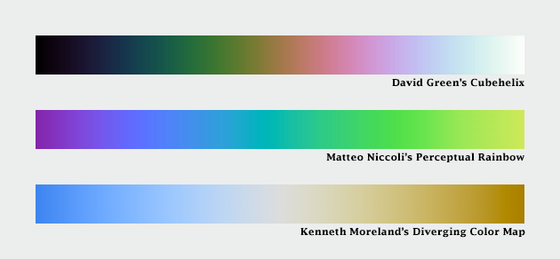
Alternate Approaches
Dave Green, a Senior Lecturer with the Department of Physics of the University of Cambridge came up with the cubehelix palette. It varies perceptually in lightness and rotates around the hue circle one and a half times, contributing additional contrast. There’s also a tool to generate variations on this palette.
Another take is Matteo Niccoli’s perceptual rainbow. Niccoli provides a brilliant deconstruction of the weaknesses of the traditional rainbow palette, and he developed an alternative with linear change in lightness, but retains many of the saturated colors that appeal to those accustomed to the rainbow palette.
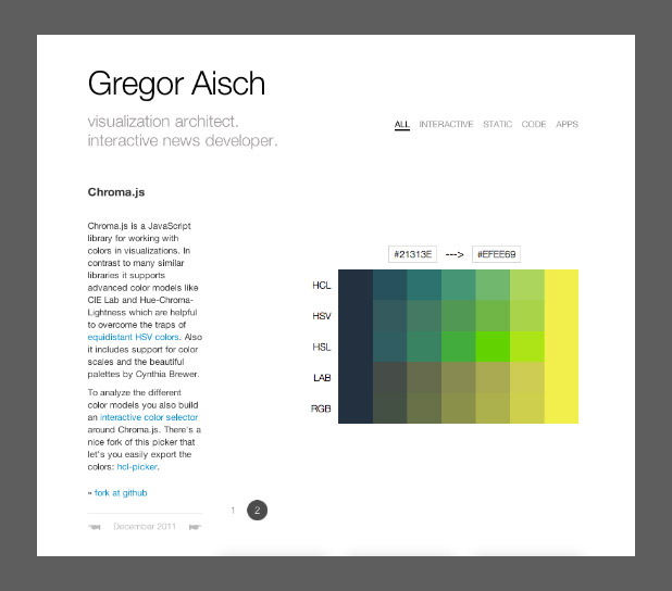
Instead of interpolating between colors in lightness, chroma, and hue space; Gregor Aisch’s brand-new additions to chroma.js use bezier curves and lightness adjustments to smooth and linearize palettes. He also included a way to pick intermediate hues, which adds some welcome flexibility to palette-building.
And Kenneth Moreland of Sandia National Laboratories developed algorithms to generate perceptual divergent palettes.
Computer Science
Bruce Linbloom provides tools to translate between color spaces—and the math behind them.
I mentioned Color Mine in my previous post, on tools. In addition to the online color-calculator, they offer libraries to convert from one color space to another.
And here’s an approach to scientifically determining the semantic associations of color, by Sharon Lin et al.:
Selecting Semantically-Resonant Colors for Data Visualization.
Practitioners
There’s a large (and growing) community of data visualizers on the web, all of them eager to share ideas. I’m indebted to them.
Robert Kosara summarizes many of these issues on his blog Eager Eyes, with How the Rainbow Color Map Misleads.
Matt Hall, of Agile Geoscience, wrote a recent trio of articles: Five Things about Colour (which includes my favorite optical illusion) and Five More Things about Colour and Colouring Maps.
I’ve already pointed to Gregor Aisch’s chroma.js, but he’s also got a concise critique of HSV-derived palettes.
Theresa-Marie Rhyne covers additional color spaces (Red, Yellow, Blue; Cyan, Magenta, Yellow, Black) and types of color schemes (monochromatic, complementary, analogous) in her post Applying Artistic Color Theories to Visualization.
Andy Kirk, Visualizing Data: Tools and Resources for Working with Colour.
Dundas Data Visualization provides one of the best explanations of the challenges of designing for the color blind I’ve seen with Visualizing for the Color Blind.
Three posts by Visual.ly’s own Drew Skau explain why NASA should stop relying on the spectrum to display data Dear NASA: No More Rainbow Color Scales, Please provide tips for Building Effective Color Scales, and explore the psychology of color Seeing Color Through Infographics and Data Visualizations.
Many of these bloggers are active on Twitter:
Matteo Niccoli @My_Carta
Robert Kosara @eagereyes
Matt Hall @kwinkunks
Andy Kirk @visualisingdata
Gregor Aisch @driven_by_data
Drew Skau @seeingstructure
Naomi Robbins @nbrgraphs
Mike Bostock @mbostock
even Edward Tufte @EdwardTufte
(and me @rsimmon)
What’s Missing?
I’m sure I’ve missed some important resources for learning and using color. For example, I’ve misplaced the first book I read on color vision, and I can’t recall the title. There are many other resources available, please point them out in the comments.
Subtleties of Color
Part 1: Introduction
Part 2: The “Perfect” Palette
Part 3: Different Data, Different Colors
Part 4: Connecting Color to Meaning
Part 5: Tools & Techniques
(This series on the use of color in data visualization is being cross-posted on visual.ly. Thanks to Drew Skau at visual.ly for the invitation.)
Tools & Techniques: the Nuts and Bolts of Designing a Color Palette
Knowing what makes a good palette for visualization, how to find and apply good examples, or create one from scratch? In my mind the best place to start is Color Brewer. Cynthia Brewer’s tool is popular for a reason: it explains the theory behind palette design, provides excellent examples to get started with, and even displays the palettes on a sample map. The Color Brewer Palettes are also implemented in visualization applications and languages like D3, Processing, R, ArcMap, etc.
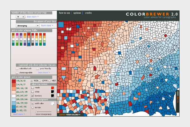
The widely-used Red-Blue divergent palette on Color Brewer.
If you don’t use software that comes with the Color Brewer palettes (Adobe Photoshop, for example), using the tables can be a bit tricky. Each color has to be specified manually, and then the individual steps need to be blended (at least if you want a smooth ramp).
In Photoshop, there’s two ways to do this: create a custom indexed color palette (good for 8-bit data, with a range of 256 values), or create a gradient map (useful for applying color to 16-bit datasets). Similar techniques should work with the GIMP and other applications.
To build an indexed palette (also called a color look-up table), start with one of the 9-color Color Brewer palettes. We need 9 colors because there are 8 divisions between each specified color, which divides evenly into the 256 available indices.
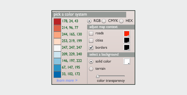
To convert the discrete colors from Color Brewer into a smooth 256-color ramp, import an 8-bit grayscale image into Photoshop. Then select Image > Mode > Indexed Color. This will bring up the Color Table window. Starting in the upper left, click and drag to select two rows, representing the first 32 colors in the palette. Then enter the Red, Green, Blue values of the first color (178, 24, 43 in our example), hit return, then enter the second color (214, 96, 77). Do this 7 more times (I know, it’s tedious) and you’ll have a full 8-bit palette. To make your life easier, Save the color table for next time (in .act format, the specification is buried on this page) before you hit OK.
You can also make a discrete palette. Just set the start and end points of the ramp to the same color.
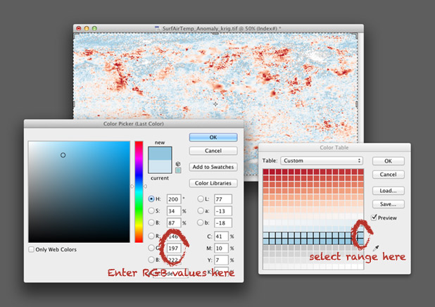
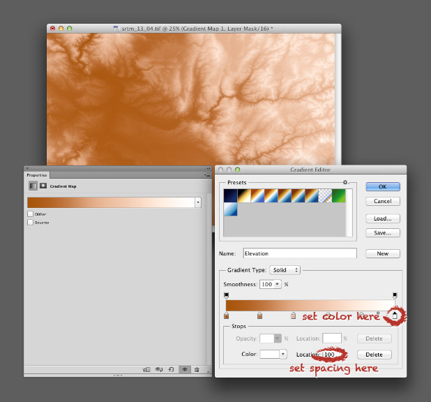
For 16-bit data (a digital elevation model, for example), use a gradient map. Again, start by opening a grayscale file, but this time with a bit depth of 16. Then convert the grayscale image to a color one by selecting Image > Mode > RGB Color. Then add a gradient map: Layer > New Adjustment Layer > Gradient Map… Name the layer if you want, then hit OK. You’ll end up with an editable gradient map as a separate layer above your data.
A gradient map allows you to set an arbitrary number of color points to blend between, and change both the relative spacing (in increments of one percent) and relative weighting of each point. It’s a bit more flexible than an indexed color palette, but specific to Photoshop (indexed color palettes are useful in almost all visualization and graphics software). For example, to create a palette blended between 6 colors, set 6 points, each separated by a distance of 20% (see the image below). Like an indexed color palette, you can also save the gradient for future use.
While Color Brewer is great (I use the palettes frequently) it’s not comprehensive. The available palettes are a bit limited in contrast, the selection of single- or two-color palettes is small, the lightness and saturation of the end points don’t match between palettes (making it impossible to make direct comparisons between similar datasets), and the Munsell color space doesn’t have perceptually linear saturation.
The next logical step is the NASA Ames Color Tool. (Note: When OS X 10.6 was released, the standard gamma for Macs changed from 1.8 to 2.2. Use the “Color Tool, Gamma = 2.2 (PC)” option on both Macs and PCs.) Developed to support the creation of legible aviation charts, the Ames Tool converts between the CIE L*C*h color space and RGB values. Lightness varies between 0 and 100 in increments of 10, chroma (saturation) from 0 to 156, also in increments of 10, and hue from 0 to 360 in 1˚ steps.
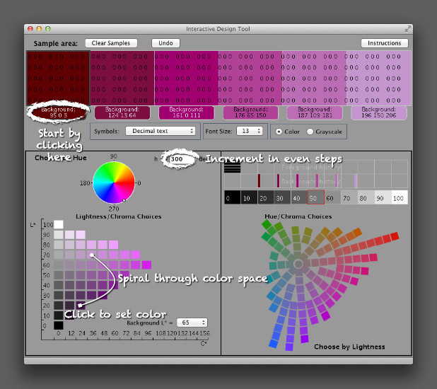
I find it easiest to create palettes by typing in the hue manually, then picking a color with the appropriate lightness and chroma. Move diagonally across the array of colors, and change the hue in even increments with each step. This creates a spiral through three-dimensional color space, with hue, chroma, and lightness varying simultaneously. It’s possible to create a strictly perceptual palette by always changing saturation in the same direction (usually from dark and saturated (intense) to light and desaturated (pale)), but the available range of contrast is less than a palette that includes very dark colors. Feel free to experiment, as long as lightness varies evenly.
The Ames tool provides more flexibility than Color Brewer, but is also limited in the available range of colors. The maximum lightness with any hue is 90, the darkest 10 (inevitably with very low saturation). A suite of tools utilizing Gregor Aisch’s chroma.js Javascript library expand the number of colors, but are (in my opinion) a bit trickier to use than the Ames tool.
Chroma.js home page.
HCL picker, by Tristen Brown.
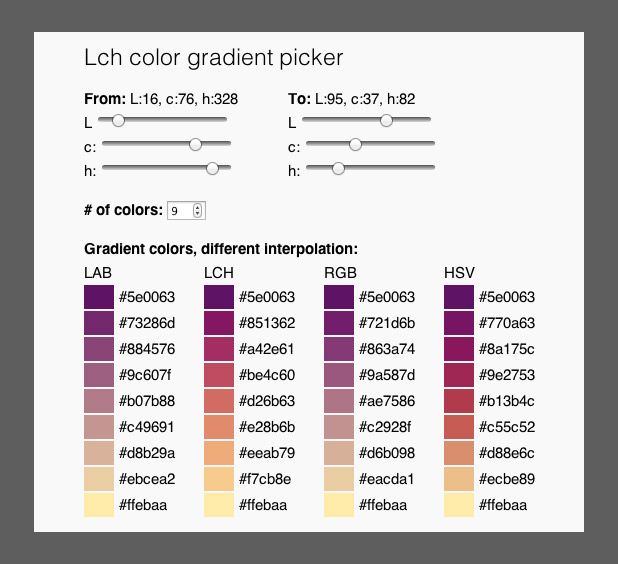
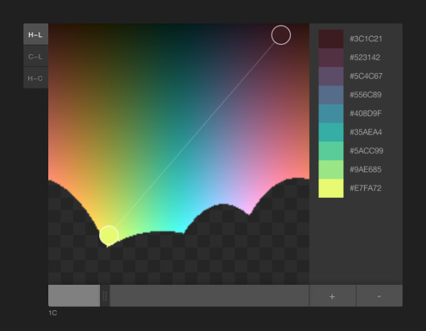
LAB, LCH, RGB, and HSV color picker, with initial colors specified in LCH (also by Gregor Aisch). LAB allows two-color ramps, which provides additional options to create palettes appropriate for particular datasets. Gregor was kind enough to whip this up based on a few suggestion posted on Twitter. Thanks!
Another option, but sadly lacking in visual feedback, is the colormine.org Online Color Converter. I haven’t used it much, but the results seem a little bit different than the equivalent conversion with chroma.js. Not too surprising, since L*C*h to RGB conversions are hardly simple.
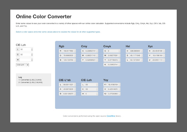
The ColorMine color conversion interface.
The NASA Ames color tool, Lch color gradient picker, and Online Color Converter are more-or-less useful for building sequential or divergent scales. I want hue, from the médialab at Sciences Po is designed to randomly generate “maximally distinct” colors—i.e. colors for qualitative palettes. (ColorBrewer, of course, works for all three types of data.)
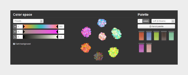
The interface for I want hue, a tool to generate qualitative color palettes derived from a perceptual color space.
The unique part about I want hue is that it can generate clusters of analogous colors—colors near each other on the color wheel. Perfect for building complex maps with large numbers of categories. It’s also useful for choosing colors for different categories of data that’s not spatial: line graphs, dot plots, or grouped bar charts, for example.
As far as I know, these tools are the state of the art. Yet each of them is limited in one way or another. Color Brewer has a fixed number of palettes. The NASA tool has a limited number of available lightness values. The chroma.js interfaces are a bit difficult to control precisely. Colormine lacks feedback. All of these tools generate a small number of colors, that then need to be blended to create smooth palettes.
What would the ideal palette building tool look like? (My ideal tool, at least.)
Spoiler alert: I’m working on this. Drop me a line if you’re interested in collaborating.
Subtleties of Color
Part 1: Introduction
Part 2: The “Perfect” Palette
Part 3: Different Data, Different Colors
Part 4: Connecting Color to Meaning
Part 6: References & Resources for Visualization Professionals
(This series on the use of color in data visualization is being cross-posted on visual.ly. Thanks to Drew Skau at visual.ly for the invitation.)
Connecting Color to Meaning
Pretty much any dataset can be categorized as one of three types—sequential, divergent, and qualitative—each suited to a different color scheme. Sequential data is best displayed with a palette that varies uniformly in lightness and saturation, preferably with a simultaneous shift in hue. Divergent data is suited to bifurcated palettes with a neutral central color. Qualitative data benefits from a set of easily distinguishable colors. Palettes defined in a perceptual color space—particularly CIE L*C*h—will be more accurate than those composed using RGB or HSV color spaces, which are more suited to computers than people.
I consider those the fundamentals of color for data visualization. You’d better be certain you know what you’re doing before you violate those rules (i.e. don’t use a rainbow palette unless there’s a reason more compelling than “that’s how we’ve always done it”). What are the more subtle aspects of color for data visualization? The touches that (hopefully) put an image on the 10% side of Sturgeon’s Law (not the 90%).
Intuitive Colors
This may sound obvious, but it’s an underused principle. Whenever possible, make intuitive palettes. Some conventional color schemes, especially those used in scientific visualization, are difficult for non-experts to understand. In fact, one study found “satellite visualizations used by many scientists are not intelligible to novice users” (emphasis mine). Visualizations should be as easy as possible to interpret, so try to find a color scheme that matches the audience’s preconceptions and cultural associations.
It’s not always possible, of course (what color is electrical charge, or income?) but a fair number of datasets lend themselves to particular colors. Vegetation is green, barren ground is gray or beige. Water is blue. Clouds are white. Red, orange, and yellow are hot (or at least warm); blue is chilly.
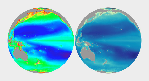
The unnatural colors of the rainbow palette (left) are often difficult for novice viewers to interpret. A more naturalistic palette for phytoplankton (more or less a type of ocean vegetation) trends from dark blue for barren ocean, through turquoise, green, and yellow for increasing concentrations of the tiny plants and algae.
In addition to colors affiliated with our physical environment (can you tell I primarily work on Earth science datasets?), cultural values are linked to certain colors. Check out the quilted thumbnails of Google image search results for words like “clean” (mint green) “malevolent” (ochre) and “abstract” (blue). Use these relationships to add cues into a visualization. Be aware that these are not universal, but vary by culture.
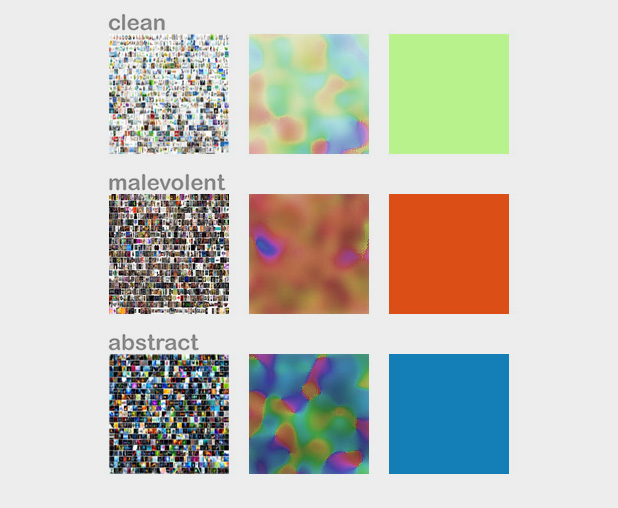
The cultural associations of color (at least in English), derived via Google image search. Image by John Nelson, IDV solutions.
Layering
The combination of two or more datasets often tell a story better than a single dataset, and the best visualizations tell stories. The color schemes for multiple datasets displayed together need to be designed together, and complement one another.
One approach is to layer datasets together, which is pretty much impossible if you’ve already used all the colors of the rainbow to display a single dataset. (I know I harp on the rainbow palette, and I’m sure you’re tired of it, but despite the well known flaws it’s still used in a disproportionate amount of visualization.) Instead, use muted colors to limit the range of hues and contrast in one dataset, and then overlay additional data, such as the contour lines and shaded relief of a topographic map combined with land cover, roads, and buildings.
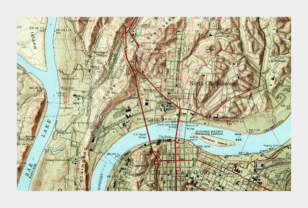
Muted colors, subtle shading and thin contour lines allow multiple types of data to be layered together in this 1958 topographic map of Chattanooga, Tennessee. (Did I mention cartographers have been doing this for ages, and are really good at it?)
Complementary Datasets
Other types of complementary data aren’t co-located: maps that include ocean and land, for example. In those cases careful control of lightness, saturation, and hue can enable quick differentiation as well as (mostly) accurate comparisons between datasets. Use two different hues, and vary the lightness and saturation simultaneously.
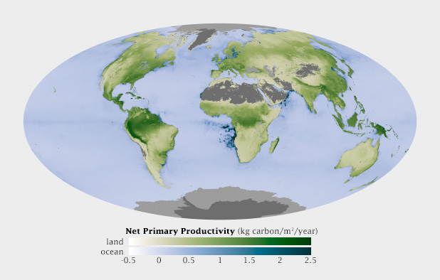
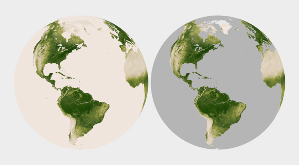
This map shows net primary productivity [a measure of the how much plants breathe (technically the amount of carbon plants take from the atmosphere and use to grow each year)] on land and in the ocean. The two datasets are qualitatively different (phytoplankton growing in the ocean, terrestrial plants on land), but quantitatively the same. The green land NPP is easily distinguishable from the blue oceans, but the relative lightness matches for a given rate of carbon uptake.
Non-diverging Breakpoints
Some sequential datasets feature one or more physically significant quantities: freezing on a map of temperature, for example. It’s not usually appropriate to use a full divergent palette, since the data are still on a continuum. To show these transitions, keep the change in lightness consistent throughout the palette, but introduce an abrupt shift in hue and/or saturation at the appropriate point. This does a good job of preserving patterns (again, one of the strengths of visualizations) while emphasizing and differentiating particular ranges of data.
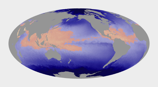
Hurricanes and other tropical cyclones are able to form and strengthen in waters over 82˚ Fahrenheit. This ocean temperature map uses rose and yellow to distinguish the warm waters that can sustain tropical cyclones from cool water, colored blue. (Map based on Microwave OI SST Data from Remote Sensing Systems.)
Use Color to Separate Data from Non-Data
Since color attracts the eye, lack of color can cause areas of a graphic to recede into the background. This is an extremely useful tool for creating hierarchy in a visualization. After all, you want viewers to focus on what’s important. Areas of no data are almost always less important than valid data points, but it’s still essential to include them in a visualization. Simply choosing not to color areas of no data, but assigning them a shade of gray (or even pure black and white) simultaneously de-emphasizes missing data and separates it from data. Just be careful to choose a shade of gray that’s distinct from the adjacent data.
Missing or invalid data should be clearly separated from valid data. Simply replacing the light beige used to represent water in this map of land vegetation (left) with gray causes the land surfaces to stand out. (Vegetation maps adapted from the NOAA Environmental Visualization Laboratory.)
Figure-Ground
Sometimes it just comes down to a judgement call. I developed a special temperature map showing the hottest land temperatures over the course of a year, so the entire map had to feel “hot” but the merely warm areas were well over 40 degrees Celsius cooler than the hottest spots on Earth. Pale yellow to deep red felt like an obvious choice. It was reasonably intuitive, and the very hottest points stood out well from the lighter areas. The brain moves the bright red areas into the foreground, and pushes the pale yellows into the background.
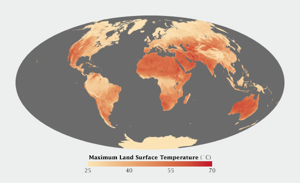
Warm colors, ranging from pale yellow to blood red, were most appropriate for this map of Earth’s hottest places.
When I applied the same color scale to a single day’s data, however, I was surprised to see that the coolest areas (irrigated fields) were subjectively hotter than their surroundings. The relatively small areas of pale yellow, surrounded by larger expanses of darker red, moved into the image foreground. (A combination of the compact areas of light color and very sharp boundaries, I think.) This subverted my intentions for the image. I ended up reverting to my standard blue-purple-red-yellow temperature palette, even though blue indicated temperatures of at least 30 degrees C (86 Fahrenheit)!
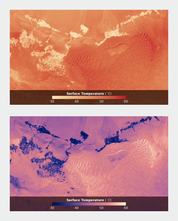
Using a yellow-red palette, cool irrigated fields appear warmer than the nearby dunes, inverting the true relationship. A palette that runs from blue through red to yellow reads more naturally.
Aesthetics
Aesthetics matter: attractive things work better.
Donald Norman, Emotional Design.
Most of these suggestions on the use of color are based on the principles of perception, which are derived from the neurological basis of how we see. They provide the foundation for accurate data visualization. But what separates “adequate” from “good” from “great” isn’t a matter of following rules—it’s a matter of aesthetics and judgement.
Follow good design practice as well as good visualization practice when developing imagery. In addition to color, consider the other aspects of design: typography, line, shape, alignment, etc. Be aware of the media you’re designing for. It may be trite, but a good visualization is better than the sum of its parts. Be aware of how the various elements of your design fit together. How do the colors used for the data interact with labels? With any nearby graphical elements? Are you designing for the web, television, or print? All of these considerations should inform your decisions.
Unfortunately I can’t provide any hard and fast rules to design visualizations that are aesthetically pleasing (or even beautiful). I can only encourage you to keep your eyes open. Look for good design, good art, and good visualization. Figure out why it works, and incorporate those elements into your own projects.
Subtleties of Color
Part 1: Introduction
Part 2: The “Perfect” Palette
Part 3: Different Data, Different Colors
Part 5: Tools & Techniques
Part 6: References & Resources for Visualization Professionals
(This series on the use of color in data visualization is being cross-posted on visual.ly. Thanks to Drew Skau at visual.ly for the invitation.)
Different Data, Different Colors
There are several types of data, each suited to different types of display. Continuously varying data, called sequential data, is the most familiar. In addition to sequential, Cynthia Brewer defines two additional types of data: divergent and qualitative. Divergent data has a “break point” in the center, often signifying a difference. For example, departure from average temperature, population change, or electric charge. Qualitative data is broken up into discrete classes or categories, as in land cover or political affiliation.
Sequential data (discussed in depth in my previous post, The “Perfect” Palette) is best represented by color palettes that vary evenly from light to dark, or dark to light, often with a simultaneous shift in hue and/or saturation.
Sequential data lies along a smooth continuum, and is suited to a palette with a linear change in lightness, augmented by simultaneous shifts in hue and saturation.
Divergent Data
Data that varies from a central value (or other breakpoint) is known as divergent or bipolar data. Examples include profits and losses in the stock market, differences from the norm (daily temperature compared to the monthly average), change over time, or magnetic polarity. In essence, there’s a qualitative change in the data (often a change in sign) as it crosses a threshold.
In divergent data, it’s usually more important to differentiate data on either side of the breakpoint—increase versus a decrease, acid versus base—than small variations in the data. Bipolar data is suited to a palette that uses two different hues that vary from a central neutral color. Essentially, two sequential palettes with equal variation in lightness and saturation are merged together. This type of palette works because it takes advantage of pre attentive processing: our visual systems can discriminate the different colors quickly and without conscious thought.
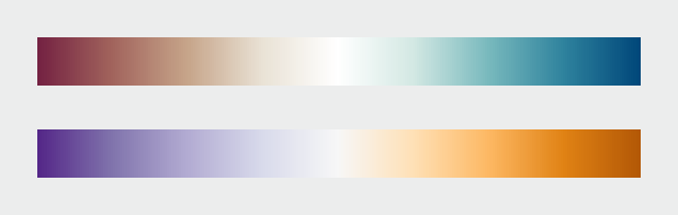
Divergent palettes, each composed of two sequential palettes merged with a neutral color. (Derived from the NASA Ames Color Tool (top) and Color Brewer.)
For the most part use white or light gray as the central shade. Although neutral, black or dark gray is typically a poor choice because the most extreme values will be light and desaturated, deemphasizing them. Central colors with a hue component, even a slight one, will tend to be associated with one end of the scale or the other.
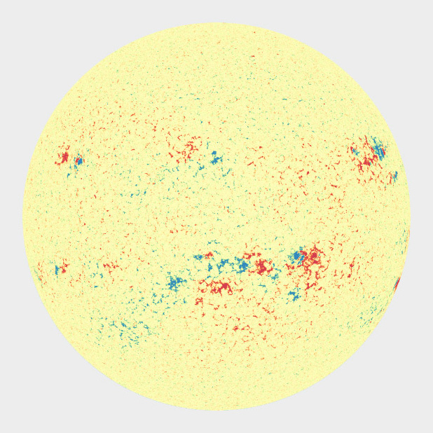
A magnetogram is a map of magnetic fields, in this case on the surface of the Sun. A divergent palette suits this data because the north polarity (red) and south polarity (blue) are both measurements of the same quantity (magnetism), just with opposite signs. SDO HMI image adapted from the Solar Data Analysis Center.
I find it much more difficult to design divergent palettes than sequential palettes. There’s a limited number of color pairs that allow strong contrast simultaneously in both hues. If the colors converge too abruptly, high-contrast “rivers” of white may appear in the visualization when quantities are near the transition point. Even worse, about 5 percent of people (almost all of them men) are color blind, and will have a difficult time seeing the difference in certain hue pairs, particularly red-green (more rarely blue-red).
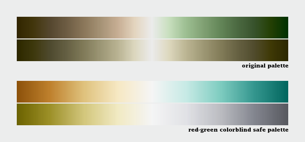
Despite our best intentions, the Earth Observatory long used a vegetation anomaly palette that was completely unreadable by color blind viewers. Compare the full color palettes to what a color deficient viewer would see (derived from Adobe Photoshop’s deuteranopia simulation).
A sequential palette that varies uniformly in lightness will still be readable by someone with color deficient vision (or a black and white print), regardless of the hue. But a divergent palette with matched lightness can be difficult or impossible to parse if the viewer can’t distinguish the hues. To ensure your designs are accessible, choose from the color blind safe palettes on Color Brewer, or one of the online color blindness simulators.
Despite these difficulties, divergent palettes are worth using. In many cases, especially for trends, a difference map using a divergent palette is much more effective than an animation or even a sequence of small multiples.
Categorical Data
Qualitative data (occasionally known as categorical or thematic data) is distinct from sequential and divergent data: instead of representing proportional relationships, color is used to separate areas into distinct categories. Instead of a range of related colors, the palette should consist of colors as distinct from one another as possible. Due to the limits of perception, especially simultaneous contrast, the maximum number of categories that can be displayed is about 12 (practically speaking, probably fewer).
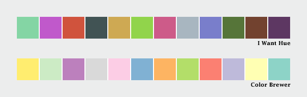
These two qualitative color schemes—from I Want Hue (top) and Color Brewer (lower)—each consist of 12 distinct colors.
If you need to display double-digit categories, it’s best to group similar classes together. This is how the United States Geological Survey presents the 16 classes of the National Land Cover Database. Four urban densities are shown in shades of red, 3 forest types in shades of green, and different types of cropland in yellow and brown.
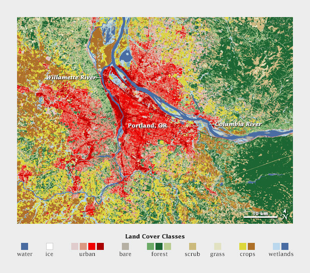
A grouped color scheme allows the USGS to simultaneously show 16 different land cover classes in a single map of the area surrounding Portland, Oregon.
For even larger numbers of categories, incorporate additional elements like symbols, hatching, stippling, or other patterns. Also, label each element directly. It’s impossible to distinguish dozens of colors and shapes simultaneously. Geological maps can have more than 100 categories yet remain (somewhat) readable.
Subtleties of Color
Part 1: Introduction
Part 2: The “Perfect” Palette
Part 4: Connecting Color to Meaning
Part 5: Tools & Techniques
Part 6: References & Resources for Visualization Professionals
(This series on the use of color in data visualization is being cross-posted on visual.ly. Thanks to Drew Skau at visual.ly for the invitation.)
alert message
