Whether it was retreating ice, super storms, wildfires, or the simple changing of the seasons there was no shortage of fascinating, beautiful, and occasionally ominous imagery in 2012. Throughout the year, we published more than 600 images. Of those, the ten most popular (based on the number of page views) are below. Click on each image for more details and a full caption. Plus, you can browse through our Image of the Day archives month by month in case you missed some and want to catch up.
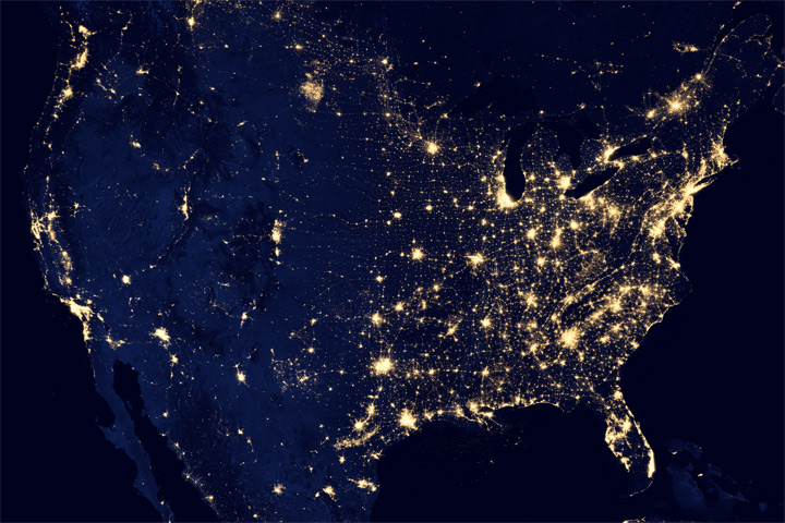
1 — City Lights of the United States 2012
Updated for 2012, this map of lights across America has a least 10 times better resolution than previous maps.
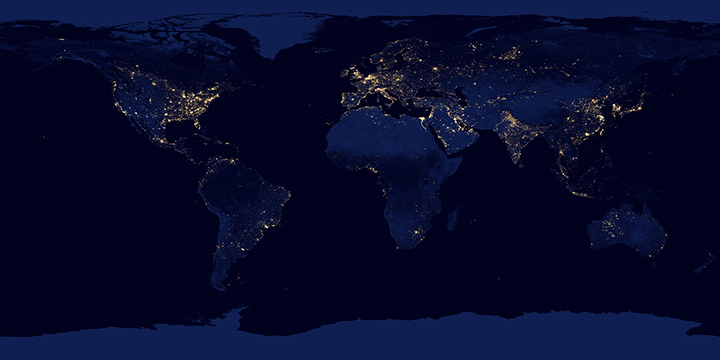
2 — Nights Lights 2012, Flat Map
The lights of cities and villages trace the outlines of civilization in this global view.
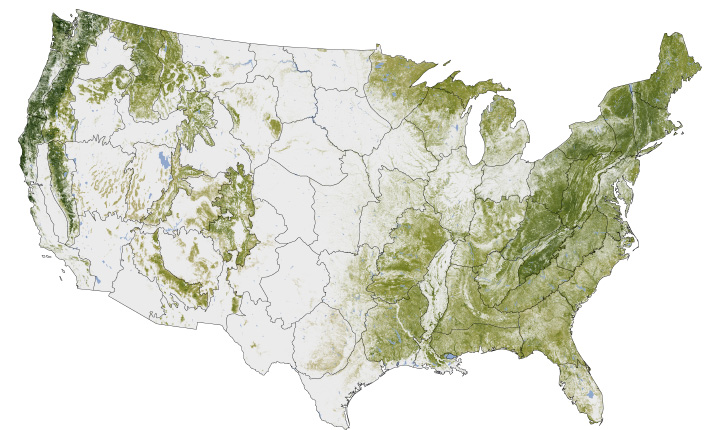
3 — Where the Trees Are
The National Biomass and Carbon Dataset reveals the location and the carbon storage of forests in the United States.
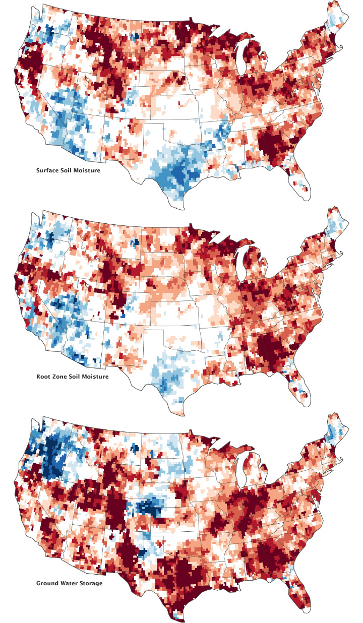
4 — Signs of the U.S. Drought are Underground
Nearly two-thirds of the continental United States suffered some form of drought in the summer of 2012.
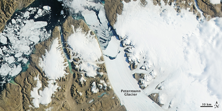
5 — More Ice Breaks off of Petermann Glacier
A new chunk of Petermann Glacier broke off in July 2012, two years after another large ice island was launched. In the same week, the surface of the Greenland ice sheet experienced unusually widespread melting and some flooding along rivers.
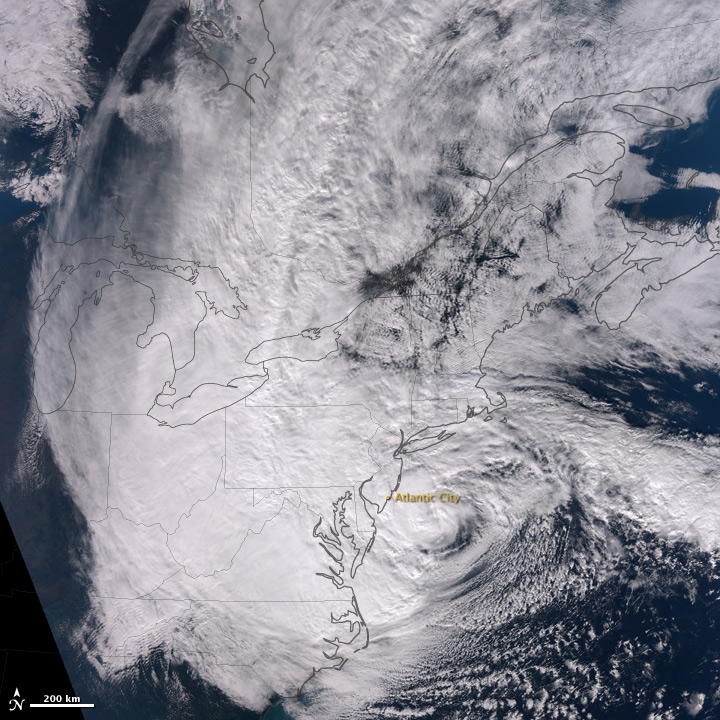
6 — Hurricane Sandy
Acquired October 29, 2012, this natural-color image shows Sandy shortly before landfall on the U.S. East Coast .
7 — Night Lights 2012: Black Marble
This animated globe shows the city lights of the world as they appeared to the new Suomi NPP satellite, which has at least 10 times better light-resolving power than previous night-viewing satellites.

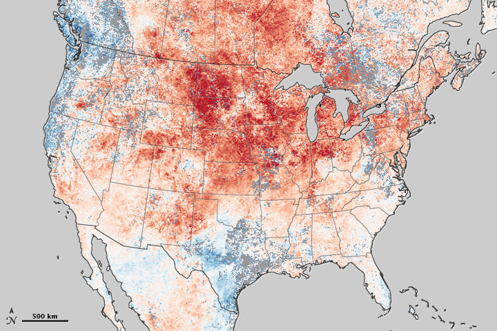
8 — Historic Heat in North America Turns Winter to Summer
The winter and early spring of 2012 brought record-setting high temperatures over much of United States and Canada.
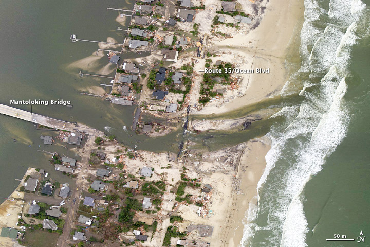
9 — A Changed Coastline in Jersey (aerial photo)
Hurricane Sandy cut a new channel and wiped out houses in the town of Mantoloking, New Jersey.
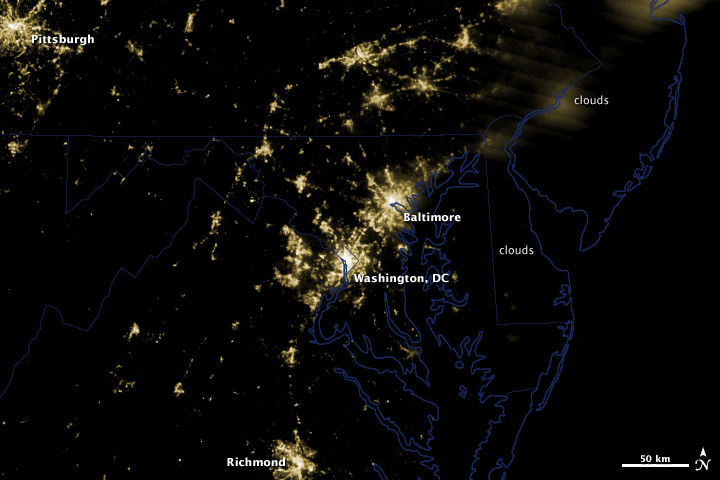
10 — Power Outages in Washington, DC
A potent line of thunderstorms knocked out power for millions of households in the U.S. Midwest and Mid Atlantic on June 29, 2012.

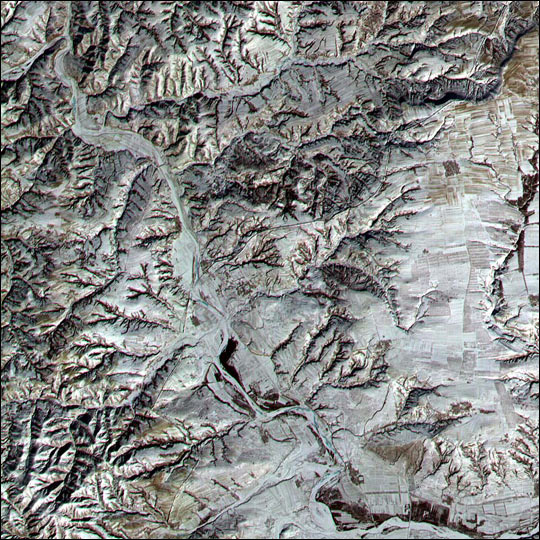
Congratulations to Alan for being our first reader to work out that the December puzzler showed an area near the Flat Tops in northwestern Colorado. Alan recognized that the treeless regions in the lower right were plateaus and pinpointed the location on December 19, even pointing out Devils Causeway. Meanwhile, other puzzler players — notably Angie Connelly and Bill Butler — weighed in with interesting details about the type of rock (basalt) that makes up the plateau and the impact that a recent fire had on vegetation in the area.
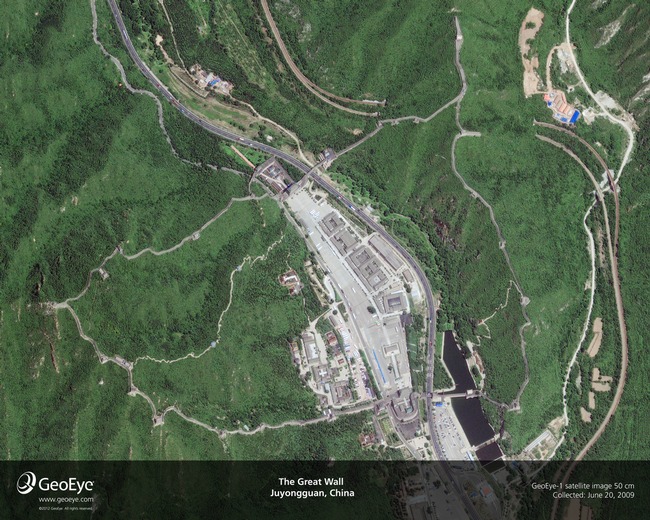
It’s worth noting that the image does not show the Great Wall of China, which was the most common answer we received. It’s a popular myth that the Great Wall is one of only human-made structures visible from space. As this NASA story explained in 2005 and this Scientific American story detailed in 2008, the Great Wall is quite difficult for astronauts (either in orbit or on the moon) to see because there isn’t enough contrast between the color of the wall and the surrounding vegetation.
Sensors on Earth-observing satellites can detect the Great Wall more readily than the human eye, but it isn’t easy to distinguish the structure even in images from the higher-resolution sensors in NASA’s fleet. The Advanced Spaceborne Thermal Emission and Reflection Radiometer (ASTER) instrument on NASA’s Terra statellite, which has a 15-meter spatial resolution, acquired the image below of the wall in the winter of 2001. At the time, a low sun angle and light snow cover helped highlight a section of the wall in Shanxi Province.
Ronald Beck, a program information specialist for the Landsat program told Scientific American that the wall is visible to Landsat as well, but only under certain weather conditions. “We have satellite images where snow covers the fields near the wall and snow has been cleared on the wall, and that allows us to see the wall,” he said. “The key is contrast.”
Commercial satellites, operated by companies such as GeoEye, offer the clearest view of the Great Wall from space. A sensor with half-meter resolution on the GeoEye-1 satellite acquired the image below on June 20, 2009. If you’re interested in seeing how sensors on various Earth-observing satellites compare, here’s a useful list categorized by their spatial resolution.
On December 22, we published a caption that provides more details about the Flat Top mountain scene. In addition to being a location with noteworthy geology, the image shows the part of White River National Forest where park rangers harvested the 2012 U.S. Capitol Christmas tree. The videos below explain more about how the tree was selected, transported, and decorated.
Every month, NASA Earth Observatory will offer up a puzzling satellite image here on Earth Matters. The seventh puzzler is above. Your challenge is to use the comments section below to tell us what part of the world we’re looking at, when the image was acquired, and why the scene is interesting.
How to answer. Your answer can be a few words or several paragraphs. (Just try to keep it shorter than 300-400 words). You might simply tell us what part of the world an image shows. Or you can dig deeper and explain what satellite and instrument produced the image, what bands were used to create it, and what’s interesting about the geologic history of some obscure speck of color in the far corner of an image. If you think something is interesting or noteworthy about a scene, tell us about it.
The prize. We can’t offer prize money for being the first to respond or for digging up the most interesting kernels of information. But, we can promise you credit and glory (well, maybe just credit). Roughly one week after a “mystery image” appears on the blog, we will post an annotated and captioned version as our Image of the Day. In the credits, we’ll acknowledge the person who was first to correctly ID an image. We’ll also recognize people who offer the most interesting tidbits of information. Please include your preferred name or alias with your comment. If you work for an institution that you want us to recognize, please mention that as well.
Recent winners. If you’ve won the puzzler in the last few months, please sit on your hands for at least a few days to give others a chance to play.
You can read more about the origins of the satellite puzzler here. Good luck!
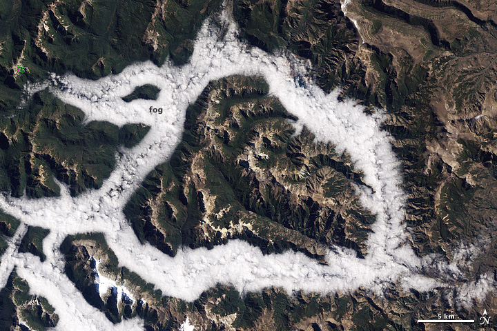
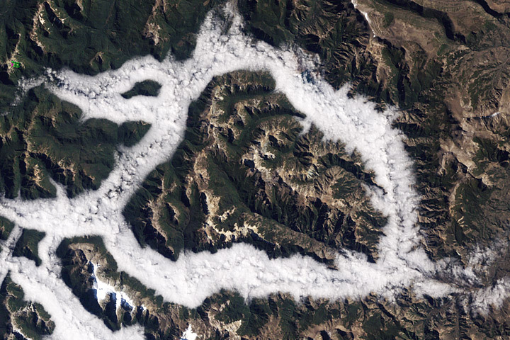
The answer we had in mind for our November puzzler was fog in Argentina’s, Lake District. The exact coordinates were -40° 24′ 50.47″, -71° 22′ 59.14.” We had a number of players who came quite close — including Stuart Grice, and David P , and Michael Osborne — but no one got the exact coordinates, province, or district. The November puzzler, in fact, was our first puzzler that didn’t get solved down to the GPS coordinates within a few minutes or hours of posting.
I won’t deny that we were initially pleased that we had stumped some of the remote sensing pros who play the puzzler. But after the euphoria wore off, we found ourselves wondering: is it unfair to pick an obscure patch of mountains or sea and expect people to find it?
This latest puzzler got a few of us at the Earth Observatory thinking: what constitutes a correct answer, particularly when an image doesn’t show a discrete, obvious occurrence or place like the Çöllolar mine collapse or the Russian city of Dudinka? We thought it over and came up with these tips.
1) Being specific helps. Providing us with exact coordinates doesn’t hurt — in fact, it helps a lot. We will always recognize the first player who sends us the correct coordinates.
2) But this is an open-ended puzzler. We’re just as interested in having you teach us something interesting about a particular feature — a certain rock formation, cloud type, or whatever — as we are in simply getting inundated with coordinates. In fact, going forward, we’re going to recognize at least one puzzler player who goes beyond simply giving us the coordinates. This also mean you can continue posting answers even after somebody has guessed the coordinates.
3) Have fun. We take our science and remote sensing seriously, but one of the reasons we started the puzzler was to simply share the wonder and joy of looking at this planet that we’re lucky to call home. We wanted to give you the opportunity to have as much fun learning and writing about the Earth as we do. Don’t be shy about teaching us and your fellow readers something new and unexpected. Tell us about the adventures you’ve had traveling to a location. Maybe even tell a joke or share an interesting video. We’re not above awarding “style” points.
4) Post your answers on the blog. When we started the puzzler, we thought it would work to have players post their comments on facebook, twitter, google+, and the various other social media feeds. But after receiving hundreds of comments on disparate sites, we’ve learned there are simply too many for us to monitor (while trying to do our day jobs). You’re welcome to react and discuss puzzler images on the various NASA social media feeds, but from now on we will only select winners from the comments posted on the Earth Matters blog.
Good luck!
On December 5, 2012, the National Oceanic and Atmospheric Administration (NOAA) released its annual Arctic Report Card, covering late 2011 through late 2012. The report listed a number of significant events in a record-breaking and sometimes sobering year.
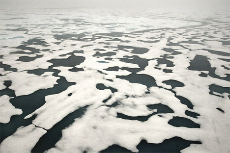
Photo courtesy NOAA ClimateWatch Magazine.
One of the biggest stories was the record-low sea ice extent in the Arctic Ocean. Arctic sea ice shrinks and grows every year, typically reaching its minimum in September. The last decade, however, has seen a series of below-normal extents, with new records set in 2002, 2005, 2007, and 2012. By mid-September 2012, Arctic sea ice had dropped to 3.41 million square kilometers (1.32 million square miles), which was significantly below the 2007 record of 4.17 million square kilometers (1.61 million square miles). (See Visualizing the 2012 Sea Ice Minimum for prior Earth Observatory coverage of this event.)
NOAA data for high latitudes during June indicated that snow cover extent has declined by 17.6 percent per decade—an even faster rate of decline than the sea ice extent. From June 2008 to June 2012, North America experienced three record-low snow cover extents, and Eurasia experienced five straight record lows.
The summer of 2012 also brought widespread melting on the Greenland Ice Sheet. An estimated 97 percent of the ice surface was melting at some point on July 11–12. July 2012 also brought an unusually high melt index—calculated by multiplying the number of days when melt occurred by the area that melted. Compared to the 1979–2012 average, the 2012 melt index was +2.4, nearly twice the previous melt index record set in 2010. (See Satellites Observe Widespread Melting Event on Greenland for prior Earth Observatory coverage of this event.)
The Greenland melting was linked to a drop in albedo—the amount of sunlight reflected back into space—on the ice sheet in 2012. A drop in albedo can set up a feedback loop; as the ice surface melts, it grows darker, absorbing more sunlight and melting more ice.
Other highlights of the 2012 Arctic Report Card include an increase in the length of the high-latitude growing season, record-high permafrost temperatures, a giant phytoplankton bloom under the ice in the Chukchi Sea, the threat of extinction to the Arctic fox, and severe weather events. (including a strong storm off Alaska and a strong summer storm over the Arctic.)
Reflecting on the year’s events, Mark Serreze, director of the National Snow and Ice Data Center, remarked: “The year 2012 was nature’s kick in the pants. Arctic sea ice and snow cover were at record lows and nearly the entire Greenland ice sheet saw surface melt. Climate change is here and Mother Nature is giving us a stern warning of bigger changes to come.”
For more information, see NOAA ClimateWatch Magazine, which offers report card highlights.
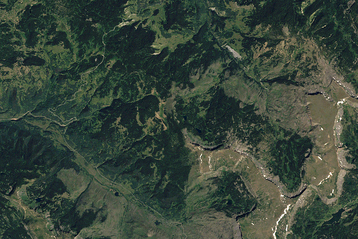
Every month, NASA Earth Observatory will offer up a puzzling satellite image here on Earth Matters. The sixth puzzler is above. Your challenge is to use the comments section below to tell us what part of the world we’re looking at, when the image was acquired, and what’s happening in the scene.
How to answer. Your answer can be a few words or several paragraphs. (Just try to keep it shorter than 300-400 words). You might simply tell us what part of the world an image shows. Or you can dig deeper and explain what satellite and instrument produced the image, what bands were used to create it, and what’s interesting about the geologic history of some obscure speck of color in the far corner of an image. If you think something is interesting or noteworthy about a scene, tell us about it.
The prize. We can’t offer prize money for being the first to respond or for digging up the most interesting kernels of information. But, we can promise you credit and glory (well, maybe just credit). Roughly one week after a “mystery image” appears on the blog, we will post an annotated and captioned version as our Image of the Day. In the credits, we’ll acknowledge the person who was first to correctly ID an image. We’ll also recognize people who offer the most interesting tidbits of information. Please include your preferred name or alias with your comment. If you work for an institution that you want us to recognize, please mention that as well.
Recent winners. If you’ve won the puzzler in the last few months, please sit on your hands for at least a few days to give others a chance to play.
You can read more about the origins of the satellite puzzler here. Good luck!
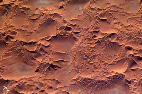
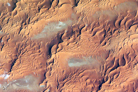
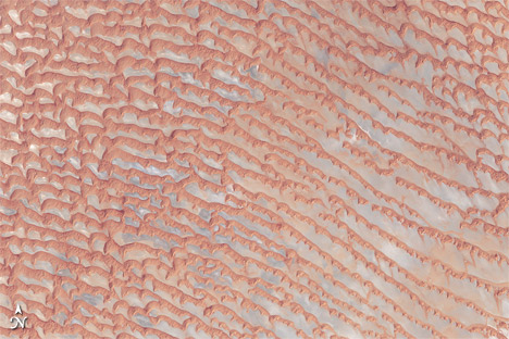
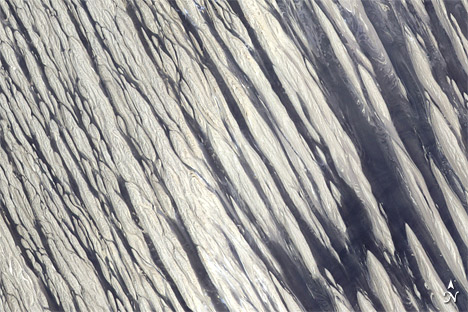
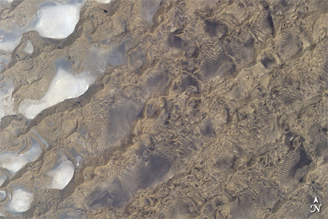
The November 2012 issue of National Geographic features an article, “Sailing the Dunes,” about aerial trips over sandy deserts. The author, George Steinmetz, has flown in light aircraft in high winds—a dangerous combination. Yet the same winds that make the flying so dangerous also sculpt some of the world’s most beautiful landscapes. Several of the places mentioned in the article have also been covered by the Earth Observatory. Here is a sampling of some of those places, plus some additional dune-rich landscapes.
The Sahara Desert spans northern Africa, covering about 9.4 million square kilometers (3.6 million square miles). Within the Sahara are multiple sand seas, or ergs — big, windswept landscapes of shifting sands. The ergs can be as photogenic as they are forbidding.
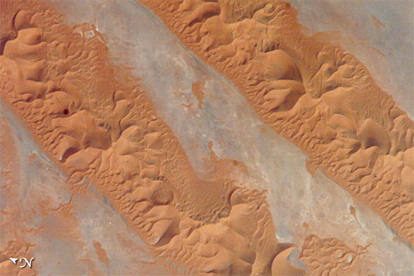
Issaouane Erg in Algeria holds multiple crescent-shaped (barchan) dunes and star dunes. Winds blowing mostly from one direction create barchan dunes while variable winds create star dunes. Low-angled sunlight highlights the varied dune shapes in this region. Story: Issaouane Erg, Algeria
Besides barchan dunes and star dunes, Issaouane Erg is also home to mega-dunes. Mega-dunes likely take hundreds of thousands of years to form, and may have started their formation when the Sahara—once a more hospitable place—began to dry. In between the big dunes, winds have swept sand away from the desert surface altogether, revealing gray-beige mud and salts. Story: Dune Types in the Issaouane Erg, Eastern Algeria
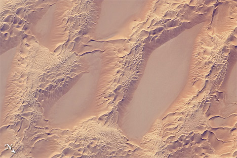
The flat areas between dunes are known as dune streets, and they are unmistakable in Algeria’s Erg Oriental. In between the streets, star dunes sit atop linear dunes. Story: Erg Oriental, Algeria
Nearly sand-free basins also separate complex dunes in the Marzuq Sand Sea of southwestern Libya. The big sand masses are known as “draa” dunes, Arabic for “arm.” Extending from some of the draa dunes are snakelike linear dunes. Story: Sand Dunes, Marzuq Sand Sea, Southwest Libya
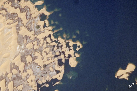
Dunes form in arid conditions, but conditions can change. The manmade Toshka Lakes of Egypt flooded old dune landscapes. Depending on lake levels and the underlying topography, some dunes are completely flooded while the crests of others poke above the water surface. Story: Toshka Lakes, Egypt
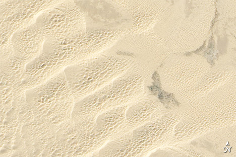
Although it covers an area much smaller than the Sahara Desert, the Arabian Peninsula’s Empty Quarter, also known as Rub’ al Khali, holds half as much sand as the entire Sahara. Salt flats—sebkhas or sabkhas—separate the towering dunes. Story: Empty Quarter
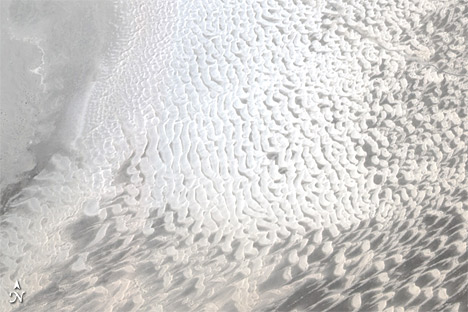
Though it lacks the massive sand seas of the Sahara and the Arabian Peninsula, the United States sports some impressive dune fields of its own. White Sands National Monument holds gleaming white sands formed from gypsum. These brilliant white dunes occur at the northern edge of the Chihuahuan Desert, which extends across the U.S.-Mexico border. Story: White Sands National Monument
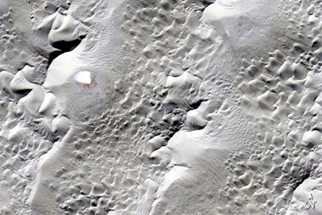
The Algodones Dunes of southeastern California lack the snowy look of White Sands, but make up for it by hosting a complex assortment of dune formations. Smaller dunes sit on top of giant crescent-shaped dunes. Wind does not act alone in shaping this landscape; water flows off the Cargo Muchacho Mountains to the east, making its way into the dune field and sustaining some plant life. Story: The Algodones Dunes
Some of the world’s most complex dune formations occur in the Badain Jaran Desert of Inner Mongolia. Small lakes dot flat areas in between dunes, which have been characterized as “complex reversing mega-dunes developed from compound barchanoid mega-dunes.” Story: Elevation Map of the Badain Jaran Desert
And sometimes a single desert can host completely different landscapes. Identified by satellite data as the hottest place on Earth, Iran’s Lut Desert contains two completely different landscapes. The central portion is home to wind-sculpted linear ridges known as yardangs. The southeastern part of the desert hosts dunes that soar to 300 meters (1,000 feet) alternating with salt pans. Story: Diverse Terrain of Iran’s Dasht-e Lut
Note that due to the angle of sunlight, some of these images produce an optical illusion known as relief inversion.

On October 25, 2012, we published a set of images that shows how the Hektoria and Green glaciers on the Antarctic Peninsula have continued thinning since the Larsen-B ice shelf’s collapse in 2002. Though those two glaciers have been some of the fastest changing in recent years, they aren’t the only Larsen-B tributary glaciers that have lost ice over the last decade.
In all, the 15 glaciers that flow into the ice shelf have lost more than 10 gigatons (one gigaton equals one billion tons) of mass per year, according to research published in the Journal of Glaciology. Some of the most dramatic changes have occurred at Crane, the longest of the Larsen B tributary glaciers. Since the collapse of the ice shelf, Crane Glacier has retreated by more than 12 kilometers (7 miles).
This visualization, based on an image captured by the Advanced Land Imager (ALI) instrument on the Earth Observing-1 (EO-1) satellite, shows the location of the terminus in April 2002, February 2003, and February 2006. Since 2006, the terminus has stayed in the same general position. The image was acquired on February 24, 2012. For another view of Crane glacier’s retreating terminus, please see this image.
NASA Earth Observatory image created by Jesse Allen and Robert Simmon, using EO-1 ALI data provided courtesy of the NASA EO-1 team.
The following is a cross-post of a news release written by our colleagues Rob Gutro and Laura Betz in NASA public affairs and Suomi NPP outreach…
As Hurricane Sandy made a historic landfall on the New Jersey coast during the night of October 29, the Visible Infrared Imaging Radiometer Suite (VIIRS) on NASA/NOAA’s Suomi National Polar-orbiting Partnership (Suomi NPP) satellite captured this nighttime view of the storm. This image, provided by University of Wisconsin-Madison, is a composite of several satellite passes over North America taken 18 hours before Sandy’s landfall.

The storm was captured by a special “day-night band,” which detects light in a range of wavelengths from green to near-infrared and uses filtering techniques to observe dim signals such as auroras, airglow, gas flares, city lights, fires and reflected moonlight. City lights in the south and mid-section of the United States are visible in the image.
William Straka, associate researcher at Cooperative Institute for Meteorological Satellite Studies, University of Wisconsin-Madison, explains that since there was a full moon there was the maximum illumination of the clouds.
“You can see that Sandy is pulling energy both from Canada as well as off in the eastern part of the Atlantic,” Straka said. “Typically forecasters use only the infrared bands at night to look at the structure of the storm. However, using images from the new day/night band sensor in addition to the thermal channels can provide a more complete and unique view of hurricanes at night.”
VIIRS is one of five instruments onboard Suomi NPP. The mission is the result of a partnership between NASA, the National Oceanic and Atmospheric Administration, and the U.S. Department of Defense.
On Monday, Oct. 29, around 8 p.m. EDT, Hurricane Sandy made landfall 5 miles (10 km) south of Atlantic City, N.J., near 39 degrees 24 minutes north latitude and 74 degrees 30 minutes west longitude. At the time of landfall, Sandy’s maximum sustained winds were near 80 mph (130 kph) and it was moving to the west-northwest at 23 mph (37 kph). According to the National Hurricane Center, hurricane-force winds extended outward to 175 miles (280 km) from the center, and tropical-storm-force winds extended 485 miles (780 km). Sandy’s minimum central pressure at the time of landfall was 946 millibars or 27.93 inches.
Suomi NPP was launched on Oct. 28, 2011, from Vandenberg Air Force Base, Calif. One year later, the satellite has orbited Earth more than 5,000 times and returned images and data that provide critical weather and climate measurements of complex Earth systems. Suomi NPP observes nearly every location on Earth’s surface twice every 24 hours, once in daylight and once at night. NPP flies 512 miles (824 kilometers) above the surface in a polar orbit, circling the planet about 14 times a day. NPP sends its data once an orbit to the ground station in Svalbard, Norway, and continuously to local, direct-broadcast users.
For storm history, images, and video of Hurricane Sandy, please visit the following websites:
http://www.nasa.gov/mission_pages/hurricanes/archives/2012/h2012_Sandy.html
http://cimss.ssec.wisc.edu/goes/blog/
http://earthobservatory.nasa.gov/NaturalHazards/event.php?id=79504
Check our Hurricane Sandy event page, our YouTube page, and NASA’s Hurricane Resource page for the latest storm images from NASA.
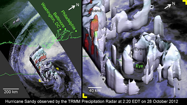
NASA hurricane researcher Owen Kelley prepared this image and caption.
The day before Hurricane Sandy’s center was forecast to make landfall in New Jersey, the radar on the Tropical Rainfall Measuring Mission (TRMM) satellite observed the hurricane’s center.
At 2:20 EDT on Sunday October 28, Hurricane Sandy was a marginal category 1 hurricane and its eyewall was modest, as TRMM reveals, which gives us hints about its possible future strength.
The eyewall was somewhat compact with its 40 km diameter; the eyewall contained only relatively light precipitation; and none of Sandy’s eyewall storm cells managed to burst through, or even reach, the tropopause, which has about a 10 km height at mid-latitudes. Evidence of the weak updrafts in the eyewall comes from the fact that the TRMM radar’s reflectivity stayed under 40 dBZ, a commonly cited signal strength at which updrafts can be vigorous enough to form hail and to lift smaller ice particles up through the tropopause and into the stratosphere.
But placed in context, the TRMM-observed properties of Hurricane Sandy’s eyewall are evidence of remarkable vigor. Most hurricanes
only have well-formed and compact eyewalls at category 3 strength or higher. Sandy was not only barely a category 1 hurricane, but
Sandy was also experiencing strong wind shear, Sandy was going over ocean typically too cold to form hurricanes, and Sandy had been limping along as a marginal hurricane for several days.
With infrared satellite observations (as in the background of the images show), one can speculate about what the sort of convective storms are developing under the hurricane’s cloud tops, but Sandy was sneaking up the East Coast too far out at sea for land-based radars to provide definitive observations of the rain regions inside of the hurricane’s clouds. The radar on the TRMM satellite provided this missing information during this overflight of Hurricane Sandy.
The TRMM satellite also showed that the super-sized rainband that extended to the west and north of the center did contain vigorous
storm cells, as indicated by the red regions of radar reflectivity in excess of 40 dBZ. This rainband is expected to lash the coast well before the hurricane’s center make landfall. Even further west, at the upper left corner of the image, one can see two small storm cells. These storm cells are the southern-most tip of the independent weather system that is coming across the United States and that is expected to merge and possibly reinvigorate the remnants of Hurricane Sandy after Sandy makes landfall.
TRMM is a joint mission between NASA and JAXA, the Japan Space Exploration Agency. Some of the questions about hurricanes left unanswered by the TRMM satellite will be explored by the Global Precipitation Measuring (GPM) satellite scheduled for launch in 2014. For more information, visit http://pmm.gsfc.nasa.gov.
alert message
