

NASA was mostly shut down for January 2019, but Earth wasn’t. In case you missed it, here are some of the big stories we didn’t cover during the impasse.
Scientists Find Evidence of An Ancient Earth Rock on the Moon
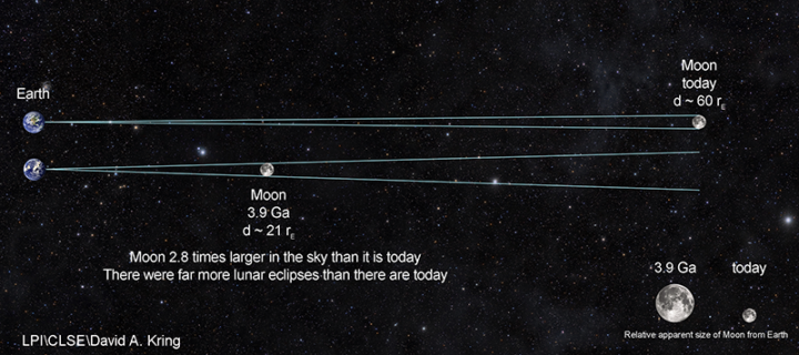
Four billion years ago, the Moon was about three times closer to Earth than it is now. So if a large asteroid or comet slammed into Earth and jettisoned material into space, it was more likely that rock fragments might end up landing on the Moon. That’s how an international team of scientists working with the Center for Lunar Science and Exploration (CLSE) think that a small fragment composed of quartz, feldspar, and zircon—a combination of minerals commonly found on Earth—ended up embedded within a larger Moon rock collected by Apollo astronauts. The team recently revealed evidence from the ancient rock fragment, suggesting that it is one of the oldest Earth rocks ever found.
A Rare Typhoon Hits Thailand
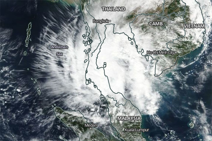
It is rare for powerful tropical storms to strike Thailand. Before January 2019, the last time it happened was 1962. So meteorologists took notice when Tropical Storm Pabuk slammed into southern Thailand on January 4, 2019, packing sustained winds of 95 kilometers per hour (60 mph) and delivering torrential rains to some of Thailand’s most popular tourist destinations. The Moderate Resolution Imaging Spectroradiometer (MODIS) on NASA’s Aqua satellite captured this image of the storm on January 4, 2019.
Snow Falls in Algeria (Yes, the Sahara)
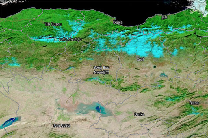
In another unusual weather event, fresh snow created surreal scenery in Algeria when it coated Saharan desert dunes in mid-January. This is just the third time snow has fallen in Ain Sefra, the gateway to the Sahara Desert, in the past 37 years. (The last time was 2018.) The Moderate Resolution Imaging Spectroradiometer (MODIS) on NASA’s Terra satellite captured an image of the snow on January 14, 2019. It is composed with false color, using a combination of infraed and visible light (MODIS bands 7-2-1). Snow appears blue with this band combination.
China’s War on Particulates May Be Making Ozone Pollution Worse
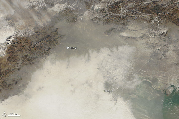
For the past few years, China has advanced an ambitious plan to reduce emissions of fine particulate (PM2.5), a harmful type of air pollution. Authorities have restricted the number of vehicles on the roads, capped how much coal industries can burn, and shuttered many polluting factories and power plants. The result has been impressive: over five years, concentrations of PM2.5 in eastern China have fallen nearly 40 percent. But, there is another wrinkle. Particulates also sponge up substances that make it harder for ground-level ozone to form. So even as concentrations of PM2.5 decline, ozone concentrations are rising, new research shows.
Can Satellites Sense Poverty?
Increasingly, yes, at least in rural areas. By analyzing observations of villages in Kenya, one team of researchers recently showed that land use and land cover data from satellites contains some useful clues for identifying the poorest households in rural areas. Key indicators included: the size of buildings within a homestead, the amount of bare agricultural land adjacent to a homestead, and the length of the growing season. The researchers think this type of information could make it easier to monitor the progress of efforts designed to reduce poverty in rural areas, such as the U.N. Sustainable Development Goals.
A meteor exploded over western Cuba on February 1, 2019, and it delivered an impressive light show. The event was captured by numerous ground-based cameras. It was also spotted from space.

Researchers from the Cooperative Institute for Meteorological Satellite Studies wrote a blog post showing a series of images and data from the event, including the animation above. It was composed from false-color images gathered by NOAA’s GOES-16 satellite. (NASA builds GOES satellites for NOAA.) The dark blue pixels moving toward the northeast appear to be the signature of a debris cloud drifting in the atmosphere after the meteor exploded. A close look at visible imagery from GOES-16 reveals a shadow apparently cast by the debris cloud.
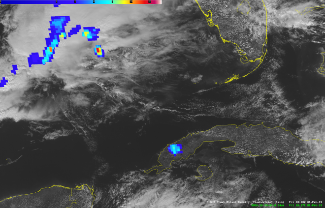
Meanwhile, scientists at NASA’s Short-term Prediction Research and Transition Center (SPoRT) reported signs of the meteor flash in an image acquired by the Geostationary Lightning Mapper (GLM). The meteor flash appears in this image as blue pixels over Cuba. (The blue in the top-left corner is lightning activity over the ocean.)
The meteor was notably smaller than the rock that exploded in February 2013 over Chelyabinsk, Russia. That event injected hundreds of tons of dust into the stratosphere and set the stage for scientists to directly study the plume’s long-term evolution in Earth’s atmosphere.
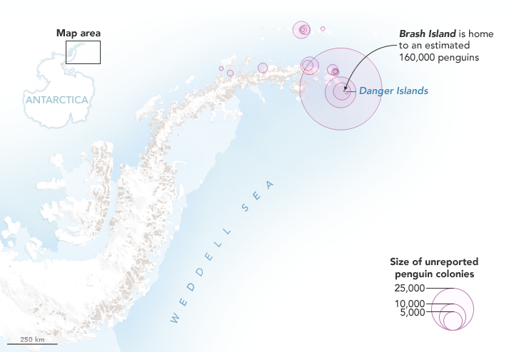
NASA Earth Observatory map by Joshua Stevens, using Landsat data from the U.S. Geological Survey and calculations from Lynch, H. J., & Schwaller, M. R.
Last year, we published a story explaining how scientists had used satellite images of rocks stained pink with guano to discover several unexpectedly large colonies of Adélie penguins on the Danger Islands. Now the researchers are back with a new announcement: Using Landsat data, they have analyzed how the size of that penguin population has changed since 1982. They also used Landsat’s deep archive of satellite imagery to analyze what the penguins eat and whether their diets have changed over the past three decades.
“While the Adélie population [on the Danger Islands] is massive, it was even larger in the past,” said Heather Lynch of Stony Brook University. “We believe the population peaked in the late 1990s and has been on a slow steady decline ever since.” The scientists are still working out what may have caused the 10 to 15 percent decline in the population, but they think it is probably related to changing environmental conditions.
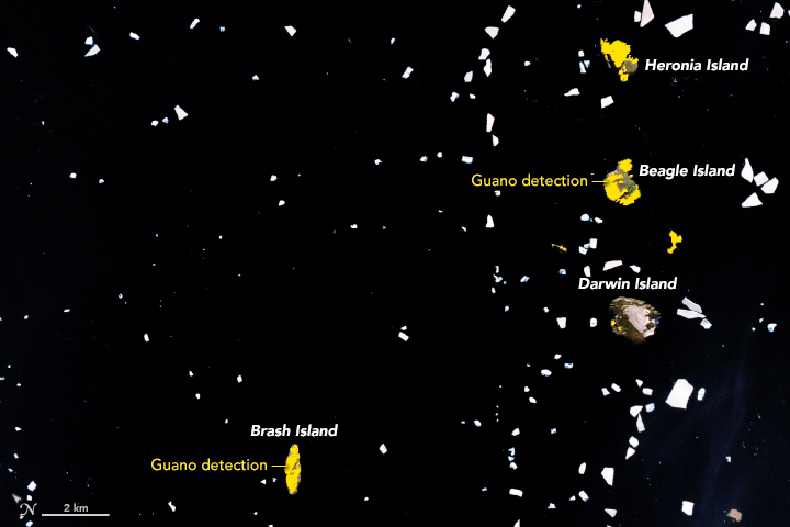
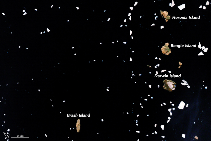
NASA Earth Observatory images by Joshua Stevens, using Landsat data from the U.S. Geological Survey and calculations from Lynch, H. J., & Schwaller, M. R. (2014).
Adélie penguins are particularly sensitive to changes in climate because they require ice-free land areas to breed and access to open water. They also need enough sea ice to support populations of key food sources. The researchers thought that changing diets would accompany the decline in population, but by analyzing the spectral signatures of all the guano stains found in cloud-free Landsat image of the islands since 1982, they were surprised to discover the penguins’ diets have stayed the same.
Penguin guano ranges from white to pink to dark red. White guano is from eating mostly fish; pink and red is from mostly eating krill. The University of Connecticut’s Casey Youngflesh, however, noticed some intriguing regional patterns in what Adélie penguins eat. Colonies in West Antarctica tend to eat more krill, while colonies in East Antarctic consume more fish. The reasons for the difference are not clear, though Youngflesh is looking into the possibility that differences in the Antarctic silverfish population may be a factor.
Discovering the big colonies on the Danger Islands has also opened up a new pathway for figuring out when penguins first arrived. By digging through layers of guano-stained pebbles during a recent field expedition and dirt and dating them with radiocarbon techniques, Michael Polito of Louisiana State University worked out that penguins must have arrived on the Danger Islands about 2,900 years ago, thousands of years earlier than previous evidence suggested.
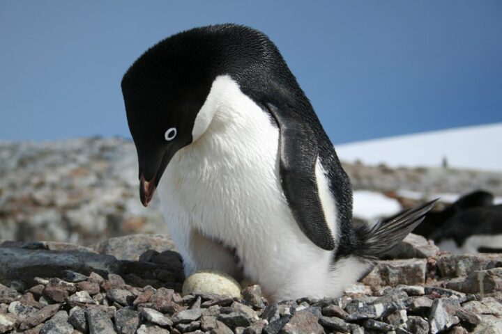
Credits: Heather Lynch, Stony Brook University.
Expect to hear even more guano-stained discoveries in the future. “We are only just scratching the surface of what we can do in terms of tracking seabirds from space,” said Lynch. “We should be able to extend the technique to snow petrel, boobies, and cormorants.”
Lynch put the total number of penguins on the Danger Islands at roughly 1.5 million (individual birds) — more than live on all the rest of the Antarctic Peninsula combined.
Read more about the Danger Island Adélie penguins from NASA and MAPPPD.
Lately, it feels like we’re hearing about wildfires erupting in the western United States more often. But how have wildfire occurrences changed over the decades?
Researchers with the NASA-funded Rehabilitation Capability Convergence for Ecosystem Recovery (RECOVER) have analyzed more than 40,000 fires from Colorado to California between 1950 to 2017 to learn how wildfire frequency, size, location, and a few other traits have changed.
Here are six trends they have observed in the western United States:
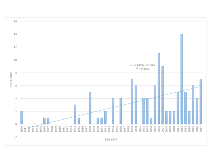
Over the past six decades, there has been a steady increase in the number of fires in the western U.S. In fact, the majority of western fires—61 percent—have occurred since 2000 (shown in the graph below).
Those fires are also burning more acres of land. The average annual amount of acres burned has been steadily increasing since 1950. The number of megafires—fires that burn more than 100,000 acres (156 square miles)—has increased in the past two decades.
Source: NASA RECOVER / Keith Weber
The recent increase in fire frequency and size is likely related to a few reasons, including the rise of global temperatures since the start of the new millennia. Seventeen of the 18 warmest years on record have occurred since 2001.
Global temperatures can affect local fire conditions. Amber Soja, a wildfire expert at NASA’s Langley Research Center, said fire-weather conditions—high temperatures, low relative humidity, high wind speed, and low precipitation—can increase dryness and make vegetation in the west easier to burn. “Those fire conditions all fall under weather and climate,” said Soja. “The weather will change as Earth warms, and we’re seeing that happen.”
Even though fire frequency and size has increased, only a small percentage of western lands— 11 percent—has burned since 1950. In this map, wildfires are shown in orange. Private lands are shown in purple while public lands are clear (no color). The location of wildfires was random; that is, there was no bias toward fires affecting private or public land.
Keith Weber, a professor at Idaho State University who led the analysis, was surprised at the 11 percent figure. There’s no clear reason yet for why more of the region hasn’t burned. “Some of the 89% may not burn because it has low susceptibility—not dry enough or it has low fuel (vegetation),” said Weber. “Some areas may be really ripe for a fire, but they have not had an ignition source yet.”
How has only 11 percent of the west burned, yet the annual number of acres burned and the frequency of fire increased? It turns out that many fires are occurring in areas that have already experienced fires, known as burn-on-burn effects. About 3 percent—almost a third of the burned land—has seen repeated fire activity.
The map here shows the locations of repeated fire activity. While you can’t see it at this map’s resolution, some areas have experienced as many as 11 fires since 1950. In those areas, fires occurred about every seven years, said Weber, which is about the amount of time it takes for an ecosystem to build up enough vegetation to burn again.
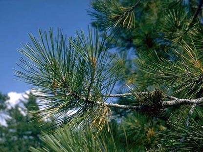
Since 2000, wildfires have shifted from burning shrub-lands to burning conifers. The Southern Rocky Mountains Ponderosa Pine Woodland landscape has experienced the most acres burned—more than 3 million.
The reason might lie within the tree species. Ponderosa Pine is a fire-adapted species. With its thick and flaky bark, the tree can withstand low-intensity surface fires. It also drops branches lower as they age, which deters fire from climbing up the tree and burning their green needles. “The fire will remove forest undergrowth, but will be just fine for the pines,” said Weber. “We are starting to see Ponderosa Pines thrive in those areas.”
Source: National Park Service
Research suggests that global warming is predicted to increase the number of very large fires (more than 50,000 acres) in the western United States by the middle of the century (2041-2070).
The map below shows the projected increase in the number of “very large fire weeks”—periods where conditions will be conducive to very large fires—by mid-century (2041-2070) compared to the recent past (1971-2000). The projections are based on scenarios where carbon dioxide emissions continue to increase.
According the Fourth National Climate Assessment, wildfires are expected to affect human health and several industries:
More about the source data:
Unless otherwise stated in the article, these data come from NASA’s Rehabilitation Capability Convergence for Ecosystem Recovery. RECOVER is an online mapping tool that pulls together data on 26 different variables useful for fires managers, such as burn severity, land slope, vegetation, soil type, and historical wildfires. In the past, fire managers might need several days or weeks to assemble and present such a large amount of information. RECOVER does so in five minutes, with the help of sophisticated server technologies that gather data from a multitude of sources. Funded by NASA’s Applied Science Program, RECOVER provides these data on specific fires to help fire managers to start rehabilitation plans earlier and implement recovery efforts quickly.
The researchers used the data layer showing historical fires since 1950, which were compiled from comprehensive databases by the U.S. Geological Survey Geospatial Multi-Agency Coordination, National Interagency Fire Center, Bureau of Land Management, U.S. Forest Service, and various state agencies such as the California Department of Forestry and Fire Protection. The historical fires do not include prescribed fires and undocumented fires. Learn more about the RECOVER program and its recent involvement with the Woosley Fire.
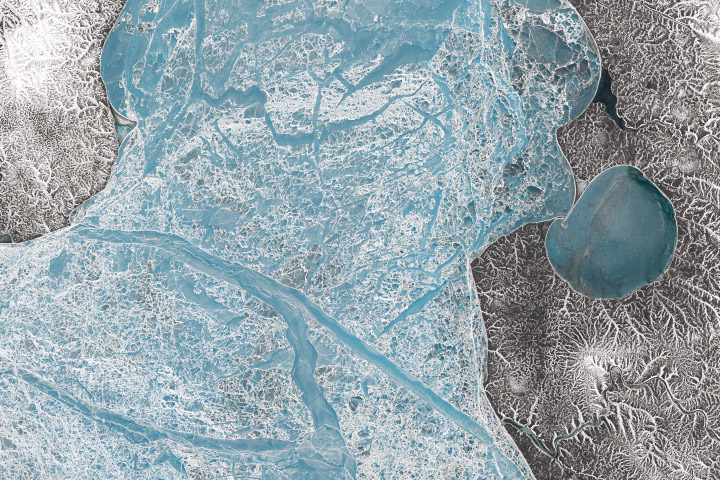
Every month on Earth Matters, we offer a puzzling satellite image. The November 2018 puzzler is above. Your challenge is to use the comments section to tell us what we are looking at and why it is interesting.
How to answer. You can use a few words or several paragraphs. You might simply tell us the location. Or you can dig deeper and explain what satellite and instrument produced the image, what spectral bands were used to create it, or what is compelling about some obscure feature in the image. If you think something is interesting or noteworthy, tell us about it.
The prize. We can’t offer prize money or a trip to Mars, but we can promise you credit and glory. Well, maybe just credit. Roughly one week after a puzzler image appears on this blog, we will post an annotated and captioned version as our Image of the Day. After we post the answer, we will acknowledge the first person to correctly identify the image at the bottom of this blog post. We also may recognize readers who offer the most interesting tidbits of information about the geological, meteorological, or human processes that have shaped the landscape. Please include your preferred name or alias with your comment. If you work for or attend an institution that you would like to recognize, please mention that as well.
Recent winners. If you’ve won the puzzler in the past few months or if you work in geospatial imaging, please hold your answer for at least a day to give less experienced readers a chance to play.
Releasing Comments. Savvy readers have solved some puzzlers after a few minutes. To give more people a chance to play, we may wait between 24 to 48 hours before posting comments.
Good luck!
Editor’s Note: We have highlighted the story of the Pilgrims and Thanksgiving several times over the years. Here are some of those pieces in one convenient place.
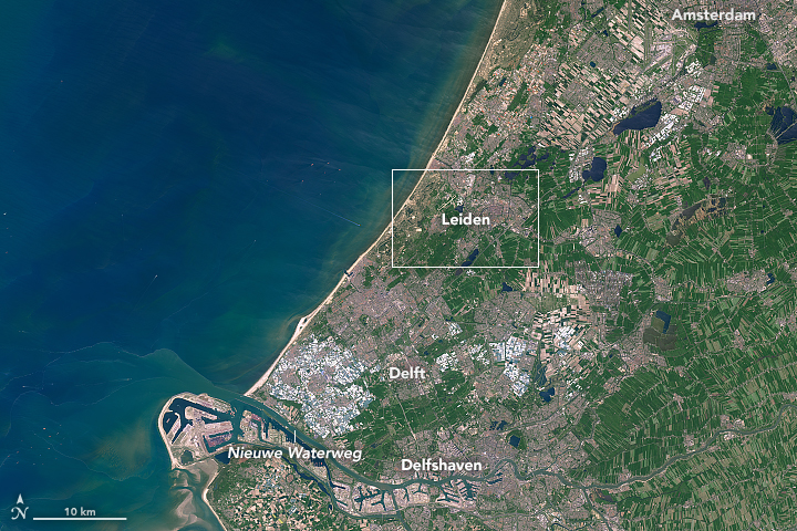
First stop, Holland. Image credit: NASA Earth Observatory image by Joshua Stevens, using Landsat data from the U.S. Geological Survey.
Most school children in America learn about the Pilgrims—the group of English settlers who endured a harrowing journey to the New World in 1620 on the Mayflower. It is sometimes overlooked, however, that Plymouth was not the first stop—nor the intended destination—for this congregation of religious separatists from the town of Scrooby in the English county of Nottinghamshire.
Before ever setting foot in North America, the Pilgrims spent several years living in Leiden, a city in the Netherlands. Most of the hundred or so people in the congregation lived in one-room cottages near Leiden University, in the shadow of the Pieterskerk, the oldest church in the city.
About a decade after they arrived, the congregation decided it was time to move. Tough economic conditions in Leiden meant few new recruits from England were willing to join them; Dutch culture was thought to be a bad influence on the children; and there was a looming possibility that Holland would go to war with Spain, a leading Catholic power.
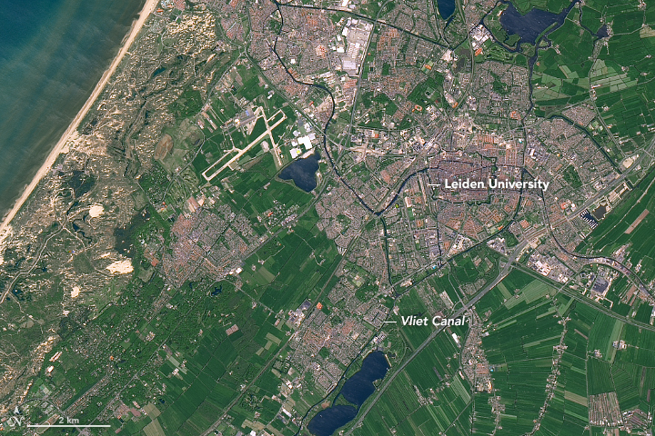
Leaving Leiden University. NASA Earth Observatory image by Joshua Stevens, using Landsat data from the U.S. Geological Survey.
Leiden was a city of many waterways, so when the Pilgrims were ready to leave in July 1620, they boarded several small boats on the Rapenburg Canal (near the university). This narrow canal fed into the larger Vliet Canal, which flows from Leiden toward Delft.
From there, they made their way back to England, where they struggled for a few months trying to repair a leaking ship. After abandoning that ship, they finally set sail for the New World on September 6, 1620, knowing they had to cross nearly 3,000 miles of open ocean.
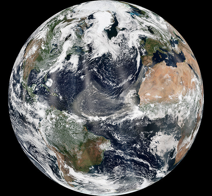
The North Atlantic can be treacherous. Image credit: NASA Earth Observatory image by Jesse Allen and Robert Simmon, using VIIRS data from the Suomi National Polar-orbiting Partnership.
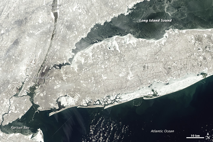
The original destination: the mouth of the Hudson River. NASA Earth Observatory image by Jesse Allen, using Landsat data from the U.S. Geological Survey.
The first half of the two month journey proved to be smooth and uneventful. But in October, they encountered a series of storms that turned the sea into a writhing cauldron. During one particularly bad storm, the ship nearly capsized.
Their intended destination was the northern edge of Virginia Colony, which at the time stretched from to the mouth of the Hudson River. However, the storms blew the Pilgrims off course toward Cape Cod in Massachusetts.
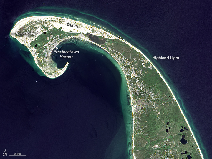
Provincetown, Massachusetts. NASA Earth Observatory image by Jesse Allen, using Landsat data from the U.S. Geological Survey.
When they realized this, they contemplated heading south. However, they were wary of the shallow waters and shoals east and south of Cape Cod and Nantucket—waters full of the sandy, rocky outwash from ancient glaciers. They sailed instead around the northeastern tip of the Cape and on November 21, 1620, dropped anchor just off the shores of modern-day Provincetown. While resting in that harbor, they composed and signed the first self-governing document in American history, the Mayflower Compact.
Over the coming weeks, they made first contact with Native American people, likely the Nauset tribe. First Encounter Beach in Eastham marks the reported location of a skirmish between the colonists and the tribe. The Pilgrims eventually sailed across Cape Cod Bay and settled in Plymouth.
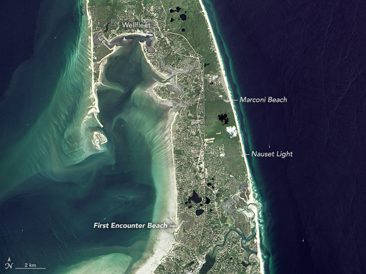
First Encounter Beach. NASA Earth Observatory image by Jesse Allen, using Landsat data from the U.S. Geological Survey.
It was in Plymouth where the Pilgrims celebrated the first Thanksgiving, a three-day harvest celebration that included feasting, games, and military exercises.
While there continues to be debate among historians about the circumstances and influences that led to the first Thanksgiving, there is evidence that the roots of the tradition might be traced back to Leiden. During their time in the city, the Pilgrims would have experienced a celebratory thanksgiving service and festival that was held each year on October 3 to mark the 1574 end of the Spanish siege of the city.
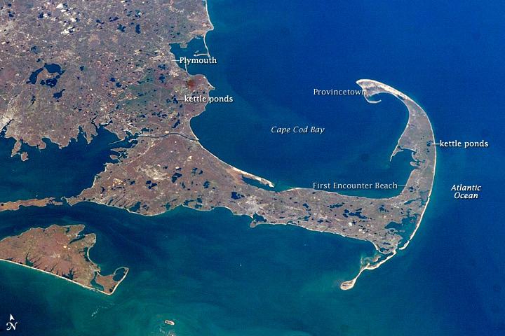
Crossing Cape Cod Bay brought the Pilgrims to Plymouth. This astronaut photograph was acquired on November 7, 2007.
As powerful downslope winds sent the deadly Camp Fire raging through bone-dry vegetation in northern California on November 8, 2018, sensors on the ground and in space began to detect sharp increases in air pollution downwind of the inferno.
From space, the Moderate Resolution Imaging Spectroradiometer (MODIS) and Visible Infrared Imaging Radiometer Suite (VIIRS) sensor observed expansive smoke and aerosol plumes over California’s Central Valley and coast soon after the fire began. Likewise, the Ozone Mapping Profiler Suite (OMPS) on Suomi NPP observed unusually high aerosol levels, and the Measurement of Pollution in the Troposphere (MOPITT) on Terra picked up strong carbon monoxide signals from the fire.
Meanwhile on the ground, atmospheric scientists Pawan Gupta, Robert Levy, Prakash Doraiswamy, and Olga Pikelnaya have been keeping a close eye on air quality data from a network of low-cost sensors distributed throughout the region. These sensors measure the mass concentration of fine particulate matter (PM2.5). Some stations measured PM2.5 values higher than 500 micrograms per cubic meter, which is about 40 times higher than the level considered safe to breathe.
#fires and #smoke in CA continue deteriorating air quality in the region – satellite images from @NASA_NPP #VIIRS #OMPS and low-cost sensor network @purpleairq shows hazardous conditions @NASA_HAQAST @NASAEarthData @iccialtopenburn @Open_AQ @R5_Fire_News @USRAedu @SanGasso pic.twitter.com/lhO08wUg4i
— Pawan Gupta (@pawanpgupta) November 11, 2018
“On November 9th, due to favorable wind direction, most of the smoke was confined to a smaller region north of San Francisco, but the wind direction changed on the 10th, and smoke spread over a much larger region,” noted Gupta, who is based at NASA’s Marshall Space Flight Center and works with NASA’s SERVIR and ARSET programs. “On the 11th and 12th, the wind direction again changed, and most of the smoke blew over the ocean.”
Gupta is involved in an ongoing effort to deploy and test low-cost commercial air quality sensors to see how well their measurements compare with standard EPA measurements and NASA satellite observations. The ground-based sensors that are part of official state and federal government observing networks cost several thousand dollars each, but the new generation of sensors cost just a few hundred dollars—cheap enough that Gupta thinks they could proliferate and potentially be used to help fill in crucial gaps, particularly in countries with few air quality sensors.
“The low-cost sensors have performed as expected, though with varying accuracy for certain types of particles,” said Gupta. “Going forward, we hope to use what we learn from them to improve the techniques scientists use to derive levels of particulate matter at the surface from the entire column aerosol measurements observed by satellites.”
So far, Gupta and his colleagues have deployed about 40 low-cost sensors in California. Next summer, they plan to add hundreds of additional sensors in New Delhi, an area that regularly gets hit with dust storms and smoke from agricultural burning. They also plan to deploy sensors in North Carolina, an area with relatively clean air.
Citizen scientists interested in air quality can get involved in the project. Gupta and colleagues from RTI International, South Coast Air Quality Management District, NASA, and other institutions are recruiting volunteers to host the low-cost sensor and share the results with the experts.
Further Reading:
Air Quality Citizen Science, Project Goals and Overview
EOS, New Strategies to Protect People from Smoke During Wildfires
KVPR, NASA’s JPL Using Fresno As A Test Bed For Air Quality Research
Geohealth, Impact of California Fires on Local and Regional Air Quality: The Role of a Low‐Cost Sensor Network and Satellite Observations
 A new edition of The Earth Observer, a bi-monthly publication that covers the nuts-and-bolts of NASA’s Earth Observing System, is out. Here are a few excerpts, along with some musical headlines that may get you humming as you read. You can download the full issue here. Back issues here.
ICE ICE BABY
The Advanced Topographic Laser Altimeter System (ATLAS), the lone instrument on ICESat-2, successfully fired its laser on September 30 after the mission operations team completed testing of the spacecraft and opened the door protecting the optics. The primary science mission for ICESat-2 is to gather enough observations to estimate the annual height change of the Greenland and Antarctic ice sheets to within four millimeters. Hundreds of billions of tons of land ice melt into the ocean annually, raising sea levels worldwide. In recent years, meltwater from Greenland and Antarctica alone has raised global sea level by more than a millimeter a year, and the rate is increasing.
THIS LANDSAT IS YOUR LANDSAT
In January 2008, the U.S. Geological Survey and NASA decided to open the full Landsat image archive for public access on a non discriminatory, no-cost basis. This change in Landsat’s data policy ushered in a new era of Landsat data uses and applications while also revolutionizing the way Landsat has been woven into scientific discovery, economic prosperity, and public policy for management of land and water resources across a range of scales.
DEVELOPING SATELLITE SKILLS FOR 525,600 MINUTES (TIMES TWENTY)
From 1998 to the current 2018 fall term, the NASA DEVELOP National Program has engaged 4,671 participants who have conducted 931 projects. The program bridges the gap between science and society by demonstrating how NASA Earth Science data can be applied to environmental decision making. These projects have demonstrated the applications of NASA Earth observations to a wide variety of sectors, addressing topics such as drought monitoring, vector-borne disease risk, water-quality assessments, pre- and post-wildfire mapping, agriculture monitoring, and critical habitat identification.
I CAN SEE CLEARLY NOW
The first Earth Science Decadal Survey identified CLARREO as a Tier-1 (i.e., highest) priority mission for development. The CLARREO Pre-Formulation Mission, referred to herein as the “Full” CLARREO mission, was recommended to better understand climate change. The foundation of CLARREO is the ability to produce highly accurate climate records to test climate projections in order to improve models and enable sound policy decisions.
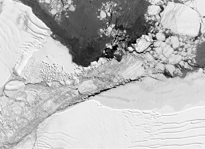

The sharp-angled iceberg that made headlines in late October 2018 had a longer, rougher journey than was initially thought.
The iceberg was spotted on October 16, 2018, during a flight for Operation IceBridge—NASA’s long-running aerial survey of polar ice. During that day’s survey of glaciers and ice shelves along the northern Antarctic Peninsula, scientist Jeremy Harbeck spotted the compelling berg. Harbeck explained in a NASA story his reason for taking the picture:
“I was actually more interested in capturing the A68 iceberg that we were about to fly over, but I thought this rectangular iceberg was visually interesting and fairly photogenic, so on a lark, I just took a couple photos.”
Not only were the edges of the iceberg extremely straight, but the two corners appeared “squared off” at right angles. The berg was so clean-cut that it was reasonable to assume it might have very recently calved from the Larsen C ice shelf. That’s the same ice shelf that spawned A-68, the trillion-ton iceberg that broke away in July 2017.
It turns out, however, that the rectangle berg actually has had a much longer journey. Scientists used images from Landsat 8 and the European Space Agency’s Sentinel-1 to trace the berg back to its origins. They found that it calved from the ice shelf’s new front in early November 2017, just a few months after A-68 broke away. The image below, tweeted November 9, 2018, by Stef Lhermitte of Delft University of Technology, shows the small, newly calved icebergs. The rectangle iceberg—which was about 4 kilometers long at the time—appears just north of a curved berg. Both were about a third of the way down the new front of the Larsen C.
The rectangle berg then began a northward journey, navigating the newly open water between the Larsen C ice shelf and Iceberg A-68. Collision threats were everywhere: A-68 could smash into the little bergs at any time, and smaller bergs could collide with each other.
The berg cruised all the way north and through a narrow passage between the A-68’s northern tip and a rocky outcrop near the ice shelf known as Bawden Ice Rise. NASA/UMBC glaciologist Chris Shuman likens this zone to a nutcracker. A-68 has repeatedly smashed against the rise and caused pieces of ice to splinter into clean-cut geometric shapes. An area of geometric ice rubble is visible in the Landsat 8 image (top and below) from October 14, 2018, two days before the IceBridge flight.
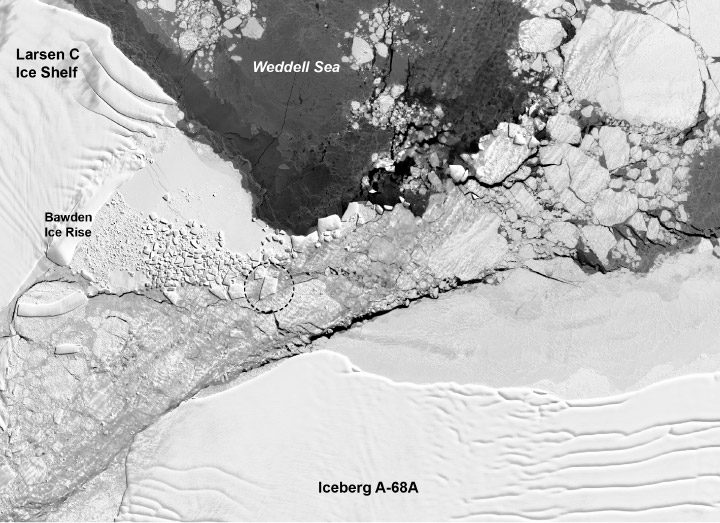
The once-long rectangle berg did not make it through unscathed; it broke into smaller bits. The iceberg in Harbeck’s photograph, circled in the annotated Landsat 8 satellite image, appears closer to the shape of a trapezoid. The trapezoidal berg is about 900 meters wide and 1500 meters long, which is tiny compared to the Delaware-sized A-68.
By November 2018 the iceberg had moved out of the rubble zone and into open water. Shuman noted: “Now it’s just another iceberg on its way to die.”
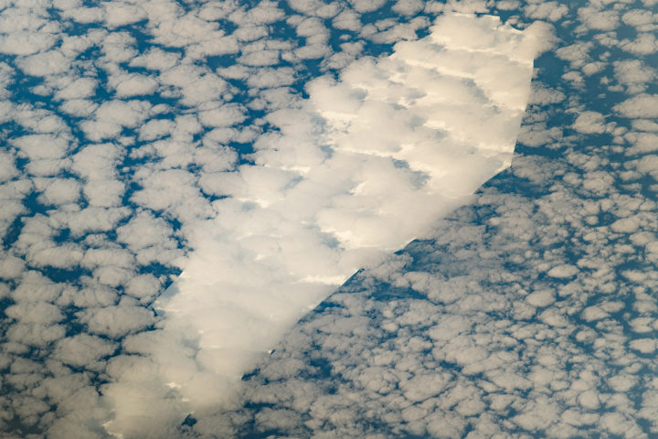
Every month on Earth Matters, we offer a puzzling satellite image. The October 2018 puzzler is above. Your challenge is to use the comments section to tell us what we are looking at and why it is interesting.
How to answer. You can use a few words or several paragraphs. You might simply tell us the location. Or you can dig deeper and explain what satellite and instrument produced the image, what spectral bands were used to create it, or what is compelling about some obscure feature in the image. If you think something is interesting or noteworthy, tell us about it.
The prize. We can’t offer prize money or a trip to Mars, but we can promise you credit and glory. Well, maybe just credit. Roughly one week after a puzzler image appears on this blog, we will post an annotated and captioned version as our Image of the Day. After we post the answer, we will acknowledge the first person to correctly identify the image at the bottom of this blog post. We also may recognize readers who offer the most interesting tidbits of information about the geological, meteorological, or human processes that have shaped the landscape. Please include your preferred name or alias with your comment. If you work for or attend an institution that you would like to recognize, please mention that as well.
Recent winners. If you’ve won the puzzler in the past few months or if you work in geospatial imaging, please hold your answer for at least a day to give less experienced readers a chance to play.
Releasing Comments. Savvy readers have solved some puzzlers after a few minutes. To give more people a chance to play, we may wait between 24 to 48 hours before posting comments.
Good luck!