

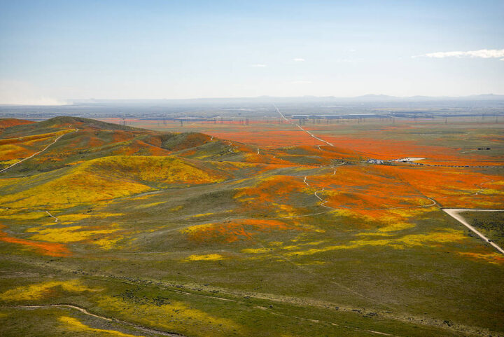
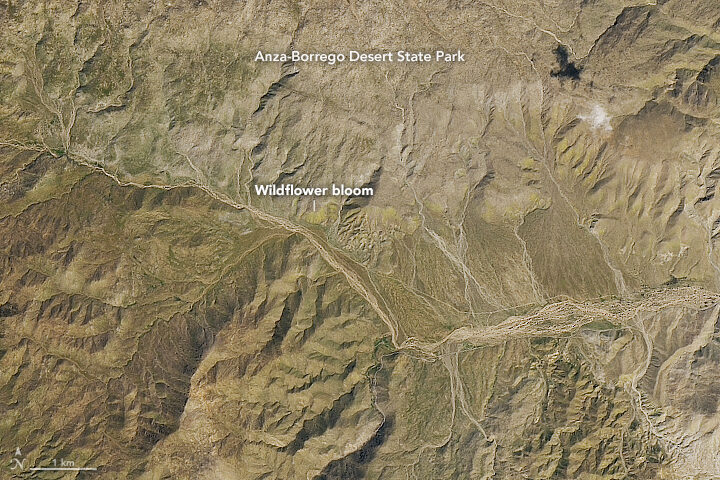
When we published a few Landsat images of wildflower super blooms in California in March 2019, you may have had to squint a little to find the flowers. From 705 kilometers (438 miles) above Earth’s surface, at the 15-meter-per-pixel resolution of the Operational Land Imager on Landsat 8, the flowers tend to blend with the hues of the desert.
Not so with this colorful photograph of poppies and other wildflowers in Antelope Valley that was taken from a T-34 airplane. The picture was shot by NASA Armstrong aerial photographer Jim Ross, who may have one of the coolest jobs at NASA. Watch the video below to find out how he got it.
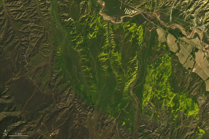
Meanwhile, remote sensing scientist Iban Ameztoy was inspired enough by the aerial photos to pull Sentinel-2 satellite imagery of the same bloom and share them on Twitter.
Want more satellite imagery and aerial photography of the super bloom in California? NASA Earth Observatory and NASA Armstrong have you covered.
Join a mosquito mapping blitz for Citizen Science Day through GLOBE Observer.
Earth observations take place on many spatial scales. Some observations originate from sensors in space; others can happen with a mobile phone in the palm of your hand. GLOBE Observer is a free mobile app that connects an international network of citizen scientists with the broader scientific community in an effort to document and analyze changes taking place in Earth’s air, land, water, and life. The app is the centerpiece of a citizen science blitz now underway.
Both globalization and a changing climate have caused countless living creatures to adjust their range and distribution. For human health, one of the most concerning impacts of a changing climate is the range expansion of mosquitoes. These flying vectors of disease are responsible for illness in millions of people; they also cause more than 700,000 deaths each year.
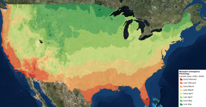
The northern hemisphere is now greening up in response to changes in sunlight and temperatures, and mosquito season is either just beginning or underway in much of the contiguous United States. The map above indicates when the first appearance of mosquitoes can be expected based on past weather data. The actual time of first appearance in a region can vary by several weeks, depending on the weather and other variables.
The GLOBE Observer app has a new tool known as the Mosquito Habitat Mapper, which makes it possible for citizen scientists to observe, record, and share data about mosquito breeding sites using a mobile phone. The data are important to scientists trying to predict disease outbreaks and epidemics. Observations provided by citizen scientists, combined with satellite observations and models, can make it possible to track the range and spread of invasive mosquitoes.
With the Mosquito Habitat Mapper, citizen scientists can report active and potential breeding sites in their communities. And using a built-in taxonomic key, GLOBE Observers can help determine whether the mosquito larvae have the potential to transmit disease pathogens to humans.
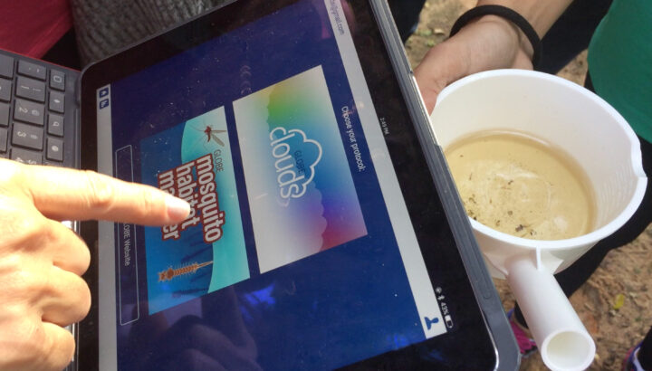
GLOBE Observers also can have an immediate impact on health in their community. In the last step of Mosquito Habitat Mapper, users report whether they were able to remove a breeding site. This can be accomplished in most cases by simply tipping and tossing standing water that is found in containers, or by covering stored water with a net or a lid. For larger water bodies such as ponds, irrigation ditches, or swamps, the reports about breeding sites can be used by mosquito surveillance agencies.
In this way, GLOBE Observers are not only engaged scientifically, they can become agents of change in their community. The World Health Organization (WHO) identifies source reduction–the elimination of mosquito breeding sites–as the most effective way to protect human populations and reduce the threat of mosquito vector-borne disease.
The GLOBE Observer Mosquito Blitz kicked off on April 7, 2019, and ends on Citizen Science Day (April 13). Join in this effort by downloading the app. Follow GLOBE Observer on social media during Mosquito Blitz week on Facebook or Twitter. Check out the Mosquito Blitz website and GLOBE Mission Mosquito for more mosquito resources.

What do you get when you mix science with sugary marshmallow candy? Peepola Tesla, the candy bunny that invented the transmitter. Or Neanderpeeps, the group of sweet marshmallows that created fire. Or Dmitri Mendelpeep, the father of the peepiodic table.
For the first time possibly ever, science writers, school children, and enthusiastic science fans participated in “The World’s Finest Science-Themed Peeps Diorama Contest.” Participants were asked to recreate scenes of scientific discoveries, field work, moments in history, and model organisms— all made with the spring marshmallow treats. With nearly 50 entries to choose from, you now get to vote on which diorama deserves the coveted “Peeple’s Choice Award.”
Of course here at NASA Earth Observatory, we are partial to the space- and Earth-themed dioramas. Take a peep at some of the entries below. Make sure to vote for your favorite here before April 14, 2019.
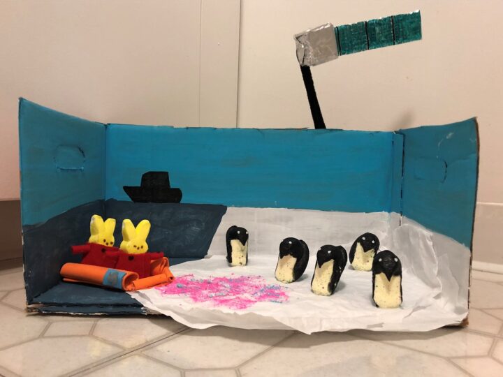
Antarctic peep-searchers use Landsat images of peep-guin peep (er, poop) to measure the health of colonies. Penguin peep (er, poop) is bright pink and bright blue, depending on if they’re eating shrimp or sardines. What they’re eating and how much peep (er, poop) is on the ice is an important indicator of peep-guin health. In this diorama, intrepid peep-searchers are bundled up in their cozy Arctic gear, visiting the peep-guin colony from a peep-search ship to ground-truth the colony counts they’re getting with satellite data. Reminder to all peep-searchers: Don’t eat the pink snow!
Read about the original research on NASA Earth Observatory.

Peep scientists are investigating an unusual object at the far reaches of the solar system, known as Ultima Peep. The spacecraft New Hare-rizons is closing in, and images of Ultima Peep are becoming clearer. At first, Ultima Peep appeared to be shaped like a bowling pin, but now, some are beginning to suspect that Ultima Peep is shaped like a peep. (Perhaps it is a lonely space peep?) The peeple demand information! Scientists have called a press conference to weigh in, and journalists are peepering them with questions.
The scientific inspiration for this diorama is, of course, NASA’s New Horizons spacecraft and its investigation of the Kuiper Belt object Ultima Thule, the shape of which became clearer as the spacecraft got closer. Unfortunately, in our world, bunny ears never materialized. The diorama also includes a title and a close-up of the encounter between New Hare-rizons and Ultima Peep.
Read about the Ultimate Thule flyby.
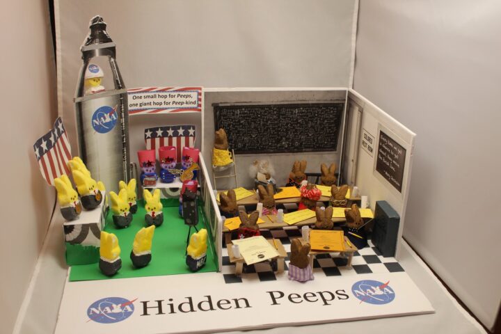
Hidden Peeps is an artistic rendering of the Black women who made essential contributions to the U.S. scientific space program at NASA. The right side of the diorama depicts the women, known as computers, whose work enabled US spaceflights but went largely unsung. The details include Dorothy Vaughan programming an early computer, Katherine Johnson and Mary Jackson writing their official technical reports, other women doing math on the chalkboard, calculating trajectories, verifying fight patterns. Be sure to check out the ‘colored’ bathroom sign (NASA’s facilities in Virginia were segregated), the Mary Jackson quote, the women’s glasses, typewriter, pencils, coffee mugs and family peeps photo.
The other side of the diorama depicts the men receiving attention and accolades for the space program complete with astronaut John Glenn in the rocket, military band, NBC photographer, and medals. Check out the NASA logo and the Neil Armstrong-inspired banner, “One small hop for Peeps….”
Learn more about NASA’s Hidden Figures and Modern Figures.
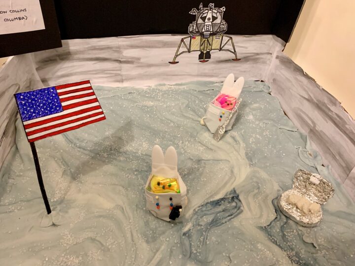
Astropeeps Bunny Aldrin and Neil Peepstrong explore Tranquilipeep Base — making history as the first sentient marshmallows to step on the moon. Marshmallow Collins drew the short straw and is orbiting up high in the Columbia capsule.
Meanwhile, Bunny is collecting rock samples with his shovel and sample box, and Neil takes pictures with his hand-held camera. The two astropeeps have already planted the American flag, and their ride — the Eagle lander — waits in the distance. They keep their spacesuits on, because bad things happen to Peeps in a vacuum…
See the photograph taken by Neil Armstrong of the Lunar Module at Tranquility Base.
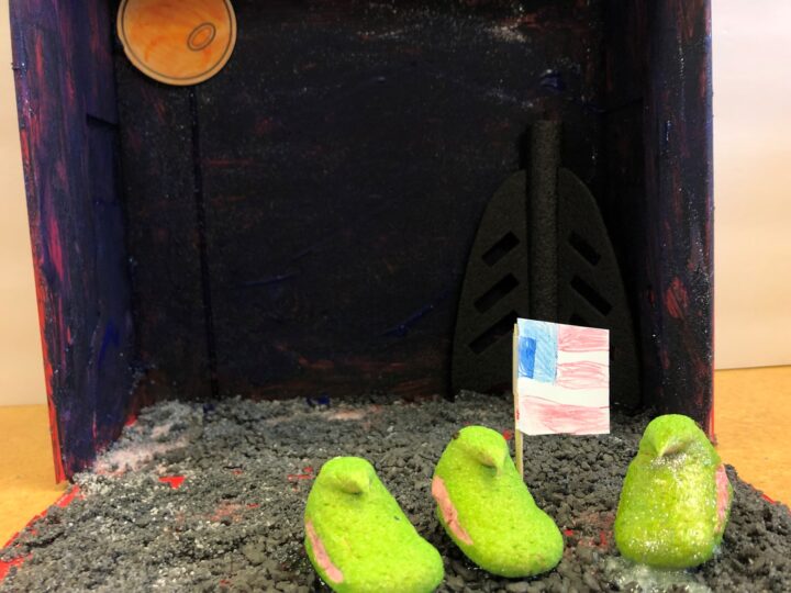
Peepil Armstrong takes his first hop on the moon.
View the original video of Neil Armstrong walking on the moon.
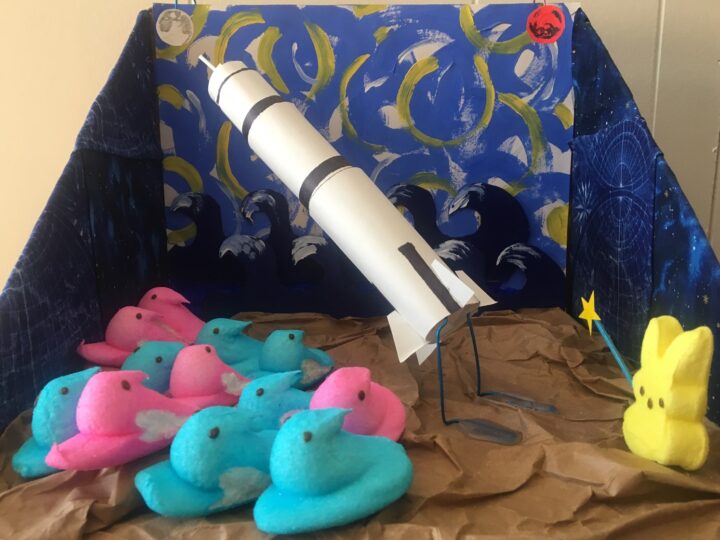
Wernher Von Braun’s V2 rockets ultimately powered the Saturn V and took the United States to the moon, but von Braun always saw Mars as the true destination. Today, we are proving him right. So while the crowds have their eyes on the moon, von Braun points the way to Mars.
Learn about NASA’s mission to Mars.
The contest is hosted by The Open Notebook, a non-profit publication aimed to help science journalists sharpen their skills by providing useful tools, articles, and career advice. The contest is the brainchild of volunteers Joanna Church, Helen Fields, and Kate Ramsayer, an award-winning trio of peep diorama makers from the Washington, DC, area.
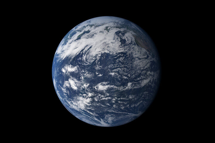
From afar, Earth’s oceans look quite blue. But closer inspection reveals a much more complex palette. Tiny particles floating in the water (phytoplankton, pollution, and sediments) can change how light is absorbed and scattered, which affects the apparent color of the water near its surface.
Color is useful for scientists who model how the oceans might evolve with time and climate change. “It’s cool to see how all of these global Earth models—completely different when it comes to their complexity—use the color of the ocean to explain the changes in the future,” said Ivona Cetinic, an ocean ecologist at NASA’s Goddard Space Flight Center.
In one example, NASA-funded researchers showed large areas of the planet’s blue water becoming even bluer. The change would come from a decline in green-pigmented phytoplankton as the planet warms. You can read more about that study in Nature Communications, or check out some of the media coverage.
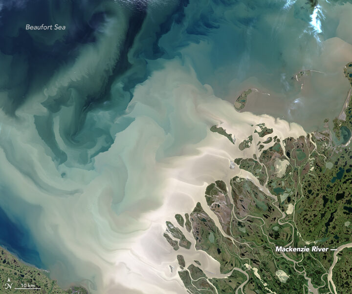
In a different study published in Geophysical Research Letters (GRL), researchers from NASA Goddard found that the “yellowing” of coastal waters could lead to cooler global ocean temperatures. Yellow-brown waters already show up around some coastal areas where rivers meet the ocean—such as the outwash from the Mackenzie River in northern Canada (above). Pulses of water from the spring melt move a huge amount of dissolved organic material and sediment into the Beaufort Sea. Coastal waters could become yellower over time if increases in precipitation and melting on land wash more dissolved organic material out to the ocean.
The researchers ran simulations that incorporated NASA ocean-color data and showed that after 300 years, the top 700 meters of a “yellow” ocean with dissolved organic material and plankton would be colder than a “green” phytoplankton-only ocean. That’s because yellow water lets less light and heat pass through the top layer of water, keeping it cooler below.
The authors wrote in the GRL paper: “We suggest that an increase in these yellowing materials behaves as a buffer that mitigates some effects of a warming climate.”
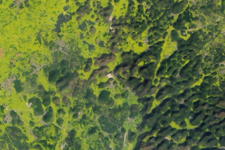
Every month on Earth Matters, we offer a puzzling satellite image. The March 2019 puzzler is above. Your challenge is to use the comments section to tell us what we are looking at and why it is interesting.
How to answer. You can use a few words or several paragraphs. You might simply tell us the location. Or you can dig deeper and explain what satellite and instrument produced the image, what spectral bands were used to create it, or what is compelling about some obscure feature in the image. If you think something is interesting or noteworthy, tell us about it.
The prize. We can’t offer prize money or a trip to Mars, but we can promise you credit and glory. Well, maybe just credit. Roughly one week after a puzzler image appears on this blog, we will post an annotated and captioned version as our Image of the Day. After we post the answer, we will acknowledge the first person to correctly identify the image at the bottom of this blog post. We also may recognize readers who offer the most interesting tidbits of information about the geological, meteorological, or human processes that have shaped the landscape. Please include your preferred name or alias with your comment. If you work for or attend an institution that you would like to recognize, please mention that as well.
Recent winners. If you’ve won the puzzler in the past few months or if you work in geospatial imaging, please hold your answer for at least a day to give less experienced readers a chance to play.
Releasing Comments. Savvy readers have solved some puzzlers after a few minutes. To give more people a chance to play, we may wait between 24 to 48 hours before posting comments.
Good luck!
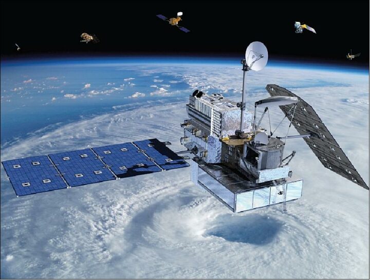
On February 27, 2014, a Japanese rocket launched NASA’s latest satellite to advance how scientists study raindrops from space. The satellite, the Global Precipitation Measurement (GPM) Core Observatory, paints a picture of global precipitation every 30 minutes, with help from its other international satellite partners. It has provided innumerable insights into Earth’s precipitation patterns, severe storms, and into the rain and snow particles within clouds. It has also helped farmers trying to increase crop yields, and aided researchers predicting the spread of fires.
In honor of GPM’s fifth anniversary, we’re highlighting some of our favorite and most unique Earth Observatory stories, as made possible by measurements taken by GPM.
The Second Wettest October in Texas Ever
In Fall 2018, storm after storm rolled through and dumped record rainfall in parts of Texas. When Hurricane Willa hit Texas around October 24, the ground was already soaked. One particularly potent cold front in mid-October dropped more than a foot of rain in areas. By the end of the month, October 2018 was the second wettest month in Texas on record.
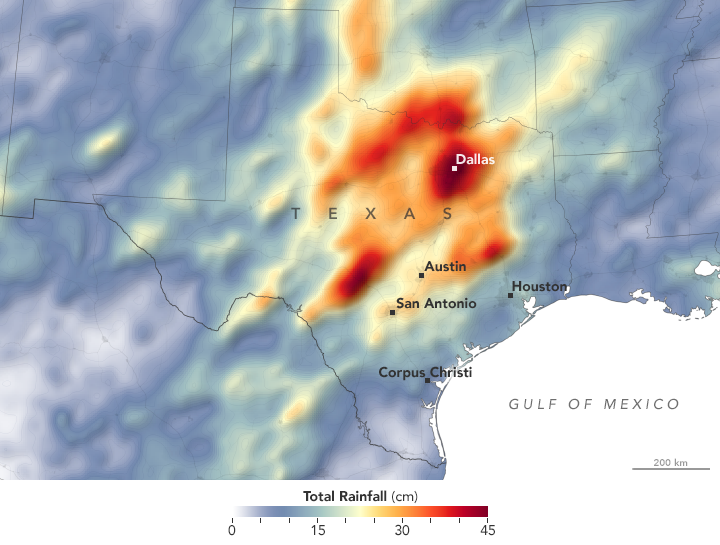
GPM measured the total amount of rainfall over the region from October 1 to October 31, 2018. The brightest areas reflect the highest rainfall amounts, with many places receiving 25 to 45 centimeters (10 to 17 inches) or more during this period. The satellite imagery can also be seen from natural-color satellite imagery.
Observing Rivers in the Air
With the GPM mission’s global vantage point, we can more clearly see how weather systems form and connect with one another. In this visualization from October 11-22, 2017, note the long, narrow bands of moisture in the air, known as “atmospheric rivers.” These streams are fairly common in the Pacific Northwest and frequently bring much of the region’s heavy rains and snow in the fall and winter. But this atmospheric river was unusual for its length—extending roughly 8,000 kilometers (5,000 miles) from Japan to Washington. That’s about two to three times the typical length of an atmospheric river.

Since atmospheric rivers often bring strong winds, they can force moisture up and over mountain ranges and drop a lot of precipitation in the process. In this case, more than four inches of rain fell on the western slopes of the Olympic Mountains and the Cascade Range, while areas to the east of the mountains (in the rain shadow) generally saw less than one inch.
Increasing Crop Yield for Farmers in Pakistan
Knowing how much precipitation is falling or has fallen is useful for people around the world. Farmers, in particular, are interested in knowing precipitation amounts so they can prevent overwatering or underwatering their crops.
The Sustainability, Satellites, Water, and Environment (SASWE) research group at the University of Washington has been working with the Pakistan Council of Research in Water Resources (PCRWR) to bring this kind of valuable information directly to the cell phones of farmers. A survey by the PCRWR found that farmers who used the text message alerts reported a 40 percent savings in water. Anecdotally, many farmers say their income has doubled because they got more crops by applying the correct amount of water.
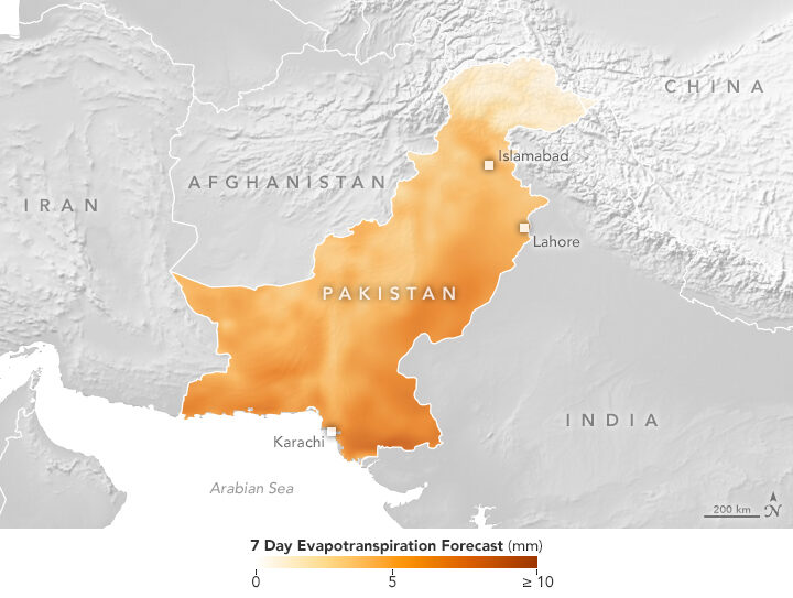
The map above shows the forecast for evapotranspiration for October 16-22, 2018. Evapotranspiration is an indication of the amount of water vapor being removed by sunlight and wind from the soil and from plant leaves. It is calculated from data on temperature, humidity, wind speed, and solar radiation, as well as a global numerical weather model that assimilates NASA satellite data. The team also looks at maps of precipitation, temperature and wind speed to help determine crop conditions. Precipitation data comes from GPM that is combined with ground-based measurements from the Pakistan Meteorological Department.
Forecasting Fire
Precipitation can drastically affect the spread of a fire. For instance, if a region has not received normal precipitation for weeks or months, the vegetation might be drier and more prone to catching fire.
NASA researchers recently created a model that analyzes various weather factors that lead to the formation and spread of fires. The Global Fire Weather Database (GFWED) accounts for local winds, temperatures, and humidity, while also being the first fire prediction model to include satellite–based precipitation measurements.
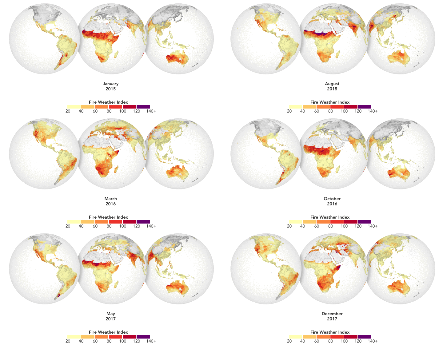
The animation above shows GFWED’s calculated fire danger around the world from 2015 to 2017. The model compiles and analyzes various data sets and produces a rating that indicates how likely and intense fire might become in a particular area. It is the same type of rating that many firefighting agencies use in their day–to–day operations. Historical data are available to understand the weather conditions under which fires have occurred in the past, and near–real–time data are available to gauge current fire danger.
Automatically Detecting Landslides
In this mountainous country of Nepal, 60 to 80 percent of the annual precipitation falls during the monsoon (roughly June to August). That’s also when roughly 90 percent of Nepal’s landslide fatalities occur. NASA researchers have designed an automated system to identify potential landslides that might otherwise go undetected and unreported. This information could significantly improve landslide inventories, leading to better risk management.
The computer program works by scanning satellite imagery for signs that a landslide may have occurred recently, looking at topographical features such as hill slopes.
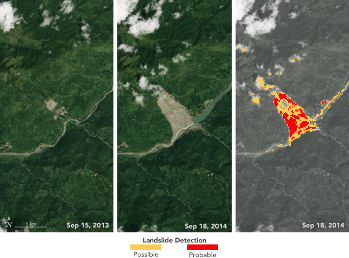
The left and middle images above were acquired by the Landsat 8 satellite on September 15, 2013, and September 18, 2014—before and after the Jure landslide in Nepal on August 2, 2014. The image on the right shows that 2014 Landsat image processed with computer program. The red areas show most of the traits of a landslide, while yellow areas exhibit a few of the proxy traits.
The program also uses data from GPM to help pin when each landslide occurred. The GPM core satellite measures rain and snow several times daily, allowing researchers to create maps of rain accumulation over 24-, 48-, and 72-hour periods for given areas of interest—a product they call Detecting Real-time Increased Precipitation, or DRIP. When a certain amount of rain has fallen in a region, an email can be sent to emergency responders and other interested parties.
The GPM Core Observatory is a joint satellite project by NASA and the Japan Aerospace Exploration Agency. The satellite is part of the larger GPM mission, which consists of about a dozen international satellite partners to provide global observations of rain and snow.
To learn more about GPM’s accomplishments over the past five years, visit: https://pmm.nasa.gov/resources/featured-articles-archive
To learn more about the GPM mission, visit: https://www.nasa.gov/mission_pages/GPM/main/index.html
The Grand Canyon in northern Arizona has a long history. Between 5-6 million years ago, the Colorado River started carving through a high, flat plateau. About 12,000 years ago, people in the vicinity of the canyon left behind the area’s oldest known human artifacts. One-hundred years ago, a signature by President Woodrow Wilson established the Grand Canyon as a National Park.
NASA Earth Observatory has existed for just one-fifth the time of Grand Canyon National Park. But over those 20 years, satellites and astronauts have captured some magnificent views of the park from above. Here are some of our favorites.
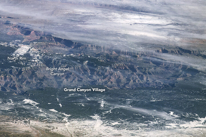
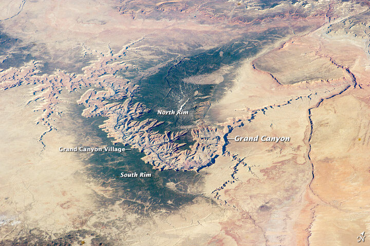
“If you want to see the whole canyon at once, an airplane won’t do. You have to be in orbit. I would highly recommend the International Space Station, if you have the chance.”
Marker Marshall, U.S. National Park Service ranger at the Grand Canyon
The top image, shot by an astronaut from the International Space Station (ISS), shows the canyon in winter 2009, when snow blanketed part of the plateau. The second image, also shot from the ISS, shows the canyon in spring 2014.
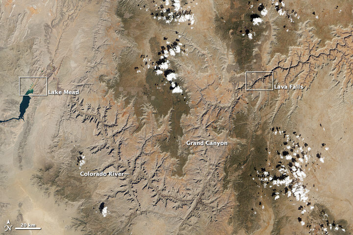
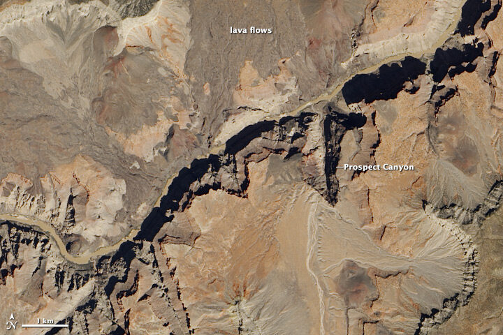
Satellites usually offer nadir (straight-down) views of the canyon, such as these natural color images acquired with the Landsat 8 satellite in April 2013. The wide view shows the canyon in context with the surrounding plateau, while the detailed image shows an area around the rapids known as Lava Falls (in reference to old lava flows in the area).
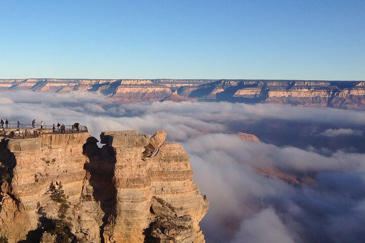
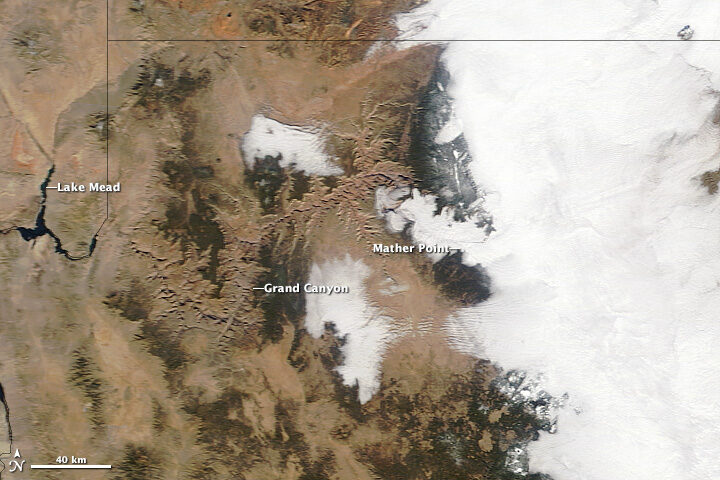
In its 100 years as a National Park, the canyon still turns up surprises to visitors and Park Service rangers. These images show a rare weather event in December 2013 that filled the canyon with an ocean of clouds.
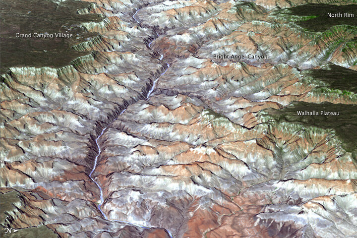
Three-dimensional views are also possible from space. An improved version of a digital topographic map of Earth released in October 2011 made it possible to produce this 3D view of the eastern part of the Grand Canyon.
You can view more Earth Observatory images of the Grand Canyon here. And if you find yourself in Arizona, here is list of centennial events hosted by the National Park Service throughout the year.
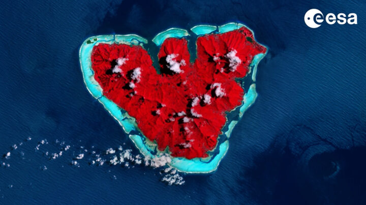
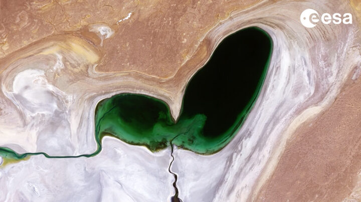
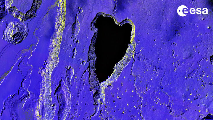
When you look at Earth from above as often as we do, you become intimately familiar with the shapes and patterns that can emerge across the planet. Some are made by people and others by nature. Some are ephemeral and others more permanent.
Today we took a light-hearted approach to the Image of the Day, explaining the science behind one such shape—what appears to be a Valentine in the Sky. The image prompted us to look and see where other heart-shaped features have turned up.
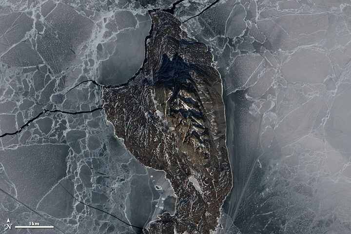
Heart-Shaped Uummannaq
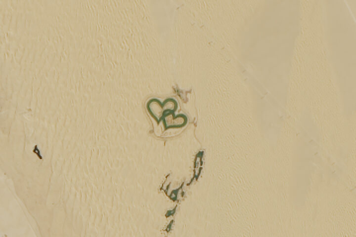
Love Lake
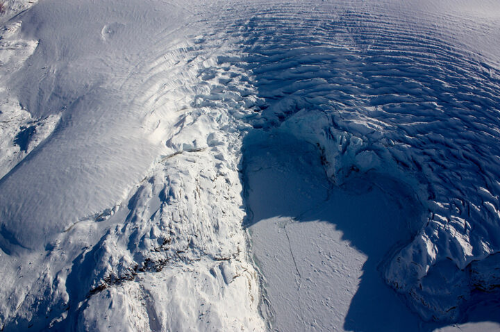
Heart-shaped Calving Front
Island Love
Shrinking Heart
Loving Big
On February 12, 1809, Charles Robert Darwin was born in England in the town of Shrewsbury. The famed naturalist, geologist, and biologist is best known for his 19th century expedition to the Galápagos Islands, which inspired revolutionary insights about evolution and natural selection. Lesser known is that the expedition to the Galápagos was just one part of a much longer journey. The Second Voyage of the HMS Beagle brought Darwin and his fellow travelers to South America, Australia, Africa, and several islands in between. Here are a few interesting places where the HMS Beagle stopped that we have covered in earlier stories.
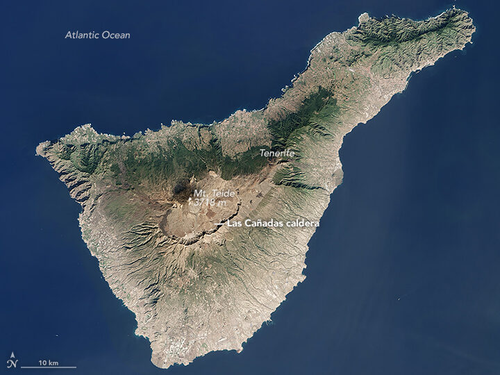
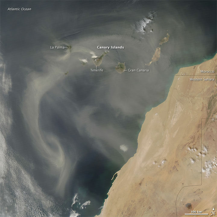
The crew of the Beagle was denied landing on Tenerife because of fears they might be carrying cholera. The Operational Land Imager (OLI) on Landsat 8 acquired this image of the island on January 25, 2016.
Darwin was struck by the intensity of the dust in this area. “The atmosphere is generally very hazy, chiefly due to an impalpable dust, which is constantly falling, even on vessels far out at sea,” he wrote. “It is produced, as I believe, from the wear and tear of volcanic rocks, and must come from the coast of Africa.”
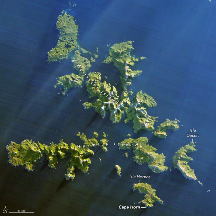
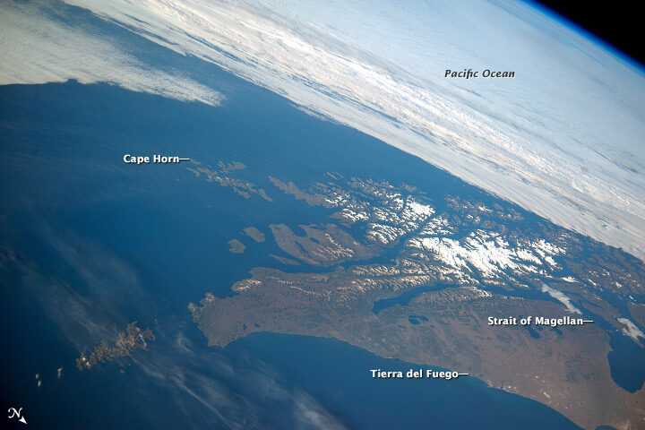
Southwest of Cape Horn at the southern tip of South America, the ocean floor rises sharply. Along with the potent westerly winds that swirl around the Furious Fifties, this pushes up massive waves with frightening regularity. Add in frigid water temperatures, rocky coastal shoals, and stray icebergs—which drift north from Antarctica across the Drake Passage—and it is easy to see why the area is known as a graveyard for ships. In his journal, Darwin described the harrowing journey as the explorers tried to round the Horn just before Christmas.
“Great black clouds were rolling across the heavens, and squalls of rain, with hail, swept by us with such extreme violence, that the Captain determined to run into Wigwam Cove. This is a snug little harbor, not far from Cape Horn; and here, at Christmas-eve, we anchored in smooth water. The only thing which reminded us of the gale outside, was every now and then a puff from the mountains, which made the ship surge at her anchors.”
Charles Darwin
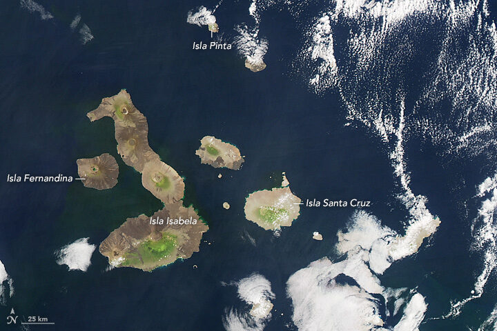
The Galapagos archipelago includes more than 125 islands, islets, and rocks populated by a diversity of wildlife. Charles Darwin’s book, The Voyage of the Beagle, cast a spotlight on the Galapagos, which he called “a little world within itself, or rather a satellite attached to America, whence it has derived a few stray colonists.” It was this little world that would revolutionize scientific understanding of biology and lead to Darwin’s On the Origin of Species, which would come to be known as the foundation of evolution.
On this stopover, Darwin had a chance to explore coral reef.
“We paddled for some time about the reef admiring the pretty branching Corals,” he wrote. “It is my opinion, that besides the avowed ignorance concerning the tiny architects of each individual species, little is yet known, in spite of the much which has been written, of the structure and origin of the Coral Islands and reefs.”
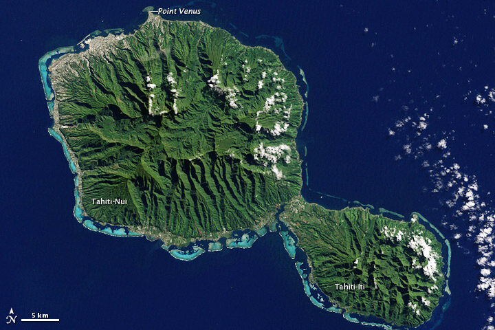
The Enhanced Thematic Mapper Plus on the Landsat 7 satellite captured this natural-color image of Tahiti on July 11, 2001. This island is part of a volcanic chain formed by the northwestward movement of the Pacific Plate over a fixed hotspot.
All the sea travel offered plenty of time to observe and ponder the intricacies of phytoplankton.
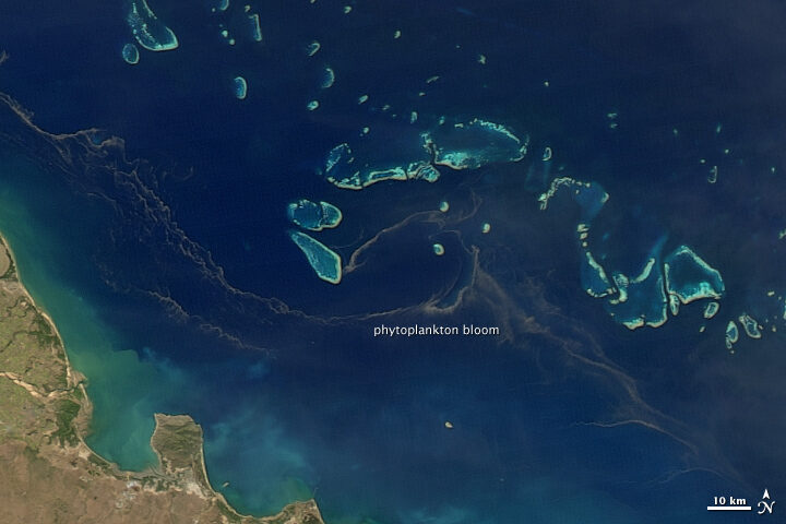
“My attention was called to a reddish-brown appearance in the sea. The whole surface of the water, as it appeared under a weak lens, seemed as if covered by chopped bits of hay, with their ends jagged,” he wrote. “These are minute cylindrical, in bundles or rafts of from twenty to sixty in each…Their numbers must be infinite: the ship passed through several bands of them, one of which was about ten yards wide, and, judging from the mud-like color of the water, at least two and a half miles.”
On August 9, 2011, the Moderate Resolution Imaging Spectroradiometer (MODIS) on the Aqua satellite captured this image of a similar band of brown between the Great Barrier Reef and the Queensland shore. Though it’s impossible to identify the species from satellite imagery, such red-brown streamers are usually trichodesmium. Sailors have long called these brown streamers “sea sawdust.”
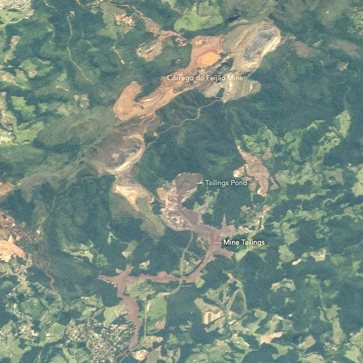
A few days after we published a Landsat 8 image of a deadly dam collapse and flood in Brazil, astronauts photographed the scene from the International Space Station on February 2, 2019.
The tailings pond label points to the source of the mine waste. When an earthen dam on the southwestern edge of that pond collapsed on January 25, it sent a torrent of sludge pouring down a valley toward the Paraopeba River. Over a distance of roughly 8 kilometers (5 miles), the mine sludge overran the mine’s headquarters, a hotel, and a residential area. Videos published by news agencies and AGU’s Landslide Blog offer a remarkable view of the dam collapsing and sludge rushing forward at roughly 120 kilometers (75 miles) per hour.
NASA’s Earth Science Disasters Program has developed an interactive version of the astronaut photograph that allows you to explore the area before and after the disaster. More astronaut photos of the event are available here.