

Drew Skau and I have received a few comments on Subtleties of Color that deserve to be included. (By the way, don’t be shy. You can leave a comment here or at visual.ly)
Naomi B. Robbins demonstrated that the standard land cover classification palette fails for color-deficient viewers. She also pointed out that “color-deficient” is the correct term to use, not “color-blind”. (Robbins is an expert in graphical data presentation who leads her own consulting firm, NBR, tweets from @nbrgraphs, and has blogged for Forbes.)
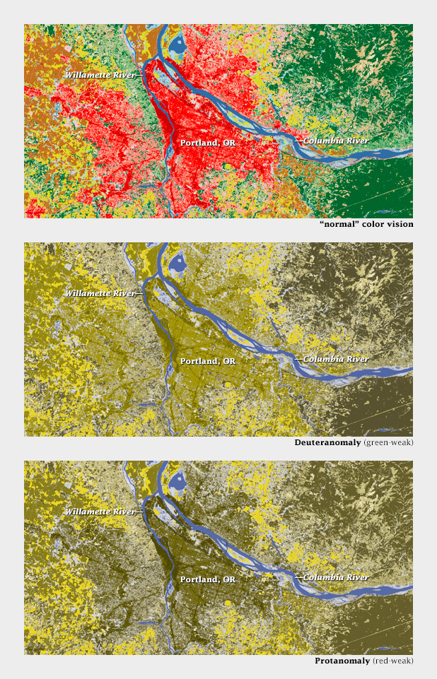
Color-deficient viewers would likely confuse red urban areas with green forests, not to mention tan scrub, in this land cover classification map of the Portland area.
Robbins is absolutely right, and I don’t think there’s an easy answer—even the Geological Survey, with its rich history of cartography, has problems displaying more than a handful of categories on a single map.
On an encouraging note, Mike Bostock sent examples (via Twitter: @mbostock) of CIE L*C*h color palettes dynamically generated by D3.js. In a web browser. (D3.js is a library that enables dynamic, interactive display of everything from time series to networks to maps. For those of us who began our careers 3 days before Netscape Navigator came out of beta, this is astonishing. Bostock created it.)
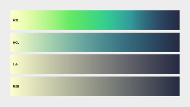
Comparison of color ramps generated with D3.js in hue, saturation, lightness (HSL, non-perceptual); hue, chroma, lightness (HCL, perceptual); L*a*b, (Lab, perceptual); and red, green, blue (RGB, non-perceptual). D3.js allows both the selection of start and end points and interpolation in perceptual color spaces.
Here’s an example of a palette applied to a grayscale image of topography by d3.js:
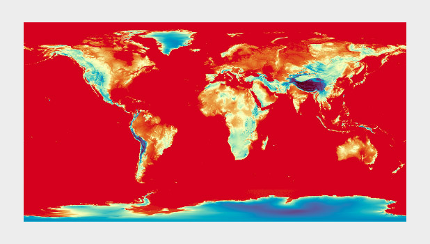
A divergent color map from D3.js (reminiscent of Color Brewer’s Spectral palette) used to display global topographic data. I do not usually recommend using a divergent palette to show sequential data, but this map cleverly uses the breakpoint (light yellow) to show median elevation. (It’s still a bit bright & saturated for my taste, though.)
I’ll post more comments if and when I get them.
Subtleties of Color
Part 1: Introduction
Part 2: The “Perfect” Palette
Part 3: Different Data, Different Colors
Part 4: Connecting Color to Meaning
Part 5: Tools & Techniques
Part 6: References and Resources for Visualization Professionals
References and Resources for Visualization Professionals
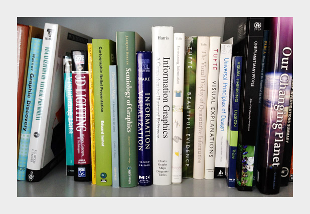
The previous posts are my personal take on using color in visualization. I hope my perspective is useful, but it’s primarily a synthesis of the work of others. Here’s a list of the sources that inspired and informed this series. If you don’t have the time or the inclination to sort through the whole set, I think these three resources are essential: Colin Ware’s Information Visualization: Perception for Design, which has several sections on vision, light, and color; The “Color and Information” chapter in Edward Tufte’s Envisioning Information, and the supplementary information in Cynthia Brewer’s ColorBrewer tool.
Artists
Artists (particularly painters) have long been concerned, possibly better described as obsessed, with color. Two Twentieth-Century classics stand out: Johannes Itten’s The Elements of Color and Josef Albers’ The Interaction of Color. Itten’s text focuses on color theory (including a somewhat outdated explanation of the physiology of color perception) and the mixture of pigments.
The Interaction of Color is centered around a series of exercises performed with colored paper (replicated in an iPad app developed by Yale University) a concrete demonstration of simultaneous contrast, simulated transparency, and perceptual versus mathematical use of color. It’s the definitive guide to the relativity of color.
Bruce MacEvoy’s web site is primarily about painting with watercolors, and has outstanding sections on color theory and color vision.
Cartographers
As I’ve mentioned several times in this series, cartographers were communicating with color long before the term “data visualization” was coined.
Eduard Imhof’s Cartographic Relief Presentation explains the theory and meticulous craft applied to Swiss topographic maps (zoom in). The book covers the use of color to denote elevation and how to layer information by carefully controlling hue, saturation, and lightness.
Tom Patterson, a cartographer with the National Park Service, updates Imhof’s ideas on Shaded Relief: Ideas and Techniques about Relief Presentation on Maps. This web site shows how to use modern techniques and data to replicate classic map designs. I find The Development and Rationale of Cross-blended Hypsometric Tints (PDF) particularly fascinating. It describes Patterson’s technique of using two color palettes to denote elevation on a single map: one optimized for arid areas, the other for humid ones.
Relief Shading covers similar ground, with a straightforward section on color.
In addition to developing Color Brewer, Cynthia Brewer has written two books relevant to color and visualization. Designing Better Maps: A Guide for GIS Users is a how-to guide. Its companion volume, Designed Maps: A Sourcebook for GIS Users teaches by example, showcasing well-designed maps, and describing why they are effective.
Designers
Written in 1967, Jacques Bertin’s Semiology of Graphics laid out what may have been the first comprehensive, perception-based theory of visualization. The section on color is short, but essential.
Edward Tufte may be dogmatic, perhaps even a bit curmudgeonly, but he makes an elegant case for his point of view. The chapter on color in Envisioning Information is dense and convincing, packing an entire textbook’s worth of information into 16 pages.
Maureen Stone’s A Field Guide to Digital Color could probably fit in any one of these categories. It covers everything from color theory, the physiology of vision, color management, and data visualization.
Scientists Studying Vision, Perception, and Visualization
As I’ve hopefully made clear, a perceptual approach to color in data visualization isn’t a matter of aesthetics or personal taste: it’s based on research into human vision and understanding. Here are some of the papers and books I’ve found most helpful.
Borland and Taylor Rainbow Color Map (Still) Considered Harmful Key quote: “The rainbow color map confuses viewers through its lack of perceptual ordering, obscures data through its uncontrolled luminance variation, and actively misleads interpretation through the introduction of non-data-dependent gradients.”
Penny Rheingans Task-based Color Scale Design (zipped PDF) Key Quote: “There are no hard and fast rules in the design of color scales. … The actual answers must come from the visualization designer after consideration of relevant factors, and perhaps with a bit of divine inspiration. In the end, the true test of the value of a color scale is simply ‘Does it work?’”
Bernice Rogowitz and Lloyd Treinish authored two key papers in the 1990s: How NOT to Lie with Visualization and Why Should Engineers and Scientists Be Worried About Color? Key quote: “At the core of good science and engineering is the careful and respectful treatment of data.”
Spence, et al. Using Color to Code Quantity in Spatial Displays (PDF) Key quote: “Linear variation in brightness and saturation facilitates simple tasks such as magnitude estimation or paired comparisons, and the addition of hue enhances performance with more complex cognitive tasks.”
Colin Ware: Color Sequences for Univariate Maps: Theory, Experiments, and Principles (PDF) Key quote: “In general, the form information displayed in a univariate map is far more important than the metric information. Absolute quantities are well represented in a table, whereas maps gain their utility from their ability to display the ridges and valleys, cusps, and other features.”
Ware’s two books, Information Visualization: Perception for Design and Visual Thinking for Design are also excellent resources. Information Visualization is more thorough, Visual Thinking for Design is more concise.
Alternate Approaches
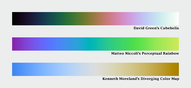
Dave Green, a Senior Lecturer with the Department of Physics of the University of Cambridge came up with the cubehelix palette. It varies perceptually in lightness and rotates around the hue circle one and a half times, contributing additional contrast. There’s also a tool to generate variations on this palette.
Another take is Matteo Niccoli’s perceptual rainbow. Niccoli provides a brilliant deconstruction of the weaknesses of the traditional rainbow palette, and he developed an alternative with linear change in lightness, but retains many of the saturated colors that appeal to those accustomed to the rainbow palette.
Instead of interpolating between colors in lightness, chroma, and hue space; Gregor Aisch’s brand-new additions to chroma.js use bezier curves and lightness adjustments to smooth and linearize palettes. He also included a way to pick intermediate hues, which adds some welcome flexibility to palette-building.
And Kenneth Moreland of Sandia National Laboratories developed algorithms to generate perceptual divergent palettes.
Computer Science
Bruce Linbloom provides tools to translate between color spaces—and the math behind them.
I mentioned Color Mine in my previous post, on tools. In addition to the online color-calculator, they offer libraries to convert from one color space to another.
And here’s an approach to scientifically determining the semantic associations of color, by Sharon Lin et al.:
Selecting Semantically-Resonant Colors for Data Visualization.
Practitioners
There’s a large (and growing) community of data visualizers on the web, all of them eager to share ideas. I’m indebted to them.
Robert Kosara summarizes many of these issues on his blog Eager Eyes, with How the Rainbow Color Map Misleads.
Matt Hall, of Agile Geoscience, wrote a recent trio of articles: Five Things about Colour (which includes my favorite optical illusion) and Five More Things about Colour and Colouring Maps.
I’ve already pointed to Gregor Aisch’s chroma.js, but he’s also got a concise critique of HSV-derived palettes.
Theresa-Marie Rhyne covers additional color spaces (Red, Yellow, Blue; Cyan, Magenta, Yellow, Black) and types of color schemes (monochromatic, complementary, analogous) in her post Applying Artistic Color Theories to Visualization.
Andy Kirk, Visualizing Data: Tools and Resources for Working with Colour.
Dundas Data Visualization provides one of the best explanations of the challenges of designing for the color blind I’ve seen with Visualizing for the Color Blind.
Three posts by Visual.ly’s own Drew Skau explain why NASA should stop relying on the spectrum to display data Dear NASA: No More Rainbow Color Scales, Please provide tips for Building Effective Color Scales, and explore the psychology of color Seeing Color Through Infographics and Data Visualizations.
Many of these bloggers are active on Twitter:
Matteo Niccoli @My_Carta
Robert Kosara @eagereyes
Matt Hall @kwinkunks
Andy Kirk @visualisingdata
Gregor Aisch @driven_by_data
Drew Skau @seeingstructure
Naomi Robbins @nbrgraphs
Mike Bostock @mbostock
even Edward Tufte @EdwardTufte
(and me @rsimmon)
What’s Missing?
I’m sure I’ve missed some important resources for learning and using color. For example, I’ve misplaced the first book I read on color vision, and I can’t recall the title. There are many other resources available, please point them out in the comments.
Subtleties of Color
Part 1: Introduction
Part 2: The “Perfect” Palette
Part 3: Different Data, Different Colors
Part 4: Connecting Color to Meaning
Part 5: Tools & Techniques
(This series on the use of color in data visualization is being cross-posted on visual.ly. Thanks to Drew Skau at visual.ly for the invitation.)