Tools & Techniques: the Nuts and Bolts of Designing a Color Palette
Knowing what makes a good palette for visualization, how to find and apply good examples, or create one from scratch? In my mind the best place to start is Color Brewer. Cynthia Brewer’s tool is popular for a reason: it explains the theory behind palette design, provides excellent examples to get started with, and even displays the palettes on a sample map. The Color Brewer Palettes are also implemented in visualization applications and languages like D3, Processing, R, ArcMap, etc.
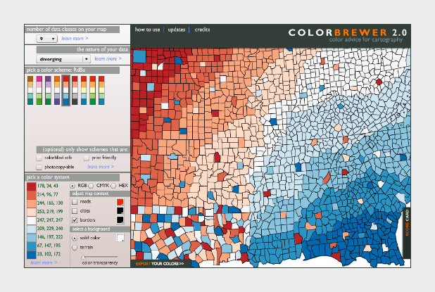
The widely-used Red-Blue divergent palette on Color Brewer.
If you don’t use software that comes with the Color Brewer palettes (Adobe Photoshop, for example), using the tables can be a bit tricky. Each color has to be specified manually, and then the individual steps need to be blended (at least if you want a smooth ramp).
In Photoshop, there’s two ways to do this: create a custom indexed color palette (good for 8-bit data, with a range of 256 values), or create a gradient map (useful for applying color to 16-bit datasets). Similar techniques should work with the GIMP and other applications.
To build an indexed palette (also called a color look-up table), start with one of the 9-color Color Brewer palettes. We need 9 colors because there are 8 divisions between each specified color, which divides evenly into the 256 available indices.
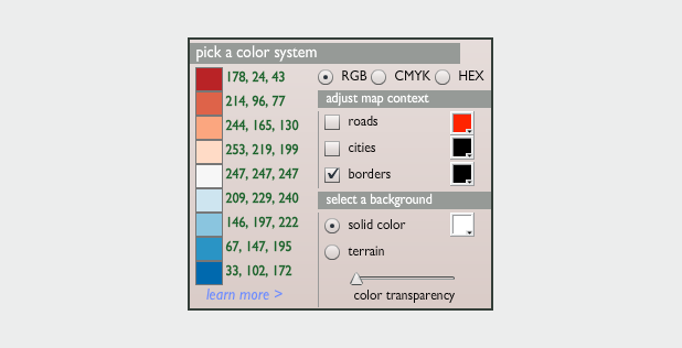
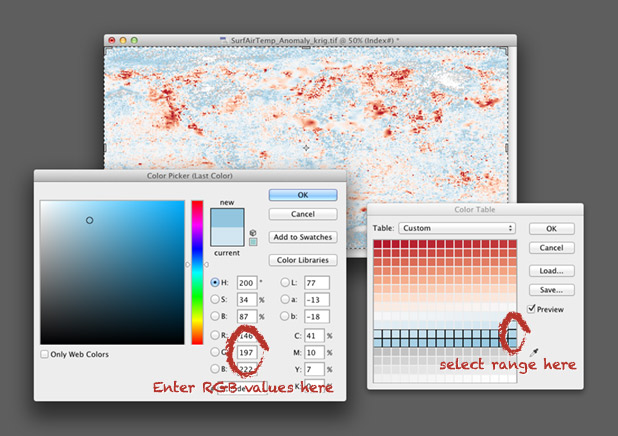
To convert the discrete colors from Color Brewer into a smooth 256-color ramp, import an 8-bit grayscale image into Photoshop. Then select Image > Mode > Indexed Color. This will bring up the Color Table window. Starting in the upper left, click and drag to select two rows, representing the first 32 colors in the palette. Then enter the Red, Green, Blue values of the first color (178, 24, 43 in our example), hit return, then enter the second color (214, 96, 77). Do this 7 more times (I know, it’s tedious) and you’ll have a full 8-bit palette. To make your life easier, Save the color table for next time (in .act format, the specification is buried on this page) before you hit OK.
You can also make a discrete palette. Just set the start and end points of the ramp to the same color.
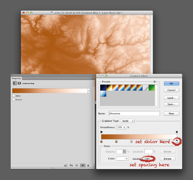
For 16-bit data (a digital elevation model, for example), use a gradient map. Again, start by opening a grayscale file, but this time with a bit depth of 16. Then convert the grayscale image to a color one by selecting Image > Mode > RGB Color. Then add a gradient map: Layer > New Adjustment Layer > Gradient Map… Name the layer if you want, then hit OK. You’ll end up with an editable gradient map as a separate layer above your data.
A gradient map allows you to set an arbitrary number of color points to blend between, and change both the relative spacing (in increments of one percent) and relative weighting of each point. It’s a bit more flexible than an indexed color palette, but specific to Photoshop (indexed color palettes are useful in almost all visualization and graphics software). For example, to create a palette blended between 6 colors, set 6 points, each separated by a distance of 20% (see the image below). Like an indexed color palette, you can also save the gradient for future use.
While Color Brewer is great (I use the palettes frequently) it’s not comprehensive. The available palettes are a bit limited in contrast, the selection of single- or two-color palettes is small, the lightness and saturation of the end points don’t match between palettes (making it impossible to make direct comparisons between similar datasets), and the Munsell color space doesn’t have perceptually linear saturation.
The next logical step is the NASA Ames Color Tool. (Note: When OS X 10.6 was released, the standard gamma for Macs changed from 1.8 to 2.2. Use the “Color Tool, Gamma = 2.2 (PC)” option on both Macs and PCs.) Developed to support the creation of legible aviation charts, the Ames Tool converts between the CIE L*C*h color space and RGB values. Lightness varies between 0 and 100 in increments of 10, chroma (saturation) from 0 to 156, also in increments of 10, and hue from 0 to 360 in 1˚ steps.
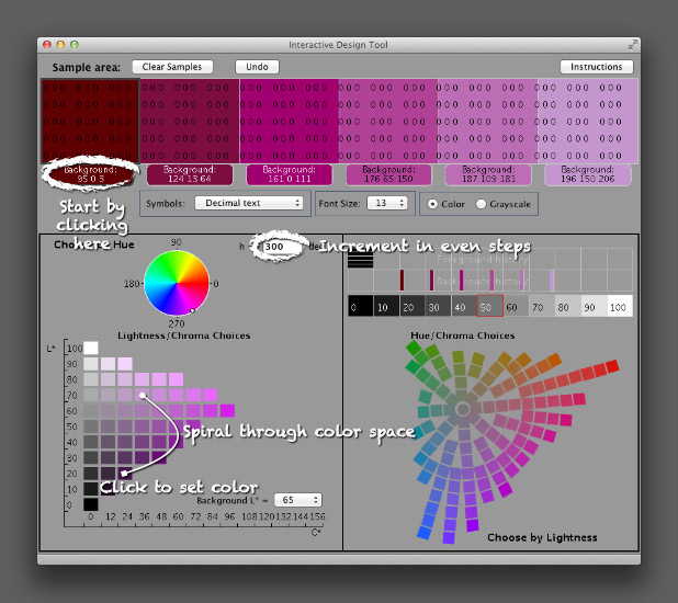
I find it easiest to create palettes by typing in the hue manually, then picking a color with the appropriate lightness and chroma. Move diagonally across the array of colors, and change the hue in even increments with each step. This creates a spiral through three-dimensional color space, with hue, chroma, and lightness varying simultaneously. It’s possible to create a strictly perceptual palette by always changing saturation in the same direction (usually from dark and saturated (intense) to light and desaturated (pale)), but the available range of contrast is less than a palette that includes very dark colors. Feel free to experiment, as long as lightness varies evenly.
The Ames tool provides more flexibility than Color Brewer, but is also limited in the available range of colors. The maximum lightness with any hue is 90, the darkest 10 (inevitably with very low saturation). A suite of tools utilizing Gregor Aisch’s chroma.js Javascript library expand the number of colors, but are (in my opinion) a bit trickier to use than the Ames tool.
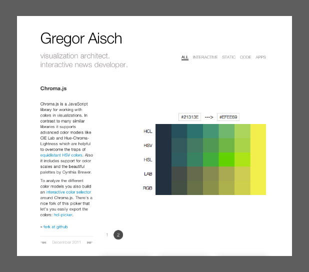
Chroma.js home page.
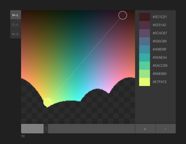
HCL picker, by Tristen Brown.
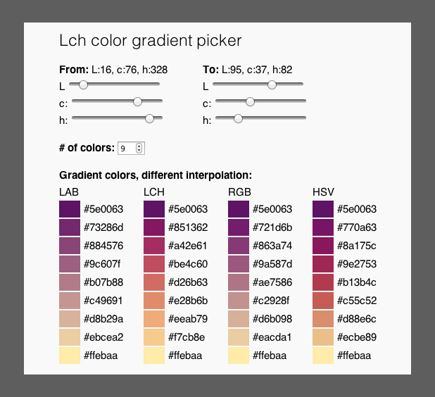
LAB, LCH, RGB, and HSV color picker, with initial colors specified in LCH (also by Gregor Aisch). LAB allows two-color ramps, which provides additional options to create palettes appropriate for particular datasets. Gregor was kind enough to whip this up based on a few suggestion posted on Twitter. Thanks!
Another option, but sadly lacking in visual feedback, is the colormine.org Online Color Converter. I haven’t used it much, but the results seem a little bit different than the equivalent conversion with chroma.js. Not too surprising, since L*C*h to RGB conversions are hardly simple.
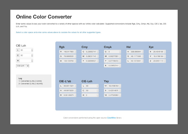
The ColorMine color conversion interface.
The NASA Ames color tool, Lch color gradient picker, and Online Color Converter are more-or-less useful for building sequential or divergent scales. I want hue, from the médialab at Sciences Po is designed to randomly generate “maximally distinct” colors—i.e. colors for qualitative palettes. (ColorBrewer, of course, works for all three types of data.)
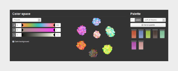
The interface for I want hue, a tool to generate qualitative color palettes derived from a perceptual color space.
The unique part about I want hue is that it can generate clusters of analogous colors—colors near each other on the color wheel. Perfect for building complex maps with large numbers of categories. It’s also useful for choosing colors for different categories of data that’s not spatial: line graphs, dot plots, or grouped bar charts, for example.
As far as I know, these tools are the state of the art. Yet each of them is limited in one way or another. Color Brewer has a fixed number of palettes. The NASA tool has a limited number of available lightness values. The chroma.js interfaces are a bit difficult to control precisely. Colormine lacks feedback. All of these tools generate a small number of colors, that then need to be blended to create smooth palettes.
What would the ideal palette building tool look like? (My ideal tool, at least.)
- Interpolate and choose colors in a perceptual color space (i.e. CIE L*C*h). [There are a handful of color ramp generators that interpolate in L*C*h, but selection is still in RGB or HSL (Magnaview and ArcGIS, for example.)]
- Automatically rotate through hue space, while simultaneously changing lightness and saturation. Allow clockwise and counter-clockwise rotation (red-yellow-green-blue or red-magenta-purple-blue).
- Also allow linear interpolation through 3-dimensional color space. Changing from blue to yellow without going through green, for instance.
- Maybe even support “weighting” of the transition: palettes that arc through color space, but aren’t a tight spiral or straight line.
- Generate continuous as well as discrete palettes, exported as an indexed color image or color table.
- Make the entire gamut of CIE L*C*h color space available.
- Allow “illegal” (out of gamut) colors, but indicate when these occur.
- Display the path of interpolation in a representation of the CIE L*C*h gamut. In 3D.
- Support multiple display color spaces: sRGB, Adobe RGB, CMYK, etc.
- Provide a preview image, or even allow upload of sample imagery.
- All built with modern web technologies that provide instantaneous feedback and an elegant user interface.
Spoiler alert: I’m working on this. Drop me a line if you’re interested in collaborating.
Subtleties of Color
Part 1: Introduction
Part 2: The “Perfect” Palette
Part 3: Different Data, Different Colors
Part 4: Connecting Color to Meaning
Part 6: References & Resources for Visualization Professionals
(This series on the use of color in data visualization is being cross-posted on visual.ly. Thanks to Drew Skau at visual.ly for the invitation.)



Very helpful article. I’ve used color brewer before but have not used some of the ones you mentioned in the post. I tried several of them, but because of IT restrictions where I work, we don’t have a “modern” browser as was needed with several of tools.