The Earth Observatory has published its last Image of the Day on this website. Please join us on our new home at science.nasa.gov/earth/earth-observatory.
In response to Map of the Ancient Mississippi a few of you left comments to the effect of “no one should live in floodplains.” It’s an appealing notion, but I think it’s unrealistic. Anne Jefferson of Highly Allochthonous published an epic post yesterday outlining the benefits and risks of building in a flood plain, and the need to balance them: Levees and the illusion of flood control. It’s well worth a read. Plus, she dug up some great archival imagery, like this map of the 1927 flood:

Some additional details on the map are in this article from the National Archives: The 200th Anniversary of the Survey of the Coast.
Sticking to the flood theme, here’s a recent map from the U.S. Army Corps of Engineers showing the predicted travel time for water in the Morganza Floodway.
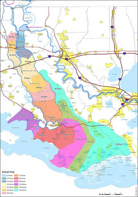
It’s a reasonably good map, with one big flaw: the colors are more appropriate for categorical data (such as a geological map of different rock types) rather than sequential data (like elapsed time). There’s no natural progression from one color to the next, so to work out the ordering one has to rely on the position of adjacent bands of color, or look repeatedly between the map and the key. A palette that varied from light to dark, dull to saturated, or both, would be easier to read at a glance. Like this:
![]()
Since I’m still not ready to do a long series of posts on colors, here’s a handout I wrote for the 2008 Access Data Workshop that covers more of the basics: Use of Color in Data Visualization. (PDF) If you’re really interested in the topic just skip what I wrote and go straight to the references:
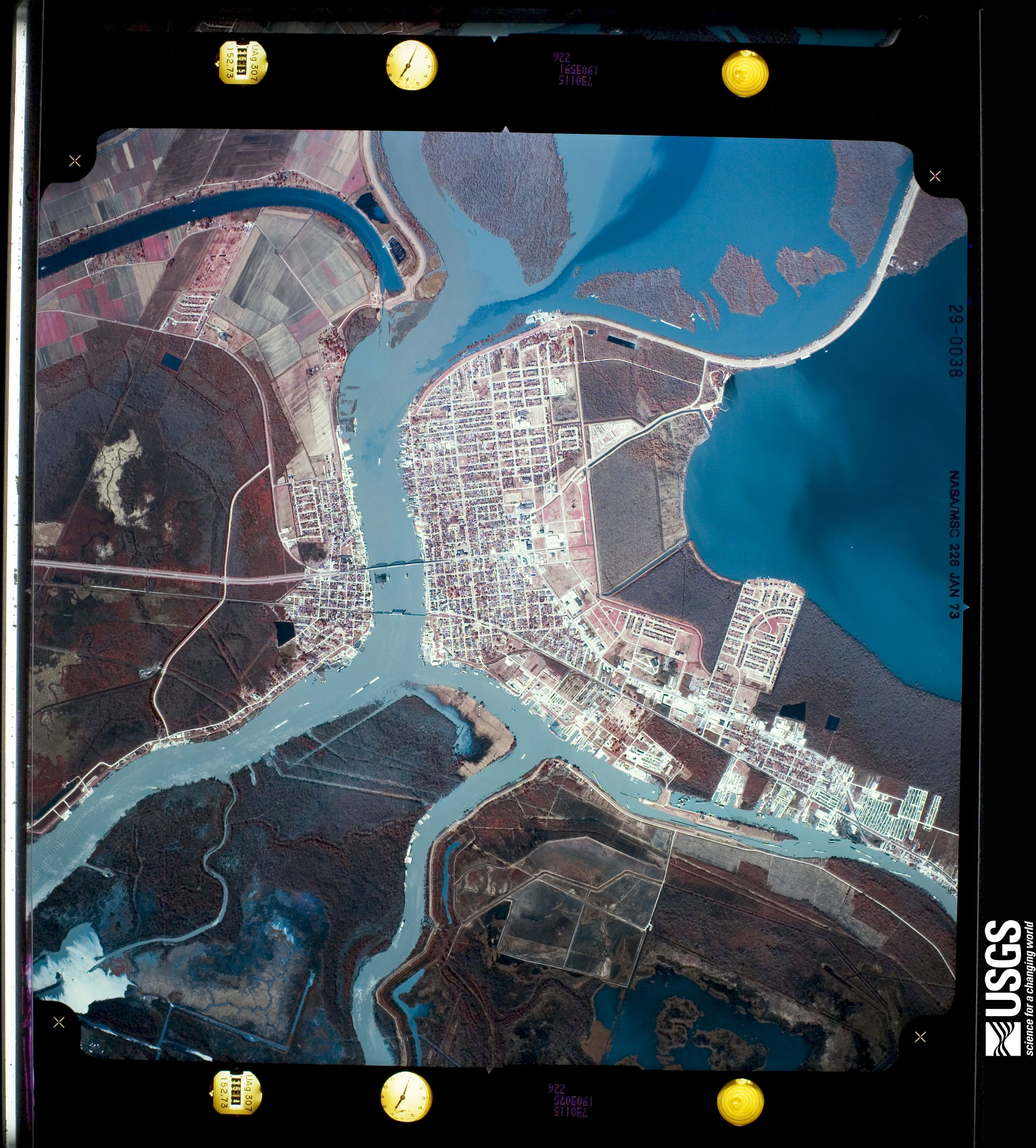
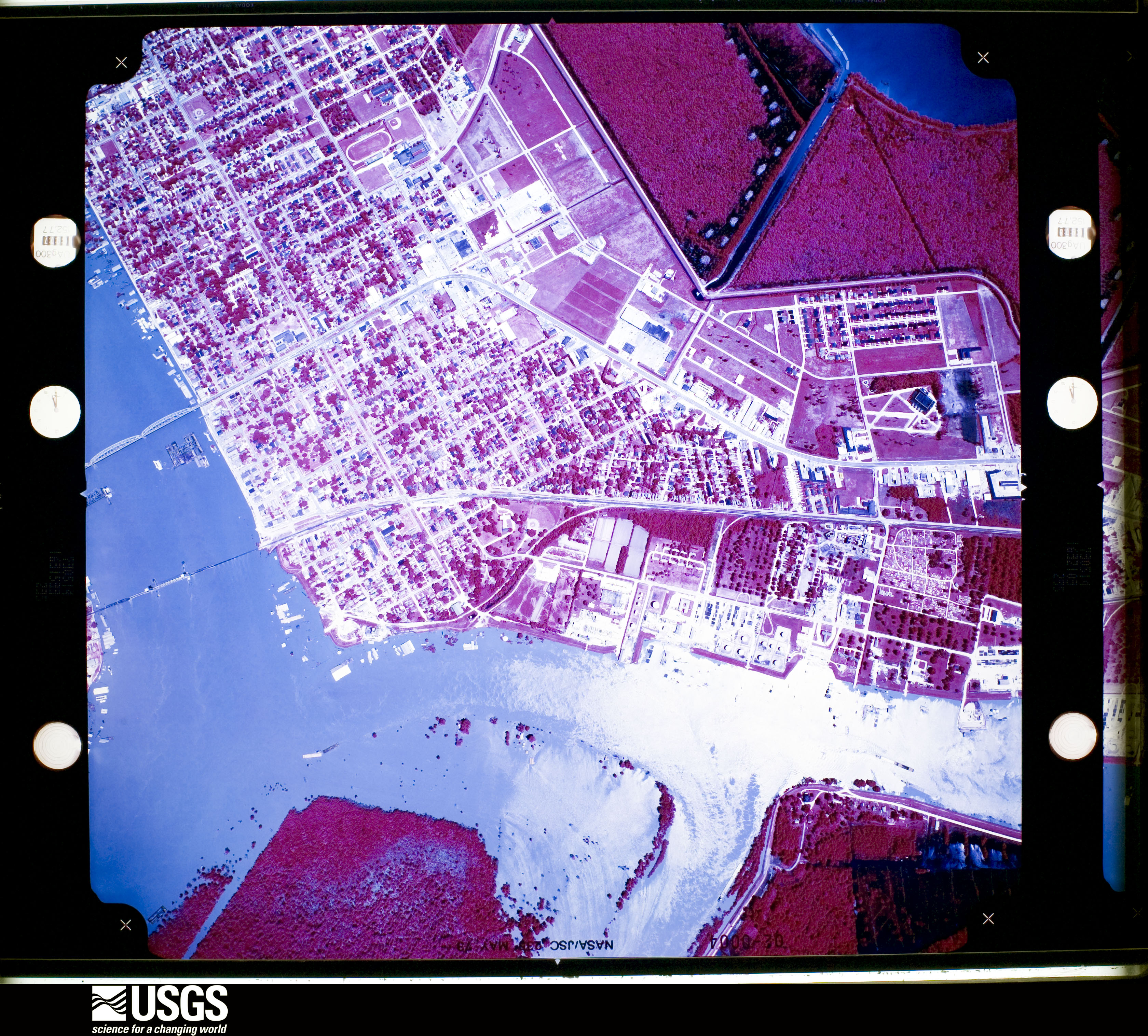
While poking around looking for imagery of the 1973 flooding on the Mississippi, I discovered some fascinating, very high resolution aerial photography. Images of Morgan City—a community near the mouth of the Atchafalaya River that was damaged by flooding in 1973, and will likely be hit by rising water in the next few weeks. Both are false color, but the May image is either a poor scan or the originals have degraded. These photographs, and thousands like them, are available from Earth Explorer, the online USGS archive of satellite data and aerial photography. John Mcphee’s essay “Atchafalaya” from his book The Control of Nature beautifully describes Morgan City and the 1973 flood.
Historic flooding along the Mississippi River gives me an excuse to show another of my favorite maps, from Geological Investigation of the Alluvial Valley of the Lower Mississippi River.
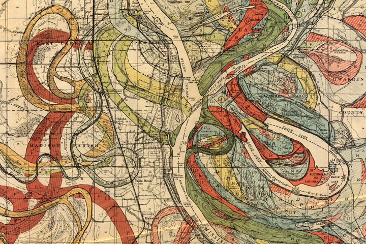
Each color represents an old channel, dating back 1,000 years or so. Those that correspond to historical records are dated, while older channels are ordered according to the principle of superposition (newer sediments on top of older ones). Many of the surface layers are still visible in satellite imagery. High-resolution, geolocated maps from Cairo to the Gulf, along with major tributaries, geological maps, and cross sections, are distributed by the U.S. Army Corps of Engineers.
