

“… complex datasets require complex visualizations. In general though, simpler is usually the best way to go in the sense that you should make it as easy as possible for a reader to understand what’s going on. You’re the storyteller, so it’s your job to tell them what’s interesting.”
—Nathan Yau, author of Visualize This: The Flowing Data Guide to Design, Visualization, and Statistics and the Flowing Data blog (that I should read more frequently). Found on SmartPlanet.
Every visualization blog on the planet has already posted one or two of these, but they’re awesome, so here is what Washington, DC looks like via Tweets (blue) and photos posted to Flickr (orange). White areas have both tweets and photos.

Unsurprisingly, tourist areas are dominated by photos, residential areas by tweets. More here: See something or say something. Visualization by Eric Fischer. H/T to Visual Complexity.
There’s an interesting article in today’s New York Times about mapping historical landscapes: Digital Maps Are Giving Scholars the Historical Lay of the Land.
Few battles in history have been more scrutinized than Gettysburg’s three blood-soaked days in July 1863, the turning point in the Civil War. Still, there were questions that all the diaries, official reports and correspondence couldn’t answer precisely. What, for example, could Gen. Robert E. Lee actually see when he issued a series of fateful orders that turned the tide against the Confederate Army nearly 150 years ago?
Now historians have a new tool that can help. Advanced technology similar to Google Earth, MapQuest and the GPS systems used in millions of cars has made it possible to recreate a vanished landscape. This new generation of digital maps has given rise to an academic field known as spatial humanities.
Along with some nice examples.
Although I got back from the 2011 GRC Visualization in Science and Education conference Friday night, my brain still hurts (in a good way). Thanks to Liz and Ghislain for their superb job as conference chairs. To me, the theme of this year’s conference was salience (more precisely, perceptual salience)–the ability of our visual system to focus on one thing at a time, to the near exclusion of everything else.
Hold one hand out in front of you, with the thumb up, and focus on the thumbnail. This is the limit of your locus of attention: about one degree. Away from that point everything else in your visual field fades into the background. For data visualization this is both an advantage (you can draw people to the important parts of an image) and a drawback (it’s impossible to pay attention to two things at once, and it’s easy to have your focus shifted unintentionally).
I’ll have some examples, and interesting bits from the presentations and discussion, in the next few days and weeks.
Every once in a while we get satellite imagery that shows things that are hard to imagine, like floating rocks. It’s helpful to have a different persepctive, like this series of photographs collected by The Atlantic. Fantastic.
In response to Map of the Ancient Mississippi a few of you left comments to the effect of “no one should live in floodplains.” It’s an appealing notion, but I think it’s unrealistic. Anne Jefferson of Highly Allochthonous published an epic post yesterday outlining the benefits and risks of building in a flood plain, and the need to balance them: Levees and the illusion of flood control. It’s well worth a read. Plus, she dug up some great archival imagery, like this map of the 1927 flood:
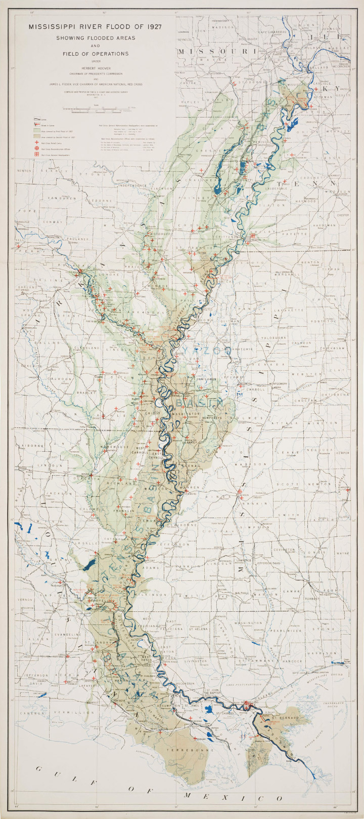
Some additional details on the map are in this article from the National Archives: The 200th Anniversary of the Survey of the Coast.
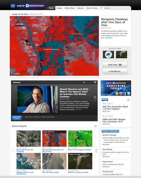
Here’s a sneak peek at the site-wide redesign we’ll be launching next week. Let us know what you think (not that we can change anything at this point, but we’ll keep any critiques in mind for version 3.1). [Design primarily by Cuban Council, implementation by Paul Przyborski & Kevin Ward.]

Sticking to the flood theme, here’s a recent map from the U.S. Army Corps of Engineers showing the predicted travel time for water in the Morganza Floodway.
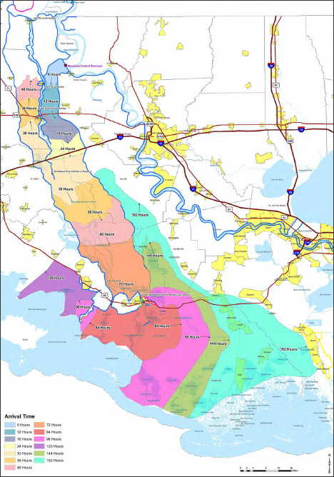
It’s a reasonably good map, with one big flaw: the colors are more appropriate for categorical data (such as a geological map of different rock types) rather than sequential data (like elapsed time). There’s no natural progression from one color to the next, so to work out the ordering one has to rely on the position of adjacent bands of color, or look repeatedly between the map and the key. A palette that varied from light to dark, dull to saturated, or both, would be easier to read at a glance. Like this:
![]()
Since I’m still not ready to do a long series of posts on colors, here’s a handout I wrote for the 2008 Access Data Workshop that covers more of the basics: Use of Color in Data Visualization. (PDF) If you’re really interested in the topic just skip what I wrote and go straight to the references:
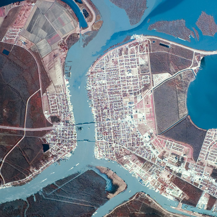
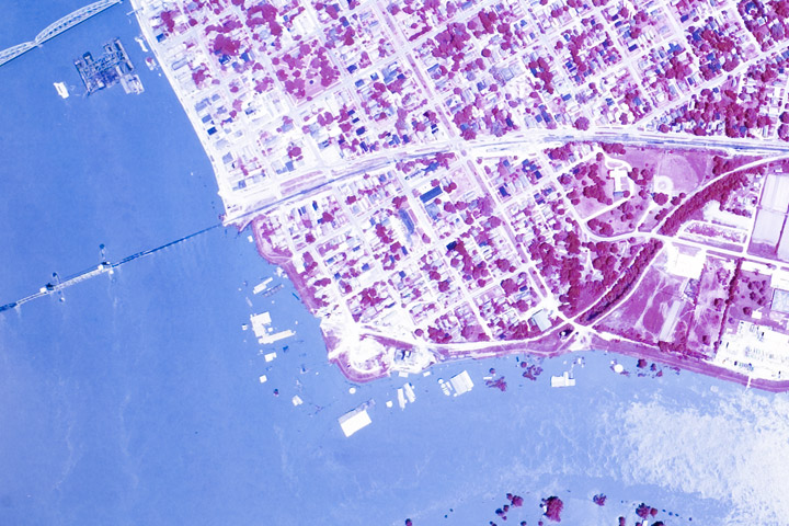
While poking around looking for imagery of the 1973 flooding on the Mississippi, I discovered some fascinating, very high resolution aerial photography. Images of Morgan City—a community near the mouth of the Atchafalaya River that was damaged by flooding in 1973, and will likely be hit by rising water in the next few weeks. Both are false color, but the May image is either a poor scan or the originals have degraded. These photographs, and thousands like them, are available from Earth Explorer, the online USGS archive of satellite data and aerial photography. John Mcphee’s essay “Atchafalaya” from his book The Control of Nature beautifully describes Morgan City and the 1973 flood.
Historic flooding along the Mississippi River gives me an excuse to show another of my favorite maps, from Geological Investigation of the Alluvial Valley of the Lower Mississippi River.
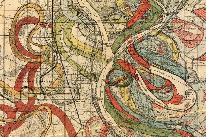
Each color represents an old channel, dating back 1,000 years or so. Those that correspond to historical records are dated, while older channels are ordered according to the principle of superposition (newer sediments on top of older ones). Many of the surface layers are still visible in satellite imagery. High-resolution, geolocated maps from Cairo to the Gulf, along with major tributaries, geological maps, and cross sections, are distributed by the U.S. Army Corps of Engineers.