
I got back from AGU last Saturday, picked up the pups from the kennel, and now I’m getting things together here so I can go on vacation right after Christmas.

As always it’s an overwhelming conference—there’s probably 1,000 posters on the floor at any given time, and at least ten simultaneous sessions. I got some very good ideas wandering through the posters (a map of ice flow speed for all of Antarctica, research on a paleo lake in Kenya, and a global dataset of limiting factors for tree growth being highlights) that I’ll hopefully be working on in the New Year. Tuesday’s special session on communicating climate change was also worthwhile (and packed). I think both my talks went pretty well, even if I can’t pronounce Eyjafjallajökull—despite professional help from a native Icelandic speaker. One conclusion we came to in the visualization session: it would be helpful for AGU to start promoting good visualization techniques. I plan on following up on that, hopefully I’ll have more to say soon.
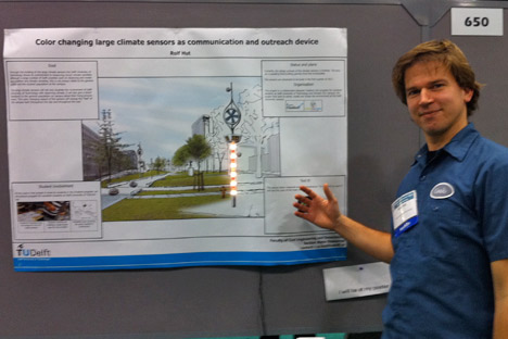
A few words of advice for poster presenters (I originally planned on showing some examples of good and bad design, but chickened out). White space is good: try not to jam your poster full of every last detail of your research. Do not use Comic Sans (avoid it on slides, too). Seriously. Your research may be groundbreaking, but it’s hard for me to take you seriously if you try to be cute. Especially since the new Microsoft typefaces that ship with Vista, Windows 7, and recent versions of Office are very, very good. Make your graphics big. Avoid the rainbow palette. (I’ll have more to say about this—a lot more—soon. It was a big part of my Eyjafjallajökull talk.) Print up a one-page summary to distribute. Include a conclusion, written for non-experts. Your poster will be up all day, you’ll only be there for an hour or two. Finally: if you can figure out a way to add multimedia, do it. Rolf Hut of the Delft University of Technology had an amazing, temperature-sensing interactive LED display:

If anyone is going to the AGU fall meeting in San Francisco and would like to know more about the Earth Observatory and/or data visualization, I’ll be giving two talks, both on Thursday the 16th:
The Communication Strategy of NASA’s Earth Observatory at 8:45 a.m. in session ED41D. Climate Change Adaptation: Education and Communication I.
Visualization Case Study: Eyjafjallajökull Ash at 1:55 p.m. in session ED43B. Visualization of Geophysical Processes for Science, Education, and Outreach II.
I’ll be there all week, so if you want to meet to chat (or know of any sessions you think I’d be interested in, or excellent restaurants), send a message to the “Design Feedback” topic on our contact page, and I’ll get back to you.