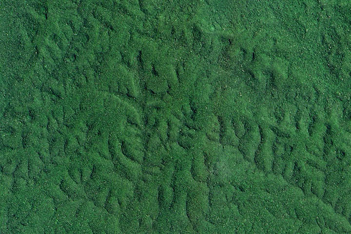
Each month, Earth Observatory offers up a puzzling satellite image here on Earth Matters. In celebration of Earth Month 2013, we’re upping the ante. We are going to release a new puzzler image every day this week. The second image is above. Your challenge is to use the comments section to tell us what part of the world we are looking at, when the image was acquired, and why the scene is interesting. We’ll post the answer to all five puzzlers at 6 p.m. EST on Friday, April 26.
How to answer. Your answer can be a few words or several paragraphs. (Try to keep it shorter than 200 words). You might simply tell us what part of the world an image shows. Or you can dig deeper and explain what satellite and instrument produced the image, what spectral bands were used to create it, or what is compelling about some obscure speck in the far corner of an image. If you think something is interesting or noteworthy, tell us about it.
The prize. We can’t offer prizes, but we can promise you credit and glory (well, maybe just credit). Later this week when we post annotated and captioned versions of the puzzler images as our Image of the Day, we will acknowledge the people who were first to correctly ID the images. We’ll also recognize people who offer the most interesting tidbits of information. Please include your preferred name or alias with your comment. If you work for an institution that you want us to recognize, please mention that as well.
Recent winners. If you’ve won the puzzler in the last few months, look at this week as a new challenge — can you get all five image locations?
Good luck!
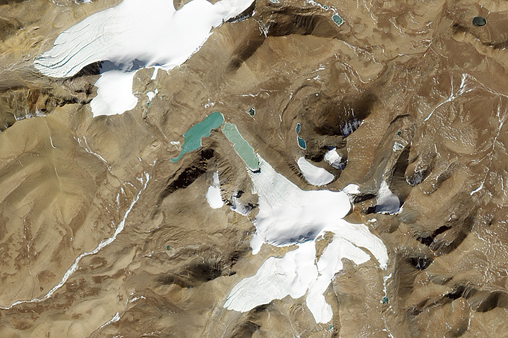
Each month, Earth Observatory offers up a puzzling satellite image here on Earth Matters. In celebration of Earth Month 2013, we’re upping the ante. We are going to release a new puzzler image every day this week. The first image is above. Your challenge is to use the comments section to tell us what part of the world we are looking at, when the image was acquired, and why the scene is interesting. We’ll post the answer to all five puzzlers at 6 p.m. EST on Friday, April 26.
How to answer. Your answer can be a few words or several paragraphs. (Try to keep it shorter than 200 words). You might simply tell us what part of the world an image shows. Or you can dig deeper and explain what satellite and instrument produced the image, what spectral bands were used to create it, or what is compelling about some obscure speck in the far corner of an image. If you think something is interesting or noteworthy, tell us about it.
The prize. We can’t offer prizes, but we can promise you credit and glory (well, maybe just credit). Later this week when we post annotated and captioned versions of the puzzler images as our Image of the Day, we will acknowledge the people who were first to correctly ID the images. We’ll also recognize people who offer the most interesting tidbits of information. Please include your preferred name or alias with your comment. If you work for an institution that you want us to recognize, please mention that as well.
Recent winners. If you’ve won the puzzler in the last few months, look at this week as a new challenge — can you get all five image locations?
Good luck!
Tournament: Earth 2013 has come to a stunning end. A newcomer to the landscape—a volcano that wasn’t even above the water’s surface at the beginning of 2012—literally came out of nowhere to win our first-ever tournament. The #7 seeded El Hierro submarine eruption from the “events” bracket captured the overall crown.
In a true Cinderella story, the underwater volcano proceeded to knock off four higher seeds before meeting another #7 seed—the crack in the Pine Island Glacier—in the final. The matchup was not even close, as El Hierro romped with 91 percent of the votes.

Perhaps sensing its impending victory, El Hierro began stirring in late March 2013. According to Erik Klemetti’s “Eruptions” volcanology blog, earthquake swarms beneath the island suggested that magma was on the move. Perhaps a volcano will soon be popping some lava champagne to celebrate the win.
Here is a walk through the opponents that El Hierro tossed aside on it’s month-long romp through earthly fame:
ROUND 1: Overnight View of Hurricane Sandy (#2 seed, events bracket)

ROUND 2: GOES View of Hurricane Sandy (#3 seed, events bracket)

ROUND 3: New Volcanic Island in the Red Sea (#5 seed, events bracket)

ROUND 4: Night Lights 2012 – Flat Map (#2 seed, Earth at night bracket)

ROUND 5: Flying Through a Crack in the Ice (#7 seed, data bracket)

How much and how fast will sea level rise in the coming decades? What makes sea level rise hard to predict? Who will be affected? NASA scientists and guests discussed this and much more in a Google+ Hangout on April 2, 2013. You can watch an archived version of the hangout below.
[youtube OvnuswLzWRo]
Hangout participants included:
Josh Willis, NASA’s Jet Propulsion Laboratory
Sophie Nowicki, NASA’s Goddard Space Flight Center
Mike Watkins, NASA’s Jet Propulsion Laboratory
Virginia Burkett, U.S. Geological Survey
Andrew Revkin, Pace University & New York Times Dot Earth blogger
Plus, here’s some background reading on sea level rise.
+NOAA: Sea Level Trends
+NASA Climate Indicator: Sea Level
+Jet Propulsion Laboratory: Sea Level Viewer
+NASA News: What Goes Down Must Come Up
+Earth Observatory: Regional Patterns of Sea Level Change 1993-2007
+Climate Central: Surging Seas
+National Geographic: Sea Level Rise
+New York Times: Sea Level and the Limits of the Bathtub Analogy
+Los Angeles Times: Most in U.S. Concerned about Sea Level Rise, Poll Finds
Recently, we published a data visualization showing tropospheric NO2 over the Indian Ocean. The effort got us to thinking about how we try to present data in a way that’s easy to interpret while staying true to the science.
The visualization below of satellite measurements of NO2 in the atmosphere revealed the location of shipping lanes in the Indian Ocean. Ships tend to pass consistently along the same paths — through the Red Sea, across the Arabian Sea, across the southern end of the Bay of Bengal, through the Malacca Straits — to major ports in eastern Asia. On any given day, the exhaust fumes from a few ships do not provide a dramatic signal. But by making a long-term average (2005 through 2012) of data, the small day-to-day fluctuations add up to a discernible signal.

![]()
One of the other things we did in building this visualization was to mask the land surfaces with light grey, in order to emphasize the NO2 over the oceans. But what happens if we take off that gray blanket over the land masses?

![]()
Oh my! Pretty much anywhere there are people, there’s a saturated pool of NO2. All of Europe looks like a putrid mass of polluted air, as does eastern China, the cities of the Middle East, the Himalayan regions of India and Pakistan. In fact, pretty much anywhere there are significant human populations, there is NO2 running right off the scale! You can still see the ship tracks, but it’s the deep, over-saturated brown-orange that grabs your attention.
If you want to show concentrations over land, you need a breath of fresh air, like this:

![]()
This is a better way to show NO2 emissions over land. Distinct signals show up around industrialized cities in Europe, the Middle East, and southern Asia, as well as fire emissions in equatorial Africa. Eastern China is still a saturated mess, as are some of the major industrial areas elsewhere in China. Heavy industrialization and an increase in automobiles for transportation has resulted in levels of atmospheric pollution in China not seen since the 1940s to 60s in the U.S. and Europe.
But this third map scarcely shows the NO2 emissions over the sea, and the ship track signals are hardly discernible, even though we are still using the same exact set of data in all three visualizations. So what is going on?
Look carefully at the color palette, or scale bar, below each map describing how different colors reflect different concentrations of NO2. The high end of the scale has been changed; in fact, it has been multiplied by a factor of ten in the last version. When compared to land-based sources of pollution, ship tracks are quite faint. As much as ships contribute to NO2 pollution, they can’t compare to land-based sources.
That makes sense, if you think about it. If a single ship emitted the same amount of NO2 each day as a small coal-fired power plant, you would expect the signals to match. But the ship is not sitting still; it is moving back and forth across thousands of miles of open ocean and its emissions are thinned out over long distances and time. It is only when there are hundreds of similar ships traveling along the same route that the signal begins to build; and even then, the emissions are still spread across a vast area in a way that land-based sources are not.
So for our story on ship tracks, we made the visualization with tight limits on the NO2 concentration in order to bring out the signal from the noise. Had we not masked out the land sources, the ship tracks would have been lost.
How is your bracket looking now after Round 2 of Tournament Earth?
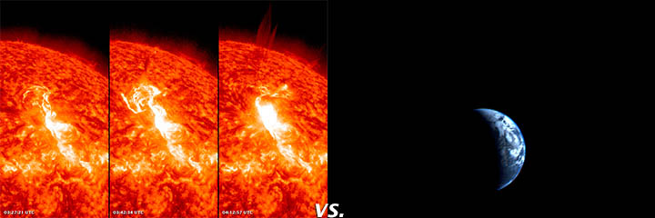
Cinderella Baja was finally taken out by the Black Marble, but two other high seeds remain: “Crack in the Ice” and “El Hierro.” If you want to dissect what went wrong (or right) with your picks last week, look below to see how the voting played out. In the data section, we saw the PIG Ice Crack blow out the North American heat wave image, which garnered just 22 percent of the vote. Voyager’s view of Earth also went down hard, earning just 37 percent of the vote against the solar flare.
Don’t forget to vote in the third round. Some key matchups to watch: #1 ranked City Lights of the United States is squaring off against #2 ranked Night Lights 2012. And in the true color section, the Black Marble faces the toughest competition it has seen yet from the solar flare image. Voting closes at 4pm Eastern Time on March 22.
The Black Marble (57%) vs. Baja California (43%)
Solar Flares (63 %) vs. Voyager Far from Home (37 %)
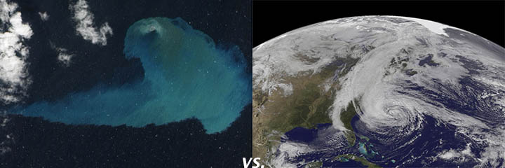
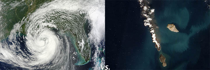
El Hierro (57%) vs. GOES Hurricane Sandy (43%)
Hurricane Isaac (35%) vs. New Volcanic Island (65%)
City Lights United States (66%) vs. Lights of London (34% )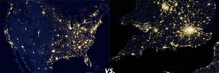
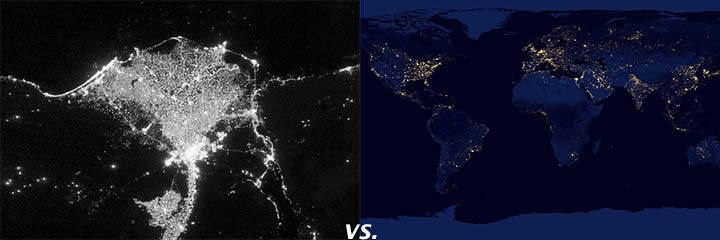
City Lights Nile (47%) vs. Flat Map Night Lights (53%)
PIG Ice Crack (78%) vs. North American Heat Wave (22%)

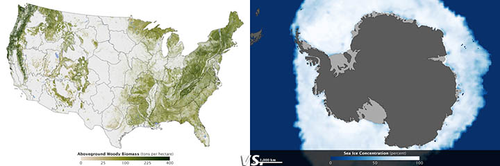
Tree Map (48%) vs. Antarctic Sea Ice (52%)

Each month, Earth Observatory offers up a puzzling satellite image here on Earth Matters. The tenth puzzler is above. Your challenge is to use the comments section to tell us what part of the world we are looking at, when the image was acquired, and why the scene is interesting.
How to answer. Your answer can be a few words or several paragraphs. (Try to keep it shorter than 300 words). You might simply tell us what part of the world an image shows. Or you can dig deeper and explain what satellite and instrument produced the image, what spectral bands were used to create it, or what is compelling about some obscure speck in the far corner of an image. If you think something is interesting or noteworthy, tell us about it.
The prize. We can’t offer prize money for being the first to respond or for digging up the most interesting kernels of information. But, we can promise you credit and glory (well, maybe just credit). Roughly one week after a puzzler image appears on this blog, we will post an annotated and captioned version as our Image of the Day. In the credits, we’ll acknowledge the person who was first to correctly ID the image. We’ll also recognize people who offer the most interesting tidbits of information. Please include your preferred name or alias with your comment. If you work for an institution that you want us to recognize, please mention that as well.
Recent winners. If you’ve won the puzzler in the last few months, please sit on your hands for at least a few days to give others a chance to play.
Australia is no stranger to fires, floods, drought, and heat. But a new report from the Australian Climate Commission not only points out that fire hazards and extreme weather events are worsening, it links them to a warming climate.
The report focuses on what it calls the “Angry Summer” of 2012/2013. The 90-day period included 123 broken records for maximum temperatures, heat waves, floods, and daily rainfall amounts. “The summer of 2012/2013 was Australia’s hottest summer since records began in 1910,” the report stated. The Angry Summer brought the highest area-averaged maximum temperature in Australia: 40.30°C (104.54°F). The summer also brought the longest stretch of high temperatures: for seven straight days (January 2–8), the average daily maximum temperature for the entire continent exceeded 39°C (102.2°F). This broke the previous record of four straight days above 39°C.

The report also made a starker point: “There have only been 21 days in 102 years where the average maximum temperature across Australia has exceeded 39°C; eight of these days happened this summer.”
High temperatures exacerbate fire danger, and the Australian summer of 2012/2013 brought major bushfires in New South Wales, Victoria, and Tasmania. Based on air temperature, humidity, drought, and wind speed, Australia’s forest fire danger index has historically used a scale from 1 to 100 to gauge the danger of bushfires. Starting in 2009, the index added a new fire danger rating above 100, termed “catastrophic,” reflecting a new fire-danger regime.
While some parts of Australia were on fire, other parts were under water. The Climate Commission discussed heavy rainfall, including torrential rains from cyclone Oswald that flooded parts of the Queensland coast in January 2013. The report stated that parts of the east coast broke rainfall records for the entire month in just the seven days of the storm. The report linked recent extreme rainfall events in eastern Australia to higher sea surface temperatures, which increase atmospheric water vapor and lead to greater precipitation.
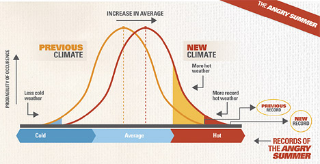
From The Angry Summer, adapted from IPCC 2007.
The Climate Commission pointed out that Australia’s average temperature has increased by 0.9°C (1.6°F) since 1910, and went on to say that, while that temperature increase might seem small, “When the average temperature shifts, the temperatures at the hot and cold ends (tails) of the temperature range shift too. A small increase in the average temperature creates a much greater likelihood of very hot weather and a much lower likelihood of very cold weather.”
See the full report at http://climatecommission.gov.au/report/the-angry-summer/
Our image of the day on February 26 provided a satellite view of how a nor’easter can stir up the New England coast and its waters. Here are a few other views from the storm they called Nemo…

A aerial photo from Kelsey-Kennard Airview shows the new breach in South Beach, just off the town of Chatham, Massachusetts.
WCVB television in Boston surveyed the destruction in the Cape Cod National Seashore. Click here to view.
Beach dunes, parking lots, boardwalks, stairways — along with waterfront homes — took a beating from the storm the media called “Nemo.” This YouTube video shows the wreckage at Coast Guard Beach, in Sandwich, and other points on Cape Cod, Massachusetts:
[youtube f-dCkJ2xCVw]
In Truro, the ocean breached the dunes and sent water into the Pamet River:
[youtube l3G4sUAqkLY]
An image from the SEVIRI instrument aboard the European Space Agency’s Meteosat-10 geostationary satellite. The vapor trail left by the meteor is visible in the center of the image. Credit: European Space Agency/EUMETSAT
Around 9:20 a.m. local time on February 15, 2013, a blazing mass of rock from space—a meteor—streaked across the sky over the Ural Mountains in the Chelyabinsk region of Russia. The burning mass produced a loud sonic boom and shock wave that blew out windows in multiple cities and towns. Russian media outlets are reporting hundreds of injuries, most minor, and damage to thousands of buildings.
Bill Cooke, the head of the Meteoroid Environments Office at Marshall Flight Center, said that the object, which likely came from the asteroid belt, had a diameter of about 15 meters (50 feet) and weighed about 7,000 metric tons. When it encountered the top of Earth’s atmosphere, it was moving 18 kilometers (11 miles) per second and left a vapor trail that was approximately 480 kilometers (300 miles) long. It lasted in the atmosphere for over 30 seconds before breaking up 25 kilometers (15 miles) above the surface, producing a violent explosion that released about 300 kilotons of energy. Most of the fragments burned up as they passed through the atmosphere, but some meteorites did reach the surface. One reportedly left an impact crater that was 6 meters (20 feet) in diameter.
The SEVIRI instrument on the European Space Agency’s Meteosat-10 geostationary weather satellite captured a view (top of this page) of the vapor trail. Dramatic videos and photos of the incident have also popped up on the internet.
The incident was not related to 2012 DA14, a 45 meter (150 foot) diameter asteroid that was expected to make its closest approach to Earth—17,200 miles (27,000 kilometers)—at 2:25 p.m. EST on Feb 15, 2013. The trajectory of the Russian meteor was significantly different than the trajectory of the asteroid 2012 DA14.
If you would like to learn more about 2012 DA14, tune into NASA Television starting at 2 p.m. EST. For general background about near-Earth objects, see these FAQ’s from NASA’s Near Earth Object Program.
http://www.youtube.com/watch?feature=player_embedded&v=b0cRHsApzt8
For more information:
Live Updates from RT
Moscow Times
NASA Press Release
NASA Press Conference
RIA Novosit
Russia Beyond the Headlines
Slate: Bad Astronomer
USGS
alert message
