

Compared to Earth, the planet Jupiter is about 11 times larger in circumference, 5 times farther from the Sun, 4 times colder, and it rotates 2.5 times faster. Based on the numbers, this gas giant wouldn’t seem to have much in common with our planet. But spend a moment looking at these detailed images of vortices in Earth’s oceans and in the atmosphere on Jupiter. You might struggle to tell the difference.

In 2019 we published this side-by-side comparison of Jupiter and Earth. The image of Jupiter (left) shows ammonia-rich clouds swirling in the outermost layers of the planet’s atmosphere. The eddies trace disturbances caused by the planet’s fast rotation and by high temperatures deeper in the atmosphere. The image of Earth (right) shows a green phytoplankton bloom tracing the edges of a vortex in the Baltic Sea. Turbulent processes in the oceans are important for moving heat, carbon, and nutrients around the planet.
Scientists are paying attention to the similarities. Lia Siegelman, a physical oceanographer at Scripps Institution of Oceanography, became interested in NASA’s Juno mission when images of Jupiter reminded her of the turbulent oceans she was studying on Earth. She presented the following examples at the December 2021 meeting of the American Geophysical Union.
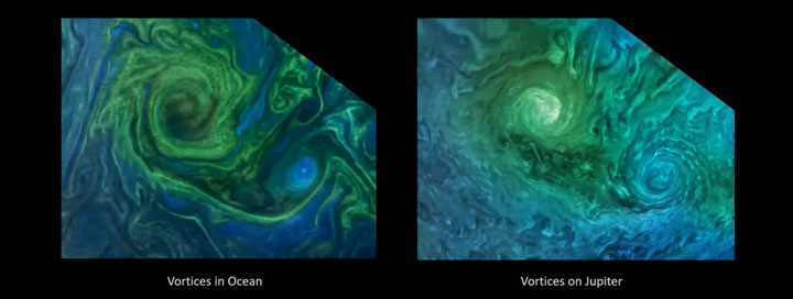
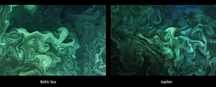
Notice how the swirls and vortices in the Norwegian Sea (top-left) and Baltic Sea (bottom-left) resemble vortices in Jupiter’s atmosphere (top- and bottom-right). Siegelman noted that although the scales are different–the vortex on Jupiter is about ten times larger than the one in the Baltic–they are generated by the same sort of fluid dynamics.
By studying these naturally emerging patterns, scientists are learning more about atmospheric processes on Jupiter. Someday, such comparisons might even tell us something new about our home planet.
The Juno spacecraft, which has been gathering data on the gas giant since July 2016, completed its 38th close pass by Jupiter in November 2021. You can find more information about the Juno mission here and here.
“Not bad for a shoebox.”
This quip, uttered by an engineer at NASA’s Wallops Island Near Earth Network (NEN) receiving station on March 22, 2019, is something NASA oceanographer Gene Carl Feldman will never forget.
The comment came in response to the successful downlink and processing of the first image from the HawkEye imager aboard the University of North Carolina-Wilmington’s SeaHawk CubeSat, currently in low-Earth orbit approximately 575 kilometers above the surface.
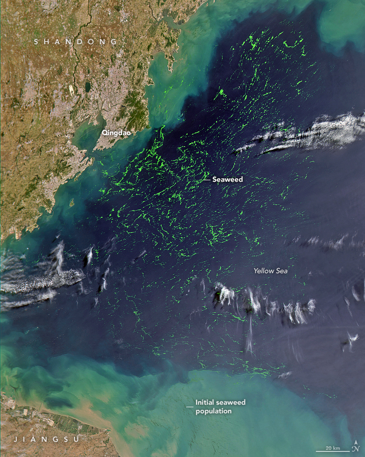
The goal of the SeaHawk mission was to prove a concept: that it is possible to collect scientifically credible ocean color data comparable to that of previous ocean color satellite missions from a 3U (or unit) CubeSat, a small, cube-shaped satellite (also known as a nanosatellite) measuring just 10-centimeters x 10-centimeters x 30-centimeters. The first successful download of an image from HawkEye proved it was.
“The mission could have ended at that moment, and we could have declared 100 percent success,” said Feldman, who specializes in ocean color remote sensing. “This was the first X-band downlink from a CubeSat that NASA had ever done. The data came down, it was processed flawlessly through the system — it was amazing! Everything worked. Here you have this 11-meter dish collecting data from something you can hold in one hand.”
The mission could have ended at that time, but, of course, it didn’t. Although pursued as a proof-of-concept, Feldman admits he had bigger plans for SeaHawk from the start.
“I didn’t think it would be worth NASA’s investment to do a one-off, get one image, prove the concept, and go home,” he said. “My goal from the beginning was to integrate this mission into the infrastructure that we have built over the past 25 years to support ocean color satellites, and to demonstrate that a CubeSat can be treated like a normal, credible scientific mission.”
Click here to read more about the origins, development, and performance of SeaHawk and HawkEye.
From Wisconsin to Washington D.C., pollen counts were quite high this spring, making seasonal allergies brutal for many people. Recent research shows that changes in the onset of spring—both early and late—can extend allergy misery and lead to more severe asthma for some people.
Warm springtime temperatures signal shrub buds to burst, trees to leaf-out, and flowers to bloom. As plants produce and release pollen, our bodies can mistakenly identify it as a dangerous intruder to our respiratory systems. Our immune systems produce chemicals to fight it, inducing sneezing, watery eyes, and stuffy noses. Research also shows allergenic pollen is also among the leading risk factors known to worsen asthma.
Amir Sapkota, a professor of public health at the University of Maryland, and his colleagues investigated how changes in the timing of spring onset affected asthma hospitalizations in Maryland over the past decade. The team used the Normalized Difference Vegetation Index (NDVI), which shows the relative “greenness” of vegetation, to determine the timing of the spring onset. (The data come from the Moderate Resolution Imaging Spectroradiometer (MODIS) on NASA’s Aqua and Terra satellites.) The team combined the satellite data with pollen counts and inpatient hospital admissions from the Maryland Department of Health.
They found that very early onset of spring (10 days early) was associated with a 17 percent increase in asthma hospitalizations in Maryland from 2001-2012, while late onset (3 days later) was associated with a 7 percent increase.
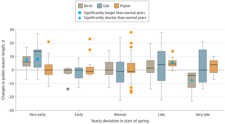
Sapkota explained that the hospitalization risk increased because of changes in pollen dynamics. Tree pollen is common in spring, while grass and weed pollen are more common during summer and fall. According to Sapkota, an early onset of spring leads to earlier and longer tree pollen seasons. At the other end, late onset causes different species of trees to bloom at the same time, thus increasing overall pollen levels in the environment. Both scenarios can lead to increases in asthma hospitalizations.
harmony: 1. A pleasing arrangement of parts. 2. An interweaving of different accounts into a single narrative. (Merriam-Webster Online Dictionary)
The Operational Land Imager (OLI) aboard the Landsat 8 satellite and the Multi-Spectral Instrument (MSI) aboard the Sentinel-2A and Sentinel-2B satellites tell two slightly different stories of Earth. OLI fully images the planet’s land surfaces every sixteen days at 30-meter resolution. MSI images Earth with repeat coverage every five days at 10- to 20-meter resolution.
But what if you could combine, or harmonize, these two data stories into a single narrative? With the provisional release of the Harmonized Landsat Sentinel-2 (HLS) dataset, NASA, the U.S. Geological Survey, and the European Space Agency have done just that. By combining OLI and MSI data—processing it to be used together as if it all came from a single instrument on one satellite—scientists have created global land surface products at 30-meter spatial resolution that are refreshed every two to three days.
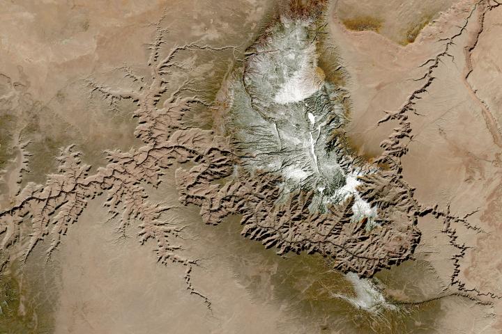
“Our definition of ‘harmonized’ is that observations should be interchangeable for common [spectral] bands,” says Jeff Masek, the HLS principal investigator and Landsat 9 project scientist. “By harmonizing the datasets and making the corrections so that it appears to the user that the data are coming from a single platform, it makes it easier for a user to put these two datasets together and get that high temporal frequency they need for land monitoring.”
Two provisional surface reflectance HLS products are available through NASA’s Earthdata Search and NASA’s Land Processes Distributed Active Archive Center (LP DAAC): the Landsat 30-meter (L30) product (doi:10.5067/HLS/HLSL30.015) and the Sentinel 30-meter (S30) product (doi:10.5067/HLS/HLSS30.015). HLS imagery also is available through NASA’s Global Imagery Browse Services (GIBS) for interactive exploration using the NASA Worldview data visualization application.
The HLS image-processing algorithm was initially developed by a team at NASA’s Goddard Space Flight Center starting in 2013, with test versions released in 2015, 2016, and 2017. Even though HLS was still in the prototype stage and covered just 28 percent of Earth’s land surface, the team saw immediate and clear value for the scientific community. The project was scaled up from 28 percent to nearly 100 percent of Earth’s land surface (minus Antarctica) in 2019 by NASA’s Interagency Implementation and Advanced Concepts Team (IMPACT) at NASA’s Marshall Space Flight Center.
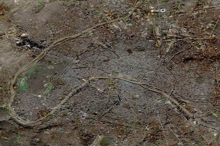
The HLS dataset is optimized for use in the Amazon Web Services commercial cloud environment; hosting it in the cloud has significant benefits for data users. “We’re really trying to take data analysis to the next level where we’re able to provide this large-scale processing without large-scale computing requirements,” says Brian Freitag, the HLS project manager at IMPACT. “For example, if you want to look at all the HLS data for a particular plot of land at the 30-meter resolution provided by HLS, you can do this using your laptop. Everything is in cloud-optimized GeoTIFF format.”
The harmonious combination of the OLI and MSI stories is opening new avenues of terrestrial research. A principal HLS application area will be agriculture, including studies of vegetation health; crop development, management, and identification; and drought impacts. HLS data also are being used in a new vegetation seasonal cycle dataset available through LP DAAC.
Global, 30-meter coverage every two to three days? The ability to access and work with years of Landsat and Sentinel imagery in the commercial cloud? That’s a harmonious arrangement the scientific community is eager to explore.
NASA, the European Space Agency (ESA), and the Japan Aerospace Exploration Agency (JAXA) have joined forces to create the COVID-19 Earth Observation Dashboard. The web platform combines the collective scientific power of the agencies’ Earth-observing satellites to document changes in the environment and society in response to the pandemic.
The dashboard is a user-friendly tool to track changes in air and water quality, climate change, economic activity, and agriculture.
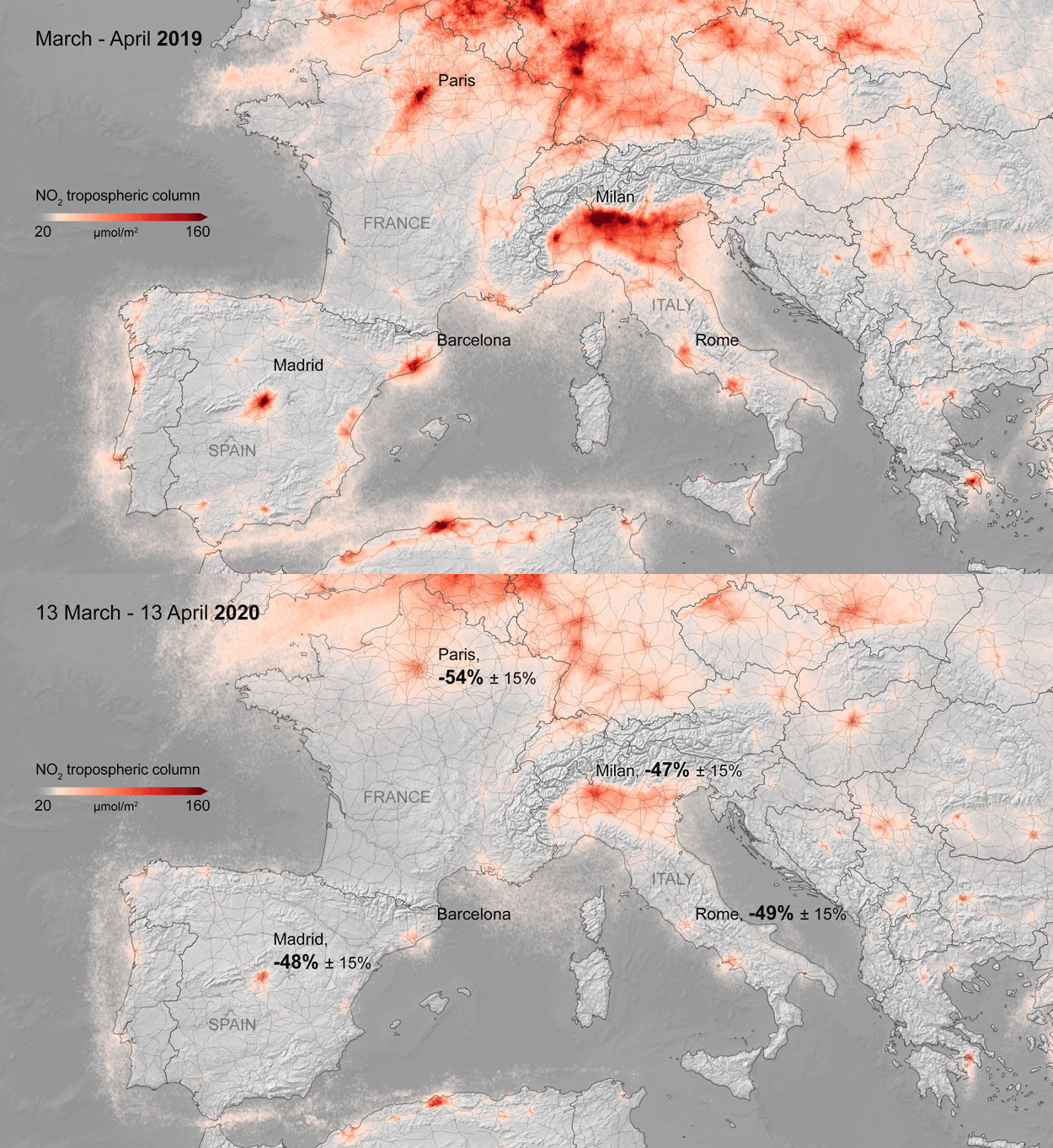
Air quality changes were among the first noticeable impacts of pandemic-related stay-at-home orders, and the resulting reductions in industrial activity, that could be tracked through satellite observations. Reductions in nitrogen dioxide (NO2) levels — primarily related to temporary reductions in the burning of fossil fuels — show up clearly in satellite data.
A preliminary analysis also indicates that planting (farming) activity dropped during the quarantines and lockdowns. For example, the cultivated area of white asparagus in Brandenburg, Germany, has been 20 to 30 percent lower this year, compared to 2019. More information on agricultural productivity changes will be added to the dashboard in the months to come.

Recent water quality changes have been reported in a few locations that typically have intense industry and tourism — activities that have decreased during the pandemic. Data on ship identification, construction activity, and nighttime lights (above) are featured on the dashboard to keep track of some of the economic ramifications of the virus.
Together, ESA, JAXA, and NASA will continue to add new observations to the dashboard in the coming months to see how these indicators change. Learn more in the NASA press release, the video below, or by exploring the dashboard.
To counter the rapid spread of COVID-19 in the winter and spring of 2020, quarantines and social distancing measures were implemented around the world. Air traffic nearly ceased; non-essential businesses were closed; and the number of vehicles on the road fell well below normal.
Remote sensing scientists have started looking at potential changes in the environment due to these changes in human behavior. They are looking for signs of how environmental factors such as humidity, temperature, and ultraviolet radiation might play a role in the behavior of the virus. Some may also look for data related to access to water resources, which can be critical to the spread or prevention of certain diseases.
NASA’s Earth Science Data Systems program has developed a new web-based tool, the COVID-19 Data Pathfinder, which provides links to datasets that can be used to research changing environmental impacts from modified human behavior patterns, the possibility of seasonal trends in virus transmission, and water availability. The COVID-19 Data Pathfinder is also a resource for participants in NASA’s Space Apps COVID-19 Challenge, providing an intuitive means for new users to find and use NASA data.
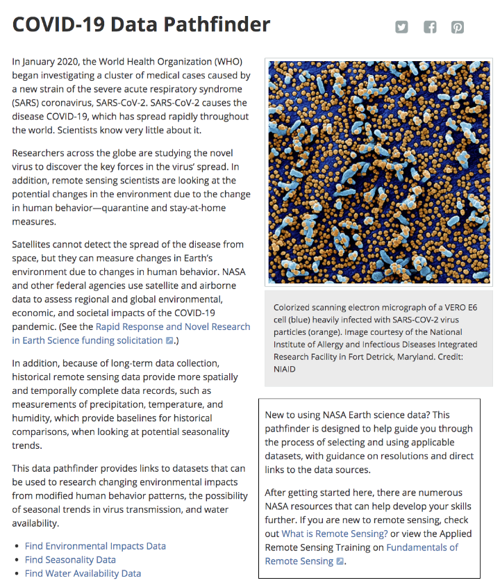
Web view of the COVID-19 Data Pathfinder page
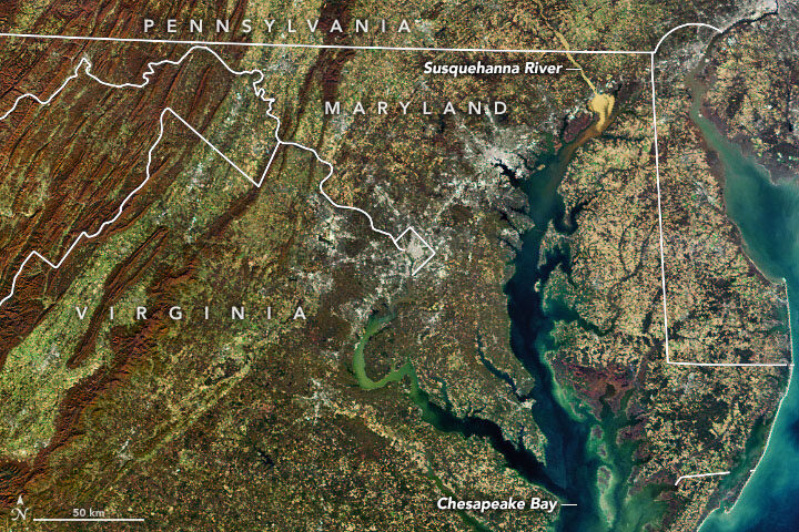
In November 2019, we highlighted this Landsat 8 image showing a glut of sediment flowing down the Susquehanna River into Chesapeake Bay. It was a striking, timely image, but one of the realities of publishing new content every day is that sometimes good information comes in after a deadline has passed.
In this case, Mark Trice, a water quality expert with the Maryland Department of Natural Resources, pointed out a few things about Susquehanna sediment after our story was out that seem worth passing on.
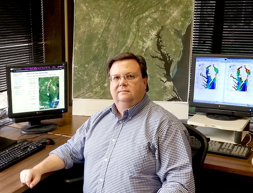
Among them: a link to a recent report that synthesizes and summarizes what scientists have learned about the ecological effects of high sediment flows on the Susquehanna River and the role of the Conowingo Dam. While the dam trapped most sediment and associated nutrient pollution (nitrogen and phosphorus) when it was first built, enough material has piled up behind the dam now that significant amounts of sediment and nutrients now flow past it during storms. A University of Maryland press release summarized the findings this way:
Most sediment and particulate nutrient impacts to the Bay occur during high-flow events, such as during major storms, which occur less than 10 percent of the time. Loads delivered to the upper Chesapeake Bay during low flows have decreased since the late 1970s, while loads during large storm events have increased. Most of these materials are retained within the upper Bay but some can be transported to the mid-Bay during major storm events, where their nutrients could become bioavailable.
The potential impact of reservoir sediments to Bay water quality are limited due to the low reactivity of scoured material, which decreases the impact of total nutrient loading even in extreme storms. Most of this material would deposit in the low salinity waters of the upper Bay, where rates of nitrogen and phosphorus release from sediments into the water are low.
“While storm events can have major short-term impacts, the Bay is actually really resilient, which is remarkable,” said the study’s lead author Cindy Palinkas, associate professor at the University of Maryland Center for Environmental Science. “If we are doing all of the right things, it can handle the occasional big input of sediment.”
Trice’s colleagues at the Maryland Department of Natural Resources (DNR) underscored the Bay’s resiliency to sediment as well when I asked about the recent event. “Although these high flow events routinely occur, the Bay is resilient and continues to show improvement due to the commitment by the Bay watershed partners to have all pollution reduction strategies implemented by 2025 to have a healthy Chesapeake Bay,” said Bruce Michael of Maryland DNR.
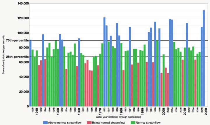
Also worth mentioning: the 2019 water year (October 1, 2018, to September 30, 2019) brought a record-breaking flow of freshwater into the Bay, Trice noted. “The annual average freshwater flow into the Chesapeake Bay during water year 2019 was 130,750 cubic feet per second, which is the highest annual amount since 1937, the first year for which data are available,” the U.S Geological Survey said.
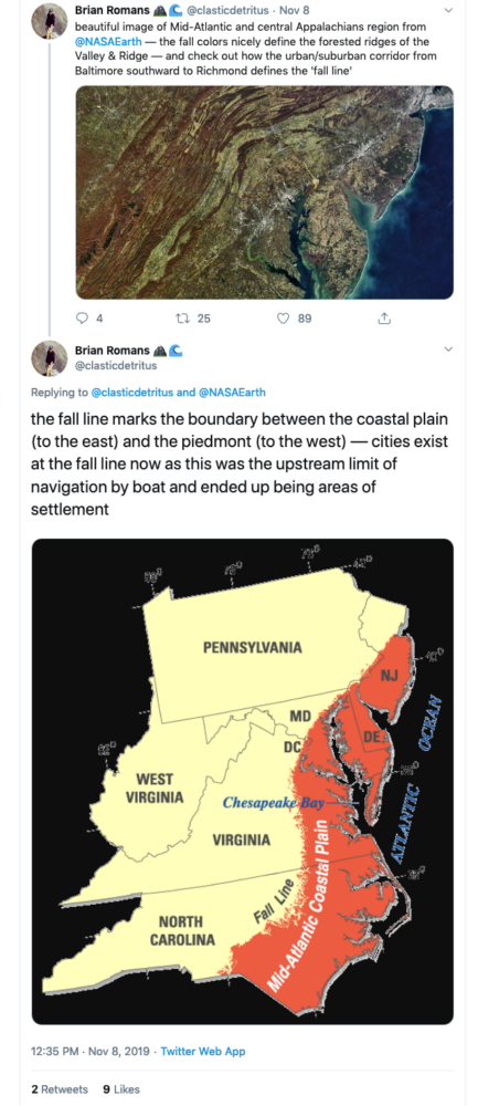
Finally, thank you to Virginia Tech geology professor Brian Romans (@clasticdetritus) for pointing out something about the image that is unrelated to sediment but fascinating: the line of cities and suburbs running from Baltimore, Md., to Richmond, Va., marks the boundary between two key geologic zones: the flat Coastal Plain to the east and the more rugged Piedmont to the west. Interestingly, many cities are located along this “fall line” because rapids prevented boats from traveling any farther upstream when they were first settled.
NASA Earth Observatory map by Joshua Stevens, using Landsat data from the U.S. Geological Survey and calculations from Lynch, H. J., & Schwaller, M. R.
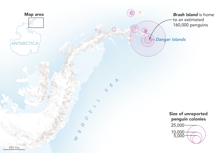
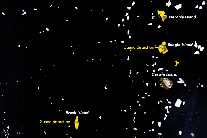
Last year, we published a story explaining how scientists had used satellite images of rocks stained pink with guano to discover several unexpectedly large colonies of Adélie penguins on the Danger Islands. Now the researchers are back with a new announcement: Using Landsat data, they have analyzed how the size of that penguin population has changed since 1982. They also used Landsat’s deep archive of satellite imagery to analyze what the penguins eat and whether their diets have changed over the past three decades.
“While the Adélie population [on the Danger Islands] is massive, it was even larger in the past,” said Heather Lynch of Stony Brook University. “We believe the population peaked in the late 1990s and has been on a slow steady decline ever since.” The scientists are still working out what may have caused the 10 to 15 percent decline in the population, but they think it is probably related to changing environmental conditions.
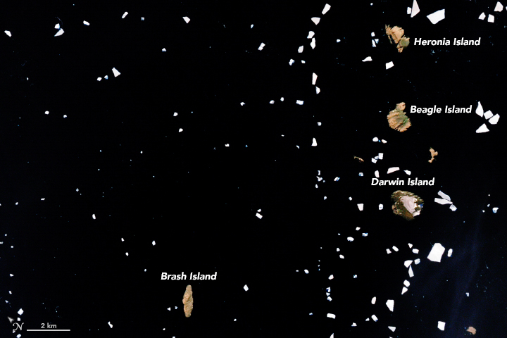
NASA Earth Observatory images by Joshua Stevens, using Landsat data from the U.S. Geological Survey and calculations from Lynch, H. J., & Schwaller, M. R. (2014).
Adélie penguins are particularly sensitive to changes in climate because they require ice-free land areas to breed and access to open water. They also need enough sea ice to support populations of key food sources. The researchers thought that changing diets would accompany the decline in population, but by analyzing the spectral signatures of all the guano stains found in cloud-free Landsat image of the islands since 1982, they were surprised to discover the penguins’ diets have stayed the same.
Penguin guano ranges from white to pink to dark red. White guano is from eating mostly fish; pink and red is from mostly eating krill. The University of Connecticut’s Casey Youngflesh, however, noticed some intriguing regional patterns in what Adélie penguins eat. Colonies in West Antarctica tend to eat more krill, while colonies in East Antarctic consume more fish. The reasons for the difference are not clear, though Youngflesh is looking into the possibility that differences in the Antarctic silverfish population may be a factor.
Discovering the big colonies on the Danger Islands has also opened up a new pathway for figuring out when penguins first arrived. By digging through layers of guano-stained pebbles during a recent field expedition and dirt and dating them with radiocarbon techniques, Michael Polito of Louisiana State University worked out that penguins must have arrived on the Danger Islands about 2,900 years ago, thousands of years earlier than previous evidence suggested.
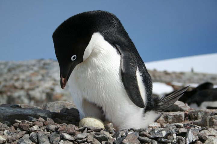
Credits: Heather Lynch, Stony Brook University.
Expect to hear even more guano-stained discoveries in the future. “We are only just scratching the surface of what we can do in terms of tracking seabirds from space,” said Lynch. “We should be able to extend the technique to snow petrel, boobies, and cormorants.”
Lynch put the total number of penguins on the Danger Islands at roughly 1.5 million (individual birds) — more than live on all the rest of the Antarctic Peninsula combined.
Read more about the Danger Island Adélie penguins from NASA and MAPPPD.
In July 2016, the lower portion of a valley glacier in the Aru Range of Tibet detached and barreled into a nearby valley, killing nine people and hundreds of animals. The huge avalanche, one of the largest scientists had ever seen, sent a tongue of debris spreading across 9 square kilometers (3 square miles). With debris reaching speeds of 140 kilometers (90 miles) per hour, the avalanche was remarkably fast for its size.
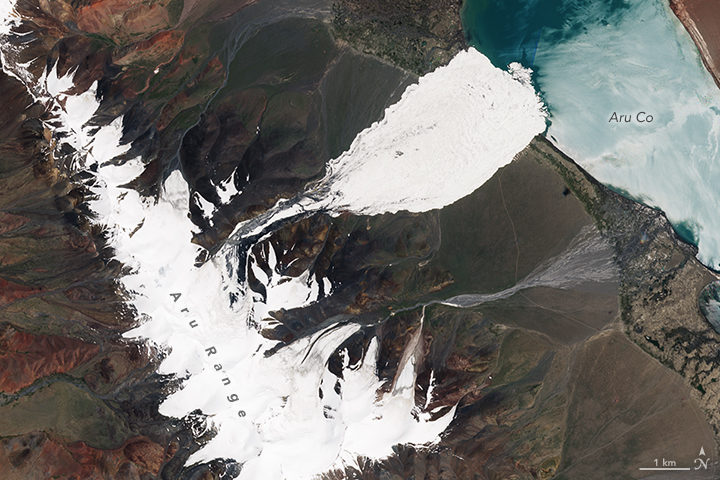
(NASA Earth Observatory image by Joshua Stevens, using modified Copernicus Sentinel 2 data processed by the European Space Agency. Image collected on July 21, 2016.)
Researchers were initially baffled about how it had happened. The glacier was on a nearly flat slope that was too shallow to cause avalanches, especially fast-moving ones. What’s more, the collapse happened at an elevation where permafrost was widespread; it should have securely anchored the glacier to the surface.
Two months later, it happened again — this time to a glacier just a few kilometers away. One gigantic avalanche was unusual; two in a row was unprecedented. The second collapse raised even more questions. Had an earthquake played a role in triggering them? Did climate change play a role? Should we expect more of these mega-avalanches?
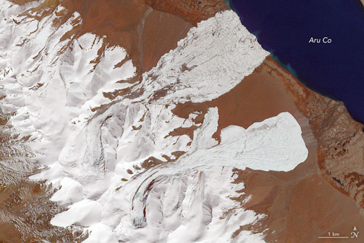
(NASA Earth Observatory image by Joshua Stevens and Jesse Allen, using ASTER data from NASA/GSFC/METI/ERSDAC/JAROS, and U.S./Japan ASTER Science Team. Image collected on October 4, 2016.)
Now scientists have answers about how these unusual avalanches happened. There were four factors that came together and triggered the collapses, an international team of researchers reported in Nature Geoscience. The scientists analyzed many types of satellite, meteorological, and seismic data to reach their conclusions. They also sent teams of researchers to investigate the avalanches in the field.
First, increasing snowfall since the mid-1990s caused snow to pile up and start working its way toward the front edge of the glaciers (a process known as surging). Second, a great deal of rain fell in the summer of 2016. As a result, water worked its way through crevasses on the surface and lubricated the undersides of the glaciers. Third, water pooled up underneath the glaciers, even as the edges remained frozen to the ground. Fourth, the glaciers sat on a fine-grained layer of siltstone and clay that became extremely slippery.
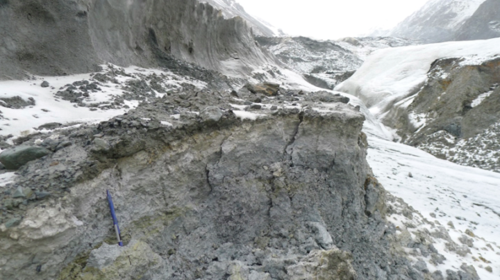
Notice the large amounts of silt and clay in the path of the first avalanche. (Photo taken on July 15, 2017, by Adrien Gilbert/University of Oslo)
Earth Observatory checked in with Andreas Kääb (University of Oslo), lead author of the study, to find out more about how the avalanche happened and what it means.
These glaciers were not on a steep slope, but the avalanche moved quite quickly. How did that happen?
Strong resistance by the frozen margins and tongues of the glaciers allowed the pressure to build instead of enabling them to adjust. The glaciers were loading up more and more pressure until the frozen margins suddenly failed. Local people reported a load bang. Once the margins failed, there was nothing at the glacier bed to hold it back, just water-soaked clay.
Your study notes that there was “undestroyed grassy vegetation on the lee side of the hills, suggesting that the fast-moving mass had partially jumped over it.” Are you saying the avalanche was airborne? If so, is that unusual?
Yes, for a small part of the avalanche path. We see this for other large-volume, high-speed avalanches, and it really illustrates the massive amount of energy released. You need quite high speeds in order for debris to jump. For us, the phenomenon is important as validation for the speeds obtained from the seismic signals the avalanches triggered and the avalanche modeling that we did.
Would you say these collapses were a product of climate change?
Climate change was necessary, but other factors that had nothing to do with climate were also critical. The increasing mass of the glaciers since the 1990s and the heavy rains and meltwater in 2016 are connected to climate change. The type of bedrock and the way the edges were frozen to the ground had nothing to do with climate change.
Can we expect to see more big glacial collapses as the world gets warmer?
It’s not clear. Climate change could increase or, maybe even more likely, decrease the probability of such massive collapses. Most glaciers on Earth are actually losing mass (not gaining, like the two glaciers in Tibet were). Also, if permafrost becomes less widespread over time and glacier margins melt, it is less likely that pressure will build up in that way that it did in this case.
I know you used several types of satellite data as part of this analysis. Can you mention a few that yielded particularly useful information?
We used a lot of different sources of data: Sentinel 1 and 2, TerraSAR-X/TanDEM-X, Planet Labs, and DigitalGlobe WorldView. Landsat 8 was absolutely critical because it gave the first and critical indication of the soft-bed characteristics. The entire Landsat series was instrumental for checking the glacier history since the 1980s. We also used declassified Corona data back to the 1960s.
Are these sorts of avalanches likely to happen in other parts of the world?
Honestly, I have no clue at the moment, but we would be much less surprised next time. We know now that this type of collapse can happen under special circumstances. (It happened once before in the Caucasus at Kolka Glacier.) One thing that should be investigated is whether there are other glaciers—especially polythermal ones—with these very fine-grained materials underneath them.
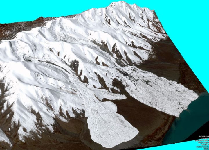
Three dimensional CNES Pléiades image of the avalanches. Processed by Etienne Berthier. Via Twitter.
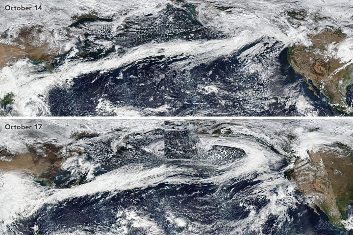
Atmospheric rivers stretched from Asia to North America in October 2017. Learn more.
If you live on the West Coast of North America, you have probably heard meteorologists talk about “atmospheric rivers” — the narrow, low-level plumes of moisture that often accompany extratropical storms and transport large volumes of water vapor across long distances. When atmospheric rivers encounter land, they can drop tremendous amounts of rain and snow. That can be good for replenishing reservoirs and for quenching droughts, but these remarkable meteorological features can also trigger destructive floods, landslides, and wind storms.
During the past decade, atmospheric rivers have fueled a flood of another type: scientific research papers. Prior to 2004, fewer than 10 studies mentioned atmospheric rivers in any given year; in 2015, about 200 studies were published on the matter. The availability of increasingly sophisticated satellite and aircraft data has fueled the trend, according to a recent article in the Bulletin of the American Meteorological Society. Here’s a sampling of what scientists have learned about these rivers in the sky.
They Can Bring Rains, Winds, And Lots of Damage
In a study led by Duane Waliser of NASA’s Jet Propulsion Laboratory and published in Nature Geoscience, researchers showed that atmospheric rivers are among the most damaging storm types in the middle latitudes. Of the wettest and windiest storms (those ranked in the top 2 percent), atmospheric rivers were associated with nearly half of them. Waliser and colleagues found that atmospheric rivers were associated with a doubling of wind speed compared to all storm conditions.
They Shift With The Seasons
During the winter, atmospheric rivers in the Pacific generally shift northward and westward, Bryan Mundhenk of Colorado State University and colleagues concluded in a study. They also found that the El Niño/Southern Oscillation (ENSO) cycle can affect the frequency of atmospheric river events and shift where they occur. The research was based on data processed by MERRA, a NASA reanalysis of meteorological data from satellites.
They Aren’t Just a West Coast Thing
Atmospheric rivers are a global phenomenon and responsible for about 22 percent of all water runoff. One recent study from a University of Georgia team underscored that the U.S. Southeast sees a steady stream of atmospheric rivers. “They are more common than we thought in the Southeast, and it is important to properly understand their contributions to rainfall given our dependence on agriculture and the hazards excessive rainfall can pose,” said Marshall Shepherd of the University of Georgia. Other studies note that atmospheric rivers have contributed to anomalous snow accumulation in East Antarctica and extreme rainfall in the Bay of Bengal.
Climate Change Could Alter Them
A recent study led by Christine Shields of the National Center for Atmospheric Research suggests that climate change could push atmospheric rivers in the Pacific toward the equator and bring more intense rains to southern California. The modeling calls for smaller increases in rain rates in the Pacific Northwest. Another ensemble of models shows a in the number of days with landfalling atmospheric rivers in western North America.
Satellites Are Key to Studying Their Precipitation
While there are few ground-based weather stations in the open ocean to tally how much rain falls, satellites such as those included in the Global Precipitation Measurement (GPM) mission can estimate precipitation rates from above. “Satellites have proven valuable over both the ocean and land, though uncertainties are often larger over land because of complicating factors like the terrain and the presence of snow on the surface,” said Ali Behrangi, the author of a study that assessed the skill of different satellite-derived measurements of precipitation rates.