

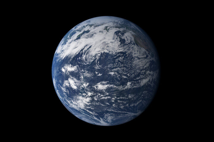
From afar, Earth’s oceans look quite blue. But closer inspection reveals a much more complex palette. Tiny particles floating in the water (phytoplankton, pollution, and sediments) can change how light is absorbed and scattered, which affects the apparent color of the water near its surface.
Color is useful for scientists who model how the oceans might evolve with time and climate change. “It’s cool to see how all of these global Earth models—completely different when it comes to their complexity—use the color of the ocean to explain the changes in the future,” said Ivona Cetinic, an ocean ecologist at NASA’s Goddard Space Flight Center.
In one example, NASA-funded researchers showed large areas of the planet’s blue water becoming even bluer. The change would come from a decline in green-pigmented phytoplankton as the planet warms. You can read more about that study in Nature Communications, or check out some of the media coverage.
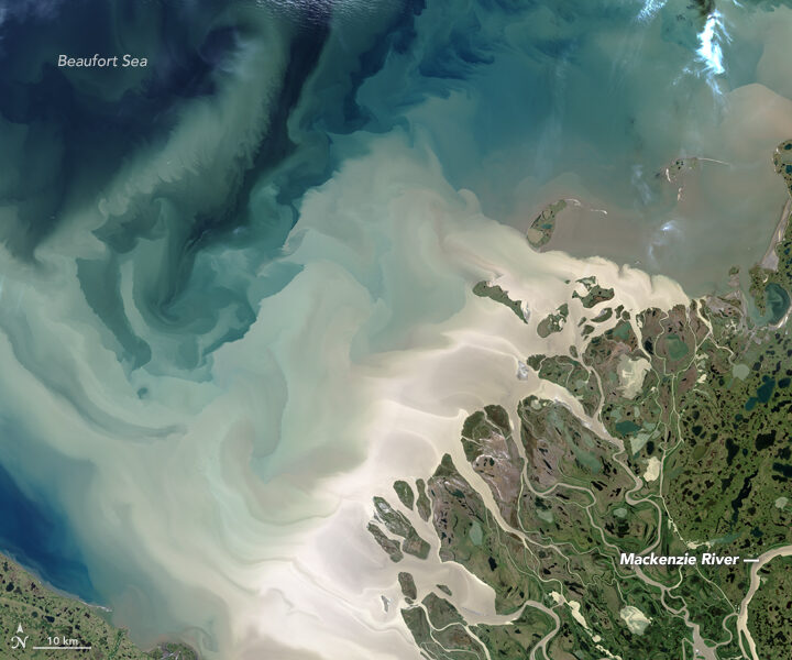
In a different study published in Geophysical Research Letters (GRL), researchers from NASA Goddard found that the “yellowing” of coastal waters could lead to cooler global ocean temperatures. Yellow-brown waters already show up around some coastal areas where rivers meet the ocean—such as the outwash from the Mackenzie River in northern Canada (above). Pulses of water from the spring melt move a huge amount of dissolved organic material and sediment into the Beaufort Sea. Coastal waters could become yellower over time if increases in precipitation and melting on land wash more dissolved organic material out to the ocean.
The researchers ran simulations that incorporated NASA ocean-color data and showed that after 300 years, the top 700 meters of a “yellow” ocean with dissolved organic material and plankton would be colder than a “green” phytoplankton-only ocean. That’s because yellow water lets less light and heat pass through the top layer of water, keeping it cooler below.
The authors wrote in the GRL paper: “We suggest that an increase in these yellowing materials behaves as a buffer that mitigates some effects of a warming climate.”
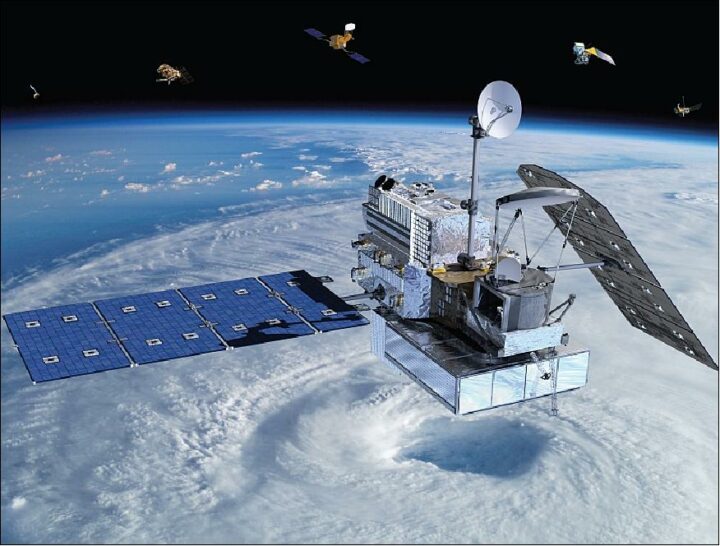
On February 27, 2014, a Japanese rocket launched NASA’s latest satellite to advance how scientists study raindrops from space. The satellite, the Global Precipitation Measurement (GPM) Core Observatory, paints a picture of global precipitation every 30 minutes, with help from its other international satellite partners. It has provided innumerable insights into Earth’s precipitation patterns, severe storms, and into the rain and snow particles within clouds. It has also helped farmers trying to increase crop yields, and aided researchers predicting the spread of fires.
In honor of GPM’s fifth anniversary, we’re highlighting some of our favorite and most unique Earth Observatory stories, as made possible by measurements taken by GPM.
The Second Wettest October in Texas Ever
In Fall 2018, storm after storm rolled through and dumped record rainfall in parts of Texas. When Hurricane Willa hit Texas around October 24, the ground was already soaked. One particularly potent cold front in mid-October dropped more than a foot of rain in areas. By the end of the month, October 2018 was the second wettest month in Texas on record.
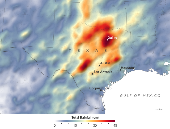
GPM measured the total amount of rainfall over the region from October 1 to October 31, 2018. The brightest areas reflect the highest rainfall amounts, with many places receiving 25 to 45 centimeters (10 to 17 inches) or more during this period. The satellite imagery can also be seen from natural-color satellite imagery.
Observing Rivers in the Air
With the GPM mission’s global vantage point, we can more clearly see how weather systems form and connect with one another. In this visualization from October 11-22, 2017, note the long, narrow bands of moisture in the air, known as “atmospheric rivers.” These streams are fairly common in the Pacific Northwest and frequently bring much of the region’s heavy rains and snow in the fall and winter. But this atmospheric river was unusual for its length—extending roughly 8,000 kilometers (5,000 miles) from Japan to Washington. That’s about two to three times the typical length of an atmospheric river.

Since atmospheric rivers often bring strong winds, they can force moisture up and over mountain ranges and drop a lot of precipitation in the process. In this case, more than four inches of rain fell on the western slopes of the Olympic Mountains and the Cascade Range, while areas to the east of the mountains (in the rain shadow) generally saw less than one inch.
Increasing Crop Yield for Farmers in Pakistan
Knowing how much precipitation is falling or has fallen is useful for people around the world. Farmers, in particular, are interested in knowing precipitation amounts so they can prevent overwatering or underwatering their crops.
The Sustainability, Satellites, Water, and Environment (SASWE) research group at the University of Washington has been working with the Pakistan Council of Research in Water Resources (PCRWR) to bring this kind of valuable information directly to the cell phones of farmers. A survey by the PCRWR found that farmers who used the text message alerts reported a 40 percent savings in water. Anecdotally, many farmers say their income has doubled because they got more crops by applying the correct amount of water.
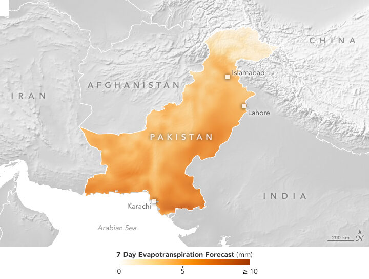
The map above shows the forecast for evapotranspiration for October 16-22, 2018. Evapotranspiration is an indication of the amount of water vapor being removed by sunlight and wind from the soil and from plant leaves. It is calculated from data on temperature, humidity, wind speed, and solar radiation, as well as a global numerical weather model that assimilates NASA satellite data. The team also looks at maps of precipitation, temperature and wind speed to help determine crop conditions. Precipitation data comes from GPM that is combined with ground-based measurements from the Pakistan Meteorological Department.
Forecasting Fire
Precipitation can drastically affect the spread of a fire. For instance, if a region has not received normal precipitation for weeks or months, the vegetation might be drier and more prone to catching fire.
NASA researchers recently created a model that analyzes various weather factors that lead to the formation and spread of fires. The Global Fire Weather Database (GFWED) accounts for local winds, temperatures, and humidity, while also being the first fire prediction model to include satellite–based precipitation measurements.
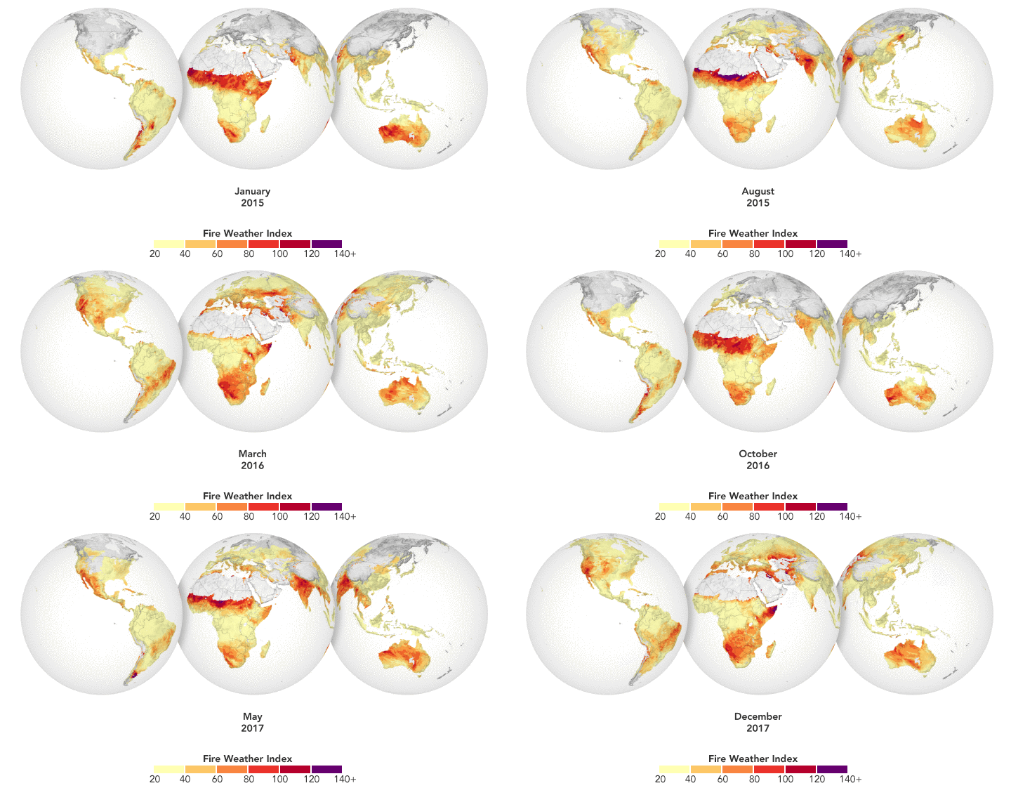
The animation above shows GFWED’s calculated fire danger around the world from 2015 to 2017. The model compiles and analyzes various data sets and produces a rating that indicates how likely and intense fire might become in a particular area. It is the same type of rating that many firefighting agencies use in their day–to–day operations. Historical data are available to understand the weather conditions under which fires have occurred in the past, and near–real–time data are available to gauge current fire danger.
Automatically Detecting Landslides
In this mountainous country of Nepal, 60 to 80 percent of the annual precipitation falls during the monsoon (roughly June to August). That’s also when roughly 90 percent of Nepal’s landslide fatalities occur. NASA researchers have designed an automated system to identify potential landslides that might otherwise go undetected and unreported. This information could significantly improve landslide inventories, leading to better risk management.
The computer program works by scanning satellite imagery for signs that a landslide may have occurred recently, looking at topographical features such as hill slopes.
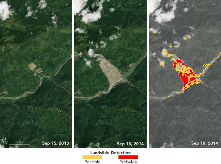
The left and middle images above were acquired by the Landsat 8 satellite on September 15, 2013, and September 18, 2014—before and after the Jure landslide in Nepal on August 2, 2014. The image on the right shows that 2014 Landsat image processed with computer program. The red areas show most of the traits of a landslide, while yellow areas exhibit a few of the proxy traits.
The program also uses data from GPM to help pin when each landslide occurred. The GPM core satellite measures rain and snow several times daily, allowing researchers to create maps of rain accumulation over 24-, 48-, and 72-hour periods for given areas of interest—a product they call Detecting Real-time Increased Precipitation, or DRIP. When a certain amount of rain has fallen in a region, an email can be sent to emergency responders and other interested parties.
The GPM Core Observatory is a joint satellite project by NASA and the Japan Aerospace Exploration Agency. The satellite is part of the larger GPM mission, which consists of about a dozen international satellite partners to provide global observations of rain and snow.
To learn more about GPM’s accomplishments over the past five years, visit: https://pmm.nasa.gov/resources/featured-articles-archive
To learn more about the GPM mission, visit: https://www.nasa.gov/mission_pages/GPM/main/index.html
NASA was mostly shut down for January 2019, but Earth wasn’t. In case you missed it, here are some of the big stories we didn’t cover during the impasse.
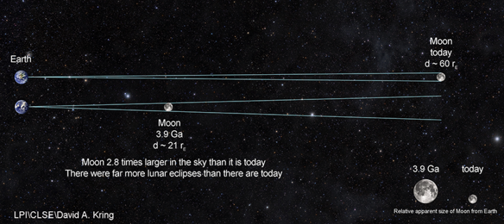
Scientists Find Evidence of An Ancient Earth Rock on the Moon
Four billion years ago, the Moon was about three times closer to Earth than it is now. So if a large asteroid or comet slammed into Earth and jettisoned material into space, it was more likely that rock fragments might end up landing on the Moon. That’s how an international team of scientists working with the Center for Lunar Science and Exploration (CLSE) think that a small fragment composed of quartz, feldspar, and zircon—a combination of minerals commonly found on Earth—ended up embedded within a larger Moon rock collected by Apollo astronauts. The team recently revealed evidence from the ancient rock fragment, suggesting that it is one of the oldest Earth rocks ever found.
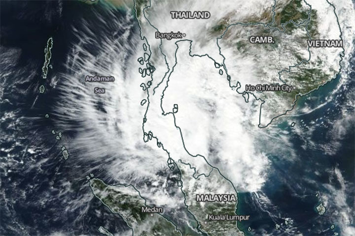
A Rare Typhoon Hits Thailand
It is rare for powerful tropical storms to strike Thailand. Before January 2019, the last time it happened was 1962. So meteorologists took notice when Tropical Storm Pabuk slammed into southern Thailand on January 4, 2019, packing sustained winds of 95 kilometers per hour (60 mph) and delivering torrential rains to some of Thailand’s most popular tourist destinations. The Moderate Resolution Imaging Spectroradiometer (MODIS) on NASA’s Aqua satellite captured this image of the storm on January 4, 2019.
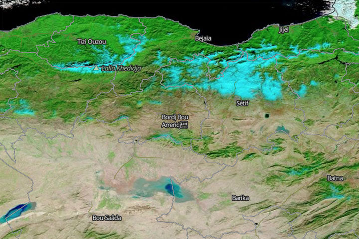
Snow Falls in Algeria (Yes, the Sahara)
In another unusual weather event, fresh snow created surreal scenery in Algeria when it coated Saharan desert dunes in mid-January. This is just the third time snow has fallen in Ain Sefra, the gateway to the Sahara Desert, in the past 37 years. (The last time was 2018.) The Moderate Resolution Imaging Spectroradiometer (MODIS) on NASA’s Terra satellite captured an image of the snow on January 14, 2019. It is composed with false color, using a combination of infraed and visible light (MODIS bands 7-2-1). Snow appears blue with this band combination.
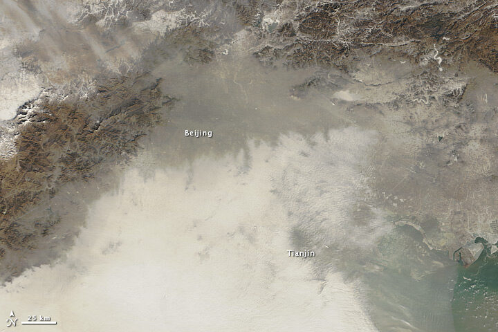
China’s War on Particulates May Be Making Ozone Pollution Worse
For the past few years, China has advanced an ambitious plan to reduce emissions of fine particulate (PM2.5), a harmful type of air pollution. Authorities have restricted the number of vehicles on the roads, capped how much coal industries can burn, and shuttered many polluting factories and power plants. The result has been impressive: over five years, concentrations of PM2.5 in eastern China have fallen nearly 40 percent. But, there is another wrinkle. Particulates also sponge up substances that make it harder for ground-level ozone to form. So even as concentrations of PM2.5 decline, ozone concentrations are rising, new research shows.
Can Satellites Sense Poverty?
Increasingly, yes, at least in rural areas. By analyzing observations of villages in Kenya, one team of researchers recently showed that land use and land cover data from satellites contains some useful clues for identifying the poorest households in rural areas. Key indicators included: the size of buildings within a homestead, the amount of bare agricultural land adjacent to a homestead, and the length of the growing season. The researchers think this type of information could make it easier to monitor the progress of efforts designed to reduce poverty in rural areas, such as the U.N. Sustainable Development Goals.
A meteor exploded over western Cuba on February 1, 2019, and it delivered an impressive light show. The event was captured by numerous ground-based cameras. It was also spotted from space.

Researchers from the Cooperative Institute for Meteorological Satellite Studies wrote a blog post showing a series of images and data from the event, including the animation above. It was composed from false-color images gathered by NOAA’s GOES-16 satellite. (NASA builds GOES satellites for NOAA.) The dark blue pixels moving toward the northeast appear to be the signature of a debris cloud drifting in the atmosphere after the meteor exploded. A close look at visible imagery from GOES-16 reveals a shadow apparently cast by the debris cloud.
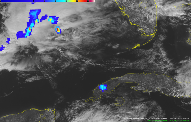
Meanwhile, scientists at NASA’s Short-term Prediction Research and Transition Center (SPoRT) reported signs of the meteor flash in an image acquired by the Geostationary Lightning Mapper (GLM). The meteor flash appears in this image as blue pixels over Cuba. (The blue in the top-left corner is lightning activity over the ocean.)
The meteor was notably smaller than the rock that exploded in February 2013 over Chelyabinsk, Russia. That event injected hundreds of tons of dust into the stratosphere and set the stage for scientists to directly study the plume’s long-term evolution in Earth’s atmosphere.
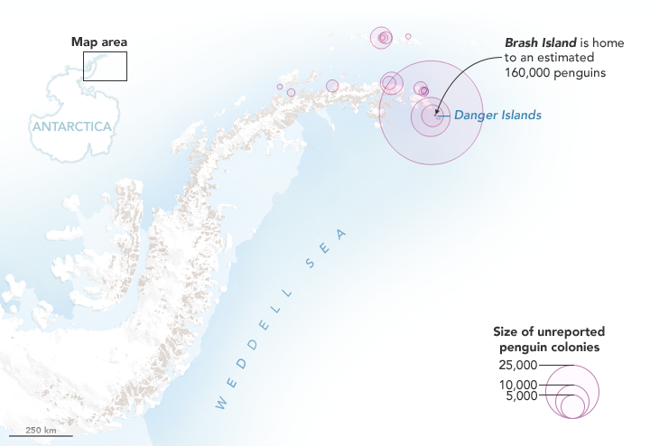
NASA Earth Observatory map by Joshua Stevens, using Landsat data from the U.S. Geological Survey and calculations from Lynch, H. J., & Schwaller, M. R.
Last year, we published a story explaining how scientists had used satellite images of rocks stained pink with guano to discover several unexpectedly large colonies of Adélie penguins on the Danger Islands. Now the researchers are back with a new announcement: Using Landsat data, they have analyzed how the size of that penguin population has changed since 1982. They also used Landsat’s deep archive of satellite imagery to analyze what the penguins eat and whether their diets have changed over the past three decades.
“While the Adélie population [on the Danger Islands] is massive, it was even larger in the past,” said Heather Lynch of Stony Brook University. “We believe the population peaked in the late 1990s and has been on a slow steady decline ever since.” The scientists are still working out what may have caused the 10 to 15 percent decline in the population, but they think it is probably related to changing environmental conditions.
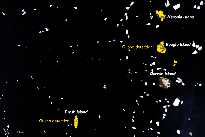
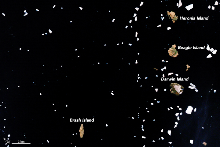
NASA Earth Observatory images by Joshua Stevens, using Landsat data from the U.S. Geological Survey and calculations from Lynch, H. J., & Schwaller, M. R. (2014).
Adélie penguins are particularly sensitive to changes in climate because they require ice-free land areas to breed and access to open water. They also need enough sea ice to support populations of key food sources. The researchers thought that changing diets would accompany the decline in population, but by analyzing the spectral signatures of all the guano stains found in cloud-free Landsat image of the islands since 1982, they were surprised to discover the penguins’ diets have stayed the same.
Penguin guano ranges from white to pink to dark red. White guano is from eating mostly fish; pink and red is from mostly eating krill. The University of Connecticut’s Casey Youngflesh, however, noticed some intriguing regional patterns in what Adélie penguins eat. Colonies in West Antarctica tend to eat more krill, while colonies in East Antarctic consume more fish. The reasons for the difference are not clear, though Youngflesh is looking into the possibility that differences in the Antarctic silverfish population may be a factor.
Discovering the big colonies on the Danger Islands has also opened up a new pathway for figuring out when penguins first arrived. By digging through layers of guano-stained pebbles during a recent field expedition and dirt and dating them with radiocarbon techniques, Michael Polito of Louisiana State University worked out that penguins must have arrived on the Danger Islands about 2,900 years ago, thousands of years earlier than previous evidence suggested.
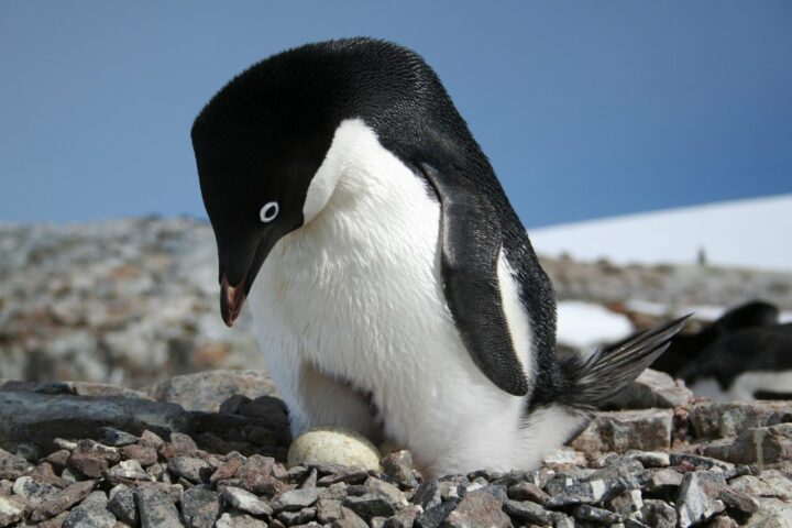
Credits: Heather Lynch, Stony Brook University.
Expect to hear even more guano-stained discoveries in the future. “We are only just scratching the surface of what we can do in terms of tracking seabirds from space,” said Lynch. “We should be able to extend the technique to snow petrel, boobies, and cormorants.”
Lynch put the total number of penguins on the Danger Islands at roughly 1.5 million (individual birds) — more than live on all the rest of the Antarctic Peninsula combined.
Read more about the Danger Island Adélie penguins from NASA and MAPPPD.
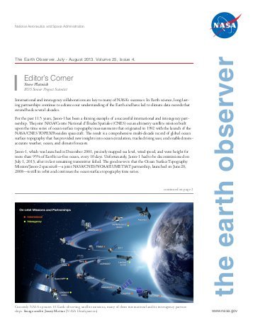 A new edition of The Earth Observer, a bi-monthly publication that covers the nuts-and-bolts of NASA’s Earth Observing System, is out. Here are a few excerpts, along with some musical headlines that may get you humming as you read. You can download the full issue here. Back issues here.
ICE ICE BABY
The Advanced Topographic Laser Altimeter System (ATLAS), the lone instrument on ICESat-2, successfully fired its laser on September 30 after the mission operations team completed testing of the spacecraft and opened the door protecting the optics. The primary science mission for ICESat-2 is to gather enough observations to estimate the annual height change of the Greenland and Antarctic ice sheets to within four millimeters. Hundreds of billions of tons of land ice melt into the ocean annually, raising sea levels worldwide. In recent years, meltwater from Greenland and Antarctica alone has raised global sea level by more than a millimeter a year, and the rate is increasing.
THIS LANDSAT IS YOUR LANDSAT
In January 2008, the U.S. Geological Survey and NASA decided to open the full Landsat image archive for public access on a non discriminatory, no-cost basis. This change in Landsat’s data policy ushered in a new era of Landsat data uses and applications while also revolutionizing the way Landsat has been woven into scientific discovery, economic prosperity, and public policy for management of land and water resources across a range of scales.
DEVELOPING SATELLITE SKILLS FOR 525,600 MINUTES (TIMES TWENTY)
From 1998 to the current 2018 fall term, the NASA DEVELOP National Program has engaged 4,671 participants who have conducted 931 projects. The program bridges the gap between science and society by demonstrating how NASA Earth Science data can be applied to environmental decision making. These projects have demonstrated the applications of NASA Earth observations to a wide variety of sectors, addressing topics such as drought monitoring, vector-borne disease risk, water-quality assessments, pre- and post-wildfire mapping, agriculture monitoring, and critical habitat identification.
I CAN SEE CLEARLY NOW
The first Earth Science Decadal Survey identified CLARREO as a Tier-1 (i.e., highest) priority mission for development. The CLARREO Pre-Formulation Mission, referred to herein as the “Full” CLARREO mission, was recommended to better understand climate change. The foundation of CLARREO is the ability to produce highly accurate climate records to test climate projections in order to improve models and enable sound policy decisions.

A boatload of scientists headed out to sea this week. Actually, two boatloads. Both the R/V Salley Ride and the R/V Roger Revelle are taking part in a mission called Export Processes in the Ocean from Remote Sensing (EXPORTS).
Their plan: track what happens to carbon as it sinks from the well-lit surface of the ocean down to the dimmer “twilight zone” (between 650 feet and 3300 feet below the surface) using floats, gliders, and other scientific equipment. Then they’ll try to do the same thing using satellites.
To help spread the word about the scientific work the team will be doing, oceanographer and blogger Kim Martini put together a fun set of #sciencetradingcards that people have been passing around on social media. Maybe she’ll roll out phytoplankton and zooplankton trading cards next?
Read more about the project from the mission website, a NASA Goddard press release, and the videos below. See a sample of the trading cards at the bottom of the page.
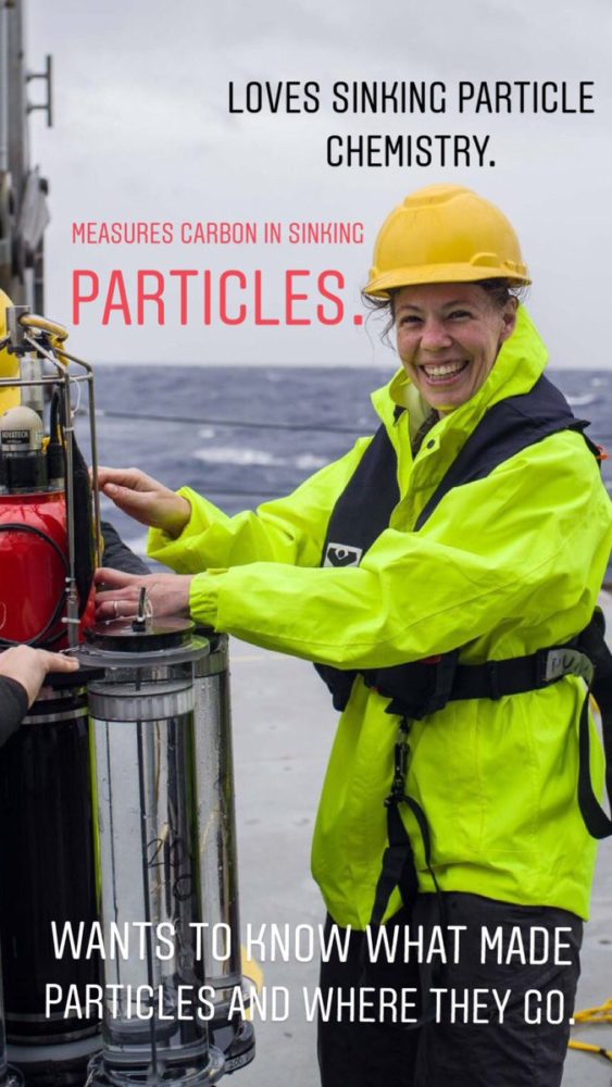
Project Title: Linking sinking particle chemistry and biology with changes in the magnitude and efficiency of carbon export into the deep ocean Project Lead: Margaret Estapa, Skidmore College

Project Title: Autonomous Investigation of Export Pathways from Hours to Seasons
Project Lead: Craig Lee – University of Washington
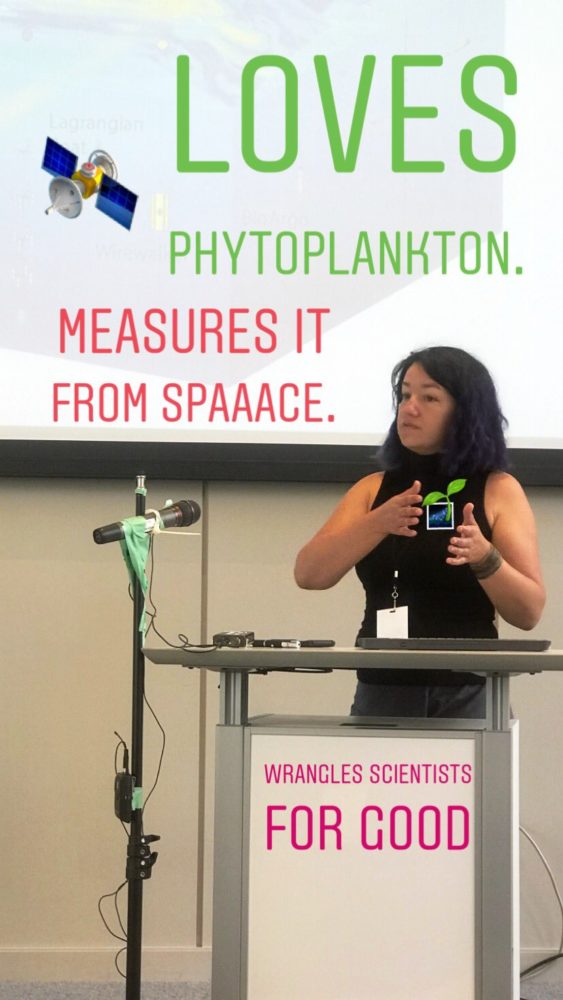
Ivona Cetinic – EXPORTS Project Scientist
NASA Goddard Space Flight Center/USRA

Project Title: Diatoms, Food Webs and Carbon Export – Leveraging NASA EXPORTS to Test the Role of Diatom Physiology in the Biological Carbon Pump Project Lead: Bethany Jenkins, The University of Rhode Island
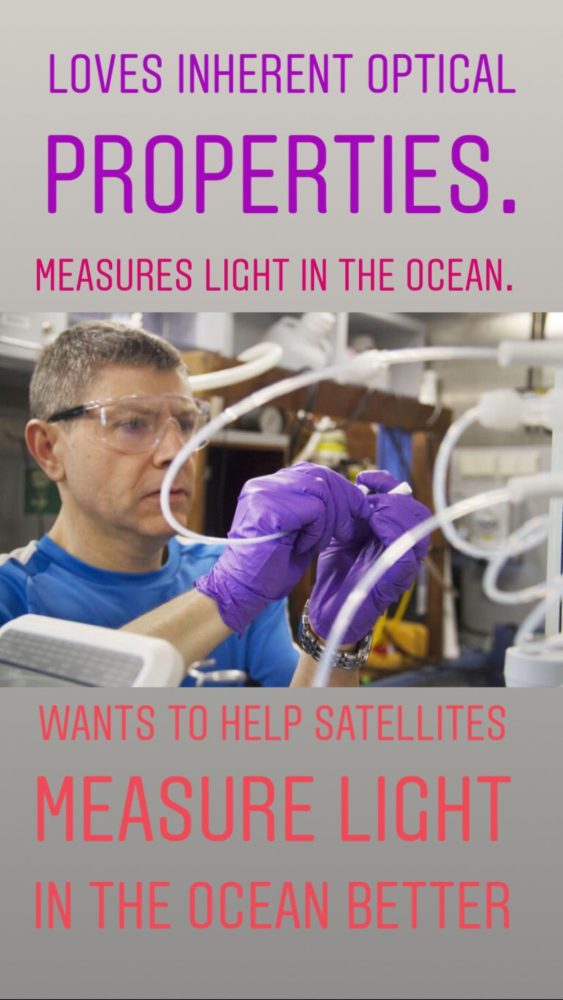
Project Title: In Situ Optics and Biogeochemistry in Support of EXPORTS Science Project Lead: Antonio Mannino, NASA Goddard Space Flight Center

Project Title: Zooplankton-Mediated Export Pathways: Quantifying Fecal Pellet Export and Active Transport by Diel and Ontogenetic Vertical Migration in the North Pacific Project Lead: Deborah Steinberg, Virginia Institute of Marine Science
For more than two months, lava has been pouring from part of Hawaii’s Kilauea volcano, destroying homes and remaking the land surface. More data and imagery of the eruption is flowing in from satellites, drones, and ground-based sensors than Earth Observatory can cover, but here are a few striking images that we would be remiss not to share.
By The Lava’s Early Light 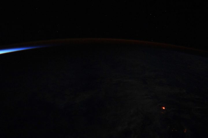
NASA Astronaut Ricky Arnold tweeted this nighttime photograph of lava on June 20, 2018. If the Star Spangled Banner had been composed in Hawaii rather than Baltimore, maybe “lava’s early light” would have made it into the lyrics. Credit: NASA
The Wrong Side of the Lava Flow
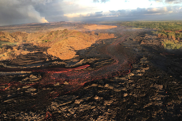
Notice the stark differences in landscapes on the northern and southern sides of the lava channel. With trade winds blowing heat and volcanic gases to the southwest, the north side remained green. Vegetation on the south side, yellowed and brown, took a battering. This aerial photograph was taken on July 10, 2018. Image Credit: USGS.
A Colorful Satellite Perspective on a Collapsing Caldera
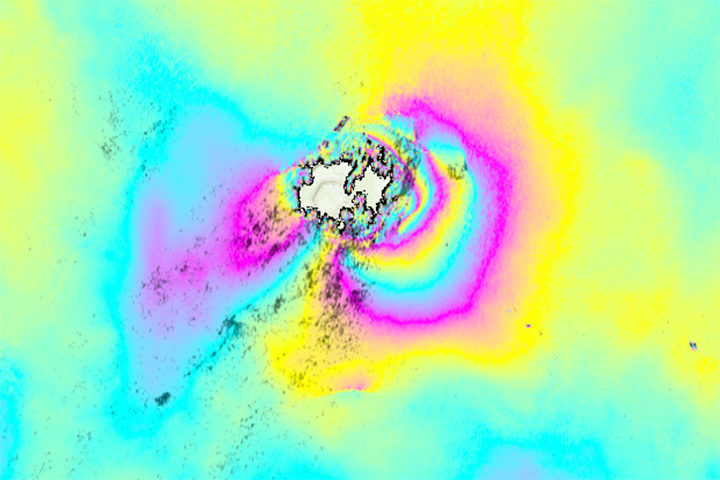
As lava flows from some parts of Kilauea, other parts of the volcano have been sinking. In the case of the summit caldera, the rate of subsidence has been dramatic. This interferometric synthetic aperature radar (InSAR) image, or interferogram, shows surface movement at the summit caldera between June 9 and June 23. Each cycle of yellow-blue-purple indicates approximately 5 inches (13 centimeters) of movement. Areas where the colorful lines are the closest have shifted the most. The data was collected by Advanced Land Observing Satellite-2 (ALOS-2), a Japanese Aerospace Exploration Agency (JAXA) mission. Read more about this image and type of data from NASA’s Disasters Program. Image Credit: NASA/JAXA.
The Same Caldera Collapse Seen from the Ground
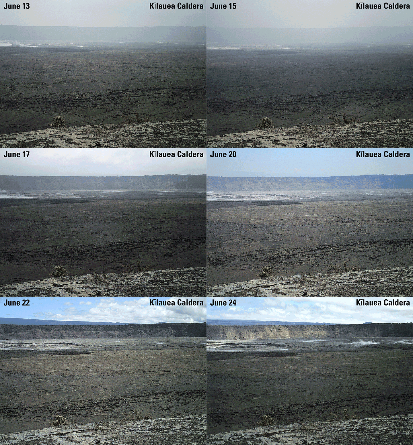
This sequence of images shows rapid subsidence of the caldera floor, along with the development of scarps. One photograph is shown per day between June 13 and 24. The photos were taken from the southern caldera rim, near Keanakāko‘i Crater, and face north. Image Credit: USGS.
Laze Billows into the Air as Lava Pours into the Sea
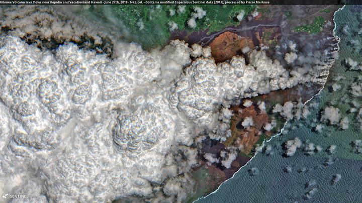
In this Sentinel-2 image, a large plume of laze—steam, volcanic gases, and shards of glass—blows west over Hawaii as lava poured into the sea on June 27, 2018. Pierre Markuse created this image using data from Sentinel-2, a satellite managed by the European Space Agency. He regularly downloads and processes Sentinel and Landsat satellite data and has posted dozens of Kilauea images on Flickr. Image Credit: ESA/Sentinel-2/Markuse

Orbit Pavilion. Image courtesy of NASA/Jet Propulsion Laboratory-Caltech/The Studio/Dan Goods
Sure, space may be silent, or at least absent the sound waves that human ears can hear. But put that aside for a moment, and try to imagine the sound of a satellite orbiting hundreds of miles above Earth’s surface.
Now imagine 19 sounds for 19 Earth-observing satellites — the murmur of ocean waves for a spacecraft that studies the oceans, or the howl of winds for one that studies hurricanes. Then swirl all of those sounds into a shell-shaped silver sculpture that looks like something from a sci-fi film.
Put the shell at the Huntington Library in southern California, walk inside, and you have Orbit Pavilion — an immersive piece of art and science communication designed to envelop people in sounds that represents the orbital movements of NASA’s fleet of Earth-observing satellites.
Dan Goods and David Delgado, artists working at The Studio at NASA Jet Propulsion Laboratory, initially developed the sound concept. They commissioned sound artist Shane Myrbeck to compose the soundscape, and Jason Klimoski and Lesley Chang of StudioKCA to envision and design a form.
Myrbeck describes the pavilion’s soundscape this way:
“The piece is in two parts, each with one sound following the path of a satellite. One section demonstrates the movement of the satellites by compressing a day’s worth of trajectory data into one minute, so listeners are enveloped by a symphony of 19 sounds swirling around them. The other section represents the real-time position of the spacecraft: each satellite currently in our hemisphere will “speak” in sequence, and when a sound is playing, if a listener points to the direction of the sound, they are pointing to the satellite orbiting hundreds of miles above us….These satellites are all part of Earth science missions, studying our atmosphere, oceans, and geology — they are helping us better understand how our planet is changing, and potentially how we can be better stewards of it. In that way I see them as kind of sentinels or protectors.”
The result, as Myrebeck had hoped, is both enveloping and comforting.

Information about the orbits of 17 satellites and two sensors on the International Space Station feed into the Orbit Pavilion. Image Credit: StudioKCA

The current fleet of Earth-observing satellites. Image Credit: NASA/EOSPSO
For a deeper dive into the diversity of the data these satellites collect, try searching a satellite’s name on Visible Earth. Or browse NASA Earth Observatory’s global maps sections and Image of the Day archive.
For instance, the map below helped me understand our planet a little bit better. It depicts more than a decade of cloudiness data as observed by the MODIS sensor. Blue shows areas where clouds were infrequent; white indicates areas where they were common.
Image Credit: NASA Earth Observatory, based on data from MODIS.
Today’s blog is re-posted from NASA.gov in recognition of the agency’s Earth Day activities.
NASA’s Worldview app lets you explore Earth as it looks right now or as it looked almost 20 years ago. See a view you like? Take a snapshot and share your map with a friend or colleague. Want to track the spread of a wildfire? You can even create an animated GIF to see change over time.
Through an easy-to-use map interface, you can watch tropical storms developing over the Pacific Ocean; track the movement of icebergs after they calve from glaciers and ice shelves; and see wildfires spread and grow as they burn vegetation in their path. Pan and zoom to your region of the world to see not only what it looks like today, but to investigate changes over time. Worldview’s nighttime lights layers provide a truly unique perspective of our planet.
What else can you do with Worldview? Add imagery by discipline, natural hazard, or key word to learn more about what’s happening on this dynamic planet. View Earth’s frozen regions with the Arctic and Antarctic views. Take a look at current natural events like tropical storms, volcanic eruptions, wildfires, and icebergs at the touch of a button using the “events” tab.
https://worldview.earthdata.nasa.gov
Worldview is an open-source project at NASA. All data, software, and services are freely available to anyone for any purpose. You can participate in the software development by visiting: