

|
|||
|
In April 2008, atmospheric scientist Kevin Gurney and several colleagues from Purdue, Colorado State University, and Lawrence Berkeley National Laboratory published the first detailed inventory of carbon dioxide emissions from the burning of fossil fuels across the United States. Known as the Vulcan Project, for the Roman god of fire, the inventory catalogues how much carbon dioxide different human activities produce on an hourly, daily, and monthly basis—from vehicles to industrial activity to electricity used by homes or businesses. |
|||
|
Prior to the Vulcan Project, most estimates of fossil fuel emissions were based on population density as a stand-in for actual measurements. “We had annual estimates at the national level, which you can get from basic UN [United Nations] statistics derived from sales of coal, oil, and natural gas around the world. But people would distribute them within a country based on population density,” said Gurney. |
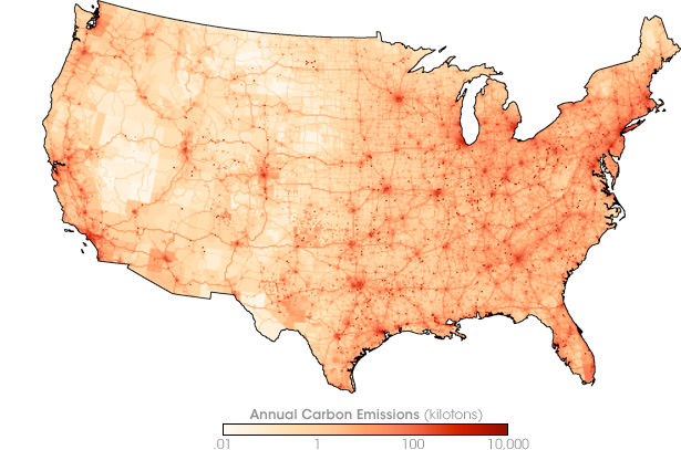
The Vulcan Project maps American carbon dioxide emissions. The map shows annual emissions in 2002 (kilotons of carbon) from urban centers (larger red patches), widely scattered point sources like remote power stations or smelters (small red dots), and highways. (Map by Jesse Allen, based on data from the Vulcan Project.) |
||
In contrast, Gurney and his team tallied up emissions from specific human activities where they actually occur and summarized them by city, county, and state. Sponsored by NASA and the Department of Energy as part of the North American Carbon Program, the inventory will help advance carbon cycle science and could help the United States as it develops strategies for reducing the carbon dioxide emissions that are driving global warming. |
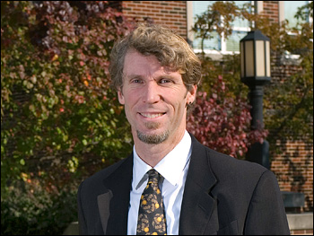
Kevin Gurney of Purdue University led the small team of scientists and computer programmers on the Vulcan Project. Itemizing the human-generated part of the U.S. carbon budget was a departure from his previous work, which focused on the role of vegetation as a natural carbon sink. (Photograph ©2007 Kevin Gurney.) |
||
|
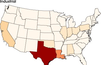
The Vulcan inventory summarizes emissions from different processes. With a concentration of oil refineries along the Gulf Coast, Texas leads the nation in industrial emissions of carbon dioxide. Texas’ 5.7 gigatons of carbon per year is 50 percent more than neighboring Louisiana’s emissions, and 150 percent more than third-place California’s. |
||
|
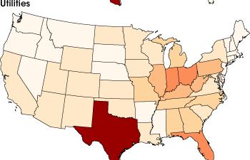
Texas’ emissions from utilities are higher than California’s, even though California has a larger population. This reversal is partly because California imports electricity from surrounding states. Coal-fired power plants in the Ohio Valley export electricity to the Northeast, making utility emissions in less populated states, including West Virginia and Kentucky, higher than more populated states, like New Jersey and New York. |
||
|
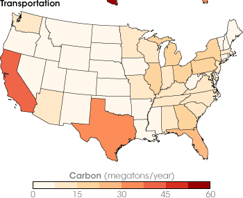
California, famous for its car culture, has the highest carbon dioxide emissions for the transportation sector. Wide-open Texas also has relatively high emissions. Nationally, transportation emissions are higher in the East than the West. (Maps by Jesse Allen, based on data from the Vulcan Project.) |
||
The Need for a Better InventoryThe project evolved as a sideline from Gurney’s research on the natural carbon cycle and the mystery of the “missing carbon sink.” The mystery is that atmospheric carbon dioxide levels in the Northern Hemisphere are lower than scientists would expect given the amount of fossil fuels we burn. Somewhere, there is a missing carbon sink, a place or places that are taking in more carbon dioxide than scientists expected. A few years ago, NASA began firming up its plans to launch the Orbiting Carbon Observatory (“OCO” for short) satellite in late 2008 or 2009. OCO will provide the smaller scale, more frequent measurements of carbon dioxide in the atmosphere that scientists need to pinpoint the Northern Hemisphere’s missing carbon sink. It was at this point that Gurney got sidetracked by the fossil fuel inventory. “When NASA began talking about its plans for OCO,” he says, “we thought, ‘OK, we are going to have the observations of CO2 in the atmosphere at smaller scale, but now we have a big looming problem, which is we just don’t know fossil fuel emissions well enough at that scale.” In other words, scientists would have more detail on where carbon dioxide winds up, but still not enough detail about where it came from. A demand for more detail on emissions also began to emerge from the community of people thinking about energy policy and emission regulation. “A decade ago,” says Gurney, “the policy community was thinking in very broad terms about emissions mitigation at a national level.” But in recent years, policymakers on the state and local level have become increasingly interested in reducing their carbon footprint through locally tailored strategies. These science and policy needs motivated Gurney to propose Vulcan. Making the Data You Have into the Data You NeedTo create the inventory, Gurney and his colleagues relied on existing data at numerous state and federal agencies, including the Environmental Protection Agency, the Federal Highway Administration, and the Census Bureau. Nobody specifically collected data on carbon dioxide emissions, but they each collected data that could be fed into models that would allow Gurney to estimate them. The EPA had data on how much carbon monoxide industries, power plants, or urban areas generate; what kinds of devices produced it, and the kind and amount of fuel they used. Knowing all these things, says Gurney, “I can figure out how much CO2 was emitted quite easily with simple combustion models.” In addition to pollution records, they used county records of everything from the square footage of commercial and residential buildings, to the miles of roads, to how many and what kinds of cars were registered. They gathered these records up, figured out how to tease carbon dioxide emissions from them, and mapped them on a common grid. |
|||
Stories of American Energy Use |
|||
|
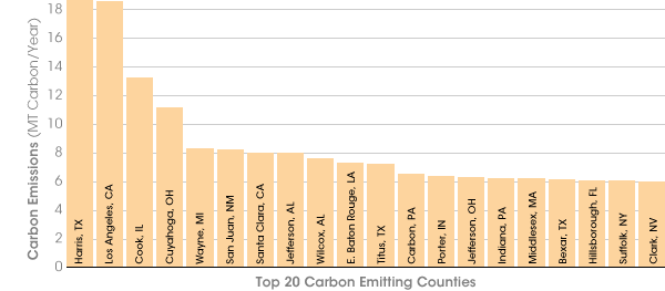
Even the preliminary analysis he has done with Vulcan so far fascinates him. As a case in point, he talks about ranking the top twenty counties with the highest emissions. “The first thing you see,” says, Gurney, “is that virtually no part of the country is un-represented.” There are pockets of high emissions all over the country. And the counties with the highest emissions are often, but not always, places with large populations. In some cases, a busy interstate highway through a mostly rural area or a power plant that supplies electricity to other counties (even other states) is enough to push a county up in the rankings. |
|||
|
|||
|
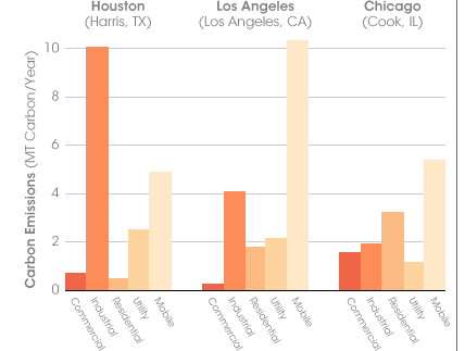
Even in counties with similarly high population densities, the processes causing high emissions aren’t always the same. “Consider the top three counties,” says Gurney. The first encompasses the Houston area, the second, Los Angeles, and the third, Chicago. On the one hand, it isn’t a surprise that such densely populated places make the list of the largest emitters in the country. On the other hand, Gurney finds it interesting that they each have different reasons for being there. “Around Houston, it’s industrial emissions that pushes them to the top of the list. In Los Angeles, it’s cars. In Chicago, it’s residential and commercial heating—because the temperatures are cold and the houses and buildings are old.” |
Nearly all parts of the country are represented in a ranking of the top twenty counties with the greatest carbon dioxide emissions. (Graph by Robert Simmon, based on data from the Vulcan Project.) |
||
|
Each of the counties in the list of top three emitters has different mix of reasons for being there. Around Houston, industrial emissions, mostly from oil refineries, are over 10 megatons of carbon per year. Los Angeles’ industrial emissions are less than half of Houston’s, but its mobile (vehicle) emissions are more than double. The large number of old, poorly insulated buildings in Chicago, the Windy City, elevate the city’s commercial and residential electricity consumption, pushing the county’s emissions to number three in the nation. (Graph by Robert Simmon, based on data from the Vulcan Project.) |
||
|
To Gurney, the inventory isn’t about calling places out for bad or good carbon behavior. “It’s really a story about American life, about how people live in different parts of the country, what their energy needs are and how they meet them.” This story is fundamental to deciding the most effective and realistic strategies for reducing emissions that cause global warming. Some stories appear straightforward and predictable. A graph of daily carbon dioxide emissions traces out the American work week: emissions are consistently higher Monday through Friday, dropping on Saturday and again on Sunday, as the population takes a rest day. |
|||

|
|||
|
Other stories appear simple on the surface, but could have multiple underlying themes. Tallying up emissions on a weekly basis over the course of a year reveals a distinct summer time peak. Scientists will have to analyze the inventory more carefully to determine the reasons for the seasonal patterns. Is it because, as a nation, we use more electricity to cool our homes and businesses than to heat them? Or is it that we travel more in summer? |
A graph of daily carbon dioxide emissions for several months document the familiar story of the American work week. Emissions are higher on weekdays, when more people work and more businesses are open, and they hit a weekly low on Sundays. (Graph by Robert Simmon, based on data from the Vulcan Project.) |
||

|
|||
|
Having the data to start to answer these questions has given Gurney new enthusiasm for the project. “We have devoted so much time to building the system and all the tedium that goes with it, and now we get to do exciting stuff. I am really more excited about the project now than I was at the beginning,” he says. From Vulcan to Hestia: A “Science 2.0” Test Case?Gurney is also intrigued with the potential for the Vulcan project to explore questions that fall more under the domain of social, as opposed to physical, science. Among them, how might scientists use the Web to tap local expertise to expand on or quality-control science data sets? When his group announced the release of the Vulcan inventory, they created a Website where they solicited collaborators. Dozens of people, from environmental groups to employees of state and local regulatory agencies, contacted Gurney through the Website, sharing data and local expertise that may improve the inventory’s quality. Gurney admits that the “Science 2.0” approach (using wikis, blogs, and other Web 2.0 technologies to allow easy, global-scale collaboration) has its limitations, and isn’t suitable for all kinds of science—”Obviously, you couldn’t do high-energy physics this way”—but it’s something he wants to explore. That kind of approach will likely play a big part in the next phase of his project, which his team is calling Hestia, after the ancient Greek goddess of the hearth. The team plans to find partners in industry, government, non-governmental organizations, and universities around the world to create a global fossil fuel inventory that drills down to the scale of urban neighborhoods. Anyone on the Web will be able to access it through an interactive, three-dimensional visualization of the Earth. With a project so ambitious, they’ll need all the collaborators the Web can bring them.
|
Weekly totals of carbon emissions peak in the summer at over 30 megatons. This summertime peak may tell more than one story about American life and energy use. Perhaps it is because Americans travel more in summer, or because we use more electricity for cooling than heating—and perhaps there are different reasons for different areas. Gurney and other scientists can use the database to better understand how American energy use changes from place to place, from season to season, day to day, even hour to hour. (Graph by Robert Simmon, based on data from the Vulcan Project.) |
||