

Earth is Cooling…No It’s Warming | |||
In 1967 Hansen went to work for NASA’s Goddard Institute for Space Studies, in New York City, where he continued his research on planetary problems. Around 1970, some scientists suspected Earth was entering a period of global cooling. Decades prior, the brilliant Serbian mathematician Milutin Milankovitch had explained how our world warms and cools on roughly 100,000-year cycles due to its slowly changing position relative to the Sun. Milankovitch’s theory suggested Earth should be just beginning to head into its next ice age cycle. The surface temperature data gathered by Mitchell seemed to agree; the record showed that Earth experienced a period of cooling (by about 0.3°C) from 1940 through 1970. Of course, Mitchell was only collecting data over a fraction of the Northern Hemisphere—from 20 to 90 degrees North latitude. Still, the result drew public attention and a number of speculative articles about Earth’s coming ice age appeared in newspapers and magazines. |
|||
 |
But other scientists forecasted global warming. Russian climatologist Mikhail Budyko had also observed the three-decade cooling trend. Nevertheless, he published a paper in 1967 in which he predicted the cooling would soon switch to warming due to rising human emissions of carbon dioxide. Budyko’s paper and another paper published in 1975 by Veerabhadran Ramanathan caught Hansen’s attention. Ramanathan pointed out that human-made chlorofluorocarbons (or CFCs) are particularly potent greenhouse gases, with as much as 200 times the heat-retaining capacity of carbon dioxide. Because people were adding CFCs to the lower atmosphere at an increasing rate, Ramanathan expressed concern that these new gases would eventually add to Earth’s greenhouse effect and cause our world to warm. (Because CFCs also erode Earth’s protective ozone layer, their use was mostly abolished in 1989 with the signing of the Montreal Protocol.) The notion that humans could override nature and force the globe to warm intrigued Hansen. “It had been known for more than a century that increasing carbon dioxide could have an effect on global temperature,” Hansen said (referring to the pioneering work of John Tyndall and Svante Arrhenius in the 1800s). But global warming in the near future? That was another matter. Hansen returned his attention to the physics equations he’d played with almost 10 years earlier. Collaborating with Andy Lacis, a colleague at NASA, he built a simple climate model to simulate how changes in the atmosphere cause Earth’s average temperature to change over time. Hansen and Lacis tweaked the inputs to simulate the cumulative influence of all known human-made greenhouse gases except carbon dioxide (including CFCs, methane, nitrous oxide, and ozone) to see if their net effect could even be felt on a global scale in the climate system. To their surprise, Hansen’s team found that the warming effect of all those gases added together is comparable to the warming effect of carbon dioxide alone. |
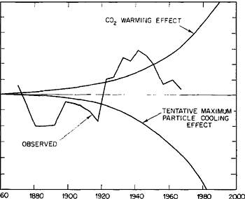
Initial efforts to observe Earth’s temperature were limited to the Northern Hemisphere, and they showed a cooling trend from 1940 to 1970 (jagged line). Scientists estimated the relative effects of carbon dioxide (warming, top curve) and aerosols (cooling, bottom curve) on climate, but did not have enough data to make precise predictions. (Graph from Mitchell, 1972.) | |
 |
The simple model also allowed Hansen to simulate the climate impact of Mount Agung’s eruption 15 years after the event. The model indicated that loading the atmosphere with volcanic aerosols should have caused a global cooling—a prediction that agreed pretty well with observed temperature data. The model demonstrated that both human and natural activities could force climate to change. But Hansen knew that natural forcings, like volcanic eruptions or changes in the Sun’s activity, tend to go up and down over a long period of time whereas the human forcing from greenhouse gas emissions was steadily increasing. “It became clear that human-produced greenhouse gases should become a dominant forcing and even exceed other climate forcings, such as volcanoes or the Sun, at some point in the future,” Hansen observed. How soon would the human forcing begin to dominate? No one knew. |
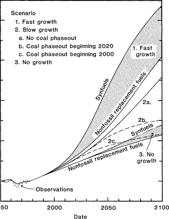
In 1981, NASA scientists predicted the impact of carbon dioxide emissions on global temperatures between 1950 and 2100 based on different scenarios for energy growth rates and energy source. If energy use stayed constant at 1980 levels (scenario 3, bottom lines), temperatures were predicted to rise just over 1°C. If energy use grew moderately (scenario 2, middle lines), warming would be 1–2.5 °C. Fast growth (scenario 1, top lines) would cause 3–4°C of warming. In each scenario, the warming was predicted to be less if some of the energy was supplied by non-fossil (renewable) fuels instead of coal-based, synthetic fuels (synfuels). (Graph from Hansen et al., 1981.) | |
 | |||
To find out, Hansen would need real-world data on a global scale. He requested data tapes from Roy Jenne, of the National Center for Atmospheric Research, who was widely recognized in the 1970s as having the best weather dataset in the world. Of course, there remained the problem that the weather stations supplying Jenne’s dataset were rather sparse compared to the vastness of Earth’s surface. |
To test his climate model, Hansen calculated the cooling effect of Mount Agung’s eruption (dotted line) and compared the results with real-world temperature measurements (solid line). Despite its simplicity, the model accurately reflected the dip in tropical temperatures caused by the eruption. (Graph from Hansen et al., 1978.) | ||
 | |||
“The lack of any global temperature analysis [for Earth] did not seem right to me,” Hansen recalled. Drawing from his previous work in estimating the average planetary surface temperature of Venus, he knew that if scientists had measurements from as many places on another planet as were available from Jenne’s dataset they would not hesitate to estimate Earth’s global temperature. He decided to try. At the outset Hansen knew that weather fluctuations would introduce short-term temperature anomalies into the weather station dataset that are not the same thing as climate change. But he reasoned that by taking averages over several years, and appropriately “weighting” the weather stations’ data, it should be possible to determine meaningful temperature changes over longer time periods. In the mid-1970s, he hired Jeremy Barberra, a New York University undergraduate student at the time, to automate the processing of Jenne’s dataset. They decided to process the data to produce average temperature changes, and not absolute temperature. “If you focus your analysis on temperature change, and not on determining absolute temperature values, then the station coverage is adequate,” Hansen explained. “What matters is the long-term mean over large scales, not single measurements from individual stations.” The success of Hansen’s and Barberra’s approach depended on the principle that temperature anomalies have a much larger scale than absolute temperature. Consider a mountain on which it can be much cooler on one side than the other. This example illustrates how absolute temperature patterns can vary sharply over relatively short distances. On the other hand, temperature anomalies are typically large-scale events driven by Rossby Waves. Rossby Waves are slow-moving waves in the ocean or atmosphere, driven from west to east by the force of Earth spinning. We see such waves in the atmosphere as large-scale meanders of the mid-latitude jet stream. |
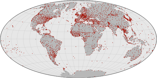
Weather stations (red dots) are scattered unevenly across the globe. They are especially sparse in Africa and over the oceans. Before scientists could be confident in global temperature records, Hansen needed to demonstrate that widely spaced observations captured global temperature trends accurately. (NASA map by Robert Simmon, based on data from the National Climatic Data Center.) | ||
|
“If it is an unusually warm winter in New York, it is probably also warm in Washington, D.C., for example,” Hansen explained. “At high- and mid-latitudes Rossby Waves are the dominant cause of short-term temperature variations. And since those are fairly long waves we didn’t think we needed a station at every one degree of separation.” A station at every 1 degree would mean a station roughly every 80 kilometers (at mid-latitudes). But in a 1987 paper appearing in the Journal of Geophysical Review, Hansen and Sergei Lebedeff demonstrated that the temperature readings of weather stations within 1,000 kilometers (620 miles) of one another are highly correlated. The close correlation meant they could map global temperature changes over time despite the fact that weather stations are widely spaced and located mainly on continents and islands. Here’s basically how their approach works: For each center point in a global grid of 1-degree boxes they let all weather station data within a 1,200-kilometer radius influence the estimated temperature change at that point. They gave greatest “weight” to the station closest to that point; for all other stations within that radius, they let the weighting fall off linearly with distance, all the way to a weighting of zero for stations 1,200 kilometers away or farther. “Again, our objective was not to determine the precise temperature of individual stations, but to produce a global-scale map of temperature change,” Hansen emphasized. “We were interested in tracking global climate patterns, not local weather variations.” In their 1981 analysis, published in the journal Science, Hansen’s team reported finding that, overall, Earth’s average temperature rose by about 0.4°C for the period from 1880 to 1978. There was roughly 0.1°C of global cooling from 1940-1970. This cooling was less than what Mitchell had found earlier due to the fact that Hansen’s team was now using global data, and not just data from a swath around the Northern Hemisphere. Just as Budyko had predicted, Hansen found that Earth’s cooling trend swung back in the warming direction around 1970 and has been warming ever since. Moreover, Hansen noted, the warming trend observed in real-world data is consistent with his (and others’) global climate model outputs in their 100-year simulations. |
Absolute temperatures can vary a lot even over short distances, but temperature anomalies usually affect a large region. Most week-to-week temperature variability is driven by Rossby Waves. These waves are easy to see in the looping motions of the jet stream. In this animation, Rossby Waves spiral from left to right toward Europe in the Northern Hemisphere and South Africa in the Southern Hemisphere. The scale of these waves is so large that weather stations separated by 1,000 kilometers or more adequately record the temperature anomalies they produce. (Double-click to pause or replay animation.) (NASA animation by Robert Simmon, based on SEVIRI data copyright EUMETSAT.) High definition animation (23 MB Quicktime) | ||
 |
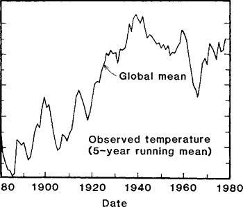
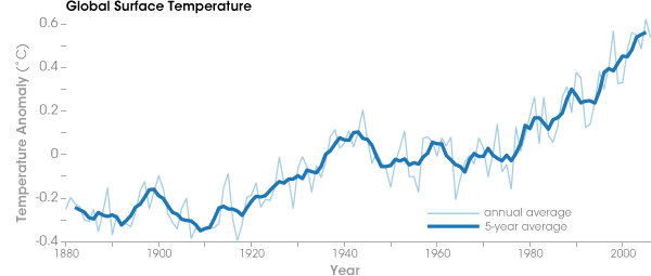
Since 1978, global warming has become even more apparent. Over the last 30 years, Hansen’s analysis reveals that Earth warmed another 0.5°C, for a total warming of 0.9°C since 1880. |
The first reliable global measurements of temperature from NASA, published by Hansen and his colleagues in 1981, showed a modest warming from 1880 to 1980, with only a slight dip in temperatures from 1940 to 1970. (Graph adapted from Hansen et al. 1981.) | |
 | |||
“To questions about whether this warming is natural or just a fluctuation, the answer has become clear: the world is getting warmer,” Hansen stated. “This fact agrees so well with what we calculate with our global climate model that I am confident we are looking at warming that is mainly due to increasing human-made greenhouse gases.” |
Since 1980, global surface temperatures have increased sharply, the Earth’s response to increasing concentrations of greenhouse gases such as carbon dioxide. (NASA graph adapted from Goddard Institute for Space Studies data.) | ||