Historic flooding along the Mississippi River gives me an excuse to show another of my favorite maps, from Geological Investigation of the Alluvial Valley of the Lower Mississippi River.
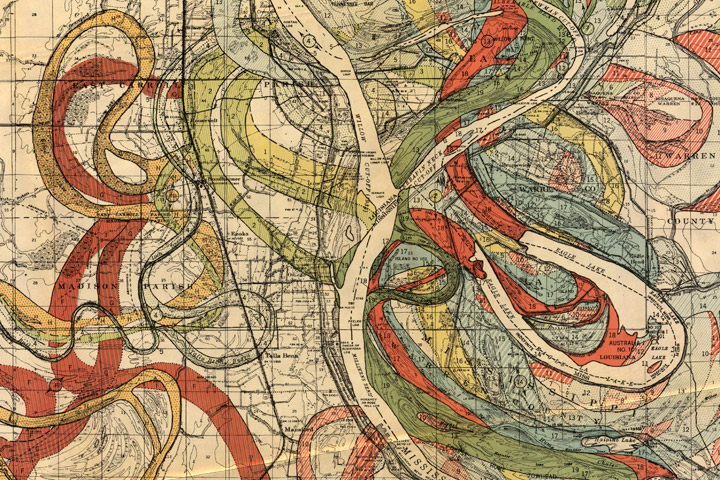
Each color represents an old channel, dating back 1,000 years or so. Those that correspond to historical records are dated, while older channels are ordered according to the principle of superposition (newer sediments on top of older ones). Many of the surface layers are still visible in satellite imagery. High-resolution, geolocated maps from Cairo to the Gulf, along with major tributaries, geological maps, and cross sections, are distributed by the U.S. Army Corps of Engineers.
Since I was (slightly) critical of the New York Times graphics department yesterday, I’ll show a Times map that is one of my favorite visualizations today: a map of shaking intensity and slip during the 1906 San Francisco Earthquake.
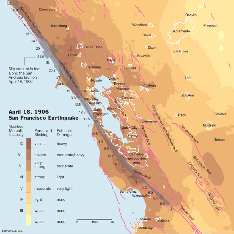
Aside from being elegant, it’s data-rich without being cluttered, and multivariate. It shows shaking intensity (in two dimensions), fault location (in two dimensions), slip along the San Andreas (one dimension), urban locations (two dimensions), and has three layers of direct labeling (cities, faults, and slip). The key is adjacent to the data, and written in clear language. Compare the map from the Times to the equivalent from the USGS:
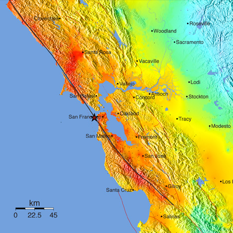
The New York Times version both has more data and is more readable. Why? First off, the Times uses a subdued, discrete, color palette that shifts through a small range of hues. This allows other information to be layered into the map. The USGS, in contrast, uses a rainbow of hues at maximum saturation. The rainbow palette [at some point I’m going to do series of posts on color palettes, but for now i’ll just point to Color Brewer to explain the importance of appropriate color maps in data visualization] uses the full spectrum and is so saturated that there are very few colors left over for additional data—notice how the red fault lines on the USGS map disappear in areas of intense shaking. The dark ocean in the USGS version also competes visually with the data-rich areas of the map.
The New York Times also forgoes the use of terrain data in their map. It adds a lot of great context to the image (the San Andreas creates a distinct valley), but at web resolutions shaded relief is very difficult to pull off. The high frequency contrast distracts from the other data in the map. At larger sizes, or printed at high resolution, the terrain could be added back in (but it still needs to be treated carefully—see Relief Shading for advice). As a result, fine details in the faults and the boundaries of urban areas remain legible.
My favorite part of the Times map is the inclusion of the amount of slip at various locations on the San Andreas: it’s so much more informative than merely indicating the epicenter. Earthquakes—especially big earthquakes—aren’t points. They occur over a two dimensional area (reduced to a one dimensional quantity on this map). Increased slip correlates with increased shaking, which tells a story. That’s what makes this map so powerful. It’s a narrative of cause and effect, which is a quality of the best data visualizations.
Last week, Jessica Ball of the American Geophysical Union’s Magma Cum Laude blog pointed out this map of natural hazards in the U.S., published by the New York Times:

The map has many of the design virtues common in graphics from the Times (clean, focused on the data, clearly labeled, small multiples), but when I first viewed it I had trouble parsing the data. It took me a while to figure out that hazard was indicated by color, and the size of each circle denoted ancilliary information (population).
It turns out that our eyes & brains perceive area more strongly than color. Here’s a list of ways to visually compare quantities (described by Bang Wong in his Points of View column for Nature Methods), in order from easiest to hardest:
I suspect I’m not the only person who would consider the size of the circles more important than the color, and assume size was correlated with hazard. I had to carefully read the key to figure out the proper way to read the map. Perhaps using size to encode hazard, and color (or opacity, or icons) for population would have worked better.
I recently had the opportunity to attend & give a presentation at the 2011 International Symposium on Remote Sensing of the Environment in lovely Sydney, Australia. (OK, not so recently—the conference ended on the April 15th. I blame jetlag.) Just over 60 people turned up for the talk, which was mostly about our visualization of Eyjafjallajökull. (Which means I had to attempt to learn how to pronounce “Eyjafjallajökull.” Luckily I don’t think anybody made it from Iceland to Sydney to critique me.) If you’re interested, I’ve posted Keynote and PDF copies (originally prepared for last years’s fall AGU).
During sessions many of the talks were a bit on the technical side for me, so I ended up preparing material for NASA’s portable “hyperwall”—9 HDTV screens linked together. It’s useful for either high-res animations, or small multiples. With relatively thick bezels on the monitors, simultaneous display of 9 images worked particularly well:
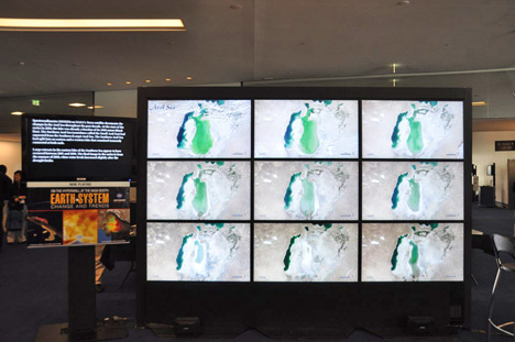
Compare the small multiples on the hyperwall with the sequential display of the same images from the Earth Observatory’s World of Change.
During my talk I promised the audience that I’d update the blog more frequently, so there should be more posts in the future. I sometimes struggle for good ideas, so if you have a suggestion, please drop a note in the comments.
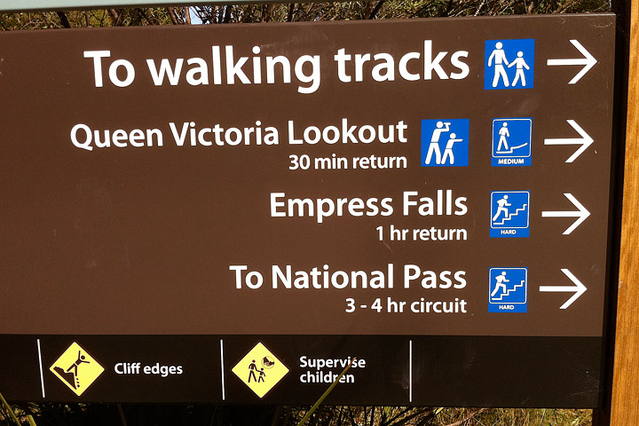
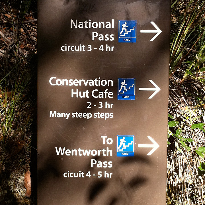
One of the best things about international travel (at least to a geek like me) is to see how different cultures approach design and signage. Here’s a few from Blue Mountains National Park, near Sydney, Australia.
Over the past week or two, there has been severe flooding in Australia, Brazil, Sri Lanka, and the Phillipines, but all we’ve shown on the Earth Observatory is the flooding in Australia. Why? Here’s a sampling of images of Rio de Janeiro since January 12:
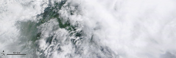
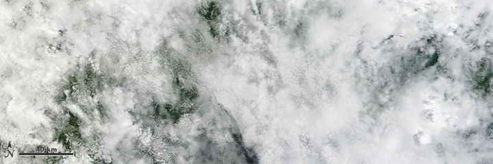
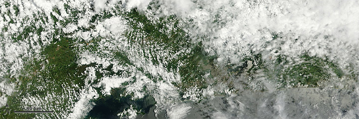
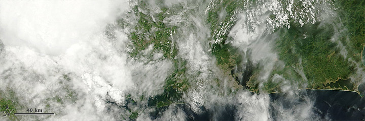
Earth is cloudy. Especially in the tropics. Even more especially when there’s enough rain to cause flooding. The satellite imagery we have easy, fast, and free access to (for example, check out the twice daily MODIS imagery of São Paulo) is primarily based on visible and infrared light, which can’t penetrate clouds, so for many floods we can’t show anything useful.
In addition, the damage in Brazil, Sri Lanka, and the Philippines was caused by flash floods, landslides, and debris flows, which are all much smaller scale than the rivers overflowing their banks near Brisbane. In satellite imaging there’s a tradeoff between spatial resolution (detail) and temporal resolution (frequency) so there are fewer opportunities to capture the high resolution data necessary to show relatively localized events. To view something like a landslide, we have to have both a break in the clouds and the opportunity to aim a high resolution sensor. Which occurred this morning:
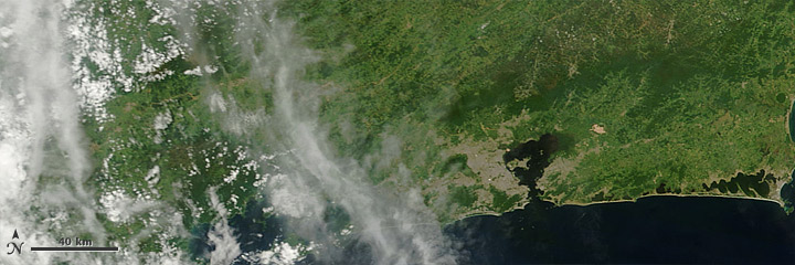
With clear skies and an overpass of Earth Observing-1, we may have an image of Teresopolis, Brazil by tomorrow.
P.S.: Despite the dispassionate view afforded by satellites, my thoughts go out to the victims and their families.
Update: For some reason the satellite never acquired the data, and the next viewing opportunity won’t be for another few days.
I got back from AGU last Saturday, picked up the pups from the kennel, and now I’m getting things together here so I can go on vacation right after Christmas.
As always it’s an overwhelming conference—there’s probably 1,000 posters on the floor at any given time, and at least ten simultaneous sessions. I got some very good ideas wandering through the posters (a map of ice flow speed for all of Antarctica, research on a paleo lake in Kenya, and a global dataset of limiting factors for tree growth being highlights) that I’ll hopefully be working on in the New Year. Tuesday’s special session on communicating climate change was also worthwhile (and packed). I think both my talks went pretty well, even if I can’t pronounce Eyjafjallajökull—despite professional help from a native Icelandic speaker. One conclusion we came to in the visualization session: it would be helpful for AGU to start promoting good visualization techniques. I plan on following up on that, hopefully I’ll have more to say soon.
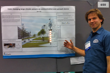
A few words of advice for poster presenters (I originally planned on showing some examples of good and bad design, but chickened out). White space is good: try not to jam your poster full of every last detail of your research. Do not use Comic Sans (avoid it on slides, too). Seriously. Your research may be groundbreaking, but it’s hard for me to take you seriously if you try to be cute. Especially since the new Microsoft typefaces that ship with Vista, Windows 7, and recent versions of Office are very, very good. Make your graphics big. Avoid the rainbow palette. (I’ll have more to say about this—a lot more—soon. It was a big part of my Eyjafjallajökull talk.) Print up a one-page summary to distribute. Include a conclusion, written for non-experts. Your poster will be up all day, you’ll only be there for an hour or two. Finally: if you can figure out a way to add multimedia, do it. Rolf Hut of the Delft University of Technology had an amazing, temperature-sensing interactive LED display:
If anyone is going to the AGU fall meeting in San Francisco and would like to know more about the Earth Observatory and/or data visualization, I’ll be giving two talks, both on Thursday the 16th:
The Communication Strategy of NASA’s Earth Observatory at 8:45 a.m. in session ED41D. Climate Change Adaptation: Education and Communication I.
Visualization Case Study: Eyjafjallajökull Ash at 1:55 p.m. in session ED43B. Visualization of Geophysical Processes for Science, Education, and Outreach II.
I’ll be there all week, so if you want to meet to chat (or know of any sessions you think I’d be interested in, or excellent restaurants), send a message to the “Design Feedback” topic on our contact page, and I’ll get back to you.
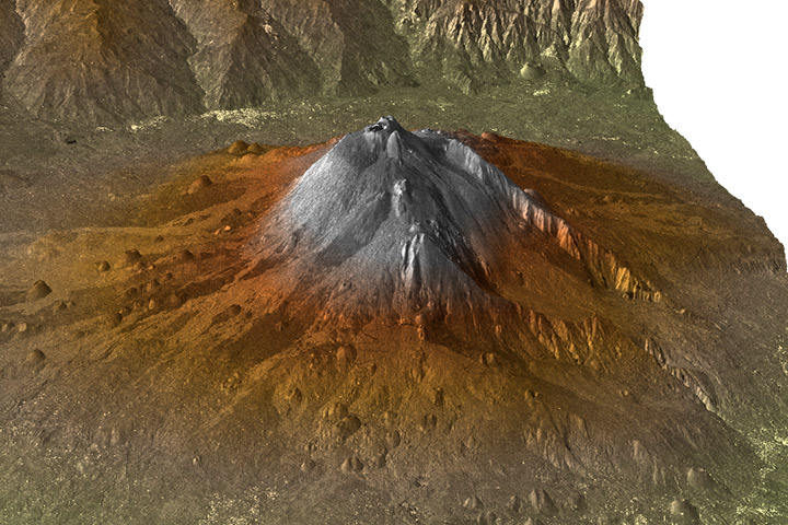
One of my (many) pet peeves in data visualization is vertical exaggeration. For example, here’s a 3D rendered view (from the south looking north) of Mount Etna:
Compared to the real thing, photographed from the International Space Station (from the north looking south):
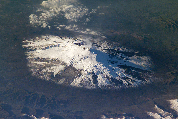
The 3D view is scaled so the volcano appears much higher than it does in real life—perhaps four or five times higher—but it’s impossible to tell since the caption doesn’t say. My big problem with this is that Etna looks like a classic, steep-sided stratovolcano (like Mount Fuji), rather than a complex mountain formed from a combination of viscous lavas (typical of stratovolcanoes), fluid lavas typical of shield volcanoes (like the Hawaiian Islands), and collapses (like Mount St. Helens).
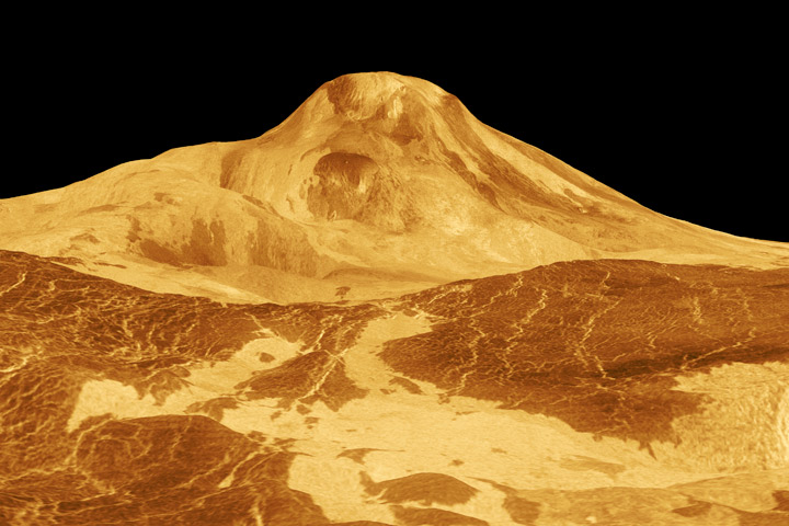
At least it’s not as bad as the infamous image of Maat Mons on Venus, which has a staggering vertical exaggeration of 22.5 times (Maat Mons is actually shaped more like a wad of gum on the sidewalk, not Mount Rainier):
Why does it matter? Because topography gives clues to the underlying geology and processes that form a landscape. For example, the angle of the walls of the Grand Canyon is determined by the rock type: hard rocks form cliffs, soft rocks form slopes. The vertical granite walls of Yosemite are composed of hard granite that resisted the erosion of ice age glaciers.
The reason for the shape of mountains on Venus is perhaps even more interesting. It’s so hot on the surface (465°C) that most of the rocks creep: over time solid materials deform under their own weight. This limits the height of mountains on Venus, and ensures that steep slopes—if they exist at all—are extremely rare (and likely indicative of active tectonics). The vertical exaggeration used in images of Venus’ surface obscures some of the fundamental processes that shaped the planet.
One final note: If you absolutely have to use vertical exaggeration, at least indicate that fact in the caption, or even better, include a scale on the image itself.
[Credit where credit is due: I first learned of Maat Mons from one of Edward Tufte’s lectures on data visualization. Tufte himself cited the “Flat-Venus Society” and NASA’s David Morrison.]
In the process of researching captions I can run into some amazing stuff, like this photo (taken yesterday) of incandescent rocks arcing through the sky during the collapse of a lava bench near Kilauea:
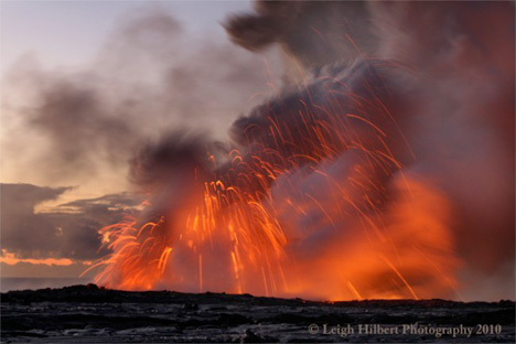
The USGS explains: “lava can instantly transform seawater to steam, causing explosions that blasts hot rocks, water, and molten lava fragments into the air.” No kidding.
Leigh’s site, Hawaiian Lava Daily, has some of the best photos of Hawaii’s active lava flows I’ve ever seen. He also pointed me to this description and photo essay of the last moments of Gary Sleik’s house in Kapana Gardens—destroyed by lava in July—as well as a recent “wake” for the house. An intimate look at events that can appear quite impersonal from space.
