Last month it was Science Friday, this month it’s Co.DESIGN: NASA Creates Insanely High-Res Map Of America’s Trees, And Offers A Lesson In Information Design. Tim Maly describes our map of tree biomass in the U.S. (based on an exquisite data set from Woods Hole Research Center), and lets me rant a bit about color palettes and data visualization.
Last week, Flora Lichtman of Science Friday put together a short video about the views of Earth NASA has produced over the years. She began with the famous Earthrise photo taken by the crew of Apollo 8, then interviewed me and NASA scientist Gene Feldman. We discussed the differences between photographs and data visualizations, and the craftsmanship that went into the 2002 Blue Marble. There’s even an audio clip from the late Carl Sagan, describing the Pale Blue Dot image from Voyager 1. All spurred by global imagery from the new Suomi NPP satellite.
Along with half the Earth scientists at NASA, I’ll be at the American Geophysical Union Fall Meeting next week. If you’re interested in getting together to talk scientific visualization, drop a note in the comments, or stop by my poster: Methods to Enhance Climate Change Imagery for Communication (5 MB PDF). It’s got a few before/after examples of imagery from NASA press releases and the IPCC showing a better way of presenting the information (in my opinion).
U11B: Effectively Communicating Climate Science (How to Address Related Issues)
December 5, 2011
8:00 a.m.–12:20 p.m. (good thing I’ll still be on East Coast time).
Halls A-C (Moscone South)
Here’s more info on the session, and the oral presentation in the afternoon.
I’ll also be at Communicating Your Science: Panel and Workshops on Sunday, and at the social media soiree Mondy evening (6:00–8:00 p.m. InterContinental Ballroom C). Hope to see you there!
Callan Bentley of Mountain Beltway posted a photo of the Chesapeake that’s a nice complement to the view from space we published last night. I live in the Anacostia River watershed, which feeds into the Chesapeake, and all the nearby streams have been brown since Hurricane Irene hit three weeks ago. The Bay is probably going to be muddy for a while.
You can see how things progress with twice-daily satellite views of the Bay via the image “subset” centered on the Chesapeake Lighthouse. Unfortunately, it’s been cloudy the past few days, but there’s a chance there will be a clear shot by early next week—the forecast for Monday is “mostly sunny.”
A time-lapse sequence from the International Space Station taken on September 3, 2011. The station starts above Northern Africa, then passes over the Mediterranean Sea and Turkey, followed by the Black and Caspian Seas, the Great Steppe, and finally Mongolia and Lake Baikal.
For more ISS (and Shuttle, Apollo, etc.) photos, check out The Gateway to Astronaut Photography of Earth.
Of all the Earth sciences, geology has the strongest tradition of visual communication. It’s probably because mapping is fundamental to the field, and geologists have 200 years of practice at it. As a result, they tend to create well designed imagery.
Two exemplary techniques geologists use: they almost always include a scale, and they often annotate images directly, rather than relying on separate keys or text descriptions. Here’s an example from Lockwood DeWitt, of Outside the Interzone:
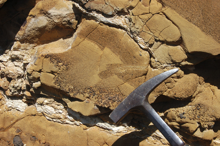
Callan Bentley, author of Mountain Beltway, added annotations that show small faults, and the distribution of grain size in the rock:
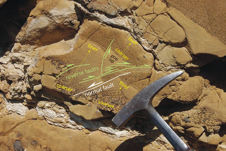
Callan even used different colors to differentiate types of information, and varied the size labels to emphasize the location and type of faulting. Excellent work.
Here’s what Lockwood had to say about Table Rock:
Table Rock is quite similar to the more widely known Fort Rock, but larger and better preserved. It erupted enough material that toward the end, it had raised a cone above the original water-influenced explosive (hydrophreatic) vent. The final phase was a more gentle effusive basalt eruption, which filled in the hollow interior. Without that basalt filling, Table Rock would look very similar indeed to Fort Rock. Here’s the location in FlashEarth, maybe a hundred yards north of the dirt road. The two features both lie in the Fort Rock-Christmas Valley, which were filled by a pluvial lake during the Pleistocene. Even a quick glance over this area reveals quite a few similar water-mediated eruptions. In this view, Hole-in-the-Ground is in the left of the top middle, Fort Rock is in the upper middle, just to left of the four center-pivot irrigation fields, turning the rotated “L” into a backwards “C,” and Table Rock is in the bottom right middle, just above and a bit to the right of the Highway 31 label and tight cluster of irrigated fields.
By the way, I don’t include a scale in every image. Sometimes I just want to let the beauty of a spot be what it is. so I take two pictures. One with, and one without, scale. Here’s an example from a couple days earlier, sans scale. But I have a number of other photos of the same spot (not posted yet) that do provide a sense of scale.
I rest my case.
There’s an interesting article in today’s New York Times about mapping historical landscapes: Digital Maps Are Giving Scholars the Historical Lay of the Land.
Few battles in history have been more scrutinized than Gettysburg’s three blood-soaked days in July 1863, the turning point in the Civil War. Still, there were questions that all the diaries, official reports and correspondence couldn’t answer precisely. What, for example, could Gen. Robert E. Lee actually see when he issued a series of fateful orders that turned the tide against the Confederate Army nearly 150 years ago?
Now historians have a new tool that can help. Advanced technology similar to Google Earth, MapQuest and the GPS systems used in millions of cars has made it possible to recreate a vanished landscape. This new generation of digital maps has given rise to an academic field known as spatial humanities.
Along with some nice examples.
Although I got back from the 2011 GRC Visualization in Science and Education conference Friday night, my brain still hurts (in a good way). Thanks to Liz and Ghislain for their superb job as conference chairs. To me, the theme of this year’s conference was salience (more precisely, perceptual salience)–the ability of our visual system to focus on one thing at a time, to the near exclusion of everything else.
Hold one hand out in front of you, with the thumb up, and focus on the thumbnail. This is the limit of your locus of attention: about one degree. Away from that point everything else in your visual field fades into the background. For data visualization this is both an advantage (you can draw people to the important parts of an image) and a drawback (it’s impossible to pay attention to two things at once, and it’s easy to have your focus shifted unintentionally).
I’ll have some examples, and interesting bits from the presentations and discussion, in the next few days and weeks.
Every once in a while we get satellite imagery that shows things that are hard to imagine, like floating rocks. It’s helpful to have a different persepctive, like this series of photographs collected by The Atlantic. Fantastic.
Here’s a sneak peek at the site-wide redesign we’ll be launching next week. Let us know what you think (not that we can change anything at this point, but we’ll keep any critiques in mind for version 3.1). [Design primarily by Cuban Council, implementation by Paul Przyborski & Kevin Ward.]