Compared to Earth, the planet Jupiter is about 11 times larger in circumference, 5 times farther from the Sun, 4 times colder, and it rotates 2.5 times faster. Based on the numbers, this gas giant wouldn’t seem to have much in common with our planet. But spend a moment looking at these detailed images of vortices in Earth’s oceans and in the atmosphere on Jupiter. You might struggle to tell the difference.
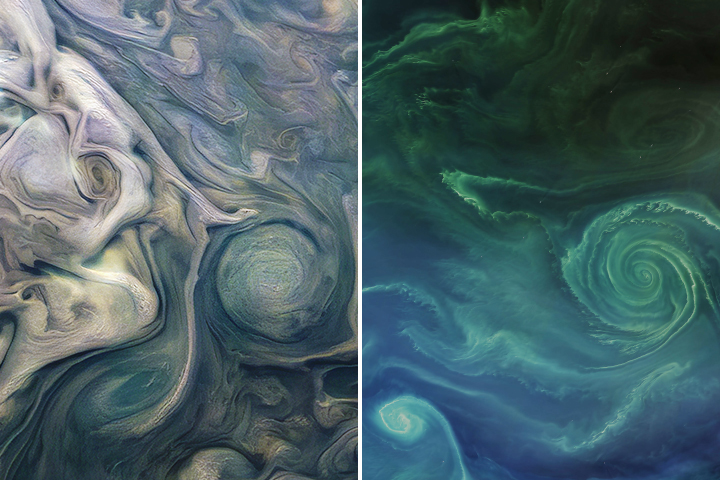
In 2019 we published this side-by-side comparison of Jupiter and Earth. The image of Jupiter (left) shows ammonia-rich clouds swirling in the outermost layers of the planet’s atmosphere. The eddies trace disturbances caused by the planet’s fast rotation and by high temperatures deeper in the atmosphere. The image of Earth (right) shows a green phytoplankton bloom tracing the edges of a vortex in the Baltic Sea. Turbulent processes in the oceans are important for moving heat, carbon, and nutrients around the planet.
Scientists are paying attention to the similarities. Lia Siegelman, a physical oceanographer at Scripps Institution of Oceanography, became interested in NASA’s Juno mission when images of Jupiter reminded her of the turbulent oceans she was studying on Earth. She presented the following examples at the December 2021 meeting of the American Geophysical Union.
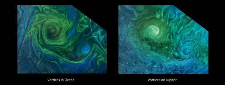
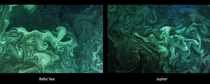
Notice how the swirls and vortices in the Norwegian Sea (top-left) and Baltic Sea (bottom-left) resemble vortices in Jupiter’s atmosphere (top- and bottom-right). Siegelman noted that although the scales are different–the vortex on Jupiter is about ten times larger than the one in the Baltic–they are generated by the same sort of fluid dynamics.
By studying these naturally emerging patterns, scientists are learning more about atmospheric processes on Jupiter. Someday, such comparisons might even tell us something new about our home planet.
The Juno spacecraft, which has been gathering data on the gas giant since July 2016, completed its 38th close pass by Jupiter in November 2021. You can find more information about the Juno mission here and here.
From Wisconsin to Washington D.C., pollen counts were quite high this spring, making seasonal allergies brutal for many people. Recent research shows that changes in the onset of spring—both early and late—can extend allergy misery and lead to more severe asthma for some people.
Warm springtime temperatures signal shrub buds to burst, trees to leaf-out, and flowers to bloom. As plants produce and release pollen, our bodies can mistakenly identify it as a dangerous intruder to our respiratory systems. Our immune systems produce chemicals to fight it, inducing sneezing, watery eyes, and stuffy noses. Research also shows allergenic pollen is also among the leading risk factors known to worsen asthma.
Amir Sapkota, a professor of public health at the University of Maryland, and his colleagues investigated how changes in the timing of spring onset affected asthma hospitalizations in Maryland over the past decade. The team used the Normalized Difference Vegetation Index (NDVI), which shows the relative “greenness” of vegetation, to determine the timing of the spring onset. (The data come from the Moderate Resolution Imaging Spectroradiometer (MODIS) on NASA’s Aqua and Terra satellites.) The team combined the satellite data with pollen counts and inpatient hospital admissions from the Maryland Department of Health.
They found that very early onset of spring (10 days early) was associated with a 17 percent increase in asthma hospitalizations in Maryland from 2001-2012, while late onset (3 days later) was associated with a 7 percent increase.
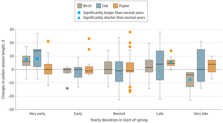
Sapkota explained that the hospitalization risk increased because of changes in pollen dynamics. Tree pollen is common in spring, while grass and weed pollen are more common during summer and fall. According to Sapkota, an early onset of spring leads to earlier and longer tree pollen seasons. At the other end, late onset causes different species of trees to bloom at the same time, thus increasing overall pollen levels in the environment. Both scenarios can lead to increases in asthma hospitalizations.
Remember the year 2000? Bill Clinton was president of the United States, Faith Hill and Santana topped Billboard music charts, and the world’s computers had just “survived” the Y2K bug. It also was the year that NASA’s Terra satellite began collecting images of Earth.
Eighteen years later, the versatile satellite — with five scientific sensors — is still operating. For all of that time, the satellite’s Moderate Resolution Imaging Spectroradiometer (MODIS) has been collecting daily data and imagery of the Arctic — and the rest of the planet, too.
If you knew where to look and were willing to wait patiently for file downloads, the images have always been available on specialized websites used by scientists. But there was no quick-and-easy way for the public to browse the imagery. With the recent addition of the full record of MODIS data into NASA’s Worldview browser, checking on what was happening anywhere in the world on any day since 2000 has gotten much easier.
Say you want to check on the weather in your hometown on the day you or your child was born. Just navigate to the date on Worldview, and make sure that the MODIS data layer is turned on. (In the image below, you can tell the Terra MODIS data layer is on because it is light gray.)
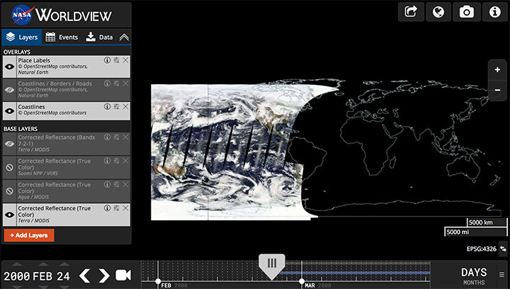
This Worldview screenshot shows the first day that Terra MODIS collected data — February 24, 2000. The very first Terra scene showed northern Argentina and Chile. Credit: EOSDIS.
One of the things I love about having all this MODIS data at my fingertips is that it makes it possible to see the passage of relatively long periods of time in just a few minutes. Look, for instance, at the animation at the top of this page, generated by Delft University of Technology ice scientist Stef Lhermitte using Worldview.
Lhermitte summoned every natural-color MODIS image of the Arctic that Terra and Aqua (which also has a MODIS instrument) have collected since April 2003. The result — a product of 71,000 satellite overpasses — is a remarkable six-minute time capsule of swirling clouds, bursts of wildfire smoke, the comings and goings of snow, and the ebb and flow of sea ice.
Though beautiful, Lhermitte’s animation also has a troubling side to it. If you look carefully, you can see the downward trend in sea ice extent. Look, for instance, at mid-August and September 2012 — the period when Arctic sea ice extent hit a record-low minimum of 3.4 million square miles. Between the heavy cloud cover, you will see lots of dark open water. Compare that to the same period in 2003, when the minimum extent was 6.2 million square miles. Scientists attribute the loss of sea ice to global warming.
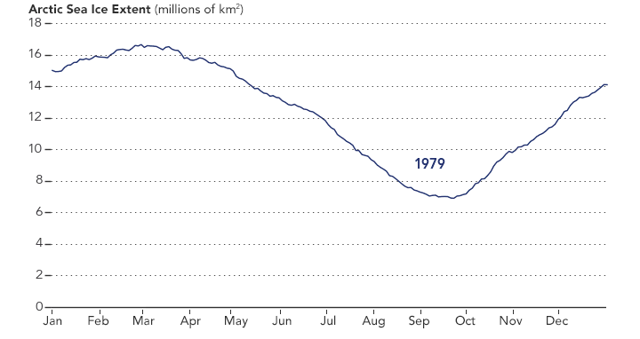
NASA Earth Observatory chart by Joshua Stevens, using data from the National Snow and Ice Data Center.
Earth Matters had a conversation with Lhermitte to find why he made the clip and what stands out about it. MODIS images of notable events that Lhermitte mentioned are interspersed throughout the interview. All of the images come from the archives of NASA Earth Observatory, a website that was founded in 1999 in conjunction with the launch of Terra.
What prompted you to create this animation?
The extension of the MODIS record back to the beginning of the mission in the Worldview website triggered me to make the animation. As a remote sensing scientist, I often use Worldview to put things into context (e.g. for studying changes over ice sheets and glaciers). Previously, Worldview only had data until 2010.
What do you think are the most interesting events or patterns visible in the clip?
I think the strength of the video is that it contains so many of them, and it allows you to see them all in one video. The ones that are most striking to me are:
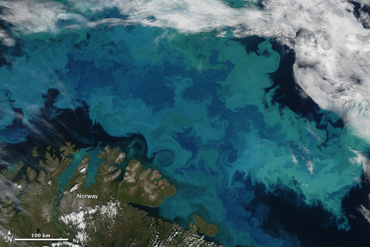
An Aqua MODIS image of a bloom in the Barents Sea on August 14, 2011. Image by Jeff Schmaltz, MODIS Rapid Response Team at NASA GSFC.
+ algal blooms in the Barents Sea
+ declining sea ice extent. You can see this both annually and over the longer term.
+ changing snow extent. You can see this each summer, especially over Canada and Siberia.
+ summer wildfire smoke in Canada (2004, 2005, 2009, 2014, 2017) and Russia (2006, 2011, 2012, 2013, 2014, 2016)
+ albedo reductions (reduction in brightness) over the Greenland Ice Sheet in 2010 and 2012 related to strong melt years.
+ overall eastward atmospheric circulation
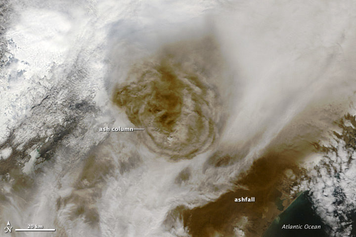
+ the Grímsvötn ash plume (21 May 2011)
How did you make it? Was it difficult from a technical standpoint?
It was simple. I just downloaded the MODIS quicklook data from the Worldview archive using an automated script. Afterwards, I slightly modified the images for visualization purposes (e.g. overlaying country borders, clipping to a circular area). and stitched everything together in a video.
When you sit back and watch the whole video, how does it make you feel?
On the one hand, I am fascinated by the beauty and complexity of our planet. On the other hand, as a scientist, it makes me want to understand its processes even better. The video shows so many different processes at different scales, from natural processes (annual changes in snow cover and the Vatnajökull ash plume) to climate change related changes (e.g. the long term decrease in sea ice).
Terra MODIS image of the eruption of Grímsvötn Volcano in Iceland on May 22, 2011. NASA image by Jeff Schmaltz, MODIS Rapid Response Team.
There are some gaps during the winter where the extent of the sea ice abruptly changes. Can you explain why?
I used the standard reflectance products, which show the reflected sunlight. I decided to leave all dates out where part of the Arctic is without sunlight during satellite overpasses (approximately 10:30 a.m. and 1:30 p.m. local time). The missing data due to the polar night are very prominent if you compile the complete record including winter months, and I did not want it to distract the viewer from the more subtle changes in the video.
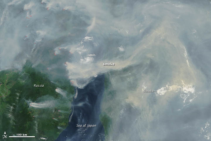
A Terra MODIS image of smoke and fires in Siberia on June 29, 2012. NASA image by Jeff Schmaltz, LANCE MODIS Rapid Response.
In the course of your day job as a scientist, do you use MODIS imagery? For what purpose?
Yes, as a polar remote sensing scientist, I tend to work with a range of satellite data sets. MODIS is a unique data product, given its global daily coverage and its long record. Besides the fact that I use MODIS frequently to monitor ice shelves and outlet glaciers, my colleagues and I use it to study snow and ice-albedo processes, snow cover in mountainous areas, vegetation recovery after wildfires, and ecosystem processes. One MODIS animation of ice calving from a glacier in Antarctica actually made it into the Washington Post recently.
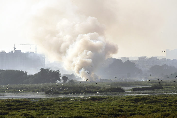
Fire on Bellandur Lake on January 19, 2018. Photo by pee vee.
In Bengaluru, India, one of the city’s lakes is so polluted with sewage, trash, and industrial chemicals that it has an alarming habit of catching on fire. As recently as January 19, 2018, fire broke out on Bellandur Lake and burned for seven hours.
The same lake is notorious for churning up large amounts of white foam that has, at times, spilled from the lake and enveloped nearby streets, cars, and bridges. The water is so polluted that it can’t be used for drinking or bathing or even irrigation.
Bellandur Lake is not the only lake in Bengaluru with water quality problems. During a recent check, not one of the hundreds of lakes that the city tested was clean enough to be used for drinking or bathing.
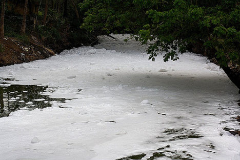
Foamy water flowing into Bellandur Lake. Photo by Kannon B.
I point this out on World Water Day to underscore that Bengaluru’s water woes, though extreme, are not particularly uncommon. According to the United Nations, a quarter of all people on the planet lack access to safely managed drinking water, and 40 percent of people live in areas where water scarcity is a problem. Roughly 80 percent of wastewater flows back into ecosystems untreated. Even in the United States, tens of millions of people may be exposed to unsafe drinking water, according to one recently published study.
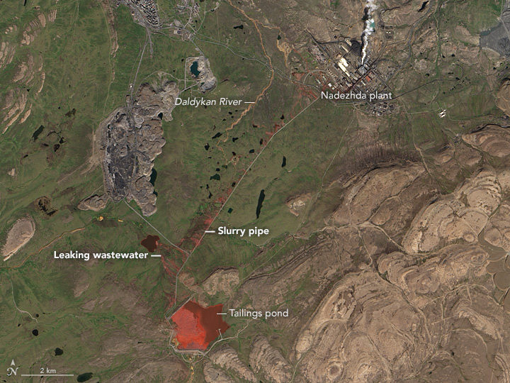
Even in the course of reporting for this website from a satellite perspective, we see signs of trouble. Capetown was on the verge of running out of water in February 2018. Drought pushed São Paulo’s reservoirs to near empty in recent years. The GRACE satellites have observed rapid depletion of groundwater in several critical aquifers. On more than one occasion, we have reported on rainbow-colored escaped mine tailings contaminating waterways.
NASA Earth Observatory image by Jesse Allen, using Landsat data from the U.S. Geological Survey. Learn more about the image here.
To push back against such problems, NASA’s Earth Science Division, and particularly its applied sciences program, is doing what it can to marshal the agency’s resources to make countries aware of what NASA resources are available to monitor and reduce the impact of water-related problems.

Learn more about the Sustainable Development Goals. Image by the United Nations.
As one piece of its water program, NASA scientists and staff are working with the United Nations to highlight key NASA datasets, tools, and satellite-based monitoring capabilities that may help countries meet the 17 sustainable development goals established by the international body. Goal number 6—that countries ensure the availability and sustainable management of water and sanitation for all—has been a particular focus of the NASA teams.
NASA and NOAA satellites collect several types of data that may be useful for water management. Sensors such as the Moderate Resolution Imaging Spectroradiometer (MODIS) and the Visible Infrared Imaging Radiometer Suite (VIIRS) collect daily data and images of water bodies around the planet that can be used to track the number and extent of lakes and reservoirs.
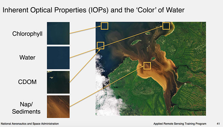
Image courtesy of this NASA ARSET presentation. Learn more about the image here.
The same sensors collect information about water color, which scientists use to detect sediment, chlorophyll-a (a product of phytoplankton and algae blooms), colored dissolved organic matter (CDOM), and other indicators of water quality.
The strength of MODIS and VIIRS is that these sensors collect daily imagery; the downside is that the data is relatively coarse. However, another family of satellites, Landsat, carries sensors that provide more than 10 times as much detail.
The combination of information from multiple satellites collected over time can be powerful. For instance, as we reported previously, a team of scientists based in China used decades of Landsat data to track a 30 percent decrease in the total surface area of lakes in Inner Mongolia between the 1980s and 2010. The scientists attributed the losses to warming temperatures, decreased precipitation, and increased mining and agricultural activity.
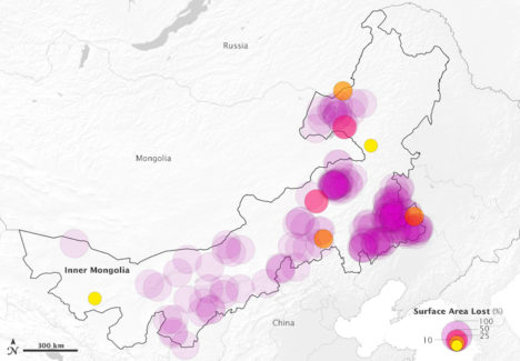
This map above depicts 375 lakes within Inner Mongolia that experienced a loss in water surface area between 1987-2010. The large, purple circles indicate a complete loss of water. Learn more about the map here.
Meanwhile, one of NASA’s scientists, Nima Pahlevan, is in the process of building an early warning system based on Landsat and Sentinel-2 data that will be used to alert water managers in near-real time when satellites detect high levels of chlorophyll-a, an indicator that harmful algal blooms could be present. While some blooms are harmless, outbreaks of certain types of organisms lead to fish kills and dangerous contamination of seafood. His team is working on a prototype system for Lake Mead in Nevada (see below), Indian River Lagoon in Florida, and certain reservoirs in Oregon. Eventually, he hopes to have a tool available that can be used globally.
“The idea is that we can get the information to water managers quickly about where satellites are seeing suspicious blooms, and then folks on the ground will know where to test water to determine if there’s a harmful algae bloom,” said Pahvalen. “We’re not suggesting that satellites can replace on-the-ground sampling, but they can be a great complement and make that work much work more efficient and less costly.”
To learn more about how satellites can be used to aid in the monitoring of water quality, see this workshop report and harmful algal bloom training module from NASA’s ARSET program.
NASA Earth Observatory image by Jesse Allen, using Landsat data from the U.S. Geological Survey. The image was captured on August 3, 2017, by the Operational Land Imager (OLI) on Landsat 8.
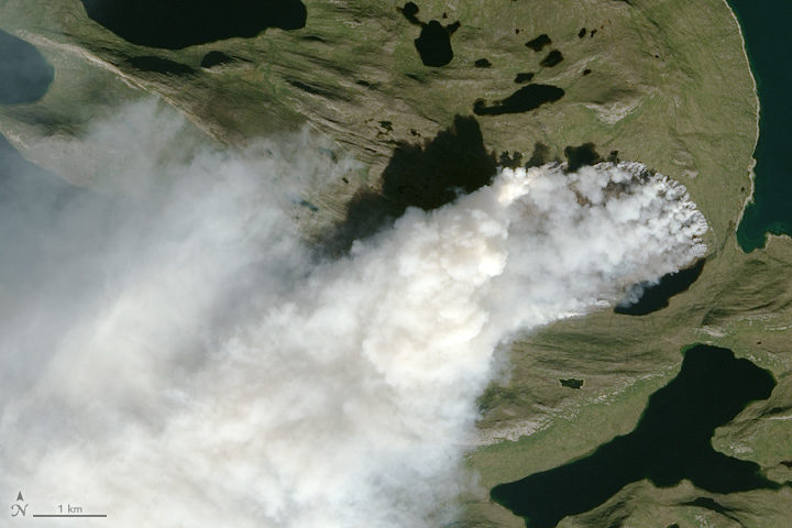
Scientists around the world have been using satellites to monitor a wildfire in Greenland. In a place better known for ice, just how unusual is this fire? NASA Earth Observatory checked with Earth science experts Ruth Mottram, Jessica McCarty, and Stef Lhermitte to find out. Mottram is a climate scientist at the Danish Meteorological Institute; Lhermitte is remote sensing scientist at Delft University of Technology; and McCarty is a geographer at Miami University.
How unusual is this fire?
Mottram: Many of my colleagues at the Danish Meteorological Institute (DMI) were a bit surprised at first, but it was clear talking to both the Greenland weather forecasters (they do three month rotations to the airport at Kangerlussuaq) and to some of the older guys that fires do happen reasonably regularly, particularly in the west and south. However, they are not always reported either officially or in the news unless the fire is close to a settlement or affecting shipping or flights. This fire seems to be a fairly large one, but there has been no systematic attempt to gather evidence or data on Greenland’s fires – at least not at DMI. I have never heard of anyone else in Denmark doing it either, so it is a bit hard to be more precise than that.
McCarty: This is a hard question to answer, and I keep telling media reporters the same thing: we need to have the wildfire history analyzed before we know how unusual this is. I can tell you from the global wildfire science community that I am a part of, we would have never thought the we would need to make a wildfire history to understand the fire regime in Greenland. So that part is unusual.
Lhermitte: I completely agree with Jessica. I used to be a wildfire remote sensing scientist (finished my PhD on African wildfires in 2008), but I have shifted since then to the cryosphere community (including some work on Greenland’s ice). It was a big surprise to me to see both worlds combined on Monday when I first noticed a Greenland fire tweet. Now it is clear that fires have occurred before, but that we basically lack a good record. MODIS gives us a glimpse, but the sensor cannot detect fires through clouds, and the record is short. Based on what I have seen, the 2017 fire is the biggest one on the MODIS record, but the record is sparse and incomplete.
I know you have done some looking through MODIS and Landsat satellite data for evidence of past fires in Greenland. What have you found?
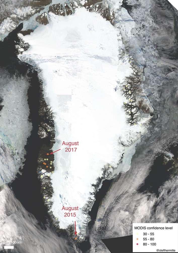
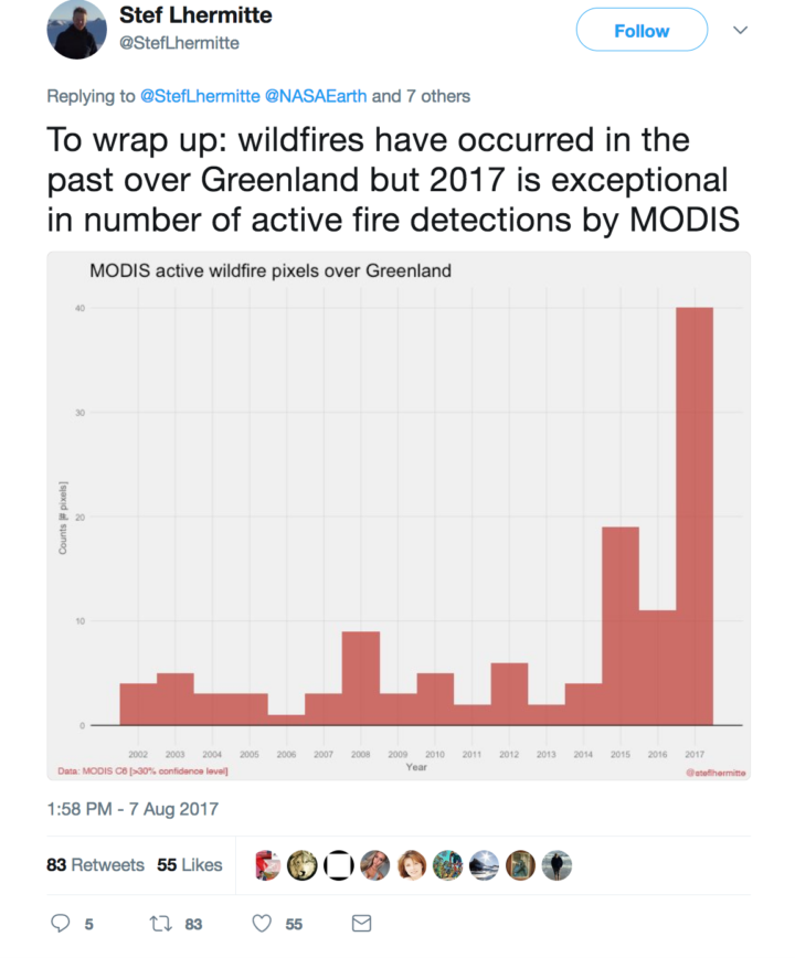
Lhermitte: I looked back at the record of MODIS active fire detections since 2002 and made a quick overview map. In the map below, fire detections are marked with circles. Higher confidence fires are red; lower confidence fires are yellow. In most years, the satellite flags about 5 pixels as having active fires. In 2015, it flagged about 20 pixels. There were over 40 pixels flagged in 2017, so this year has been exceptional. Note: Most of these detections are probably campfires or false detections—not uncontrolled wildfires. There have been two big wildfires: the one happening now and one in August of 2015.
McCarty: Overall, 2017 appears to be a larger fire season than any year since 2001. But from a remote sensing point of view, this is a difficult place to study the fire regime using satellite-based active fire detections (because of cloudiness and other factors). The Landsat/Sentinel-2/Deimos, etc. burn scar images will be more helpful.
Mottram: I have not looked into any of the specific data, but I have heard anecdotes about fires in Narsarsuaq close to the DMI ice service reconnaissance station in the south of Greenland, in the Kobbefjord close to Nuuk, and just to the north of Sisimiut near this one. There was also a large fire in 2008 near Eqi, close to Ilulissat, which the Greenland press reported was caused by a tourist burning rubbish but failing to put the fire out.
One of you said on social media that you think the fire may be burning through peat. Are you sure? How can you tell?
McCarty: The fire line has not moved much in comparison to a wildfire in a grassland or forest. However, Stef made an awesome Sentinel-2 animation that shows the fire line moving some. I still think it is peat with a mix of grasses and moss (given the Google Earth Pro and Deimos imagery), but how deep the peat is difficult to ascertain. A recent study in the Qaanaaq region (north of where these wildfires are) found five times more peat in the soil distribution and soil content than previously reported. Also, historically, peat houses were constructed in this area of Greenland, which means there are peat deposits nearby. Short grasses with underlying peat is my working hypothesis for now since we are onto day 11 of the fire.
Mottram: I am not really a soils expert, and Greenland really suffers from having little detailed mapping of this kind. Also, Greenland is pretty diverse from north to south and east to west. There are high rocky mountains and permafrost. The south has sheep pasture and even some areas of forest; the north has large areas with low vegetation cover. However, there are also extensive areas of peat cite in the scientific literature.
Do you think this fire was triggered by human activity or lightning? Do we know what triggers most fires in Greenland?
McCarty: I still can’t find any indication that this was lightning, so it must be human activity. Greenlandic/Danish news reports are reporting that hikers and tourists should stay from this area, so I would assume that humans are on the landscape there.
Mottram: I can’t really say for sure. Lightning is not impossible, but neither is human activity. It is the middle of the hunting/fishing/berry-picking/hiking season, and this area is known for reindeer. In fact, the Greenland press had an interview with a reindeer hunter who had to turn back from visiting because of the smoke in the fjord. Actually, the hunter wanted the fire put out by the authorities, so he could go hunting there.
What has the weather been like in Greenland during the last few months? Has it been unusually hot or dry where this fire is burning?
Mottram: It has been a very dry summer in the south but also quite dry in this region, and the fire was preceded by some relatively high temperatures. My climatologist colleague John Cappelen tells me that the DMI station at Sisimiut measured an precipitation anomaly of -30.0 millimeters for June and -20.7 millimeters for July compared to the mean precipitation of 1981-2010. In other words, there was almost no rain in June and a bit more than half the usual rainfall in July. There have also been some warm days in Sisimiut (or at least at the airport where the weather station is), particularly towards the end of the month. The monthly average temperature was 7.1 Celsius compared to a 1961-1990 average of 6.3 Celsius in July. The trend has continued into August as well.
This fire got me wondering why there are ice-free areas along Greenland’s coast where vegetation grows. Are these relatively new features? How do you think they got there?
Lhermitte: These ice free coastal areas are mainly the result of the bedrock topography, where the coastal Greenland areas are much more elevated than the interior of Greenland. Since the last glacial maximum, the ice sheet has partly retreated and exposed more land. If the ice sheet would retreat further, we would see more of the inner, lower land exposed.
Mottram: The ice sheet is more or less in equilibrium with the climate, so it is where it is because that is where the glaciers can flow. During the last glacial maximum, the ice sheet extended far out onto the continental shelf and connected (in the north west) with the Laurentide ice sheet in North America. Then, with warming after the last glacial period, the ice sheet retreated. (That is, more ice was melting and calving away than was being replenished by snowfall.) The ice sheet has been more or less stable in its present extent for about the last 10,000 years (with some smaller advances and retreats responding to more local climate variability).
